
Search results for "Subsequently adding" in Home Design Ideas
 FullerHouse Remodeling
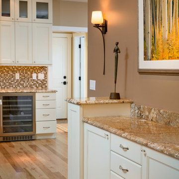
FullerHouse Construction Project: Arapahoe Ridge, Boulder CO whole house remodel
Our clients’ modest, 2,100 SF 1960’s Ranch had received only a few minor cosmetic upgrades since its original construction. And given a need for more space and a desire to stay in their neighborhood – the prime Arapahoe Ridge neighborhood of Boulder – our clients knew their home was due for a major renovation.
By the time DAJ Designs of Louisville had completed drawings, it was clear that very little of the original house was going to remain the same.
To create the space and configuration they desired, the first goal was to add a 2nd story, allocated solely for the new Master Suite, with its own private Balcony. But to create additional space needed for the Kitchen and walk-in pantry, we also pushed out into the original Garage footprint, subsequently extending the Garage to create room for 3+ vehicles. We also reworked nearly every other interior partition wall on the main floor to accommodate a spacious Great Room, 2 kids’ bedrooms, an Office, 2 bathrooms, and a dedicated Laundry room.
With clean white Craftsman details for the Exterior and interior trim and doors, natural granite counters, glass tiles, and creamy white Shaker-style cabinetry, our clients’ good taste added a timeless warmth to their now larger (3,000 SF) and more functional home.
 Ernest Schieferstein Architecture
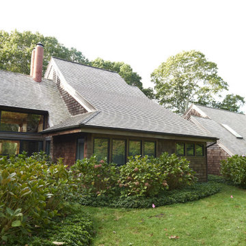
Over the decades since the original construction, I have added three subsequent major additions transforming the layout, size and detail style of this home. I took on the challenge to make all the subsequent additions seamless design statements.
 Donald Lococo Architects
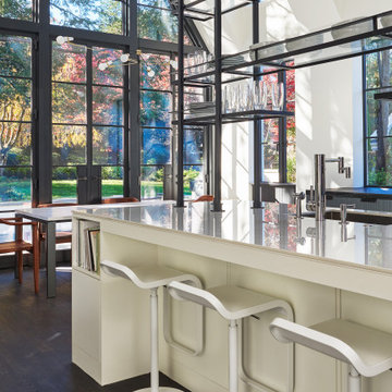
Subsequent additions are covered with living green walls to deemphasize stylistic conflicts imposed on a 1940’s Tudor and become backdrop surrounding a kitchen addition. On the interior, further added architectural inconsistencies are edited away, and the language of the Tudor’s original reclaimed integrity is referenced for the addition. Sympathetic to the home, windows and doors remain untrimmed and stark plaster walls contrast the original black metal windows. Sharp black elements contrast fields of white. With a ceiling pitch matching the existing and chiseled dormers, a stark ceiling hovers over the kitchen space referencing the existing homes plaster walls. Grid members in windows and on saw scored paneled walls and cabinetry mirror the machine age windows as do exposed steel beams. The exaggerated white field is pierced by an equally exaggerated 13 foot black steel tower that references the existing homes steel door and window members. Glass shelves in the tower further the window parallel. Even though it held enough dinner and glassware for eight, its thin members and transparent shelves defy its massive nature, allow light to flow through it and afford the kitchen open views and the feeling of continuous space. The full glass at the end of the kitchen reveres a grouping of 50 year old Hemlocks. At the opposite end, a window close to the peak looks up to a green roof.
Find the right local pro for your project

 Hursthouse Landscape - Architect, Build, Maintain
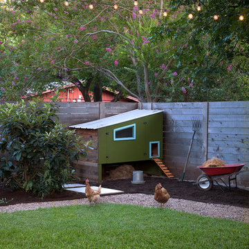
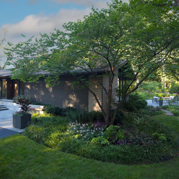
The bluestone entry and poured-in-place concrete create strength of line in the front while the plantings softly transition to the back patio space.
Design ideas for a huge mid-century modern partial sun side yard stone garden path in Chicago for summer.
Design ideas for a huge mid-century modern partial sun side yard stone garden path in Chicago for summer.
 Donald Lococo Architects
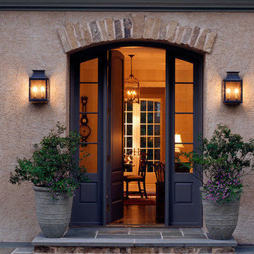
Situated in Kenwood, Maryland just outside of Washington, D.C., this whole-house renovation reinterprets a 1950s split-level into a rustic French country house. Published 3 times, The French country house plans for this renovation inform and guide the remodel. Short double-hung existing windows of various sizes on a 1950s brick front wall (see below) were replaced by straightforward openings along the front facade. By replacing them with a series of similar openings, the end result is a principled, simple elegance inspired by French country style homes. The rustic application of field stone arches and rough stucco are both inviting and enchanting, echoing French country interior design.
Elements of French country home decor complement the home. The traditional French country home design has been widely published, including features in Renovation Style and Maryland Life magazines, among others. One singular continuous walkway runs the entire length of the main front under each of the French doors, and a courtyard created by stucco walls and stone piers create an inner sanctum in the front yard. In the back of the property, added French gates lead to a newly constructed pavilion.
 Donald Lococo Architects
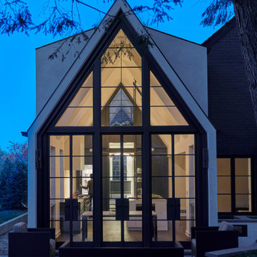
Subsequent additions are covered with living green walls to deemphasize stylistic conflicts imposed on a 1940’s Tudor and become backdrop surrounding a kitchen addition. On the interior, further added architectural inconsistencies are edited away, and the language of the Tudor’s original reclaimed integrity is referenced for the addition. Sympathetic to the home, windows and doors remain untrimmed and stark plaster walls contrast the original black metal windows. Sharp black elements contrast fields of white. With a ceiling pitch matching the existing and chiseled dormers, a stark ceiling hovers over the kitchen space referencing the existing homes plaster walls. Grid members in windows and on saw scored paneled walls and cabinetry mirror the machine age windows as do exposed steel beams. The exaggerated white field is pierced by an equally exaggerated 13 foot black steel tower that references the existing homes steel door and window members. Glass shelves in the tower further the window parallel. Even though it held enough dinner and glassware for eight, its thin members and transparent shelves defy its massive nature, allow light to flow through it and afford the kitchen open views and the feeling of continuous space. The full glass at the end of the kitchen reveres a grouping of 50 year old Hemlocks. At the opposite end, a window close to the peak looks up to a green roof.

Sponsored
Columbus, OH

Hope Restoration & General Contracting
Columbus Design-Build, Kitchen & Bath Remodeling, Historic Renovations
 The Mosaic Factory
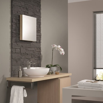
The composition of layers, the palette of shades, and the use of natural materials (concrete and granulate) give this stone his warm feel and romantic look. The Odyssee stone is 100 percent frost-resistant and can therefore be used indoors and outdoors. With a variety of sizes it's easy to make that realistic random looking wall. Stone Design is durable, easy to clean, does not discolor and is moist, frost, and heat resistant. The light weight panels are easy to install with a regular thin set mortar (tile adhesive) based on the subsurface conditions. The subtle variatons in color and shape make it look and feel like real stone. After treatment with a conrete sealer this stone is even more easy to keep clean.
 Richard Best Architect, Inc.
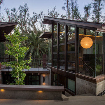
Hillside Modernism In Context.
The owners of this modern hillside home sought to have a home in a nice Los Angeles neighborhood wherein they could raise their burgeoning family. The owners purchased a 1948 2000sf, single story, 2 bedroom English Cottage styled home (believed to have been originally owned by Yul Brynner) on a ½ acre hillside site in the exclusive Brentwood area of Los Angeles. The property slopes downward away from the street and overlooks a mini eucalyptus arroyo. The owners love their new location but are now faced-with having to raise their new and growing family on a hillside with extremely limited yard spaces for children to play and in a location where nature is very close – deer as well as coyotes wander the arroyo.
In 2000 the owners commissioned architect Richard Best to add 2500sf to the cottage and transform it into a home more fitting to their growing family’s needs. Subsequently, in 2014/15, the owners again commissioned Richard to create a 2-story master suite addition. Living in or visiting the completed project - the original 1948 home remodeled + the 2000 addition + the 2014/15 addition, one goes through an unexpected and delightful experience as the spaces of the home “unfold” to reveal intimacy and environmental immersion.
It was important to Richard and to the owners that their remodels and additions be appropriately designed to fit into the neighborhood and have the feel, scale, and soul of the original cottage. With this in-mind, Richard has interpreted the design intentions of the original cottage - “modernizing” the architectural vocabulary and creating open-plan, 2-story additions which promote site “engagement” at various floor levels and openness to the outdoors in a manner clearly inspired by the original cottage, yet modern.
At the front door of the original (still remains as it was) 1948 structure, one is presented with a quaint a low-slung entry which establishes a very comfortable sense of scale. Inside, the remodeled spaces of the original cottage exude comfort and a cozy sensibility evoked by the reuse of the original home’s exposed timber framing structure, open-plan circulation, and an inventive two-sided steel fireplace which acts as a room divider between the living room and a home office. Accordion wood doors connect these rooms to a newly formed outdoor rear patio. At this point one also gets ones first hint that something very interesting is happening just beyond – a glimpse of the 2000 & 2014/15 additions.
Moving from the original 1948 structure into the 2-story 2000 addition, one is greeted by a modern and open linear floor plan arrangement – a kitchen, casual dining and family room extend perpendicularly from the 1948 structure into the rear yard and down the hillside. The open framed cathedral ceiling and wood roof trusses establish a lofty feeling and a rhythm discretely separating the open rooms one from the other. Extensive use of windows and French doors connect the indoors to the outdoors and provide abundant natural lighting. This new appendage ends with a symmetrical family room which has no corners – it is a geometry composed of two overlapped squares - one rotated 45 degrees atop the other to create double opportunities for bay windows. The design not only connects the home to the desired exterior flat yards spaces, but it also takes full advantage of the sloping terrain by adding a floor below the original level so as to maintain a scale appropriate to the neighborhood. The exterior materials were chosen taking “hints” from the original 1948 structure – natural redwood siding, reused brick veneer and wood doors/windows all serving to aesthetically connect the addition back-to the spirit of the original structure.
By 2014/15 the owners’ family has fully blossomed - the children are now teenagers and there is a need for additional space. However, the owners are very content with their remodeled cottage and Richard’s 2000 addition – unsure how to add to a home which they feel is quite perfect as it is … wanting whatever changes are to be made to be sympathetic to it. They are also concerned about potential additions blocking-out their views of the eucalyptus arroyo. The owners approached Richard with trepidation – we love our perfect house but we need it to be a bit bigger and we don’t want to block-out the arroyo views or create a hemmed-in feeling – how can we add but still see the arroyo.
In response Richard created a private yet connected 2-story master suite, which by its positioning, dynamic geometries and extensive glazing create the fourth side of the former rear patio, making it into exterior courtyard with views around and through the new addition into the arroyo. A dynamic angularity in the new master addition (inspired by the 2000 addition) simultaneously reduces the apparent size/presence of the master suite addition on the edge of the eucalyptus arroyo while creating framed views into the arroyo from the newly formed courtyard. The new master suite - a master bathroom, master closet and a master sleeping loft each having exterior decks and/or patios, is connected back to the 2000 addition via a glazed hallway which provides a sense of connectedness and privacy. A modern rustic aesthetic of exposed board-formed concrete, natural finished Corten steel exterior cladding, frameless metal windows, and clear finished Douglas Fir planks serve to “extend” the soul of the original cottage into the master suite.
The project is a highly sustainable design as well. Energy use is reduced by employing a high efficiency heat pump heating and cooling system, dual paned/gasketed metal window/door systems, natural lighting through a Kalwall skylight and generous exterior glazing with extensive eaves for shading, rigid roof insulation, and earthen backing – the lower floor is up-against the hillside which tends to even-out the day/night temperature differential.
Credits:
Architecture & Interior Design: Richard Best Architect Inc.
Structural Engineering: Dan Echeto & David Choi Associates
Interior Decor: Noelle Schoop
Landscape: Connie Heitzman
Photos: Carmel McFayden and Adriano Sarmento / James Porschen
 Highline Partners, Ltd
Audrey Hall
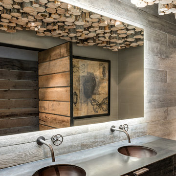
Example of a mountain style bathroom design in Other with flat-panel cabinets, dark wood cabinets and an integrated sink
Example of a mountain style bathroom design in Other with flat-panel cabinets, dark wood cabinets and an integrated sink
 Bruns Architecture
Tricia Shay Photography
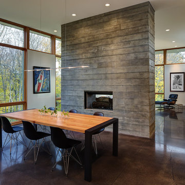
Inspiration for a mid-sized contemporary concrete floor and brown floor great room remodel in Milwaukee with a two-sided fireplace and white walls
Inspiration for a mid-sized contemporary concrete floor and brown floor great room remodel in Milwaukee with a two-sided fireplace and white walls
 Vincent Longo Custom Builders
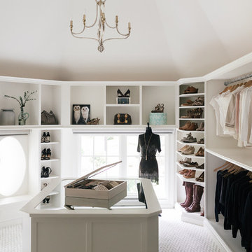
Walk-in closet - large transitional women's carpeted and white floor walk-in closet idea in Atlanta with open cabinets and white cabinets
 Delaney Window Fashions LLC
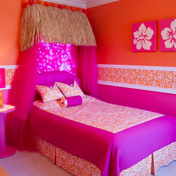
When the client spoke with the Delaney Window Fashions LLC workroom designer about the creation of a unique, Hawaiian-themed child’s bedroom, the bright pink and orange paint was already in place, along with the hibiscus floral fabric border. The impetus for the additional work was the transition from a baby’s room with a crib to a little girl’s room with a full-size bed. Although the room was started, it was far from complete.
With a limited amount of the client’s floral fabric, which had subsequently been discontinued, the designer created bedding and pillows and constructed a Hawaiian-themed bed canopy with lights. The homeowner wanted the bedding to be washable but not quilted and the bed crown to be light weight. A tailored, center-pleat bed skirt was created first. The remaining fabric, along with an accent fabric was used to create a comforter, envelope and bolster pillows. The comforter was created with two mitered corners; and micro-cording was purposely added around the middle section to hide the seam.The middle section was hand tacked to secure comforter layers for laundering.
To finish the bedding, a tiki hut-inspired bed crown was created, which was challenging because the material had to be light weight. Including LED garland added a
fun and whimsical element. With child safety in mind, shirred tulle panels were attached to the back and sides of the crown. In this way, the lights were visible, but not accessible to the child.
The project was a success, and the client loves the room. The child’s lighted tiki hut bed crown provided a cozy environment for nightly bedtime stories. It made for one happy little girl!
This project was applied for a competition.
Photographer: Simona Buna

Sponsored
Columbus, OH

Structural Remodeling
Franklin County's Heavy Timber Specialists | Best of Houzz 2020!
 CDH Designs LLC
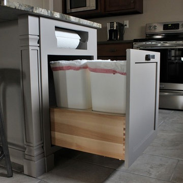
After going through the tragedy of losing their home to a fire, Cherie Miller of CDH Designs and her family were having a difficult time finding a home they liked on a large enough lot. They found a builder that would work with their needs and incredibly small budget, even allowing them to do much of the work themselves. Cherie not only designed the entire home from the ground up, but she and her husband also acted as Project Managers. They custom designed everything from the layout of the interior - including the laundry room, kitchen and bathrooms; to the exterior. There's nothing in this home that wasn't specified by them.
CDH Designs
15 East 4th St
Emporium, PA 15834
 Donald Lococo Architects
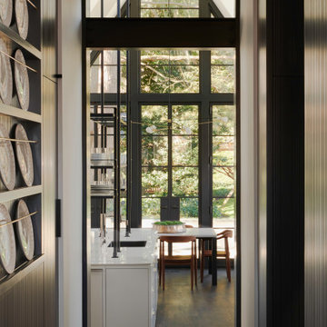
Subsequent additions are covered with living green walls to deemphasize stylistic conflicts imposed on a 1940’s Tudor and become backdrop surrounding a kitchen addition. On the interior, further added architectural inconsistencies are edited away, and the language of the Tudor’s original reclaimed integrity is referenced for the addition. Sympathetic to the home, windows and doors remain untrimmed and stark plaster walls contrast the original black metal windows. Sharp black elements contrast fields of white. With a ceiling pitch matching the existing and chiseled dormers, a stark ceiling hovers over the kitchen space referencing the existing homes plaster walls. Grid members in windows and on saw scored paneled walls and cabinetry mirror the machine age windows as do exposed steel beams. The exaggerated white field is pierced by an equally exaggerated 13 foot black steel tower that references the existing homes steel door and window members. Glass shelves in the tower further the window parallel. Even though it held enough dinner and glassware for eight, its thin members and transparent shelves defy its massive nature, allow light to flow through it and afford the kitchen open views and the feeling of continuous space. The full glass at the end of the kitchen reveres a grouping of 50 year old Hemlocks. At the opposite end, a window close to the peak looks up to a green roof.
 Donald Lococo Architects
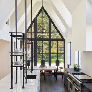
Subsequent additions are covered with living green walls to deemphasize stylistic conflicts imposed on a 1940’s Tudor and become backdrop surrounding a kitchen addition. On the interior, further added architectural inconsistencies are edited away, and the language of the Tudor’s original reclaimed integrity is referenced for the addition. Sympathetic to the home, windows and doors remain untrimmed and stark plaster walls contrast the original black metal windows. Sharp black elements contrast fields of white. With a ceiling pitch matching the existing and chiseled dormers, a stark ceiling hovers over the kitchen space referencing the existing homes plaster walls. Grid members in windows and on saw scored paneled walls and cabinetry mirror the machine age windows as do exposed steel beams. The exaggerated white field is pierced by an equally exaggerated 13 foot black steel tower that references the existing homes steel door and window members. Glass shelves in the tower further the window parallel. Even though it held enough dinner and glassware for eight, its thin members and transparent shelves defy its massive nature, allow light to flow through it and afford the kitchen open views and the feeling of continuous space. The full glass at the end of the kitchen reveres a grouping of 50 year old Hemlocks. At the opposite end, a window close to the peak looks up to a green roof.
 CITYDESKSTUDIO, Inc.
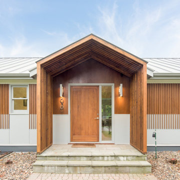
Built in 1949, this Edina home had a strong horizontal presence on the site, but through subsequent renovations the overall massing was lacking clarity and refinement and the entry was diminutive and uninviting. The roof and siding materials were aging, and important interior spaces were cramped and closed in. The house needed better light, better connection internally and out, and exterior updates to clarify and enhance the strengths of the home.
The primary design evolved out of a celebration of the existing horizontality of the home and a recognition that a bigger home was not needed. By layering materiality and color, a new identity was created. A new cedar entry canopy slips out from under the previous roof line, extending further towards the street. This added warmth at the entry is echoed along the facade, creating a graceful rhythm and texture. The previous additions were re-clad with a darker material palette in order to anchor and unify the ends of the home. As the grade slopes down towards the back yard, horizontal bands are exposed, revealing the layering top to bottom. Combined, these few shifts in color and materiality allowed for a complete transformation of the home.
The interior is reflective of the material and color palette used outside. The main living spaces are opened up and connected while strengthening the original symmetry of the more formal linear alignment of rooms. A whole new kitchen relocates the center of the home and makes more fluid the daily life of this young family. The house is fully transformed inside and out, all without adding more square feet.
Project Team:
Ben Awes, AIA, Principal-in-Charge
Nate Dodge
Sponsored
Columbus, OH
Hope Restoration & General Contracting
Columbus Design-Build, Kitchen & Bath Remodeling, Historic Renovations
 Donald Lococo Architects
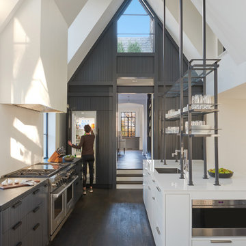
Subsequent additions are covered with living green walls to deemphasize stylistic conflicts imposed on a 1940’s Tudor and become backdrop surrounding a kitchen addition. On the interior, further added architectural inconsistencies are edited away, and the language of the Tudor’s original reclaimed integrity is referenced for the addition. Sympathetic to the home, windows and doors remain untrimmed and stark plaster walls contrast the original black metal windows. Sharp black elements contrast fields of white. With a ceiling pitch matching the existing and chiseled dormers, a stark ceiling hovers over the kitchen space referencing the existing homes plaster walls. Grid members in windows and on saw scored paneled walls and cabinetry mirror the machine age windows as do exposed steel beams. The exaggerated white field is pierced by an equally exaggerated 13 foot black steel tower that references the existing homes steel door and window members. Glass shelves in the tower further the window parallel. Even though it held enough dinner and glassware for eight, its thin members and transparent shelves defy its massive nature, allow light to flow through it and afford the kitchen open views and the feeling of continuous space. The full glass at the end of the kitchen reveres a grouping of 50 year old Hemlocks. At the opposite end, a window close to the peak looks up to a green roof.
 Donald Lococo Architects
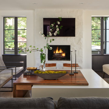
Subsequent additions are covered with living green walls to deemphasize stylistic conflicts imposed on a 1940’s Tudor and become backdrop surrounding a kitchen addition. On the interior, further added architectural inconsistencies are edited away, and the language of the Tudor’s original reclaimed integrity is referenced for the addition. Sympathetic to the home, windows and doors remain untrimmed and stark plaster walls contrast the original black metal windows. Sharp black elements contrast fields of white. With a ceiling pitch matching the existing and chiseled dormers, a stark ceiling hovers over the kitchen space referencing the existing homes plaster walls. Grid members in windows and on saw scored paneled walls and cabinetry mirror the machine age windows as do exposed steel beams. The exaggerated white field is pierced by an equally exaggerated 13 foot black steel tower that references the existing homes steel door and window members. Glass shelves in the tower further the window parallel. Even though it held enough dinner and glassware for eight, its thin members and transparent shelves defy its massive nature, allow light to flow through it and afford the kitchen open views and the feeling of continuous space. The full glass at the end of the kitchen reveres a grouping of 50 year old Hemlocks. At the opposite end, a window close to the peak looks up to a green roof.
 CITYDESKSTUDIO, Inc.
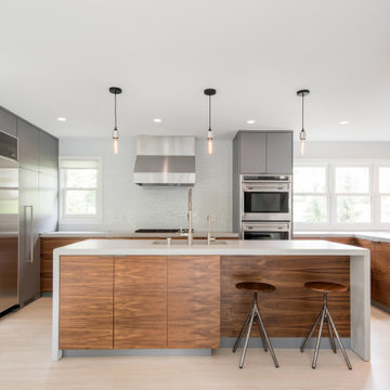
Built in 1949, this Edina home had a strong horizontal presence on the site, but through subsequent renovations the overall massing was lacking clarity and refinement and the entry was diminutive and uninviting. The roof and siding materials were aging, and important interior spaces were cramped and closed in. The house needed better light, better connection internally and out, and exterior updates to clarify and enhance the strengths of the home.
The primary design evolved out of a celebration of the existing horizontality of the home and a recognition that a bigger home was not needed. By layering materiality and color, a new identity was created. A new cedar entry canopy slips out from under the previous roof line, extending further towards the street. This added warmth at the entry is echoed along the facade, creating a graceful rhythm and texture. The previous additions were re-clad with a darker material palette in order to anchor and unify the ends of the home. As the grade slopes down towards the back yard, horizontal bands are exposed, revealing the layering top to bottom. Combined, these few shifts in color and materiality allowed for a complete transformation of the home.
The interior is reflective of the material and color palette used outside. The main living spaces are opened up and connected while strengthening the original symmetry of the more formal linear alignment of rooms. A whole new kitchen relocates the center of the home and makes more fluid the daily life of this young family. The house is fully transformed inside and out, all without adding more square feet.
Project Team:
Ben Awes, AIA, Principal-in-Charge
Nate Dodge
1