
Search results for "Suffered" in Home Design Ideas
 JLC Architecture
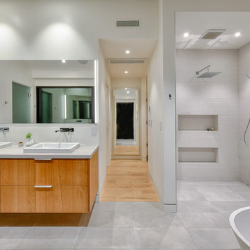
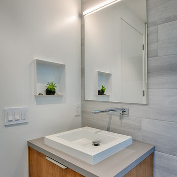
JLC was charged with transforming a 35 year old home which had suffered a remodel or two into a cohesive and modern home. Sustainable design principles were placed at the forefront of the design process alongside functionality and aesthetics. The end result is a roughly 3,000 sf home that is both comfortable and beautiful. The exterior palette is defined by Resysta siding and decking, acrylic stucco, a standing seam metal roof and black aluminum windows and doors. At the interiors white oak and walnut cabinetry throughout bring natural warmth to the clean, white interior. The home achieved LEED Platinum in 2017 and was featured on the San Diego Green Building Council’s 2017 Green Homes Tour.
Project website: neuhaus-encinitas.blogspot.com

 12/12 Architects & Planners
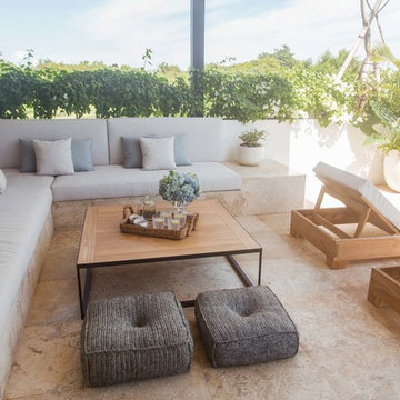
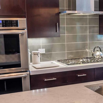
This family of 5 was quickly out-growing their 1,220sf ranch home on a beautiful corner lot. Rather than adding a 2nd floor, the decision was made to extend the existing ranch plan into the back yard, adding a new 2-car garage below the new space - for a new total of 2,520sf. With a previous addition of a 1-car garage and a small kitchen removed, a large addition was added for Master Bedroom Suite, a 4th bedroom, hall bath, and a completely remodeled living, dining and new Kitchen, open to large new Family Room. The new lower level includes the new Garage and Mudroom. The existing fireplace and chimney remain - with beautifully exposed brick. The homeowners love contemporary design, and finished the home with a gorgeous mix of color, pattern and materials.
The project was completed in 2011. Unfortunately, 2 years later, they suffered a massive house fire. The house was then rebuilt again, using the same plans and finishes as the original build, adding only a secondary laundry closet on the main level.
Find the right local pro for your project
 MAAM
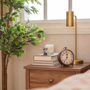
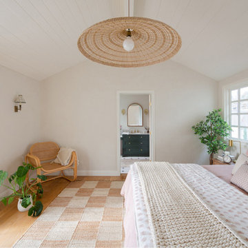
MAAMThis charming house was built in 1924 with all the aspiration of the California transplants of that era - mimicking a traditional, English cottage built into the hillside of scenic Los Feliz. When our clients moved in, nearly 100 years later, the house was suffering from a poorly-built, 2006 addition which was a jumble of walls and bathrooms that also turned out to be a breeding ground for black mold. After careful remediation, the clients decided to make the most of the fact that their primary suite had been taken down to the studs by reconceiving the layout of the 300 sf wing to accommodate a generous new primary bathroom, walk-in closet and convertible home office / guest bedroom.
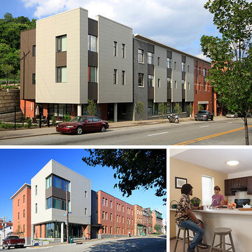
 AIA Pittsburgh
ARCHITECTURE: Honor Award
PROJECT: Uptown Lofts on Fifth
CLIENT: ACTION-Housing, Inc.
ARCHITECTURE FIRM: FortyEighty Architecture
ENGINEERS: Langan Engineering & Environmental Services, Inc.; Keystone Structural Solutions; Iams Consulting, LLC
CONTRACTORS: Mosites Construction Company
PHOTOGRAPHER: FortyEighty Architecture
DESCRIPTION: The Uptown Lofts on Fifth are two new multi-unit apartment buildings constructed on opposite sides of Fifth Avenue in Uptown, a neighborhood of Pittsburgh that suffers from steady population decline due to a lack of adequate housing. The developer for the project, ACTION-Housing, Inc., serves a mission to empower people to build secure and self-sufficient lives through decent, affordable housing, and has worked to demonstrate the importance of energy efficiency through various projects. This project was designed to allow for a comparison of the operational performance of the two buildings – one designed to meet Passive House standards and the other designed to meet the requirements of the current energy code.
JURY COMMENTS: This is the project the jury discussed the most. Perhaps not best in any one category, this project achieved so much in so many categories. Architecture is about richness, layers of meanings, and social responsibility. This project surpassed others by doing so much in terms of being solidly designed in the context of its neighborhood, with aggressive sustainable goals, and all on a very tight budget. It is serving as a demonstration to the greater sustainable community with two test buildings from which to compare the ROI on a project designed to meet passive house standards versus a building meeting the current energy codes. Most importantly, this building brings a high level of dignity to an all too often overlooked user in a neglected part of town.
 Michael Gorski Architect
The original 1920’s cottage was charming, but suffered from a series of additions that marred the exterior and created an awkward floor plan. To renovate this home, the exterior of the original cottage was left largely intact, the previous additions were removed, a garage/bedroom wing was added to the rear, and a glazed breakfast room was added where old and new construction meet. Within the original cottage, several partitions were removed and openings between rooms were widened. The resulting home maintains the intimate feel of the original cottage, while creating the light and airy interior desired by the owner.
 dcap pllc
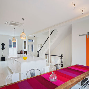
Built in 1853, this landmark townhouse suffered from decades of neglect. The new residence combines original materials such as the wide plank subfloors discovered beneath warped and rotted parquet with new insertions like the parlor floor steel structure and barn door. Energy conservation modifications including a fluid applied air barrier, continuous exterior wall insulation and a pair of compact boilers are hidden behind new interior finishes. Sprinkled throughout the house are rescued elements ranging from door knobs to a claw foot tub with a fresh coat of bright green paint.
Photos by Archphoto | Ines Leong.
 Tile Doctor Ltd
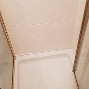
The pictures below detail the renovation of Ceramic Tiled Shower Cubicleat a property in Bolton Upon Dearne South Yorkshire. I was called in as the homeowners dreaded using the shower due to the state of the tiles, grout and cubicle in general.
As you can see from the photograph the grout was filthy, the silicone was mouldy, and the shower frame was caked in mouldy dirt. Over the years there had been a build-up of hard water and staining from products which leave a residue. They had used everyday cleaning products, but these had not been able to touch the problem as it had been left for too long.
I discussed with the clients how Tile Doctor could help, and how we would be able to deep clean the shower area and replace the mouldy silicone. I was confident we could get the renovate the cubicle and get it looking like new again. They were happy to accept my price and we arranged a time to complete the job. It would certainly be far cheaper than ripping out the shower cubicle and replacing with new.
Bolton Upon Dearne is a small village in the very middle of South Yorkshire, it is almost the same distance away from the centres of Barnsley, Rotherham and Doncaster. It has a rich history of coal mining but like many pit villages it has suffered since the pit closures of the 80’s and 90’s.
To start the shower was treated with Tile Doctor Oxy Gel, being a gel this product sticks well to the vertical surfaces giving it time to break down grease and grime, you’ll see from the picture just how much dirt was released.
This was followed with a strong dilution of Tile Doctor Duo Clean which is great for restoring lighter coloured grout back to its original state as well as removing mould. After scrubbing the soiled water was easily drained away using the shower hose. The transformation was amazing, the area already looked so much more inviting!
Next the old silicone that had gone mouldy was removed with a sharp knife, this is a slow work as you have avoid damaging the tile or the shower tray. Additionally, a clean and dry surface is required for the new silicone to adhere well.
The tiles were Ceramic which are given a glazed surface during manufacture, so they don’t need a specialist sealant like natural stone. However, the surface of grout is cementous and attracts dirt easily so the whole shower wall was sealed using a can of Tile Doctor Wall and Grout Sealer. This gives a layer which will protect the tiles and grout and will ensure the tiles are easier to keep clean.
For everyday cleaning I recommended they use Tile Doctor Aqua-Pro which is an effective, yet pH neutral tile and grout cleaner designed for everyday use in Bathrooms and Kitchens. The formula eliminates soap scum build-up and hard water deposits and its neutral formula won’t prematurely degrade the sealer. Used regularly this will prevent the build-up they had previously experienced and will keep the tiles looking good for some time to come.
As you can imagine my client was very happy with the completed work.
Matthew Lovett
South Yorkshire Tile Doctor
 MAAM
MAAMThis charming house was built in 1924 with all the aspiration of the California transplants of that era - mimicking a traditional, English cottage built into the hillside of scenic Los Feliz. When our clients moved in, nearly 100 years later, the house was suffering from a poorly-built, 2006 addition which was a jumble of walls and bathrooms that also turned out to be a breeding ground for black mold. After careful remediation, the clients decided to make the most of the fact that their primary suite had been taken down to the studs by reconceiving the layout of the 300 sf wing to accommodate a generous new primary bathroom, walk-in closet and convertible home office / guest bedroom.
 JLC Architecture
JLC was charged with transforming a 35 year old home which had suffered a remodel or two into a cohesive and modern home. Sustainable design principles were placed at the forefront of the design process alongside functionality and aesthetics. The end result is a roughly 3,000 sf home that is both comfortable and beautiful. The exterior palette is defined by Resysta siding and decking, acrylic stucco, a standing seam metal roof and black aluminum windows and doors. At the interiors white oak and walnut cabinetry throughout bring natural warmth to the clean, white interior. The home achieved LEED Platinum in 2017 and was featured on the San Diego Green Building Council’s 2017 Green Homes Tour.
Project website: neuhaus-encinitas.blogspot.com
 SPACE DECOR CONTRACTORS LLC
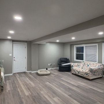
SDC Signature (Space Decor Contractors LLC) completely reimagined this tired, dated den, transforming it into a modern, beautiful, and fundamentally safe living space. The original room suffered from significantly uneven ceilings and an outdated aesthetic that caused the homeowner structural concerns. Our comprehensive scope of work went far beyond simple finishes—we focused on restoring absolute structural integrity and peace of mind.
We executed a precise structural overhaul, reinforcing the main central beam and implementing a custom scissor framing system to safely raise and perfectly level the ceiling joists. By removing all the outdated wiring and installing new, code-compliant electrical for energy-efficient recessed LED lighting, we eliminated hidden hazards behind the walls.
The homeowner was absolutely thrilled with the final result. Beyond the stunning visual upgrade, she now has the security and confidence of knowing the "bones" of her home are expertly reinforced and built to last.
Key Transformation Details:
Structural Engineering & Safety: Reinforcement of the main beam and installation of a custom scissor framing system to securely level and elevate the ceiling.
Modernization: Complete removal of heavy drop ceilings, old wall paneling, and a gas fireplace to create a clean, open, and safe layout.
Premium Finishes: Expertly hung and finished smooth drywall on ceilings and walls, fresh premium paint throughout, and new custom trim.
Upgrades: Installation of safe, modern recessed lighting, dedicated electrical connection prep for a future mini-split HVAC system, and professional floor repairs.
This project highlights our commitment to delivering uncompromised craftsmanship. At SDC Signature, we don't just build beautiful spaces; we build trust and lasting structural security for discerning homeowners.

 Five Star Tree Care
Nurturing multiple trees on your land will complete the look of your yard and increase the curb appeal of your property. Trees will also produce oxygen and encourage wildlife to move into the area. Just like any living thing, trees have a set lifespan which means that sometimes you will need to seek tree removal. Just because one tree has reached the end of its life doesn’t mean that’s the end. You can plan another in its place to enhance the environment around your home.
Knowing when to have a tree removed is not always easy to understand. That’s why Five Star Tree Services has put together a list of the top four signs that it may be time to remove and replace an old tree.
The Tree is Dead
If one of your trees is obviously dead, it no longer offers any benefits to your home or the surrounding environment. Dead trees can actually even become a hazard to your home and your family. Dead branches can fall on your roof or the tree itself can tip over during a storm. The best course of action is to call Five Star Tree Services to have a tree removal service performed. You will want to have the tree removed as soon as you can. Removing the dead tree will also help reduce the chances of fungus, vermin, and disease from developing or spreading to other trees on your land.
Oversized Tree
Large trees have a tendency to grow even larger. If you are worried about a tree brushing against your home or your foundation, it may be a good idea to have it removed. When trees encroach on the exterior walls or the foundation, it can result in costly repairs.
Decayed & Diseased Trees
Just like with people, trees can develop illnesses or infections that have no cure. These can come from trauma to the tree, seasonal fungus that are left untreated, or even from animals or bugs. Trees that suffer from decay or disease have a higher chance of collapsing on homes or even people due to lack of stability. Unhealthy trees also reduce the overall curb appeal of your home by making your landscaping visually unattractive. If you are trying to sell your home, it is a good idea to remove diseased and decaying trees before listing it on the market.
Over Shading or View Blocking Trees
Trees are another random part of nature that cares little for your personal view. If they are planted in an ideal spot that provides them with plenty of sun and nutrients, they will flourish in their location. If your trees are blocking the view of a critical area such as the lake or the beach, it can make you enjoy your home even less. For homes that are on the market for sale, a blocked view can deter home buyers from closing on the property. Although healthy tree removal should always be considered carefully, Five Star Tree Services can remove the impediment to your view in short order.
How We Can Help
Five Star Tree Services is the premier arborist company in the metro area. We offer a full complement of Toronto Tree Care Services which includes affordable tree removal services, tree pruning, tree planting and more. Our qualified staff is standing by to help, so give us a call at (416) 990-3355 today.
 KURV Architecture DPC (Alex Hughes Architects)
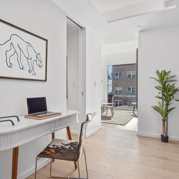
Located in the heart of Manhattan’s Lower East Side, the building was erected on a shallow commercial lot between two 120 year old masonry buildings and a new residential rental building. 330 Grand Street is a mix of 725 SF 1BRs and 1050 SF 2BR apartments. It also contains a 1100 SF two story duplex as well as private and public rooftop space, large private balconies for most units and two large private terraces for the ground floor units.
330 Grand Street was originally designed and approved at the NYC DOB as a prefabricated modular building. During the pandemic, as shipping costs skyrocketed putting the project at risk, we suggested redesigning the building as a reinforced cast-in-place concrete structure. Concrete was readily available and prices had not been affected by the demand increase that many other materials suffered in the pandemic. We took this opportunity to raise floor to ceiling heights, enlarge high performance windows and redistribute the buildings MEPFS and Structural Systems to create very open floor plans.
The challenge was to create a luxurious sensorial living experience with very limited means. In a city with very high construction costs, low cost residential buildings in the area are usually devoid of good quality, design and character. Our approach was to aim high for the end user, prioritizing natural light, open space with long visual perspectives, high ceilings and as always, rejecting the use of predefined building templates.
Our biggest challenge was to ensure that the small spaces feel as clean cut, large and bright as possible. Several unique design decisions were made to ensure low cost and high quality;
Floor plans were laid out so that spaces were wide open and free of clutter from mechanical or structural interruptions. Therefore all infrastructure was placed in lateral demising walls, which in turn act as the unit’s storage and kitchen. The apartments feel wide open, are super quiet and have more storage space than any other comparable apartment in the city.
To solve the problem of the site’s shallow commercial lot which is typically prone to dark interior spaces we focused our attention on the building’s envelope. Instead of the usual small punched window openings, oversized high performance windows were designed to ensure that light penetrated as far as possible into the units. In the smaller 1BR units, the full 50’ depth of the lot is perceived by partitioning spaces with sliding pocket doors that can be retracted to allow deep visual perspectives, making the sight lines in the space feel longer, larger, more ample than normal. In addition to the full height glazing, each unit above the 2nd floor receives a 7 foot covered balcony, adding 120 to 240 sf to each apartment, something unusual in New York City buildings. The space is large enough for a full size dining table, when the weather permits being outside.
We also worked hard to ensure modularity. For example, all kitchen units are all identical throughout the building. The idea of modularity and the economy of the repetitive unit is exercised to the maximum through the building.
Hardware, appliances, flooring, wall coverings and material finishes are all carefully selected to feel bespoke, high quality and unique.
It was important to KURV that the result of this work manifest into something that would deeply connect with the end user and sustain relationships with the consumers of this space.
All images by KURV Architecture ©
 Halmann Vella
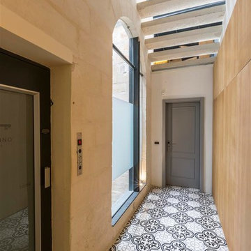
The original patterned tiles of the house suffered considerable damage and required replacement. Halmann Vella created a custom-made pattern reminiscent of the traditional Maltese patterned tiles. This new pattern perfectly marries the traditional aspect of the house with its branding.
Photograph by Fredrick Muscat.
 Sharkey Design|Build
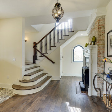
The historic Edward H.C. Taylor home was build in 1890, it suffered substantial fire damage and required extensive restoration of the interior and exterior. We were thrilled to have the opportunity to work on this gem.
 Irene Designs
Kitchen — Project Description (Bolton, CT)
(Full Renovation • Reconfiguration • Architectural Corrections)
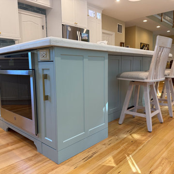
The original kitchen suffered from spatial imbalance and limited functionality: the right side was visually and physically heavy with cabinetry and appliances, the 135-degree angled walls lacked symmetry due to a missing window on the driveway side, and the small island could only seat two. Circulation was obstructed by a desk positioned in the main traffic flow, and the low French door felt disproportionate in scale compared to the large windows and adjacent two-story Great Room.
Major Structural & Functional Improvements
Repositioned window on the front elevation to the right, creating a long-desired view to the driveway while freeing space for a centered cooktop and statement hood — visually aligning with the Great Room’s redesigned fireplace focal wall.
Installed a new custom sliding door, significantly taller and wider than the original French door. This upgrade enhances natural light, visually opens the kitchen to the deck, and provides unobstructed traffic flow thanks to its sliding operation.
New Kitchen Layout & Enhanced Functionality
Designed an entirely new layout centered around a 10' double-slab island, providing expansive workspace and a natural gathering zone.
Added conversational seating for the whole family, allowing comfortable interaction on all sides of the island.
Introduced purpose-designed storage solutions, including pullouts, rollouts, spice towers, tray organizers, and deep drawers to maximize usability.
Reallocated the desk area to a dedicated window spot overlooking the backyard, removing it from traffic paths and improving both functionality and comfort.
Cabinetry & Architectural Detailing
Custom two-tone cabinetry in soft white and a serene blue-green tone reflects the visual language of the adjacent Great Room, creating whole-home cohesion.
Installed lit upper glass cabinets along the entire perimeter, balancing vertical proportions and creating an elegant display band throughout the kitchen.
A custom range hood was designed and painted to match the base cabinetry, becoming a focal point framed by symmetrical windows.
Surfaces, Lighting & Finishes
The island features a double-thickness quartz slab with a soft ogee radius for a timeless, furniture-like feel.
A full-height, handcrafted aqua subway tile backsplash introduces depth, texture, and a gentle reflective quality.
New layered lighting concept, including recessed lights, pendants, task lighting, and integrated cabinet lighting, ensures a warm and functional workspace at any time of day.
 KURV Architecture DPC (Alex Hughes Architects)
Located in the heart of Manhattan’s Lower East Side, the building was erected on a shallow commercial lot between two 120 year old masonry buildings and a new residential rental building. 330 Grand Street is a mix of 725 SF 1BRs and 1050 SF 2BR apartments. It also contains a 1100 SF two story duplex as well as private and public rooftop space, large private balconies for most units and two large private terraces for the ground floor units.
330 Grand Street was originally designed and approved at the NYC DOB as a prefabricated modular building. During the pandemic, as shipping costs skyrocketed putting the project at risk, we suggested redesigning the building as a reinforced cast-in-place concrete structure. Concrete was readily available and prices had not been affected by the demand increase that many other materials suffered in the pandemic. We took this opportunity to raise floor to ceiling heights, enlarge high performance windows and redistribute the buildings MEPFS and Structural Systems to create very open floor plans.
The challenge was to create a luxurious sensorial living experience with very limited means. In a city with very high construction costs, low cost residential buildings in the area are usually devoid of good quality, design and character. Our approach was to aim high for the end user, prioritizing natural light, open space with long visual perspectives, high ceilings and as always, rejecting the use of predefined building templates.
Our biggest challenge was to ensure that the small spaces feel as clean cut, large and bright as possible. Several unique design decisions were made to ensure low cost and high quality;
Floor plans were laid out so that spaces were wide open and free of clutter from mechanical or structural interruptions. Therefore all infrastructure was placed in lateral demising walls, which in turn act as the unit’s storage and kitchen. The apartments feel wide open, are super quiet and have more storage space than any other comparable apartment in the city.
To solve the problem of the site’s shallow commercial lot which is typically prone to dark interior spaces we focused our attention on the building’s envelope. Instead of the usual small punched window openings, oversized high performance windows were designed to ensure that light penetrated as far as possible into the units. In the smaller 1BR units, the full 50’ depth of the lot is perceived by partitioning spaces with sliding pocket doors that can be retracted to allow deep visual perspectives, making the sight lines in the space feel longer, larger, more ample than normal. In addition to the full height glazing, each unit above the 2nd floor receives a 7 foot covered balcony, adding 120 to 240 sf to each apartment, something unusual in New York City buildings. The space is large enough for a full size dining table, when the weather permits being outside.
We also worked hard to ensure modularity. For example, all kitchen units are all identical throughout the building. The idea of modularity and the economy of the repetitive unit is exercised to the maximum through the building.
Hardware, appliances, flooring, wall coverings and material finishes are all carefully selected to feel bespoke, high quality and unique.
It was important to KURV that the result of this work manifest into something that would deeply connect with the end user and sustain relationships with the consumers of this space.
All images by KURV Architecture ©

 Paradox Interior Design Inc.
Challenge: Our client needed their downtown Toronto condo to serve as a peaceful retreat from the demanding pace of urban professional life. The space suffered from the sterile, impersonal aesthetic typical of many Toronto condos, lacking the warmth and tranquility needed to truly unwind after busy workdays in the city's core.
Solution: We approached this project in thoughtful stages, transforming the condo into a serene sanctuary that promotes relaxation and rejuvenation. By incorporating a palette of light, calming colors and introducing rich textural elements throughout the space, we elevated the sterile interior into a sophisticated retreat. Each design decision was made with the goal of creating visual and tactile interest that would engage the senses and promote a sense of calm.
Highlights: • Staged design approach that allowed for thoughtful evolution of the space • Light color palette that enhances natural light and creates an airy, peaceful atmosphere • Rich variety of textures that add warmth and visual interest to combat sterile condo interiors • Strategic material selection that transforms typical condo finishes into sophisticated design elements
Results: The transformed Downtown Zen condo now serves as the perfect urban escape—a space that immediately shifts the client's mindset from work mode to relaxation. This project demonstrates how thoughtful design can overcome the limitations of typical Toronto condo interiors, creating a personalized sanctuary that enhances daily life and well-being.
 Jarrett Design
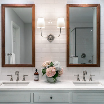
This bathroom needed help as it was tired, dated and cramped! The vanity area was open to the master bedroom and sandwiched between a closet and existing bathroom wall. Behind the bathroom wall, was a second sink, a small walk-in shower and the commode. A poorly placed linen closet ate into the area and there was a soffit over the shower adding to the cramped feeling. The ceiling was cluttered with old-school heating lamps, flush-mount fixtures and ventilation grills. The “movie star” lighting meant to add some glamour only made the bathroom feel dated and sad. Our clients wanted to bring this bathroom to life.
We built a wall and added a door between the bedroom and bathroom to ensure more privacy and define the space. In addition, we removed the wall separating the actual bathroom and vanity area to make the master bathroom larger. The linen closet was also taken out so the shower could be expanded significantly. Our homeowner had recently suffered a knee injury so they were looking for future solutions that would work for them as they continued to age. We made the shower large enough to include a bench and installed a handheld sprayer located near the seat. Shower walls were reinforced so that when the day came that a grab bar was needed, they would be ready.
We added a tall cabinet that featured two, deep rollouts and interior shelving to keep linens and bathroom supplies organized. Beneath the sinks, we included rollout drawers so items would not get lost in those dark areas under the plumbing. Everything that had been cluttering the ceiling was removed including the shower soffit and heat lamp. With those gone, we added evenly-spaced, recessed ceiling lights to help brighten the space making it safer and more practical.
We chose a custom blue-green paint for the cabinets which was understated enough to provide a sense of serenity while still offering a splash of color to help liven up the room. Walnut-framed mirrors added a touch of warmth and the patterned floor tile made the whole room fun! An old bathroom came alive!
 Horn & Co. (Previously JHLA)
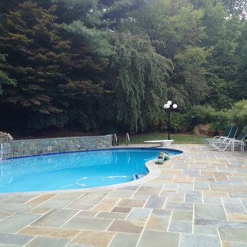
The existing concrete aggregate terrace suffered from disrepair and access was limited from the rear of the Bethesda home. We were tasked with replacing all paving, coping, and stairs. An improved water feature behind the original kidney-shaped pool provided white noise to distract visitors from the nearby highway noise.
41