
Search results for "Suffered" in Home Design Ideas
 Bell Contractors
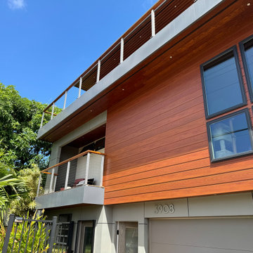
Front Fascia of new home construction project. Aluminum wood appearance siding allows for superior thermal insulation, durability, and sustainability over real hardwood. Due to this wall's direct exposure to sunlight, real wood would have quickly suffered UV damage and required frequent maintenance.
 Solomon's Arbor, LLC
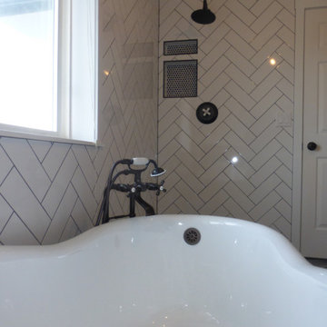
Imagine taking a nice long soak in the tub. You could suffer worse views than this!
Mid-sized master white tile and ceramic tile porcelain tile, multicolored floor and double-sink claw-foot bathtub photo in Boise with light wood cabinets, marble countertops, white countertops and a freestanding vanity
Mid-sized master white tile and ceramic tile porcelain tile, multicolored floor and double-sink claw-foot bathtub photo in Boise with light wood cabinets, marble countertops, white countertops and a freestanding vanity

 12/12 Architects & Planners
This family of 5 was quickly out-growing their 1,220sf ranch home on a beautiful corner lot. Rather than adding a 2nd floor, the decision was made to extend the existing ranch plan into the back yard, adding a new 2-car garage below the new space - for a new total of 2,520sf. With a previous addition of a 1-car garage and a small kitchen removed, a large addition was added for Master Bedroom Suite, a 4th bedroom, hall bath, and a completely remodeled living, dining and new Kitchen, open to large new Family Room. The new lower level includes the new Garage and Mudroom. The existing fireplace and chimney remain - with beautifully exposed brick. The homeowners love contemporary design, and finished the home with a gorgeous mix of color, pattern and materials.
The project was completed in 2011. Unfortunately, 2 years later, they suffered a massive house fire. The house was then rebuilt again, using the same plans and finishes as the original build, adding only a secondary laundry closet on the main level.
Find the right local pro for your project
 Meredith O'Donnell Fine Furniture
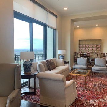
In this unit Senior Designer Jon Fortuna of Meredith O'Donnell Fine Furniture was tasked with creating a warm and livable space from scratch for a client who had suffered a catastrophic loss in a fire and given one week to make a new space feel like the home the client had lived in for decades. another view of the main living area.
 Paradox Interior Design Inc.
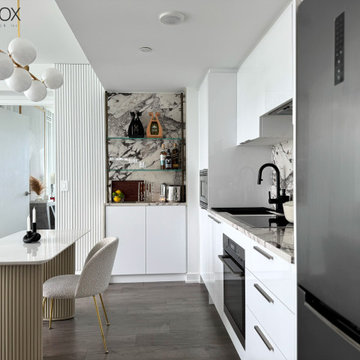
Challenge: Our client needed their downtown Toronto condo to serve as a peaceful retreat from the demanding pace of urban professional life. The space suffered from the sterile, impersonal aesthetic typical of many Toronto condos, lacking the warmth and tranquility needed to truly unwind after busy workdays in the city's core.
Solution: We approached this project in thoughtful stages, transforming the condo into a serene sanctuary that promotes relaxation and rejuvenation. By incorporating a palette of light, calming colors and introducing rich textural elements throughout the space, we elevated the sterile interior into a sophisticated retreat. Each design decision was made with the goal of creating visual and tactile interest that would engage the senses and promote a sense of calm.
Highlights: • Staged design approach that allowed for thoughtful evolution of the space • Light color palette that enhances natural light and creates an airy, peaceful atmosphere • Rich variety of textures that add warmth and visual interest to combat sterile condo interiors • Strategic material selection that transforms typical condo finishes into sophisticated design elements
Results: The transformed Downtown Zen condo now serves as the perfect urban escape—a space that immediately shifts the client's mindset from work mode to relaxation. This project demonstrates how thoughtful design can overcome the limitations of typical Toronto condo interiors, creating a personalized sanctuary that enhances daily life and well-being.
 Charles Douglas
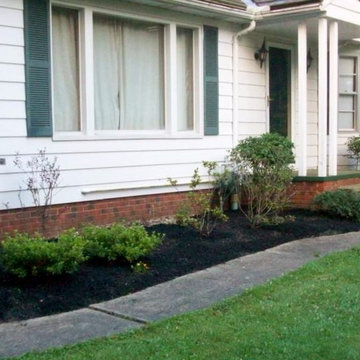
Trimmed hedges and the addition of mulch reinvigorated this drab area. in addition the Rhododendron were suffering from malnutrition so we added fertilizer to the so
 Solstice Design Studio
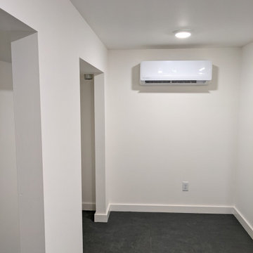
This is a design-build indoor garden room which provides space for seed starting, full sized plants and a hydroponic system. This space features an efficient mini-split unit for heating and cooling as well as an automated exhaust system with passive air intake for balanced ventilation. Powered by a small solar array and Tesla Powerwall. This project, and the home it’s attached to, is slated to be at or near net zero energy.
This project is a great example of the benefit of hiring not only a general contractor, but an architect as well (and in our case a design-build firm that is qualified to fill both roles). The design of the space and the systems within the room, paired with quality and thoughtful execution of the plans are what we aim for with all of our projects.
 Advance Design Studio, Ltd.
Laundry rooms and mudrooms can be a headache for many homeowners. They are usually cramped with poor functionality and little storage space. Joe and Kristin suffered all those aches and more, as their laundry room lacked clothing storage. Shoes were crammed in every corner. There was nowhere to fold clothes without taking them to the kitchen. They were ready for a complete laundry room remodel project.
Joe and Kristin interviewed several local remodeling companies but didn’t connect with anyone who could understand their vision. During the summer, when they were attending their son’s race venue, they noticed fellow kart racers Todd and Christine Jurs’ sponsor banner for their remodeling company, Advance Design Studio. Immediately they were thrilled that they knew someone they trusted who could handle the renovation.
“We wanted someone that we actually knew, who has a little bit more invested than an outside person that we don’t have any ties to,” Kristin said.
Project Designer Nicole Ryan came to their home in Warrenville for the initial consultation. Kristin, an avid HGTV viewer, brought her ideas to Nicole. Throughout the design process, they worked together designing the space, selecting materials, and choosing colors. Nicole made sure to incorporate Kristin’s must-haves into the finished laundry room remodel.
“It was really easy. Nicole made the transition very easy,” Kristin said of Nicole’s work in the design phase of the project. With the materials selected and the drawings finalized, it was time to begin construction. Kristin and Joe were impressed with how quickly and cleanly this phase went.
“Everyone that came in was very respectful, very neat, and that was a big part for me because I didn’t want dust going through the rest of my house,” Kristin said.
The new combination mudroom/laundry room is everything Kristin and Joe hoped. There is plenty of storage, three pull-out laundry hampers for presorting laundry, a large central island for folding clothes, a designated bar to hang dry, and even a unique rotating shoe rack to keep shoes from cluttering the space.
“My rotating shoe rack,” Kristin said when asked what her favorite part of her new laundry room was. “We have four kids. We have a lot of shoes and sporting events. So it makes sense to have all that space for shoes.”
The center island has an exceptional feature as well. It has wheels. Kristin wanted to be able to move the island out of the way for different functions in the room. An island with wheels can be placed wherever needed in the space.
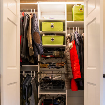
The two existing closets were reconfigured with built-in closet storage systems to make them more functional than before with shelves for baskets holding gloves and hats, umbrellas, and coats.
“They love it,” Project Designer Nicole Ryan said. “They had a vision of how they wanted the space to function but didn’t know exactly how to get it there. My design took all their needs and used the most efficient products to get them the desired outcome. Tons of function, while still looking beautiful!”
The “White” Hudson Panel Dura Supreme cabinetry on the perimeter brightens the space and contrasts the popular blue “Gale Force” Dura Supreme cabinetry of the rolling island. The black and white encaustic design porcelain tile backsplash adds visual interest to the room above the white quartz countertops. Additionally, an oil-rubbed bronze bar for hanging clothes is conveniently located above the washer/dryer, and a stainless-steel under-mount sink with a matching Kohler faucet offers perfect functionality.
“I would definitely recommend Advance Design; they’ve been wonderful. They were so helpful. Any little changes we had, they were able to accommodate,” Kristin said.
 12/12 Architects & Planners
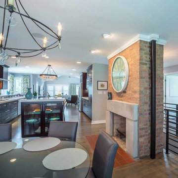
This family of 5 was quickly out-growing their 1,220sf ranch home on a beautiful corner lot. Rather than adding a 2nd floor, the decision was made to extend the existing ranch plan into the back yard, adding a new 2-car garage below the new space - for a new total of 2,520sf. With a previous addition of a 1-car garage and a small kitchen removed, a large addition was added for Master Bedroom Suite, a 4th bedroom, hall bath, and a completely remodeled living, dining and new Kitchen, open to large new Family Room. The new lower level includes the new Garage and Mudroom. The existing fireplace and chimney remain - with beautifully exposed brick. The homeowners love contemporary design, and finished the home with a gorgeous mix of color, pattern and materials.
The project was completed in 2011. Unfortunately, 2 years later, they suffered a massive house fire. The house was then rebuilt again, using the same plans and finishes as the original build, adding only a secondary laundry closet on the main level.
 KURV Architecture DPC (Alex Hughes Architects)
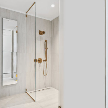
Located in the heart of Manhattan’s Lower East Side, the building was erected on a shallow commercial lot between two 120 year old masonry buildings and a new residential rental building. 330 Grand Street is a mix of 725 SF 1BRs and 1050 SF 2BR apartments. It also contains a 1100 SF two story duplex as well as private and public rooftop space, large private balconies for most units and two large private terraces for the ground floor units.
330 Grand Street was originally designed and approved at the NYC DOB as a prefabricated modular building. During the pandemic, as shipping costs skyrocketed putting the project at risk, we suggested redesigning the building as a reinforced cast-in-place concrete structure. Concrete was readily available and prices had not been affected by the demand increase that many other materials suffered in the pandemic. We took this opportunity to raise floor to ceiling heights, enlarge high performance windows and redistribute the buildings MEPFS and Structural Systems to create very open floor plans.
The challenge was to create a luxurious sensorial living experience with very limited means. In a city with very high construction costs, low cost residential buildings in the area are usually devoid of good quality, design and character. Our approach was to aim high for the end user, prioritizing natural light, open space with long visual perspectives, high ceilings and as always, rejecting the use of predefined building templates.
Our biggest challenge was to ensure that the small spaces feel as clean cut, large and bright as possible. Several unique design decisions were made to ensure low cost and high quality;
Floor plans were laid out so that spaces were wide open and free of clutter from mechanical or structural interruptions. Therefore all infrastructure was placed in lateral demising walls, which in turn act as the unit’s storage and kitchen. The apartments feel wide open, are super quiet and have more storage space than any other comparable apartment in the city.
To solve the problem of the site’s shallow commercial lot which is typically prone to dark interior spaces we focused our attention on the building’s envelope. Instead of the usual small punched window openings, oversized high performance windows were designed to ensure that light penetrated as far as possible into the units. In the smaller 1BR units, the full 50’ depth of the lot is perceived by partitioning spaces with sliding pocket doors that can be retracted to allow deep visual perspectives, making the sight lines in the space feel longer, larger, more ample than normal. In addition to the full height glazing, each unit above the 2nd floor receives a 7 foot covered balcony, adding 120 to 240 sf to each apartment, something unusual in New York City buildings. The space is large enough for a full size dining table, when the weather permits being outside.
We also worked hard to ensure modularity. For example, all kitchen units are all identical throughout the building. The idea of modularity and the economy of the repetitive unit is exercised to the maximum through the building.
Hardware, appliances, flooring, wall coverings and material finishes are all carefully selected to feel bespoke, high quality and unique.
It was important to KURV that the result of this work manifest into something that would deeply connect with the end user and sustain relationships with the consumers of this space.
All images by KURV Architecture ©
 KURV Architecture DPC (Alex Hughes Architects)
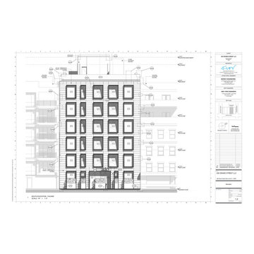
Located in the heart of Manhattan’s Lower East Side, the building was erected on a shallow commercial lot between two 120 year old masonry buildings and a new residential rental building. 330 Grand Street is a mix of 725 SF 1BRs and 1050 SF 2BR apartments. It also contains a 1100 SF two story duplex as well as private and public rooftop space, large private balconies for most units and two large private terraces for the ground floor units.
330 Grand Street was originally designed and approved at the NYC DOB as a prefabricated modular building. During the pandemic, as shipping costs skyrocketed putting the project at risk, we suggested redesigning the building as a reinforced cast-in-place concrete structure. Concrete was readily available and prices had not been affected by the demand increase that many other materials suffered in the pandemic. We took this opportunity to raise floor to ceiling heights, enlarge high performance windows and redistribute the buildings MEPFS and Structural Systems to create very open floor plans.
The challenge was to create a luxurious sensorial living experience with very limited means. In a city with very high construction costs, low cost residential buildings in the area are usually devoid of good quality, design and character. Our approach was to aim high for the end user, prioritizing natural light, open space with long visual perspectives, high ceilings and as always, rejecting the use of predefined building templates.
Our biggest challenge was to ensure that the small spaces feel as clean cut, large and bright as possible. Several unique design decisions were made to ensure low cost and high quality;
Floor plans were laid out so that spaces were wide open and free of clutter from mechanical or structural interruptions. Therefore all infrastructure was placed in lateral demising walls, which in turn act as the unit’s storage and kitchen. The apartments feel wide open, are super quiet and have more storage space than any other comparable apartment in the city.
To solve the problem of the site’s shallow commercial lot which is typically prone to dark interior spaces we focused our attention on the building’s envelope. Instead of the usual small punched window openings, oversized high performance windows were designed to ensure that light penetrated as far as possible into the units. In the smaller 1BR units, the full 50’ depth of the lot is perceived by partitioning spaces with sliding pocket doors that can be retracted to allow deep visual perspectives, making the sight lines in the space feel longer, larger, more ample than normal. In addition to the full height glazing, each unit above the 2nd floor receives a 7 foot covered balcony, adding 120 to 240 sf to each apartment, something unusual in New York City buildings. The space is large enough for a full size dining table, when the weather permits being outside.
We also worked hard to ensure modularity. For example, all kitchen units are all identical throughout the building. The idea of modularity and the economy of the repetitive unit is exercised to the maximum through the building.
Hardware, appliances, flooring, wall coverings and material finishes are all carefully selected to feel bespoke, high quality and unique.
It was important to KURV that the result of this work manifest into something that would deeply connect with the end user and sustain relationships with the consumers of this space.
All images by KURV Architecture ©
 Fox Construction, LLC
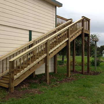
Client requested "short steps" due to the older woman who would be using them, she suffers from arthritis.
Inspiration for a large transitional wooden straight staircase remodel in Houston with wooden risers
Inspiration for a large transitional wooden straight staircase remodel in Houston with wooden risers
 KURV Architecture DPC (Alex Hughes Architects)
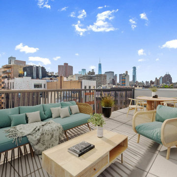
Located in the heart of Manhattan’s Lower East Side, the building was erected on a shallow commercial lot between two 120 year old masonry buildings and a new residential rental building. 330 Grand Street is a mix of 725 SF 1BRs and 1050 SF 2BR apartments. It also contains a 1100 SF two story duplex as well as private and public rooftop space, large private balconies for most units and two large private terraces for the ground floor units.
330 Grand Street was originally designed and approved at the NYC DOB as a prefabricated modular building. During the pandemic, as shipping costs skyrocketed putting the project at risk, we suggested redesigning the building as a reinforced cast-in-place concrete structure. Concrete was readily available and prices had not been affected by the demand increase that many other materials suffered in the pandemic. We took this opportunity to raise floor to ceiling heights, enlarge high performance windows and redistribute the buildings MEPFS and Structural Systems to create very open floor plans.
The challenge was to create a luxurious sensorial living experience with very limited means. In a city with very high construction costs, low cost residential buildings in the area are usually devoid of good quality, design and character. Our approach was to aim high for the end user, prioritizing natural light, open space with long visual perspectives, high ceilings and as always, rejecting the use of predefined building templates.
Our biggest challenge was to ensure that the small spaces feel as clean cut, large and bright as possible. Several unique design decisions were made to ensure low cost and high quality;
Floor plans were laid out so that spaces were wide open and free of clutter from mechanical or structural interruptions. Therefore all infrastructure was placed in lateral demising walls, which in turn act as the unit’s storage and kitchen. The apartments feel wide open, are super quiet and have more storage space than any other comparable apartment in the city.
To solve the problem of the site’s shallow commercial lot which is typically prone to dark interior spaces we focused our attention on the building’s envelope. Instead of the usual small punched window openings, oversized high performance windows were designed to ensure that light penetrated as far as possible into the units. In the smaller 1BR units, the full 50’ depth of the lot is perceived by partitioning spaces with sliding pocket doors that can be retracted to allow deep visual perspectives, making the sight lines in the space feel longer, larger, more ample than normal. In addition to the full height glazing, each unit above the 2nd floor receives a 7 foot covered balcony, adding 120 to 240 sf to each apartment, something unusual in New York City buildings. The space is large enough for a full size dining table, when the weather permits being outside.
We also worked hard to ensure modularity. For example, all kitchen units are all identical throughout the building. The idea of modularity and the economy of the repetitive unit is exercised to the maximum through the building.
Hardware, appliances, flooring, wall coverings and material finishes are all carefully selected to feel bespoke, high quality and unique.
It was important to KURV that the result of this work manifest into something that would deeply connect with the end user and sustain relationships with the consumers of this space.
All images by KURV Architecture ©
 KURV Architecture DPC (Alex Hughes Architects)
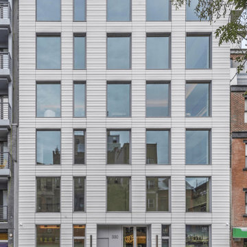
Located in the heart of Manhattan’s Lower East Side, the building was erected on a shallow commercial lot between two 120 year old masonry buildings and a new residential rental building. 330 Grand Street is a mix of 725 SF 1BRs and 1050 SF 2BR apartments. It also contains a 1100 SF two story duplex as well as private and public rooftop space, large private balconies for most units and two large private terraces for the ground floor units.
330 Grand Street was originally designed and approved at the NYC DOB as a prefabricated modular building. During the pandemic, as shipping costs skyrocketed putting the project at risk, we suggested redesigning the building as a reinforced cast-in-place concrete structure. Concrete was readily available and prices had not been affected by the demand increase that many other materials suffered in the pandemic. We took this opportunity to raise floor to ceiling heights, enlarge high performance windows and redistribute the buildings MEPFS and Structural Systems to create very open floor plans.
The challenge was to create a luxurious sensorial living experience with very limited means. In a city with very high construction costs, low cost residential buildings in the area are usually devoid of good quality, design and character. Our approach was to aim high for the end user, prioritizing natural light, open space with long visual perspectives, high ceilings and as always, rejecting the use of predefined building templates.
Our biggest challenge was to ensure that the small spaces feel as clean cut, large and bright as possible. Several unique design decisions were made to ensure low cost and high quality;
Floor plans were laid out so that spaces were wide open and free of clutter from mechanical or structural interruptions. Therefore all infrastructure was placed in lateral demising walls, which in turn act as the unit’s storage and kitchen. The apartments feel wide open, are super quiet and have more storage space than any other comparable apartment in the city.
To solve the problem of the site’s shallow commercial lot which is typically prone to dark interior spaces we focused our attention on the building’s envelope. Instead of the usual small punched window openings, oversized high performance windows were designed to ensure that light penetrated as far as possible into the units. In the smaller 1BR units, the full 50’ depth of the lot is perceived by partitioning spaces with sliding pocket doors that can be retracted to allow deep visual perspectives, making the sight lines in the space feel longer, larger, more ample than normal. In addition to the full height glazing, each unit above the 2nd floor receives a 7 foot covered balcony, adding 120 to 240 sf to each apartment, something unusual in New York City buildings. The space is large enough for a full size dining table, when the weather permits being outside.
We also worked hard to ensure modularity. For example, all kitchen units are all identical throughout the building. The idea of modularity and the economy of the repetitive unit is exercised to the maximum through the building.
Hardware, appliances, flooring, wall coverings and material finishes are all carefully selected to feel bespoke, high quality and unique.
It was important to KURV that the result of this work manifest into something that would deeply connect with the end user and sustain relationships with the consumers of this space.
All images by KURV Architecture ©
 Johnson + Fernàndez Interior Design
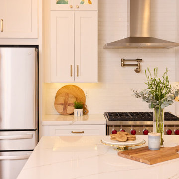
This kitchen suffered a water leak. The entire back wall was damaged where the range and fridge live. We did all new cabinetry, new countertops, new backsplash, new hardware and lighting. Pretty much we replaced the entire kitchen but the floors. We kept the existing layout to make it more simple and easy to turnaround.
 Rick Roberts Lawn Service Inc.
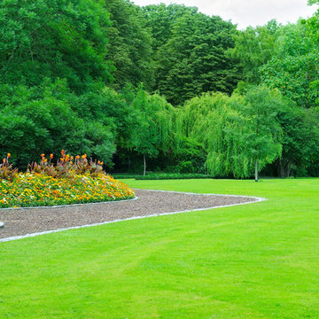
Nothing says "home" like a lush, green, manicured lawn. A professionally designed and installed landscape can increase your enjoyment of your home while also increase the resale value of your property. Often times, though, keeping your lawn maintained takes too much time, is too much of a hassle and requires more tools than many homeowners have at their disposal. To keep your lawn healthy and save yourself from the hassle, enlist help from the lawn maintenance professionals at Rick Roberts Lawn Service. Our team has over 20 years of experience providing lawn care services to homeowners throughout Southwest Florida, and we take pride in offering quality results.
At Rick Roberts Lawn Service, our residential lawn maintenance contractors provide exceptional quality residential lawn maintenance services at fair pricing. In the event of a hurricane, you can rest assured that our lawn maintenance company can take care of any storm related damages your yard suffers because we have the experience and necessary equipment to provide quick storm recovery lawn maintenance services.

 The New Amity Workshop, LLC
I've been on dedicated plant watch the past couple of weeks. With the temperatures rising here in the Hudson River Valley, my garden has just started to emerge from its winter rest. This past winter may not have had the arctic blasts and epic snow storms of the previous years, but it was still long and dark like any typical northeast winter. So it's always with giddy anticipation that I obsessively check in on the garden in the early spring for the first signs of green!
The Woodland Peony has been one of the first plants to push through the garden with its rosy, brownish-green leaves. I mistakenly planted it last year near the hose bib, watched it bud up and then quickly get trampled by my children who have a frenetic passion for all things water. After I got over my sudden loss, I relocated the bare roots last fall under our old Crabapple tree at the front of the house. Unlike the more common peonies that thrive in full sun, the Woodland Peony is a nice, compact selection for the woodland shade garden. These peonies naturalize in deciduous woodlands where they can enjoy early spring sun and summer shade. I'm hoping that our Crabapple's canopy will provide just the right amount of filtered sunlight.
The Woodland Peony, as with all peonies, is also deer resistant, which always makes for an attractive plant in my eyes. We live on a little under two-and-a-half acres of land surrounded by properties that find themselves somewhere between farmland, meadow, woodland and marsh. Needless to say, the deer are king here and our gardens suffer.
My peonies were a gift, but came from Peony's Envy, a nursery located in Bernardsville, New Jersey. Their website is a great resource for all things peony. I'm hoping one day to make it out to their nursery to take walk among their acres of tree, herbaceous and intersectional peonies.
PAEONIA JAPONICA
Type - Herbaceous Perennial
Hardiness Zone - 3-8
Height - 1.0 - 1.5'
Spread - 1.0 - 1.5'
Exposure - Part shade
Bloom Color - White single flower with yellow stamens
Bloom Time - Mid-Late April
Flower - Fragrant
Features - Scarlet and indigo seed pods, Deer resistance
For more information on Paeonia japonica see the Missouri Botanical Garden's Plant Finder.
 Alloy Architecture & Construction
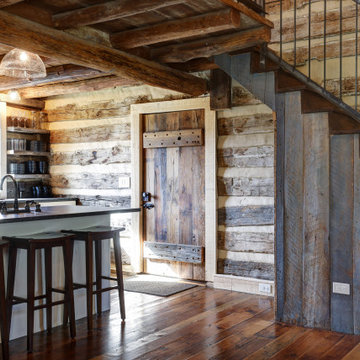
Alloy was truly fortunate to have the opportunity to restore and renovate this 1850’s log cabin at Afton Mountain. No home looks more at home than this cabin in the foothills.
The cabin suffered years of decay and an unsympathetic interior renovation so our first step was to work with a local log cabin specialist to correctly restore the structure. We then rebuilt much of the interior to have everything a modern home needs while staying true to the log cabin aesthetic.
On all of our projects we carefully research materials and finishes but this one really took that to the next level. We enjoyed the challenge and the chance to show off the impressive craftsmanship of our carpenters.
As you approach on the winding path, the log cabin feels like a part of the landscape. And now, when you come inside, you can keep that connected feeling – in comfort.
 JLC Architecture
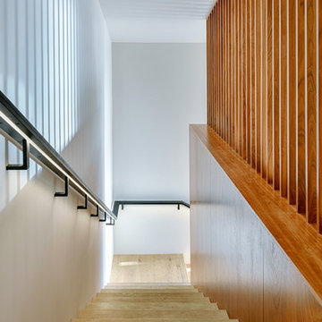
JLC was charged with transforming a 35 year old home which had suffered a remodel or two into a cohesive and modern home. Sustainable design principles were placed at the forefront of the design process alongside functionality and aesthetics. The end result is a roughly 3,000 sf home that is both comfortable and beautiful. The exterior palette is defined by Resysta siding and decking, acrylic stucco, a standing seam metal roof and black aluminum windows and doors. At the interiors white oak and walnut cabinetry throughout bring natural warmth to the clean, white interior. The home achieved LEED Platinum in 2017 and was featured on the San Diego Green Building Council’s 2017 Green Homes Tour.
Project website: neuhaus-encinitas.blogspot.com
 Centoni Restoration & Development, Inc.
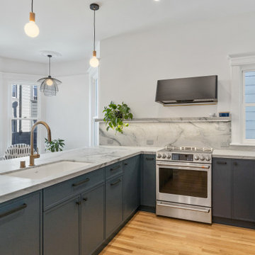
This lovely 2-story townhome suffered the effects of more than 120 years of “remuddling” and “modernization” through significant modification of the structural framing. With a large section of a load-bearing wall removed and shear walls, the full 3-story building was structurally compromised.
The program included the installation of a steel beam and structural reframing, beginning at the ground floor and through to the 3rd-floor living space.
The new structural design allowed for a significantly improved living space. The kitchen was relocated and expanded, as were the living room and dining room.
Several upgrades were made to the home, including incorporating all-electrical appliances. 1900 Victorian now boasts several eco-friendly and energy-efficient features.
42