
Search results for "Suggestions provide" in Home Design Ideas
 Renaissance Conservatories
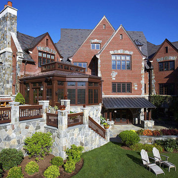
The plan for this sensational residence was the original creation of Ken Andersen and his associates at the
venerable firm of R.S. Granoff Architects. After enjoying their beautiful home for eight years, the owners felt
the time had arrived to expand and enhance their outside living space, and to complement it with an elegant
conservatory. Naturally, they turned to Ken for inspiration, who to our gratitude called on the Renaissance
Design Team to assist in bringing his plan and his clients’ dreams to fruition.
Meeting an exceptionally tight completion schedule was but one of many challenges for this fast-track job.
Thanks to the cooperation of every participant, first-shovel to completion was accomplished in an incredibly
short twelve weeks; all with minimal disruption to the family’s daily routine.
Ken Andersen’s relentless attention to the many intricacies clearly resonates in the glorious finished product.
GOALS:
• Create a conservatory garden room from which to savor the
seasonal splendor of the home’s expansive yards.
• Add a new stone patio and open air kitchen, easily accessible
from the new conservatory’s dining area.
• Provide access from the adjacent family room and the
convenience of a direct pathway to the kitchen.
• Eliminate the shared family room wall to enhance room size,
traffic flow, and natural lighting.
• Accomplish all this in a manner consistent with the home’s
fine Tudor-inspired architecture.
FEATURES:
• The suggestion of traditional hewn timber frame construction
through the use of chamfered pilasters, ceiling beams, and
lantern rafters.
• The warmth of naturally finished mahogany accentuating a
painted beaded ceiling.
• Delicately mullioned transom sash articulated in German
Antique art glass with soldered copper cames.
• Renaissance’s Signature Revival Series oiled bronze push-pull
window hardware.
• Concealed rolling insect screens with beaded head valences.
• Raised paneling at the knee wall and light shaft, matching
those found elsewhere in the home.
• A venting roof lantern with motorized sash.
• Copper roofing, gutters, spouting, and finial posts.

 Saikley Architects
We updated this 1907 two-story family home for re-sale. We added modern design elements and amenities while retaining the home’s original charm in the layout and key details. The aim was to optimize the value of the property for a prospective buyer, within a reasonable budget.
New French doors from kitchen and a rear bedroom open out to a new bi-level deck that allows good sight lines, functional outdoor living space, and easy access to a garden full of mature fruit trees. French doors from an upstairs bedroom open out to a private high deck overlooking the garden. The garage has been converted to a family room that opens to the garden.
The bathrooms and kitchen were remodeled the kitchen with simple, light, classic materials and contemporary lighting fixtures. New windows and skylights flood the spaces with light. Stained wood windows and doors at the kitchen pick up on the original stained wood of the other living spaces.
New redwood picture molding was created for the living room where traces in the plaster suggested that picture molding has originally been. A sweet corner window seat at the living room was restored. At a downstairs bedroom we created a new plate rail and other redwood trim matching the original at the dining room. The original dining room hutch and woodwork were restored and a new mantel built for the fireplace.
We built deep shelves into space carved out of the attic next to upstairs bedrooms and added other built-ins for character and usefulness. Storage was created in nooks throughout the house. A small room off the kitchen was set up for efficient laundry and pantry space.
We provided the future owner of the house with plans showing design possibilities for expanding the house and creating a master suite with upstairs roof dormers and a small addition downstairs. The proposed design would optimize the house for current use while respecting the original integrity of the house.
Photography: John Hayes, Open Homes Photography
https://saikleyarchitects.com/portfolio/classic-craftsman-update/

 Charlie Allen Renovations, Inc.
For a small family in the Boston suburbs, their modest sized home was just the right size. But with some smart changes, they wondered if it could be more enjoyable. Working with architect Joseph S. Artley, we came up with a number of solutions:
• To make the kitchen a more comfortable work and gathering space, a bay window was removed and the kitchen itself bumped out slightly to allow for the introduction of an expansive island, as well as additional countertop and cabinetry.
• The first floor half-bathroom was relocated to the end of the entry hall. This allowed us to connect the kitchen with what had been a three-season porch.
• That three-season porch was properly heated and remodeled as a sunny breakfast nook: the perfect spot for the family to gather in the mornings.
• Near the entry to the breakfast nook, an existing electrical box could not be moved. To conceal it, we suggested an oversized family bulletin board, which we provided as a gift to the homeowners. Now, it offers a great spot to catch up on the day’s activities and enjoy some family artwork while heading in for breakfast.
• This family loves to read and they asked for custom built in bookshelves in the living room that would look original to the home and match existing shelving on the other side of the room.
• The den is a favorite spot for the family to watch movies and play games, but the room, which had also been a three season porch prior to an earlier renovation, was drafty in the winter and hot in the summer. We introduced new, energy efficient windows and insulation throughout, resulting in a much more inviting and cozy room.
Today, after barely increasing the footprint of the home, the family has a new breakfast room, a usable den, a larger and more inviting kitchen, and a better-situated first-floor bath. Lots of simple fixes = a much happier space for the whole family.
Photos by Shelly Harrison
Find the right local pro for your project

 Northwest Construction & Landscape, LLC
Formal Backyard Garden Showcases the Beauty of Natural Gray Concrete
This Pacific Northwest project called for a total backyard transformation that required a significant reduction in lawn space, most of which was saturated and mossy. Emily of Emily Russell Landscape Architecture designed this formal backyard garden which was installed by Northwest Construction & Landscape, LLC.
Previously unused space was organized through the creation of a courtyard patio which functions as an extension of the house that the homeowner can use for family gatherings, entertaining, or reflection. Budgetary concerns led her to opt for concrete rather than a mortared flagstone patio. “I always let homeowners know that we can do either for them, but to me, going with concrete is an easy choice to make because of the cost savings,” says Colby Brand, President of Northwest of Construction & Landscape, LLC.
Ashlar slate stamped concrete was suggested by Colby to mimic the pattern used in Emily’s conceptual design. The final plan featured natural gray, ashlar slate stamped concrete with antique coloring for texture. Colby and his team poured the steps first. Substantial in size – the rise is 4’ with a run of 5,’ and includes a 4’ landing on top – the steps allow an easy and fluid transition from inside to outside.
After the steps were completed, the curved walkway on the side of the house was poured, connecting the backyard to the front yard. Instead of a conventional, rectangular shape for the 647 sf courtyard patio area, the formality of the plan called for sections of the concrete to bump out into the garden beds against the back side of the house, tying the contrasting elements together.
Granite urns and curved, concrete benches purchased by the homeowner rest atop the rounded portion of the concrete and provide a space for sitting and an inviting view from the house. Regarding the final product, Emily Russell states, “My client and I are extremely happy with the finished patio. It's such an inviting space that is well loved and used on a regular basis.”
 Northwest Construction & Landscape, LLC
Formal Backyard Garden Showcases the Beauty of Natural Gray Concrete
This Pacific Northwest project called for a total backyard transformation that required a significant reduction in lawn space, most of which was saturated and mossy. Emily of Emily Russell Landscape Architecture designed this formal backyard garden which was installed by Northwest Construction & Landscape, LLC.
Previously unused space was organized through the creation of a courtyard patio which functions as an extension of the house that the homeowner can use for family gatherings, entertaining, or reflection. Budgetary concerns led her to opt for concrete rather than a mortared flagstone patio. “I always let homeowners know that we can do either for them, but to me, going with concrete is an easy choice to make because of the cost savings,” says Colby Brand, President of Northwest of Construction & Landscape, LLC.
Ashlar slate stamped concrete was suggested by Colby to mimic the pattern used in Emily’s conceptual design. The final plan featured natural gray, ashlar slate stamped concrete with antique coloring for texture. Colby and his team poured the steps first. Substantial in size – the rise is 4’ with a run of 5,’ and includes a 4’ landing on top – the steps allow an easy and fluid transition from inside to outside.
After the steps were completed, the curved walkway on the side of the house was poured, connecting the backyard to the front yard. Instead of a conventional, rectangular shape for the 647 sf courtyard patio area, the formality of the plan called for sections of the concrete to bump out into the garden beds against the back side of the house, tying the contrasting elements together.
Granite urns and curved, concrete benches purchased by the homeowner rest atop the rounded portion of the concrete and provide a space for sitting and an inviting view from the house. Regarding the final product, Emily Russell states, “My client and I are extremely happy with the finished patio. It's such an inviting space that is well loved and used on a regular basis.”

 Alair Homes Plano
These clients debated moving from their dated 1979 house but decided to remodel since they loved their neighborhood and location of their home. We did a whole house interior and exterior remodel for them and they are so happy with their decision. The homeowners felt that reading floorplans was not so easy, so they loved our ability to provide 3D renderings and our personal touches and suggestions from our in-house designers.
The general layout of the home stayed the same with a few minor changes. We took the 38 year old home down to the studs and transformed it completely. The only thing that remains unchanged is the address. The popcorn texture was removed from the ceiling, removed all soffits, replaced all cabinets, flooring and countertops throughout the home. The wet bar was removed from the living room opening the space. The kitchen layout remained the same, but the cook surface was moved. Unneeded space was removed from the laundry room, giving them a larger pantry.
The master suite remained the same but additional lighting was added for reading. We made major improvements in the master bath by adding a rain shower, more storage and a bench to their new shower and gave them a larger bathtub.
All new cedar siding was replaced on the exterior of the home and a fresh coat of paint makes this 1979 home look brand new!
Design/Remodel by Hatfield Builders & Remodelers | Photography by Versatile Imaging
 Alair Homes Plano
These clients debated moving from their dated 1979 house but decided to remodel since they loved their neighborhood and location of their home. We did a whole house interior and exterior remodel for them and they are so happy with their decision. The homeowners felt that reading floorplans was not so easy, so they loved our ability to provide 3D renderings and our personal touches and suggestions from our in-house designers.
The general layout of the home stayed the same with a few minor changes. We took the 38 year old home down to the studs and transformed it completely. The only thing that remains unchanged is the address. The popcorn texture was removed from the ceiling, removed all soffits, replaced all cabinets, flooring and countertops throughout the home. The wet bar was removed from the living room opening the space. The kitchen layout remained the same, but the cook surface was moved. Unneeded space was removed from the laundry room, giving them a larger pantry.
The master suite remained the same but additional lighting was added for reading. We made major improvements in the master bath by adding a rain shower, more storage and a bench to their new shower and gave them a larger bathtub.
All new cedar siding was replaced on the exterior of the home and a fresh coat of paint makes this 1979 home look brand new!
Design/Remodel by Hatfield Builders & Remodelers | Photography by Versatile Imaging
Sponsored
Delaware, OH

Buckeye Basements, Inc.
Central Ohio's Basement Finishing ExpertsBest Of Houzz '13-'21
 Alair Homes Plano
These clients debated moving from their dated 1979 house but decided to remodel since they loved their neighborhood and location of their home. We did a whole house interior and exterior remodel for them and they are so happy with their decision. The homeowners felt that reading floorplans was not so easy, so they loved our ability to provide 3D renderings and our personal touches and suggestions from our in-house designers.
The general layout of the home stayed the same with a few minor changes. We took the 38 year old home down to the studs and transformed it completely. The only thing that remains unchanged is the address. The popcorn texture was removed from the ceiling, removed all soffits, replaced all cabinets, flooring and countertops throughout the home. The wet bar was removed from the living room opening the space. The kitchen layout remained the same, but the cook surface was moved. Unneeded space was removed from the laundry room, giving them a larger pantry.
The master suite remained the same but additional lighting was added for reading. We made major improvements in the master bath by adding a rain shower, more storage and a bench to their new shower and gave them a larger bathtub.
All new cedar siding was replaced on the exterior of the home and a fresh coat of paint makes this 1979 home look brand new!
Design/Remodel by Hatfield Builders & Remodelers | Photography by Versatile Imaging
 Alair Homes Plano
These clients debated moving from their dated 1979 house but decided to remodel since they loved their neighborhood and location of their home. We did a whole house interior and exterior remodel for them and they are so happy with their decision. The homeowners felt that reading floorplans was not so easy, so they loved our ability to provide 3D renderings and our personal touches and suggestions from our in-house designers.
The general layout of the home stayed the same with a few minor changes. We took the 38 year old home down to the studs and transformed it completely. The only thing that remains unchanged is the address. The popcorn texture was removed from the ceiling, removed all soffits, replaced all cabinets, flooring and countertops throughout the home. The wet bar was removed from the living room opening the space. The kitchen layout remained the same, but the cook surface was moved. Unneeded space was removed from the laundry room, giving them a larger pantry.
The master suite remained the same but additional lighting was added for reading. We made major improvements in the master bath by adding a rain shower, more storage and a bench to their new shower and gave them a larger bathtub.
All new cedar siding was replaced on the exterior of the home and a fresh coat of paint makes this 1979 home look brand new!
Design/Remodel by Hatfield Builders & Remodelers | Photography by Versatile Imaging
 Alair Homes Plano
These clients debated moving from their dated 1979 house but decided to remodel since they loved their neighborhood and location of their home. We did a whole house interior and exterior remodel for them and they are so happy with their decision. The homeowners felt that reading floorplans was not so easy, so they loved our ability to provide 3D renderings and our personal touches and suggestions from our in-house designers.
The general layout of the home stayed the same with a few minor changes. We took the 38 year old home down to the studs and transformed it completely. The only thing that remains unchanged is the address. The popcorn texture was removed from the ceiling, removed all soffits, replaced all cabinets, flooring and countertops throughout the home. The wet bar was removed from the living room opening the space. The kitchen layout remained the same, but the cook surface was moved. Unneeded space was removed from the laundry room, giving them a larger pantry.
The master suite remained the same but additional lighting was added for reading. We made major improvements in the master bath by adding a rain shower, more storage and a bench to their new shower and gave them a larger bathtub.
All new cedar siding was replaced on the exterior of the home and a fresh coat of paint makes this 1979 home look brand new!
Design/Remodel by Hatfield Builders & Remodelers | Photography by Versatile Imaging

 SEN Creative
Photo: Lauren Edith Anderson © 2016 Houzz
Photo of a traditional landscaping in San Francisco.
Photo of a traditional landscaping in San Francisco.


 Kraft Custom Construction
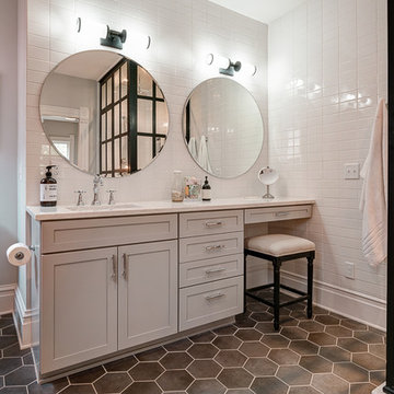
For this small cottage near Bush Park in Salem, we redesigned the kitchen, pantry and laundry room configuration to provide more efficient storage and workspace while keeping the integrity and historical accuracy of the home. In the bathroom we improved the skylight in the shower, installed custom glass doors and set the tile in a herringbone pattern to create an expansive feel that continues to reflect the home’s era. In addition to the kitchen and bathroom remodel, we updated the furnace, created a vibrant custom fireplace mantel in the living room, and rebuilt the front steps and porch overhang.
Sponsored
Columbus, OH

Hope Restoration & General Contracting
Columbus Design-Build, Kitchen & Bath Remodeling, Historic Renovations
 Alair Homes Plano
These clients debated moving from their dated 1979 house but decided to remodel since they loved their neighborhood and location of their home. We did a whole house interior and exterior remodel for them and they are so happy with their decision. The homeowners felt that reading floorplans was not so easy, so they loved our ability to provide 3D renderings and our personal touches and suggestions from our in-house designers.
The general layout of the home stayed the same with a few minor changes. We took the 38 year old home down to the studs and transformed it completely. The only thing that remains unchanged is the address. The popcorn texture was removed from the ceiling, removed all soffits, replaced all cabinets, flooring and countertops throughout the home. The wet bar was removed from the living room opening the space. The kitchen layout remained the same, but the cook surface was moved. Unneeded space was removed from the laundry room, giving them a larger pantry.
The master suite remained the same but additional lighting was added for reading. We made major improvements in the master bath by adding a rain shower, more storage and a bench to their new shower and gave them a larger bathtub.
All new cedar siding was replaced on the exterior of the home and a fresh coat of paint makes this 1979 home look brand new!
Design/Remodel by Hatfield Builders & Remodelers | Photography by Versatile Imaging
 Saikley Architects
We updated this 1907 two-story family home for re-sale. We added modern design elements and amenities while retaining the home’s original charm in the layout and key details. The aim was to optimize the value of the property for a prospective buyer, within a reasonable budget.
New French doors from kitchen and a rear bedroom open out to a new bi-level deck that allows good sight lines, functional outdoor living space, and easy access to a garden full of mature fruit trees. French doors from an upstairs bedroom open out to a private high deck overlooking the garden. The garage has been converted to a family room that opens to the garden.
The bathrooms and kitchen were remodeled the kitchen with simple, light, classic materials and contemporary lighting fixtures. New windows and skylights flood the spaces with light. Stained wood windows and doors at the kitchen pick up on the original stained wood of the other living spaces.
New redwood picture molding was created for the living room where traces in the plaster suggested that picture molding has originally been. A sweet corner window seat at the living room was restored. At a downstairs bedroom we created a new plate rail and other redwood trim matching the original at the dining room. The original dining room hutch and woodwork were restored and a new mantel built for the fireplace.
We built deep shelves into space carved out of the attic next to upstairs bedrooms and added other built-ins for character and usefulness. Storage was created in nooks throughout the house. A small room off the kitchen was set up for efficient laundry and pantry space.
We provided the future owner of the house with plans showing design possibilities for expanding the house and creating a master suite with upstairs roof dormers and a small addition downstairs. The proposed design would optimize the house for current use while respecting the original integrity of the house.
Photography: John Hayes, Open Homes Photography
https://saikleyarchitects.com/portfolio/classic-craftsman-update/

 Joel Reis Architecture and Real Estate Photography
Bathroom - mid-sized farmhouse master gray tile and marble tile bathroom idea in Los Angeles with recessed-panel cabinets, distressed cabinets, white walls, an undermount sink, marble countertops and white countertops
 Saikley Architects
We updated this 1907 two-story family home for re-sale. We added modern design elements and amenities while retaining the home’s original charm in the layout and key details. The aim was to optimize the value of the property for a prospective buyer, within a reasonable budget.
New French doors from kitchen and a rear bedroom open out to a new bi-level deck that allows good sight lines, functional outdoor living space, and easy access to a garden full of mature fruit trees. French doors from an upstairs bedroom open out to a private high deck overlooking the garden. The garage has been converted to a family room that opens to the garden.
The bathrooms and kitchen were remodeled the kitchen with simple, light, classic materials and contemporary lighting fixtures. New windows and skylights flood the spaces with light. Stained wood windows and doors at the kitchen pick up on the original stained wood of the other living spaces.
New redwood picture molding was created for the living room where traces in the plaster suggested that picture molding has originally been. A sweet corner window seat at the living room was restored. At a downstairs bedroom we created a new plate rail and other redwood trim matching the original at the dining room. The original dining room hutch and woodwork were restored and a new mantel built for the fireplace.
We built deep shelves into space carved out of the attic next to upstairs bedrooms and added other built-ins for character and usefulness. Storage was created in nooks throughout the house. A small room off the kitchen was set up for efficient laundry and pantry space.
We provided the future owner of the house with plans showing design possibilities for expanding the house and creating a master suite with upstairs roof dormers and a small addition downstairs. The proposed design would optimize the house for current use while respecting the original integrity of the house.
Photography: John Hayes, Open Homes Photography
https://saikleyarchitects.com/portfolio/classic-craftsman-update/


 Dream Kitchens
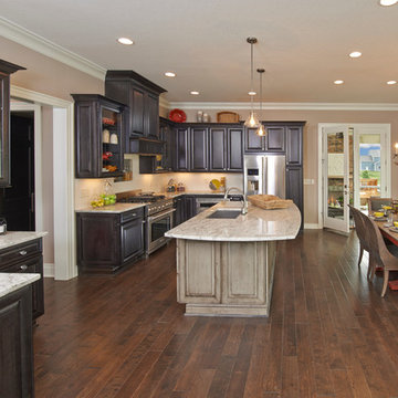
What had been the family summer “camp” on the lake for many years was to become a summer “home” for the owners in their retirement years. After meeting the requirements for rebuilding at waters edge, the couple focused on their next big requirement: a wonderful kitchen. This kitchen would be part of a single living space that combines the kitchen, dining and sitting areas. They wanted a beautiful, warm, inviting kitchen where they could enjoy their family, a kitchen that would take advantage of views of the lake, a kitchen that would be especially functional for one or more cooks and helpers -- and make it the perfect shade of yellow, please!
While they thought they wanted a kitchen with an island that overlooked the rest of the living space, their designer suggested a U-shaped design. A peninsula would minimize the concern that someone would inadvertently miss the edge of the two steps down to the lower living/dining area. It would also give them a kitchen that would allow for things on their wish list: a mantle style hood, a large window at the back of the house, countertop seating and lots of storage.
Placing the stove and mantle hood in the corner of the room created space for the large window, and opened up space for high quality storage with uninterrupted lengths of countertop. Rather than competing with the windows and the views, the high style of the mantle hood complements and balances the entire space. Glass was added to the upper section of the wall cabinets. They continue the effect of the transom windows and provide for display of pottery that had been collected over the years.
The sink was strategically positioned on the peninsula so that during food preparation or clean up there are views to the lake -- and the opportunity to socialize with people gathered at the countertop or in the living/dining area! Countertop seating was created by angling the extended Shivakashi granite countertop back into the kitchen and away from the steps. A third chair pulls up to the end of the countertop. It’s the favorite seat in the house!
The kitchen in this rebuilt lakeside home is being enjoyed and loved in its perfect shade of yellow – magically named “Full Moon”.

 Mitra Designs Studio Collaborative
A Vermont Guest House Project which involved renovation to an existing art studio (see existing photos)and an addition to house the bedroom area and loft. The Architectural and Interior Design concepts were developed by Mitra Designs Studio Collaborative(me), a design firm based in Vermont. This building is located on a 160-acre private property. The guest house sits on beautiful rocky ledges, looking over the spectacular view of the Adirondack Mountains, a pond, and Vermont farm fields. The homeowners are Americans who work and live in Hongkong and come to their Vermont home several times a year to get away from the hustle bustles of the concrete city of Hongkong, ( please note that their main house is a short walk to this guest house). The goal of the design was to create a Guest House and a Forest retreat with subtle influences of a modern tree-house and a theme where east-meets-west! The original studio was not insulated and did not have plumbing, as you can see in the photos plumbing was added as part of the renovation and the building was insulated very tightly. All built-ins including the queen bed and two children's bed was custom designed by Mitra. Much of the design concepts were created artfully to bring the outdoors indoors. The bathroom theme of concrete counters and river stone pebble flooring suggests subtle influences of a river that is surrounded with rocks; Mitra selected mid-century furniture to further complement this clean and modern forest retreat. A local artist was commissioned to take artful photographs from the natural surroundings of this property. Her photographs were then infused on a floating brushed chrome plate. There are many stories to be given about this wonderful project and I will be happy to speak with you and provide you with any other information you may need. Photo credit Susan Teare Photography
 Story Homes
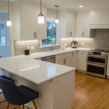
This St. Louis Park Minnesota home was built in 1938, with several remodeling updates and the addition of a four-season porch over the years. But the kitchen looked dated with its dark Oak cabinets, and the appliances were tired. So, the owners chose to transform a smaller kitchen and dining room into an amazing living/entertaining space.
To open up the space the non-supporting wall that separated the kitchen and the dining room was removed. The new open design features a peninsula with seating for three, just right for casual dining and conversation. Extra-wide drawers below provide storage for those larger kitchen utensils.
New 1 ½ inch Red Oak flooring was installed and stained to exactly match and connect the existing living room and dining room. White flat-panel upper and lower kitchen cabinets and drawers feature brushed nickel hardware. The white double bay undermount kitchen sink features Kohler faucets with detachable spray head.
New stainless-steel appliances are featured throughout, and the custom wood-paneled clad stove hood is vented outdoors.
But maybe the most interesting part of this kitchen’s appeal are the bright “Calacatta Plazo” Quartz countertops. This choice of this Quartz shows subtle gray veins.
Finding Subway tile in the color of that gray vein was challenging. But it was worth it. “Greige” colored Subway tile was chosen for the backsplash. White grout and the horizontal orientation of the tile makes the room feel larger, making this backsplash the perfect complement to this kitchen design.
With all this white the kitchen is already pretty bright. But the perfect lighting combination brings it all together. Pendant lights above the sink and peninsula offer just the right design touch. Bright, under-cabinet lights make meal preparation easy. The in-ceiling and pendant lights are on dimmers – something Rick suggests for all his remodeling projects. Lights and music for meal preparation are remotely controlled using Apple’s assistant, Siri.
The result: A bright white kitchen that opens up the room and blends perfectly with the existing design.
55