
Search results for "Supply plane primarily" in Home Design Ideas

 Unique Landscapes and Custom Pools
These strips of fabric are the perfect way to eliminate the sun's heat without blocking the light. It keeps the space comfortable but still bright and inviting.
 Nip Tuck Remodeling
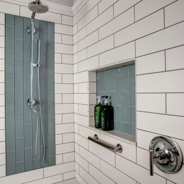
Two phases completed in 2020 & 2021 included kitchen and primary bath remodels. Bright, light, fresh and simple describe these beautiful spaces fit just for our clients.
The primary bath was a fun project to complete. A few must haves for this space were a place to incorporate the Peloton, more functional storage and a welcoming showering/bathing area.
The space was primarily left in the same configuration, but we were able to make it much more welcoming and efficient. The walk in shower has a small bench for storing large bottles and works as a perch for shaving legs. The entrance is doorless and allows for a nice open experience + the pebbled shower floor. The freestanding tub took the place of a huge built in tub deck creating a prefect space for Peleton next to the vanity. The vanity was freshened up with equal spacing for the dual sinks, a custom corner cabinet to house supplies and a charging station for sonicares and shaver. Lastly, the corner by the closet door was underutilized and we placed a storage chest w/ quartz countertop there.
The overall space included freshening up the paint/millwork in the primary bedroom.
Serving communities in: Clyde Hill, Medina, Beaux Arts, Juanita, Woodinville, Redmond, Kirkland, Bellevue, Sammamish, Issaquah, Mercer Island, Mill Creek
 Neumann & Rudy Architecture
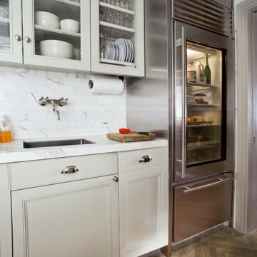
**I. Spatial Composition & Architectural Volume**
This is a galley-adjacent service zone — most likely a scullery or butler's pantry annexed to a primary kitchen — and its power derives from compression rather than expanse. The composition is organized along a single working wall that terminates abruptly in a full-height stainless volume, creating a deliberate collision of cabinetry rhythm and monolithic mass. The upper millwork establishes the governing geometry: a run of glazed-front wall cabinets with recessed shaker-profile stiles and rails, capped by a substantial crown assembly that reads as architectural cornice rather than applied trim. Within the second bay, the designer has inserted a period-correct plate rack with fluted vertical dividers and open glassware shelving, converting storage into ordered display and introducing a fine-grain vertical striation that counterpoints the broader panel field below. The base run answers with inset drawer fronts and applied-molding door panels, its cabinetry set on a shallow toe recess that lets the volume appear to float rather than plinth. The sightline is intentionally foreshortened: the eye travels the countertop plane eastward, is arrested by the refrigerator's tall stainless slab, then released through a sliver of hallway and door casing at the far right — a compressed reveal that implies circulation beyond and prevents the corridor from reading as a dead end. Ceiling height is inferred rather than shown, the cabinetry's soffit-scaled crown suggesting generous vertical proportion held in check by the room's narrow footprint.
**II. Materiality, Color & Texture**
The palette is a study in achromatic warmth, restrained to four principal materials and disciplined in its saturation. Cabinetry is finished in a soft greige-white — a putty-leaning off-white with faint green-grey undertone — applied in a low-sheen eggshell that absorbs rather than reflects, allowing the millwork profiles to be read through shadow rather than gloss. The backsplash is a honed marble subway field, laid in running bond with tight joints; its veining is delicate, feathered, and grey-toned, providing textural incident without pattern assertion. This continues seamlessly into the countertop, a thick marble slab with a squared eased edge and an integrated undermount trough sink, the material continuity from horizontal to vertical plane reinforcing the wall as a single stone-clad surface. Against this cool mineral field, the stainless steel refrigerator introduces an industrial register — brushed, directional, faintly grey-violet in its reflected light — while polished nickel hardware (bin pulls, cup pulls, knobs, and a wall-mounted bridge faucet with cross handles) supplies punctuating specular highlights at a consistent scale. The floor is the room's tonal anchor: white oak in a herringbone lay, fumed or grey-washed to a driftwood tone that reveals open grain and medullary ray figure. Small warm accents — a butcher-block cutting board with worn patina, amber glass bottles, a persimmon-toned bowl, the pale green of a champagne label — function as chromatic acupuncture within an otherwise desaturated field.
**III. Lighting, Atmosphere & Style Profile**
Illumination is layered and largely concealed. Ambient daylight enters obliquely from the left, raking across the marble backsplash at a low angle that mobilizes the honed surface's subtle relief and casts the cabinet door profiles into legible shadow. Undercabinet linear lighting washes the countertop and backsplash with a warm, low-kelvin pool, while the refrigerator's interior glazing performs as an unexpected internal lantern — a glowing vitrine that punctures the stainless slab and becomes the composition's focal luminance. This device is the image's most sophisticated gesture: it recasts a utilitarian appliance as an illuminated cabinet of curiosities, echoing the glass-front upper millwork on the opposite wall and completing a diagonal dialogue of lit transparency across the room. The resulting atmosphere is quiet, tempered, and quietly bourgeois — an interior of custodial calm rather than spectacle. Stylistically, the project synthesizes as a **contemporary Anglo-American scullery vernacular**: classical inset millwork and plate-rack joinery inherited from the pre-war service kitchen, reinterpreted through professional-grade stainless equipment, honed rather than polished stone, and a wire-brushed herringbone floor. Call it Refined Utilitarianism — a design position in which historical typology supplies the grammar, industrial hardware supplies the punctuation, and the near-monochrome palette allows craft, profile, and light to carry the entire expressive burden.
Find the right local pro for your project

 Miller-Roodell Architects Ltd
Set in Montana's tranquil Shields River Valley, the Shilo Ranch Compound is a collection of structures that were specifically built on a relatively smaller scale, to maximize efficiency. The main house has two bedrooms, a living area, dining and kitchen, bath and adjacent greenhouse, while two guest homes within the compound can sleep a total of 12 friends and family. There's also a common gathering hall, for dinners, games, and time together. The overall feel here is of sophisticated simplicity, with plaster walls, concrete and wood floors, and weathered boards for exteriors. The placement of each building was considered closely when envisioning how people would move through the property, based on anticipated needs and interests. Sustainability and consumption was also taken into consideration, as evidenced by the photovoltaic panels on roof of the garage, and the capability to shut down any of the compound's buildings when not in use.

 down2earth Interior Design, LLC.
Is your closet busting at the seams? Or do you perhaps have no closet at all? Time to consider adding a mudroom to your house. Mudrooms are a popular interior design trend these days, and for good reason - they can house far more than a simple coat closet can. They can serve as a family command center for kids' school flyers and menus, for backpacks and shoes, for art supplies and sports equipment. Some mudrooms contain a laundry area, and some contain a mail station. Some mudrooms serve as a home base for a dog or a cat, with easy to clean, low maintenance building materials. A mudroom may consist of custom built-ins, or may simply be a corner of an existing room with pulled some clever, freestanding furniture, hooks, or shelves to house your most essential mudroom items.
Whatever your storage needs, extensive or streamlined, carving out a mudroom area can keep the whole family more organized. And, being more organized saves you stress and countless hours that would otherwise be spent searching for misplaced items.
While we love to design mudroom niches, a full mudroom interior design allows us to do what we do best here at Down2Earth Interior Design: elevate a space that is primarily driven by pragmatic requirements into a space that is also beautiful to look at and comfortable to occupy. I find myself voluntarily taking phone calls while sitting on the bench of my mudroom, simply because it's a comfortable place to be. My kids do their homework in the mudroom sometimes. My cat loves to curl up on sweatshirts temporarily left on the bench, or cuddle up in boxes on their way out to the recycling bins, just outside the door. Designing a custom mudroom for our family has elevated our lifestyle in so many ways, and I look forward to the opportunity to help make your mudroom design dreams a reality as well.
Photos by Ryan Macchione

 ZeroEnergy Design
This modern green home offers both a vacation destination on Cape Cod near local family members and an opportunity for rental income.
FAMILY ROOTS. A West Coast couple living in the San Francisco Bay Area sought a permanent East Coast vacation home near family members living on Cape Cod. As academic professionals focused on sustainability, they sought a green, energy efficient home that was well-aligned with their values. With no green homes available for sale on Cape Cod, they decided to purchase land near their family and build their own.
SLOPED SITE. Comprised of a 3/4 acre lot nestled in the pines, the steeply sloping terrain called for a plan that embraced and took advantage of the slope. Of equal priority was optimizing solar exposure, preserving privacy from abutters, and creating outdoor living space. The design accomplished these goals with a simple, rectilinear form, offering living space on the both entry and lower/basement levels. The stepped foundation allows for a walk-out basement level with light-filled living space on the down-hill side of the home. The traditional basement on the eastern, up-hill side houses mechanical equipment and a home gym. The house welcomes natural light throughout, captures views of the forest, and delivers entertainment space that connects indoor living space to outdoor deck and dining patio.
MODERN VISION. The clean building form and uncomplicated finishes pay homage to the modern architectural legacy on the outer Cape. Durable and economical fiber cement panels, fixed with aluminum channels, clad the primary form. Cedar clapboards provide a visual accent at the south-facing living room, which extends a single roof plane to cover the entry porch.
SMART USE OF SPACE. On the entry level, the “L”-shaped living, dining, and kitchen space connects to the exterior living, dining, and grilling spaces to effectively double the home’s summertime entertainment area. Placed at the western end of the entry level (where it can retain privacy but still claim expansive downhill views) is the master suite with a built-in study. The lower level has two guest bedrooms, a second full bathroom, and laundry. The flexibility of the space—crucial in a house with a modest footprint—emerges in one of the guest bedrooms, which doubles as home office by opening the barn-style double doors to connect it to the bright, airy open stair leading up to the entry level. Thoughtful design, generous ceiling heights and large windows transform the modest 1,100 sf* footprint into a well-lit, spacious home. *(total finished space is 1800 sf)
RENTAL INCOME. The property works for its owners by netting rental income when the owners are home in San Francisco. The house especially caters to vacationers bound for nearby Mayo Beach and includes an outdoor shower adjacent to the lower level entry door. In contrast to the bare bones cottages that are typically available on the Cape, this home offers prospective tenants a modern aesthetic, paired with luxurious and green features. Durable finishes inside and out will ensure longevity with the heavier use that comes with a rental property.
COMFORT YEAR-ROUND. The home is super-insulated and air-tight, with mechanical ventilation to provide continuous fresh air from the outside. High performance triple-paned windows complement the building enclosure and maximize passive solar gain while ensuring a warm, draft-free winter, even when sitting close to the glass. A properly sized air source heat pump offers efficient heating & cooling, and includes a carefully designed the duct distribution system to provide even comfort throughout the house. The super-insulated envelope allows us to significantly reduce the equipment capacity, duct size, and airflow quantities, while maintaining unparalleled thermal comfort.
ENERGY EFFICIENT. The building’s shell and mechanical systems play instrumental roles in the home’s exceptional performance. The building enclosure reduces the most significant energy glutton: heating. Continuous super-insulation, thorough air sealing, triple-pane windows, and passive solar gain work together to yield a miniscule heating load. All active energy consumers are extremely efficient: an air source heat pump for heating and cooling, a heat pump hot water heater, LED lighting, energy recovery ventilation (ERV), and high efficiency appliances. The result is a home that uses 70% less energy than a similar new home built to code requirements.
OVERALL. The home embodies the owners’ goals and values while comprehensively enabling thermal comfort, energy efficiency, a vacation respite, and supplementary income.
PROJECT TEAM
ZeroEnergy Design - Architect & Mechanical Designer
A.F. Hultin & Co. - Contractor
Pamet Valley Landscape Design - Landscape & Masonry
Lisa Finch - Original Artwork
European Architectural Supply - Windows
Eric Roth Photography - Photography
 ZeroEnergy Design
This modern green home offers both a vacation destination on Cape Cod near local family members and an opportunity for rental income.
FAMILY ROOTS. A West Coast couple living in the San Francisco Bay Area sought a permanent East Coast vacation home near family members living on Cape Cod. As academic professionals focused on sustainability, they sought a green, energy efficient home that was well-aligned with their values. With no green homes available for sale on Cape Cod, they decided to purchase land near their family and build their own.
SLOPED SITE. Comprised of a 3/4 acre lot nestled in the pines, the steeply sloping terrain called for a plan that embraced and took advantage of the slope. Of equal priority was optimizing solar exposure, preserving privacy from abutters, and creating outdoor living space. The design accomplished these goals with a simple, rectilinear form, offering living space on the both entry and lower/basement levels. The stepped foundation allows for a walk-out basement level with light-filled living space on the down-hill side of the home. The traditional basement on the eastern, up-hill side houses mechanical equipment and a home gym. The house welcomes natural light throughout, captures views of the forest, and delivers entertainment space that connects indoor living space to outdoor deck and dining patio.
MODERN VISION. The clean building form and uncomplicated finishes pay homage to the modern architectural legacy on the outer Cape. Durable and economical fiber cement panels, fixed with aluminum channels, clad the primary form. Cedar clapboards provide a visual accent at the south-facing living room, which extends a single roof plane to cover the entry porch.
SMART USE OF SPACE. On the entry level, the “L”-shaped living, dining, and kitchen space connects to the exterior living, dining, and grilling spaces to effectively double the home’s summertime entertainment area. Placed at the western end of the entry level (where it can retain privacy but still claim expansive downhill views) is the master suite with a built-in study. The lower level has two guest bedrooms, a second full bathroom, and laundry. The flexibility of the space—crucial in a house with a modest footprint—emerges in one of the guest bedrooms, which doubles as home office by opening the barn-style double doors to connect it to the bright, airy open stair leading up to the entry level. Thoughtful design, generous ceiling heights and large windows transform the modest 1,100 sf* footprint into a well-lit, spacious home. *(total finished space is 1800 sf)
RENTAL INCOME. The property works for its owners by netting rental income when the owners are home in San Francisco. The house especially caters to vacationers bound for nearby Mayo Beach and includes an outdoor shower adjacent to the lower level entry door. In contrast to the bare bones cottages that are typically available on the Cape, this home offers prospective tenants a modern aesthetic, paired with luxurious and green features. Durable finishes inside and out will ensure longevity with the heavier use that comes with a rental property.
COMFORT YEAR-ROUND. The home is super-insulated and air-tight, with mechanical ventilation to provide continuous fresh air from the outside. High performance triple-paned windows complement the building enclosure and maximize passive solar gain while ensuring a warm, draft-free winter, even when sitting close to the glass. A properly sized air source heat pump offers efficient heating & cooling, and includes a carefully designed the duct distribution system to provide even comfort throughout the house. The super-insulated envelope allows us to significantly reduce the equipment capacity, duct size, and airflow quantities, while maintaining unparalleled thermal comfort.
ENERGY EFFICIENT. The building’s shell and mechanical systems play instrumental roles in the home’s exceptional performance. The building enclosure reduces the most significant energy glutton: heating. Continuous super-insulation, thorough air sealing, triple-pane windows, and passive solar gain work together to yield a miniscule heating load. All active energy consumers are extremely efficient: an air source heat pump for heating and cooling, a heat pump hot water heater, LED lighting, energy recovery ventilation (ERV), and high efficiency appliances. The result is a home that uses 70% less energy than a similar new home built to code requirements.
OVERALL. The home embodies the owners’ goals and values while comprehensively enabling thermal comfort, energy efficiency, a vacation respite, and supplementary income.
PROJECT TEAM
ZeroEnergy Design - Architect & Mechanical Designer
A.F. Hultin & Co. - Contractor
Pamet Valley Landscape Design - Landscape & Masonry
Lisa Finch - Original Artwork
European Architectural Supply - Windows
Eric Roth Photography - Photography
Sponsored
Columbus, OH

Structural Remodeling
Franklin County's Heavy Timber Specialists | Best of Houzz 2020!
 Neumann & Rudy Architecture
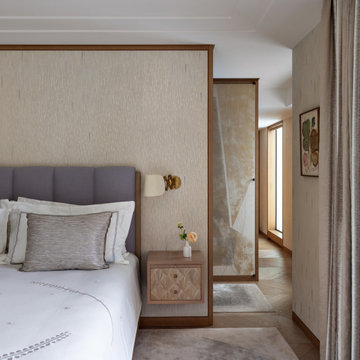
## I. Spatial Composition & Architectural Volume
This bedroom operates as an exercise in controlled asymmetry, its plan organized around a freestanding headboard wall that reads less as partition than as inhabited architecture. Framed in a crisp oak reveal that traces its full perimeter, the wall detaches from the ceiling plane and terminates short of the right-hand elevation, generating a threshold that draws the eye into a secondary corridor volume beyond. This device — the *poché* wall as spatial pivot — establishes a layered enfilade: the intimate sleeping zone in the foreground, a transitional dressing passage in the middle distance, and a slot of daylight at the terminus. The ceiling is articulated with a shallow recessed tray and delicate stepped cornice, a restrained gesture toward classical Parisian *moulure* that regulates the room's proportion without ornamental excess. Sightlines are deliberately choreographed: the bed sits low and horizontal, the joinery plinth of the nightstand cantilevers from the wall to preserve floor-plane continuity, and the herringbone parquet visible beyond the threshold introduces a directional pull that animates what would otherwise be a static rectilinear volume. The result is a composition of nested frames — millwork within millwork — that lends considerable depth to a comparatively compact footprint.
## II. Materiality, Color & Texture
The palette is tonal rather than chromatic, calibrated within a narrow band of oatmeal, greige, and pale putty, and enlivened almost entirely through surface incident. The dominant wallcovering — a vertically striated, marquetry-like textile of tessellated ivory and taupe fibers — supplies a subtle warp-and-weft rhythm that shifts under raking light, functioning as texture masquerading as pattern. Against this, rift-sawn white oak framing introduces a honeyed, gently reddish undertone, while the bespoke bedside cabinet deploys a radiating sunburst veneer in a blush-tinged walnut or eucalyptus, its book-matched geometry providing the room's single moment of overt figuration. Textiles carry the tonal counterweight: the channel-tufted headboard in a muted heather-aubergine linen offers the deepest saturation in the frame, cooling the prevailing warmth, while cotton percale with contrast tape borders, a slubbed lumbar cushion, and a hand-stitched matelassé coverlet with tambour scrollwork build a gradient of tactility from crisp to plush. The doorway's parchment-and-verdigris art panel — appearing as a gilded, oxidized *gessoed* screen — supplies a patinated, almost frescoed counterpoint, while unlacquered brass at the sconce introduces the only metallic warmth, deliberately restrained.
## III. Lighting, Atmosphere & Style Profile
Illumination is handled with notable discretion. Natural light enters obliquely from an off-frame source at right, filtered through a floor-to-ceiling striated linen drapery that diffuses rather than admits, producing an even, shadowless wash consistent with northern European daylight. A secondary aperture — the narrow vertical slot glimpsed down the corridor — acts as a luminous punctuation mark, terminating the sightline with a slender bar of brightness that draws the occupant forward. Artificial lighting is intentionally sparse and task-oriented: a brass scissor-arm sconce with an unbleached linen shade, adjustable and near-vernacular in its mechanism, provides articulated reading light while contributing a note of atelier informality against the otherwise refined joinery. The absence of visible downlights or decorative pendants reinforces the room's quietude. Stylistically, the scheme resolves into a sophisticated **Soft Minimalism** inflected with contemporary Parisian classicism — the restraint and tonal discipline of the former, the millwork rigor and proportional literacy of the latter, warmed by a *wabi*-adjacent appreciation for patina and handwork. It is a room that eschews statement in favor of atmosphere, achieving luxury through material intelligence and the calibrated withholding of contrast.
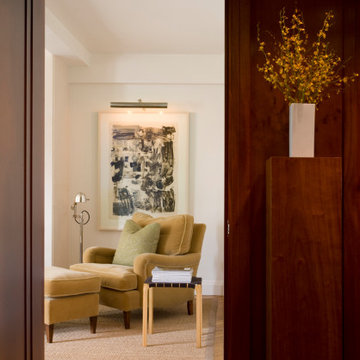 Neumann & Rudy Architecture
The photograph is constructed as a deliberate act of framing — an enfilade view captured through a threshold, in which the aperture of a doorway becomes both proscenium and compositional device. The image is organized around a strong vertical tripartite division: a dark stile of paneled millwork at the left edge, the luminous rectangle of the adjacent sitting room at center, and a substantial pier of figured hardwood joinery at right, terminating in a plinth-like pedestal. This asymmetrical clamping of the bright volume between two dark masses produces a pronounced sense of compression and release, a Wrightian sequencing in which the constricted, wood-lined passage funnels the eye toward the softer, higher-key room beyond. The architectural vocabulary within that inner volume is restrained and orthogonal: crisp painted plaster planes, a shallow soffit or dropped beam crossing the ceiling to modulate the overhead datum, and a simple flat-stock baseboard that reads as a quiet ground line rather than an ornamental flourish. The sightline is layered and telescopic — foreground jamb, mid-ground seating group, background artwork on the far wall — establishing depth through overlapping planes rather than perspectival theatrics. Underfoot, a herringbone-laid oak parquet in the passage gives way to a large-format sisal rug bound in linen tape, its rectilinear geometry reinforcing the axis while softening the transition between circulation and repose.
The material argument here is one of calibrated opposition: dense, saturated hardwood against pale, absorptive plaster and textile. The framing joinery — most plausibly a rich mahogany or stained cherry, its cathedral grain and ribbon figure fully legible under raking light — carries a deep oxblood-to-umber tonality and a satin, hand-rubbed sheen that lends the passage a library-like gravity. Against this, the interior room is rendered in a warm off-white with distinctly yellow-ochre undertones, avoiding the clinical chill of a true cool white and instead reading as parchment or unbleached linen. The upholstery — a rolled-arm wing chair and matching ottoman in a camel or buff-toned cotton velvet — supplies the tactile fulcrum of the composition: a napped, light-absorbing pile that contrasts against the coarse, tightly woven boucle of the sisal below and the smooth lacquer of the vertical joinery. Accent notes are sparing and precise: a pale celadon embroidered cushion introduces the only cool chromatic interruption; a rectilinear bench in blond ash with a woven black leather strap deck delivers a graphic, near-Nordic counterpoint; and a monolithic white ceramic vessel atop the pedestal provides a hard, matte punctuation. The abstract work on paper — a gestural monochrome in charcoal, ink and Payne's grey, generously matted behind glass — functions as the room's tonal anchor, its cool achromatics preventing the warm palette from tipping into sentimentality. Sprays of yellow oncidium orchid supply the single high-chroma gesture, echoing the ochre undertone of the walls.
The lighting strategy is layered, low-lumen and unapologetically warm, eschewing ambient wash in favor of discrete pools of illumination. A slim linear picture light, bronze-finished and cantilevered from the wall, grazes the artwork with a scalloped throw that reveals the tooth of the paper and establishes the far wall as the room's luminous terminus. A chrome-shaded articulating floor lamp — a modernist task fixture with a distinctly mid-century pedigree — provides a secondary, reflective glint and introduces the only cool metallic in the palette. Daylight enters obliquely and unseen from the left, softly modeling the plaster and the velvet nap without ever flattening the composition; the foreground joinery, meanwhile, sits in deep shadow, its grain caught only in a slow, specular gradient. The cumulative atmosphere is one of hushed, crepuscular intimacy — a room calibrated for reading and retreat rather than reception. Stylistically, the project resolves into a form of Transitional Warm Modernism: the classical proportioning, paneled millwork and rolled-arm seating are drawn from a traditional American vocabulary, yet they are stripped of applied ornament, edited to essentials, and disciplined by the graphic austerity of the abstract art and the blond-and-black bench. It is a sensibility best characterized as quiet luxury — tonal, textural, and materially honest, deriving its authority from the resonance of grain, nap and light rather than from any declarative gesture.
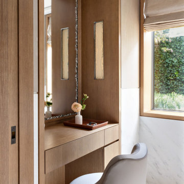 Neumann & Rudy Architecture
**Spatial Composition & Architectural Volume**
This is an exercise in the architecture of the alcove — a vanity niche carved from a continuous run of full-height oak joinery, its recess reading less as furniture placed against a wall than as volume subtracted from mass. The composition is governed by a strict orthogonal discipline: the reveal-jointed cabinet stiles establish a vertical rhythm that the photographer's oblique sightline compresses into layered planes, while the cantilevered vanity slab introduces a single decisive horizontal that arrests the vertical drift. The niche is capped by a soffited overhead panel, giving the recess a deliberate lintel and lending the aperture the proportional gravitas of a doorway. Depth is orchestrated through nested framing: the pocketed sliding door in the foreground crops the scene, the joinery reveal frames the alcove, and the full-height mirror frames a reflected secondary volume — a window, a Roman shade, a second bloom — extending the room's apparent envelope well beyond its physical bounds. To the right, the plane pivots into a marble-clad wall and a deeply reveal-set casement whose broad oak jamb and stool are detailed with the same tectonic logic as the millwork, unifying opening and cabinetry into a single architectural grammar. Above, a recessed perimeter shadow-gap ceiling floats the plaster plane free of the wall, dematerializing the junction and heightening the sense of contained, cabin-like intimacy.
**Materiality, Color & Texture**
The palette is narrow, warm, and rigorously controlled — a study in tonal adjacency rather than contrast. Rift-sawn white oak dominates, its cathedral and straight-grain figure deliberately book-matched and run vertically to accentuate height, finished in a matte, low-sheen sealer that reads as raw yet refined; note the subtle chromatic modulation between the honeyed door leaves, the slightly cooler carcass panels, and the pale, almost bleached drawer fronts, a gradient that provides articulation without resorting to hue shift. Against this, the Calacatta- or Carrara-type marble wainscot introduces a cool, silvery counterpoint, its soft grey veining offering the only real graphic incident in the field. The mirror surround — a hand-cast, rope-twist metal frame in polished nickel or silvered bronze — supplies a jewel-like glint and a moment of organic, almost baroque relief against the sobriety of the flat panels, echoed in the pair of églomisé or reverse-painted glass insets set flush into the alcove wall like recessed cabochons. Textiles are handled with restraint: a raw-silk or textured linen Roman shade in a tobacco-taupe stacks in generous, softly rumpled folds, while the swivel chair is upholstered in a taut, sueded greige leather whose sculpted, scrolled back offers the room's most sensuous curve. The tan saddle-leather tray and the milk-glazed ceramic bud vase complete a haptic register that moves from cool stone to warm hide to matte ceramic to silken wood.
**Lighting, Atmosphere & Style Profile**
Illumination is almost entirely daylit and side-cast, with the diffused southern wash filtered through the linen shade to produce a luminous, shadowless bloom across the marble and a raking, grain-revealing light along the oak. The design conspicuously withholds decorative fixtures; instead, light is architecturalized — the églomisé panels flanking the mirror function as concealed backlit apertures, glowing softly to provide flattering vertical face-lighting at the vanity, while the perimeter ceiling reveal implies a cove source for ambient wash. This suppression of visible hardware is central to the atmosphere: serene, hushed, and hotel-like in its precision, yet domesticated by the flowers and the intimate scale of the nook. Stylistically the project synthesizes into a refined **Soft Minimalism with a couture-modernist inflection** — the reductive planarity and reveal-detailing of contemporary minimalism warmed by mid-century Scandinavian wood craft and elevated by discreet Art Deco–adjacent flourishes in the metalwork and glass. It is a vocabulary of quiet luxury, where value is signaled not through ornament but through the tolerances of the joinery, the calibration of tone-on-tone, and the confidence to let a single ranunculus carry the room's only note of chroma.
 down2earth Interior Design, LLC.
Is your closet busting at the seams? Or do you perhaps have no closet at all? Time to consider adding a mudroom to your house. Mudrooms are a popular interior design trend these days, and for good reason - they can house far more than a simple coat closet can. They can serve as a family command center for kids' school flyers and menus, for backpacks and shoes, for art supplies and sports equipment. Some mudrooms contain a laundry area, and some contain a mail station. Some mudrooms serve as a home base for a dog or a cat, with easy to clean, low maintenance building materials. A mudroom may consist of custom built-ins, or may simply be a corner of an existing room with pulled some clever, freestanding furniture, hooks, or shelves to house your most essential mudroom items.
Whatever your storage needs, extensive or streamlined, carving out a mudroom area can keep the whole family more organized. And, being more organized saves you stress and countless hours that would otherwise be spent searching for misplaced items.
While we love to design mudroom niches, a full mudroom interior design allows us to do what we do best here at Down2Earth Interior Design: elevate a space that is primarily driven by pragmatic requirements into a space that is also beautiful to look at and comfortable to occupy. I find myself voluntarily taking phone calls while sitting on the bench of my mudroom, simply because it's a comfortable place to be. My kids do their homework in the mudroom sometimes. My cat loves to curl up on sweatshirts temporarily left on the bench, or cuddle up in boxes on their way out to the recycling bins, just outside the door. Designing a custom mudroom for our family has elevated our lifestyle in so many ways, and I look forward to the opportunity to help make your mudroom design dreams a reality as well.
Photos by Ryan Macchione
 ZeroEnergy Design
This modern green home offers both a vacation destination on Cape Cod near local family members and an opportunity for rental income.
FAMILY ROOTS. A West Coast couple living in the San Francisco Bay Area sought a permanent East Coast vacation home near family members living on Cape Cod. As academic professionals focused on sustainability, they sought a green, energy efficient home that was well-aligned with their values. With no green homes available for sale on Cape Cod, they decided to purchase land near their family and build their own.
SLOPED SITE. Comprised of a 3/4 acre lot nestled in the pines, the steeply sloping terrain called for a plan that embraced and took advantage of the slope. Of equal priority was optimizing solar exposure, preserving privacy from abutters, and creating outdoor living space. The design accomplished these goals with a simple, rectilinear form, offering living space on the both entry and lower/basement levels. The stepped foundation allows for a walk-out basement level with light-filled living space on the down-hill side of the home. The traditional basement on the eastern, up-hill side houses mechanical equipment and a home gym. The house welcomes natural light throughout, captures views of the forest, and delivers entertainment space that connects indoor living space to outdoor deck and dining patio.
MODERN VISION. The clean building form and uncomplicated finishes pay homage to the modern architectural legacy on the outer Cape. Durable and economical fiber cement panels, fixed with aluminum channels, clad the primary form. Cedar clapboards provide a visual accent at the south-facing living room, which extends a single roof plane to cover the entry porch.
SMART USE OF SPACE. On the entry level, the “L”-shaped living, dining, and kitchen space connects to the exterior living, dining, and grilling spaces to effectively double the home’s summertime entertainment area. Placed at the western end of the entry level (where it can retain privacy but still claim expansive downhill views) is the master suite with a built-in study. The lower level has two guest bedrooms, a second full bathroom, and laundry. The flexibility of the space—crucial in a house with a modest footprint—emerges in one of the guest bedrooms, which doubles as home office by opening the barn-style double doors to connect it to the bright, airy open stair leading up to the entry level. Thoughtful design, generous ceiling heights and large windows transform the modest 1,100 sf* footprint into a well-lit, spacious home. *(total finished space is 1800 sf)
RENTAL INCOME. The property works for its owners by netting rental income when the owners are home in San Francisco. The house especially caters to vacationers bound for nearby Mayo Beach and includes an outdoor shower adjacent to the lower level entry door. In contrast to the bare bones cottages that are typically available on the Cape, this home offers prospective tenants a modern aesthetic, paired with luxurious and green features. Durable finishes inside and out will ensure longevity with the heavier use that comes with a rental property.
COMFORT YEAR-ROUND. The home is super-insulated and air-tight, with mechanical ventilation to provide continuous fresh air from the outside. High performance triple-paned windows complement the building enclosure and maximize passive solar gain while ensuring a warm, draft-free winter, even when sitting close to the glass. A properly sized air source heat pump offers efficient heating & cooling, and includes a carefully designed the duct distribution system to provide even comfort throughout the house. The super-insulated envelope allows us to significantly reduce the equipment capacity, duct size, and airflow quantities, while maintaining unparalleled thermal comfort.
ENERGY EFFICIENT. The building’s shell and mechanical systems play instrumental roles in the home’s exceptional performance. The building enclosure reduces the most significant energy glutton: heating. Continuous super-insulation, thorough air sealing, triple-pane windows, and passive solar gain work together to yield a miniscule heating load. All active energy consumers are extremely efficient: an air source heat pump for heating and cooling, a heat pump hot water heater, LED lighting, energy recovery ventilation (ERV), and high efficiency appliances. The result is a home that uses 70% less energy than a similar new home built to code requirements.
OVERALL. The home embodies the owners’ goals and values while comprehensively enabling thermal comfort, energy efficiency, a vacation respite, and supplementary income.
PROJECT TEAM
ZeroEnergy Design - Architect & Mechanical Designer
A.F. Hultin & Co. - Contractor
Pamet Valley Landscape Design - Landscape & Masonry
Lisa Finch - Original Artwork
European Architectural Supply - Windows
Eric Roth Photography - Photography
 down2earth Interior Design, LLC.
Is your closet busting at the seams? Or do you perhaps have no closet at all? Time to consider adding a mudroom to your house. Mudrooms are a popular interior design trend these days, and for good reason - they can house far more than a simple coat closet can. They can serve as a family command center for kids' school flyers and menus, for backpacks and shoes, for art supplies and sports equipment. Some mudrooms contain a laundry area, and some contain a mail station. Some mudrooms serve as a home base for a dog or a cat, with easy to clean, low maintenance building materials. A mudroom may consist of custom built-ins, or may simply be a corner of an existing room with pulled some clever, freestanding furniture, hooks, or shelves to house your most essential mudroom items.
Whatever your storage needs, extensive or streamlined, carving out a mudroom area can keep the whole family more organized. And, being more organized saves you stress and countless hours that would otherwise be spent searching for misplaced items.
While we love to design mudroom niches, a full mudroom interior design allows us to do what we do best here at Down2Earth Interior Design: elevate a space that is primarily driven by pragmatic requirements into a space that is also beautiful to look at and comfortable to occupy. I find myself voluntarily taking phone calls while sitting on the bench of my mudroom, simply because it's a comfortable place to be. My kids do their homework in the mudroom sometimes. My cat loves to curl up on sweatshirts temporarily left on the bench, or cuddle up in boxes on their way out to the recycling bins, just outside the door. Designing a custom mudroom for our family has elevated our lifestyle in so many ways, and I look forward to the opportunity to help make your mudroom design dreams a reality as well.
Photos by Ryan Macchione
Sponsored
Delaware, OH

Buckeye Basements, Inc.
Central Ohio's Basement Finishing ExpertsBest Of Houzz '13-'21

 Lightology
TruLine 1.6 5W 24VDC Plaster-In LED System creates a clean line of glare free general illumination within drywall. The linear LED system features a shallow .6 inch deep plaster in aluminum extrusion no thicker than drywall that houses two 2.5 watt rows of high CRI commercial grade white LED Soft Strip. Its 1.6 inch wide diffuser lens projects a clean line of light without LED dots. System mounts directly to studs without joist modification. TruLine is sold in 1 foot increments up to 40 feet at 5 watts per foot, 85+ CRI, in 2700K Very Warm White or 3000K Warm White color temperature, delivering 243 lumens per foot. 50,000 hour average lamp life. TruLine extrusion may be field cut. LED Soft Strip may be cut every 2.4 inches. TruLine runs in a straight line. The LED strip bends along the LED plane, allowing runs to continue from a wall onto a ceiling. Intersecting runs on the samewall require two separate TruLine systems. System includes TruLine 1.6 channels, end caps, LED Soft Strip, TL1.6 special junction box (quantity 2) and all mounting hardware. Power supply options include a Class 2 24 volt 0-10 96 or 192 watt dimmable with a Lightolier Sunrise ZP600FAM120; Leviton IP710-DL; Lutron Radio Ra2 with Grafik Eye, RRD-10ND and GRX-TVI; Grafik Eye QS with Grafik Eye, QSGRJ-XP and GRX-TVI; Diva with Grafik Eye, DVTV and PP20; Nova T with Grafik Eye, NTFTV-WH and PP20, sold separately. Indoor applications only. Fixture includes a 5 year warranty. Made in USA.
 down2earth Interior Design, LLC.
Is your closet busting at the seams? Or do you perhaps have no closet at all? Time to consider adding a mudroom to your house. Mudrooms are a popular interior design trend these days, and for good reason - they can house far more than a simple coat closet can. They can serve as a family command center for kids' school flyers and menus, for backpacks and shoes, for art supplies and sports equipment. Some mudrooms contain a laundry area, and some contain a mail station. Some mudrooms serve as a home base for a dog or a cat, with easy to clean, low maintenance building materials. A mudroom may consist of custom built-ins, or may simply be a corner of an existing room with pulled some clever, freestanding furniture, hooks, or shelves to house your most essential mudroom items.
Whatever your storage needs, extensive or streamlined, carving out a mudroom area can keep the whole family more organized. And, being more organized saves you stress and countless hours that would otherwise be spent searching for misplaced items.
While we love to design mudroom niches, a full mudroom interior design allows us to do what we do best here at Down2Earth Interior Design: elevate a space that is primarily driven by pragmatic requirements into a space that is also beautiful to look at and comfortable to occupy. I find myself voluntarily taking phone calls while sitting on the bench of my mudroom, simply because it's a comfortable place to be. My kids do their homework in the mudroom sometimes. My cat loves to curl up on sweatshirts temporarily left on the bench, or cuddle up in boxes on their way out to the recycling bins, just outside the door. Designing a custom mudroom for our family has elevated our lifestyle in so many ways, and I look forward to the opportunity to help make your mudroom design dreams a reality as well.
Photos by Ryan Macchione
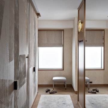 Neumann & Rudy Architecture
**Paragraph 1: Spatial Composition & Architectural Volume**
This dressing vestibule is an exercise in the choreography of compression and release — a narrow processional corridor that opens onto a shallow window alcove, terminating the sightline in a single, deliberately staged tableau. The plan is organized between two parallel planes of full-height joinery: at left, a monumental run of flush-faced wardrobe doors executed in bespoke decorative panelling, and at right, a mirror-clad pier whose reflective face doubles the room's apparent width and recapitulates the window, the bench, and the herringbone floor in a quiet trompe-l'oeil. The millwork is detailed with an admirable restraint — reveal-shadow gaps rather than architraves, concealed pivot hinges, and slim bronze-toned frames that read as drawn lines rather than mouldings. Overhead, a stepped soffit and recessed cornice detail lower the datum at the corridor, then release into the fuller ceiling height of the alcove; the effect is subtly perspectival, drawing the eye toward the luminous aperture. The punched window, generously reveal-deep and set within a wide oak surround, functions less as a view and more as a light well, its frosted glazing dissolving the exterior into pure illuminated field. The upholstered bench, centered beneath it and flanked casually by a pair of double-monk shoes, provides the anthropometric anchor — a note of inhabited scale that keeps the geometry from tipping into abstraction.
**Paragraph 2: Materiality, Color & Texture**
The palette operates within an exceptionally disciplined tonal register — a graduated field of oyster, greige, bone, and pale putty, all sharing a warm mineral undertone that prevents the achromatic scheme from turning cold. The hero surface is undoubtedly the wardrobe fronts: a hand-applied, gesso-like plaster or lacquered artisanal finish, its brushed and troweled passages bearing faint calligraphic incisions and pinpricked stitch-like perforations, evoking a Japanese ink study or an aged fresco fragment. Against this painterly softness, the joinery frames and window casings deliver rift-sawn oak with a fine, linear grain, while the perimeter walls are dressed in a subtly striated textile or grasscloth wallcovering punctuated by small inlaid tesserae — a low-frequency rhythm that reads as texture at distance and as craft detail at proximity. Hardware provides the scheme's only true contrast: elongated blackened-bronze pulls, rectilinear and unornamented, act as punctuation marks on the pale field. Metals are otherwise handled with restraint — satin brass sabots capping the bench legs, an unlacquered brass sconce armature — introducing warmth without glitter. Underfoot, the chevron-laid oak parquet supplies directional energy, softened by a plush viscose or silk-blend rug whose sheen shifts from pearl to shadow. The tactile logic is one of graduated softness: matte plaster against silk pile, honed timber against brushed textile, with mirror as the single hard, cool interruption.
**Paragraph 3: Lighting, Atmosphere & Style Profile**
Natural light is the primary compositional instrument here, and it has been diffused rather than admitted — the obscured glazing and half-drawn linen Roman shade convert daylight into a soft, north-facing luminous plane, evenly modelling the plaster and revealing its topography in raking gradients. This ambient wash is calibrated against a single decorative gesture: a wall-mounted sconce in alabaster or hand-formed opaline glass, its warm amber core providing the room's only chromatic accent and a welcome note of imperfection against the otherwise machined precision. Architectural lighting is entirely concealed — no downlight apertures interrupt the ceiling plane — reinforcing the sense that illumination emanates from the surfaces themselves. The resulting atmosphere is contemplative, hushed, almost sacral: a threshold space treated with the gravity of a chapel narthex. Stylistically, the project sits at the confluence of Soft Minimalism and contemporary Parisian couture interiors — the reductive planarity and monochromatic discipline of the former married to the artisanal, hand-wrought materiality and bronze detailing associated with the latter, with a distinctly Japandi sensibility in its reverence for wabi-sabi surface irregularity and asymmetric compositional balance. It is a scheme that achieves luxury not through ornament or contrast but through the sustained rigour of tonal control, the quality of the hand in its finishes, and the confidence to leave the volume largely empty.
 Neumann & Rudy Architecture
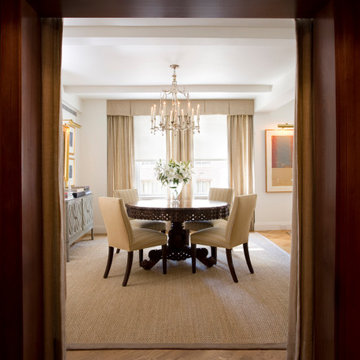
The photograph is composed as a deliberate enfilade study, framing the dining room through a deep, mahogany-cased cased opening that functions as both proscenium and threshold. This heavy portal — with its substantial reveal, plinth-like jambs and crisply mitered head casing — establishes a strong rectilinear armature that compresses the foreground and, by contrast, releases the eye into the luminous volume beyond. The plan reads as a classic pre-war apartment sequence: an axial sightline runs from the gallery floor, across the field of the dining room, and terminates at the window wall, where a curtained bay borrows daylight from the street. The ceiling is articulated by shallow beam drops or applied soffits — a coffer-adjacent treatment that registers the building's structural grid while lending the room a subtle sense of enclosure and datum. Geometry is orchestrated around opposing figures: the orthogonal rigor of casings, valance, beam lines and picture frames set against the centralized circular table, whose radial symmetry anchors the room's midpoint directly beneath the chandelier. Furnishings are held in a loose, non-touching arrangement, with generous circulation clearance at the perimeter, so that the room's volume — rather than its contents — remains the primary subject. Secondary sightlines to the left, toward a mirrored console and gilt-framed panel, and to the right, toward a picture-lit artwork, quietly widen the perceived footprint and imply adjacent rooms beyond the frame.
The material narrative is built on a controlled tonal ascent from dark to light. The foreground is dominated by richly figured, warm-red mahogany millwork and a chevron-laid oak parquet whose bleached, honeyed grain reads with a slight gray wash — a directional pattern that visually propels the viewer toward the interior. Within the dining room, the palette shifts to a low-saturation envelope of chalky off-white plaster walls and putty-toned textiles: floor-length linen or silk-blend drapery panels with a faint slubbed weave, gathered beneath a tailored, flat-front upholstered valance whose crisp horizontal band imparts an atelier precision. Underfoot, a natural sisal or seagrass rug with a linen tape border introduces a coarse, granular tactility that grounds the refined upholstery above; its woven, matte texture is deliberately calibrated against the smoother satin sheen of the dining chairs' subtly striped fabric. The room's tonal fulcrum is the antique carved pedestal table — a near-black, deeply modeled Anglo-Indian or Colonial Revival piece whose pierced apron, scrolled tripod base and paw feet supply the composition's only ornamental exuberance and its darkest value. Accents are chosen for restraint: silvered leaf on the console's fretwork facing, water-gilt on the framed panel, polished nickel or silver on the chandelier and the flower vessel, and the cool white of massed oriental lilies. Undertones remain uniformly warm — greige, ecru, taupe, oatmeal — with cool relief supplied only by the metals and the daylight itself.
Lighting is layered with quiet discipline. Natural light enters as a diffused, north-facing wash through a sheer-veiled window, its intensity softened by roller or Roman shading so that the glazing reads as a luminous plane rather than a view; this creates a gentle contre-jour that silhouettes the chandelier and the table's carved base. The multi-arm chandelier — a silvered, pagoda-crested fixture with slender candle sleeves and faceted drops — serves as sculptural punctuation more than as a working source, its warm 2700K glow registering as ambient sparkle. Accent illumination is deployed with curatorial intent: a picture light grazes the framed work at right, while the recessed downlights and the darkened foreground casings produce a chiaroscuro that heightens the sense of arrival. The cumulative atmosphere is one of hushed formality — composed, aerated, and almost monastic in its refusal of visual noise. Stylistically, the room synthesizes into what might be termed Transitional Classicism, or Warm Neutral Modern Traditional: the bones and millwork are unmistakably pre-war Beaux-Arts-derived, yet the flat-front valances, unadorned wall planes, natural-fiber flooring and simplified parson-back chairs reflect a contemporary editorial sensibility. The single antique table operates as a considered anachronism — a note of patinated gravitas within an otherwise pared-back, texturally driven interior — demonstrating a designer's confidence in restraint punctuated by one authoritative gesture.

 KINGDOM WOODWORKS
Collaboration with Canonbury Homes and Frank Neely Design Associates.
Inspiration for a timeless open concept kitchen remodel in Atlanta with beaded inset cabinets and two islands
Inspiration for a timeless open concept kitchen remodel in Atlanta with beaded inset cabinets and two islands
 Lightology
Aurora Round Edge RGB 3.3 inch trim and housing is a specification grade, adjustable accent fixture for plaster or drywall construction. The flush mounted rigid plaster plate, which is finished into the ceiling, maintains a flat finish and defines the Truly Trimless Pure edge (knife edge) 3.3 inch aperture. Uplighting the RGB (red, blue, green) LEDs within the Aurora dome creates color at the ceiling plane while a halogen white light projects downward resulting in an optical illusion. Combined with the Pure edge aperture and the hidden gear behind the lamp further enhances the illusion and creates a clean internal look. Dome is made of spun aluminum, painted to a diffuse highly reflective white finish. Features hot aiming with Philips screwdriver offering 0 to 45 degree vertical adjustment and 362 degree horizontal rotation without beam clipping. Includes standard 120 volt magnetic transformer, IC and air-tight, suitable for remodel or new construction. Secondary output voltage is 11.8 volts. LED driver/power data supply (PDS) and RGB LED modules are integral, accessible and serviceable through the aperture. Includes RGB high output LEDs totaling 24 watts and may be programmed as desired using a DMX signal. LEDs can be controlled to be static color, cross-faded, or can be set to the beat of the music. Compatible with Edge Lighting CDP or CTP controller, sold separately. Includes 12 volt 35 watt 35 degree beam spread Sylvania Tru-Aim Brilliant lamp. Halogen light source compatible with low voltage magnetic dimmer, sold separately. Includes snoot and soft focus lens, with room for lamp and two additional accessories, sold separately. UL listed for damp locations.
 U.S. Green Building Council (USGBC)
LEED Certification Level: Platinum.
Builder: R & S Engineering & Construction.
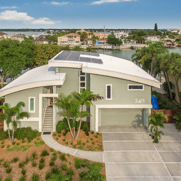
The Cavanaugh Residence is a contemporary split level with a split personality. Totally designed from the ground up to minimize impact and maximize energy and water efficiency, its beautiful facade belies its hard-working, high-producing systems, earning it a LEED Platinum score of 116.5, and a HERS rating of minus 22. The 2774 square foot home produces over 100 per cent of its power with a 10.8 kw pv system, and captures 100 per cent of its freshwater needs from the curved metal roofs through an engineered collection and purification system, stored in an integrated concrete cistern.
Constructed of locally made SIP panels on an infill waterfront lot, the home is oriented to maximize the production of the pv panels. Six inch SIP panels work together with a highly reflective, highly emmisive cool standing seam roof, icynene insulation in ceiling and floors, and carefully placed high efficiency windows and doors to create a tightly sealed environment. The 17-seer Trane heat pump variable speed compressors and TAM 7 air handlers, along with a whole house dehumidifier and fresh air intake provide a comfortable, clean indoor environment while using little energy. In the shoulder seasons, natural ventilation cools the home with fresh breezes drawn from lower windows in each room flowing through the curved ceilings to clerestory windows at the top of the house.
Natural daylighting, with windows placed in corners and high clerestories, bounce the abundant natural light so that the owners use the interior LED lighting primarily at night. Windows were sited to frame views of the neighboring park and water, and capture the light, but represent a very low percentage of glazing to wall to conserve energy.
Primarily native, xeriscaped turfless landscaping sips reclaimed water from its drip and bubbler irrigiation system, and requires little trimming or chemicals. Established trees, protected during construction, shade the home, FSC certified decks, and yard, providing a cool place to enjoy the outdoors at any time of the day, even in Florida's summer heat.
Rainwater is diverted from the bay through the engineered collection and filtration system to an integrated concrete cistern hidden beneath the decks. Abundant Florida rainwater supplies 100 per cent of the home's needs, including drinking, bathing, and cleaning. Naturally soft, the highly filtered and UV purified water requires no chemical treatment or water softener. Coupled with minimal hardscape and permeable drive and walkways, almost all ground water remains on the lot, and out of storm sewers and bay runoffs.
Designed as a forever home for this active retired couple, an open floor plan provides diagonal interior views along with great circulation space. Wide hallways and doors, curbless showers, an elevator, and extra blocking in the walls for grab rails insures the couple of being able to use their home even if physical disabilities arise.
The home's footprint is minimized by building over the conditioned crawlspace and over-sized garage, and the finished floor height, at least two feet above flood code requirements, significantly reduces insurance costs while maximizing storage space for camping and water sports equipment.
Materials, fixtures and appliances were carefully selected for energy and water efficiency, local production where possible, recycled content/recyclability, durability, and cost-effectiveness. The owners were very involved in vetting and materials selections, and assisted in just-in-time purchasing to minimize waste. Scrap materials were sorted daily for re-use elsewhere in the project (blocking, concrete forms, drywall scraps as acoustical insulation in interior walls, etc.), resulting in a tiny waste pile at the end of a dumpster-free project. Concrete waste was hauled to a local recycler to become road base, and extra useable materials were returned to the vendor or donated to Habitat Restore.
Cost-effective choices, and careful planning, saved significant dollars in construction cost as well as landfill space.
One of the biggest challenges was finding qualified subcontractors who would work within the guidelines. With the help of our LEED consultant and meetings and explanations, most subcontractors not only bought into the ideas readily, but offered up new ideas. Highly skilled and professional, the team of subs, LEED consultant, and contractor proved that LEED construction is excellent construction.
The team, the owners, and I also found that LEED construction makes great economic sense. Most materials (other than increased insulation and photovoltaic panels) cost no more, and sometimes less, than those employed in construction of a lesser standard. The owners have been living in the home for a year now, and are thrilled with the results. No power bill. No water bill. Extremely low insurance bill. Minimal ground maintenance. No fabric softener. Reduced use of soap, detergents, and shampoos and cleaning supplies. Less time cleaning with spot-free rainwater. Careful planning and materials selection brought the project in under budget, and the home operates at an extremely low cost, both to the homeowners, and the environment. Who wouldn't be thrilled?
8