
Search results for "Systems increases" in Home Design Ideas
 Drury Design
THE SETUP
The original primary bathroom was characterized by a disjointed and segmented layout. The shower featured a bulky glass-block enclosure that overwhelmed the space visually. There was a considerable amount of open, unused space, and despite having a his and hers vanity, the arrangement lacked personal space for each user, as they shared the conjoined space between the sinks. The toilet was inconveniently located right by the door, with a half-wall partition meant to provide privacy but instead contributing to a cramped and unbalanced feel. Overall, the bathroom’s layout and design were fragmented, failing to make the most of the available space and lacking adequate storage solutions.
Design objectives:
- Reconfigure the layout to enhance functionality and flow.
- Create an elegant, upscale aesthetic that is light and bright.
- Incorporate specialized storage solutions for female hair care needs.
- Increase overall storage capacity.
- Develop a spa-like shower experience.
- Provide a significant wow factor to the space.
THE REMODEL
Design challenges to be solved:
- Repositioning the toilet to a more suitable location.
- Designing hair care storage solutions without cluttering the elegant space.
- Balancing an upscale, elegant design with a feminine touch in the color palette.
- Increasing the brightness of the room without adding windows.
- Completely replacing the existing shower to create a spa-like experience.
- Planning new storage solutions without adding bulkiness or clutter to the cabinetry.
THE RENEWED SPACE
Design solutions:
Toilet Relocation: Moved the toilet by the window, creating a better overall layout that also opened up two full walls for cabinetry and storage solutions.
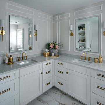
Specialized Vanity Storage: The left side of the left vanity is the wife’s. Open shelves facing across the vanity can be used for decorative or daily needs items. Pull-out docking drawers with power outlets and metal basins handle hot hair appliances.
Bright and Elegant Color Scheme: White cabinets, countertops, floors, and shower walls keep the space bright. The just-off-white wall color with a hint of pink adds a feminine touch. Thin wainscoting with white trim offers traditional-leaning elegance.
Layered Lighting Strategy: Ceiling can lights, sconces, lighted mirrors, and toe-kick lighting were installed. Natural light-rated bulbs keep the space bright and natural-feeling.
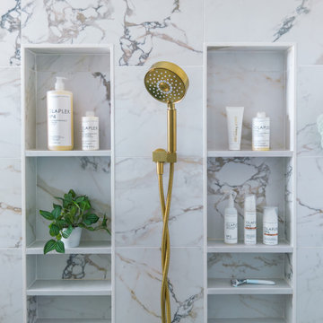
Spa-Like Shower: An extra-large shower was created using the same floor tile materials for continuity. Equipped with a Kohler Anthem system with a shower head, hand-held, and four body sprays. His and Hers niches for separate body care product storage.
Enhanced Storage Solutions: Added a linen cabinet within the vanity area for efficient storage of towels and bathroom essentials.
This elegant bathroom feels incredibly spacious now. The color palette and lights keep the room bright and cheery. Gold fixtures, the herringbone pattern on the floor, and exquisite trim work add an elegant touch. With the husband and wife having their own vanity wall sections joined at the corner, each user truly has their own space within the space. The clients are very happy with the final result.
 Dimensions in Wood Inc
This client’s vision for their kitchen/hearth room remodel was to create a harmonious space for gathering and socializing with family and friends. Without the before and after photos, you would scarcely believe this was the same home.
This huge home renovation perfectly illustrates that Dimensions In Wood’s expert team can handle every aspect of your remodeling project. Plumbing, flooring, electrical wiring, custom cabinets, structural engineering, appliances, windows, interior and exterior doors, entertainment and more. Contact us today to discuss Translating Your Visions into Reality
The client was interested in new appliance technology, cabinetry to the ceiling, and an Island large enough to seat 3. They also wanted a built-in breakfast nook, improved pantry space, more functional storage on either side of their fireplace, and a built-in appearance for the TV above the mantel. The original built-in desk was not used, and they preferred for that space to serve as a small bar area with refrigeration and a place to store their printer. We designed several plans for the space before selecting the final layout.
The new design required the removal of the soffit over the old sink, as well as a small wall beside the old refrigerator. The wall beside the stairwell had to be shortened 13 inches and a new beam installed to carry the load of the home’s 2nd story to gain enough space for the large central island. The existing closet pantry walls were also reconfigured as per the new plan.
This serves as a great reminder that Dimensions In Wood is much more than just custom cabinets.
Central to the entire custom kitchen is an 8-foot Walnut island. The huge island, which comfortably seats three, is topped with Essenza Blue quartzite. The stone’s natural striations are beautiful. Quartzite is harder than granite, and less likely to stain than other stones because of its density. The couple had to look through multiple slabs to find a piece they LOVED. The island’s custom Walnut cabinetry, built to resemble a piece of custom furniture, was stained Bronzed Walnut by Sherwin Williams.
The 4-foot Galley Workstation in the island, handles all the kitchen’s prep, serving, and cleanup needs. The Galley’s culinary tools include an upper tier cutting board, upper tier drying rack, 2 lower tier platforms, 11″ colander with non-slip handles, and 11” mixing bowl with lid and non-slip bottom. Learn more about the amazing Galley Workstation here. A Waterstone gantry faucet in a pewter finish combines a pull-down sprayer for maximum mobility and a articulated swivel spout. A water tap with reverse osmosis filter provides the highest quality drinking water. To keep a clean and sleek counter we installed a raised air switch for the garbage disposal and integrated soap dispenser. The island also houses the Thermador Sapphire 7-Program Dishwasher with a hidden touch control panel and a custom Walnut wood front. The cabinetry under the Galley Workstation features a trash roll out, as well as storage for the culinary tools.
Shortening the stairwell wall, and reframing around the stairs, which included shortening the handrail, also made room for a bi-fold door walk-in pantry with extra roll out storage and space for a small microwave. Above the panty doors is a remote controlled, electric motor powered, lift up cabinet door which hides a flat screen TV, used while the family is cooking.
To the right of the walk-in pantry is cold food storage. The Thermador, 30-inch Freedom Collection refrigerator and 24-inch built-in freezer column with internal ice maker are covered with matching cabinetry fronts. An open display space was designed above the units, creating an aesthetically beautiful wall. To the right of the refrigerator & freezer columns is a tall cabinet designed for the built-in Thermador steam and convection oven. The convention steam oven is a relatively new technology for homes, but its versatility and food quality is amazing. To the right of this is a pull-out appliance pantry which provides easy access and storage for a stand mixer, blender, and any other appliance you do not want to clutter the counter.
The most visible wall of the kitchen features the 36-inch Thermador Professional Series Harmony Gas Range with Griddle. Between the range and custom designed wood hood, a framed mosaic tile accent in the backsplash, creates a focal point. To clear the air, the Professional Series Thermador 42-inch ventilation insert provides excellent exhaust capabilities, as well as providing multi-level, vivid LED lights for beautiful illumination.
The wall cabinetry symmetrically flanks the custom hood, utilizing deeper wall cabinetry on each end, allowing for storage of oversized dishware. The base cabinetry on this wall is made up of drawers, except for the corner, which is a Kesseböhmer LeMans II. This specially designed shelf system allows ease of access in underutilized blind corners. The dual action articulation system with soft close mechanism ensures a smooth open and close.
Rounding the corner to the outside wall, the base cabinetry was built to a narrower depth, providing additional space for the island, as well as easier access to the new larger pass-thru window which serves the screen porch. The client selected Black Vermont granite countertops with an ogee edge to contrast the Linen White painted cabinetry.
The door to the screen porch was replaced with a Marvin Exterior Door with a raised panel at the bottom of the 3⁄4 glass door.
Marvin Windows replaced the other windows in the space increasing the energy efficiency and value of the home. To establish the breakfast nook, a bench with drawers and an upholstered seat was built into the bay area of the room.
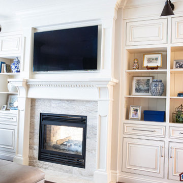
Custom bookshelves were built with open shelves, cabinet doors, and drawers on either side of the fireplace. A new stone hearth and fireplace surround were installed. Above the existing mantel we built a recessed space for the flat screen television hiding all wiring inside the walls for a completely clean look.
The space that was once a desk was transformed into a bar area. The glass shelves and glass cabinet front liquor cabinet stand out. But this bar area has hidden secrets. Tucked beneath the black granite is a Thermador under-counter double drawer refrigerator with matching wood front panels. They blend in perfectly with the cabinets. A wireless printer is easily accessed on a slide out drawer. Plus, what looks like merely wooden panels on the wall are concealing recessed storage for more bottles and glasses!
Overhead recessed lighting and speaker system provide illumination and entertainment through the entire space.
This luxury home had original, solid oak flooring through most of the first floor which the homeowner obviously wanted to keep but were in desperate need of repair and refinishing. Our master craftsmen wove in new wood flooring to match the old where needed, particularly where walls had been changed and where the floor was damaged. We sanded the floors, smoothing away years of wear and tear. The entire wood floor was then uniformly stained, making it impossible to differentiate where any repairs were made.
If this renovation has inspired you, then contact us today! There is no limit to our Dimensions.
 Drury Design
THE SETUP
The original primary bathroom was characterized by a disjointed and segmented layout. The shower featured a bulky glass-block enclosure that overwhelmed the space visually. There was a considerable amount of open, unused space, and despite having a his and hers vanity, the arrangement lacked personal space for each user, as they shared the conjoined space between the sinks. The toilet was inconveniently located right by the door, with a half-wall partition meant to provide privacy but instead contributing to a cramped and unbalanced feel. Overall, the bathroom’s layout and design were fragmented, failing to make the most of the available space and lacking adequate storage solutions.
Design objectives:
- Reconfigure the layout to enhance functionality and flow.
- Create an elegant, upscale aesthetic that is light and bright.
- Incorporate specialized storage solutions for female hair care needs.
- Increase overall storage capacity.
- Develop a spa-like shower experience.
- Provide a significant wow factor to the space.
THE REMODEL
Design challenges to be solved:
- Repositioning the toilet to a more suitable location.
- Designing hair care storage solutions without cluttering the elegant space.
- Balancing an upscale, elegant design with a feminine touch in the color palette.
- Increasing the brightness of the room without adding windows.
- Completely replacing the existing shower to create a spa-like experience.
- Planning new storage solutions without adding bulkiness or clutter to the cabinetry.
THE RENEWED SPACE
Design solutions:
Toilet Relocation: Moved the toilet by the window, creating a better overall layout that also opened up two full walls for cabinetry and storage solutions.
Specialized Vanity Storage: The left side of the left vanity is the wife’s. Open shelves facing across the vanity can be used for decorative or daily needs items. Pull-out docking drawers with power outlets and metal basins handle hot hair appliances.
Bright and Elegant Color Scheme: White cabinets, countertops, floors, and shower walls keep the space bright. The just-off-white wall color with a hint of pink adds a feminine touch. Thin wainscoting with white trim offers traditional-leaning elegance.
Layered Lighting Strategy: Ceiling can lights, sconces, lighted mirrors, and toe-kick lighting were installed. Natural light-rated bulbs keep the space bright and natural-feeling.
Spa-Like Shower: An extra-large shower was created using the same floor tile materials for continuity. Equipped with a Kohler Anthem system with a shower head, hand-held, and four body sprays. His and Hers niches for separate body care product storage.
Enhanced Storage Solutions: Added a linen cabinet within the vanity area for efficient storage of towels and bathroom essentials.
This elegant bathroom feels incredibly spacious now. The color palette and lights keep the room bright and cheery. Gold fixtures, the herringbone pattern on the floor, and exquisite trim work add an elegant touch. With the husband and wife having their own vanity wall sections joined at the corner, each user truly has their own space within the space. The clients are very happy with the final result.
Find the right local pro for your project
 JRP Design & Remodel
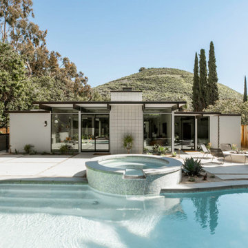
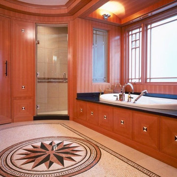
Eichler Orange is a stunning expression of mid-century modern architecture. The vision in modernizing this historic Eichler home with a 21st-century makeover was to honor the work of Joseph Eichler and restore it to the 1964 icon of California modernism it once was.
The clean aesthetics of this home features glass walls, post and beam, tongue and groove ceilings, and oversize porcelain tile floors throughout. The free-flowing indoor/outdoor floorplan is highlighted with a signature atrium, and all material selections were made to honor the time period. Custom cherry cabinets and warm slab walnut doors grace the interior.
This home had significant structural termite damage with three-quarters of the framing needing replacement. Additionally, the original house did not come close to meeting the current seismic codes. During reconstruction, we upgraded the post and beam structure with seismic hold-downs and concealed fasteners. The house lacked energy efficiency due to its flat roof and did not meet California’s current Title 24 energy-efficient standards. While honoring its era, this fully renovated residence is now updated with today’s energy efficiencies, including all-aluminum dual-glazed windows and doors, new spray foam insulation atop the flat roof, and tankless water heaters.
A new photovoltaic solar system was added. We abandoned the radiant floor heat and installed a new high-efficiency ductless heating and air units to each room. This increased the building’s performance and provided each room with its own thermostat and control. This system also allowed us to eliminate soffits and ductwork and maintain the exposed tongue and groove ceiling throughout the home.
The living space next to the family and dining room was repurposed to relocate the washer and dryer and allowed space to add a third bathroom. The primary bathroom was also reconfigured for a larger layout.
The sleek kitchen design includes frameless Crystal Cabinets, professional-grade Miele appliances, a large stainless steel Sub-Zero refrigerator/freezer, and a generous Caesarstone countertop workspace.
The outdoor backyard living space captures the natural beauty of Southern California and mid-century modern features, including drought-resistant landscaping with decomposed granite planter areas and all-new concrete hardscape. A new spa was added to the existing pool, along with a new BBQ area and firepit.
Photographer: Public 311 Design
 Vanco Construction Inc.
Master Bathroom Construction:
Luxury can be incorporated into any master bathroom renovation. Remodeling takes proper planning and construction. A bathroom must stand up to high humidity, unique electrical needs, safe slip-proof floors, and adequate lighting. As bathroom remodel contractors we listen and translate your preferences into a stylish, quiet retreat. Vanco Construction can help you select materials and features that fit within your budget and suggest alternatives to improve the room’s function and style such as hanging an extravagant chandelier; add built-in heated towel bars or install a pass-through fireplace for ambience and warmth. You might also consider increasing the master bathroom's convenience by housing your washer and dryer, adjacent dressing rooms or even massage tables in the space.
Additional finishing touches will add that extra bit of luxury to an already spa-like master bath remodel. Warming floors, sound systems and flat screens are becoming more popular in in-mirror models and the sound emanates from the glass shower door. Universal design in master bathrooms is the approach to accommodate people of all ages and abilities, which includes wider doorways, showers with no raised lip around the bottom, larger shower doors and more room around and under the counters/sinks. Universal elements such as grab bars now blend seamlessly into even the most luxurious master bathrooms. Vanco Construction can guide you and the remodeling of your master bathroom quickly, cleanly and within budget. Give us a call (973) 994-0616
 Drury Design
THE SETUP
The original primary bathroom was characterized by a disjointed and segmented layout. The shower featured a bulky glass-block enclosure that overwhelmed the space visually. There was a considerable amount of open, unused space, and despite having a his and hers vanity, the arrangement lacked personal space for each user, as they shared the conjoined space between the sinks. The toilet was inconveniently located right by the door, with a half-wall partition meant to provide privacy but instead contributing to a cramped and unbalanced feel. Overall, the bathroom’s layout and design were fragmented, failing to make the most of the available space and lacking adequate storage solutions.
Design objectives:
- Reconfigure the layout to enhance functionality and flow.
- Create an elegant, upscale aesthetic that is light and bright.
- Incorporate specialized storage solutions for female hair care needs.
- Increase overall storage capacity.
- Develop a spa-like shower experience.
- Provide a significant wow factor to the space.
THE REMODEL
Design challenges to be solved:
- Repositioning the toilet to a more suitable location.
- Designing hair care storage solutions without cluttering the elegant space.
- Balancing an upscale, elegant design with a feminine touch in the color palette.
- Increasing the brightness of the room without adding windows.
- Completely replacing the existing shower to create a spa-like experience.
- Planning new storage solutions without adding bulkiness or clutter to the cabinetry.
THE RENEWED SPACE
Design solutions:
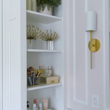
Toilet Relocation: Moved the toilet by the window, creating a better overall layout that also opened up two full walls for cabinetry and storage solutions.
Specialized Vanity Storage: The left side of the left vanity is the wife’s. Open shelves facing across the vanity can be used for decorative or daily needs items. Pull-out docking drawers with power outlets and metal basins handle hot hair appliances.
Bright and Elegant Color Scheme: White cabinets, countertops, floors, and shower walls keep the space bright. The just-off-white wall color with a hint of pink adds a feminine touch. Thin wainscoting with white trim offers traditional-leaning elegance.
Layered Lighting Strategy: Ceiling can lights, sconces, lighted mirrors, and toe-kick lighting were installed. Natural light-rated bulbs keep the space bright and natural-feeling.
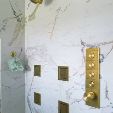
Spa-Like Shower: An extra-large shower was created using the same floor tile materials for continuity. Equipped with a Kohler Anthem system with a shower head, hand-held, and four body sprays. His and Hers niches for separate body care product storage.
Enhanced Storage Solutions: Added a linen cabinet within the vanity area for efficient storage of towels and bathroom essentials.
This elegant bathroom feels incredibly spacious now. The color palette and lights keep the room bright and cheery. Gold fixtures, the herringbone pattern on the floor, and exquisite trim work add an elegant touch. With the husband and wife having their own vanity wall sections joined at the corner, each user truly has their own space within the space. The clients are very happy with the final result.
 Drury Design
THE SETUP
The original primary bathroom was characterized by a disjointed and segmented layout. The shower featured a bulky glass-block enclosure that overwhelmed the space visually. There was a considerable amount of open, unused space, and despite having a his and hers vanity, the arrangement lacked personal space for each user, as they shared the conjoined space between the sinks. The toilet was inconveniently located right by the door, with a half-wall partition meant to provide privacy but instead contributing to a cramped and unbalanced feel. Overall, the bathroom’s layout and design were fragmented, failing to make the most of the available space and lacking adequate storage solutions.
Design objectives:
- Reconfigure the layout to enhance functionality and flow.
- Create an elegant, upscale aesthetic that is light and bright.
- Incorporate specialized storage solutions for female hair care needs.
- Increase overall storage capacity.
- Develop a spa-like shower experience.
- Provide a significant wow factor to the space.
THE REMODEL
Design challenges to be solved:
- Repositioning the toilet to a more suitable location.
- Designing hair care storage solutions without cluttering the elegant space.
- Balancing an upscale, elegant design with a feminine touch in the color palette.
- Increasing the brightness of the room without adding windows.
- Completely replacing the existing shower to create a spa-like experience.
- Planning new storage solutions without adding bulkiness or clutter to the cabinetry.
THE RENEWED SPACE
Design solutions:
Toilet Relocation: Moved the toilet by the window, creating a better overall layout that also opened up two full walls for cabinetry and storage solutions.
Specialized Vanity Storage: The left side of the left vanity is the wife’s. Open shelves facing across the vanity can be used for decorative or daily needs items. Pull-out docking drawers with power outlets and metal basins handle hot hair appliances.
Bright and Elegant Color Scheme: White cabinets, countertops, floors, and shower walls keep the space bright. The just-off-white wall color with a hint of pink adds a feminine touch. Thin wainscoting with white trim offers traditional-leaning elegance.
Layered Lighting Strategy: Ceiling can lights, sconces, lighted mirrors, and toe-kick lighting were installed. Natural light-rated bulbs keep the space bright and natural-feeling.
Spa-Like Shower: An extra-large shower was created using the same floor tile materials for continuity. Equipped with a Kohler Anthem system with a shower head, hand-held, and four body sprays. His and Hers niches for separate body care product storage.
Enhanced Storage Solutions: Added a linen cabinet within the vanity area for efficient storage of towels and bathroom essentials.
This elegant bathroom feels incredibly spacious now. The color palette and lights keep the room bright and cheery. Gold fixtures, the herringbone pattern on the floor, and exquisite trim work add an elegant touch. With the husband and wife having their own vanity wall sections joined at the corner, each user truly has their own space within the space. The clients are very happy with the final result.
Sponsored
Columbus, OH

Hope Restoration & General Contracting
Columbus Design-Build, Kitchen & Bath Remodeling, Historic Renovations
 Utopia 360 Studio
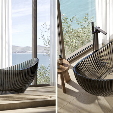
Leader Online, a UK-based company, approached us to support the launch of Nosa, a new sanitary ware brand targeting the British market.
With competition in the sector increasing, they required a cohesive set of visuals for their numerous products to establish a consistent visual language across e-commerce platforms, catalogs, and promotional materials.
It was a complete brand creation from scratch, and we pulled it off.
Key tasks:
- Develop a cohesive visual brand identity for Nosa
- Produce over 2,000 high-quality 3D visualizations
within five months
- Optimize workflows for high efficiency and a unified
visual standard
Our approach:
To efficiently manage high production volumes and accelerate feedback, we implemented an optimized workflow system. This transformed our render production into an assembly line, drastically cutting individual product processing time while upholding top image quality.
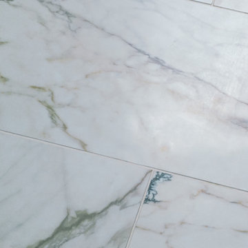
Nosa's unique marble, with its distinct veins and inclusions, was central to their brand. Since no existing textures matched, we requested physical samples.
Upon receiving the stone, we set up an improvised photo studio, capturing every detail. Our goal was
not just to replicate the marble in 3D, but to preserve
its raw, organic beauty.
We applied the same meticulous process to metal materials for accurate shade representation. Nosa prioritized authenticity, ensuring buyers saw the true material, not an over-polished version.
Result:
Nosa's market entry surpassed all expectations.
Fueled by its compelling visual identity, the brand achieved strong initial sales and is now rapidly expanding its product range, cementing its presence.
We are proud to continue our partnership with Nosa
to this day.
 Renovisions
These South Shore of Boston homeowners are no different than many recent clients who show an interest in upgrading their dated and aged bathrooms. They are looking to modernize, reflecting today’s bath trends but also desire increased re-sale value with new fixtures, tile and ventilation system. Given the time we spend in our baths, it is not surprising. (A recent Houzz, survey found that 60% of people occupy their bathrooms for at least one hour per day plus 58% of people surveyed said they use their smart phone or tablet to handle a multitude of activities.)
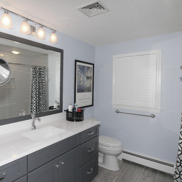
This stunning full bath Renovision involved replacing the existing builder-grade vanity, sink and faucet with striking dark blue cabinetry featuring a bank of three deep drawers on each side of a two-door sink base. This client likes the new standard vanity height, no 34.5” which allows more storage space for cosmetic and cleaning supply items.
Silestone’s Blanco Zeus countertop clearly modernizes the look and feel of this bath and doesn’t take away from the grey wood-look planked porcelain tiled floor which is on trend. The tub/shower walls with niche for shampoos and 3”x6” white subway tiles reflect a classic, clean and fresh look. The curved shower rod provides additional room while showering and its chrome finish ties in with the new shiny fixtures.
Adding a few architectural elements definitely enhanced this bath. Renovisions re-worked the existing closet space with a custom built piece which included open shelving to store bath towels and door(s) on the bottom to accommodate laundry hamper.
This furniture-look closet along with the window, trims and plantation shutters were color matched in the same white painted finish; stylish and sensible indeed!
 Utopia 360 Studio
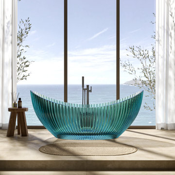
Leader Online, a UK-based company, approached us to support the launch of Nosa, a new sanitary ware brand targeting the British market.
With competition in the sector increasing, they required a cohesive set of visuals for their numerous products to establish a consistent visual language across e-commerce platforms, catalogs, and promotional materials.
It was a complete brand creation from scratch, and we pulled it off.
Key tasks:
- Develop a cohesive visual brand identity for Nosa
- Produce over 2,000 high-quality 3D visualizations
within five months
- Optimize workflows for high efficiency and a unified
visual standard
Our approach:
To efficiently manage high production volumes and accelerate feedback, we implemented an optimized workflow system. This transformed our render production into an assembly line, drastically cutting individual product processing time while upholding top image quality.
Nosa's unique marble, with its distinct veins and inclusions, was central to their brand. Since no existing textures matched, we requested physical samples.
Upon receiving the stone, we set up an improvised photo studio, capturing every detail. Our goal was
not just to replicate the marble in 3D, but to preserve
its raw, organic beauty.
We applied the same meticulous process to metal materials for accurate shade representation. Nosa prioritized authenticity, ensuring buyers saw the true material, not an over-polished version.
Result:
Nosa's market entry surpassed all expectations.
Fueled by its compelling visual identity, the brand achieved strong initial sales and is now rapidly expanding its product range, cementing its presence.
We are proud to continue our partnership with Nosa
to this day.
 Renovisions
These South Shore of Boston homeowners are no different than many recent clients who show an interest in upgrading their dated and aged bathrooms. They are looking to modernize, reflecting today’s bath trends but also desire increased re-sale value with new fixtures, tile and ventilation system. Given the time we spend in our baths, it is not surprising. (A recent Houzz, survey found that 60% of people occupy their bathrooms for at least one hour per day plus 58% of people surveyed said they use their smart phone or tablet to handle a multitude of activities.)
This stunning full bath Renovision involved replacing the existing builder-grade vanity, sink and faucet with striking dark blue cabinetry featuring a bank of three deep drawers on each side of a two-door sink base. This client likes the new standard vanity height, no 34.5” which allows more storage space for cosmetic and cleaning supply items.
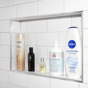
Silestone’s Blanco Zeus countertop clearly modernizes the look and feel of this bath and doesn’t take away from the grey wood-look planked porcelain tiled floor which is on trend. The tub/shower walls with niche for shampoos and 3”x6” white subway tiles reflect a classic, clean and fresh look. The curved shower rod provides additional room while showering and its chrome finish ties in with the new shiny fixtures.
Adding a few architectural elements definitely enhanced this bath. Renovisions re-worked the existing closet space with a custom built piece which included open shelving to store bath towels and door(s) on the bottom to accommodate laundry hamper.
This furniture-look closet along with the window, trims and plantation shutters were color matched in the same white painted finish; stylish and sensible indeed!
 Dimensions in Wood Inc
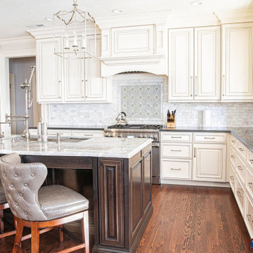
This client’s vision for their kitchen/hearth room remodel was to create a harmonious space for gathering and socializing with family and friends. Without the before and after photos, you would scarcely believe this was the same home.
This huge home renovation perfectly illustrates that Dimensions In Wood’s expert team can handle every aspect of your remodeling project. Plumbing, flooring, electrical wiring, custom cabinets, structural engineering, appliances, windows, interior and exterior doors, entertainment and more. Contact us today to discuss Translating Your Visions into Reality
The client was interested in new appliance technology, cabinetry to the ceiling, and an Island large enough to seat 3. They also wanted a built-in breakfast nook, improved pantry space, more functional storage on either side of their fireplace, and a built-in appearance for the TV above the mantel. The original built-in desk was not used, and they preferred for that space to serve as a small bar area with refrigeration and a place to store their printer. We designed several plans for the space before selecting the final layout.
The new design required the removal of the soffit over the old sink, as well as a small wall beside the old refrigerator. The wall beside the stairwell had to be shortened 13 inches and a new beam installed to carry the load of the home’s 2nd story to gain enough space for the large central island. The existing closet pantry walls were also reconfigured as per the new plan.
This serves as a great reminder that Dimensions In Wood is much more than just custom cabinets.
Central to the entire custom kitchen is an 8-foot Walnut island. The huge island, which comfortably seats three, is topped with Essenza Blue quartzite. The stone’s natural striations are beautiful. Quartzite is harder than granite, and less likely to stain than other stones because of its density. The couple had to look through multiple slabs to find a piece they LOVED. The island’s custom Walnut cabinetry, built to resemble a piece of custom furniture, was stained Bronzed Walnut by Sherwin Williams.
The 4-foot Galley Workstation in the island, handles all the kitchen’s prep, serving, and cleanup needs. The Galley’s culinary tools include an upper tier cutting board, upper tier drying rack, 2 lower tier platforms, 11″ colander with non-slip handles, and 11” mixing bowl with lid and non-slip bottom. Learn more about the amazing Galley Workstation here. A Waterstone gantry faucet in a pewter finish combines a pull-down sprayer for maximum mobility and a articulated swivel spout. A water tap with reverse osmosis filter provides the highest quality drinking water. To keep a clean and sleek counter we installed a raised air switch for the garbage disposal and integrated soap dispenser. The island also houses the Thermador Sapphire 7-Program Dishwasher with a hidden touch control panel and a custom Walnut wood front. The cabinetry under the Galley Workstation features a trash roll out, as well as storage for the culinary tools.
Shortening the stairwell wall, and reframing around the stairs, which included shortening the handrail, also made room for a bi-fold door walk-in pantry with extra roll out storage and space for a small microwave. Above the panty doors is a remote controlled, electric motor powered, lift up cabinet door which hides a flat screen TV, used while the family is cooking.
To the right of the walk-in pantry is cold food storage. The Thermador, 30-inch Freedom Collection refrigerator and 24-inch built-in freezer column with internal ice maker are covered with matching cabinetry fronts. An open display space was designed above the units, creating an aesthetically beautiful wall. To the right of the refrigerator & freezer columns is a tall cabinet designed for the built-in Thermador steam and convection oven. The convention steam oven is a relatively new technology for homes, but its versatility and food quality is amazing. To the right of this is a pull-out appliance pantry which provides easy access and storage for a stand mixer, blender, and any other appliance you do not want to clutter the counter.
The most visible wall of the kitchen features the 36-inch Thermador Professional Series Harmony Gas Range with Griddle. Between the range and custom designed wood hood, a framed mosaic tile accent in the backsplash, creates a focal point. To clear the air, the Professional Series Thermador 42-inch ventilation insert provides excellent exhaust capabilities, as well as providing multi-level, vivid LED lights for beautiful illumination.
The wall cabinetry symmetrically flanks the custom hood, utilizing deeper wall cabinetry on each end, allowing for storage of oversized dishware. The base cabinetry on this wall is made up of drawers, except for the corner, which is a Kesseböhmer LeMans II. This specially designed shelf system allows ease of access in underutilized blind corners. The dual action articulation system with soft close mechanism ensures a smooth open and close.
Rounding the corner to the outside wall, the base cabinetry was built to a narrower depth, providing additional space for the island, as well as easier access to the new larger pass-thru window which serves the screen porch. The client selected Black Vermont granite countertops with an ogee edge to contrast the Linen White painted cabinetry.
The door to the screen porch was replaced with a Marvin Exterior Door with a raised panel at the bottom of the 3⁄4 glass door.
Marvin Windows replaced the other windows in the space increasing the energy efficiency and value of the home. To establish the breakfast nook, a bench with drawers and an upholstered seat was built into the bay area of the room.
Custom bookshelves were built with open shelves, cabinet doors, and drawers on either side of the fireplace. A new stone hearth and fireplace surround were installed. Above the existing mantel we built a recessed space for the flat screen television hiding all wiring inside the walls for a completely clean look.
The space that was once a desk was transformed into a bar area. The glass shelves and glass cabinet front liquor cabinet stand out. But this bar area has hidden secrets. Tucked beneath the black granite is a Thermador under-counter double drawer refrigerator with matching wood front panels. They blend in perfectly with the cabinets. A wireless printer is easily accessed on a slide out drawer. Plus, what looks like merely wooden panels on the wall are concealing recessed storage for more bottles and glasses!
Overhead recessed lighting and speaker system provide illumination and entertainment through the entire space.
This luxury home had original, solid oak flooring through most of the first floor which the homeowner obviously wanted to keep but were in desperate need of repair and refinishing. Our master craftsmen wove in new wood flooring to match the old where needed, particularly where walls had been changed and where the floor was damaged. We sanded the floors, smoothing away years of wear and tear. The entire wood floor was then uniformly stained, making it impossible to differentiate where any repairs were made.
If this renovation has inspired you, then contact us today! There is no limit to our Dimensions.
 JRP Design & Remodel
Eichler Orange is a stunning expression of mid-century modern architecture. The vision in modernizing this historic Eichler home with a 21st-century makeover was to honor the work of Joseph Eichler and restore it to the 1964 icon of California modernism it once was.
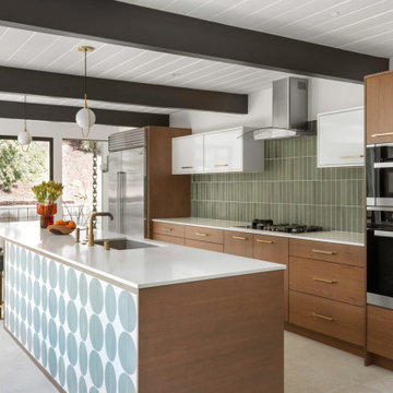
The clean aesthetics of this home features glass walls, post and beam, tongue and groove ceilings, and oversize porcelain tile floors throughout. The free-flowing indoor/outdoor floorplan is highlighted with a signature atrium, and all material selections were made to honor the time period. Custom cherry cabinets and warm slab walnut doors grace the interior.
This home had significant structural termite damage with three-quarters of the framing needing replacement. Additionally, the original house did not come close to meeting the current seismic codes. During reconstruction, we upgraded the post and beam structure with seismic hold-downs and concealed fasteners. The house lacked energy efficiency due to its flat roof and did not meet California’s current Title 24 energy-efficient standards. While honoring its era, this fully renovated residence is now updated with today’s energy efficiencies, including all-aluminum dual-glazed windows and doors, new spray foam insulation atop the flat roof, and tankless water heaters.
A new photovoltaic solar system was added. We abandoned the radiant floor heat and installed a new high-efficiency ductless heating and air units to each room. This increased the building’s performance and provided each room with its own thermostat and control. This system also allowed us to eliminate soffits and ductwork and maintain the exposed tongue and groove ceiling throughout the home.
The living space next to the family and dining room was repurposed to relocate the washer and dryer and allowed space to add a third bathroom. The primary bathroom was also reconfigured for a larger layout.
The sleek kitchen design includes frameless Crystal Cabinets, professional-grade Miele appliances, a large stainless steel Sub-Zero refrigerator/freezer, and a generous Caesarstone countertop workspace.
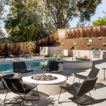
The outdoor backyard living space captures the natural beauty of Southern California and mid-century modern features, including drought-resistant landscaping with decomposed granite planter areas and all-new concrete hardscape. A new spa was added to the existing pool, along with a new BBQ area and firepit.
Photographer: Public 311 Design
Sponsored
Columbus, OH
Hope Restoration & General Contracting
Columbus Design-Build, Kitchen & Bath Remodeling, Historic Renovations
 JRP Design & Remodel
Eichler Orange is a stunning expression of mid-century modern architecture. The vision in modernizing this historic Eichler home with a 21st-century makeover was to honor the work of Joseph Eichler and restore it to the 1964 icon of California modernism it once was.
The clean aesthetics of this home features glass walls, post and beam, tongue and groove ceilings, and oversize porcelain tile floors throughout. The free-flowing indoor/outdoor floorplan is highlighted with a signature atrium, and all material selections were made to honor the time period. Custom cherry cabinets and warm slab walnut doors grace the interior.
This home had significant structural termite damage with three-quarters of the framing needing replacement. Additionally, the original house did not come close to meeting the current seismic codes. During reconstruction, we upgraded the post and beam structure with seismic hold-downs and concealed fasteners. The house lacked energy efficiency due to its flat roof and did not meet California’s current Title 24 energy-efficient standards. While honoring its era, this fully renovated residence is now updated with today’s energy efficiencies, including all-aluminum dual-glazed windows and doors, new spray foam insulation atop the flat roof, and tankless water heaters.
A new photovoltaic solar system was added. We abandoned the radiant floor heat and installed a new high-efficiency ductless heating and air units to each room. This increased the building’s performance and provided each room with its own thermostat and control. This system also allowed us to eliminate soffits and ductwork and maintain the exposed tongue and groove ceiling throughout the home.
The living space next to the family and dining room was repurposed to relocate the washer and dryer and allowed space to add a third bathroom. The primary bathroom was also reconfigured for a larger layout.
The sleek kitchen design includes frameless Crystal Cabinets, professional-grade Miele appliances, a large stainless steel Sub-Zero refrigerator/freezer, and a generous Caesarstone countertop workspace.
The outdoor backyard living space captures the natural beauty of Southern California and mid-century modern features, including drought-resistant landscaping with decomposed granite planter areas and all-new concrete hardscape. A new spa was added to the existing pool, along with a new BBQ area and firepit.
Photographer: Public 311 Design
 Utopia 360 Studio
Leader Online, a UK-based company, approached us to support the launch of Nosa, a new sanitary ware brand targeting the British market.
With competition in the sector increasing, they required a cohesive set of visuals for their numerous products to establish a consistent visual language across e-commerce platforms, catalogs, and promotional materials.
It was a complete brand creation from scratch, and we pulled it off.
Key tasks:
- Develop a cohesive visual brand identity for Nosa
- Produce over 2,000 high-quality 3D visualizations
within five months
- Optimize workflows for high efficiency and a unified
visual standard
Our approach:
To efficiently manage high production volumes and accelerate feedback, we implemented an optimized workflow system. This transformed our render production into an assembly line, drastically cutting individual product processing time while upholding top image quality.
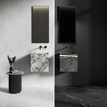
Nosa's unique marble, with its distinct veins and inclusions, was central to their brand. Since no existing textures matched, we requested physical samples.
Upon receiving the stone, we set up an improvised photo studio, capturing every detail. Our goal was
not just to replicate the marble in 3D, but to preserve
its raw, organic beauty.
We applied the same meticulous process to metal materials for accurate shade representation. Nosa prioritized authenticity, ensuring buyers saw the true material, not an over-polished version.
Result:
Nosa's market entry surpassed all expectations.
Fueled by its compelling visual identity, the brand achieved strong initial sales and is now rapidly expanding its product range, cementing its presence.
We are proud to continue our partnership with Nosa
to this day.
 Ernest M. Ferizi
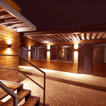
German Embassy in Pristina - Kosovo, contracted the architecture office “Ferizi + Ferizi Architects” to plan and implement an Annex Office building for their purposes. As detached part of this building is designed the waiting area, as alone standing structure.
This Office Building is constructed by assembling of Eight used office containers that were delivered on trucks and set up after only a few hours on the basis of the LEGO principle, according to the planning on strip foundations.
By removing the flexible exterior wall panels, a large room of 115 m² was created, with the counter wall as a room partition between two office spaces, each with seven workstations as well as three counters for agents on one side and a room for visitors on the other side.
With this system, room solutions can be easily implemented in all dimensions.
The container, seen as a geometric shape, is a simple, octagonal, solid box.
The standardized perfection of its dimensions is striking: 2.44 meters wide, 2.59 meters high and 6.06 meters or 12.19 meters long.
Since its introduction in 1956 by the American transport entrepreneur Malcom McLean, the container has become a standardized transport module worldwide, whether on ships, trucks or construction sites.
The shipping containers have additionally revolutionized the transport industry, pushed the globalization noticeably, and thus directly or indirectly influenced all our lives.
But after only a few years, when the first overseas containers wore out, many engineers recognized the positive properties of used shipping containers for building houses, especially since they are robust, flexible, multifunctional and second-hand relatively inexpensive to purchase. The time has long passed by to treat containers exclusively as transport objects.
As a "measure of all things", containers can hardly be ignored in construction.
Their use is no longer limited to temporary use since school containers, information containers, office containers or entire residential buildings are now part of our everyday life in the construction industry.
However, current examples of the container architecture prove that even the most demanding solutions for container building are feasible. For their specific aesthetic and spatial qualities, containers also serve as design parameters for the development of new forms of architecture and urbanity.
The office building as an extension of the visa section, characterized by modern materials and contemporary aesthetics has been designed and built mainly as a low-energy building.
Extensive insulation to achieve a comfortable and sustainable constant temperature in the interior, high window quality and low energy consumption make the building energy-efficient.
The sophisticated lighting technology, networks, heating systems and air-conditioning systems are also components of this equipment.
It creates an overall harmonic picture and guarantees the highest standard in sustainable construction, taking into consideration the fact that environmentally friendly recycling and reutilization have become an increasingly important issue in our society.
West and East side of the wooden facade is compact and has few openings, while the southern facade is completely open with lot of glass. Its spatial openness ensures a transparent, friendly work environment, which allows a lot of light into the space.
This openness allows an uninterrupted, pleasant and close-to-nature view from interior spaces into the beautiful garden. During the installation of sophisticated light sources in the garden, emphasis was not only put on functionality and security, but also on the beauty of the garden shown through the illumination in the evening.
Large, horizontal white “brisole” serve as external sun protection systems, mounted on the canopies of the entrance areas of the modular construction and the enclosure, adeptly cast shade on these areas and at the same time shape the entire architectural language.
While on one hand, the two quadratic ledges suspended in the air, are docked with steel stairs and match the wooden façade, lead the staff to their office space, the artful modern interior, on the other hand, perfectly unites the functionality, innovative technology, culture and positive effects on the employees' efficiency and wellbeing.
A lot of white, interjected by warm wooden and colored accents, determines the ambience.
In the case of the lighting solution, the mainly linear ceiling lighting is used as the overlapping design element both for the offices of the visa section as well as for the counters and the waiting area for the visitors.
They underline the puristic design in order to create a pleasant light for a desired general illumination and ensure optimal light conditions without causing disturbing reflections on the computer screens.
In addition, precisely positioned pendant luminaires are installed at the workstations, which ensure pleasant room brightness.
In the entrance area, the harmonic and uniform lighting effect from the ground highlights the integration of photography and architecture.
Photographs of landscapes, people, places, expressing unforgettable, impressive moments and memories have been lovingly engraved on 8 x 8cm square oak blocks.
The idea of an effective, impressive environment that stimulates and inspires the work was the premiss on which the whole design concept was based. Consequently, the modular construction was no longer viewed through its history of utilization and scars, but rather as a structure of work ambiance, art and elegance.
FERIZI + FERIZI Architects
Photo: Arben Llapashtica
 Drury Design
THE SETUP
The original primary bathroom was characterized by a disjointed and segmented layout. The shower featured a bulky glass-block enclosure that overwhelmed the space visually. There was a considerable amount of open, unused space, and despite having a his and hers vanity, the arrangement lacked personal space for each user, as they shared the conjoined space between the sinks. The toilet was inconveniently located right by the door, with a half-wall partition meant to provide privacy but instead contributing to a cramped and unbalanced feel. Overall, the bathroom’s layout and design were fragmented, failing to make the most of the available space and lacking adequate storage solutions.
Design objectives:
- Reconfigure the layout to enhance functionality and flow.
- Create an elegant, upscale aesthetic that is light and bright.
- Incorporate specialized storage solutions for female hair care needs.
- Increase overall storage capacity.
- Develop a spa-like shower experience.
- Provide a significant wow factor to the space.
THE REMODEL
Design challenges to be solved:
- Repositioning the toilet to a more suitable location.
- Designing hair care storage solutions without cluttering the elegant space.
- Balancing an upscale, elegant design with a feminine touch in the color palette.
- Increasing the brightness of the room without adding windows.
- Completely replacing the existing shower to create a spa-like experience.
- Planning new storage solutions without adding bulkiness or clutter to the cabinetry.
THE RENEWED SPACE
Design solutions:
Toilet Relocation: Moved the toilet by the window, creating a better overall layout that also opened up two full walls for cabinetry and storage solutions.
Specialized Vanity Storage: The left side of the left vanity is the wife’s. Open shelves facing across the vanity can be used for decorative or daily needs items. Pull-out docking drawers with power outlets and metal basins handle hot hair appliances.
Bright and Elegant Color Scheme: White cabinets, countertops, floors, and shower walls keep the space bright. The just-off-white wall color with a hint of pink adds a feminine touch. Thin wainscoting with white trim offers traditional-leaning elegance.
Layered Lighting Strategy: Ceiling can lights, sconces, lighted mirrors, and toe-kick lighting were installed. Natural light-rated bulbs keep the space bright and natural-feeling.
Spa-Like Shower: An extra-large shower was created using the same floor tile materials for continuity. Equipped with a Kohler Anthem system with a shower head, hand-held, and four body sprays. His and Hers niches for separate body care product storage.
Enhanced Storage Solutions: Added a linen cabinet within the vanity area for efficient storage of towels and bathroom essentials.
This elegant bathroom feels incredibly spacious now. The color palette and lights keep the room bright and cheery. Gold fixtures, the herringbone pattern on the floor, and exquisite trim work add an elegant touch. With the husband and wife having their own vanity wall sections joined at the corner, each user truly has their own space within the space. The clients are very happy with the final result.
 JRP Design & Remodel
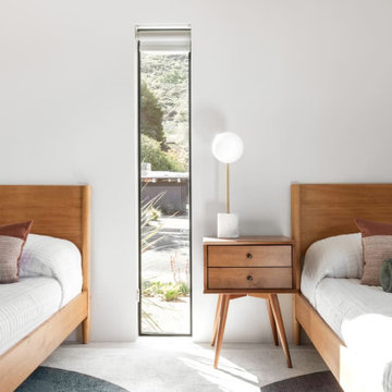
Eichler Orange is a stunning expression of mid-century modern architecture. The vision in modernizing this historic Eichler home with a 21st-century makeover was to honor the work of Joseph Eichler and restore it to the 1964 icon of California modernism it once was.
The clean aesthetics of this home features glass walls, post and beam, tongue and groove ceilings, and oversize porcelain tile floors throughout. The free-flowing indoor/outdoor floorplan is highlighted with a signature atrium, and all material selections were made to honor the time period. Custom cherry cabinets and warm slab walnut doors grace the interior.
This home had significant structural termite damage with three-quarters of the framing needing replacement. Additionally, the original house did not come close to meeting the current seismic codes. During reconstruction, we upgraded the post and beam structure with seismic hold-downs and concealed fasteners. The house lacked energy efficiency due to its flat roof and did not meet California’s current Title 24 energy-efficient standards. While honoring its era, this fully renovated residence is now updated with today’s energy efficiencies, including all-aluminum dual-glazed windows and doors, new spray foam insulation atop the flat roof, and tankless water heaters.
A new photovoltaic solar system was added. We abandoned the radiant floor heat and installed a new high-efficiency ductless heating and air units to each room. This increased the building’s performance and provided each room with its own thermostat and control. This system also allowed us to eliminate soffits and ductwork and maintain the exposed tongue and groove ceiling throughout the home.
The living space next to the family and dining room was repurposed to relocate the washer and dryer and allowed space to add a third bathroom. The primary bathroom was also reconfigured for a larger layout.
The sleek kitchen design includes frameless Crystal Cabinets, professional-grade Miele appliances, a large stainless steel Sub-Zero refrigerator/freezer, and a generous Caesarstone countertop workspace.
The outdoor backyard living space captures the natural beauty of Southern California and mid-century modern features, including drought-resistant landscaping with decomposed granite planter areas and all-new concrete hardscape. A new spa was added to the existing pool, along with a new BBQ area and firepit.
Photographer: Public 311 Design
 CAST architecture
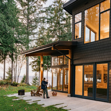
Just north of Seattle, this family home is tucked away on a magical parcel of land within the Edmonds city limits. Designed to maximize the site’s breathtaking views, it is carefully sited to blend into its wooded setting while opening fully to expansive views.
On our first visit, we found a secluded forest glade with stunning vistas of Puget Sound and the Olympic Mountains perched atop a high seaside bluff. Preserving and enhancing this singular landscape as the surrounding neighborhood fills in with development was central to our design.
The approach is intentionally restrained—the home does not reveal itself entirely upon arrival. The house is composed of two wings that cradle the meadow, making it the most important “room.” Interior spaces are oriented towards the lush landscape and impressive views framed by mature trees.
The structures are kept close to the perimeter, leaving the center of the site unbuilt. A covered bridge with a green roof acts as a front porch, linking the upslope garage/office with the main house. A gentle stair flows through the gap between the structures, drawing visitors into the clearing.
The floorplan is highly efficient, carefully tuned to the family’s daily routines. Each room is exactly suited to its purpose, yet no larger than needed.
An open corner with double-height windows creates a jewel-box dining room. Free of a corner structure, the home expands to encompass the covered patio for outdoor cooking and dining, plus easy access to the kitchen, encouraging year-round outdoor living.
Human-scale moments are intentionally created, from a stairway window seat with peekaboo views to a covered outdoor extension of the great room that fosters a cozy relationship between interior and exterior.
Much of the light-filled interior is wrapped in clear-finished fir, giving it a warm glow even on rainy winter days. White oak cabinets and black soapstone countertops add warmth to the kitchen. The built-in furniture in the library loft and the cold-rolled steel fireplace surround were crafted by the owner’s father, an expert woodworker, increasing the connection between the home and its occupants. The second story includes the primary suite with treehouse vibes.
Located on a steep slope in a landslide-prone area, the Edmonds Overlook overcame numerous technical and engineering challenges to address vehicle and fire access, stormwater and erosion mitigation, and potential earth movement.
Green Design:
Compact footprint and conditioned area compared to comparable homes, reducing carbon and ongoing energy use
Green roof at covered entry
Heat-pump air and water heating with multiple zones to maximize efficiency
Whole-house Heat Recovery Ventilation system
Engineered On-Site Stormwater Management System
Landscape restoration using 100% native species, added 47 trees to site, plus meadow plantings
 JRP Design & Remodel
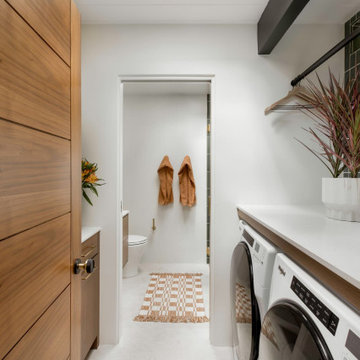
Eichler Orange is a stunning expression of mid-century modern architecture. The vision in modernizing this historic Eichler home with a 21st-century makeover was to honor the work of Joseph Eichler and restore it to the 1964 icon of California modernism it once was.
The clean aesthetics of this home features glass walls, post and beam, tongue and groove ceilings, and oversize porcelain tile floors throughout. The free-flowing indoor/outdoor floorplan is highlighted with a signature atrium, and all material selections were made to honor the time period. Custom cherry cabinets and warm slab walnut doors grace the interior.
This home had significant structural termite damage with three-quarters of the framing needing replacement. Additionally, the original house did not come close to meeting the current seismic codes. During reconstruction, we upgraded the post and beam structure with seismic hold-downs and concealed fasteners. The house lacked energy efficiency due to its flat roof and did not meet California’s current Title 24 energy-efficient standards. While honoring its era, this fully renovated residence is now updated with today’s energy efficiencies, including all-aluminum dual-glazed windows and doors, new spray foam insulation atop the flat roof, and tankless water heaters.
A new photovoltaic solar system was added. We abandoned the radiant floor heat and installed a new high-efficiency ductless heating and air units to each room. This increased the building’s performance and provided each room with its own thermostat and control. This system also allowed us to eliminate soffits and ductwork and maintain the exposed tongue and groove ceiling throughout the home.
The living space next to the family and dining room was repurposed to relocate the washer and dryer and allowed space to add a third bathroom. The primary bathroom was also reconfigured for a larger layout.
The sleek kitchen design includes frameless Crystal Cabinets, professional-grade Miele appliances, a large stainless steel Sub-Zero refrigerator/freezer, and a generous Caesarstone countertop workspace.
The outdoor backyard living space captures the natural beauty of Southern California and mid-century modern features, including drought-resistant landscaping with decomposed granite planter areas and all-new concrete hardscape. A new spa was added to the existing pool, along with a new BBQ area and firepit.
Photographer: Public 311 Design
84