
Search results for "Third get" in Home Design Ideas

 ODS Architecture
Alongside Jeff King & Company, Marina Blvd., won CotY 2016 National Winner of Landscape Design/Outdoor Living
The project was to transform an existing flat roof and master bedroom suite floor into a dramatic deck with kitchen, dining and living areas leading to a stair to an upper deck for America’s Cup race viewing. The existing home is a 3-story 4,000 square foot Spanish Mission-style home built in the 1920’s and sits directly across from the St. Francis Yacht Club on Marina Boulevard in San Francisco – a prime location. No changes were possible for the historic façade and the new construction was to be out of view from the street, as much as possible. Going up the traditionally detailed stairway with decorative railing, you land at the third floor which becomes contemporary in style for the redesigned master bedroom suite, guest bath, sitting room and the roof deck.
Large roof decks require careful attention to waterproofing and a Bison pedestal system was used to create a level deck surface and easy maintenance. Heavy ceramic tile pavers were interspersed with walkable in-floor skylights on the main deck with ipe wood floors at the upper deck and stairs. From both the master bedroom and the outdoor deck you can access a sitting room with large pocket or sliding doors to enclose it. If watching the fireworks on July 4th and it gets cold, people can move to the sitting room which has a fireplace to watch in a heated environment. The sitting room gas fireplace is surrounded by steel with a figured steel panel re-purposed from old sea pier metal that has been cleaned and sealed.
A guest bath is adjacent to the master bath for guest use. A square recessed pattern tile was used to tie the old Spanish Mission-style feeling into the new more contemporary walls. In a large home that was short on storage, a large built-in armoire was built into the master bathroom for extra capacity. The project took two and a half years to complete including design and construction, in part due to historic reviews by the State of California.
 Kitchen Design Concepts
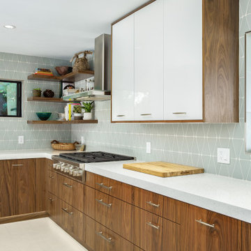
This 1950's kitchen hindered our client's cooking and bi-weekly entertaining and was inconsistent with the home's mid-century architecture. Additional key goals were to improve function for cooking and entertaining 6 to 12 people on a regular basis. Originally with only two entry points to the kitchen (from the entry/foyer and from the dining room) the kitchen wasn’t very open to the remainder of the home, or the living room at all. The door to the carport was never used and created a conflict with seating in the breakfast area. The new plans created larger openings to both rooms, and a third entry point directly into the living room. The “peninsula” manages the sight line between the kitchen and a large, brick fireplace while still creating an “island” effect in the kitchen and allowing seating on both sides. The television was also a “must have” utilizing it to watch cooking shows while prepping food, for news while getting ready for the day, and for background when entertaining.
Meticulously designed cabinets provide ample storage and ergonomically friendly appliance placement. Cabinets were previously laid out into two L-shaped spaces. On the “top” was the cooking area with a narrow pantry (read: scarce storage) and a water heater in the corner. On the “bottom” was a single 36” refrigerator/freezer, and sink. A peninsula separated the kitchen and breakfast room, truncating the entire space. We have now a clearly defined cool storage space spanning 60” width (over 150% more storage) and have separated the ovens and cooking surface to spread out prep/clean zones. True pantry storage was added, and a massive “peninsula” keeps seating for up to 6 comfortably, while still expanding the kitchen and gaining storage. The newly designed, oversized peninsula provides plentiful space for prepping and entertaining. Walnut paneling wraps the room making the kitchen a stunning showpiece.
 Murphy Bros. Design | Build | Remodel
The list was long. Very long. And the level of remodeling they needed was a too demanding for these very capable empty nester DIYers to handle on their own. That’s not surprising since they wanted to remodel their kitchen, living room, entryway, and add a garage/office/bedroom addition off the side of their home.
“I think what was really driving this remodel was the shared desire to liberate this home from its 60’s style (dark paneling) and confined layout,” recalls Murphy Bros. designer Courtney Cartee. “They needed more space everywhere, from the kitchen to the adjoining entryway and living room. In short they really needed a whole new look and layout.”
So we suggested a three-part solution. A completely new kitchen, which required the removal of a giant stone fireplace, that was causing all kinds of space issues in both living room, entry and kitchen.
The second part of the design involved an addition to the side of the property, which added another garage stall and an office/bedroom above. “I can remember going in front of the city hall officials to get approval for the variance to add on the garage addition,” remembers Cartee. “They were very impressed with how our design integrated the addition with the existing exterior of the home. They remarked that so many remodels in their city now are just tear downs instead of taking the time and imagination to work with what’s already there.”
The third aspect of the design had to do with the entry and upgrading the exterior of the home. The entry is now wider and the whole house was painted to achieve much better curb appeal, which can have a big impact on first impressions for resale and simple pride.
“Before they had just enough room for barely two people in their kitchen. I mean it was really tight. Once we got that fireplace out, that opened up everything. Now they can have the whole family in that space and still be able to move around and entertain,” says Cartee.
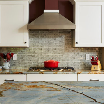
Island & perimeter countertop: Azure Quartzite slab from Brazil.
Backsplash: Dockside Gale Stria porcelain and glass wall tile
Find the right local pro for your project

 Vintage Cellars - Luxury Custom Wine Cellars LA
This project is more than meets the eye! In a gorgeous neighborhood in Del Mar, San Diego, California, This unique small custom wine cellar truly acts as a showstopper. Originally within this house, the door which now faces outward used to be around the corner in a small hallway, virtually eliminating any visibility into this contemporary walk in custom wine cellar. Upon seeing the location of this space within the house, Gene Walder and the knowledgeable team at Vintage Cellars knew that to really take advantage of the room provided, (which is actually below the stairs), they needed to get rid of the original door and add a brand new one facing the main living space.
Just a small feat in a series of unique custom features within this cellar!
Here at Vintage Cellars, before any design takes shape, it is vital to understand what the clients wants and needs are based on their growing collection of wine. With a good idea of bottle sizes, shapes (some pinot noir bottles, for example have a wider bottom than a typical cabernet sauvignon bottle) and unique features desired, the team of wine cellar designers and wine cellar builders at Vintage Cellars are able to create a very special and desirable wine cellar for each client.
The owners of this beautiful home collaborated heavily with the Vintage Cellars team in the design process of this rustic custom wine cellar - something that we aim to do with every project. The homeowners wanted to showcase some of their favorite Magnum sized bottles in a high reveal horizontal display row, directly on top of another area highlighting the best 750 ml's in their collection.
This small custom wine room fills most of the left wall with single deep, individual bottle storage. Directly below this wine racking is room for wine case / wine bin storage. Centered within this wall is a nice space for opening and decanting wines with a gorgeous dark stone countertop and room for hanging wine glasses above.
The opposite wall is filled floor to ceiling with label revealing horizontal display rows. Again, this type of feature is very desirable in recent years. Homeowners want to be able to showcase the best bottles they own within their custom wine cellars in the most stunning and beautiful ways possible. Additionally, this feature is commonly replicated with metal bars for a more contemporary and modern look and feel.
Within Beach Cities such as Del Mar, La Jolla, Cardiff, Coronado, Rancho Santa Fe, Encinitas, Solana Beach, Newport Beach and Orange County alike, small walk wine cellars are all the rage. Custom Wine Closet s and Under the Stairs Custom Wine Room s are quickly becoming a commonplace feature within modern luxury homes.
Funny enough, because San Diego has become such a hub and mecca for craft beer breweries, luxury homes within communities such as La Jolla, Del Mar, Encinitas, Coronado, Cardiff, Rancho Santa Fe, Solana Beach, Carlsbad, La Costa and Torrey Pines have taken notice and began including space for unique beer storage within their custom wine cellars as well.
This right side wall horizontal display racking does just that. If you look closely, those intricately labeled bottles are craft brews kept at a chill and refreshing 55 Degrees- just waiting to be opened and enjoyed immediately.
Just when you thought the custom wine cellar tour was over, another unique feature catches your eye. You see the back stone wall? Press ever so gently in the top left corner two thirds of the way up and - Voila! - a secret door appears and slowly reveals more room under the stairway for case storage and the like.
The homeowner also decided to add interesting lighting to this cellar. The Custom wine room can turn any color of the rainbow - allowing you to focus on all lights or just one a time, creating that perfect mood lighting for the holidays, springtime, or summer.
This entire custom wine cellar and all wine racking were done in raw black walnut.
Vintage Cellars has built gorgeous custom wine cellars and wine storage rooms across the United States and World for over 25 years. We are your go-to business for anything wine cellar and wine storage related! Whether you're interested in a wine closet, wine racking, custom wine racks, a custom wine cellar door, or a cooling system for your existing space, Vintage Cellars has you covered!
We carry all kinds of wine cellar cooling and refrigeration systems, incuding: Breezaire, CellarCool, WhisperKool, Wine Guardian, CellarPro and Commercial systems.
We also carry many types of Wine Refrigerators, Wine Cabinets, and wine racking types, including La Cache, Marvel, N'Finity, Transtherm, Vinotheque, Vintage Series, Credenza, Walk in wine rooms, Climadiff, Riedel, Fontenay, and VintageView.
Vintage Cellars also does work in many styles, including Contemporary and Modern, Rustic, Farmhouse, Traditional, Craftsman, Industrial, Mediterranean, Mid-Century, Industrial and Eclectic.
Some locations we cover often include: San Diego, Rancho Santa Fe, Corona Del Mar, Del Mar, La Jolla, Newport Beach, Newport Coast, Huntington Beach, Del Mar, Solana Beach, Carlsbad, Orange County, Beverly Hills, Malibu, Pacific Palisades, Santa Monica, Bel Air, Los Angeles, Encinitas, Cardiff, Coronado, Manhattan Beach, Palos Verdes, San Marino, Ladera Heights, Santa Monica, Brentwood, Westwood, Hancock Park, Laguna Beach, Crystal Cove, Laguna Niguel, Torrey Pines, Thousand Oaks, Coto De Caza, Coronado Island, San Francisco, Danville, Walnut Creek, Marin, Tiburon, Hillsborough, Berkeley, Oakland, Napa, Sonoma, Agoura Hills, Hollywood Hills, Laurel Canyon, Sausalito, Mill Valley, San Rafael, Piedmont, Paso Robles, Carmel, Pebble Beach
Contact Vintage Cellars today with any of your Wine Cellar needs!
(800) 876-8789
Vintage Cellars
904 Rancheros Drive
San Marcos, California 92069
(800) 876-8789
 Kitchen Design Concepts
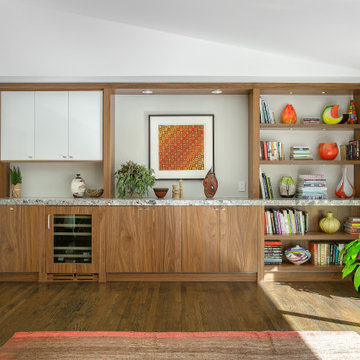
This 1950's kitchen hindered our client's cooking and bi-weekly entertaining and was inconsistent with the home's mid-century architecture. Additional key goals were to improve function for cooking and entertaining 6 to 12 people on a regular basis. Originally with only two entry points to the kitchen (from the entry/foyer and from the dining room) the kitchen wasn’t very open to the remainder of the home, or the living room at all. The door to the carport was never used and created a conflict with seating in the breakfast area. The new plans created larger openings to both rooms, and a third entry point directly into the living room. The “peninsula” manages the sight line between the kitchen and a large, brick fireplace while still creating an “island” effect in the kitchen and allowing seating on both sides. The television was also a “must have” utilizing it to watch cooking shows while prepping food, for news while getting ready for the day, and for background when entertaining.
Meticulously designed cabinets provide ample storage and ergonomically friendly appliance placement. Cabinets were previously laid out into two L-shaped spaces. On the “top” was the cooking area with a narrow pantry (read: scarce storage) and a water heater in the corner. On the “bottom” was a single 36” refrigerator/freezer, and sink. A peninsula separated the kitchen and breakfast room, truncating the entire space. We have now a clearly defined cool storage space spanning 60” width (over 150% more storage) and have separated the ovens and cooking surface to spread out prep/clean zones. True pantry storage was added, and a massive “peninsula” keeps seating for up to 6 comfortably, while still expanding the kitchen and gaining storage. The newly designed, oversized peninsula provides plentiful space for prepping and entertaining. Walnut paneling wraps the room making the kitchen a stunning showpiece.
 Kitchen Design Concepts
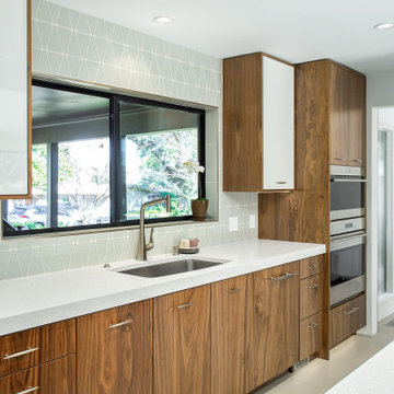
This 1950's kitchen hindered our client's cooking and bi-weekly entertaining and was inconsistent with the home's mid-century architecture. Additional key goals were to improve function for cooking and entertaining 6 to 12 people on a regular basis. Originally with only two entry points to the kitchen (from the entry/foyer and from the dining room) the kitchen wasn’t very open to the remainder of the home, or the living room at all. The door to the carport was never used and created a conflict with seating in the breakfast area. The new plans created larger openings to both rooms, and a third entry point directly into the living room. The “peninsula” manages the sight line between the kitchen and a large, brick fireplace while still creating an “island” effect in the kitchen and allowing seating on both sides. The television was also a “must have” utilizing it to watch cooking shows while prepping food, for news while getting ready for the day, and for background when entertaining.
Meticulously designed cabinets provide ample storage and ergonomically friendly appliance placement. Cabinets were previously laid out into two L-shaped spaces. On the “top” was the cooking area with a narrow pantry (read: scarce storage) and a water heater in the corner. On the “bottom” was a single 36” refrigerator/freezer, and sink. A peninsula separated the kitchen and breakfast room, truncating the entire space. We have now a clearly defined cool storage space spanning 60” width (over 150% more storage) and have separated the ovens and cooking surface to spread out prep/clean zones. True pantry storage was added, and a massive “peninsula” keeps seating for up to 6 comfortably, while still expanding the kitchen and gaining storage. The newly designed, oversized peninsula provides plentiful space for prepping and entertaining. Walnut paneling wraps the room making the kitchen a stunning showpiece.
 Kitchen Design Concepts
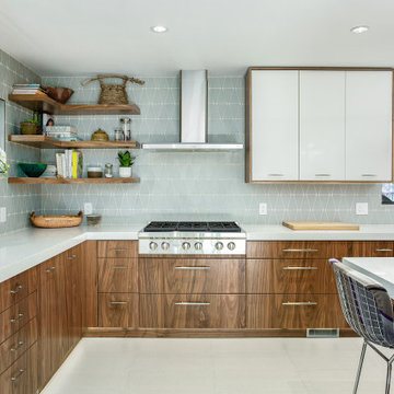
This 1950's kitchen hindered our client's cooking and bi-weekly entertaining and was inconsistent with the home's mid-century architecture. Additional key goals were to improve function for cooking and entertaining 6 to 12 people on a regular basis. Originally with only two entry points to the kitchen (from the entry/foyer and from the dining room) the kitchen wasn’t very open to the remainder of the home, or the living room at all. The door to the carport was never used and created a conflict with seating in the breakfast area. The new plans created larger openings to both rooms, and a third entry point directly into the living room. The “peninsula” manages the sight line between the kitchen and a large, brick fireplace while still creating an “island” effect in the kitchen and allowing seating on both sides. The television was also a “must have” utilizing it to watch cooking shows while prepping food, for news while getting ready for the day, and for background when entertaining.
Meticulously designed cabinets provide ample storage and ergonomically friendly appliance placement. Cabinets were previously laid out into two L-shaped spaces. On the “top” was the cooking area with a narrow pantry (read: scarce storage) and a water heater in the corner. On the “bottom” was a single 36” refrigerator/freezer, and sink. A peninsula separated the kitchen and breakfast room, truncating the entire space. We have now a clearly defined cool storage space spanning 60” width (over 150% more storage) and have separated the ovens and cooking surface to spread out prep/clean zones. True pantry storage was added, and a massive “peninsula” keeps seating for up to 6 comfortably, while still expanding the kitchen and gaining storage. The newly designed, oversized peninsula provides plentiful space for prepping and entertaining. Walnut paneling wraps the room making the kitchen a stunning showpiece.


 Kitchen Design Concepts
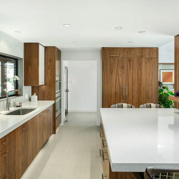
This 1950's kitchen hindered our client's cooking and bi-weekly entertaining and was inconsistent with the home's mid-century architecture. Additional key goals were to improve function for cooking and entertaining 6 to 12 people on a regular basis. Originally with only two entry points to the kitchen (from the entry/foyer and from the dining room) the kitchen wasn’t very open to the remainder of the home, or the living room at all. The door to the carport was never used and created a conflict with seating in the breakfast area. The new plans created larger openings to both rooms, and a third entry point directly into the living room. The “peninsula” manages the sight line between the kitchen and a large, brick fireplace while still creating an “island” effect in the kitchen and allowing seating on both sides. The television was also a “must have” utilizing it to watch cooking shows while prepping food, for news while getting ready for the day, and for background when entertaining.
Meticulously designed cabinets provide ample storage and ergonomically friendly appliance placement. Cabinets were previously laid out into two L-shaped spaces. On the “top” was the cooking area with a narrow pantry (read: scarce storage) and a water heater in the corner. On the “bottom” was a single 36” refrigerator/freezer, and sink. A peninsula separated the kitchen and breakfast room, truncating the entire space. We have now a clearly defined cool storage space spanning 60” width (over 150% more storage) and have separated the ovens and cooking surface to spread out prep/clean zones. True pantry storage was added, and a massive “peninsula” keeps seating for up to 6 comfortably, while still expanding the kitchen and gaining storage. The newly designed, oversized peninsula provides plentiful space for prepping and entertaining. Walnut paneling wraps the room making the kitchen a stunning showpiece.

 The Outdoor Kitchen Design Store
Wallingford, Ct.
Living beyond the walls of your home outdoors seamlessly to capture the serenity of the morning sun and after evening dinner gatherings were on the menu for this great family. The idea at hand brought forth by outdoor living fabulously designer Michael Gotowala founder of THE OUTDOOR KITCHEN DESIGN STORE by PREFERRED PROPERTIES were graciously accepted and the work began to not only enlarge the deck space but to capture value centers for Outdoor culinary, evening bar and Alfresco and the convenience of a nearby splash in the hot tub surrounded by granite and even a remote Fire feature above the hot tub. All these features part of the recipe for Living Outdoors fabulously. If you look close enough you can see the masonry details in which Preferred Properties is known for. The elegance of Stone surrounding Brown Jordan's cabinetry in Java color shows the insightfulness of masterful outdoor Kitchen builder Michael Gotowala founder of THE OUTDOOR KITCHEN DESIGN STORE by PREFERRED PROPERTIES. The sprawling outdoor grill island has plenty of work or play space for that matter highlighting DCS grill, plenty of storage, two drawer refrigerator and a trash pull all capped off with large swirling granite counters. A nice touch here is the top shelf designed for sight lines from entering the back yard, wind blockage for grilling, receptacles, and even night lighting underneath to illuminate at night.
The second area is the sprawling bar and beverage Alfresco up against the house. Even the top shelf mimics the octagon bow window shape. The stone and granite details surround a nice layout of outdoor cabinetry for user convenience.
The third area more of a splash to the outdoor living fabulously label is a Sundance spa enabled by a step down into from the deck. The new Deck and multi level stone surround with Remote firewalls keeps the fire visible from the house and poses as a privacy screen and back drop for the hot tub.
These subtle features and design ideas by our team make the homeowners feel absolutely fabulous about the newly unfound space. For more great outdoor kitchens go to THE OUTDOOR KITCHEN DESIGN STORE by PREFERRED PROPERTIES. www.OUTDOORKITCHENDESIGNER.com or call right away at 1-855-GET OUTDOORS
 Kitchen Design Concepts
This 1950's kitchen hindered our client's cooking and bi-weekly entertaining and was inconsistent with the home's mid-century architecture. Additional key goals were to improve function for cooking and entertaining 6 to 12 people on a regular basis. Originally with only two entry points to the kitchen (from the entry/foyer and from the dining room) the kitchen wasn’t very open to the remainder of the home, or the living room at all. The door to the carport was never used and created a conflict with seating in the breakfast area. The new plans created larger openings to both rooms, and a third entry point directly into the living room. The “peninsula” manages the sight line between the kitchen and a large, brick fireplace while still creating an “island” effect in the kitchen and allowing seating on both sides. The television was also a “must have” utilizing it to watch cooking shows while prepping food, for news while getting ready for the day, and for background when entertaining.
Meticulously designed cabinets provide ample storage and ergonomically friendly appliance placement. Cabinets were previously laid out into two L-shaped spaces. On the “top” was the cooking area with a narrow pantry (read: scarce storage) and a water heater in the corner. On the “bottom” was a single 36” refrigerator/freezer, and sink. A peninsula separated the kitchen and breakfast room, truncating the entire space. We have now a clearly defined cool storage space spanning 60” width (over 150% more storage) and have separated the ovens and cooking surface to spread out prep/clean zones. True pantry storage was added, and a massive “peninsula” keeps seating for up to 6 comfortably, while still expanding the kitchen and gaining storage. The newly designed, oversized peninsula provides plentiful space for prepping and entertaining. Walnut paneling wraps the room making the kitchen a stunning showpiece.
 Kitchen Design Concepts
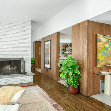
This 1950's kitchen hindered our client's cooking and bi-weekly entertaining and was inconsistent with the home's mid-century architecture. Additional key goals were to improve function for cooking and entertaining 6 to 12 people on a regular basis. Originally with only two entry points to the kitchen (from the entry/foyer and from the dining room) the kitchen wasn’t very open to the remainder of the home, or the living room at all. The door to the carport was never used and created a conflict with seating in the breakfast area. The new plans created larger openings to both rooms, and a third entry point directly into the living room. The “peninsula” manages the sight line between the kitchen and a large, brick fireplace while still creating an “island” effect in the kitchen and allowing seating on both sides. The television was also a “must have” utilizing it to watch cooking shows while prepping food, for news while getting ready for the day, and for background when entertaining.
Meticulously designed cabinets provide ample storage and ergonomically friendly appliance placement. Cabinets were previously laid out into two L-shaped spaces. On the “top” was the cooking area with a narrow pantry (read: scarce storage) and a water heater in the corner. On the “bottom” was a single 36” refrigerator/freezer, and sink. A peninsula separated the kitchen and breakfast room, truncating the entire space. We have now a clearly defined cool storage space spanning 60” width (over 150% more storage) and have separated the ovens and cooking surface to spread out prep/clean zones. True pantry storage was added, and a massive “peninsula” keeps seating for up to 6 comfortably, while still expanding the kitchen and gaining storage. The newly designed, oversized peninsula provides plentiful space for prepping and entertaining. Walnut paneling wraps the room making the kitchen a stunning showpiece.
 Tile Doctor Ltd
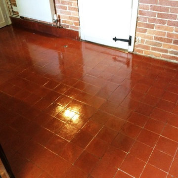
Let me start by saying this was by far the hardest job I’ve ever done and as you read on you will soon realise why. The customer called me out to quote on a Quarry tiled floor at a house in Danehill that was covered in concrete screed. She said it had always been there and she’s lived there for years always meaning to get it bought back to a state that she could live with. Undaunted by the state of the floor (see photo below) we agreed a price and fixed a date to do the work.
For the next two days I spent all my time pouring neat Tile Doctor Grout Clean-up onto small areas and working it in with a metal scraper and wire brush. Once removed the resultant muck was rinsed and extracted using a wet vacuum, laborious work as you can imagine although I was kept entertained by playing the occasional game of fetch with a very keen Collie dog who seemed fascinated by the bloke sitting on his floor all day. After two days of this my hands were throbbing but I could see red quarry tile emerging. The final two hours on the second day were spent making good any areas under the washing machine and fridge and giving the floor a thorough rinse to remove any trace of cleaning product.
The floor dried off overnight and I came back the third day to seal the tiles making sure that my canine companion had been sent next door first. To seal the floor I used six coats of Tile Doctor Seal and Go which really brought back the colour in the floor and gave it an amazingly shiny surface.
Once sealed the floors transformation was complete and when the customer returned from work she was utterly speechless. I’d turned what looked like a building site into a stunning tiled floor.
 Kitchen Design Concepts
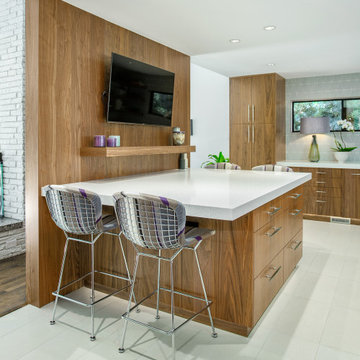
This 1950's kitchen hindered our client's cooking and bi-weekly entertaining and was inconsistent with the home's mid-century architecture. Additional key goals were to improve function for cooking and entertaining 6 to 12 people on a regular basis. Originally with only two entry points to the kitchen (from the entry/foyer and from the dining room) the kitchen wasn’t very open to the remainder of the home, or the living room at all. The door to the carport was never used and created a conflict with seating in the breakfast area. The new plans created larger openings to both rooms, and a third entry point directly into the living room. The “peninsula” manages the sight line between the kitchen and a large, brick fireplace while still creating an “island” effect in the kitchen and allowing seating on both sides. The television was also a “must have” utilizing it to watch cooking shows while prepping food, for news while getting ready for the day, and for background when entertaining.
Meticulously designed cabinets provide ample storage and ergonomically friendly appliance placement. Cabinets were previously laid out into two L-shaped spaces. On the “top” was the cooking area with a narrow pantry (read: scarce storage) and a water heater in the corner. On the “bottom” was a single 36” refrigerator/freezer, and sink. A peninsula separated the kitchen and breakfast room, truncating the entire space. We have now a clearly defined cool storage space spanning 60” width (over 150% more storage) and have separated the ovens and cooking surface to spread out prep/clean zones. True pantry storage was added, and a massive “peninsula” keeps seating for up to 6 comfortably, while still expanding the kitchen and gaining storage. The newly designed, oversized peninsula provides plentiful space for prepping and entertaining. Walnut paneling wraps the room making the kitchen a stunning showpiece.

Sponsored
Columbus, OH
Free consultation for landscape design!

Peabody Landscape Group
Franklin County's Reliable Landscape Design & Contracting
 The Outdoor Kitchen Design Store
Wallingford, Ct.
Living beyond the walls of your home outdoor KITCHEN DESIGNER MICHAEL GOTOWALA FOUNDER THE OUTDOOR KITCHEN DESIGN STORE IN seamlessly capturing the serenity of the morning sun and after evening dinner gatherings were on the menu for this great family. The idea at hand brought forth by outdoor living fabulously designer Michael Gotowala founder of THE OUTDOOR KITCHEN DESIGN STORE by PREFERRED PROPERTIES were graciously accepted and the work began to not only enlarge the deck space but to capture value centers for Outdoor culinary, evening bar and Alfresco and the convenience of a nearby splash in the hot tub surrounded by granite and even a remote Fire feature above the hot tub. All these features part of the recipe for Living Outdoors fabulously. If you look close enough you can see the masonry details in which Preferred Properties is known for. The elegance of Stone surrounding Brown Jordan's cabinetry in Java color shows the insightfulness of masterful outdoor Kitchen builder Michael Gotowala founder of THE OUTDOOR KITCHEN DESIGN STORE by PREFERRED PROPERTIES. The sprawling outdoor grill island has plenty of work or play space for that matter highlighting DCS grill, plenty of storage, two drawer refrigerator and a trash pull all capped off with large swirling granite counters. A nice touch here is the top shelf designed for sight lines from entering the back yard, wind blockage for grilling, receptacles, and even night lighting underneath to illuminate at night.
The second area is the sprawling bar and beverage Alfresco up against the house. Even the top shelf mimics the octagon bow window shape. The stone and granite details surround a nice layout of outdoor cabinetry for user convenience.
The third area more of a splash to the outdoor living fabulously label is a Sundance spa enabled by a step down into from the deck. The new Deck and multi level stone surround with Remote firewalls keeps the fire visible from the house and poses as a privacy screen and back drop for the hot tub.
These subtle features and design ideas by our team make the homeowners feel absolutely fabulous about the newly unfound space. For more great outdoor kitchens go to THE OUTDOOR KITCHEN DESIGN STORE by PREFERRED PROPERTIES. www.OUTDOORKITCHENDESIGNER.com or call right away at 1-855-GET OUTDOORS

 Forever Redwood
We take country style and craftsmanship to the next level with this Baja Redwood Outdoor Dining Table. Designed for up to twelve adult guests, this table is perfect for large family gatherings, dinners, or parties with friends. It’s built tough, rustic, and strong enough to take even the harshest weather; yet it’s elegant enough to put in your dining room.
 The Outdoor Kitchen Design Store
Wallingford, Ct.
Living beyond the walls of your home outdoors seamlessly to capture the serenity of the morning sun and after evening dinner gatherings were on the menu for this great family. The idea at hand brought forth by outdoor living fabulously designer Michael Gotowala founder of THE OUTDOOR KITCHEN DESIGN STORE by PREFERRED PROPERTIES were graciously accepted and the work began to not only enlarge the deck space but to capture value centers for Outdoor culinary, evening bar and Alfresco and the convenience of a nearby splash in the hot tub surrounded by granite and even a remote Fire feature above the hot tub. All these features part of the recipe for Living Outdoors fabulously. If you look close enough you can see the masonry details in which Preferred Properties is known for. The elegance of Stone surrounding Brown Jordan's cabinetry in Java color shows the insightfulness of masterful outdoor Kitchen builder Michael Gotowala founder of THE OUTDOOR KITCHEN DESIGN STORE by PREFERRED PROPERTIES. The sprawling outdoor grill island has plenty of work or play space for that matter highlighting DCS grill, plenty of storage, two drawer refrigerator and a trash pull all capped off with large swirling granite counters. A nice touch here is the top shelf designed for sight lines from entering the back yard, wind blockage for grilling, receptacles, and even night lighting underneath to illuminate at night.
The second area is the sprawling bar and beverage Alfresco up against the house. Even the top shelf mimics the octagon bow window shape. The stone and granite details surround a nice layout of outdoor cabinetry for user convenience.
The third area more of a splash to the outdoor living fabulously label is a Sundance spa enabled by a step down into from the deck. The new Deck and multi level stone surround with Remote firewalls keeps the fire visible from the house and poses as a privacy screen and back drop for the hot tub.
These subtle features and design ideas by our team make the homeowners feel absolutely fabulous about the newly unfound space. For more great outdoor kitchens go to THE OUTDOOR KITCHEN DESIGN STORE by PREFERRED PROPERTIES. www.OUTDOORKITCHENDESIGNER.com or call right away at 1-855-GET OUTDOORS

 Skill Construction & Design, LLC
It sparkles, it shimmers, it glitters, its glass. Glass mosaics are everywhere, from gorgeous kitchen backsplashes like this one, to color baths and reflective fireplaces. But as beautiful as this backsplash is, it’s only the beginning of this great kitchen.
Our kitchen begins with a little bump, a simple little peninsula with room for one. Upon the deep dark espresso cabinets sits the contrasting countertop. The super glossy white stone with subtle swirls reflects the colors of the glass mosaics. We gave the peninsula a little overhang and pulled up an enticing contemporary stool.
Although the kitchen space is fairly large, two walls contained openings to other spaces, while a third contained a large and sunny bay window. Rather than bottle neck our traffic flow, we chose to make the most of the walls we had. We started with a deep undermount stainless steel sink with a far-reaching faucet with pull out spray. Beside this, we placed our contemporary stainless steel dishwasher.
To keep the feeling open and airy we installed dark floating shelves, which really pop against our multicolored glass backsplash. We added lighting under the bottom shelf for extra sparkle, as well as the perfect task lighting.
We needed some wall cabinets, not just for storage but to compliment our microwave. Above the stainless steel stove our matching microwave serves multipurpose, from cooking, to venting, to task lighting the stove. When space counts, make the most of it. We nestled our stove beside the dishwasher, giving ourselves room for a landing zone at the end. The cooking area feels even more spacious set next to our large bay window.
To give us the greatest amount of storage, we added a floor to ceiling pantry. Although it is only 12″ deep, it’s 48″ wide. The clean “slab” style door create an uncluttered look that compliments the patterning of the floor. We used 6″ x 24″ porcelain wood look flooring. This flooring exploded on the market not too long ago, giving you the look of hardwoods, without fear of water, dents and scratches. The floor will never need to be refinished, no matter how much abuse it takes.
Look at all that storage. There’s even room on the bottom for that huge mixer we all seem to have. The pantry gives us plenty of room for all we need to store and it’s 12″ depth means it’s easy to find what you’re looking for. No more pulling out half your stored items just to find that product in the very back.
We round out this fabulous kitchen with a full-sized, bottom freezer, French door refrigerator. Espresso panels encase the sides while a deep and tall upper cabinet gives us room to store some more. By placing the refrigerator between the two entrances to the kitchen, family and friends can get a beverage without getting in the cook’s way.
To direct our lighting around the room and focus on specific areas, we used a long track of spot lights with a contemporary look. Between the window in the daytime, spots and undercabinet lights at night, the kitchen is always bright, even with the darker cabinetry.
http://www.rjkconstructioninc.com/

 ODS Architecture
Alongside Jeff King & Company, Marina Blvd., won CotY 2016 National Winner of Landscape Design/Outdoor Living
The project was to transform an existing flat roof and master bedroom suite floor into a dramatic deck with kitchen, dining and living areas leading to a stair to an upper deck for America’s Cup race viewing. The existing home is a 3-story 4,000 square foot Spanish Mission-style home built in the 1920’s and sits directly across from the St. Francis Yacht Club on Marina Boulevard in San Francisco – a prime location. No changes were possible for the historic façade and the new construction was to be out of view from the street, as much as possible. Going up the traditionally detailed stairway with decorative railing, you land at the third floor which becomes contemporary in style for the redesigned master bedroom suite, guest bath, sitting room and the roof deck.
Large roof decks require careful attention to waterproofing and a Bison pedestal system was used to create a level deck surface and easy maintenance. Heavy ceramic tile pavers were interspersed with walkable in-floor skylights on the main deck with ipe wood floors at the upper deck and stairs. From both the master bedroom and the outdoor deck you can access a sitting room with large pocket or sliding doors to enclose it. If watching the fireworks on July 4th and it gets cold, people can move to the sitting room which has a fireplace to watch in a heated environment. The sitting room gas fireplace is surrounded by steel with a figured steel panel re-purposed from old sea pier metal that has been cleaned and sealed.
A guest bath is adjacent to the master bath for guest use. A square recessed pattern tile was used to tie the old Spanish Mission-style feeling into the new more contemporary walls. In a large home that was short on storage, a large built-in armoire was built into the master bathroom for extra capacity. The project took two and a half years to complete including design and construction, in part due to historic reviews by the State of California.
 Skill Construction & Design, LLC
It sparkles, it shimmers, it glitters, its glass. Glass mosaics are everywhere, from gorgeous kitchen backsplashes like this one, to color baths and reflective fireplaces. But as beautiful as this backsplash is, it’s only the beginning of this great kitchen.
Our kitchen begins with a little bump, a simple little peninsula with room for one. Upon the deep dark espresso cabinets sits the contrasting countertop. The super glossy white stone with subtle swirls reflects the colors of the glass mosaics. We gave the peninsula a little overhang and pulled up an enticing contemporary stool.
Although the kitchen space is fairly large, two walls contained openings to other spaces, while a third contained a large and sunny bay window. Rather than bottle neck our traffic flow, we chose to make the most of the walls we had. We started with a deep undermount stainless steel sink with a far-reaching faucet with pull out spray. Beside this, we placed our contemporary stainless steel dishwasher.
To keep the feeling open and airy we installed dark floating shelves, which really pop against our multicolored glass backsplash. We added lighting under the bottom shelf for extra sparkle, as well as the perfect task lighting.
We needed some wall cabinets, not just for storage but to compliment our microwave. Above the stainless steel stove our matching microwave serves multipurpose, from cooking, to venting, to task lighting the stove. When space counts, make the most of it. We nestled our stove beside the dishwasher, giving ourselves room for a landing zone at the end. The cooking area feels even more spacious set next to our large bay window.
To give us the greatest amount of storage, we added a floor to ceiling pantry. Although it is only 12″ deep, it’s 48″ wide. The clean “slab” style door create an uncluttered look that compliments the patterning of the floor. We used 6″ x 24″ porcelain wood look flooring. This flooring exploded on the market not too long ago, giving you the look of hardwoods, without fear of water, dents and scratches. The floor will never need to be refinished, no matter how much abuse it takes.
Look at all that storage. There’s even room on the bottom for that huge mixer we all seem to have. The pantry gives us plenty of room for all we need to store and it’s 12″ depth means it’s easy to find what you’re looking for. No more pulling out half your stored items just to find that product in the very back.
We round out this fabulous kitchen with a full-sized, bottom freezer, French door refrigerator. Espresso panels encase the sides while a deep and tall upper cabinet gives us room to store some more. By placing the refrigerator between the two entrances to the kitchen, family and friends can get a beverage without getting in the cook’s way.
To direct our lighting around the room and focus on specific areas, we used a long track of spot lights with a contemporary look. Between the window in the daytime, spots and undercabinet lights at night, the kitchen is always bright, even with the darker cabinetry.
http://www.rjkconstructioninc.com/
 Skill Construction & Design, LLC
It sparkles, it shimmers, it glitters, its glass. Glass mosaics are everywhere, from gorgeous kitchen backsplashes like this one, to color baths and reflective fireplaces. But as beautiful as this backsplash is, it’s only the beginning of this great kitchen.
Our kitchen begins with a little bump, a simple little peninsula with room for one. Upon the deep dark espresso cabinets sits the contrasting countertop. The super glossy white stone with subtle swirls reflects the colors of the glass mosaics. We gave the peninsula a little overhang and pulled up an enticing contemporary stool.
Although the kitchen space is fairly large, two walls contained openings to other spaces, while a third contained a large and sunny bay window. Rather than bottle neck our traffic flow, we chose to make the most of the walls we had. We started with a deep undermount stainless steel sink with a far-reaching faucet with pull out spray. Beside this, we placed our contemporary stainless steel dishwasher.
To keep the feeling open and airy we installed dark floating shelves, which really pop against our multicolored glass backsplash. We added lighting under the bottom shelf for extra sparkle, as well as the perfect task lighting.
We needed some wall cabinets, not just for storage but to compliment our microwave. Above the stainless steel stove our matching microwave serves multipurpose, from cooking, to venting, to task lighting the stove. When space counts, make the most of it. We nestled our stove beside the dishwasher, giving ourselves room for a landing zone at the end. The cooking area feels even more spacious set next to our large bay window.
To give us the greatest amount of storage, we added a floor to ceiling pantry. Although it is only 12″ deep, it’s 48″ wide. The clean “slab” style door create an uncluttered look that compliments the patterning of the floor. We used 6″ x 24″ porcelain wood look flooring. This flooring exploded on the market not too long ago, giving you the look of hardwoods, without fear of water, dents and scratches. The floor will never need to be refinished, no matter how much abuse it takes.
Look at all that storage. There’s even room on the bottom for that huge mixer we all seem to have. The pantry gives us plenty of room for all we need to store and it’s 12″ depth means it’s easy to find what you’re looking for. No more pulling out half your stored items just to find that product in the very back.
We round out this fabulous kitchen with a full-sized, bottom freezer, French door refrigerator. Espresso panels encase the sides while a deep and tall upper cabinet gives us room to store some more. By placing the refrigerator between the two entrances to the kitchen, family and friends can get a beverage without getting in the cook’s way.
To direct our lighting around the room and focus on specific areas, we used a long track of spot lights with a contemporary look. Between the window in the daytime, spots and undercabinet lights at night, the kitchen is always bright, even with the darker cabinetry.
http://www.rjkconstructioninc.com/
34