
Search results for "Tools elevation" in Home Design Ideas
 5 star finishes ltd
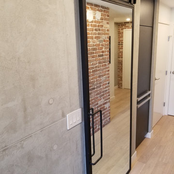
Transforming a Vancouver Home with Our Concrete Look Coarse Grey Finish
A Seamless, Architectural Concrete Aesthetic—Without the Weight of Real Concrete
When a Vancouver homeowner set out to create a sophisticated, modern apartment featuring barn-yard doors and industrial influences, they turned to 5 Star Finishes and our Concrete Look Coarse Grey plaster. The goal: bring the striking, architectural presence of poured concrete into the bedroom and entryway—without the limitations, cracks, or cold feel of real concrete.
A Custom Concrete Look with Precision Joint Patterns
For this project, the homeowner envisioned a custom joint pattern mimicking the clean geometry of architectural concrete panels. Our team taped out a precise layout using laser levels and pinstriping tape, ensuring absolute accuracy in every line.
To create authentic tie holes, stickers were strategically placed between the first and second plaster layers. This technique produces subtle recesses that replicate the look of poured-in-place concrete—adding dimension and unmistakable realism.
The Power of the Concrete Look Coarse Grey Plaster
Our Concrete Look Course Grey plaster is engineered to produce an incredibly convincing concrete texture. Using our specialized Concrete Look Texturing Tool, we’re able to create depth, movement, and natural imperfections that look and feel like true concrete—yet the finish remains:
Seamless
Lightweight
Durable
Suitable for interiors and exteriors
The result is a high-end, custom look that elevates any residential or commercial space.
Customizable to Your Design Vision
Every concrete-inspired finish can be tailored to your preferred style:
Joint widths can be wider or thinner
Tie holes can be subtle or deeply defined
Lines and patterns are completely customizable
Overall texture can be refined or more rugged depending on the desired mood
This flexibility makes the Concrete Look Coarse Grey product ideal for modern, industrial, Scandinavian, and minimalist spaces.
Project Snapshot
Location: Vancouver, BC
Spaces: Entryway + Bedroom Feature Walls
Finish: Concrete Look Coarse Grey with custom joint pattern & tie holes
Completion: 2020
Budget Range: $5,000–$10,000
Bring the Concrete Look to Your Home
If you love the bold, architectural character of concrete but want a customizable, seamless, and durable alternative, our Concrete Look Coarse Grey finish offers the ideal solution.
Explore the product here: https://shop.5starfinishes.ca/products/concrete-look-plaster
For consultations, custom applications, or trade inquiries, contact 5 Star Finishes today—your experts in luxury surface finishes across Vancouver and beyond.

 Take2 Custom Remodeling
Staircase - mid-sized traditional wooden u-shaped metal railing staircase idea in Chicago with wooden risers
 Home Improvement
In the world of wigs, convenience and realism are two of the most sought-after qualities. Women want wigs that not only look natural but also require minimal effort to wear and style. Enter wear and go wigs combined with bleached knots—a powerful duo that transforms the wig-wearing experience. These wigs offer a flawless, natural hairline and are ready to wear immediately, making them ideal for busy lifestyles without sacrificing beauty.
What Are Wear and Go Wigs?
Wear and go wigs are pre-styled wigs designed for instant wear. Unlike traditional wigs that require lace trimming, knot bleaching, or customization, wear and go wigs come ready for action right out of the box.
Key Features:
- Pre-plucked hairline and baby hairs
- Glueless design with adjustable straps and combs for secure fit
- Available in various textures such as straight, curly, and wavy
- Made with 100% human hair for authentic look and feel
- Often pre-styled into trendy cuts and shapes
- Time Saver: Perfect for women with busy schedules who want instant glam
- User-Friendly: No professional installation needed—ideal for beginners
- Protective Styling: Allows your natural hair to rest and grow healthy
- Versatile: Can be styled further with heat tools or left as is
- Reusable: Durable with proper care, lasting several months
- Lightened knots on lace for a natural scalp appearance
- Available in lace front, full lace, and 360 lace varieties
- Made with high-quality 100% human hair
- Pre-plucked hairline often accompanies bleached knots
- Customizable with parting styles and baby hairs
- Ultra-Realistic: Mimics the natural scalp for an undetectable hairline
- Styling Freedom: Allows for multiple parting options and updos
- Comfortable: Breathable lace cap keeps the scalp cool
- Protective: Keeps your natural hair shielded from heat and damage
- Long-Lasting: When cared for properly, can maintain a fresh look for months
Find the right local pro for your project

 Santa Barbara Home Design
Design Consultant Jeff Doubét is the author of Creating Spanish Style Homes: Before & After – Techniques – Designs – Insights. The 240 page “Design Consultation in a Book” is now available. Please visit SantaBarbaraHomeDesigner.com for more info.
Jeff Doubét specializes in Santa Barbara style home and landscape designs. To learn more info about the variety of custom design services I offer, please visit SantaBarbaraHomeDesigner.com
Jeff Doubét is the Founder of Santa Barbara Home Design - a design studio based in Santa Barbara, California USA.

 Danto Builders, LLC
This home is illuminated by its exterior lighting, which magnifies its unique roof lines, balconies and chimneys. Its all-natural coral-stone moldings and balcony balusters, mosaic tiles, wrought-iron railings and Pecky Cypress soffit outlookers dress it up perfectly.
In addition, the Pecky Cypress tongue-and-groove entryway ceilings and the custom, 10-foot, solid-core Brazilian Mahogany impact door with wrought-iron inserts give the perfect finish to the exterior.
From ceiling to floor, the home is inviting from the first step visitors take inside. With its series of arches, Brazilian Lyptus millwork, and marble and Brazilian cherry floors, the entryway draws people in. It opens up into a grand entertainment area, including a living room, dining room and
open kitchen.
These areas use both natural stone and wood, giving a strong but warm feel. They boost a $500,000 custom Brazilian Lyptus millwork package that dramatically dresses up the home. Highlights of the millwork
include impressive 8-foot, eight-panel doors, three-piece crown molding, radius-arch moldings and eight-piece coffered ceilings. The trees used for this wood are chopped down at their maturity of 8 years. The wood is of the highest quality with respect to its strength and beauty, and it has no knots.
Brazilian cherry floors lead into the kitchen and outdoor areas, where there is more use of wood and real coral stone. The custom kitchen cabinets are also made of Brazilian Lyptus and have insert panels with raised moldings. The kitchen displays a coral stone hood and decorative surround, which is artwork in itself. The granite kitchen counters show off beautiful, flowing colors. Along with the tumbled marble backsplashes and iron inserts, they tie all the other uses of material together.
The living room flows seamlessly into an outside living space featuring a summer kitchen, patio, pool and putting green. Coral stone is predominantly used for flooring here because of its natural beauty and coolness to the feet during the hot, sunny days in Florida. A coral hood and surrounds, mosaic and Pecky Cypress also showcase the summer kitchen. Pecky Cypress tongue and groove is also used here for the ceilings.
All the bathrooms are special. They feature various natural materials such as river rock, mosaic tiles, granite, marble and slate.
Bedrooms are classic and comfortable. One special bedroom for the grandchildren features a themed construction room designed by Daddona Studios. It has a "dump-truck" bunk bed completed with custom tool-chest storage for clothes.
 Fabco Sanctuary
The architect and designer Guy Derwent was approached by his client with a clear and compelling brief: to completely transform a grand Victorian terrace house they were planning to renovate. The client envisioned something far beyond a standard renovation – this was to be a bold and dramatic reimagining of a family home that could grow with them over time.
With the property having remained largely untouched for more than fifty years, the architects saw an opportunity to unlock its potential and deliver a contemporary design that would contrast beautifully with its Victorian heritage.
The existing layout consisted of a series of small, disconnected rooms to the rear of the house. To respond to the client’s need for openness and flexibility, the architect proposed a radical restructuring of the ground floor:
The rear rooms were completely removed
Suspended timber floors were lowered by up to two metres to align with the garden
Two bold extensions were added
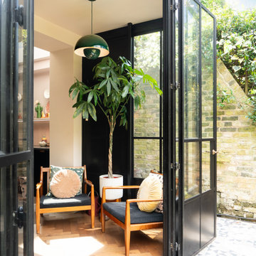
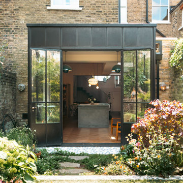
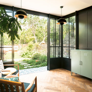
The first extension filled in the side return with a London stock brick facade and a glazed roof, while the second – a striking black steel and glass pavilion was glazed on three sides and placed along the garden elevation.
This new pavilion redefined the building’s relationship with the garden. Its steel-framed glazing created a seamless dialogue between interior and exterior, offering a sense of immersion in the surrounding landscape.
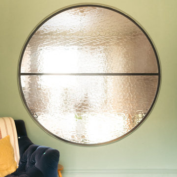
At the heart of the plan sits a dramatic, five-metre-tall dining space that acts as a transition from the original entrance hall into the new addition. A large, circular cast-glass window, framed in steel, provides a visual and spatial link between old and new, allowing light and movement to travel through the depth of the home.
Throughout the project, a series of black metal elements were introduced as sculptural interventions – each marking moments of transformation within the house. These included the bespoke steel framed circular window, a custom metal staircase, a cylindrical support column, and the striking steel and glass garden pavilion. Together, they formed a coherent architectural language that underscored the project’s bold intent.
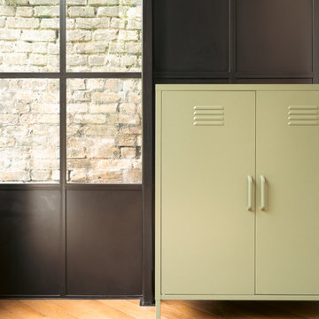
Our steel windows and doors played a vital role in delivering the project’s vision. The architects chose steel for its refined sight lines and distinctive material character, which helped bridge the gap between the historical context of the building and the bold new additions.
The black steel frames provided a crisp contrast to the pale London stock brick and added definition to the glazed pavilion, reinforcing the sense of architectural precision. In particular, the fine steel profiles of the garden room allowed the extension to feel both lightweight and immersive, blurring the boundary between the house and its garden.
The architect drew inspiration from the Bauhaus Movement, particularly the work of Walter Gropius, whose approach to functional beauty and industrial materials informed the design of the garden pavilion.
Here, our glazing system was used not just for transparency, but as an expressive architectural element. The carefully proportioned panels help to conceal the roof thickness and reinforce the pavilion’s industrial yet abstract character – a deliberate nod to product design and modernist detailing.
Sustainability was an important factor in the selection of materials. Our steel systems, made from 99% recycled content and 100% recyclable, aligned with the project’s broader environmental goals.
The architects noted that this commitment to material longevity and circularity was central to their decision to use steel. The durability and recyclability of the windows and doors ensured the project met both aesthetic and ethical criteria.
This London terrace house now stands as a celebration of contrast – between heritage and innovation, solidity and transparency, tradition and transformation. Our steel windows and doors were not simply components; they were essential tools in crafting a home that is as bold and expressive as it is functional.
The result is a home designed for modern family life, where light, space, and materiality come together in perfect harmony.
 Fabco Sanctuary
The architect and designer Guy Derwent was approached by his client with a clear and compelling brief: to completely transform a grand Victorian terrace house they were planning to renovate. The client envisioned something far beyond a standard renovation – this was to be a bold and dramatic reimagining of a family home that could grow with them over time.
With the property having remained largely untouched for more than fifty years, the architects saw an opportunity to unlock its potential and deliver a contemporary design that would contrast beautifully with its Victorian heritage.
The existing layout consisted of a series of small, disconnected rooms to the rear of the house. To respond to the client’s need for openness and flexibility, the architect proposed a radical restructuring of the ground floor:
The rear rooms were completely removed
Suspended timber floors were lowered by up to two metres to align with the garden
Two bold extensions were added
The first extension filled in the side return with a London stock brick facade and a glazed roof, while the second – a striking black steel and glass pavilion was glazed on three sides and placed along the garden elevation.
This new pavilion redefined the building’s relationship with the garden. Its steel-framed glazing created a seamless dialogue between interior and exterior, offering a sense of immersion in the surrounding landscape.
At the heart of the plan sits a dramatic, five-metre-tall dining space that acts as a transition from the original entrance hall into the new addition. A large, circular cast-glass window, framed in steel, provides a visual and spatial link between old and new, allowing light and movement to travel through the depth of the home.
Throughout the project, a series of black metal elements were introduced as sculptural interventions – each marking moments of transformation within the house. These included the bespoke steel framed circular window, a custom metal staircase, a cylindrical support column, and the striking steel and glass garden pavilion. Together, they formed a coherent architectural language that underscored the project’s bold intent.
Our steel windows and doors played a vital role in delivering the project’s vision. The architects chose steel for its refined sight lines and distinctive material character, which helped bridge the gap between the historical context of the building and the bold new additions.
The black steel frames provided a crisp contrast to the pale London stock brick and added definition to the glazed pavilion, reinforcing the sense of architectural precision. In particular, the fine steel profiles of the garden room allowed the extension to feel both lightweight and immersive, blurring the boundary between the house and its garden.
The architect drew inspiration from the Bauhaus Movement, particularly the work of Walter Gropius, whose approach to functional beauty and industrial materials informed the design of the garden pavilion.
Here, our glazing system was used not just for transparency, but as an expressive architectural element. The carefully proportioned panels help to conceal the roof thickness and reinforce the pavilion’s industrial yet abstract character – a deliberate nod to product design and modernist detailing.
Sustainability was an important factor in the selection of materials. Our steel systems, made from 99% recycled content and 100% recyclable, aligned with the project’s broader environmental goals.
The architects noted that this commitment to material longevity and circularity was central to their decision to use steel. The durability and recyclability of the windows and doors ensured the project met both aesthetic and ethical criteria.
This London terrace house now stands as a celebration of contrast – between heritage and innovation, solidity and transparency, tradition and transformation. Our steel windows and doors were not simply components; they were essential tools in crafting a home that is as bold and expressive as it is functional.
The result is a home designed for modern family life, where light, space, and materiality come together in perfect harmony.

 Fabco Sanctuary
The architect and designer Guy Derwent was approached by his client with a clear and compelling brief: to completely transform a grand Victorian terrace house they were planning to renovate. The client envisioned something far beyond a standard renovation – this was to be a bold and dramatic reimagining of a family home that could grow with them over time.
With the property having remained largely untouched for more than fifty years, the architects saw an opportunity to unlock its potential and deliver a contemporary design that would contrast beautifully with its Victorian heritage.
The existing layout consisted of a series of small, disconnected rooms to the rear of the house. To respond to the client’s need for openness and flexibility, the architect proposed a radical restructuring of the ground floor:
The rear rooms were completely removed
Suspended timber floors were lowered by up to two metres to align with the garden
Two bold extensions were added
The first extension filled in the side return with a London stock brick facade and a glazed roof, while the second – a striking black steel and glass pavilion was glazed on three sides and placed along the garden elevation.
This new pavilion redefined the building’s relationship with the garden. Its steel-framed glazing created a seamless dialogue between interior and exterior, offering a sense of immersion in the surrounding landscape.
At the heart of the plan sits a dramatic, five-metre-tall dining space that acts as a transition from the original entrance hall into the new addition. A large, circular cast-glass window, framed in steel, provides a visual and spatial link between old and new, allowing light and movement to travel through the depth of the home.
Throughout the project, a series of black metal elements were introduced as sculptural interventions – each marking moments of transformation within the house. These included the bespoke steel framed circular window, a custom metal staircase, a cylindrical support column, and the striking steel and glass garden pavilion. Together, they formed a coherent architectural language that underscored the project’s bold intent.
Our steel windows and doors played a vital role in delivering the project’s vision. The architects chose steel for its refined sight lines and distinctive material character, which helped bridge the gap between the historical context of the building and the bold new additions.
The black steel frames provided a crisp contrast to the pale London stock brick and added definition to the glazed pavilion, reinforcing the sense of architectural precision. In particular, the fine steel profiles of the garden room allowed the extension to feel both lightweight and immersive, blurring the boundary between the house and its garden.
The architect drew inspiration from the Bauhaus Movement, particularly the work of Walter Gropius, whose approach to functional beauty and industrial materials informed the design of the garden pavilion.
Here, our glazing system was used not just for transparency, but as an expressive architectural element. The carefully proportioned panels help to conceal the roof thickness and reinforce the pavilion’s industrial yet abstract character – a deliberate nod to product design and modernist detailing.
Sustainability was an important factor in the selection of materials. Our steel systems, made from 99% recycled content and 100% recyclable, aligned with the project’s broader environmental goals.
The architects noted that this commitment to material longevity and circularity was central to their decision to use steel. The durability and recyclability of the windows and doors ensured the project met both aesthetic and ethical criteria.
This London terrace house now stands as a celebration of contrast – between heritage and innovation, solidity and transparency, tradition and transformation. Our steel windows and doors were not simply components; they were essential tools in crafting a home that is as bold and expressive as it is functional.
The result is a home designed for modern family life, where light, space, and materiality come together in perfect harmony.
 Fabco Sanctuary
The architect and designer Guy Derwent was approached by his client with a clear and compelling brief: to completely transform a grand Victorian terrace house they were planning to renovate. The client envisioned something far beyond a standard renovation – this was to be a bold and dramatic reimagining of a family home that could grow with them over time.
With the property having remained largely untouched for more than fifty years, the architects saw an opportunity to unlock its potential and deliver a contemporary design that would contrast beautifully with its Victorian heritage.
The existing layout consisted of a series of small, disconnected rooms to the rear of the house. To respond to the client’s need for openness and flexibility, the architect proposed a radical restructuring of the ground floor:
The rear rooms were completely removed
Suspended timber floors were lowered by up to two metres to align with the garden
Two bold extensions were added
The first extension filled in the side return with a London stock brick facade and a glazed roof, while the second – a striking black steel and glass pavilion was glazed on three sides and placed along the garden elevation.
This new pavilion redefined the building’s relationship with the garden. Its steel-framed glazing created a seamless dialogue between interior and exterior, offering a sense of immersion in the surrounding landscape.
At the heart of the plan sits a dramatic, five-metre-tall dining space that acts as a transition from the original entrance hall into the new addition. A large, circular cast-glass window, framed in steel, provides a visual and spatial link between old and new, allowing light and movement to travel through the depth of the home.
Throughout the project, a series of black metal elements were introduced as sculptural interventions – each marking moments of transformation within the house. These included the bespoke steel framed circular window, a custom metal staircase, a cylindrical support column, and the striking steel and glass garden pavilion. Together, they formed a coherent architectural language that underscored the project’s bold intent.
Our steel windows and doors played a vital role in delivering the project’s vision. The architects chose steel for its refined sight lines and distinctive material character, which helped bridge the gap between the historical context of the building and the bold new additions.
The black steel frames provided a crisp contrast to the pale London stock brick and added definition to the glazed pavilion, reinforcing the sense of architectural precision. In particular, the fine steel profiles of the garden room allowed the extension to feel both lightweight and immersive, blurring the boundary between the house and its garden.
The architect drew inspiration from the Bauhaus Movement, particularly the work of Walter Gropius, whose approach to functional beauty and industrial materials informed the design of the garden pavilion.
Here, our glazing system was used not just for transparency, but as an expressive architectural element. The carefully proportioned panels help to conceal the roof thickness and reinforce the pavilion’s industrial yet abstract character – a deliberate nod to product design and modernist detailing.
Sustainability was an important factor in the selection of materials. Our steel systems, made from 99% recycled content and 100% recyclable, aligned with the project’s broader environmental goals.
The architects noted that this commitment to material longevity and circularity was central to their decision to use steel. The durability and recyclability of the windows and doors ensured the project met both aesthetic and ethical criteria.
This London terrace house now stands as a celebration of contrast – between heritage and innovation, solidity and transparency, tradition and transformation. Our steel windows and doors were not simply components; they were essential tools in crafting a home that is as bold and expressive as it is functional.
The result is a home designed for modern family life, where light, space, and materiality come together in perfect harmony.
 Fabco Sanctuary
The architect and designer Guy Derwent was approached by his client with a clear and compelling brief: to completely transform a grand Victorian terrace house they were planning to renovate. The client envisioned something far beyond a standard renovation – this was to be a bold and dramatic reimagining of a family home that could grow with them over time.
With the property having remained largely untouched for more than fifty years, the architects saw an opportunity to unlock its potential and deliver a contemporary design that would contrast beautifully with its Victorian heritage.
The existing layout consisted of a series of small, disconnected rooms to the rear of the house. To respond to the client’s need for openness and flexibility, the architect proposed a radical restructuring of the ground floor:
The rear rooms were completely removed
Suspended timber floors were lowered by up to two metres to align with the garden
Two bold extensions were added
The first extension filled in the side return with a London stock brick facade and a glazed roof, while the second – a striking black steel and glass pavilion was glazed on three sides and placed along the garden elevation.
This new pavilion redefined the building’s relationship with the garden. Its steel-framed glazing created a seamless dialogue between interior and exterior, offering a sense of immersion in the surrounding landscape.
At the heart of the plan sits a dramatic, five-metre-tall dining space that acts as a transition from the original entrance hall into the new addition. A large, circular cast-glass window, framed in steel, provides a visual and spatial link between old and new, allowing light and movement to travel through the depth of the home.
Throughout the project, a series of black metal elements were introduced as sculptural interventions – each marking moments of transformation within the house. These included the bespoke steel framed circular window, a custom metal staircase, a cylindrical support column, and the striking steel and glass garden pavilion. Together, they formed a coherent architectural language that underscored the project’s bold intent.
Our steel windows and doors played a vital role in delivering the project’s vision. The architects chose steel for its refined sight lines and distinctive material character, which helped bridge the gap between the historical context of the building and the bold new additions.
The black steel frames provided a crisp contrast to the pale London stock brick and added definition to the glazed pavilion, reinforcing the sense of architectural precision. In particular, the fine steel profiles of the garden room allowed the extension to feel both lightweight and immersive, blurring the boundary between the house and its garden.
The architect drew inspiration from the Bauhaus Movement, particularly the work of Walter Gropius, whose approach to functional beauty and industrial materials informed the design of the garden pavilion.
Here, our glazing system was used not just for transparency, but as an expressive architectural element. The carefully proportioned panels help to conceal the roof thickness and reinforce the pavilion’s industrial yet abstract character – a deliberate nod to product design and modernist detailing.
Sustainability was an important factor in the selection of materials. Our steel systems, made from 99% recycled content and 100% recyclable, aligned with the project’s broader environmental goals.
The architects noted that this commitment to material longevity and circularity was central to their decision to use steel. The durability and recyclability of the windows and doors ensured the project met both aesthetic and ethical criteria.
This London terrace house now stands as a celebration of contrast – between heritage and innovation, solidity and transparency, tradition and transformation. Our steel windows and doors were not simply components; they were essential tools in crafting a home that is as bold and expressive as it is functional.
The result is a home designed for modern family life, where light, space, and materiality come together in perfect harmony.
 Interior Pros - Design Studio
The grey trend has evolved in the last twelve months. Nowadays browns, beige and a touch of grey are in demand. Greige is the new buzzword.
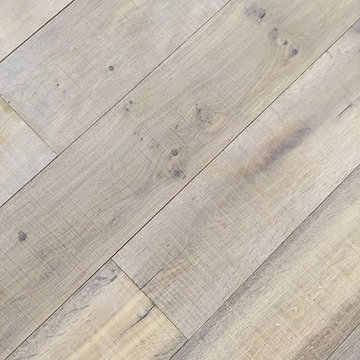
Heavier hand scraped or contoured products, the rage that started around 2005 has taken a back seat in most areas, while a softer wire brushed "ceruse effect" seen mostly on White Oak has been remarkably strong showing no effects of becoming “dated” like the others mentioned.
Ceruse Color Possibilities
There are numerous color combinations to the "cerused" process with the most popular being white or off white. This design trend in hardwood flooring can have darker gray white oak with a mild ceruse off white effect.
There are limitless possibilities in either a prefinished hardwood floor or with what we can create for you in a custom on-site finished hardwood floor.
If something suits your fancy, contact us and we can work on creating just the look and sense of style you are looking for.


 safe ZOnea
If you’re active on GardenWeb sharing plant photos, asking for advice, tracking seasonal progress you already understand how much detail goes into gardening. Soil pH, rainfall, emerging leaves, bloom counts, fertilizer schedules it adds up fast. But all that rich information often remains buried in posts, lists or memory. What if you could visualize that data and turn it into clear quick insights? That’s where a graph maker becomes a game-changer for your gardening workflow.
1. Why garden data belongs on a graph
On GardenWeb, you’ll find forums for everything from perennial care, vegetable gardening, patios, herbs, even cooking and craft projects. While plant lovers share observations and ask questions, many track progress manually in spreadsheets or memory. A graph maker flips that around:
Instead of a list of numbers (e.g., “Soil test: pH 6.4 in May, 6.1 in October”), you get a line graph showing the decline over time.
Instead of guessing which plant bloomed most, you see a bar chart comparing counts across plants.
Instead of manually calculating average rainfall effect, you plot scatter points of bloom count vs. rainfall.
By turning your data into visuals, you’re not just recording—you’re analysing, learning and improving. For GardenWeb users this means smarter decisions: Which fertilizer actually improves bloom count? Which shady spot recovers slower? A graph maker gives clarity.
2. What is a graph maker and how to use one
A graph maker is a web tool or software that lets you input raw data (numbers, dates, categories) and output visual charts like line graphs, bar charts, scatter plots, etc. It might allow you to import a spreadsheet, select chart type, customize colours, label axes, and export the image for your blog, forum post or personal log.
Here’s how you could apply it for gardening:
Log blooms per week for each rose plant.
Using the graph maker, choose line graph to track changes over weeks.
Label your y-axis “Number of Blooms”, x-axis “Week of Year”.
Add colour lines for each plant for easy comparison.
Export as PNG and embed it in a GardenWeb forum post: “See bloom trend for my ‘Peace’ vs ‘Knock Out’ roses”.
This isn’t just pretty-to-look-at: it makes the trend obvious, invites discussion (“Hey, your ‘Knock Out’ line dips after week 28—what changed?”) and helps you refine your routine.
3. Use these specific scenarios on GardenWeb
A. Soil pH and plant health tracking
After multiple tests you have pH values over time and bloom results. Upload both datasets into the graph maker, produce a dual-axis line graph: soil pH on one axis, bloom count on the other. Post your findings in the “Soil, Fertility & Nutrients” forum and get feedback.
B. Seasonal pest or disease appearance
Record number of aphids spotted each month and whether you used treatment. A bar chart via the graph maker can show pre- and post-treatment figures. Then ask the “Insect & Disease Control” forum for advice based on your visual data.
C. Yield comparison between varieties
You grow two zucchini varieties. You keep weekly yield in pounds. Use the graph maker for a side-by-side bar chart. Share in the “Vegetable Gardening” forum: “Which was better this year? See the chart”.
D. Rainfall vs growth rate
You log weekly rainfall and growth (in cm) of your tomato plants. Use scatter plot in graph maker. If a pattern emerges, you’re ready to post: “Is my growth plateau due to drought? Chart shows a clear correlation.”
4. Why this elevates your GardenWeb contributions
When you post with a chart made by a graph maker, you’re doing more than asking or showing off. You’re investigating. You’re analysing. You invite the community to give feedback on data, not just anecdotes. That elevates the discussion. Instead of “My plant died, any ideas?” you post “See this graph of pH drop and bloom count—what might be the limiting factor?” High-quality visuals raise your post’s value and garner more thoughtful responses.
Plus, your posts become useful references for others: someone else can say, “Cool graphic, can you share your data sheet?” You build credibility and help the forum become a learning hub—not just a Q&A board.
5. Tips for using a graph maker effectively in the GardenWeb context
Keep it simple: One chart, one insight. Don’t overcrowd.
Label clearly: Titles, axis labels, units (e.g., cm/week, mg/L, °F).
Use readable colours: Avoid faint tones that vanish on mobile.
Annotate when needed: Add notes like “Fertiliser switched week 12” or “Shade cloth added”.
Provide context in your post: Don’t leave the chart alone—write a few sentences explaining what it shows and what you’re seeking.
Embed carefully: Make sure your image displays properly in GardenWeb; check mobile view.
Share raw data: If possible link to your spreadsheet so others can replicate or comment.
Be open to feedback: The chart invites questions; embrace them.
6. Possible pitfalls and how to avoid them
Bad data = bad chart: If your measurements aren’t consistent, your graph will mislead. Use standardized data collection.
Too much complexity: Multi-axis charts, too many variables—confusing. Stick to one or two variables.
Overlooking mobile viewers: Many GardenWeb users browse via phones. Use large fonts and simple visuals.
Ignoring the narrative: Chart alone won’t answer. Explain what it means and what you need.
Outdated charts: If you update your data annually, keep your visuals current or label them clearly as “2024 data”.
7. Final thoughts
On GardenWeb you’ll find a vibrant community of gardeners, DIYers, cooks and design lovers.Using a graph maker for your posts and progress turns your experience from casual hobby-logging into smart data-driven gardening. You’ll not only learn more—your peers will learn more, too.
So next time you log your plant growth, record your yield, test your soil or track pests—don’t just note it. Plot it. Use a graph maker. Share it in the forum. Let your garden tell the story, and let the community help you write the next chapter.
Sponsored
Delaware, OH

Buckeye Basements, Inc.
Central Ohio's Basement Finishing ExpertsBest Of Houzz '13-'21

 Simple Steps
This modern bathroom wall is a very dark grey tile made from recycled stone dust. Its color is PB 3106 Dark Grey and is in the brushed texture.
Example of a mid-sized minimalist master gray tile and stone tile bathroom design in Miami with gray walls
Example of a mid-sized minimalist master gray tile and stone tile bathroom design in Miami with gray walls
 safe ZOnea
Staging a home for sale or for a major transition is a strange in-between state. You are still living in the space, but you are also preparing it to impress strangers, support showings, and remain functional until the final move-out day. That tension between “home” and “product” is where storage quietly becomes one of your smartest tools. Used well, storage lets you reduce clutter, protect important items, and create the kind of rooms that photograph beautifully and feel calm when buyers walk through the door.
A staged move is rarely just about shifting boxes from one address to another. It is about managing timing, presentation, and stress at the same time. When storage is built into the plan from day one, the entire process feels less rushed and more strategic. Rooms open up gradually, essentials stay accessible, and you never feel like you are drowning in half-packed chaos. Understanding how to use storage as a staging partner, not just a place to dump excess stuff, is what turns a messy transition into a controlled, professional-looking move.
Why Storage Is the Backbone of Every Staged Move
Visual space is emotional space. When every surface is covered, and every corner is full, buyers feel crowded before they have even evaluated the layout. Storage gives you a way to pull back without making drastic decisions about what to keep or donate. Seasonal décor, bulky furniture, duplicate items, archives, and personal collections can be moved out early, so the home reads cleaner and more open while still feeling lived-in. That balance between warmth and simplicity is exactly what good staging tries to achieve.
In more complex situations, such as live-work properties or home offices, storage becomes even more important. You may need to keep a business running while also presenting a polished environment to viewers. Partnering with local movers in Boston makes it easier to shift equipment, files, and nonessential pieces into storage in phases, so work can continue while the visible areas of the property stay controlled and presentable.
How Staging and Storage Work Together to Control Visual Impact
Staging works best when every object in a room has a clear purpose. A sofa frames a conversation. A table suggests gathering. A lamp softens the mood. Everything else that is not essential to that story competes for attention. Storage supports staging by giving you a clean staging bench off-site, where nonessential items can wait without being constantly shuffled between rooms or piled into overstuffed closets.
The art lies in deciding what stays and what goes. Family photos, extensive collections, excess seating, and rarely used appliances often move into storage first. What remains should be enough to show scale, comfort, and function without revealing the full weight of daily life. Commercial properties go through a similar filtering process. Extra desks, surplus equipment, outdated signage, and inactive files often move out early so the active workspace feels lean, efficient, and future-ready before a relocation supported by commercial movers takes place.
Strategic Timing of Storage before the Actual Move
The worst time to think about storage is when boxes are already stacked in the hallway. In a staged move, storage decisions ideally begin as soon as you know the property will be listed or the space will be transitioned. That might be a month or more before the main moving date. Starting early gives you time to sort, label, and prioritize instead of throwing things together in a panic.
An early storage phase also helps you test how the home feels with less in it. You may discover that removing a few large pieces transforms a cramped room into an open, inviting space. For commercial spaces, early storage lets operations continue with fewer interruptions. Departments can send nonessential items out in waves. When the main relocation comes, much of the excess is already safely stored, and what remains is easier for a commercial movers Boston team to handle with speed and care.
The Emotional Psychology behind Letting Storage Hold Your Belongings
Letting belongings leave the house ahead of you can feel unsettling. There is always a quiet fear that once something is out of sight, it will be forgotten, damaged, or harder to reclaim. That is why some people resist using storage even when they know it would make the staging process easier. Acknowledging that emotion instead of dismissing it helps you plan more honestly and avoids last-minute regret.
The reality is that good storage is not a black hole; it is a temporary pause. When items are packed thoughtfully, labeled clearly, and placed in an environment you trust, they become easier to manage than when they are tucked into random cupboards or stacked in spare rooms. For many people, living with fewer visible possessions during staging actually reduces tension. The home feels lighter and easier to maintain. Businesses notice the same effect when storage removes outdated equipment and clutter from the floor. The workspace looks more focused, and staff can concentrate on current tasks instead of navigating around accumulated history.
Protecting Assets While They Live in Storage
Sending belongings into storage is only a good idea if they come back in the same or better condition. That is where quality control matters. Furniture, textiles, electronics, files, and artwork each have different vulnerabilities. Moisture, temperature swings, dust, and rough handling can all damage them in ways that only become obvious later. Choosing the right type of storage and packing accordingly is central to the genius of using storage as part of a staged move rather than as a desperate overflow container.
Climate-controlled units, padded wrapping, elevated pallets, careful stacking, and clearly marked boxes all reduce risk. The goal is to handle items fewer times, not more. When storage is integrated into the move plan, belongings can travel directly from the home to storage and later from storage to the new address with minimal extra movement. Many owners coordinate those transfers through a well trusted movers in Boston, so the same team that moves items out early also manages their final delivery, preserving continuity and accountability.
How Storage Reduces Risk during Multi-Phase Moves
Few staged moves happen in a single clean step. There are often gaps between listing and selling, between selling and closing, between closing and final move-out. If renovations, inspections, or office reconfigurations are involved, the timeline becomes even more layered. Storage absorbs those gaps, so you are not forced to live among towers of boxes or stack equipment in hallways waiting for the next phase.
By treating storage as a flexible middle ground, you can move things out gradually while still having access when needed. For example, archived files can go first, followed by seasonal décor, then surplus furniture. As each stage ends, fewer items remain to be shifted on the final date. This phased approach reduces the risk of rushed, late-night packing sessions, careless stacking, and damaged items. It also makes it easier for commercial moving crews to work efficiently because they are handling a manageable volume of goods at each phase rather than everything at once.
Using Storage to Maintain Clean Show-Ready Conditions
One of the hardest parts of staging is keeping the property consistently show-ready. Every viewing becomes its own small event. Floors need to be cleared, surfaces wiped, and personal items tucked away. When too many belongings remain in the home, each showing takes a heavy amount of effort. Storage cuts that workload dramatically by taking nonessentials completely off the stage.
With fewer items to move and hide, maintaining a neutral, inviting look becomes much more realistic. You are not scrambling to stuff things into closets or push items under the bed. Instead, the home sits closer to show condition all the time, and the final touches before a viewing are minimal. In commercial environments, using storage helps maintain a professional appearance for clients and staff, even while the space is being prepared for a larger transition. Active tools and furniture stay in play, while inactive pieces quietly support the future from storage.
Storage as a Strategic Tool in Business Relocation Planning
For businesses, storage is more than a convenience; it is part of risk management. Office relocations and staged commercial moves have to juggle lease deadlines, equipment deliveries, IT cutovers, and staffing realities. Trying to shift everything in one move often results in downtime, lost files, and strained teams. Storage turns the move into a series of controlled steps instead of a single disruptive jump.
Unused furniture, archived documents, and non-critical inventory can be moved into storage weeks ahead of the main relocation. As the new space becomes ready, items can move out of storage and directly into position. This reduces double-handling and keeps the old and new locations from filling with half-unpacked material. A business that coordinates these flows with professional commercial movers in Boston usually experiences smoother transitions, because storage is treated as a working part of the operational plan rather than a leftover problem.
The Hidden Cost Benefits of Proper Storage Planning
On paper, storage looks like an extra expense. In reality, poorly managed moves cost far more. When everything is rushed into boxes at the last minute, items are damaged, misplaced, or transported multiple times. Extra labor hours, emergency packing supplies, replacement furniture, and extended timelines quickly outweigh the cost of well-used storage. Staging without storage also tends to keep homes and offices crowded longer, which can hurt impressions and, in the case of a sale, influence offers.
When storage is integrated from the beginning, you minimize waste. You handle items fewer times, you know where things are, and you avoid paying people to shift the same objects repeatedly. Staged homes that look better often sell faster or draw stronger interest, which helps recover investment on the back end. Businesses benefit from less downtime, safer handling of equipment, and predictable work schedules. Those gains are why many clients prefer partnering with a commercial moving company in Boston that understands storage as a cost-control tool, not just a place to park overflow.
Conclusion
The true genius of using storage during a staged home move is that it quietly rewrites the rules of transition. Instead of treating space as something that must absorb every box and belonging until the last possible moment, you treat storage as a flexible extension of the home or office. This shift in thinking opens rooms, clears sightlines, and makes every phase of the move more intentional. Staging becomes easier, maintenance becomes lighter, and the stress of living in a half-moved environment drops noticeably. When storage is chosen carefully, used early, and coordinated with the overall moving plan, it protects both physical assets and emotional energy. Buyers and visitors see a calm, collected space. You experience a less chaotic path from “here” to “there.” Whether you are selling a home, repositioning a business, or managing a complex phased relocation, storage can turn a disruptive event into a managed, almost elegant process.
For people who want that level of control and care during a staged move, Stairhopper movers have built a strong reputation by treating storage, timing, and transport as parts of one connected strategy. Their team is known for listening closely, planning around real-life constraints, and moving both residential and commercial clients through transitions with calm, steady execution. They approach every project as a partnership, aligning storage use, staging needs, and final delivery so that what matters most arrives safely, on schedule, and with as little disruption as possible.
Frequently Asked Questions
Q1. When should I arrange storage for a staged home move?
Ideally, four to six weeks before listing or transition, so clearing, packing, and staging can happen gradually without rushed decisions or last-minute stress.
Q2. Is climate-controlled storage necessary for staged moves?
It is highly recommended for wood furniture, electronics, artwork, and documents, since temperature and humidity swings can quietly damage materials over time.
Q3. How does storage help keep a home show-ready?
By moving nonessential items off-site, daily tidying becomes simpler, and each room can stay closer to a staged condition between viewings or inspections.
Q4. Can storage reduce the length of the final moving day?
Yes. When many items are moved into storage in advance, the final moving day focuses on essentials, which shortens timelines and reduces physical and mental strain.
Q5. Is storage useful for short-term business relocations?
Even in short relocations, storage helps prevent overcrowded offices and allows departments to move in phases without interrupting everyday operations.
Q6. How do I decide what should go into storage first?
Start with rarely used items, seasonal décor, surplus furniture, and archived materials, then work toward pieces that are visually distracting or make rooms feel cramped.
Q7. Will using storage make it harder to find things later?
Not if packing and labeling are done carefully. Clear categories, room-based labels, and simple inventories make stored items easier to locate than when scattered at home.
Q8. Does storage still make sense if my move happens in one day?
Yes, because staging and preparation begin well before that day. Storage keeps the home functional and attractive during the weeks leading up to the final move.

 Legacy Glass Studios
Custom leaded glass panel used for privacy and charm in small window of front entry door.
Glass: clear textured glass (granite, 1/16" reed, beveled glue chip) and beveled glass
Lead: 3/16" rounded
Size: 1 @ ~8" x 18" x 1/4" thick
*This product was commissioned and made-to-order. If you're interested in this design, let's chat! We can recreate it for you to your specified dimensions, or we can discuss any design changes you'd like, as well as additional options for materials (glass texture, color, lead size, etc.). Reach out to hello@legacyglass.com to get started!

 Sidetex Company
Shingle siding close upA Cape Cod style house with Alside Pelican Bay cedar shake siding, Color: Cape Cod Gray. Installed by Sidetex in North Haven CT 06473
Sponsored
Delaware, OH
Buckeye Basements, Inc.
Central Ohio's Basement Finishing ExpertsBest Of Houzz '13-'21
 SabaRehman Abdulrehman
Phoenix's food scene is vibrant and thriving, but also one of the most closely watched in the country. Health inspectors in Maricopa County are strict, and customers expect spotless dining spaces.
To stay competitive, restaurant owners and food vendors must stay on top of evolving health codes, sanitation protocols, and food safety benchmarks. That starts with a firm grip on restaurant cleaning safety standards. Ignoring sanitation rules risks more than bad reviews. It invites citations, customer complaints, and operational shutdowns.
Whether you're operating a food truck or a restaurant, following these Phoenix cleaning standards helps you stay compliant, pass health inspections, and build customer trust.
Importance of a Clean Phoenix Restaurant that Follows Food Health and Safety Standards
The restaurant industry in Phoenix operates under strict oversight. The Maricopa County Environmental Services Department conducts regular inspections, and violations can result in fines or closures. In this climate, restaurant cleaning is not just a hygiene standard. It is a business-critical measure.
Proper food handling and establishment cleaning protocols reduce the risk of foodborne illnesses, control pests, protect equipment, and keep your staff safe. Inconsistent practices, on the other hand, can quickly become liabilities.
Start With the Food Code
Phoenix food vendors must comply with the 2017 FDA Food Code as adopted by Maricopa County. This includes rules on:
- Sanitizing food-contact surfaces after each use
- Maintaining proper water temperatures for dishwashing
- Cleaning restrooms frequently and keeping them stocked
- Storing cleaning chemicals away from prep areas
- Daily: Wipe prep tables, mop floors, clean grills, sanitize cutting boards
- Weekly: Deep clean kitchen hoods, polish cooking equipment, disinfect drains
- Monthly: Check pest control measures, clean freezer coils, and inspect HVAC filters
- Using the right sanitizers and PPE
- Logging cleaning times and who performed the task
- Identifying signs of mold, grease buildup, or rodent activity
- Conducting thorough surface cleaning to ensure all food-contact surfaces are sanitized regularly
- Food-safe and non-corrosive
- Effective against norovirus, salmonella, and E. coli
- Clearly labeled and stored in original containers
- Seal gaps around doors and pipes
- Store dry goods in sealed, elevated containers
- Keep outdoor waste bins locked and distanced from entry points
- Record cleaning completion in real time
- Alert managers when tasks are missed
- Keep a historical record for inspections
- Is certified and understands the Arizona food codes
- Provides documented service reports
- Offers customized cleaning plans
- Offers flexible scheduling around your operating hours
- Cross-contamination prevention: Regularly clean food prep surfaces and tools, and use separate equipment for raw meats, vegetables, and ready-to-eat foods. Proper cleaning prevents any contact with food that could lead to cross-contamination and affects food quality.
- Temperature monitoring: While not directly related to cleaning, maintaining proper food temperature is essential. Hot foods should be stored above 140°F, and cold foods below 40°F. Regularly monitor temperatures and clean temperature gauges to ensure accuracy.
- Proper storage: Use clean storage containers and shelving for food storage, keeping items off the floor. Ensure all food is sealed and labeled to avoid contamination risks and comply with food safety standards.

 BAUFORMAT
Wavy mother of pearl porcelain tile, wavy white tile for bathroom shower or backsplash. Perfect for fireplace or accent wall
Example of a trendy bathroom design in Los Angeles
Example of a trendy bathroom design in Los Angeles

 SAW Live Edge
These slabs are cut from Big Leaf Maple Trees from the Canada West Coast. Big Leaf Maple is a rare tree that has a ton of character and beauty. (Custom sizes available upon request please contact for pricing)
_____________________________________________________________________
PROCESS //
The depth of this live edge floating shelf makes it a perfect bookshelf. It's also ideal for a variety of other uses such as to hold kitchenware, bathroom products or next to your bed as a floating nightstand.
Each shelf comes fitted with a steel support brace with a support anchor made of 1/2" thick steel.
Can support up to 50lbs per 24". (If mounted properly)
Comes with all mounting screws #12 x 2.5".
Drilled to accommodate studs 16"oc or 24"oc.
Finished with 3 coats of OSMO Polyx Oil Finish to protect from moisture and other elements. Low VOC.
Each live edge shelf is one-of-a-kind.
Dimensions:
Length - Available in several different lengths, choose while adding to cart
Depth - 8-12" (With live edge shelves the front edge has some curvature, the depth can vary +/- around 1" from stated size.)
Height - 1.75-2.25"
(Custom sizes upon request, please let me know if you have a minimum depth needed)
If you purchase this listing you'll receive a shelf similar to those in the photos. Although may be different in tone and curvature/ live edge. Each shelf varies in detail. If you need a different size or larger quantity you can request a custom order by hitting the 'Ask a question' button on this page.
Could also be used as a Mantel.
18