
Search results for "Towards material" in Home Design Ideas
 Klopf Architecture
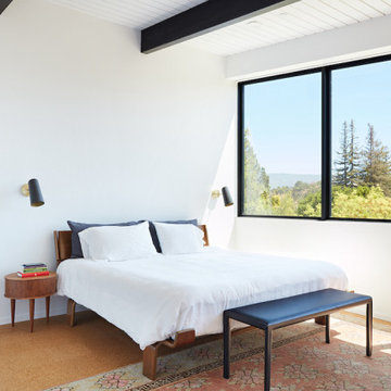
The Roger Lee designed house from 1962 was purchased by the current homeowners in almost original condition, as the previous owners elected to defer most maintenance projects over the years. The clients were able to see beyond the dated materials and finishes, single-paned glass and uninsulated walls and they approached Klopf Architecture to help them expand and update the entire home, one the family could settle into and enjoy for years to come. It was important that the new designs were aligned with Lee's original intent not only because of the client's appreciation for mid-century modern architecture, but also because the house was deemed historical. The Stanford Real Estate Office requires a stringent design review which safeguards the integrity of the community, which Klopf Architecture was happy to oblige going into their updated designs.
As with many original mid-century modern homes, the house was scaled to the 1960s lifestyle where rooms were smaller and openings to views were limited and tightly framed. The original conditions defined the direction the family of four would take in updating the house and making it comfortable for their modern lifestyle. Klopf designed a full gut remodel and major addition to bring the house into the 21st century and provide the living area needed for the client's family. The newly expanded house added just about 1,100 sf to create an airy, comfortable and family friendly house, taking full advantage of the beautiful southwestern views that extend out to the hills beyond. The enclosed garage created an additional 240 sf of covered space for long-term storage.
A cracked swimming pool created an eyesore taking up a majority of the backyard landscape, so it was one of the first elements to go during the transformation. Working with Outer Space Landscape Architects, the family asked for a mix of relaxing outdoor patio spaces that eventually blend into the native landscaping, extending their views outward toward the natural greenery of the trees beyond their property. Filling in the old pool was a smart way to expand the living spaces outward. The orientation of the house was designed to enjoy the views, but the original architecture provided the first homeowners with mere glimpses of the landscape outside.
Klopf was able to broaden those views, continuing and extending on the original architecture to take full advantage of the unobstructed natural views across the rear facade of the house. Small horizontal openings in the primary bedroom and office were replaced with much taller windows that now follow the angled roof line upward, extending across almost all of the facade. We worked with Western Windows, whose designs included an oblique-shaped, operable casement that allowed our design to rise with the slope. A new corner office added to the primary suite, offers a bright and functional work-from-home solution that looks out at the distant views and added natural light from the expanded window configuration that now wraps around the corner.
The existing lower level was designed by Lee as a utilitarian space, serving as a wet pool room with a drain in the center of the floor, bathroom, laundry and storage areas. Without the need for a pool room, Klopf was able to convert the area into a much more comfortable and functional living space with a new family room and guest suite. The new spaces enjoy easy access to a new outdoor patio through floor to ceiling, full-width glass sliders.
Continuing along the rear facade, a previously exposed deck extending from the living room and hallway provided access to the backyard through a single set of stairs leading toward the side of the house which made sense when the pool was in place. The new deck was re-envisioned as an extension of the main living room and now serves as a second outdoor living room. A new slatted pergola above provides the homeowners welcome relief from the hot afternoon sun. A second set of stairs now creates a better connection to the redesigned lower level. Klopf was able to reconfigure the spaces, extending the living room outward toward the views, where the family now claims it as the heart of the home, spending a large majority of their time outdoors.
Back inside, the original wood-burning Malm fireplace was beautifully restored and a gas burner installed to comply with California's strict air standards. It now rests in front of a wall of Heath accent tiles where a dated red brick wall used to stand. A new taller window brings more light and views into the refreshed interior living room. The original glass doors opposite the fireplace were replaced by larger sliders that when fully opened, create a seamless transition to the new outdoor living area so the two spaces feel like one connected space. The original utilitarian kitchen was needlessly tucked into the far back corner and closed-off, out of sight from the living room, so the clients asked Klopf to open it up and expand the kitchen forward so it felt more connected. Today the much larger kitchen is connected to the living area where a short wall with a cutout offers a visual glimpse into the kitchen and a handy pass-through counter for serving guests. A new breakfast nook was also added to create another spot where the family can gather for casual meals. Just outside, a new built-in outdoor grill and prep area extends the kitchen outside and connects to a new outdoor dining spot nestled amongst the trees, taking advantage of the views out back.
Klopf was able to expand the other two bedrooms, add a new laundry room and half-bath and convert the carport to an enclosed garage to add more storage areas which was lost when the pool house was converted to the family and guest room.
To maintain a historical connection to the original designs, the exterior siding was repeated on all exterior walls, a full-height stained glass window at the front entryway restored, and an interior slatted screen element repeated outside at the exterior entry courtyard and over the new outdoor living room to create a shade trellis. The new house stands proudly and shines against it's new landscaping features, while respecting and expanding on the original intent of Roger Lee's designs epitomizing the comforts of indoor-outdoor living in Northern California.
Completion year: 2020
Klopf Architecture project team: John Klopf, Klara Kevane, Noel Andrade
Contractor: ORB Construction, Brendan O'Reilly
Structural engineer: Sezen and Moon
Landscape architect: Outer space
Furnishings and decoration: Urbanism Designs
Photographer: Mariko Reed
 Klopf Architecture
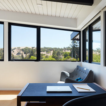
The Roger Lee designed house from 1962 was purchased by the current homeowners in almost original condition, as the previous owners elected to defer most maintenance projects over the years. The clients were able to see beyond the dated materials and finishes, single-paned glass and uninsulated walls and they approached Klopf Architecture to help them expand and update the entire home, one the family could settle into and enjoy for years to come. It was important that the new designs were aligned with Lee's original intent not only because of the client's appreciation for mid-century modern architecture, but also because the house was deemed historical. The Stanford Real Estate Office requires a stringent design review which safeguards the integrity of the community, which Klopf Architecture was happy to oblige going into their updated designs.
As with many original mid-century modern homes, the house was scaled to the 1960s lifestyle where rooms were smaller and openings to views were limited and tightly framed. The original conditions defined the direction the family of four would take in updating the house and making it comfortable for their modern lifestyle. Klopf designed a full gut remodel and major addition to bring the house into the 21st century and provide the living area needed for the client's family. The newly expanded house added just about 1,100 sf to create an airy, comfortable and family friendly house, taking full advantage of the beautiful southwestern views that extend out to the hills beyond. The enclosed garage created an additional 240 sf of covered space for long-term storage.
A cracked swimming pool created an eyesore taking up a majority of the backyard landscape, so it was one of the first elements to go during the transformation. Working with Outer Space Landscape Architects, the family asked for a mix of relaxing outdoor patio spaces that eventually blend into the native landscaping, extending their views outward toward the natural greenery of the trees beyond their property. Filling in the old pool was a smart way to expand the living spaces outward. The orientation of the house was designed to enjoy the views, but the original architecture provided the first homeowners with mere glimpses of the landscape outside.
Klopf was able to broaden those views, continuing and extending on the original architecture to take full advantage of the unobstructed natural views across the rear facade of the house. Small horizontal openings in the primary bedroom and office were replaced with much taller windows that now follow the angled roof line upward, extending across almost all of the facade. We worked with Western Windows, whose designs included an oblique-shaped, operable casement that allowed our design to rise with the slope. A new corner office added to the primary suite, offers a bright and functional work-from-home solution that looks out at the distant views and added natural light from the expanded window configuration that now wraps around the corner.
The existing lower level was designed by Lee as a utilitarian space, serving as a wet pool room with a drain in the center of the floor, bathroom, laundry and storage areas. Without the need for a pool room, Klopf was able to convert the area into a much more comfortable and functional living space with a new family room and guest suite. The new spaces enjoy easy access to a new outdoor patio through floor to ceiling, full-width glass sliders.
Continuing along the rear facade, a previously exposed deck extending from the living room and hallway provided access to the backyard through a single set of stairs leading toward the side of the house which made sense when the pool was in place. The new deck was re-envisioned as an extension of the main living room and now serves as a second outdoor living room. A new slatted pergola above provides the homeowners welcome relief from the hot afternoon sun. A second set of stairs now creates a better connection to the redesigned lower level. Klopf was able to reconfigure the spaces, extending the living room outward toward the views, where the family now claims it as the heart of the home, spending a large majority of their time outdoors.
Back inside, the original wood-burning Malm fireplace was beautifully restored and a gas burner installed to comply with California's strict air standards. It now rests in front of a wall of Heath accent tiles where a dated red brick wall used to stand. A new taller window brings more light and views into the refreshed interior living room. The original glass doors opposite the fireplace were replaced by larger sliders that when fully opened, create a seamless transition to the new outdoor living area so the two spaces feel like one connected space. The original utilitarian kitchen was needlessly tucked into the far back corner and closed-off, out of sight from the living room, so the clients asked Klopf to open it up and expand the kitchen forward so it felt more connected. Today the much larger kitchen is connected to the living area where a short wall with a cutout offers a visual glimpse into the kitchen and a handy pass-through counter for serving guests. A new breakfast nook was also added to create another spot where the family can gather for casual meals. Just outside, a new built-in outdoor grill and prep area extends the kitchen outside and connects to a new outdoor dining spot nestled amongst the trees, taking advantage of the views out back.
Klopf was able to expand the other two bedrooms, add a new laundry room and half-bath and convert the carport to an enclosed garage to add more storage areas which was lost when the pool house was converted to the family and guest room.
To maintain a historical connection to the original designs, the exterior siding was repeated on all exterior walls, a full-height stained glass window at the front entryway restored, and an interior slatted screen element repeated outside at the exterior entry courtyard and over the new outdoor living room to create a shade trellis. The new house stands proudly and shines against it's new landscaping features, while respecting and expanding on the original intent of Roger Lee's designs epitomizing the comforts of indoor-outdoor living in Northern California.
Completion year: 2020
Klopf Architecture project team: John Klopf, Klara Kevane, Noel Andrade
Contractor: ORB Construction, Brendan O'Reilly
Structural engineer: Sezen and Moon
Landscape architect: Outer space
Furnishings and decoration: Urbanism Designs
Photographer: Mariko Reed
 Karia Designs
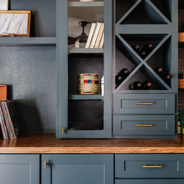
Created space for a wall mounted TV as well as additional wine storage. Finished with some glass cabinet doors with gold accent hardware.
Dry bar - mid-sized modern single-wall dark wood floor and brown floor dry bar idea in Dallas with shaker cabinets, blue cabinets, wood countertops and brown countertops
Dry bar - mid-sized modern single-wall dark wood floor and brown floor dry bar idea in Dallas with shaker cabinets, blue cabinets, wood countertops and brown countertops
Find the right local pro for your project

 User
This Greek Revival row house in Boerum Hill was previously owned by a local architect who renovated it several times, including the addition of a two-story steel and glass extension at the rear. The new owners came to us seeking to restore the house and its original formality, while adapting it to the modern needs of a family of five. The detailing of the 25 x 36 foot structure had been lost and required some sleuthing into the history of Greek Revival style in historic Brooklyn neighborhoods.
In addition to completely re-framing the interior, the house also required a new south-facing brick façade due to significant deterioration. The modern extension was replaced with a more traditionally detailed wood and copper- clad bay, still open to natural light and the garden view without sacrificing comfort. The kitchen was relocated from the first floor to the garden level with an adjacent formal dining room. Both rooms were enlarged from their previous iterations to accommodate weekly dinners with extended family. The kitchen includes a home office and breakfast nook that doubles as a homework station. The cellar level was further excavated to accommodate finished storage space and a playroom where activity can be monitored from the kitchen workspaces.
The parlor floor is now reserved for entertaining. New pocket doors can be closed to separate the formal front parlor from the more relaxed back portion, where the family plays games or watches TV together. At the end of the hall, a powder room with brass details, and a luxe bar with antique mirrored backsplash and stone tile flooring, leads to the deck and direct garden access. Because of the property width, the house is able to provide ample space for the interior program within a shorter footprint. This allows the garden to remain expansive, with a small lawn for play, an outdoor food preparation area with a cast-in-place concrete bench, and a place for entertaining towards the rear. The newly designed landscaping will continue to develop, further enhancing the yard’s feeling of escape, and filling-in the views from the kitchen and back parlor above. A less visible, but equally as conscious, addition is a rooftop PV solar array that provides nearly 100% of the daily electrical usage, with the exception of the AC system on hot summer days.
The well-appointed interiors connect the traditional backdrop of the home to a youthful take on classic design and functionality. The materials are elegant without being precious, accommodating a young, growing family. Unique colors and patterns provide a feeling of luxury while inviting inhabitants and guests to relax and enjoy this classic Brooklyn brownstone.
This project won runner-up in the architecture category for the 2017 NYC&G Innovation in Design Awards and was featured in The American House: 100 Contemporary Homes.
Photography by Francis Dzikowski / OTTO
 STUDIO KONDE | Konrad Idaszewski Architect
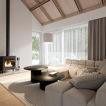
Komfoo house interior designed by STUDIO KONDE Konrad Idaszewski Architekt, an interior architecture project from Poznań focused on creating a comfortable contemporary home with a strong sense of warmth and carefully balanced proportions. Visit the full project: https://conde.pl/portfolio/gotowy-projekt-wnetrz-domu-komfoo/ As part of the Modelowedomy collection of three individually configurable houses, Komfoo offers a high living room with a mezzanine, while the kitchen and dining area are separated from the living space by a functional furniture wall, creating distinct zones while preserving the spacious character of the home.
This living room combines natural timber, soft neutral upholstery and carefully selected architectural details to create a warm and sophisticated interior. Generous glazing, a high vaulted ceiling and a freestanding wood-burning stove give the space a distinctive character, while the restrained palette of beige, cream, taupe and warm wood keeps the composition calm and cohesive.
A generous U-shaped sectional sofa upholstered in light beige fabric occupies the main seating zone, with deep cushions and broad chaise sections creating an inviting arrangement for relaxation. Several large cushions in matching neutral tones soften the substantial form of the sofa, while loosely folded throws add texture and a more relaxed residential character. In front of the seating, two overlapping round coffee tables introduce a contrasting dark element, with smooth black tops set on vertically fluted cylindrical bases.
The seating arrangement rests on a large woven rug with a pronounced looped texture and a subtle geometric pattern. Its warm cream and beige tones complement the light timber flooring and visually gather the sofa and coffee tables into a defined lounge area. A small stack of books on one of the tables provides a discreet everyday detail, while the dark furniture creates a clear contrast against the predominantly light interior.
One of the strongest features of the room is the fireplace zone positioned along the left-hand wall. A freestanding black wood-burning stove sits on a large light-coloured hearth, with the visible flames introducing a warm glow and a lively accent to the otherwise restrained interior. Beside it, a minimalist black metal log holder displays neatly stacked firewood, while slender fireplace tools stand nearby. The tall black flue rises from the stove towards the ceiling, emphasizing the impressive height of the living room.
Behind the fireplace, the wall is covered with narrow vertical white slats that create a finely textured surface and reinforce the room's vertical proportions. Above, the pitched ceiling is finished with large natural timber panels framed by visible wooden beams, bringing warmth and a subtle reference to the architecture of the house. The combination of ribbed wall cladding and exposed timber overhead creates a distinctive backdrop for the fireplace and seating area.
Full-height glazing occupies much of the rear façade, opening the living room towards the garden and filling the interior with soft daylight. Sheer vertical blinds filter the light across the windows, while long taupe-grey curtains frame the glazing and add depth to the neutral palette. Mature trees, lawn and a white garden fence are visible outside, providing a natural backdrop to the warm interior.
Suspended within the high ceiling volume, a simple cylindrical pendant adds a soft architectural lighting element above the seating area. Its clean white form remains deliberately understated against the timber structure and textured wall surfaces. Through the combination of the vaulted ceiling, natural wood, ribbed wall finish, sculptural coffee tables, generous sectional sofa and freestanding fireplace, the Komfoo living room achieves a comfortable and refined character that reflects the interior architecture approach of STUDIO KONDE and its work as an interior architect in Poznań.

 Fiorito Interior Design
Like many California ranch homes built in the 1950s, this original master bathroom was not really a "master bath." My clients, who only three years ago purchased the home from the family of the original owner, were saddled with a small, dysfunctional space. Chief among the dysfunctions: a vanity only 30" high, and an inconveniently placed window that forced the too-low vanity mirror to reflect only the waist and partial torso--not the face--of anyone standing in front of it. They wanted not only a more spacious bathroom but a bedroom as well, so we worked in tandem with an architect and contractor to come up with a fantastic new space: a true Master Suite. In order to refine a design concept for the soon-to-be larger space, and thereby narrow down material choices, my clients and I had a brainstorming session: we spoke of an elegant Old World/ European bedroom and bathroom, a luxurious bath that would reference a Roman spa, and finally the idea of a Hammam was brought into the mix. We blended these ideas together in oil-rubbed bronze fixtures, and a tiny tile mosaic in beautiful Bursa Beige marble from Turkey and white Thassos marble from Greece. The new generously sized bathroom boasts a jetted soaking tub, a very large walk-in shower, a double-sided fireplace (facing the tub on the bath side), and a luxurious 8' long vanity with double sinks and a storage tower.
The vanity wall is covered with a mosaic vine pattern in a beautiful Bursa Beige marble from Turkey and white Thassos marble from Greece,. The custom Larson Juhl framed mirrors are flanked by gorgeous hand-wrought scones from Hubbardton Forge which echo the vine and leaf pattern in the mosaic. And the vanity itself features an LED strip in the toe-kick which allows one to see in the middle of the night without having to turn on a shockingly bright overhead fixture. At the other end of the master bath, a luxurious jetted tub nestles by a fireplace in the bay window area. Views of my clients' garden can be seen while soaking in bubbles. The over-sized walk-in shower features a paneled wainscoting effect which I designed in Crema Marfil marble. The vine mosaic continues in the shower, topped by green onyx squares. A rainshower head and a hand-held spray on a bar provides showering options. The shower floor slopes gently in one direction toward a hidden linear drain; this allows the floor to be read as a continuation of the main space, without being interrupted by a center drain.
Photo by Jeff Fiorito
 Studio IAAD
 | Hines Conscient Elevate, Gurugram
A tranquil retreat from city-life
Located in the plush suburbs of Gurugram in NCR, Elevate is a co-venture housing project marking the collaboration of Hines and Conscient, two major league developers in the Indian real estate sector. Spread across an area of about 10,000 sq.ft., the design scope comprised architecture, interiors, landscaping and FFE, skillfully realized by Studio IAAD.
The holistic design brief allowed for a versatile and flexible intervention; the idea was to 'elevate' the person entering the condominiums from the chaos of the noisy world's frantic pace to a quieter, peaceful space where they can relax and take a breath of fresh air. The biophilic approach, a signature of Studio IAAD's brand, nurtures an intimate connection of the user with nature without foregoing modern comforts, whilst employing greenery as a buffer to mute the clangour of the cosmopolitan city, enabling well-being.
Nestled in a forest-like setting, the approach to the house evokes tranquility. The visitor is greeted with a narrow pathway on entry, wrapped in an enclosing thicket of overarching trees. It trails up to a circular courtyard with a sculpture at its nucleus, that embodies the aesthetics of grace, harmony and serenity. This courtyard connects to the building through a dynamic walkway peppered with abundant tropical trees and blossoming petunia flower beds on either side, activating the pedestrian experience and crafting a blissful forest-like environment. Encompassed within green canopies, the building seems to emerge from the verdant landscape, akin to the trees that surround it.
Steeped in a contemporary theme, the design also nods to rustic simplicity and examples of European aesthetics in the interiors. The structure metaphorically manifests itself as a glass box at the ground level, wrapped in transparent ribbons of glazing and holding up the levitating opaque mass that houses the private enclosed spaces on top. The expansive glass walls offer unhindered views of the scenic splendour around, enriching the visual experience. A sleek metal skeleton supports the structure, framing the glass facade and giving it a modern edge, thereby reducing the need for boxy columns. An open courtyard that forms the nexus of the project creates a niche in the building mass, dividing it into two distinct parts that remain visually connected. A conscious intervention places multiple human-form sculptures by Mukul Goyal to adorn the courtyard space with their faces directed towards the sky, representing the notion of being liberated and 'elevated'.
Within the main dwelling, the ground floor accommodates the experience centre, a lounge, a café and the audio-visual room leading up to the show apartment, kids’ room, a lounge and meeting rooms at the top level. The seating spaces of the reception, outdoor deck, café and lounge are stitched together around the central courtyard in an unceasing dialogue with each other and the infinite open sky. The spaces flow into one another and unfold as one moves along, enabling a gradual unwinding of the sensory experience instead of making a colossal impact instantly. Careful planning allows the optimization of spaces and an easy concourse of commodious rooms. The audio-visual room is a theatrical experience that allows the visitors to watch a movie when the screen is down and reveals the model room as the screen lifts, unravelling an added dimension. For experience centres, it is imperative to hold the visitor's attention, so the spaces have been designed cohesively in tandem with this intent. A specially designed kids’ room allows young families to explore the building in uninterrupted peace while their kids indulge in recreational activities. The staircase is designed using opulent chandeliers to usher the visitors from the lifts towards the stairs in order to make the ascent a part of the enchanting experience.
The three-bedroom show apartment is finished in inconspicuous, neutral tones and materials, allowing potential home-buyers to layer their personalities onto the house. Each user can relate to their own space, making it a unique selling point for the apartment. Taking a cue from the natural surroundings, a soothing play of textures by ribbed wooden cladding and mirror panelling in subdued browns forms the highlight of the living room, accentuated by flooring and furniture in pristine white. A wrap-around balcony ties two bedrooms and a corner of the living room, creating a sizable spill-out space for relaxation and recreation, enabling transcendence into the enveloping quietude. A juxtaposition of course, with the fine, awe-inspiring artworks adorn the walls of the house, leaving a solid and lingering impression on the minds of the visitor with a recall factor long after they have left. The artistry conjoined with carpets and lighting accessories in fresh and vibrant hues comes together and serenades the space with a warm, welcoming vibe- constituting a harmonious whole that exceeds the sum of its parts. A view gallery outside the apartment frames the sylvan panoramic vistas beneath the blue banner of the sky, acting as the epitome of the experience of 'Elevate' housing.
Many accessories, including lighting fixtures and furniture, have been reused from a previous project, facilitating a sustainable approach to waste management. The sculptures will also become a part of the landscape in the housing project. Concentric cut-outs in the ceiling are designed to achieve a minimal yet elegant look, integrating both HVAC and lighting services into one. The structure is designed with metal, glass and wood as principal materials for quick construction, deconstruction and reuse.
The design corroborates a dialogue between the experience centre and the show apartments through a similar theme and vocabulary. Envisioned as a boutique hotel, the building is averse to the prevailing treatment of experience centres as an afterthought to housing developments. The ethereal slow-burn experience compels the visitor to sit and ponder, escaping in the forest's therapeutic solitude, away from the outer world, becoming a placid haven that people want to connect to, engage with and inhabit.

Sponsored
Plain City, OH

The Creative Kitchen Company
Columbus Area Kitchen Remodeling and Refacing Professional

 Living Green Designs
In this backyard space, the design challenge was to bring the essence of the California Mountains to Redondo Beach. As this client is an avid outdoorsman, he wanted to bring the a feel of the Sierra Nevada mountains, his happy place, home to create his very own backyard mountain retreat. Our team sourced materials that one would find in the mountains of California whilst keeping a lounge feel in mind for the secondary design criteria, a retreat. In this retreat, we created four distinct areas: the lounging area with covered pergola, fire pit area with built-in seating bench and overhead trellis complete with carnival lighting, central waterfall, and barbeque area with picnic table and overhead carnival lighting. We built a 10” x 10” rugged pergola was built out of sustainably sourced pine. The massive posts feel as though large pine trees were harvested right out of the California Mountains and crafted right on-site. The pergola was built with a retractable shade cloth so the sun can be let in for warmth in open during the colder months. The pergola and the other hard-scaped areas in the backyard were covered with a mix of gray granite and charcoal pavers. This color selection is reminiscent of the colors in California granite. Walking north from the pergola toward the fire pit area there is a mass planting of deer grasses, assortment of ferns and California coffee berries planted to mimic California Chaparral. At the other edge of this chaparral garden, sits the Cresta Boulder fire pit. Boulders were used to create this fire pit to harness the feeling of being outdoors in the wilderness. The boulders were locally sourced out of the Sierra Nevada mountain range for authenticity. In order to frame the space we installed a trellis and off the trellis runs carnival lights for night time parties. Just beyond the fire pit sits a granite boulder water fall. The waterfall is placed so that wherever you are in the yard you can see and hear the tranquil sounds of the babbling water as it circulates and recycles. The barbeque area is nestled against the backdrop of a dark green fernleaf podocarpus hedge. During the day, birds and butterflies traverse the native foliage and at night the sounds of the fire pit dance in harmony with the gentle sounds of water falling down granite pebbles making this backyard a true retreat from the chaotic noise of the city.
 Bradford Smith - High Rock Real Estate
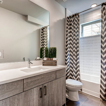
$8,000 Builder credit paid to you towards window coverings, closing costs or interest buy-down! Magazine quality kitchen w/ expensive high gloss white finish, frosted glass showcase and soft close / pull-out cabinetry * Upgraded touch faucet * Upgraded composite granite sink for durability * Upgraded GE Cafe SS appliances * Upgraded 4" solid hardwood flooring * Upgraded slimline fireplace * Upgraded tankless water heater for high efficiency* Upgraded solid core doors throughout (twice the price of standard hollow core) * Upgraded custom handmade wrought-iron rail / with butcher block wood stairsystem * Rec/Media Room w/ upgraded roll-up garage door double pane & insulated for energy efficiency * Expansive patio with panoramic unobstructed city skyline AND mountain views perfect for entertaining* Full wet bar w/ wine refrigerator, sink and storage * 4 bedroom potential (call broker for specs) * 2 car detached garage * Ample storage space in 14' garage and temp controlled 3' crawl space.
 Klopf Architecture
The Roger Lee designed house from 1962 was purchased by the current homeowners in almost original condition, as the previous owners elected to defer most maintenance projects over the years. The clients were able to see beyond the dated materials and finishes, single-paned glass and uninsulated walls and they approached Klopf Architecture to help them expand and update the entire home, one the family could settle into and enjoy for years to come. It was important that the new designs were aligned with Lee's original intent not only because of the client's appreciation for mid-century modern architecture, but also because the house was deemed historical. The Stanford Real Estate Office requires a stringent design review which safeguards the integrity of the community, which Klopf Architecture was happy to oblige going into their updated designs.
As with many original mid-century modern homes, the house was scaled to the 1960s lifestyle where rooms were smaller and openings to views were limited and tightly framed. The original conditions defined the direction the family of four would take in updating the house and making it comfortable for their modern lifestyle. Klopf designed a full gut remodel and major addition to bring the house into the 21st century and provide the living area needed for the client's family. The newly expanded house added just about 1,100 sf to create an airy, comfortable and family friendly house, taking full advantage of the beautiful southwestern views that extend out to the hills beyond. The enclosed garage created an additional 240 sf of covered space for long-term storage.
A cracked swimming pool created an eyesore taking up a majority of the backyard landscape, so it was one of the first elements to go during the transformation. Working with Outer Space Landscape Architects, the family asked for a mix of relaxing outdoor patio spaces that eventually blend into the native landscaping, extending their views outward toward the natural greenery of the trees beyond their property. Filling in the old pool was a smart way to expand the living spaces outward. The orientation of the house was designed to enjoy the views, but the original architecture provided the first homeowners with mere glimpses of the landscape outside.
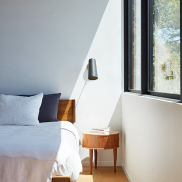
Klopf was able to broaden those views, continuing and extending on the original architecture to take full advantage of the unobstructed natural views across the rear facade of the house. Small horizontal openings in the primary bedroom and office were replaced with much taller windows that now follow the angled roof line upward, extending across almost all of the facade. We worked with Western Windows, whose designs included an oblique-shaped, operable casement that allowed our design to rise with the slope. A new corner office added to the primary suite, offers a bright and functional work-from-home solution that looks out at the distant views and added natural light from the expanded window configuration that now wraps around the corner.
The existing lower level was designed by Lee as a utilitarian space, serving as a wet pool room with a drain in the center of the floor, bathroom, laundry and storage areas. Without the need for a pool room, Klopf was able to convert the area into a much more comfortable and functional living space with a new family room and guest suite. The new spaces enjoy easy access to a new outdoor patio through floor to ceiling, full-width glass sliders.
Continuing along the rear facade, a previously exposed deck extending from the living room and hallway provided access to the backyard through a single set of stairs leading toward the side of the house which made sense when the pool was in place. The new deck was re-envisioned as an extension of the main living room and now serves as a second outdoor living room. A new slatted pergola above provides the homeowners welcome relief from the hot afternoon sun. A second set of stairs now creates a better connection to the redesigned lower level. Klopf was able to reconfigure the spaces, extending the living room outward toward the views, where the family now claims it as the heart of the home, spending a large majority of their time outdoors.
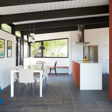
Back inside, the original wood-burning Malm fireplace was beautifully restored and a gas burner installed to comply with California's strict air standards. It now rests in front of a wall of Heath accent tiles where a dated red brick wall used to stand. A new taller window brings more light and views into the refreshed interior living room. The original glass doors opposite the fireplace were replaced by larger sliders that when fully opened, create a seamless transition to the new outdoor living area so the two spaces feel like one connected space. The original utilitarian kitchen was needlessly tucked into the far back corner and closed-off, out of sight from the living room, so the clients asked Klopf to open it up and expand the kitchen forward so it felt more connected. Today the much larger kitchen is connected to the living area where a short wall with a cutout offers a visual glimpse into the kitchen and a handy pass-through counter for serving guests. A new breakfast nook was also added to create another spot where the family can gather for casual meals. Just outside, a new built-in outdoor grill and prep area extends the kitchen outside and connects to a new outdoor dining spot nestled amongst the trees, taking advantage of the views out back.
Klopf was able to expand the other two bedrooms, add a new laundry room and half-bath and convert the carport to an enclosed garage to add more storage areas which was lost when the pool house was converted to the family and guest room.
To maintain a historical connection to the original designs, the exterior siding was repeated on all exterior walls, a full-height stained glass window at the front entryway restored, and an interior slatted screen element repeated outside at the exterior entry courtyard and over the new outdoor living room to create a shade trellis. The new house stands proudly and shines against it's new landscaping features, while respecting and expanding on the original intent of Roger Lee's designs epitomizing the comforts of indoor-outdoor living in Northern California.
Completion year: 2020
Klopf Architecture project team: John Klopf, Klara Kevane, Noel Andrade
Contractor: ORB Construction, Brendan O'Reilly
Structural engineer: Sezen and Moon
Landscape architect: Outer space
Furnishings and decoration: Urbanism Designs
Photographer: Mariko Reed
 Klopf Architecture
The Roger Lee designed house from 1962 was purchased by the current homeowners in almost original condition, as the previous owners elected to defer most maintenance projects over the years. The clients were able to see beyond the dated materials and finishes, single-paned glass and uninsulated walls and they approached Klopf Architecture to help them expand and update the entire home, one the family could settle into and enjoy for years to come. It was important that the new designs were aligned with Lee's original intent not only because of the client's appreciation for mid-century modern architecture, but also because the house was deemed historical. The Stanford Real Estate Office requires a stringent design review which safeguards the integrity of the community, which Klopf Architecture was happy to oblige going into their updated designs.
As with many original mid-century modern homes, the house was scaled to the 1960s lifestyle where rooms were smaller and openings to views were limited and tightly framed. The original conditions defined the direction the family of four would take in updating the house and making it comfortable for their modern lifestyle. Klopf designed a full gut remodel and major addition to bring the house into the 21st century and provide the living area needed for the client's family. The newly expanded house added just about 1,100 sf to create an airy, comfortable and family friendly house, taking full advantage of the beautiful southwestern views that extend out to the hills beyond. The enclosed garage created an additional 240 sf of covered space for long-term storage.
A cracked swimming pool created an eyesore taking up a majority of the backyard landscape, so it was one of the first elements to go during the transformation. Working with Outer Space Landscape Architects, the family asked for a mix of relaxing outdoor patio spaces that eventually blend into the native landscaping, extending their views outward toward the natural greenery of the trees beyond their property. Filling in the old pool was a smart way to expand the living spaces outward. The orientation of the house was designed to enjoy the views, but the original architecture provided the first homeowners with mere glimpses of the landscape outside.
Klopf was able to broaden those views, continuing and extending on the original architecture to take full advantage of the unobstructed natural views across the rear facade of the house. Small horizontal openings in the primary bedroom and office were replaced with much taller windows that now follow the angled roof line upward, extending across almost all of the facade. We worked with Western Windows, whose designs included an oblique-shaped, operable casement that allowed our design to rise with the slope. A new corner office added to the primary suite, offers a bright and functional work-from-home solution that looks out at the distant views and added natural light from the expanded window configuration that now wraps around the corner.
The existing lower level was designed by Lee as a utilitarian space, serving as a wet pool room with a drain in the center of the floor, bathroom, laundry and storage areas. Without the need for a pool room, Klopf was able to convert the area into a much more comfortable and functional living space with a new family room and guest suite. The new spaces enjoy easy access to a new outdoor patio through floor to ceiling, full-width glass sliders.
Continuing along the rear facade, a previously exposed deck extending from the living room and hallway provided access to the backyard through a single set of stairs leading toward the side of the house which made sense when the pool was in place. The new deck was re-envisioned as an extension of the main living room and now serves as a second outdoor living room. A new slatted pergola above provides the homeowners welcome relief from the hot afternoon sun. A second set of stairs now creates a better connection to the redesigned lower level. Klopf was able to reconfigure the spaces, extending the living room outward toward the views, where the family now claims it as the heart of the home, spending a large majority of their time outdoors.
Back inside, the original wood-burning Malm fireplace was beautifully restored and a gas burner installed to comply with California's strict air standards. It now rests in front of a wall of Heath accent tiles where a dated red brick wall used to stand. A new taller window brings more light and views into the refreshed interior living room. The original glass doors opposite the fireplace were replaced by larger sliders that when fully opened, create a seamless transition to the new outdoor living area so the two spaces feel like one connected space. The original utilitarian kitchen was needlessly tucked into the far back corner and closed-off, out of sight from the living room, so the clients asked Klopf to open it up and expand the kitchen forward so it felt more connected. Today the much larger kitchen is connected to the living area where a short wall with a cutout offers a visual glimpse into the kitchen and a handy pass-through counter for serving guests. A new breakfast nook was also added to create another spot where the family can gather for casual meals. Just outside, a new built-in outdoor grill and prep area extends the kitchen outside and connects to a new outdoor dining spot nestled amongst the trees, taking advantage of the views out back.
Klopf was able to expand the other two bedrooms, add a new laundry room and half-bath and convert the carport to an enclosed garage to add more storage areas which was lost when the pool house was converted to the family and guest room.
To maintain a historical connection to the original designs, the exterior siding was repeated on all exterior walls, a full-height stained glass window at the front entryway restored, and an interior slatted screen element repeated outside at the exterior entry courtyard and over the new outdoor living room to create a shade trellis. The new house stands proudly and shines against it's new landscaping features, while respecting and expanding on the original intent of Roger Lee's designs epitomizing the comforts of indoor-outdoor living in Northern California.
Completion year: 2020
Klopf Architecture project team: John Klopf, Klara Kevane, Noel Andrade
Contractor: ORB Construction, Brendan O'Reilly
Structural engineer: Sezen and Moon
Landscape architect: Outer space
Furnishings and decoration: Urbanism Designs
Photographer: Mariko Reed
 InnovationLand
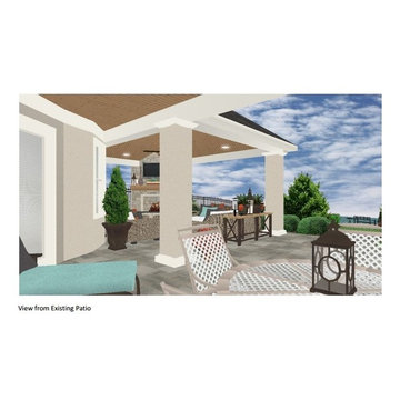
We are so excited about this stylish Houston patio addition!
It's one of our most recent outdoor living space design projects - and one of our new favorites!
We particularly love the rustic corner fireplace, the beautiful, vaulted pine ceiling and the Restoration Hardware furniture and accessories.
"Even though this space has an outdoor kitchen - often the highlight of our projects - the focus here is beautiful, comfortable outdoor living," says Outdoor Homescapes of Houston owner Wayne Franks. "And I have to say, I think this is one of the most gorgeous spaces we've created for doing that - in style."
"This project was special from the start, as we were creating this space for a friend of Wayne’s who had been a long time mentor to his boys growing up," adds Lisha Maxey, owner of LGH Designs in Houston (she coordinated furniture and finishes for the project). "This client was the principal of their high school and knew all of them very well and Wayne, too. This made it very personal, indeed, and we wanted everything to be perfect!"
The 23- by 16-foot addition, located at the back of the house in Cypress, looks out onto a manmade lake in the homeowners' subdivision. The focal point? A 9-foot-8-inch-high-by-7-foot-wide corner fireplace in Earth Grey rustic ledgestone from Colorstone in Houston. The fireplace features a custom wooden mantel, stone bench seating and a 52-inch Sunbrite outdoor TV.
Another highlight is the flooring - silver travertine tile laid out in a Versailles pattern. "We chose silver travertine in a 'Tumbled' color palette with variations of cream and brown," says Lisha. "So we had those two colors, plus grey, to pull from."
The 7-foot-long, stucco outdoor kitchen island's countertops are also noteworthy - Absolute Black granite in a leathered finish offering a modern look and a dark grey hue that works perfectly with the color palette. The kitchen island also houses an RCS 30-inch grill and fridge.
The seating area includes a sectional couch, coffee table, two swivel chairs and two ottomans - all from Restoration Hardware.
"We used Restoration Hardware's Biscayne sectional, swivel chairs and ottomans in gray, with textured linen weave in Sand and cushions and peacock accent pillows in gray," says Lisha. The coffee table is made of solid teak with a concrete top - as is the matching side table.
"We added a console table, also in teak, behind the sofa. And for accents, we added three Amalfi lanterns from Restoration Hardware in weathered zinc."
A Sunbrella® Heathered area rug (in Gray) was added to anchor the space and visually tie it together.
"The space as a whole leans towards a transitional style, in that it has many traditional cozy comforts and colors, but the furniture gives it a more contemporary look," says Lisha. "The idea from the beginning was to marry these two styles, as our clients wanted a look that would not age and be in vogue for years to come."
On the exterior, you can see how we worked to make the addition blend with the existing home - matching the shingles and stucco and continuing the landscaping.
3D graphic renderings and a virtual video tour allowed the clients to know exactly what the space would look like beforehand.
"It takes a lot of the guesswork out of the process," says Outdoor Homescapes' graphic designer, Kristy Buell Franks. "Floor plans and elevation drawings are good for giving an idea of the overall scope of the project, but it's the 3D renderings that really show what the space is going to look like."
The 3D graphics and video tours also help immensely when choosing finishing materials and furniture, she says: "The clients' choices can be put into the design to allow the clients to see how the materials will work with the existing materials on the house and how the furniture will look in the space."
What do you like about this space? Post a comment and let us know!
URL http://www.outdoorhomescapes.com
 Adam Gibson Design
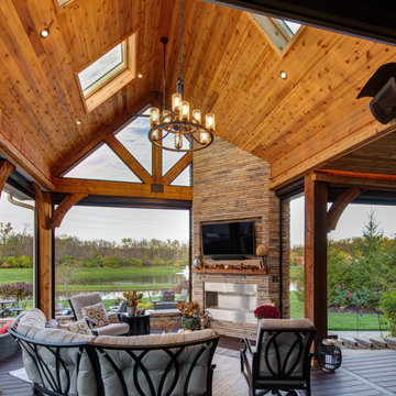
Previously a sun-drenched deck, unusable late afternoon because of the heat, and never utilized in the rain, the indoors seamlessly segues to the outdoors via Marvin's sliding wall system. Retractable Phantom Screens keep out the insects, and skylights let in the natural light stolen from the new roof. Powerful heaters and a fireplace warm it up during cool evenings.

 Living Green Designs
In this backyard space, the design challenge was to bring the essence of the California Mountains to Redondo Beach. As this client is an avid outdoorsman, he wanted to bring the a feel of the Sierra Nevada mountains, his happy place, home to create his very own backyard mountain retreat. Our team sourced materials that one would find in the mountains of California whilst keeping a lounge feel in mind for the secondary design criteria, a retreat. In this retreat, we created four distinct areas: the lounging area with covered pergola, fire pit area with built-in seating bench and overhead trellis complete with carnival lighting, central waterfall, and barbeque area with picnic table and overhead carnival lighting. We built a 10” x 10” rugged pergola was built out of sustainably sourced pine. The massive posts feel as though large pine trees were harvested right out of the California Mountains and crafted right on-site. The pergola was built with a retractable shade cloth so the sun can be let in for warmth in open during the colder months. The pergola and the other hard-scaped areas in the backyard were covered with a mix of gray granite and charcoal pavers. This color selection is reminiscent of the colors in California granite. Walking north from the pergola toward the fire pit area there is a mass planting of deer grasses, assortment of ferns and California coffee berries planted to mimic California Chaparral. At the other edge of this chaparral garden, sits the Cresta Boulder fire pit. Boulders were used to create this fire pit to harness the feeling of being outdoors in the wilderness. The boulders were locally sourced out of the Sierra Nevada mountain range for authenticity. In order to frame the space we installed a trellis and off the trellis runs carnival lights for night time parties. Just beyond the fire pit sits a granite boulder water fall. The waterfall is placed so that wherever you are in the yard you can see and hear the tranquil sounds of the babbling water as it circulates and recycles. The barbeque area is nestled against the backdrop of a dark green fernleaf podocarpus hedge. During the day, birds and butterflies traverse the native foliage and at night the sounds of the fire pit dance in harmony with the gentle sounds of water falling down granite pebbles making this backyard a true retreat from the chaotic noise of the city.
 Go Home Builders
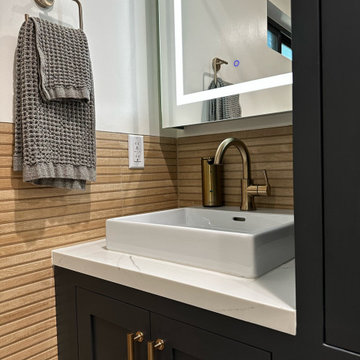
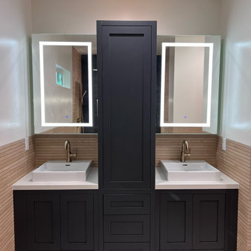
Upon stepping into this stylish japandi modern fusion bathroom nestled in the heart of Pasadena, you are instantly greeted by the unique visual journey of maple ribbon tiles These tiles create an inviting path that extends from the entrance of the bathroom, leading you all the way to the shower. They artistically cover half the wall, adding warmth and texture to the space. Indeed, creating a japandi modern fusion style that combines the best of both worlds. You might just even say japandi bathroom with a modern twist.
Elegance and Boldness
Above the tiles, the walls are bathed in fresh white paint. Particularly, he crisp whiteness of the paint complements the earthy tones of the maple tiles, resulting in a harmonious blend of simplicity and elegance.
Moving forward, you encounter the vanity area, featuring dual sinks. Each sink is enhanced by flattering vanity mirror lighting. This creates a well-lit space, perfect for grooming routines.
Balanced Contrast
Adding a contemporary touch, custom black cabinets sit beneath and in between the sinks. Obviously, they offer ample storage while providing each sink its private space. Even so, bronze handles adorn these cabinets, adding a sophisticated touch that echoes the bathroom’s understated luxury.
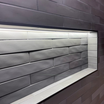
The journey continues towards the shower area, where your eye is drawn to the striking charcoal subway tiles. Clearly, these tiles add a modern edge to the shower’s back wall. Alongside, a built-in ledge subtly integrates lighting, adding both functionality and a touch of ambiance.
The shower’s side walls continue the narrative of the maple ribbon tiles from the main bathroom area. Definitely, their warm hues against the cool charcoal subway tiles create a visual contrast that’s both appealing and invigorating.
Beautiful Details
Adding to the seamless design is a sleek glass sliding shower door. Apart from this, this transparent element allows light to flow freely, enhancing the overall brightness of the space. In addition, a bronze handheld shower head complements the other bronze elements in the room, tying the design together beautifully.
Underfoot, you’ll find luxurious tile flooring. Furthermore, this material not only adds to the room’s opulence but also provides a durable, easy-to-maintain surface.
Finally, the entire japandi modern fusion bathroom basks in the soft glow of recessed LED lighting. Without a doubt, this lighting solution adds depth and dimension to the space, accentuating the unique features of the bathroom design. Unquestionably, making this bathroom have a japandi bathroom with a modern twist.
 Go Home Builders
Upon stepping into this stylish japandi modern fusion bathroom nestled in the heart of Pasadena, you are instantly greeted by the unique visual journey of maple ribbon tiles These tiles create an inviting path that extends from the entrance of the bathroom, leading you all the way to the shower. They artistically cover half the wall, adding warmth and texture to the space. Indeed, creating a japandi modern fusion style that combines the best of both worlds. You might just even say japandi bathroom with a modern twist.
Elegance and Boldness
Above the tiles, the walls are bathed in fresh white paint. Particularly, he crisp whiteness of the paint complements the earthy tones of the maple tiles, resulting in a harmonious blend of simplicity and elegance.
Moving forward, you encounter the vanity area, featuring dual sinks. Each sink is enhanced by flattering vanity mirror lighting. This creates a well-lit space, perfect for grooming routines.
Balanced Contrast
Adding a contemporary touch, custom black cabinets sit beneath and in between the sinks. Obviously, they offer ample storage while providing each sink its private space. Even so, bronze handles adorn these cabinets, adding a sophisticated touch that echoes the bathroom’s understated luxury.
The journey continues towards the shower area, where your eye is drawn to the striking charcoal subway tiles. Clearly, these tiles add a modern edge to the shower’s back wall. Alongside, a built-in ledge subtly integrates lighting, adding both functionality and a touch of ambiance.
The shower’s side walls continue the narrative of the maple ribbon tiles from the main bathroom area. Definitely, their warm hues against the cool charcoal subway tiles create a visual contrast that’s both appealing and invigorating.
Beautiful Details
Adding to the seamless design is a sleek glass sliding shower door. Apart from this, this transparent element allows light to flow freely, enhancing the overall brightness of the space. In addition, a bronze handheld shower head complements the other bronze elements in the room, tying the design together beautifully.
Underfoot, you’ll find luxurious tile flooring. Furthermore, this material not only adds to the room’s opulence but also provides a durable, easy-to-maintain surface.
Finally, the entire japandi modern fusion bathroom basks in the soft glow of recessed LED lighting. Without a doubt, this lighting solution adds depth and dimension to the space, accentuating the unique features of the bathroom design. Unquestionably, making this bathroom have a japandi bathroom with a modern twist.
 Save home
Choosing between American framed cabinets and European frameless renditions often boils down to personal preference.
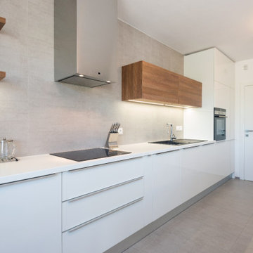
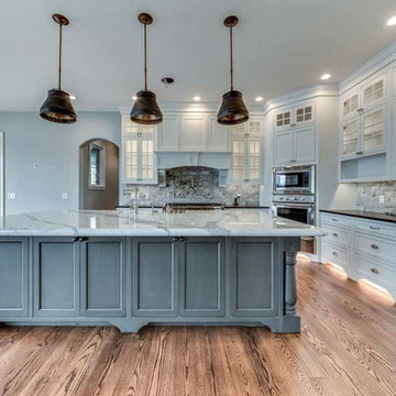
While the American framed counterpart emerges as an immensely popular choice, classic white European kitchen cabinets exhibit a timeless charm that one can't ignore.
It's pretty easy to distinguish a framed and a frameless cabinet as one pays close attention.
The American framed cabinets typically have wide gaps around the doors showing the face of the wood.
In comparison, the European frameless cabinets have much smaller gaps (less than a quarter-inch or more). Moreover, they also carry a matching edge band which is visible on the cabinet box, when its doors are left open.
Well, that's there with the basics and many more subtle differences that distinguish one kind from another.
In this post, we take a closer look at both frameless and framed cabinet styles, their merits and demerits, and help you make an informed decision to buy one.
The American Style Face Frames
As the name suggests, face frame cabinets dominate the structure of a cabinet and use comparatively thinner materials for the cabinet box.
One can find additional frame pieces (mullions) that rest right between the door and the face of the drawer.
One of the standout features of American framed cabinets is the doors that remain attached to the face frame and carry hinges concealed within. In such structures, the shelves are generally of half depth and can be hung side up or down according to one’s need.
Face frame cabinets are known to sport doors that are not classic or pure square in shape. Also, they use a trim mold for their finish which measures just about an inch, but wide enough to press on the wall contours. Thus, they are nailed right on the face of the cabinet as well as to the sides to even out the gaps following the installation.
In essence, this particular style of cabinetry is geared towards keeping things under budget and allows the makers to work persistently and create a specific line of products.
The European Frameless Style
Taking a different stance from American face frame cabinets, we have the European Frameless style that views the cabinet box as the main structure.
It goes to work with a thin edge connected to the cabinet box matching the exteriors. The material used for the cabinet box is also thicker and carries quite a bit of weight.
Also, instead of the face frame, the glides for the door and the drawers stay attached to the cabinet box itself. The white European kitchen cabinets also use concealed hinges, which is again chunkier compared to its American counterpart.
While such frameless cabinets can be easily ordered by referring to a catalog, most buyers opt for a custom made product.
Another glaring difference between the two cabinetry styles is how the European frameless renditions work with cabinet doors that are perfect squares, and all lines between the drawers and doors are straight, imparting consistency throughout.
Furthermore, the finishing detail instead of using trim molds are scribed and further cut to fit within the walls.
Delightful enough, one can have a European frameless cabinets customized to their liking, mood, and style. White European kitchen cabinets, unlike framed ones, can be made to look rustic, transitional, modern, or traditional, and could be even a blend of any two styles.
How Do You Know Which Is The Right Style For You?
As mentioned earlier, choosing a particular style of cabinetry is all dependent on your personal preference. However, there are a few merits and demerits to each style.
For instance, the white European kitchen cabinets are extremely high in demand and can offer a rich look and elegant feel to any space.
Even if you go for any other color other than the classic ones, it is the flexibility, the visually stunning appearance, and precise carpentry that goes in its favor.
Come-of-age cabinet makers have a wide range of white kitchen cabinets for sale to choose from. Cabinet DIY is one such professional and passionate cabinet maker that has helped many homeowners pick the right piece for their place. One can order from their website and get it shipped to their doorstep.
It's only evident why this carefully cut and sculpted cabinetry finds its place across leading home decor magazines and websites around the world.
The American face frame cabinets can seldom claim to match the elegance and timeless beauty of white European kitchen cabinets. Also, given the choice, European frameless cabinets have multiple doors and wide drawer banks offering adequate room for storage.
Most importantly, the hardware that goes into the making of a frameless cabinet has everything attached to the cabinet box which promises more longevity, compared to face frame renditions. While the former is more likely to stay the same over several years, the latter is prone to cracks appearing in places now and then, with slides and hinges fitted with screws.
Nevertheless, one of the standout reasons that might give American face frame cabinets an upper hand over European frameless cabinetry is budget.
American framed cabinets using much thinner finish material attributes to lower pricing. Also, given the fact that there isn't much room for exquisite designs, the budget is often an overpowering factor for many buyers.
Wrap up
For anyone who would like to order a cabinet that is aesthetically pleasing and promises endless customization and longevity will side with European frameless cabinets.
In doing so, it is quite probable that pricing won't be a hindrance as one wages the investment for the value the furniture adds to a living space. Something that American face framed cabinets can't seem to match up.
While the American framed counterpart emerges as an immensely popular choice, classic white European kitchen cabinets exhibit a timeless charm that one can't ignore.
It's pretty easy to distinguish a framed and a frameless cabinet as one pays close attention.
The American framed cabinets typically have wide gaps around the doors showing the face of the wood.
In comparison, the European frameless cabinets have much smaller gaps (less than a quarter-inch or more). Moreover, they also carry a matching edge band which is visible on the cabinet box, when its doors are left open.
Well, that's there with the basics and many more subtle differences that distinguish one kind from another.
In this post, we take a closer look at both frameless and framed cabinet styles, their merits and demerits, and help you make an informed decision to buy one.
The American Style Face Frames
As the name suggests, face frame cabinets dominate the structure of a cabinet and use comparatively thinner materials for the cabinet box.
One can find additional frame pieces (mullions) that rest right between the door and the face of the drawer.
One of the standout features of American framed cabinets is the doors that remain attached to the face frame and carry hinges concealed within. In such structures, the shelves are generally of half depth and can be hung side up or down according to one’s need.
Face frame cabinets are known to sport doors that are not classic or pure square in shape. Also, they use a trim mold for their finish which measures just about an inch, but wide enough to press on the wall contours. Thus, they are nailed right on the face of the cabinet as well as to the sides to even out the gaps following the installation.
In essence, this particular style of cabinetry is geared towards keeping things under budget and allows the makers to work persistently and create a specific line of products.
The European Frameless Style
Taking a different stance from American face frame cabinets, we have the European Frameless style that views the cabinet box as the main structure.
It goes to work with a thin edge connected to the cabinet box matching the exteriors. The material used for the cabinet box is also thicker and carries quite a bit of weight.
Also, instead of the face frame, the glides for the door and the drawers stay attached to the cabinet box itself. The white European kitchen cabinets also use concealed hinges, which is again chunkier compared to its American counterpart.
While such frameless cabinets can be easily ordered by referring to a catalog, most buyers opt for a custom made product.
Another glaring difference between the two cabinetry styles is how the European frameless renditions work with cabinet doors that are perfect squares, and all lines between the drawers and doors are straight, imparting consistency throughout.
Furthermore, the finishing detail instead of using trim molds are scribed and further cut to fit within the walls.
Delightful enough, one can have a European frameless cabinets customized to their liking, mood, and style. White European kitchen cabinets, unlike framed ones, can be made to look rustic, transitional, modern, or traditional, and could be even a blend of any two styles.
How Do You Know Which Is The Right Style For You?
As mentioned earlier, choosing a particular style of cabinetry is all dependent on your personal preference. However, there are a few merits and demerits to each style.
For instance, the white European kitchen cabinets are extremely high in demand and can offer a rich look and elegant feel to any space.
Even if you go for any other color other than the classic ones, it is the flexibility, the visually stunning appearance, and precise carpentry that goes in its favor.
Come-of-age cabinet makers have a wide range of white kitchen cabinets for sale to choose from. Cabinet DIY is one such professional and passionate cabinet maker that has helped many homeowners pick the right piece for their place. One can order from their website and get it shipped to their doorstep.
It's only evident why this carefully cut and sculpted cabinetry finds its place across leading home decor magazines and websites around the world.
The American face frame cabinets can seldom claim to match the elegance and timeless beauty of white European kitchen cabinets. Also, given the choice, European frameless cabinets have multiple doors and wide drawer banks offering adequate room for storage.
Most importantly, the hardware that goes into the making of a frameless cabinet has everything attached to the cabinet box which promises more longevity, compared to face frame renditions. While the former is more likely to stay the same over several years, the latter is prone to cracks appearing in places now and then, with slides and hinges fitted with screws.
Nevertheless, one of the standout reasons that might give American face frame cabinets an upper hand over European frameless cabinetry is budget.
American framed cabinets using much thinner finish material attributes to lower pricing. Also, given the fact that there isn't much room for exquisite designs, the budget is often an overpowering factor for many buyers.
Wrap up
For anyone who would like to order a cabinet that is aesthetically pleasing and promises endless customization and longevity will side with European frameless cabinets.
In doing so, it is quite probable that pricing won't be a hindrance as one wages the investment for the value the furniture adds to a living space. Something that American face framed cabinets can't seem to match up.
Sponsored
Fredericksburg, OH

High Point Cabinets
Columbus' Experienced Custom Cabinet Builder | 4x Best of Houzz Winner
 Go Home Builders
Upon stepping into this stylish japandi modern fusion bathroom nestled in the heart of Pasadena, you are instantly greeted by the unique visual journey of maple ribbon tiles These tiles create an inviting path that extends from the entrance of the bathroom, leading you all the way to the shower. They artistically cover half the wall, adding warmth and texture to the space. Indeed, creating a japandi modern fusion style that combines the best of both worlds. You might just even say japandi bathroom with a modern twist.
Elegance and Boldness
Above the tiles, the walls are bathed in fresh white paint. Particularly, he crisp whiteness of the paint complements the earthy tones of the maple tiles, resulting in a harmonious blend of simplicity and elegance.
Moving forward, you encounter the vanity area, featuring dual sinks. Each sink is enhanced by flattering vanity mirror lighting. This creates a well-lit space, perfect for grooming routines.
Balanced Contrast
Adding a contemporary touch, custom black cabinets sit beneath and in between the sinks. Obviously, they offer ample storage while providing each sink its private space. Even so, bronze handles adorn these cabinets, adding a sophisticated touch that echoes the bathroom’s understated luxury.
The journey continues towards the shower area, where your eye is drawn to the striking charcoal subway tiles. Clearly, these tiles add a modern edge to the shower’s back wall. Alongside, a built-in ledge subtly integrates lighting, adding both functionality and a touch of ambiance.
The shower’s side walls continue the narrative of the maple ribbon tiles from the main bathroom area. Definitely, their warm hues against the cool charcoal subway tiles create a visual contrast that’s both appealing and invigorating.
Beautiful Details
Adding to the seamless design is a sleek glass sliding shower door. Apart from this, this transparent element allows light to flow freely, enhancing the overall brightness of the space. In addition, a bronze handheld shower head complements the other bronze elements in the room, tying the design together beautifully.
Underfoot, you’ll find luxurious tile flooring. Furthermore, this material not only adds to the room’s opulence but also provides a durable, easy-to-maintain surface.
Finally, the entire japandi modern fusion bathroom basks in the soft glow of recessed LED lighting. Without a doubt, this lighting solution adds depth and dimension to the space, accentuating the unique features of the bathroom design. Unquestionably, making this bathroom have a japandi bathroom with a modern twist.

 Design Perspectives LLC
My client called me in for a "Design Perspective". She hated her floors and wanted my professional opinion. I questioned whether I should be brutally honest, and her response was "absolutely". Then truth be told, "your countertops bother me more than your floors". My client has a stunningly beautiful home and her countertops were not in "the same league". So the project scope expanded from new floors to include countertops, backsplash, plumbing fixtures and hardware. While we were at it, her overly froufrou corbels were updated along with dishwashers that "drove her crazy". Since there was plenty of "demo" in store, she elected to lower her breakfast bar to counter height at the same time to connect her nook more seamlessly with her kitchen.
The process: at our first slab warehouse stop, within ten minutes, we uncovered the most beautiful slabs of Taj Mahal ever. No need to keep looking. The slabs had perfect coloration and veining. So different from any other slab of Taj Mahal, it really ought to have its own name. Countertop selection was easy as was the subway and Arabesque backsplash tile. Polished chrome, with its blend of warm and cool tones, was the obvious choice for her plumbing fixture and hardware finish. Finding the right floor tile was what proved to be most challenging, but my client was up to the task. Several weeks of shopping and numerous samples hauled home led us to the perfect limestone.
Once her room was complete, better barstools were in order. Hancock and Moore with their huge assortment of leather colors and textures was our clear choice. The Ellie barstools selected embody the perfect blend of form and comfort.
Her new limestone flooring extends into her Butler's pantry, pool bath, powder bath and sewing room, so wait, there is still more to do.
 Living Green Designs
In this backyard space, the design challenge was to bring the essence of the California Mountains to Redondo Beach. As this client is an avid outdoorsman, he wanted to bring the a feel of the Sierra Nevada mountains, his happy place, home to create his very own backyard mountain retreat. Our team sourced materials that one would find in the mountains of California whilst keeping a lounge feel in mind for the secondary design criteria, a retreat. In this retreat, we created four distinct areas: the lounging area with covered pergola, fire pit area with built-in seating bench and overhead trellis complete with carnival lighting, central waterfall, and barbeque area with picnic table and overhead carnival lighting. We built a 10” x 10” rugged pergola was built out of sustainably sourced pine. The massive posts feel as though large pine trees were harvested right out of the California Mountains and crafted right on-site. The pergola was built with a retractable shade cloth so the sun can be let in for warmth in open during the colder months. The pergola and the other hard-scaped areas in the backyard were covered with a mix of gray granite and charcoal pavers. This color selection is reminiscent of the colors in California granite. Walking north from the pergola toward the fire pit area there is a mass planting of deer grasses, assortment of ferns and California coffee berries planted to mimic California Chaparral. At the other edge of this chaparral garden, sits the Cresta Boulder fire pit. Boulders were used to create this fire pit to harness the feeling of being outdoors in the wilderness. The boulders were locally sourced out of the Sierra Nevada mountain range for authenticity. In order to frame the space we installed a trellis and off the trellis runs carnival lights for night time parties. Just beyond the fire pit sits a granite boulder water fall. The waterfall is placed so that wherever you are in the yard you can see and hear the tranquil sounds of the babbling water as it circulates and recycles. The barbeque area is nestled against the backdrop of a dark green fernleaf podocarpus hedge. During the day, birds and butterflies traverse the native foliage and at night the sounds of the fire pit dance in harmony with the gentle sounds of water falling down granite pebbles making this backyard a true retreat from the chaotic noise of the city.
191