
Search results for "Traffic spaces" in Home Design Ideas
 Charles Vincent George Architects, Inc.
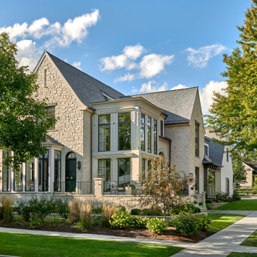
This 5,523-square-foot French Country residence offers a modern twist on classic European elegance. Located on a prominent corner lot near downtown Naperville, this home blends timeless style with contemporary living. The open-concept main floor flows seamlessly, highlighted by a stunning glass stair tower showcasing the custom curved staircase. A spacious, wrap-around patio provides ample seating to enjoy the vibrant pedestrian traffic of the nearby downtown area. Interior details include groin vaulted hallways on both levels, creating a sense of character and warmth throughout the home. The south-facing Orangerie, bathed in natural light from floor-to-ceiling windows, evokes the charm of a Parisian salon with its classic checkerboard floor and comfortable lounge furniture. The great room, anchored by a transitional fireplace with a black onyx full-height mantel, connects effortlessly to the kitchen and its expansive window-lined back counter and island, creating a generous and inviting living space. The property also includes an attached two-car garage and a detached one-car garage.

 Riverside Construction, LLC
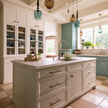
It’s the little things that our clients love the most about the newly remodeled kitchen in their Limberlost Lane, Lafayette home. Things like the island bar sink and kitchen island bar seating make it easy for them to entertain. For this couple, function trumps everything. They were living with their 1980s kitchen, but found it dark and closed off from the rest of the house. The outdated kitchen also didn’t suit the homeowners’ current style or taste.
With the help of Riverside Construction, they opened up the kitchen to create more efficient workspace, better traffic flow and improved lighting. Aesthetically, the space was upgraded with medium colored Hickory flooring, a honed travertine backsplash with Mosaic tile accents, an undermount Silgranite sink with Hawaii granite countertops, and full overlay cabinet doors in both dark and light colors.

Find the right local pro for your project
 Juxtapose Design Build
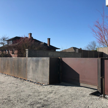
The remodel of the home was designed by UrbanADD architects here in Seattle, WA. The architecture uses bold forms that take advantage of the views of the Space Needle and of Elliot Bay. The design of the house uses material banding in the concept of a snake.
For the landscape, the homeowners requested outdoor rooms with privacy from the busy foot traffic at the intersection of 1st AVE W and W Prospect St. The landscape design complements the architecture of the with the use of steel in various ways from the entry gate, planters, and deck guard rail. We also brought the stone veneer to an outside focal wall to connect with the siding of the home and the interior fireplace wall. The landscape installation is not yet complete without plants which will be done Spring 2020.

 Main Line Kitchen Design
 is a unique business model! We are a group of skilled Kitchen Designers each with many years of experience planning kitchens around the Delaware Valley. And we are cabinet dealers for 8 nationally distributed cabinet lines much like traditional showrooms.
Unlike full showrooms open to the general public, Main Line Kitchen Design works only by appointment. Appointments can be scheduled days, nights, and weekends either in your home or in our office and selection center. During office appointments we display clients kitchens on a flat screen TV and help them look through 100’s of sample doorstyles, almost a thousand sample finish blocks and sample kitchen cabinets. During home visits we can bring samples, take measurements, and make design changes on laptops showing you what your kitchen can look like in the very room being renovated. This is more convenient for our customers and it eliminates the expense of staffing and maintaining a larger space that is open to walk in traffic. We pass the significant savings on to our customers and so we sell cabinetry for less than other dealers, even home centers like Lowes and The Home Depot.
 Main Line Kitchen Design
 is a unique business model! We are a group of skilled Kitchen Designers each with many years of experience planning kitchens around the Delaware Valley. And we are cabinet dealers for 8 nationally distributed cabinet lines much like traditional showrooms.
Unlike full showrooms open to the general public, Main Line Kitchen Design works only by appointment. Appointments can be scheduled days, nights, and weekends either in your home or in our office and selection center. During office appointments we display clients kitchens on a flat screen TV and help them look through 100’s of sample doorstyles, almost a thousand sample finish blocks and sample kitchen cabinets. During home visits we can bring samples, take measurements, and make design changes on laptops showing you what your kitchen can look like in the very room being renovated. This is more convenient for our customers and it eliminates the expense of staffing and maintaining a larger space that is open to walk in traffic. We pass the significant savings on to our customers and so we sell cabinetry for less than other dealers, even home centers like Lowes and The Home Depot.

 Renovisions
These homeowners were anxiously ready to remodel their dated 80’s kitchen and reached out to Renovisions to handle the transformation. In this new undertaking we met to discuss plans to brighten the dark room with custom painted white inset cabinets, adding more functional storage, better task lighting and GE Monogram appliances, new hardwood flooring throughout and creating a better flow into the adjacent family room. In order to open up the space, Renovisions suggested creating an angle at the peninsula. Continuing with this approach we replaced the rear door with a new one-light door that swings out instead of in to accommodate new bar stools and a better flow of traffic in and out to the deck outside. Silestone’s quartz countertops in ‘Merope’ were the perfect choice adding a nice contrast yet truly durable and low maintenance. Creating a beautifully unique subway tile niche in linen color at cooktop area and backsplash added an elegant touch to the overall look and homeowners were thrilled with this refreshing look after the Renovision.
Now their newly renovated kitchen is a showcase and nicely outfitted for family and friends.


 Orange County Deck Co.
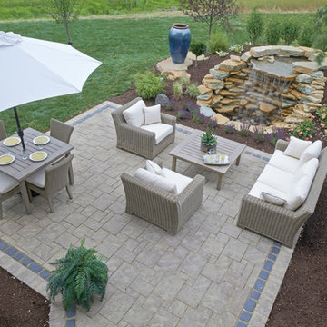
This project was full outdoor living environment, what some would call a “staycation” backyard. A hybrid pool had been installed the previous year but now the living and entertaining spaces needed to be constructed. Consisting of a deck, two patio spaces with walkways connecting all, a couple retaining walls, fencing, landscaping and a new sliding door. The retaining walls were needed to allow for the patio space around to pool. The patio space was divided into two sections, one the wet zone by the pool and the second being the handout zone. This also allowed for a smaller area of fence with a clean transition. The deck constructed using Azek building products provided the style they wanted without having to worry about maintenance. With the elevation being over 8 feet off the ground, the staircase was given careful consideration. It was put on the side that had the grade in its favor to cut down on the size and to not impede on the usable living areas. Traffic flow and usable space should always be considered when designing your space. Now to get a better view of their beautiful backyard we changed their existing single 3 ft. hinged door for a new 6 ft sliding unit. This type of change does involve some structural modification but well worth it. It gave them the sight line they wanted, allows more natural light and has less impact on the living space as the door now slides.
We had a great time constructing this space and love knowing they will be enjoying their home life with family and friends. What could we build in your backyard?
 Riverside Construction, LLC
The owners of this 1930’s craftsman home in West Lafayette were ready to fall in love with their home all over again. To do so, they had to remove the giraffe-inspired flooring, dated wallpaper, and stucco soffits. Beyond the aesthetic appeal of a retro style kitchen design, these homeowners turned to Riverside Construction to plan their kitchen remodel for maximum efficiency—to create useful and efficient storage space, larger countertops, and improve traffic flow.
This complete kitchen gut and remodel involved tearing down walls, including removing a small partition near the stove, to gain much needed square footage. The existing peninsula was relocated to the opposite side of the kitchen, and the range and refrigerator exchanged places for improved functionality. White Shaker style Wellborn cabinets, yellow Retro “Big Chill” appliances and a retro pendant light/fan combo by Fanimation rounded out this bright and airy kitchen remodel.
 Joshua Zinder Architecture + Design
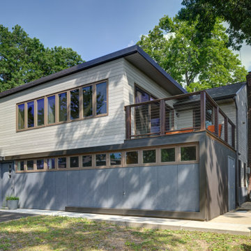
A married pair of artists sought to expand and adapt this salt box-style house into a functional, attractive live/work space while retaining certain nostalgic elements (this was the wife’s childhood home.) Their objectives included adding on a dining room; expanding the master bedroom and downstairs studio spaces; maximizing natural light; and continuing occupancy throughout.
The through-block property is sited between a high-traffic road and another that provides vehicular access to the house. The architect’s solution effectively reversed the entry sequence. The studio elevation, with the master bedroom, dining room and terrace above, is now the formal front of the house, while the former front entrance from the busy road is now secondary.
Today, visitors arrive at the new primary entrance, greeted by a façade suggesting a simple folded ribbon: metal panels that wrap the expanded master bedroom and the new terrace.
Recladding with fiber cement composite rainscreen (a choice inspired by the clients’ travels in Finland) unifies the addition with the existing. The new dining room enjoys views of Meadowlands sunsets through the 12-foot length of full-height glass and the cable rails of the new deck outside. The L-shaped artist studio/office downstairs now gains light from transom-height windows running the width of the house.

 User
For this vacation home, a complete gut job was needed in order to fit the lifestyle and needs of this young family of four and their guests. The narrow floor plan created unique challenges, but we maximized its full potential. The result was a warm but modern design with plenty of storage and seating.
One of the biggest challenges was making sure everyone had a place to sit in the kitchen. The space between the kitchen and staircase was limiting, but with sleek modern chairs that tuck away, we were able to allow for traffic patterns and seat all of the children.
To accommodate any vacation extras, an extra wide space near the kitchen and bathroom was transformed into additional shelving. We installed floor-to-ceiling cabinets that offer plenty of space for everyone’s belongings.
A clean design was a must, so we opted for a more modern look. We used Benjamin Moore's "Simply White" as the foundation, putting it on the walls and cabinets, and coordinating the countertops and backsplash. To make the home more welcoming, we used natural wood on the island and floating shelves. The wood was coordinated with the floor, creating a cohesive interior.
Project designed by Star Valley, Wyoming interior design firm Tawna Allred Interiors. They also serve Alpine, Auburn, Bedford, Etna, Freedom, Freedom, Grover, Thayne, Turnerville, Swan Valley, and Jackson Hole, Wyoming
 FBC Remodel
Stylish & Smart Laundry + Mudroom Remodel | FBC Remodel
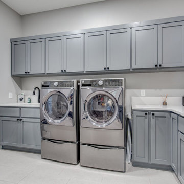
Function meets flair in this beautifully redesigned laundry and mudroom combo. Our team at FBC Remodel reimagined this high-traffic space to be both hardworking and stylish, ensuring it supports daily routines while offering elevated design.
The laundry area features custom gray cabinetry that provides ample storage for linens and cleaning supplies, while a quartz countertop and sleek black hardware keep the look polished. A built-in utility sink with a matte black faucet adds function, and the stainless-steel front-loading washer and dryer pair seamlessly with the cabinetry. A subtle framed art piece and pet-friendly features round out the space, making it as thoughtful as it is efficient.
In the adjacent mudroom, a streamlined drop zone welcomes you home with custom hooks, a bench with under-seat shoe storage, and clean, neutral tile flooring that stands up to daily wear. Trim details and fresh paint tie both spaces together for a cohesive, modern feel that blends perfectly with the rest of the home.
Whether unloading groceries or managing laundry day, this space now makes the everyday feel just a little more elevated.

 Bianchi Design
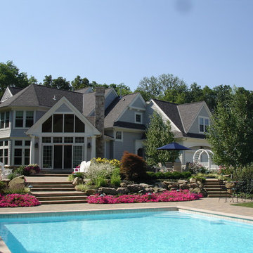
Previously, this yard was burdened by a typical boulder pile pool, that was heaped higher than typical, trying to hide the towering wall behind. At first, the clients sought merely to reconfigure the BBQ that was congesting the patio, but upon further analysis, they decided it was time to strip the entire yard, leaving only the pool shell. Bianchi’s solution introduced an array of four arbors to distract the eye from the wall behind, solving what the boulder waterfall could never do.
Additionally, the wall was painted a dark earth tone to add contrast and depth. This strategy enabled the wall to recede into the distance, while the agave blue grey arbors floated forward visually from the background. Previously, the patios were a hodgepodge of deck islands that were impossible to navigate, and were of insufficient size to arrange furniture on. A well organized patio streamlined the traffic flow and the living space, featuring a cast in place concrete fire pit and banco couch, as well as a new outdoor bistro, glowing with filtered light from the canvas shade sails overhead.
A turquoise glass overflow spa became the yards focal point, sharing the space between the pool and outdoor living. The striking symmetry of the spa and pot pedestal with regal cacti arrangement behind, flanked by the arbors on either side, created a stately first impression from the front door. This teaser was just a glimpse of what could not yet be seen serving as an invitation to explore and enjoy as the yard unfolds.
See more about this project & hear from the homeowner here: https://www.youtube.com/watch?v=7eT3RkLkg5w&feature=youtu.be
Sponsored
Columbus, OH
Free consultation for landscape design!

Peabody Landscape Group
Columbus' Reliable Landscape Design & Contracting

 Kerri Ann Thomas Interiors
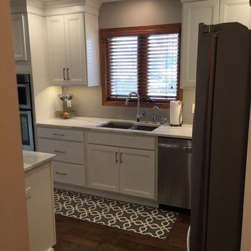
Big improvement! Way better work space. The original kitchen ended at the bulk head opening.
Example of a small cottage u-shaped medium tone wood floor eat-in kitchen design in Calgary with a double-bowl sink, shaker cabinets, gray cabinets, laminate countertops, metallic backsplash, metal backsplash, stainless steel appliances and a peninsula
Example of a small cottage u-shaped medium tone wood floor eat-in kitchen design in Calgary with a double-bowl sink, shaker cabinets, gray cabinets, laminate countertops, metallic backsplash, metal backsplash, stainless steel appliances and a peninsula
 SHOWCASE -- Hastings, Nebraska
Talk about a dramatic transformation!!
This Customer had a very large, but dark Kitchen & Dining Room. The original design of the Kitchen was very inefficient. Several cabinet doors couldn't open all the way for access into the cabinet. Counter space was broken up. The flow of both cooking and traffic through the Kitchen wasn't efficient. Lighting was dim. It wasn't a bright and cheery space where family gatherings could happen easily.
Now? This is the space where everyone congregates! You can definitely see why. Beautiful!! SHOWCASE is so thrilled for this customer's family to enjoy their lovely new spaces!!
__________________________________________
CABINETRY --
All Cabinetry is Homecrest Cabinetry by Masterbrand Cabinets. Maple wood with "Alpine" paint. The Cabinet door style is Lautner with slab drawer fronts. Hinges are 1/2" overlay. Drawer guides are Full-Extension with Soft-Close.
CABINET HARDWARE --
Hardware Resources / Jeffery Alexander Hardware in the "Sutton" series in a Brushed Nickel finish (Styles - 635-96SN, 635-128SN, 635-160SN)
KITCHEN COUNTERTOPS --
Cambria "Brittanica" quartz tops with an eased edge
Kitchen Sink is a Swanstone QURC3322 in "Metallico"
Kitchen Faucet is Moen "Align" 7565 in "Chrome"
Kitchen Soap is Moen S3947C in "Chrome"

 Michael Nash Design, Build & Homes
2013 NARI CAPITAL COTY, MERIT AWARD WINNER, RESIDENTIAL ADDITION UNDER $100,000/2013 CHRYSALIS AWARD SOUTH REGION WINNER, ADDITION UNDER $100,000
A couple with two young children lived in this 1970-vintage rambler in Arlington. As their kids grew and they added a live-in nanny, they all needed more space, a bigger kitchen and a nicer backyard space where the kids could play.
The home’s existing kitchen was 10’x10’ and adjacent to dining room of about the same size. Old cabinets, vinyl floor and olive green appliances no longer made this kitchen a happy place to which to come home. A narrow hallway leading to the bedrooms was one of their major concerns and tough to get through. As the traffic path to get to the kitchen was poorly done.
Design solutions provided by Michael Nash Design, Build & Homes included bumping out the back wall and moving the kitchen into the addition. The old hallway wall has come down and gotten wider and a new path from the front of the home to the open floor plan kitchen and dining room was created.
The new kitchen has tall cabinets with a beautiful cherry finish and a large bay window over the sink area. A new island with seating provides added work space and more storage. The wood floors were refinished to unify the space. Finally, a new, larger wooden deck was installed where the family could enjoy time together.

 TKS Design Group
Free ebook, Creating the Ideal Kitchen. DOWNLOAD NOW
This project started out as a kitchen remodel but ended up as so much more. As the original plan started to take shape, some water damage provided the impetus to remodel a small upstairs hall bath. Once this bath was complete, the homeowners enjoyed the result so much that they decided to set aside the kitchen and complete a large master bath remodel. Once that was completed, we started planning for the kitchen!
The original kitchen was just large enough to accommodate an island and a separate pantry but felt a little cramped, especially during the weekends when the couple likes to entertain. The primary goal was to maintain the functionality of the current space, but to add some breathing room as well as to provide a view to the homeowner’s side yard and substantial Hosta garden.
The solution was to bump out the space about 10 feet which provided ample room for large pro appliances, a large island for gathering and an upgraded pantry space. It was important to the homeowners to create a space that felt like it belonged in their historic 1866 home. Details such as matching new trim to the existing large custom profiles in the original home and re-purposing an existing door to be used for the new pantry, provided these touches. A large window at the main sink provides that view into the yard and a beautiful focal point for the room.
A mix of painted wood and stained cabinetry gives the new kitchen a sense of belonging in the older home, as do the Super White quartzite that has the look of marble, subway tile backsplash, polished nickel lanterns and glass and mirrored doors. The large pantry, filled with custom shelving built to the homeowner’s specifications, stainless steel appliances and the two Galley Workstations – sinks that do double duty as prep space – ensure that not only does the kitchen look great, but also functions in a personalized manner that works perfectly for the occupants.
Doing the bump out also allowed the opportunity for a small mudroom and powder room right off the kitchen as well as re-arranging some openings to allow for better traffic flow throughout the entire first floor. The result is a comfortable up-to-date home that feels both steeped in history yet allows for today’s style of living.
Designed by: Susan Klimala, CKD, CBD
Photography by: Michael Alan Kaskel
For more information on kitchen and bath design ideas go to: www.kitchenstudio-ge.com
Sponsored
Columbus, OH

Hope Restoration & General Contracting
Columbus Design-Build, Kitchen & Bath Remodeling, Historic Renovations
 JRP Design & Remodel
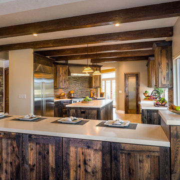
Situated in a busy suburban neighborhood, these homeowners wanted a rustic retreat that their family could enjoy every day. Although they desired the warmth and charm of a rustic cabin it needed to complement the more traditional architecture of their home. The rich wood tones of the cabinetry and beams are offset by the light colored Caeserstone countertops and the farmhouse sink. Thanks to a unique finishing process and the new rustic Alder cabinetry has the look and feel of reclaimed wood. A space comfortable for multiple occupants was important to this large family. Features such as microwave drawer on the island an adjacent eat at bar, serve to spread out the carious functions of the kitchen. The tapered island mimics the shape of the room and was designed to maximize storage while maintaining comfortable traffic flow.
 Bianchi Design
Previously, this yard was burdened by a typical boulder pile pool, that was heaped higher than typical, trying to hide the towering wall behind. At first, the clients sought merely to reconfigure the BBQ that was congesting the patio, but upon further analysis, they decided it was time to strip the entire yard, leaving only the pool shell. Bianchi’s solution introduced an array of four arbors to distract the eye from the wall behind, solving what the boulder waterfall could never do.
Additionally, the wall was painted a dark earth tone to add contrast and depth. This strategy enabled the wall to recede into the distance, while the agave blue grey arbors floated forward visually from the background. Previously, the patios were a hodgepodge of deck islands that were impossible to navigate, and were of insufficient size to arrange furniture on. A well organized patio streamlined the traffic flow and the living space, featuring a cast in place concrete fire pit and banco couch, as well as a new outdoor bistro, glowing with filtered light from the canvas shade sails overhead.
A turquoise glass overflow spa became the yards focal point, sharing the space between the pool and outdoor living. The striking symmetry of the spa and pot pedestal with regal cacti arrangement behind, flanked by the arbors on either side, created a stately first impression from the front door. This teaser was just a glimpse of what could not yet be seen serving as an invitation to explore and enjoy as the yard unfolds.
See more about this project & hear from the homeowner here: https://www.youtube.com/watch?v=7eT3RkLkg5w&feature=youtu.be

 Susan Yeley Homes
Who wouldn't want to keep their apartment in Buenos Aires? This family did. Which meant their new home in Bloomington was a fresh start and needed remodeling as well as furnishings—rugs, seating, art and everything in between. Local architect Russ Herndon revamped and opened up the kitchen in this 1970s ranch, moving awkwardly placed doors in three different locations to improve the traffic flow and allow for optimal furniture placement. SYI swept in to furnish and finish the public spaces with a careful mix of vintage and new, neutral and bold, family comfort and modern chic. The homeowner (turned friend) was a wonderful collaborator and speedy decision maker. Only one hard and fast rule governed the process: no yellow and blue, the colors of Brazil, Argentina's arch rival in soccer.
166