
Search results for "Training three to five" in Home Design Ideas

 McKee & Company
Gibeon Photography / Gravity Shots
Large elegant medium tone wood floor great room photo in Orange County with beige walls and no fireplace
Large elegant medium tone wood floor great room photo in Orange County with beige walls and no fireplace
 Fabco Sanctuary
The architect and designer Guy Derwent was approached by his client with a clear and compelling brief: to completely transform a grand Victorian terrace house they were planning to renovate. The client envisioned something far beyond a standard renovation – this was to be a bold and dramatic reimagining of a family home that could grow with them over time.
With the property having remained largely untouched for more than fifty years, the architects saw an opportunity to unlock its potential and deliver a contemporary design that would contrast beautifully with its Victorian heritage.
The existing layout consisted of a series of small, disconnected rooms to the rear of the house. To respond to the client’s need for openness and flexibility, the architect proposed a radical restructuring of the ground floor:
The rear rooms were completely removed
Suspended timber floors were lowered by up to two metres to align with the garden
Two bold extensions were added
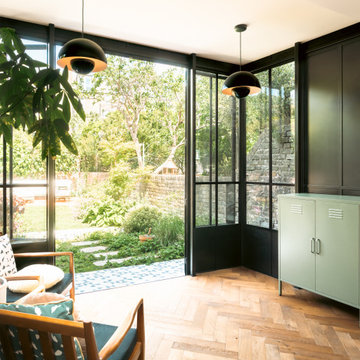
The first extension filled in the side return with a London stock brick facade and a glazed roof, while the second – a striking black steel and glass pavilion was glazed on three sides and placed along the garden elevation.
This new pavilion redefined the building’s relationship with the garden. Its steel-framed glazing created a seamless dialogue between interior and exterior, offering a sense of immersion in the surrounding landscape.
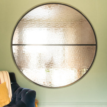
At the heart of the plan sits a dramatic, five-metre-tall dining space that acts as a transition from the original entrance hall into the new addition. A large, circular cast-glass window, framed in steel, provides a visual and spatial link between old and new, allowing light and movement to travel through the depth of the home.
Throughout the project, a series of black metal elements were introduced as sculptural interventions – each marking moments of transformation within the house. These included the bespoke steel framed circular window, a custom metal staircase, a cylindrical support column, and the striking steel and glass garden pavilion. Together, they formed a coherent architectural language that underscored the project’s bold intent.
Our steel windows and doors played a vital role in delivering the project’s vision. The architects chose steel for its refined sight lines and distinctive material character, which helped bridge the gap between the historical context of the building and the bold new additions.
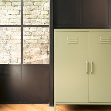
The black steel frames provided a crisp contrast to the pale London stock brick and added definition to the glazed pavilion, reinforcing the sense of architectural precision. In particular, the fine steel profiles of the garden room allowed the extension to feel both lightweight and immersive, blurring the boundary between the house and its garden.
The architect drew inspiration from the Bauhaus Movement, particularly the work of Walter Gropius, whose approach to functional beauty and industrial materials informed the design of the garden pavilion.
Here, our glazing system was used not just for transparency, but as an expressive architectural element. The carefully proportioned panels help to conceal the roof thickness and reinforce the pavilion’s industrial yet abstract character – a deliberate nod to product design and modernist detailing.
Sustainability was an important factor in the selection of materials. Our steel systems, made from 99% recycled content and 100% recyclable, aligned with the project’s broader environmental goals.
The architects noted that this commitment to material longevity and circularity was central to their decision to use steel. The durability and recyclability of the windows and doors ensured the project met both aesthetic and ethical criteria.
This London terrace house now stands as a celebration of contrast – between heritage and innovation, solidity and transparency, tradition and transformation. Our steel windows and doors were not simply components; they were essential tools in crafting a home that is as bold and expressive as it is functional.
The result is a home designed for modern family life, where light, space, and materiality come together in perfect harmony.
 Fabco Sanctuary
The architect and designer Guy Derwent was approached by his client with a clear and compelling brief: to completely transform a grand Victorian terrace house they were planning to renovate. The client envisioned something far beyond a standard renovation – this was to be a bold and dramatic reimagining of a family home that could grow with them over time.
With the property having remained largely untouched for more than fifty years, the architects saw an opportunity to unlock its potential and deliver a contemporary design that would contrast beautifully with its Victorian heritage.
The existing layout consisted of a series of small, disconnected rooms to the rear of the house. To respond to the client’s need for openness and flexibility, the architect proposed a radical restructuring of the ground floor:
The rear rooms were completely removed
Suspended timber floors were lowered by up to two metres to align with the garden
Two bold extensions were added
The first extension filled in the side return with a London stock brick facade and a glazed roof, while the second – a striking black steel and glass pavilion was glazed on three sides and placed along the garden elevation.
This new pavilion redefined the building’s relationship with the garden. Its steel-framed glazing created a seamless dialogue between interior and exterior, offering a sense of immersion in the surrounding landscape.
At the heart of the plan sits a dramatic, five-metre-tall dining space that acts as a transition from the original entrance hall into the new addition. A large, circular cast-glass window, framed in steel, provides a visual and spatial link between old and new, allowing light and movement to travel through the depth of the home.
Throughout the project, a series of black metal elements were introduced as sculptural interventions – each marking moments of transformation within the house. These included the bespoke steel framed circular window, a custom metal staircase, a cylindrical support column, and the striking steel and glass garden pavilion. Together, they formed a coherent architectural language that underscored the project’s bold intent.
Our steel windows and doors played a vital role in delivering the project’s vision. The architects chose steel for its refined sight lines and distinctive material character, which helped bridge the gap between the historical context of the building and the bold new additions.
The black steel frames provided a crisp contrast to the pale London stock brick and added definition to the glazed pavilion, reinforcing the sense of architectural precision. In particular, the fine steel profiles of the garden room allowed the extension to feel both lightweight and immersive, blurring the boundary between the house and its garden.
The architect drew inspiration from the Bauhaus Movement, particularly the work of Walter Gropius, whose approach to functional beauty and industrial materials informed the design of the garden pavilion.
Here, our glazing system was used not just for transparency, but as an expressive architectural element. The carefully proportioned panels help to conceal the roof thickness and reinforce the pavilion’s industrial yet abstract character – a deliberate nod to product design and modernist detailing.
Sustainability was an important factor in the selection of materials. Our steel systems, made from 99% recycled content and 100% recyclable, aligned with the project’s broader environmental goals.
The architects noted that this commitment to material longevity and circularity was central to their decision to use steel. The durability and recyclability of the windows and doors ensured the project met both aesthetic and ethical criteria.
This London terrace house now stands as a celebration of contrast – between heritage and innovation, solidity and transparency, tradition and transformation. Our steel windows and doors were not simply components; they were essential tools in crafting a home that is as bold and expressive as it is functional.
The result is a home designed for modern family life, where light, space, and materiality come together in perfect harmony.
Find the right local pro for your project
 Fabco Sanctuary
The architect and designer Guy Derwent was approached by his client with a clear and compelling brief: to completely transform a grand Victorian terrace house they were planning to renovate. The client envisioned something far beyond a standard renovation – this was to be a bold and dramatic reimagining of a family home that could grow with them over time.
With the property having remained largely untouched for more than fifty years, the architects saw an opportunity to unlock its potential and deliver a contemporary design that would contrast beautifully with its Victorian heritage.
The existing layout consisted of a series of small, disconnected rooms to the rear of the house. To respond to the client’s need for openness and flexibility, the architect proposed a radical restructuring of the ground floor:
The rear rooms were completely removed
Suspended timber floors were lowered by up to two metres to align with the garden
Two bold extensions were added
The first extension filled in the side return with a London stock brick facade and a glazed roof, while the second – a striking black steel and glass pavilion was glazed on three sides and placed along the garden elevation.
This new pavilion redefined the building’s relationship with the garden. Its steel-framed glazing created a seamless dialogue between interior and exterior, offering a sense of immersion in the surrounding landscape.
At the heart of the plan sits a dramatic, five-metre-tall dining space that acts as a transition from the original entrance hall into the new addition. A large, circular cast-glass window, framed in steel, provides a visual and spatial link between old and new, allowing light and movement to travel through the depth of the home.
Throughout the project, a series of black metal elements were introduced as sculptural interventions – each marking moments of transformation within the house. These included the bespoke steel framed circular window, a custom metal staircase, a cylindrical support column, and the striking steel and glass garden pavilion. Together, they formed a coherent architectural language that underscored the project’s bold intent.
Our steel windows and doors played a vital role in delivering the project’s vision. The architects chose steel for its refined sight lines and distinctive material character, which helped bridge the gap between the historical context of the building and the bold new additions.
The black steel frames provided a crisp contrast to the pale London stock brick and added definition to the glazed pavilion, reinforcing the sense of architectural precision. In particular, the fine steel profiles of the garden room allowed the extension to feel both lightweight and immersive, blurring the boundary between the house and its garden.
The architect drew inspiration from the Bauhaus Movement, particularly the work of Walter Gropius, whose approach to functional beauty and industrial materials informed the design of the garden pavilion.
Here, our glazing system was used not just for transparency, but as an expressive architectural element. The carefully proportioned panels help to conceal the roof thickness and reinforce the pavilion’s industrial yet abstract character – a deliberate nod to product design and modernist detailing.
Sustainability was an important factor in the selection of materials. Our steel systems, made from 99% recycled content and 100% recyclable, aligned with the project’s broader environmental goals.
The architects noted that this commitment to material longevity and circularity was central to their decision to use steel. The durability and recyclability of the windows and doors ensured the project met both aesthetic and ethical criteria.
This London terrace house now stands as a celebration of contrast – between heritage and innovation, solidity and transparency, tradition and transformation. Our steel windows and doors were not simply components; they were essential tools in crafting a home that is as bold and expressive as it is functional.
The result is a home designed for modern family life, where light, space, and materiality come together in perfect harmony.

 Michael Nash Design, Build & Homes
Starting Each Day Clean and Refreshed In This Classically-Modern, Marble Masterpiece
In 1985, the previous owner of the house had added an addition of which part included a 17 feet by 13 feet space off the master bedroom for both a master bath and walk-in closet. Irrespective of the dated red carpet that blanketed the entire bathroom of this 1964 colonial in Annandale, VA, the combination bathroom/closet space had its other oddities, primarily in that there was no shower. The current homeowners -- a family of five, who has been in the home for 7 years, was tired of going down the hall to use the kids’ bathroom to take a shower before work. The renovation that they have created now is a bright and luxurious space that one could bask in all day. They used this bathroom renovation opportunity to total remake the layout and function of this essential room that sets the tone for the day ahead.
Prior to the renovation, the existing bathroom oddly had two entrances, a typical one off of the master bedroom, but another straight off the upstairs hallway. As the toilet was out in the open in the previous design, ensuring that this second door was closed when company was in town was essential and a nuisance. As you entered the room, situated below the arc window, a large soaking tub that was covered on three sides with wooden steps dominated the room from the corner it projected. A relatively small 42” single bowl sink did not leave much space for his and hers toiletries, and there was no other linen closet or cabinetry for storage in the bathroom. The 8 foot by 5 foot closet with accordion doors had poorly laid out rungs not letting the storage space to be fully utilized. At over 220 square feet, the room did offer considerable space to work with, yet the existing layout, which even included a partition wall behind the vanity, felt cramped and dysfunctional.
The homeowners wished to create a classic yet modern, private, deluxe bathroom that would better integrate into their master suite and enable them to start and end each day in a luxurious way. They wanted to maintain having a soaking tub, add in a large shower, have an enclosed commode, expand to include double sinks, and add more storage for toiletries and linens. We worked with the customer to develop a creative design with extensive plumbing rework that accomplished all these needs and more.
The first order of business was to gut out all the carpet, tub, cabinetry, and non-load bearing partition walls. The new tub would be generally in the same location, but as the previous walk-in closet would be repurposed for the commode and the walk-in shower additional water lines, plumbing, and draining needed to be added; fortunately the room below is the garage, which enabled the team to frame out some bulkheads to accomplish this complex plumbing. Following the framing, including walling up the second entrance to the bathroom, adding in a pocket door for the commode, and creating the shape of the new shower, the team also laid down the wiring for one of the luxuries of this room – heated flooring. A glossy percaline boarder, and two-inch hexagon shape percaline tiles cover the entire floor, making it much easier and cleaner than the previous carpet.
Marble look tile is predominant throughout the bathroom as despite the angled frameless glass door, the entire shower is covered in 18 inch polished marble look tiles. The shower coats the user in water from either the overhead rain head, large main showerhead and/or the hand held sprayer. Over 7 feet of white Italian Statuetto marble countertop, enable the couple to have two sink bowls and plenty of room on each side. The bowls are exposed in this stainless steel console sink design which required the team to ensure that the exposed plumbing looked pristine, and painting the bottom of the porcelain bowl to match the coloring.
The white cast-iron 72-inch Cecilia claw-foot soaking tub and its chrome lion’s paws complement that other chrome and white used throughout the room. A tall, almost floor-to-ceiling linen closet finished in arctic white is nestled in the corner near the tub, enabling ample storage of towels, etc. Other cabinetry includes an 18 inch-wide vanity with decorative footing is centered between the two sinks, and a 27 inch wall mounted cabinet with shelf is above the Kohler Devonshire elongated toilet.
Billowing cloud colored grey blue paint was a great choice for this room to pick up on the veining in the marble. Mirrored medicine chests, a chandelier, wall sconces, and overhead recessed lighting also were incorporated into the design and function of the new room.
The artful combination of classic design from material choices, such as free-standing Victorian claw-foot tub along with the modern design as seen in the angled shower, frameless medicine cabinet mirrors, and frosted glass pocket door on the commode, make this bathroom quite a masterpiece.
The clients are enjoying having their private space and not having the use the kids’ bathroom anymore.

 User
Sea Arches is a stunning modern architectural masterpiece, perched atop an eleven-acre peninsular promontory rising 160 feet above the Pacific Ocean on northern California’s spectacular Mendocino coast. Surrounded by the ocean on 3 sides and presiding over unparalleled vistas of sea and surf, Sea Arches includes 2,000 feet of ocean frontage, as well as beaches that extend some 1,300 feet. This one-of-a-kind property also includes one of the famous Elk Sea Stacks, a grouping of remarkable ancient rock outcroppings that tower above the Pacific, and add a powerful and dramatic element to the coastal scenery. Integrated gracefully into its spectacular setting, Sea Arches is set back 500 feet from the Pacific Coast Hwy and is completely screened from public view by more than 400 Monterey cypress trees. Approached by a winding, tree-lined drive, the main house and guesthouse include over 4,200 square feet of modern living space with four bedrooms, two mezzanines, two mini-lofts, and five full bathrooms. All rooms are spacious and the hallways are extra-wide. A cantilevered, raised deck off the living-room mezzanine provides a stunningly close approach to the ocean. Walls of glass invite views of the enchanting scenery in every direction: north to the Elk Sea Stacks, south to Point Arena and its historic lighthouse, west beyond the property’s captive sea stack to the horizon, and east to lofty wooded mountains. All of these vistas are enjoyed from Sea Arches and from the property’s mile-long groomed trails that extend along the oceanfront bluff tops overlooking the beautiful beaches on the north and south side of the home. While completely private and secluded, Sea Arches is just a two-minute drive from the charming village of Elk offering quaint and cozy restaurants and inns. A scenic seventeen-mile coastal drive north will bring you to the picturesque and historic seaside village of Mendocino which attracts tourists from near and far. One can also find many world-class wineries in nearby Anderson Valley. All of this just a three-hour drive from San Francisco or if you choose to fly, Little River Airport, with its mile long runway, is only 16 miles north of Sea Arches. Truly a special and unique property, Sea Arches commands some of the most dramatic coastal views in the world, and offers superb design, construction, and high-end finishes throughout, along with unparalleled beauty, tranquility, and privacy. Property Highlights: • Idyllically situated on a one-of-a-kind eleven-acre oceanfront parcel • Dwelling is completely screened from public view by over 400 trees • Includes 2,000 feet of ocean frontage plus over 1,300 feet of beaches • Includes one of the famous Elk Sea Stacks connected to the property by an isthmus • Main house plus private guest house totaling over 4300 sq ft of superb living space • 4 bedrooms and 5 full bathrooms • Separate His and Hers master baths • Open floor plan featuring Single Level Living (with the exception of mezzanines and lofts) • Spacious common rooms with extra wide hallways • Ample opportunities throughout the home for displaying art • Radiant heated slate floors throughout • Soaring 18 foot high ceilings in main living room with walls of glass • Cantilevered viewing deck off the mezzanine for up close ocean views • Gourmet kitchen with top of the line stainless appliances, custom cabinetry and granite counter tops • Granite window sills throughout the home • Spacious guest house including a living room, wet bar, large bedroom, an office/second bedroom, two spacious baths, sleeping loft and two mini lofts • Spectacular ocean and sunset views from most every room in the house • Gracious winding driveway offering ample parking • Large 2 car-garage with workshop • Extensive low-maintenance landscaping offering a profusion of Spring and Summer blooms • Approx. 1 mile of groomed trails • Equipped with a generator • Copper roof • Anchored in bedrock by 42 reinforced concrete piers and framed with steel girders.
2 Fireplaces
Deck
Granite Countertops
Guest House
Patio
Security System
Storage
Gardens
 Neumann & Rudy Architecture
*Spatial Composition & Architectural Volume**
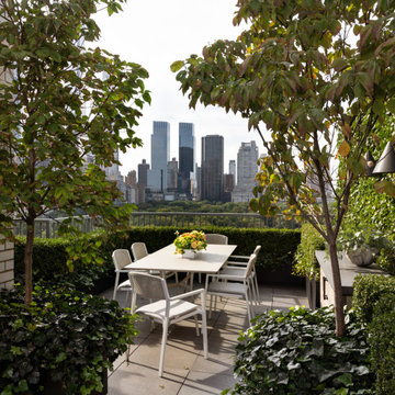
This terrace operates as an outdoor room in the fullest architectural sense: a discrete volume carved from the open air of the upper Manhattan skyline, its perimeter defined not by masonry but by a disciplined green architecture of clipped boxwood parterre hedging and multi-stemmed dogwood standards. The plan is organized on a clear axial logic — the rectilinear dining table sits centered on the sightline that threads between the flanking specimen trees and terminates in the middle distance on the Central Park tree canopy and the Columbus Circle towers beyond. That deliberate framing device is the composition's essential move: the trees function as proscenium, the hedge line as a low balustrade wall, and the powder-coated metal railing as a nearly dematerialized threshold, so the borrowed landscape is enlisted as the room's fourth elevation. Vertical enclosure is calibrated in three tiers — ground-plane ivy at ankle height, hedge and planter coping at seated eye level, and the airy tracery of tree canopy overhead — producing a ceiling plane implied rather than built, dappled and permeable. To the left, the load-bearing buff brick of the building's flank grounds the scheme with genuine architectural mass and reads as a masonry pilaster anchoring an otherwise open-sided plan, while at right a low stone-topped service console with recessed pull hardware and a monumental orb planter provides an asymmetrical counterweight, terminating circulation and articulating a secondary zone without interrupting flow. Large-format square paving, laid in a regular grid, provides the module against which all furniture placement is measured.
**Materiality, Color & Texture**
The material palette is restrained to a narrow tonal band of warm neutrals, allowing chlorophyll green to carry the scheme's entire chromatic charge. Underfoot, honed grey-taupe stone pavers offer a matte, slightly granular surface with a cool undertone; adjacent, the brick wall introduces a sandy, oatmeal-toned masonry with visible mortar coursing whose horizontality and faint striation supply the composition's only decorative pattern. Furniture is executed in a matte white or bone powder-coated aluminum frame with woven cord or resin-strap seat backs — an open basketweave that reads as textile rather than metal and softens the geometry with a hand-crafted grain. Cushions in pale greige linen-weave add a further degree of tactile compliance. Planters are dark bronze-toned metal, deliberately recessive so that mass reads as foliage rather than container, while the pale cast-stone orb planter introduces a sculptural, slightly chalky, faceted surface that catches light like unglazed ceramic. The horticultural texture work is the true material sophistication here: the tight, fine-leaved matte density of boxwood set against the broad, glossy, lacquer-like foliage of the ivy, and both played against the dogwoods' larger leaves already turning bronze, oxblood, and citron at the edges. The single note of saturation — a low, tightly massed arrangement of coral, apricot, and chartreuse blooms in a white cachepot — functions as a deliberate chromatic accent, keyed precisely to the autumnal leaf-turn overhead.
**Lighting, Atmosphere & Style Profile**
Natural light is the primary design instrument. The photograph captures a high, diffuse, slightly overexposed sky that renders the skyline in soft atmospheric perspective while raking light filters through the canopy to scatter mobile dappling across the paving — a chiaroscuro that animates an otherwise static geometry and shifts the room's character hourly. Artificial lighting is intentionally understated and architectural in intent: a suspended conical pendant in dark matte metal, hung at the right beneath the canopy, signals evening use and provides a small, precise silhouette against the ivy screen, while low-level integrated fixtures within planters and hedging would supply the subdued wash appropriate to a terrace that must never compete with the ambient glow of the city. The resulting atmosphere is one of considered seclusion — a green-walled cloister suspended above the metropolis, contemplative rather than performative. Stylistically, the project reads as Soft Minimalism in dialogue with a distinctly European, formal-garden discipline: the axial planning, clipped topiary, and standard-trained trees derive from classical parterre tradition, but they are executed with contemporary restraint — no ornament, no historicist detail, a single furniture gesture, a monochrome envelope. The synthesis might be termed Tailored Naturalism: an aesthetic in which rigorous geometry and a near-silent material palette exist precisely to give primacy to living texture, seasonal change, and the framed view.
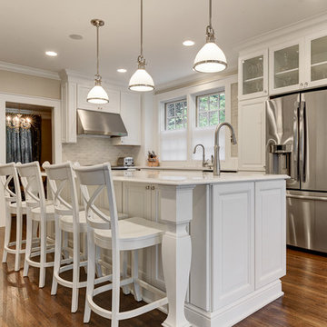
Sponsored
Columbus, OH

Hope Restoration & General Contracting
Columbus Design-Build, Kitchen & Bath Remodeling, Historic Renovations
 User
Sea Arches is a stunning modern architectural masterpiece, perched atop an eleven-acre peninsular promontory rising 160 feet above the Pacific Ocean on northern California’s spectacular Mendocino coast. Surrounded by the ocean on 3 sides and presiding over unparalleled vistas of sea and surf, Sea Arches includes 2,000 feet of ocean frontage, as well as beaches that extend some 1,300 feet. This one-of-a-kind property also includes one of the famous Elk Sea Stacks, a grouping of remarkable ancient rock outcroppings that tower above the Pacific, and add a powerful and dramatic element to the coastal scenery. Integrated gracefully into its spectacular setting, Sea Arches is set back 500 feet from the Pacific Coast Hwy and is completely screened from public view by more than 400 Monterey cypress trees. Approached by a winding, tree-lined drive, the main house and guesthouse include over 4,200 square feet of modern living space with four bedrooms, two mezzanines, two mini-lofts, and five full bathrooms. All rooms are spacious and the hallways are extra-wide. A cantilevered, raised deck off the living-room mezzanine provides a stunningly close approach to the ocean. Walls of glass invite views of the enchanting scenery in every direction: north to the Elk Sea Stacks, south to Point Arena and its historic lighthouse, west beyond the property’s captive sea stack to the horizon, and east to lofty wooded mountains. All of these vistas are enjoyed from Sea Arches and from the property’s mile-long groomed trails that extend along the oceanfront bluff tops overlooking the beautiful beaches on the north and south side of the home. While completely private and secluded, Sea Arches is just a two-minute drive from the charming village of Elk offering quaint and cozy restaurants and inns. A scenic seventeen-mile coastal drive north will bring you to the picturesque and historic seaside village of Mendocino which attracts tourists from near and far. One can also find many world-class wineries in nearby Anderson Valley. All of this just a three-hour drive from San Francisco or if you choose to fly, Little River Airport, with its mile long runway, is only 16 miles north of Sea Arches. Truly a special and unique property, Sea Arches commands some of the most dramatic coastal views in the world, and offers superb design, construction, and high-end finishes throughout, along with unparalleled beauty, tranquility, and privacy. Property Highlights: • Idyllically situated on a one-of-a-kind eleven-acre oceanfront parcel • Dwelling is completely screened from public view by over 400 trees • Includes 2,000 feet of ocean frontage plus over 1,300 feet of beaches • Includes one of the famous Elk Sea Stacks connected to the property by an isthmus • Main house plus private guest house totaling over 4300 sq ft of superb living space • 4 bedrooms and 5 full bathrooms • Separate His and Hers master baths • Open floor plan featuring Single Level Living (with the exception of mezzanines and lofts) • Spacious common rooms with extra wide hallways • Ample opportunities throughout the home for displaying art • Radiant heated slate floors throughout • Soaring 18 foot high ceilings in main living room with walls of glass • Cantilevered viewing deck off the mezzanine for up close ocean views • Gourmet kitchen with top of the line stainless appliances, custom cabinetry and granite counter tops • Granite window sills throughout the home • Spacious guest house including a living room, wet bar, large bedroom, an office/second bedroom, two spacious baths, sleeping loft and two mini lofts • Spectacular ocean and sunset views from most every room in the house • Gracious winding driveway offering ample parking • Large 2 car-garage with workshop • Extensive low-maintenance landscaping offering a profusion of Spring and Summer blooms • Approx. 1 mile of groomed trails • Equipped with a generator • Copper roof • Anchored in bedrock by 42 reinforced concrete piers and framed with steel girders.
2 Fireplaces
Deck
Granite Countertops
Guest House
Patio
Security System
Storage
Gardens
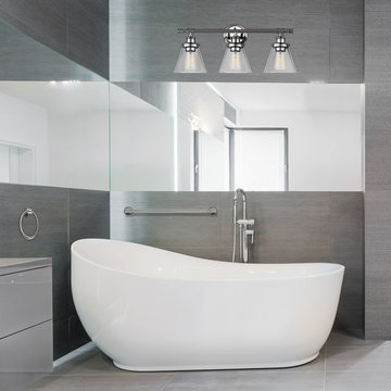
 Globe Electric
's 5-Piece Parker All-In-One Bath Set is a wonderful way to update your bathroom with one easy step. Combining a modern refined vintage look with an industrial pipe look, these pieces will update any space. Complete with a towel bar, towel ring, robe hook, toilet paper holder, and 3-light vanity fixture with thick clear glass shades in a modern and sleek chrome finish, your bathroom will look streamline and welcoming. Add a compatible dimmer switch to your vanity fixture to create a warm ambiance for a relaxing bath. While the pieces complement each other you can split this set up and use it throughout your home. The towel bar makes an excellent shoe holder. The towel ring would be great in your kitchen. The vanity light would work in your bedroom. Think outside the box! Three medium base 60W bulbs are required and sold separately. The towel bar measures 20.87" long and sits about 2.72" from the wall. The towel ring is 6.1" wide, 6.88" tall and sites about 2.72" from the wall. The robe hook is about 2.2" wide at the base and sits about 2.2" from the wall. The toilet paper holder is 6.69" wide and sites about 2.77" from the wall. The 3-light vanity is about 24.63" wide, 11" high and sits about 7.92" from the wall. Each shade is 6.5" wide and 5.32" high.

 GS Construction
Example of a small classic 3/4 white tile and stone tile mosaic tile floor alcove shower design in Chicago with an undermount sink, recessed-panel cabinets, black cabinets, quartzite countertops, a two-piece toilet and gray walls
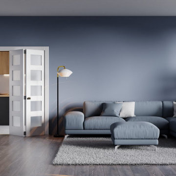
 Almesedoors
FINISH: PRIMED
The advantages of this approach – of this type of interior door finish – are fairly obvious. Pick a color, any color that suits your projects best. Mix and apply. Re- coat whenever you feel it is necessary to do so. Touch it up. It gives you, the proud owner of these interior doors, complete freedom of choice, and the significant savings, especially where it comes to bulk orders, can be a true source of joy.
As Kurt Vonnegut mentions in one of his novels (Bluebeard, unless I’m mistaken … check it out when you get a chance), the thrill of laying on colors is a large part of the artist’s professional satisfaction. In other words, a keen pleasure.
When back in the remote past visual arts became a field dominated by professionals rather than hobbyists, the main problem of “just laying on paint” became obvious: you can’t.
The medium of choice back then was egg tempera, a permanent, fast-drying substance consisting of colored pigments mixed with a water-soluble binder medium, usually glutinous material such as egg yolk. Portraits and ornaments were executed in this medium, and the wood panel was the surface of choice. One of tempera’s interesting features is that it is not as easily absorbed by wood as other mediums. Some sort of primer was necessary, of course, but pretty much any substance that dried evenly could be used.
The drawbacks of tempera, or pintura al temple, as the Spanish call it, only became obvious with the advent of the Renaissance, when the leading representatives of the trade turned to oil (and interior doors suddenly became a great deal less crude, but that’s a story for another day).
Oil painting is the process of “painting with pigments with a medium of drying oil as the binder.” Commonly used types include linseed (highly preferable in art, though not necessarily in interior doors, mind you), poppy seed, walnut, and safflower.
Today, five hundred years later, it is safe to say that oil is more versatile than pintura al temple – by orders of magnitude. Specifically, the contrasts achieved through the former are much greater, the darks are far deeper, and three- dimensional, highly realistic images are much easier to achieve. Next time you visit a museum, take a closer look at pintura al temple portraits. All of them, without exception, come off as a bit “flat” as opposed to their latter-day counterparts.
Also, where glazing is concerned …
Glazing: a painting technique in which a transparent layer, with just a touch of pigment, is laid over a previously painted surface, allowing light to travel through the glaze and be reflected back off of the opaque layer below. Gentle shadows, subtle changes of color, smooth transitions – all these can be achieved through glazing, which was used by all artists up until the middle of the Nineteenth Century, when artist tubes were invented, revolutionizing the field, and other techniques began to be explored.
Tempera enthusiasts (it takes all kinds to make a world) will assure you that glazing is not just possible in pintura al temple but is actually the basis of the whole enterprise. Well, what are you going to do? They’re enthusiasts.
Anyway, la peinture à l'huile, as the French call it, re-introduced the ancient problem of most surface’s propensity to absorb dipingere, as the Italians call the stuff. Wood or canvas, it is all the same: you’re not going to get very far without a good primer.
Experiments were conducted, and soon rabbit skin glue emerged as the least expensive and most effective solution. It was easy to apply. It dried evenly. It made the application of the l’huile stuff on top of it a walk in the park.
There were drawbacks. Today, rabbit skin glue is considered to be a major cause of cracking by most modern conservators. (Remember, when you visited the Metropolitan Museum of Art – and did you see those interior doors? … some of them are quite something … - most “old masters” pictures are completely covered with a cobweb of cracks? There you go). Because the glue is hygroscopic, it continually absorbs moisture from the atmosphere, causing the glue to swell and shrink as ambient humidity levels change. Over many humidity cycles, this repeated flexing causes the brittle oily layers to crack.
To combat this problem, modern primers are made of acrylic materials which are guaranteed not to cause any damage to the dipingere. No bubbling, no cracks. Your interior doors are safe.
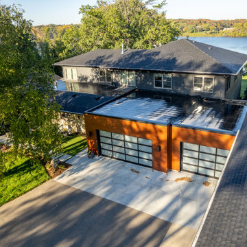
 Xpand Inc. | Homes of Xcellence
At the outset, this project began with the transformation of a 2-car attached garage. The goal was to create a mudroom, an exercise room, and a breezeway to seamlessly connect the spacious detached garage with the main part of the house. Additionally, the project involved partial roof removal and the addition of a new front entry.
But then came an unexpected twist – scope creep.
We found ourselves veering away from the initial client-supplied architectural plans. After numerous consultations with the clients and several iterations of the design, we arrived at a significantly improved plan for the remodel and addition.
Our journey commenced with the demolition of almost the entire former 2-car garage, making space for a new, oversized 3-car garage measuring 40′ x 28′. This garage was strategically placed between the existing house and the large detached garage. We introduced a custom low-sloped flat roof, designed to address historical drainage issues.
To mitigate water pooling, we created a custom concrete step at the back corner of the garage, equipped with a sturdy metal grate that sits flush with the step. We also installed a PVC drainage system, commencing at the step and running beneath a newly designed patio, ultimately draining into the yard. These measures have significantly reduced water accumulation around the house.
The new garage boasts several features, including Longboard aluminum siding, custom full glass garage doors, interior drywall finished to a level 4, an abundance of can lights, an epoxy floor coating, vinyl base trim, a new forced air garage heater, and more.
The clients also requested a designated space for their three kids and their friends to enjoy, thus giving birth to the “Kid Zone.” We partitioned a section of the existing oversized garage, resulting in a space measuring approximately 22′ x 32′, brimming with entertainment possibilities. To enhance control over the temperature in the Kid Zone, we collaborated with our licensed HVAC partner to install a cold weather mini-split system.
One of the most significant challenges was the modernization and consolidation of the home’s main electrical systems. We reconfigured and combined 6-7 different electrical panels into just two. One panel serves the main house, while the second is dedicated to backup power from a generator. These panels, along with the boiler for the in-floor heating system, are housed in a newly constructed mechanical room within the Kid Zone.
Inside the main house, we completed various tasks, such as removing the ceiling in the hallway from the new garage to address prior water damage, improve insulation, and rework electrical and HVAC systems. We also replaced the ceiling from the front door to the base of the stairs, adding new can lighting and enhancing insulation. Skilled drywall specialists then installed and finished new drywall to a level 5 standard.
The exterior of the house underwent a complete overhaul. Before installing new roofing on the entire house and garage, we modified an existing flat roof by adding custom lumber and plywood to enhance the pitch, preventing future ice dams. A new rubber roof was expertly installed on the oversized 3-car garage, and the flat roof section we re-framed.
Our meticulous exterior team removed old white aluminum soffit, fascia, and gutters, replacing them with new framing to accommodate Longboard soffit material. This task was particularly challenging due to the age of the house and the non-standard wall and roof framing. Our skilled exterior subcontractors ensured a perfect fit.
Near the pool area, we discovered severe rot and decay from years of water intrusion. After informing the homeowners, we ordered and installed five new commercial-style block framed windows and a custom 8′ high Anderson patio door. This involved careful removal and replacement of window headers from the outside to avoid disturbing the finished part of the house. We reframed the large openings to fit the new windows, and our skilled trim carpenters installed new walnut casing, base, and window sills.
In total, we replaced around 900 lineal feet of soffit and installed approximately 32 squares of aluminum siding. The entire house was meticulously prepped, repaired, and painted according to the client’s chosen color.
Throughout the project, we incorporated numerous custom touches and unique design elements, some of which you can see in the pictures. Our team also addressed various unforeseen challenges, from soil issues to rot and decay repair, roof leaks, drainage problems, electrical and HVAC complexities, and much more.
At Xpand Inc., we take pride in making it all happen, turning your remodeling and renovation dreams into reality.
 Michael Nash Design, Build & Homes
Starting Each Day Clean and Refreshed In This Classically-Modern, Marble Masterpiece
In 1985, the previous owner of the house had added an addition of which part included a 17 feet by 13 feet space off the master bedroom for both a master bath and walk-in closet. Irrespective of the dated red carpet that blanketed the entire bathroom of this 1964 colonial in Annandale, VA, the combination bathroom/closet space had its other oddities, primarily in that there was no shower. The current homeowners -- a family of five, who has been in the home for 7 years, was tired of going down the hall to use the kids’ bathroom to take a shower before work. The renovation that they have created now is a bright and luxurious space that one could bask in all day. They used this bathroom renovation opportunity to total remake the layout and function of this essential room that sets the tone for the day ahead.
Prior to the renovation, the existing bathroom oddly had two entrances, a typical one off of the master bedroom, but another straight off the upstairs hallway. As the toilet was out in the open in the previous design, ensuring that this second door was closed when company was in town was essential and a nuisance. As you entered the room, situated below the arc window, a large soaking tub that was covered on three sides with wooden steps dominated the room from the corner it projected. A relatively small 42” single bowl sink did not leave much space for his and hers toiletries, and there was no other linen closet or cabinetry for storage in the bathroom. The 8 foot by 5 foot closet with accordion doors had poorly laid out rungs not letting the storage space to be fully utilized. At over 220 square feet, the room did offer considerable space to work with, yet the existing layout, which even included a partition wall behind the vanity, felt cramped and dysfunctional.
The homeowners wished to create a classic yet modern, private, deluxe bathroom that would better integrate into their master suite and enable them to start and end each day in a luxurious way. They wanted to maintain having a soaking tub, add in a large shower, have an enclosed commode, expand to include double sinks, and add more storage for toiletries and linens. We worked with the customer to develop a creative design with extensive plumbing rework that accomplished all these needs and more.
The first order of business was to gut out all the carpet, tub, cabinetry, and non-load bearing partition walls. The new tub would be generally in the same location, but as the previous walk-in closet would be repurposed for the commode and the walk-in shower additional water lines, plumbing, and draining needed to be added; fortunately the room below is the garage, which enabled the team to frame out some bulkheads to accomplish this complex plumbing. Following the framing, including walling up the second entrance to the bathroom, adding in a pocket door for the commode, and creating the shape of the new shower, the team also laid down the wiring for one of the luxuries of this room – heated flooring. A glossy percaline boarder, and two-inch hexagon shape percaline tiles cover the entire floor, making it much easier and cleaner than the previous carpet.
Marble look tile is predominant throughout the bathroom as despite the angled frameless glass door, the entire shower is covered in 18 inch polished marble look tiles. The shower coats the user in water from either the overhead rain head, large main showerhead and/or the hand held sprayer. Over 7 feet of white Italian Statuetto marble countertop, enable the couple to have two sink bowls and plenty of room on each side. The bowls are exposed in this stainless steel console sink design which required the team to ensure that the exposed plumbing looked pristine, and painting the bottom of the porcelain bowl to match the coloring.
The white cast-iron 72-inch Cecilia claw-foot soaking tub and its chrome lion’s paws complement that other chrome and white used throughout the room. A tall, almost floor-to-ceiling linen closet finished in arctic white is nestled in the corner near the tub, enabling ample storage of towels, etc. Other cabinetry includes an 18 inch-wide vanity with decorative footing is centered between the two sinks, and a 27 inch wall mounted cabinet with shelf is above the Kohler Devonshire elongated toilet.
Billowing cloud colored grey blue paint was a great choice for this room to pick up on the veining in the marble. Mirrored medicine chests, a chandelier, wall sconces, and overhead recessed lighting also were incorporated into the design and function of the new room.
The artful combination of classic design from material choices, such as free-standing Victorian claw-foot tub along with the modern design as seen in the angled shower, frameless medicine cabinet mirrors, and frosted glass pocket door on the commode, make this bathroom quite a masterpiece.
The clients are enjoying having their private space and not having the use the kids’ bathroom anymore.
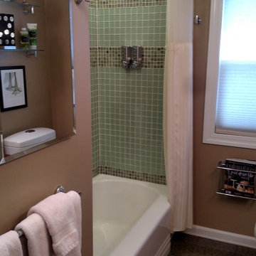


 My House Design|Build|Team
The family who owned this 1965 home chose a dramatic upgrade for their Coquitlam full home renovation. They wanted more room for gatherings, an open concept kitchen, and upgrades to bathrooms and the rec room. Their neighbour knew of our work, and we were glad to bring our skills to another project in the area.
Choosing Dramatic Lines
In the original house, the entryway was cramped, with a closet being the first thing everyone saw.
We opened the entryway and moved the closet, all while maintaining separation between the entry and the living space.
To draw the attention from the entry into the living room, we used a dramatic, flush, black herringbone ceiling detail across the ceiling. This detail goes all the way to the entertainment area on the main floor.
The eye arrives at a stunning waterfall edge walnut mantle, modern fireplace.
Open Concept Kitchen with Lots of Seating
The dividing wall between the kitchen and living areas was removed to create a larger, integrated entertaining space. The kitchen also has easy access to a new outdoor social space.
A new large skylight directly over the kitchen floods the space with natural light.
The kitchen now has gloss white cabinetry, with matte black accents and the same herringbone detail as the living room, and is tied together with a low maintenance Caesarstone’s white Attica quartz for the island countertop.
This over-sized island has barstool seating for five while leaving plenty of room for homework, snacking, socializing, and food prep in the same space.
To maximize space and minimize clutter, we integrated the kitchen appliances into the kitchen island, including a food warming drawer, a hidden fridge, and the dishwasher. This takes the eyes to focus off appliances, and onto the design elements which feed throughout the home.
We also installed a beverage center just beside the kitchen so family and guests can fix themselves a drink, without disrupting the flow of the kitchen.
Updated Downstairs Space, Updated Guest Room, Updated Bathrooms
It was a treat to update this entire house. Upstairs, we renovated the master bedroom with new blackout drapery, new decor, and a warm light grey paint colour. The tight bathroom was transformed with modern fixtures and gorgeous grey tile the homeowners loved.
The two teen girls’ rooms were updated with new lighting and furniture that tied in with the whole home decor, but which also reflected their personal taste.
In the basement, we updated the rec room with a bright modern look and updated fireplace. We added a needed door to the garage. We upgraded the bathrooms and created a legal second suite which the young adult daughter will use, for now.
Laundry Its Own Room, Finally
In a family with four women, you can imagine how much laundry gets done in this house. As part of the renovation, we built a proper laundry room with plenty of storage space, countertops, and a large sink.
 Michael Nash Design, Build & Homes
Starting Each Day Clean and Refreshed In This Classically-Modern, Marble Masterpiece
In 1985, the previous owner of the house had added an addition of which part included a 17 feet by 13 feet space off the master bedroom for both a master bath and walk-in closet. Irrespective of the dated red carpet that blanketed the entire bathroom of this 1964 colonial in Annandale, VA, the combination bathroom/closet space had its other oddities, primarily in that there was no shower. The current homeowners -- a family of five, who has been in the home for 7 years, was tired of going down the hall to use the kids’ bathroom to take a shower before work. The renovation that they have created now is a bright and luxurious space that one could bask in all day. They used this bathroom renovation opportunity to total remake the layout and function of this essential room that sets the tone for the day ahead.
Prior to the renovation, the existing bathroom oddly had two entrances, a typical one off of the master bedroom, but another straight off the upstairs hallway. As the toilet was out in the open in the previous design, ensuring that this second door was closed when company was in town was essential and a nuisance. As you entered the room, situated below the arc window, a large soaking tub that was covered on three sides with wooden steps dominated the room from the corner it projected. A relatively small 42” single bowl sink did not leave much space for his and hers toiletries, and there was no other linen closet or cabinetry for storage in the bathroom. The 8 foot by 5 foot closet with accordion doors had poorly laid out rungs not letting the storage space to be fully utilized. At over 220 square feet, the room did offer considerable space to work with, yet the existing layout, which even included a partition wall behind the vanity, felt cramped and dysfunctional.
The homeowners wished to create a classic yet modern, private, deluxe bathroom that would better integrate into their master suite and enable them to start and end each day in a luxurious way. They wanted to maintain having a soaking tub, add in a large shower, have an enclosed commode, expand to include double sinks, and add more storage for toiletries and linens. We worked with the customer to develop a creative design with extensive plumbing rework that accomplished all these needs and more.
The first order of business was to gut out all the carpet, tub, cabinetry, and non-load bearing partition walls. The new tub would be generally in the same location, but as the previous walk-in closet would be repurposed for the commode and the walk-in shower additional water lines, plumbing, and draining needed to be added; fortunately the room below is the garage, which enabled the team to frame out some bulkheads to accomplish this complex plumbing. Following the framing, including walling up the second entrance to the bathroom, adding in a pocket door for the commode, and creating the shape of the new shower, the team also laid down the wiring for one of the luxuries of this room – heated flooring. A glossy percaline boarder, and two-inch hexagon shape percaline tiles cover the entire floor, making it much easier and cleaner than the previous carpet.
Marble look tile is predominant throughout the bathroom as despite the angled frameless glass door, the entire shower is covered in 18 inch polished marble look tiles. The shower coats the user in water from either the overhead rain head, large main showerhead and/or the hand held sprayer. Over 7 feet of white Italian Statuetto marble countertop, enable the couple to have two sink bowls and plenty of room on each side. The bowls are exposed in this stainless steel console sink design which required the team to ensure that the exposed plumbing looked pristine, and painting the bottom of the porcelain bowl to match the coloring.
The white cast-iron 72-inch Cecilia claw-foot soaking tub and its chrome lion’s paws complement that other chrome and white used throughout the room. A tall, almost floor-to-ceiling linen closet finished in arctic white is nestled in the corner near the tub, enabling ample storage of towels, etc. Other cabinetry includes an 18 inch-wide vanity with decorative footing is centered between the two sinks, and a 27 inch wall mounted cabinet with shelf is above the Kohler Devonshire elongated toilet.
Billowing cloud colored grey blue paint was a great choice for this room to pick up on the veining in the marble. Mirrored medicine chests, a chandelier, wall sconces, and overhead recessed lighting also were incorporated into the design and function of the new room.
The artful combination of classic design from material choices, such as free-standing Victorian claw-foot tub along with the modern design as seen in the angled shower, frameless medicine cabinet mirrors, and frosted glass pocket door on the commode, make this bathroom quite a masterpiece.
The clients are enjoying having their private space and not having the use the kids’ bathroom anymore.

 Charlie
Buying term papers from academic writing services and freelance writers is becoming a popular deal. Therefore, former and current professors are entering this industry to write papers for money more and more often. Such services as CourseworkService.com are becoming popular among students all over the world. An interesting fact is that they hire not only former graduates but also out-of-work academics.
When professors find a compromise about cheating
Jennifer Sunseri, a former assistant professor, lost her job in 2009. She has been looking for a job for almost three years. At long last, she had abandoned all hope of finding a new job and started working as an academic writing service creating papers for college students.
Jenifer says, “I realize that it is legal, but highly unethical especially regarding the fact that I am a former professor. For me this is an equivalent of prostitution. But I have been living in a tight situation for years without an opportunity to visit a doctor or pay my bills. I am 53, and I have no kids to help me when I am out-of-work.”
She has been a tutor in Texas Tech since 1998, where she established a Slavic folklore course. Jenifer didn’t have any publications during her working years at Texas Tech, so when the time has come to apply for a venture, she realized that she has no chances and left. She moved to her sister and her mom and now she is living in her studio apartment with her two cats.
Sunseri was worried when she lost her job even though she has master’s degrees in Slavic linguistics and technical communications.
“I thought that my educator’s and writer’s skills will be useful,” she said. “However, I was shocked at the quantity of applications for an instructor at the local college, as well as for the office manager, or an adjunct at the local institution. Even an effort to apply for a substitute teacher failed. I cannot believe that those who have academic background, experience and a degree are in less demand than those have not.”
When Ph.D. and master’s degrees lose their magical power, people with academic background have no choice but to start their term paper writing career. Once professors become unemployed, one may say that they feel themselves like high school graduates looking for a part-time job. However, you will be surprised, but according to statistics sometimes those with high school or college diplomas are more welcome than people with higher education. The reason is that a lot of new job places in America were created at times of economic recovery and, therefore, they are low-paying and require specialists with lower skills. It turns to be that it is much easier to learn a less-educated worker and train him/her in a particular way suitable for a certain company or service than to teach a higher-educated worker all over again. In addition, higher educated job candidates are more selective about their choice.
How to become a ghostwriter if you have been punishing others for paper cheating
Jenifer was not fastidious. She was looking for a job that would correspond her skills and finally decided to try herself as an online editor. While searching for an editing job, she ran against term paper writing service. This company asked her to send examples of her works and complete a test task. She has been accepted as a ghostwriter.
In fact, term paper writing services gladly accept people with higher education and offer them to write papers of all kinds for money. Jenifer says that her first assignments for sale included a 5-page paper on public debt, 10-page paper on linguistics, and an editing work of someone else’s 20-page paper. All these assignments brought her about $150. Jenifer reports that it is possible to turn a useful penny by writing academic papers.
Jenifer realized that ghostwriting is a good source of income after she read an article about an anonymous academic writer who earned almost $70,000 a year writing papers for high school and college students.
“Currently this business becomes more and more popular. During finals and midterms, we have a lot of work to do since there are a lot of students ready to pay for a custom paper and submit it as their own,” he says. “It is no wonder that students use writing services. I have seen a lot of their writings, and I realize why they are so desperate about writing their assignments. Some of them are unable to compose a grocery list without additional help. They really need it. We help them pass a course, that’s all.”
Jenifer says that this work helped her be on form and develop her core skills like writing and researching all the time. She was unemployed for a long time and was afraid that her skills might become lower due to a lack of practice. However, at a writing company she never stops practicing. She claims that this is a hard work mostly because you have to be meet urgent deadlines.
The other challenge was a paper that she couldn’t complete once. The problem was not in a lack of competency, but in ethics. She discovered that it was an order for a student from her former place of work, Tech University. She says that she felt weird about completing this work and refused to write it.
“I became angry when I realized that I am going to serve a kid who is partying in Florida, while being a former faculty member of the university he is attending.”
Currently, Jenifer is working as a Russian translator. However, she is not abandoning academic writing industry even though she feels a little awkward about helping students to cheat. It is not that bad that unemployable professors have an opportunity to earn for living being ghostwriters even though it is not very ethical.
Ironically, a place of work like academic writing company that makes out-of-job educators feel that they are performing a crime assisting students in cheating seems to be the only place in the job market that values their experience in the sphere of education.
 Tile Doctor Ltd
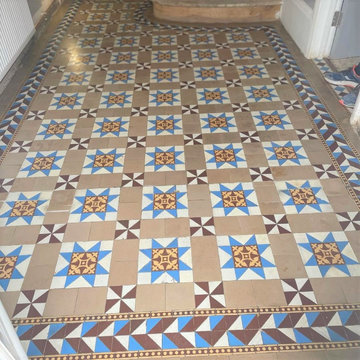
These pictures of a Victorian Tiled Hallway are from a property in Canterbury that was once a nursing home and was now being renovated to become a children’s home. The building was being gutted and extended at the same time and when the carpet was pulled up in the hallway, they were surprised to find a relatively intact Victorian tiled floor underneath.
Whilst they thought it bizarre that anyone would want to cover up such an attractive floor the carpet had protected it over the years. They realized it would make a marvellous feature at the entrance to the property, but professional restoration would be needed to do it justice. After a bit of research, they came across Tile Doctor and got in touch.
Canterbury comes under my North Kent designation, so I went to visit the property and survey the floor and quote for doing the restoration. There were a few missing and loose tiles that would need replacing and refixing also there was a lot of ingrained dirt so a deep clean and application of a new sealer would be required. I gave them a price for the work which they readily accepted, and we arranged a suitable time to carry out the work. Subject to the building schedule I had calculated the floor would take three days to restore.
On the first day I set about replacing and re-fixing the missing, broken, and loose tiles. This is delicate work as you need to extract the old tile without disturbing its neighbours and then clean up the area ready for its replacement. Being a Tile Doctor I keep a selection of stock tiles for repairs, some are reclaimed, and some are replica. Also, there are several companies still making Victorian style tiles so I can usually source what I need.
After the individual missing and broken tiles had been replaced and the adhesive had set, it was then a matter of renovating the floor as a whole. The tiles were covered in a thick layer of carpet adhesive which needed a combination of specialist tools and products to remove. First, a liberal layer of Tile Doctor Remove and Go was applied and left to dwell for thirty minutes. Next, Tile Doctor Pro-Clean was added and scrubbed in with a black pad.
This process softened the adhesive sufficiently in readiness for the next stage which involves using a set of diamond burnishing pads on a weighted buffing machine. Several applications were needed, each time with a successively finer grade of diamond pad and rinsing off the slurry in between. The tiles were first milled using a very coarse 50-grit pad, followed by 100, 200 and finally burnished with a 400-grit burnishing pads. This removed all the adhesive and dirt in the tiles, which was cleaned up using the wet vacuum.
Old Victorian floors like this do not have a damp proof membrane installed under the floor, and with a lot of water being used in the cleaning process I was concerned White efflorescence salts could appear later as the floor dried. To counter this, I gave the floor an acid wash using Tile Doctor Acid Gel to counter and dissolve the salts, it also gives the tiles another clean and will remove any old grout smears further improving the appearance of the tiles. Once done the floor was left to dry overnight.
On my return I tested the floor was dry by taking several moisture readings around the floor with a damp meter. Applying sealer to a damp floor is never advised and can lead to clouding and an unwanted finish.
Happy that the tiles were dry, a single coat of Tile Doctor Colour Grow sealer was applied. This is an impregnating sealer with a colour enhancing component to ‘lift’ the stronger colours of the floor. Colour Grow however does leave a matt appearance and as the client had asked for a shiny finish it was topped up with five coats of Tile Doctor Seal and Go. This is a compatible topical sealer which added a mid to high sheen.
By the end of the third day the Victorian floor looked brand new, and I received the following feedback from the client. Its rare to receive feedback from commercial customers so they were clearly overwhelmed with the transformation.
Did not think this glued covered bad old floor could look sooooo good Fabulous Fantastic job Looks Amazing Thank you
For aftercare I recommend the use of Tile Doctor Neutral Cleaner which isn’t as harsh as many of the products you find in supermarket. Stronger products can actually strip off the sealer over time leaving it vulnerable to dirt and detracting from its appearance.
Graham Davis
North Kent Tile Doctor
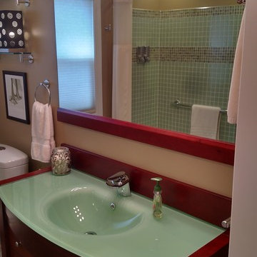
 Michael Nash Design, Build & Homes
Starting Each Day Clean and Refreshed In This Classically-Modern, Marble Masterpiece
In 1985, the previous owner of the house had added an addition of which part included a 17 feet by 13 feet space off the master bedroom for both a master bath and walk-in closet. Irrespective of the dated red carpet that blanketed the entire bathroom of this 1964 colonial in Annandale, VA, the combination bathroom/closet space had its other oddities, primarily in that there was no shower. The current homeowners -- a family of five, who has been in the home for 7 years, was tired of going down the hall to use the kids’ bathroom to take a shower before work. The renovation that they have created now is a bright and luxurious space that one could bask in all day. They used this bathroom renovation opportunity to total remake the layout and function of this essential room that sets the tone for the day ahead.
Prior to the renovation, the existing bathroom oddly had two entrances, a typical one off of the master bedroom, but another straight off the upstairs hallway. As the toilet was out in the open in the previous design, ensuring that this second door was closed when company was in town was essential and a nuisance. As you entered the room, situated below the arc window, a large soaking tub that was covered on three sides with wooden steps dominated the room from the corner it projected. A relatively small 42” single bowl sink did not leave much space for his and hers toiletries, and there was no other linen closet or cabinetry for storage in the bathroom. The 8 foot by 5 foot closet with accordion doors had poorly laid out rungs not letting the storage space to be fully utilized. At over 220 square feet, the room did offer considerable space to work with, yet the existing layout, which even included a partition wall behind the vanity, felt cramped and dysfunctional.
The homeowners wished to create a classic yet modern, private, deluxe bathroom that would better integrate into their master suite and enable them to start and end each day in a luxurious way. They wanted to maintain having a soaking tub, add in a large shower, have an enclosed commode, expand to include double sinks, and add more storage for toiletries and linens. We worked with the customer to develop a creative design with extensive plumbing rework that accomplished all these needs and more.
The first order of business was to gut out all the carpet, tub, cabinetry, and non-load bearing partition walls. The new tub would be generally in the same location, but as the previous walk-in closet would be repurposed for the commode and the walk-in shower additional water lines, plumbing, and draining needed to be added; fortunately the room below is the garage, which enabled the team to frame out some bulkheads to accomplish this complex plumbing. Following the framing, including walling up the second entrance to the bathroom, adding in a pocket door for the commode, and creating the shape of the new shower, the team also laid down the wiring for one of the luxuries of this room – heated flooring. A glossy percaline boarder, and two-inch hexagon shape percaline tiles cover the entire floor, making it much easier and cleaner than the previous carpet.
Marble look tile is predominant throughout the bathroom as despite the angled frameless glass door, the entire shower is covered in 18 inch polished marble look tiles. The shower coats the user in water from either the overhead rain head, large main showerhead and/or the hand held sprayer. Over 7 feet of white Italian Statuetto marble countertop, enable the couple to have two sink bowls and plenty of room on each side. The bowls are exposed in this stainless steel console sink design which required the team to ensure that the exposed plumbing looked pristine, and painting the bottom of the porcelain bowl to match the coloring.
The white cast-iron 72-inch Cecilia claw-foot soaking tub and its chrome lion’s paws complement that other chrome and white used throughout the room. A tall, almost floor-to-ceiling linen closet finished in arctic white is nestled in the corner near the tub, enabling ample storage of towels, etc. Other cabinetry includes an 18 inch-wide vanity with decorative footing is centered between the two sinks, and a 27 inch wall mounted cabinet with shelf is above the Kohler Devonshire elongated toilet.
Billowing cloud colored grey blue paint was a great choice for this room to pick up on the veining in the marble. Mirrored medicine chests, a chandelier, wall sconces, and overhead recessed lighting also were incorporated into the design and function of the new room.
The artful combination of classic design from material choices, such as free-standing Victorian claw-foot tub along with the modern design as seen in the angled shower, frameless medicine cabinet mirrors, and frosted glass pocket door on the commode, make this bathroom quite a masterpiece.
The clients are enjoying having their private space and not having the use the kids’ bathroom anymore.
 Michael Nash Design, Build & Homes
Starting Each Day Clean and Refreshed In This Classically-Modern, Marble Masterpiece
In 1985, the previous owner of the house had added an addition of which part included a 17 feet by 13 feet space off the master bedroom for both a master bath and walk-in closet. Irrespective of the dated red carpet that blanketed the entire bathroom of this 1964 colonial in Annandale, VA, the combination bathroom/closet space had its other oddities, primarily in that there was no shower. The current homeowners -- a family of five, who has been in the home for 7 years, was tired of going down the hall to use the kids’ bathroom to take a shower before work. The renovation that they have created now is a bright and luxurious space that one could bask in all day. They used this bathroom renovation opportunity to total remake the layout and function of this essential room that sets the tone for the day ahead.
Prior to the renovation, the existing bathroom oddly had two entrances, a typical one off of the master bedroom, but another straight off the upstairs hallway. As the toilet was out in the open in the previous design, ensuring that this second door was closed when company was in town was essential and a nuisance. As you entered the room, situated below the arc window, a large soaking tub that was covered on three sides with wooden steps dominated the room from the corner it projected. A relatively small 42” single bowl sink did not leave much space for his and hers toiletries, and there was no other linen closet or cabinetry for storage in the bathroom. The 8 foot by 5 foot closet with accordion doors had poorly laid out rungs not letting the storage space to be fully utilized. At over 220 square feet, the room did offer considerable space to work with, yet the existing layout, which even included a partition wall behind the vanity, felt cramped and dysfunctional.
The homeowners wished to create a classic yet modern, private, deluxe bathroom that would better integrate into their master suite and enable them to start and end each day in a luxurious way. They wanted to maintain having a soaking tub, add in a large shower, have an enclosed commode, expand to include double sinks, and add more storage for toiletries and linens. We worked with the customer to develop a creative design with extensive plumbing rework that accomplished all these needs and more.
The first order of business was to gut out all the carpet, tub, cabinetry, and non-load bearing partition walls. The new tub would be generally in the same location, but as the previous walk-in closet would be repurposed for the commode and the walk-in shower additional water lines, plumbing, and draining needed to be added; fortunately the room below is the garage, which enabled the team to frame out some bulkheads to accomplish this complex plumbing. Following the framing, including walling up the second entrance to the bathroom, adding in a pocket door for the commode, and creating the shape of the new shower, the team also laid down the wiring for one of the luxuries of this room – heated flooring. A glossy percaline boarder, and two-inch hexagon shape percaline tiles cover the entire floor, making it much easier and cleaner than the previous carpet.
Marble look tile is predominant throughout the bathroom as despite the angled frameless glass door, the entire shower is covered in 18 inch polished marble look tiles. The shower coats the user in water from either the overhead rain head, large main showerhead and/or the hand held sprayer. Over 7 feet of white Italian Statuetto marble countertop, enable the couple to have two sink bowls and plenty of room on each side. The bowls are exposed in this stainless steel console sink design which required the team to ensure that the exposed plumbing looked pristine, and painting the bottom of the porcelain bowl to match the coloring.
The white cast-iron 72-inch Cecilia claw-foot soaking tub and its chrome lion’s paws complement that other chrome and white used throughout the room. A tall, almost floor-to-ceiling linen closet finished in arctic white is nestled in the corner near the tub, enabling ample storage of towels, etc. Other cabinetry includes an 18 inch-wide vanity with decorative footing is centered between the two sinks, and a 27 inch wall mounted cabinet with shelf is above the Kohler Devonshire elongated toilet.
Billowing cloud colored grey blue paint was a great choice for this room to pick up on the veining in the marble. Mirrored medicine chests, a chandelier, wall sconces, and overhead recessed lighting also were incorporated into the design and function of the new room.
The artful combination of classic design from material choices, such as free-standing Victorian claw-foot tub along with the modern design as seen in the angled shower, frameless medicine cabinet mirrors, and frosted glass pocket door on the commode, make this bathroom quite a masterpiece.
The clients are enjoying having their private space and not having the use the kids’ bathroom anymore.
 Michael Nash Design, Build & Homes
Starting Each Day Clean and Refreshed In This Classically-Modern, Marble Masterpiece
In 1985, the previous owner of the house had added an addition of which part included a 17 feet by 13 feet space off the master bedroom for both a master bath and walk-in closet. Irrespective of the dated red carpet that blanketed the entire bathroom of this 1964 colonial in Annandale, VA, the combination bathroom/closet space had its other oddities, primarily in that there was no shower. The current homeowners -- a family of five, who has been in the home for 7 years, was tired of going down the hall to use the kids’ bathroom to take a shower before work. The renovation that they have created now is a bright and luxurious space that one could bask in all day. They used this bathroom renovation opportunity to total remake the layout and function of this essential room that sets the tone for the day ahead.
Prior to the renovation, the existing bathroom oddly had two entrances, a typical one off of the master bedroom, but another straight off the upstairs hallway. As the toilet was out in the open in the previous design, ensuring that this second door was closed when company was in town was essential and a nuisance. As you entered the room, situated below the arc window, a large soaking tub that was covered on three sides with wooden steps dominated the room from the corner it projected. A relatively small 42” single bowl sink did not leave much space for his and hers toiletries, and there was no other linen closet or cabinetry for storage in the bathroom. The 8 foot by 5 foot closet with accordion doors had poorly laid out rungs not letting the storage space to be fully utilized. At over 220 square feet, the room did offer considerable space to work with, yet the existing layout, which even included a partition wall behind the vanity, felt cramped and dysfunctional.
The homeowners wished to create a classic yet modern, private, deluxe bathroom that would better integrate into their master suite and enable them to start and end each day in a luxurious way. They wanted to maintain having a soaking tub, add in a large shower, have an enclosed commode, expand to include double sinks, and add more storage for toiletries and linens. We worked with the customer to develop a creative design with extensive plumbing rework that accomplished all these needs and more.
The first order of business was to gut out all the carpet, tub, cabinetry, and non-load bearing partition walls. The new tub would be generally in the same location, but as the previous walk-in closet would be repurposed for the commode and the walk-in shower additional water lines, plumbing, and draining needed to be added; fortunately the room below is the garage, which enabled the team to frame out some bulkheads to accomplish this complex plumbing. Following the framing, including walling up the second entrance to the bathroom, adding in a pocket door for the commode, and creating the shape of the new shower, the team also laid down the wiring for one of the luxuries of this room – heated flooring. A glossy percaline boarder, and two-inch hexagon shape percaline tiles cover the entire floor, making it much easier and cleaner than the previous carpet.
Marble look tile is predominant throughout the bathroom as despite the angled frameless glass door, the entire shower is covered in 18 inch polished marble look tiles. The shower coats the user in water from either the overhead rain head, large main showerhead and/or the hand held sprayer. Over 7 feet of white Italian Statuetto marble countertop, enable the couple to have two sink bowls and plenty of room on each side. The bowls are exposed in this stainless steel console sink design which required the team to ensure that the exposed plumbing looked pristine, and painting the bottom of the porcelain bowl to match the coloring.
The white cast-iron 72-inch Cecilia claw-foot soaking tub and its chrome lion’s paws complement that other chrome and white used throughout the room. A tall, almost floor-to-ceiling linen closet finished in arctic white is nestled in the corner near the tub, enabling ample storage of towels, etc. Other cabinetry includes an 18 inch-wide vanity with decorative footing is centered between the two sinks, and a 27 inch wall mounted cabinet with shelf is above the Kohler Devonshire elongated toilet.
Billowing cloud colored grey blue paint was a great choice for this room to pick up on the veining in the marble. Mirrored medicine chests, a chandelier, wall sconces, and overhead recessed lighting also were incorporated into the design and function of the new room.
The artful combination of classic design from material choices, such as free-standing Victorian claw-foot tub along with the modern design as seen in the angled shower, frameless medicine cabinet mirrors, and frosted glass pocket door on the commode, make this bathroom quite a masterpiece.
The clients are enjoying having their private space and not having the use the kids’ bathroom anymore.
171