
Search results for "Transformative effects" in Home Design Ideas
 Mottram Architecture
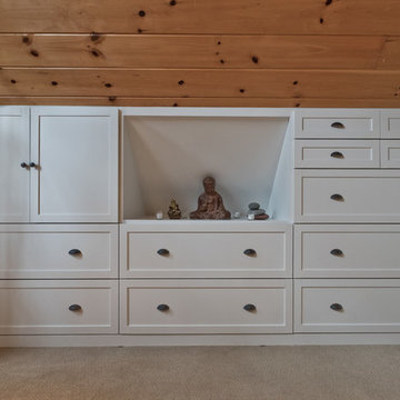
Timber frame homes offer unique challenges during a remodel. What often makes them beautiful and attractive to most homeowners, also makes them challenging for space requirements.
Context: The lovely couple that owned this home were struggling with some interesting floor plan challenges that just didn't work for their family. The loved the beautiful timbers and woodwork of their home, but the dramatically sloping ceilings on the second floor, particularly in the bathroom, just didn't work for this 1 1/2 bath home. Needing to use the skylight to approach the toilet was a less then ideal scenario. Although the bathroom footprint was more then adequate, the sloped ceiling only made half of the space useable. Check out the Before/After post on our blog to see the photos of the house pre-renovation. As much as they loved all the wood features in their home, another challenge they had was light. The wood ceiling made everything inside the house darker, even with a fantastic array of south facing windows, there were spaces in the home that felt dark and small. When they contacted us they wanted to know how could they make their brighter and more inviting, were there solutions to the 2nd floor sloped ceiling issues, and if they were going to do all of this work, how could they make their home more comfortable and efficient. A nagging water leak in the upstairs bathroom spurred them into action and here is how we solved their dilemma.
Conclusion: First, we added a little dormer to the rear of the house so we could get full headroom in nearly all of the upstairs bathroom! Then we decided to extend that dormer one more timber bay over to create a walk in closet with natural light and plenty of space. Since we were contemplating energy efficiency, we resolved a nagging issue that is present in a lot of timber frame construction, air tightness. Commonly found in timber frame construction, fiberglass insulation is installed in the rafter bays and board ceilings are installed over top. Unfortunately, board ceilings are anything but air tight, and fiberglass insulation needs to be in an airtight cavity for maximum effectiveness. So we were able to solve two issues at the same time for this homeowner. We removed the board ceiling and fiberglass insulation, we dense packed the rafter bays with cellulose insulation, and installed sheetrock in place of the boards. The boards were salvaged for re-use by the homeowner, and the space and light quality was dramatically improved. Some may think that losing the board ceiling took something away from the space, but what you'll see in the pictures is that it highly accentuates the heavy timbers and really makes them stand out in a beautiful way. Now with this added airtightness, better insulation, and brighter space, the homeowner hardly runs their wood stove, and it's so quiet in the space, an added bonus from changing the insulation. It became necessary to also add a sheetrock ceiling to the living room to hide the plumbing from the new bathroom layout above. Changing this ceiling gave the homeowner some real quality lighting that was lacking in the living room before. The brighter ceiling and new lighting layout completely transforms the living room into a space you want to hang out, even though the layout didn't change at all. When the homeowner saw the finished spaces she said "I can't believe this is my house, I want to live in this house"
Energy Efficiency: I touched a little on the efficiency above, but like all projects done with Mottram Architecture, we always want to leave you with a little extra. Timber frame construction with board ceilings and fiberglass insulation are notoriously leaky! If you want to know what we think about fiberglass insulation, check our our blog post on Why Fiberglass Insulation Sucks. By installing cellulose insulation and covering it with sheetrock we were able to greatly reduce the heat flowing out of this home. It not only improves cashflow it improves the comfort level in the space. Who wants to sit in their living room and feel a draft? Let us remind you, we are not saying cellulose insulation is an air barrier, we use the sheetrock to help with that, but it does significantly reduce the air flow over fiberglass insulation. And when we reduce the airflow, we reduce the heat flow. And when we reduce the heat flow, we reduce the need to re-heat that drafty air from outside. When it comes to energy efficiency the first and best place to start is air infiltration. We greatly reduced the air infiltration with the new insulation, but we also added a hat and warm boots. What I mean by that is, we improved the insulation in the roof, and we installed insulation in the basement. Maybe it's a silly analogy, but when you think about keeping warm, we always start with the hat and boots! With sustainability in mind, the next project will be to add a deck to the front of this house with rain catchment barrels from the metal roof. They are planning to plant a garden in the spring and the rain catchment system will help to irrigate the new garden.
Builder: East Shore Builders
Photographer: Michael Eric Berube
 Paradise City
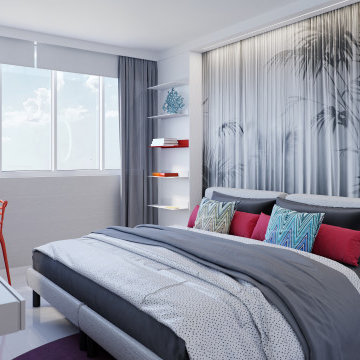
I am proud to present New, Stylish, Practical, and just Awesome ) design for your new kid's room. Ta -da...
The space in this room is minimal, and it's tough to have two beds there and have a useful and pretty design. This design was built on the idea to have a bed that transforms from king to two tweens and back with ease.
I do think most of the time better to keep it as a single bed and, when needed, slide bed over and have two beds. The single bed will give you more space and air in the room.
You will have easy access to the closet and a much more comfortable bed to sleep on it.
On the left side, we are going to build costume wardrobe style closet
On the right side is a column. We install some exposed shelving to bring this architectural element to proportions with the room.
Behind the bed, we use accent wallpaper. This particular mural wallpaper looks like fabric has those waves that will softener this room. Also, it brings that three-dimension effect that makes the room look larger without using mirrors.
Led lighting over that wall will make shadows look alive. There are some Miami vibes it this picture. Without dominating overall room design, these art graphics are producing luxury filing of living in a tropical paradise. ( Miami Style)
On the front is console/table cabinetry. In this combination, it is in line with bed design and the overall geometrical proportions of the room. It is a multi-function. It will be used as a console for a TV/play station and a small table for computer activities.
In the end wall in the hallway is a costume made a mirror with Led lights. Girls need mirrors )
Our concept is timeless. We design this room to be the best for any age. We look into the future ) Your girl will grow very fast. And you do not have to change a thing in this room. This room will be comfortable and stylish for the next 20 years. I do guarantee that )
Your daughter will love it!
 SDH Studio Architecture and Interior Design
SDH Studio - Architecture and Design
Location: Southwest Ranches, Florida, Florida, USA
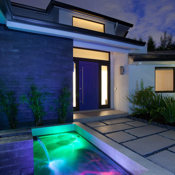
Set on a expansive two-acre lot in horse country, Southwest Ranches, Florida.
This project consists on the transformation of a 3700 Sq. Ft. Mediterranean structure to a 6500 Sq. Ft. Contemporary Home.
Find the right local pro for your project
 LD&A
LD&AWe were pleased to work with our clients to transform their pool room into the cozy, welcoming, and functional retreat of their dreams!
Example of a large beach style indoor tile and custom-shaped natural pool design in Calgary
Example of a large beach style indoor tile and custom-shaped natural pool design in Calgary
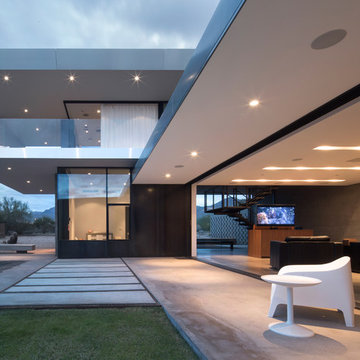
 Western Window Systems
Scottsdale-based architectural firm Chen + Suchart Studio created this modern home in Arizona with a private courtyard and pool on the lower level and rooms that take advantage of views of the McDowell Mountains upstairs. Sliding glass panels that disappear into walls, courtesy of Western Window Systems’ Series 600 Multi-Slide Doors, transform rooms into uninterrupted spaces that open to other living areas and allow for panoramic outlooks of the surroundings.
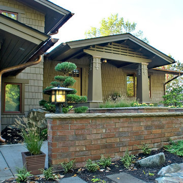
 Vujovich Design Build, Inc.
Working with SALA architect, Joseph G. Metzler, Vujovich transformed the entire exterior as well as the primary interior spaces of this 1970s split in to an Arts and Crafts gem.
-Troy Thies Photography
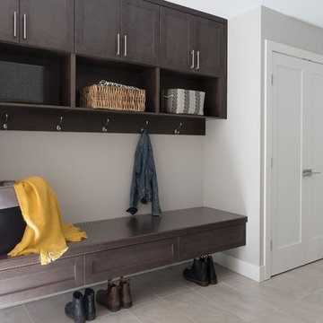
 Harwood Design Builders Ltd.
This whole home renovation was a transformation of the main and upper floors, a garage conversion and a complete exterior facelift.
The original garage was converted into a large practical mudroom, powder room, laundry and TV rooms. The walls between the kitchen, living and dining room were removed and a full island, bar area and a 6’ pantry were added. Shaker style cabinets in off white contrast with charcoal espresso cabinets for a dramatic effect in the kitchen.
Hand scraped hickory hardwoods add durability and provide a solid foundation for the Ledgestone gas burning fireplace.
Upstairs the master features floor to ceiling wall cabinets eliminating the need for a bureau. The ensuite is a beautiful retreat with a closed off water closet, double vanity and glass enclosed shower.

Sponsored
Columbus, OH

Hope Restoration & General Contracting
Columbus Design-Build, Kitchen & Bath Remodeling, Historic Renovations
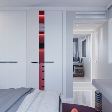 Paradise City
I am proud to present New, Stylish, Practical, and just Awesome ) design for your new kid's room. Ta -da...
The space in this room is minimal, and it's tough to have two beds there and have a useful and pretty design. This design was built on the idea to have a bed that transforms from king to two tweens and back with ease.
I do think most of the time better to keep it as a single bed and, when needed, slide bed over and have two beds. The single bed will give you more space and air in the room.
You will have easy access to the closet and a much more comfortable bed to sleep on it.
On the left side, we are going to build costume wardrobe style closet
On the right side is a column. We install some exposed shelving to bring this architectural element to proportions with the room.
Behind the bed, we use accent wallpaper. This particular mural wallpaper looks like fabric has those waves that will softener this room. Also, it brings that three-dimension effect that makes the room look larger without using mirrors.
Led lighting over that wall will make shadows look alive. There are some Miami vibes it this picture. Without dominating overall room design, these art graphics are producing luxury filing of living in a tropical paradise. ( Miami Style)
On the front is console/table cabinetry. In this combination, it is in line with bed design and the overall geometrical proportions of the room. It is a multi-function. It will be used as a console for a TV/play station and a small table for computer activities.
In the end wall in the hallway is a costume made a mirror with Led lights. Girls need mirrors )
Our concept is timeless. We design this room to be the best for any age. We look into the future ) Your girl will grow very fast. And you do not have to change a thing in this room. This room will be comfortable and stylish for the next 20 years. I do guarantee that )
Your daughter will love it!
 One Room at a Time, Inc.
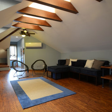
The attic space was transformed from a cold storage area of 700 SF to useable space with closed mechanical room and 'stage' area for kids. Structural collar ties were wrapped and stained to match the rustic hand-scraped hardwood floors. LED uplighting on beams adds great daylight effects. Short hallways lead to the dormer windows, required to meet the daylight code for the space. An additional steel metal 'hatch' ships ladder in the floor as a second code-required egress is a fun alternate exit for the kids, dropping into a closet below. The main staircase entrance is concealed with a secret bookcase door. The space is heated with a Mitsubishi attic wall heater, which sufficiently heats the space in Wisconsin winters.
One Room at a Time, Inc.
 Bridgewater
The new owners were looking forward to living in their new home with an open floor plan, tall vaulted ceilings, and great views. It featured a large Great Room with two big French Doors separating the Dining Room from the Master Bedroom.
But after only a few months they identified a major design flaw: Each of the French Doors had ten glass windows with two large windows above each door. (Check out our before and after designs, traffic flow diagrams and photos of this project.) Glass windows and doors allowed sound and light from guests or the TV in the great room to easily sneak into the bedroom. With unique work and sleep schedules (he’s a pilot, she’s a registered nurse) this design wasn’t working.
Then there was a traffic flow design flaw: The Master Bedroom had a second entrance from a hallway. To get into the bedroom from the hallway you needed to walk down another claustrophobic hallway.
To get from the Master Bedroom to the Master Bath begin at the most remote corner of the bedroom and down a hallway between two closets. Once inside the bath, a huge triangular Jacuzzi dominating the space.
So, from a privacy and traffic flow perspective, this home had some major design issues.
When Craig Weber first met with the owners, he listened to their ideas and concerns. The owners trusted Craig to come up with the most efficient and most effective solution to this design dilemma. He offered a solution that resolved the bed-bath traffic flow problem, offered some bedroom room privacy, and updated the bath.
First, the two French Doors and windows were removed. A new wall was built with sound-absorbing materials, making the Great Room and Dining Room more comfortable spaces for entertaining while creating the bedroom privacy the owners craved.
Solving the Bedroom/Bath traffic flow problem began with removing the two existing closets. The bath door was relocated next to the hall entrance, and then a new walk-in closet was added adjacent to the hallway entrance. The solution offered easy access to and from the bath, closet and hallway without a hint of claustrophobia.
The Master Bath underwent a major transformation designed for convenience and comfort – especially during long, cold Minnesota winters.
Most everything from the former bath was torn out, beginning with the giant Jacuzzi.
A new bathtub that is wider and deeper than the standard size was installed with brushed Nickel fixtures. It’s the perfect place to relax with a glass of wine and candles.
Warm floors are a Minnesota “must have.” The bath’s new ceramic floor features in-floor electric heat. Getting in and out of the tub is easy and comfortable.
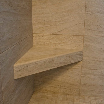
The new walk-in shower again features in-floor heating and a place to sit. The most interesting feature of this shower may the custom ceramic tile installed with unique patterns.
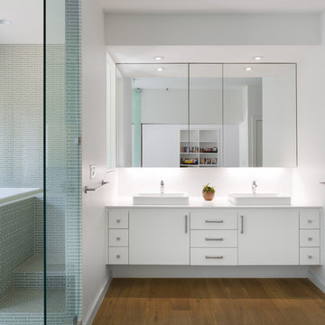
A new vanity Cambria Bradshaw countertops features two under-hung ceramic sinks with matching brushed Nickel fixtures.
Tall ceilings and three glass windows near the ceiling flood the room with natural light. A new energy-efficient window frames an ornamental stained glass window created by the owner’s father – a great personal touch.
A quiet place to sleep. A private dining room for entertaining. A Master Bath to die for. And easy traffic flow. The owners couldn’t have been more delighted with the outcome. And Lilly, their cat, loves it too.
 Chi Renovation & Design
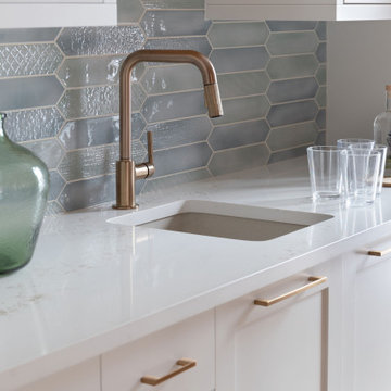
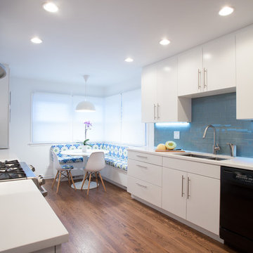
Transforming this galley style kitchen into a long, closed in space provided our clients with an ideal layout that meets all their needs. By adding a wall at one end of the kitchen, which we used for additional cabinets and space-consuming appliances, we were then able to build an inviting custom banquet on the other end. The banquet includes useful built-in storage underneath along with large, corner windows that offer the perfect amount of natural light.
The white painted flat panel custom cabinets and white quartz countertops have a crisp, clean effect on the design while the blue glass subway tiled backsplash adds color and is highlighted by the under cabinet lighting throughout the space.
Home located in Skokie Chicago. Designed by Chi Renovation & Design who also serve the Chicagoland area, and it's surrounding suburbs, with an emphasis on the North Side and North Shore. You'll find their work from the Loop through Lincoln Park, Humboldt Park, Evanston, Wilmette, and all of the way up to Lake Forest.
For more about Chi Renovation & Design, click here: https://www.chirenovation.com/
To learn more about this project, click here: https://www.chirenovation.com/portfolio/skokie-kitchen-banquette/
 Milgard Windows & Doors
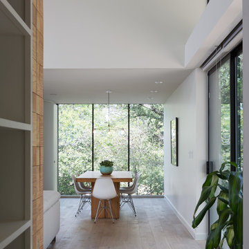
The Kiguchi family moved into their Austin, Texas home in 1994. Built in the 1980’s as part of a neighborhood development, they happily raised their family here but longed for something more contemporary. Once they became empty nesters, they decided it was time for a major remodel. After spending many years visiting Austin AIA Home Tours that highlight contemporary residential architecture, they had a lot of ideas and in 2013 were ready to interview architects and get their renovation underway.
The project turned into a major remodel due to an unstable foundation. Architects Ben Arbib and Ed Hughey, of Arbib Hughey Design were hired to solve the structural issue and look for inspiration in the bones of the house, which sat on top of a hillside and was surrounded by great views.
Unfortunately, with the old floor plan, the beautiful views were hidden by small windows that were poorly placed. In order to bring more natural light into the house the window sizes and configurations had to be addressed, all while keeping in mind the homeowners desire for a modern look and feel.
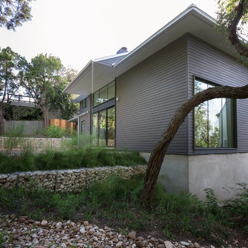
To achieve a more contemporary and sophisticated front of house, a new entry was designed that included removing a two-story bay window and porch. The entrance of the home also became more integrated with the landscape creating a template for new foliage to be planted. Older exterior materials were updated to incorporate a more muted palette of colors with a metal roof, dark grey siding in the back and white stucco in the front. Deep eaves were added over many of the new large windows for clean lines and sun protection.
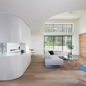
“Inside it was about opening up the floor plan, expanding the views throughout the house, and updating the material palette to get a modern look that was also warm and inviting,” said Ben from Arbib Hughey Design. “Prior to the remodel, the house had the typical separation of rooms. We removed the walls between them and changed all of the windows to Milgard Thermally Improved Aluminum to connect the inside with the outside. No matter where you are you get nice views and natural light.”
The architects wanted to create some drama, which they accomplished with the window placement and opening up the interior floor plan to an open concept approach. Cabinetry was used to help delineate intimate spaces. To add warmth to an all-white living room, white-washed oak wood floors were installed and pine planks were used around the fireplace. The large windows served as artwork bringing the color of nature into the space.
An octagon shaped, elevated dining room, (named “the turret”), had a big impact on the design of the house. They architects rounded the corners and added larger window openings overlooking a new sunken garden. The great room was also softened by rounding out the corners and that circular theme continued throughout the house, being picked up in skylight wells and kitchen cabinetry. A staircase leading to a catwalk was added and the result was a two-story window wall that flooded the home with natural light.
When asked why Milgard® Thermally Improved Aluminum windows were selected, the architectural team listed many reasons:
1) Aesthetics: “We liked the slim profiles and narrow sightlines. The window frames never get in the way of the view and that was important to us. They also have a very contemporary look that went well with our design.”
2) Options: “We liked that we could get large sliding doors that matched the windows, giving us a very cohesive look and feel throughout the project.”
3) Cost Effective: “Milgard windows are affordable. You get a good product at a good price.”
4) Custom Sizes: “Milgard windows are customizable, which allowed us to get the right window for each location.”
Ready to take on your own traditional to modern home remodeling project? Arbib Hughey Design advises, “Work with a good architect. That means picking a team that is creative, communicative, listens well and is responsive. We think it’s important for an architect to listen to their clients and give them something they want, not something the architect thinks they should have. At the same time you want an architect who is willing and able to think outside the box and offer up design options that you may not have considered. Design is about a lot of back and forth, trying out ideas, getting feedback and trying again.”
The home was completely transformed into a unique, contemporary house perfectly integrated with its site. Internally the home has a natural flow for the occupants and externally it is integrated with the surroundings taking advantage of great natural light. As a side note, it was highly praised as part of the Austin AIA homes tour.
 Republic West Remodeling
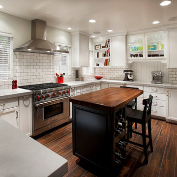
We transformed a small kitchen with little functional appeal into this beautiful, bright highly functional kitchen. White cabinets and counters pair nicely with the contrasting island, a black base with butcher block top.

Sponsored
Sunbury, OH

J.Holderby - Renovations
Franklin County's Leading General Contractors - 2X Best of Houzz!
 Gayler Design Build
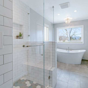
The client derived inspiration for her new shower from a photo featuring a multi-colored tile floor. Using this photo, Gayler Design Build custom-designed a shower pan that incorporated six different colors of 4-inch hexagon tiles by Lunada Bay. These tiles were beautifully combined and laid in a “dark to light” pattern effectively transforming the shower into a work of art. Contributing to the room’s classic and timeless bathroom design was the shower walls that were designed in cotton white 3x6 subway tiles with grey grout. An elongated, oversized shower niche completed the look providing just the right space for necessary soap and shampoo bottles.
 Paradise City
I am proud to present New, Stylish, Practical, and just Awesome ) design for your new kid's room. Ta -da...
The space in this room is minimal, and it's tough to have two beds there and have a useful and pretty design. This design was built on the idea to have a bed that transforms from king to two tweens and back with ease.
I do think most of the time better to keep it as a single bed and, when needed, slide bed over and have two beds. The single bed will give you more space and air in the room.
You will have easy access to the closet and a much more comfortable bed to sleep on it.
On the left side, we are going to build costume wardrobe style closet
On the right side is a column. We install some exposed shelving to bring this architectural element to proportions with the room.
Behind the bed, we use accent wallpaper. This particular mural wallpaper looks like fabric has those waves that will softener this room. Also, it brings that three-dimension effect that makes the room look larger without using mirrors.
Led lighting over that wall will make shadows look alive. There are some Miami vibes it this picture. Without dominating overall room design, these art graphics are producing luxury filing of living in a tropical paradise. ( Miami Style)
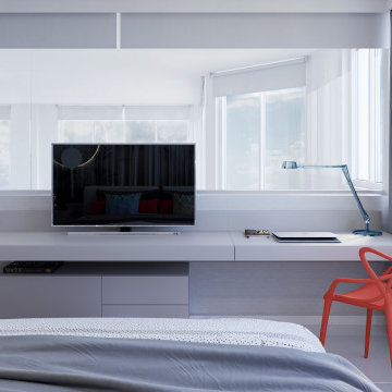
On the front is console/table cabinetry. In this combination, it is in line with bed design and the overall geometrical proportions of the room. It is a multi-function. It will be used as a console for a TV/play station and a small table for computer activities.
In the end wall in the hallway is a costume made a mirror with Led lights. Girls need mirrors )
Our concept is timeless. We design this room to be the best for any age. We look into the future ) Your girl will grow very fast. And you do not have to change a thing in this room. This room will be comfortable and stylish for the next 20 years. I do guarantee that )
Your daughter will love it!
 Heller & Associates
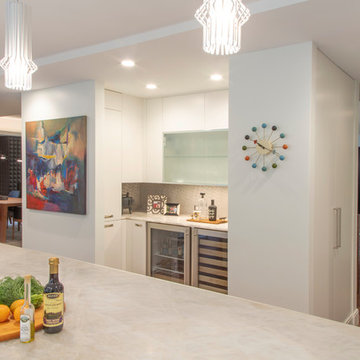
A decidedly modern, no-nonsense vibe permeates this 2018 kitchen remodel in Huntington Woods. Sleek gray and white cabinets feature flush mounted pulls reminiscent of filing cabinets. Hardworking Viking appliances and an industrial looking citrus juicer stand ready to get things done. Minimalist bar stools tuck neatly away beneath the extended island countertop. The one-handled, high arc faucet with gourmet spray joins an under-mount sink in front of an unadorned new picture window. Contemporary French doors by Weather Shield flank either side of the sink to create a calming sense of symmetry and balance.
A second glance reveals understated touches that soften the edges of the kitchen to make it inviting and comfortable. Etched glass doors grace the upper cabinets in the side pantry. The stainless steel backsplashes wear a subtle, circular rubbed sheen. A trio of delicately bent glass pendants reminiscent of glowing Asian paper lanterns hover serenely above the length of the island's waterfalled countertop. The quartzite countertops themselves appear soft, almost like translucent origami paper that has been lovingly folded, refolded, and smoothed back out. The countertop edges are mitered and gently square to cascade to the floor with a graceful waterfall effect down to the walnut floors.
The initial room design included a walk-in pantry, which during construction was transformed into an open wine bar with finished cabinetry. The square stepped ceiling detail symmetrically positioned over the island is the pleasing result of dropping the ceiling by two inches to conceal an original dropped beam. The finished design honors the spirit of the home's original design while ushering it graciously into the present day.
 Milgard Windows & Doors
The Kiguchi family moved into their Austin, Texas home in 1994. Built in the 1980’s as part of a neighborhood development, they happily raised their family here but longed for something more contemporary. Once they became empty nesters, they decided it was time for a major remodel. After spending many years visiting Austin AIA Home Tours that highlight contemporary residential architecture, they had a lot of ideas and in 2013 were ready to interview architects and get their renovation underway.
The project turned into a major remodel due to an unstable foundation. Architects Ben Arbib and Ed Hughey, of Arbib Hughey Design were hired to solve the structural issue and look for inspiration in the bones of the house, which sat on top of a hillside and was surrounded by great views.
Unfortunately, with the old floor plan, the beautiful views were hidden by small windows that were poorly placed. In order to bring more natural light into the house the window sizes and configurations had to be addressed, all while keeping in mind the homeowners desire for a modern look and feel.
To achieve a more contemporary and sophisticated front of house, a new entry was designed that included removing a two-story bay window and porch. The entrance of the home also became more integrated with the landscape creating a template for new foliage to be planted. Older exterior materials were updated to incorporate a more muted palette of colors with a metal roof, dark grey siding in the back and white stucco in the front. Deep eaves were added over many of the new large windows for clean lines and sun protection.
“Inside it was about opening up the floor plan, expanding the views throughout the house, and updating the material palette to get a modern look that was also warm and inviting,” said Ben from Arbib Hughey Design. “Prior to the remodel, the house had the typical separation of rooms. We removed the walls between them and changed all of the windows to Milgard Thermally Improved Aluminum to connect the inside with the outside. No matter where you are you get nice views and natural light.”
The architects wanted to create some drama, which they accomplished with the window placement and opening up the interior floor plan to an open concept approach. Cabinetry was used to help delineate intimate spaces. To add warmth to an all-white living room, white-washed oak wood floors were installed and pine planks were used around the fireplace. The large windows served as artwork bringing the color of nature into the space.
An octagon shaped, elevated dining room, (named “the turret”), had a big impact on the design of the house. They architects rounded the corners and added larger window openings overlooking a new sunken garden. The great room was also softened by rounding out the corners and that circular theme continued throughout the house, being picked up in skylight wells and kitchen cabinetry. A staircase leading to a catwalk was added and the result was a two-story window wall that flooded the home with natural light.
When asked why Milgard® Thermally Improved Aluminum windows were selected, the architectural team listed many reasons:
1) Aesthetics: “We liked the slim profiles and narrow sightlines. The window frames never get in the way of the view and that was important to us. They also have a very contemporary look that went well with our design.”
2) Options: “We liked that we could get large sliding doors that matched the windows, giving us a very cohesive look and feel throughout the project.”
3) Cost Effective: “Milgard windows are affordable. You get a good product at a good price.”
4) Custom Sizes: “Milgard windows are customizable, which allowed us to get the right window for each location.”
Ready to take on your own traditional to modern home remodeling project? Arbib Hughey Design advises, “Work with a good architect. That means picking a team that is creative, communicative, listens well and is responsive. We think it’s important for an architect to listen to their clients and give them something they want, not something the architect thinks they should have. At the same time you want an architect who is willing and able to think outside the box and offer up design options that you may not have considered. Design is about a lot of back and forth, trying out ideas, getting feedback and trying again.”
The home was completely transformed into a unique, contemporary house perfectly integrated with its site. Internally the home has a natural flow for the occupants and externally it is integrated with the surroundings taking advantage of great natural light. As a side note, it was highly praised as part of the Austin AIA homes tour.
Sponsored
Sunbury, OH
J.Holderby - Renovations
Franklin County's Leading General Contractors - 2X Best of Houzz!
 Milgard Windows & Doors
The Kiguchi family moved into their Austin, Texas home in 1994. Built in the 1980’s as part of a neighborhood development, they happily raised their family here but longed for something more contemporary. Once they became empty nesters, they decided it was time for a major remodel. After spending many years visiting Austin AIA Home Tours that highlight contemporary residential architecture, they had a lot of ideas and in 2013 were ready to interview architects and get their renovation underway.
The project turned into a major remodel due to an unstable foundation. Architects Ben Arbib and Ed Hughey, of Arbib Hughey Design were hired to solve the structural issue and look for inspiration in the bones of the house, which sat on top of a hillside and was surrounded by great views.
Unfortunately, with the old floor plan, the beautiful views were hidden by small windows that were poorly placed. In order to bring more natural light into the house the window sizes and configurations had to be addressed, all while keeping in mind the homeowners desire for a modern look and feel.
To achieve a more contemporary and sophisticated front of house, a new entry was designed that included removing a two-story bay window and porch. The entrance of the home also became more integrated with the landscape creating a template for new foliage to be planted. Older exterior materials were updated to incorporate a more muted palette of colors with a metal roof, dark grey siding in the back and white stucco in the front. Deep eaves were added over many of the new large windows for clean lines and sun protection.
“Inside it was about opening up the floor plan, expanding the views throughout the house, and updating the material palette to get a modern look that was also warm and inviting,” said Ben from Arbib Hughey Design. “Prior to the remodel, the house had the typical separation of rooms. We removed the walls between them and changed all of the windows to Milgard Thermally Improved Aluminum to connect the inside with the outside. No matter where you are you get nice views and natural light.”
The architects wanted to create some drama, which they accomplished with the window placement and opening up the interior floor plan to an open concept approach. Cabinetry was used to help delineate intimate spaces. To add warmth to an all-white living room, white-washed oak wood floors were installed and pine planks were used around the fireplace. The large windows served as artwork bringing the color of nature into the space.
An octagon shaped, elevated dining room, (named “the turret”), had a big impact on the design of the house. They architects rounded the corners and added larger window openings overlooking a new sunken garden. The great room was also softened by rounding out the corners and that circular theme continued throughout the house, being picked up in skylight wells and kitchen cabinetry. A staircase leading to a catwalk was added and the result was a two-story window wall that flooded the home with natural light.
When asked why Milgard® Thermally Improved Aluminum windows were selected, the architectural team listed many reasons:
1) Aesthetics: “We liked the slim profiles and narrow sightlines. The window frames never get in the way of the view and that was important to us. They also have a very contemporary look that went well with our design.”
2) Options: “We liked that we could get large sliding doors that matched the windows, giving us a very cohesive look and feel throughout the project.”
3) Cost Effective: “Milgard windows are affordable. You get a good product at a good price.”
4) Custom Sizes: “Milgard windows are customizable, which allowed us to get the right window for each location.”
Ready to take on your own traditional to modern home remodeling project? Arbib Hughey Design advises, “Work with a good architect. That means picking a team that is creative, communicative, listens well and is responsive. We think it’s important for an architect to listen to their clients and give them something they want, not something the architect thinks they should have. At the same time you want an architect who is willing and able to think outside the box and offer up design options that you may not have considered. Design is about a lot of back and forth, trying out ideas, getting feedback and trying again.”
The home was completely transformed into a unique, contemporary house perfectly integrated with its site. Internally the home has a natural flow for the occupants and externally it is integrated with the surroundings taking advantage of great natural light. As a side note, it was highly praised as part of the Austin AIA homes tour.
 Everything Home
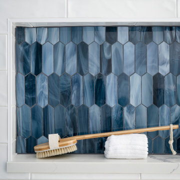
Our design studio worked magic on this dated '90s home, turning it into a stylish haven for our delighted clients. Through meticulous design and planning, we executed a refreshing modern transformation, breathing new life into the space.
In this bathroom design, we embraced a bright, airy ambience with neutral palettes accented by playful splashes of beautiful blue. The result is a space that combines serenity and a touch of fun.
---
Project completed by Wendy Langston's Everything Home interior design firm, which serves Carmel, Zionsville, Fishers, Westfield, Noblesville, and Indianapolis.
For more about Everything Home, see here: https://everythinghomedesigns.com/
To learn more about this project, see here:
https://everythinghomedesigns.com/portfolio/shades-of-blue/
 Milgard Windows & Doors
The Kiguchi family moved into their Austin, Texas home in 1994. Built in the 1980’s as part of a neighborhood development, they happily raised their family here but longed for something more contemporary. Once they became empty nesters, they decided it was time for a major remodel. After spending many years visiting Austin AIA Home Tours that highlight contemporary residential architecture, they had a lot of ideas and in 2013 were ready to interview architects and get their renovation underway.
The project turned into a major remodel due to an unstable foundation. Architects Ben Arbib and Ed Hughey, of Arbib Hughey Design were hired to solve the structural issue and look for inspiration in the bones of the house, which sat on top of a hillside and was surrounded by great views.
Unfortunately, with the old floor plan, the beautiful views were hidden by small windows that were poorly placed. In order to bring more natural light into the house the window sizes and configurations had to be addressed, all while keeping in mind the homeowners desire for a modern look and feel.
To achieve a more contemporary and sophisticated front of house, a new entry was designed that included removing a two-story bay window and porch. The entrance of the home also became more integrated with the landscape creating a template for new foliage to be planted. Older exterior materials were updated to incorporate a more muted palette of colors with a metal roof, dark grey siding in the back and white stucco in the front. Deep eaves were added over many of the new large windows for clean lines and sun protection.
“Inside it was about opening up the floor plan, expanding the views throughout the house, and updating the material palette to get a modern look that was also warm and inviting,” said Ben from Arbib Hughey Design. “Prior to the remodel, the house had the typical separation of rooms. We removed the walls between them and changed all of the windows to Milgard Thermally Improved Aluminum to connect the inside with the outside. No matter where you are you get nice views and natural light.”
The architects wanted to create some drama, which they accomplished with the window placement and opening up the interior floor plan to an open concept approach. Cabinetry was used to help delineate intimate spaces. To add warmth to an all-white living room, white-washed oak wood floors were installed and pine planks were used around the fireplace. The large windows served as artwork bringing the color of nature into the space.
An octagon shaped, elevated dining room, (named “the turret”), had a big impact on the design of the house. They architects rounded the corners and added larger window openings overlooking a new sunken garden. The great room was also softened by rounding out the corners and that circular theme continued throughout the house, being picked up in skylight wells and kitchen cabinetry. A staircase leading to a catwalk was added and the result was a two-story window wall that flooded the home with natural light.
When asked why Milgard® Thermally Improved Aluminum windows were selected, the architectural team listed many reasons:
1) Aesthetics: “We liked the slim profiles and narrow sightlines. The window frames never get in the way of the view and that was important to us. They also have a very contemporary look that went well with our design.”
2) Options: “We liked that we could get large sliding doors that matched the windows, giving us a very cohesive look and feel throughout the project.”
3) Cost Effective: “Milgard windows are affordable. You get a good product at a good price.”
4) Custom Sizes: “Milgard windows are customizable, which allowed us to get the right window for each location.”
Ready to take on your own traditional to modern home remodeling project? Arbib Hughey Design advises, “Work with a good architect. That means picking a team that is creative, communicative, listens well and is responsive. We think it’s important for an architect to listen to their clients and give them something they want, not something the architect thinks they should have. At the same time you want an architect who is willing and able to think outside the box and offer up design options that you may not have considered. Design is about a lot of back and forth, trying out ideas, getting feedback and trying again.”
The home was completely transformed into a unique, contemporary house perfectly integrated with its site. Internally the home has a natural flow for the occupants and externally it is integrated with the surroundings taking advantage of great natural light. As a side note, it was highly praised as part of the Austin AIA homes tour.
52