
Search results for "Travellers rising" in Home Design Ideas
 User
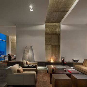
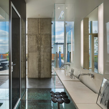
UserThe Clients contacted Cecil Baker + Partners to reconfigure and remodel the top floor of a prominent Philadelphia high-rise into an urban pied-a-terre. The forty-five story apartment building, overlooking Washington Square Park and its surrounding neighborhoods, provided a modern shell for this truly contemporary renovation. Originally configured as three penthouse units, the 8,700 sf interior, as well as 2,500 square feet of terrace space, was to become a single residence with sweeping views of the city in all directions.
The Client’s mission was to create a city home for collecting and displaying contemporary glass crafts. Their stated desire was to cast an urban home that was, in itself, a gallery. While they enjoy a very vital family life, this home was targeted to their urban activities - entertainment being a central element.
The living areas are designed to be open and to flow into each other, with pockets of secondary functions. At large social events, guests feel free to access all areas of the penthouse, including the master bedroom suite. A main gallery was created in order to house unique, travelling art shows.
Stemming from their desire to entertain, the penthouse was built around the need for elaborate food preparation. Cooking would be visible from several entertainment areas with a “show” kitchen, provided for their renowned chef. Secondary preparation and cleaning facilities were tucked away.
The architects crafted a distinctive residence that is framed around the gallery experience, while also incorporating softer residential moments. Cecil Baker + Partners embraced every element of the new penthouse design beyond those normally associated with an architect’s sphere, from all material selections, furniture selections, furniture design, and art placement.
Barry Halkin and Todd Mason Photography
 User
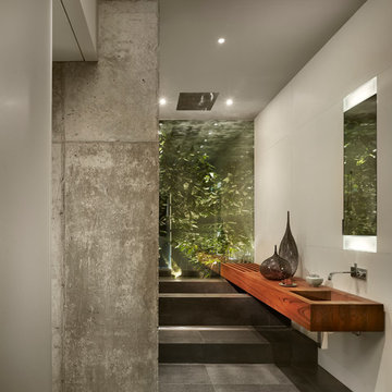
UserThe Clients contacted Cecil Baker + Partners to reconfigure and remodel the top floor of a prominent Philadelphia high-rise into an urban pied-a-terre. The forty-five story apartment building, overlooking Washington Square Park and its surrounding neighborhoods, provided a modern shell for this truly contemporary renovation. Originally configured as three penthouse units, the 8,700 sf interior, as well as 2,500 square feet of terrace space, was to become a single residence with sweeping views of the city in all directions.
The Client’s mission was to create a city home for collecting and displaying contemporary glass crafts. Their stated desire was to cast an urban home that was, in itself, a gallery. While they enjoy a very vital family life, this home was targeted to their urban activities - entertainment being a central element.
The living areas are designed to be open and to flow into each other, with pockets of secondary functions. At large social events, guests feel free to access all areas of the penthouse, including the master bedroom suite. A main gallery was created in order to house unique, travelling art shows.
Stemming from their desire to entertain, the penthouse was built around the need for elaborate food preparation. Cooking would be visible from several entertainment areas with a “show” kitchen, provided for their renowned chef. Secondary preparation and cleaning facilities were tucked away.
The architects crafted a distinctive residence that is framed around the gallery experience, while also incorporating softer residential moments. Cecil Baker + Partners embraced every element of the new penthouse design beyond those normally associated with an architect’s sphere, from all material selections, furniture selections, furniture design, and art placement.
Barry Halkin and Todd Mason Photography
 Maugel DeStefano Architects
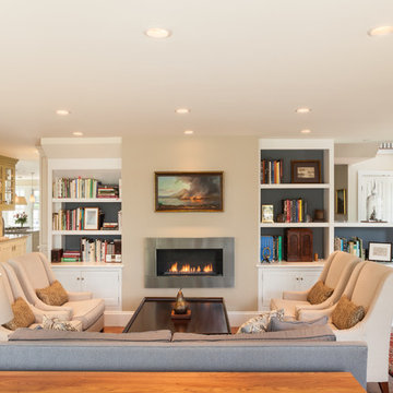
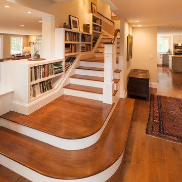
Located in the beautiful historic district on a quaint New England island, the existing home was a 1940s house with a 1970s addition. The home was meaningful to the fabric of the community and extensive approvals were sought and granted from the local Historic District Commission. The result is a beautiful four-story home, neatly tucked into the rock of the surrounding landscape.
The jewel of the home is an extraordinary central staircase, fashioned with low-rise, long-run stairs, and multiple landings to serve as resting spots. With over 200 linear feet of bookshelves, there is plenty of space to house distinguished artifacts and a book collection gathered from travels around the world. Amenities of the home include a garden room, a deck off the spacious living room, a high-end kitchen, a library, four bedrooms (including a bunk room for the grandchildren), a home office, an elevator, and a perch overlooking the Piscataqua River.
Photos:John Benford
Find the right local pro for your project
 Maugel DeStefano Architects
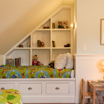
Located in the beautiful historic district on a quaint New England island, the existing home was a 1940s house with a 1970s addition. The home was meaningful to the fabric of the community and extensive approvals were sought and granted from the local Historic District Commission. The result is a beautiful four-story home, neatly tucked into the rock of the surrounding landscape.
The jewel of the home is an extraordinary central staircase, fashioned with low-rise, long-run stairs, and multiple landings to serve as resting spots. With over 200 linear feet of bookshelves, there is plenty of space to house distinguished artifacts and a book collection gathered from travels around the world. Amenities of the home include a garden room, a deck off the spacious living room, a high-end kitchen, a library, four bedrooms (including a bunk room for the grandchildren), a home office, an elevator, and a perch overlooking the Piscataqua River.
Photos:John Benford
 User
UserThe Clients contacted Cecil Baker + Partners to reconfigure and remodel the top floor of a prominent Philadelphia high-rise into an urban pied-a-terre. The forty-five story apartment building, overlooking Washington Square Park and its surrounding neighborhoods, provided a modern shell for this truly contemporary renovation. Originally configured as three penthouse units, the 8,700 sf interior, as well as 2,500 square feet of terrace space, was to become a single residence with sweeping views of the city in all directions.
The Client’s mission was to create a city home for collecting and displaying contemporary glass crafts. Their stated desire was to cast an urban home that was, in itself, a gallery. While they enjoy a very vital family life, this home was targeted to their urban activities - entertainment being a central element.
The living areas are designed to be open and to flow into each other, with pockets of secondary functions. At large social events, guests feel free to access all areas of the penthouse, including the master bedroom suite. A main gallery was created in order to house unique, travelling art shows.
Stemming from their desire to entertain, the penthouse was built around the need for elaborate food preparation. Cooking would be visible from several entertainment areas with a “show” kitchen, provided for their renowned chef. Secondary preparation and cleaning facilities were tucked away.
The architects crafted a distinctive residence that is framed around the gallery experience, while also incorporating softer residential moments. Cecil Baker + Partners embraced every element of the new penthouse design beyond those normally associated with an architect’s sphere, from all material selections, furniture selections, furniture design, and art placement.
Barry Halkin and Todd Mason Photography
 InnovationLand
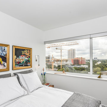
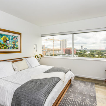
Houston Interior Designer Lisha Maxey took this Museum District condo from the dated, mirrored walls of the 1980s to Mid Century Modern with a gallery look featuring the client's art collection.
"The place was covered with glued-down, floor-to-ceiling mirrors," says Lisha Maxey, senior designer for Homescapes of Houston and principal at LGH Design Services in Houston. "When we took them off the walls, the walls came apart. We ended up taking them down to the studs."
The makeover took six months to complete, primarily because of strict condo association rules that only gave the Houston interior designers very limited access to the elevator - through which all materials and team members had to go.
"Monday through Friday, we could only be noisy from 10 a.m. to 2 p.m., and if we had to do something extra loud, like sawing or drilling, we had to schedule it with the management and they had to communicate that to the condo owners. So it was just a lot of coordination. But a lot of Inner City Loopers live in these kinds of buildings, so we're used to handling that kind of thing."
The client, a child psychiatrist in her 60s, recently moved to Houston from northeast Texas to be with friends. After being widowed three years ago, she decided it was time to let go of the traditionally styled estate that wasn't really her style anyway. An avid diver who has traveled around the world to pursue her passion, she has amassed a large collection of art from her travels. Downsizing to 1,600 feet and wanting to go more contemporary, she wanted the display - and the look - more streamlined.
"She wanted clean lines and muted colors, with the main focus being her artwork," says Maxey. "So we made the space a palette for that."
Enter the white, gallery-grade paint she chose for the walls: "It's halfway between satin and flat," explains Maxey. "It's not glossy and it's not chalky - just very smooth and clean."
Adding to the gallery theme is the satin nickel track lighting with lamps aimed to highlight pieces of art. "This lighting has no wires," notes Maxey. "It's powered by a positive and negative conduit."
The new flooring throughout is a blended-grey porcelain tile that looks like wood planks. "It's gorgeous, natural-looking and combines all the beauty of wood with the durability of tile," says Maxey. "We used it throughout the condo to unify the space."
After Maxey started looking at the client's bright, vibrant, colorful artwork, she felt the palette couldn't stay as muted anymore. Hence the Mid Century Modern orange leather sofas from West Elm and bright green chairs from Joybird, plus the throw pillows in different textures, patterns and shades of gold, orange and green.
The concave lines of the Danish-inspired chairs, she notes, help them look beautiful from all the way around - a key to designing spaces for loft living.
"The table in the living room is very interesting," notes Maxey. "It was handmade for the client in 1974 and has a signature on it from the artist. She was adamant about including the piece, which has all these hand-painted black-and-white art tiles on the top. I took one look at it and said 'It's not really going to go.'"
However, after cutting 6 inches off the bottom and making it look a little distressed, the table ended up being the perfect complement to the sofas.
The dining room table - from Design Within Reach - is a solid piece of mahogany, the chair upholstery a mix of grey velvet and leather and the legs a shiny brass. "The side chairs are leather and the end ones are velvet," says Maxey. "It's a nice textural mix that lends depth and texture."
The galley kitchen, meanwhile, has been lightened and brightened, with white quartz countertops and backsplashes mimicking the look of Carrara marble, stainless steel appliances and a velvet green bench seat for a punch of color. The cabinets are painted a cool grey color called "Silverplate."
The two bathrooms have been updated with contemporary white vanities and vessel sinks and the master bath now features a walk-in shower tiled in Dolomite white marble (the floor is Bianco Carrara marble mosaic, done in a herringbone pattern.
In the master bedroom, Homescapes of Houston knocked down a wall between two smaller closets with swing doors to make one large walk-in closet with pocket doors. The closet in the guest bedroom also came out 13 more inches.
The client's artwork throughout personalizes the space and tells the story of a life. There's a huge bowl of shells from the client's diving adventures, framed art from her child psychiatry patients and a 16th century wood carving from a monastery that's been in her family forever.
"Her collection is quite impressive," says Maxey. "There's even a framed piece of autographed songs written by John Lennon." (You can see this black-framed piece of art on the wall in the photo above of two green chairs).
"We're extremely happy with how the project turned out, and so is the client," says Maxey. "No expense was spared for her. It was a labor of love and we were excited to do it."
 InnovationLand
Houston Interior Designer Lisha Maxey took this Museum District condo from the dated, mirrored walls of the 1980s to Mid Century Modern with a gallery look featuring the client's art collection.
"The place was covered with glued-down, floor-to-ceiling mirrors," says Lisha Maxey, senior designer for Homescapes of Houston and principal at LGH Design Services in Houston. "When we took them off the walls, the walls came apart. We ended up taking them down to the studs."
The makeover took six months to complete, primarily because of strict condo association rules that only gave the Houston interior designers very limited access to the elevator - through which all materials and team members had to go.
"Monday through Friday, we could only be noisy from 10 a.m. to 2 p.m., and if we had to do something extra loud, like sawing or drilling, we had to schedule it with the management and they had to communicate that to the condo owners. So it was just a lot of coordination. But a lot of Inner City Loopers live in these kinds of buildings, so we're used to handling that kind of thing."
The client, a child psychiatrist in her 60s, recently moved to Houston from northeast Texas to be with friends. After being widowed three years ago, she decided it was time to let go of the traditionally styled estate that wasn't really her style anyway. An avid diver who has traveled around the world to pursue her passion, she has amassed a large collection of art from her travels. Downsizing to 1,600 feet and wanting to go more contemporary, she wanted the display - and the look - more streamlined.
"She wanted clean lines and muted colors, with the main focus being her artwork," says Maxey. "So we made the space a palette for that."
Enter the white, gallery-grade paint she chose for the walls: "It's halfway between satin and flat," explains Maxey. "It's not glossy and it's not chalky - just very smooth and clean."
Adding to the gallery theme is the satin nickel track lighting with lamps aimed to highlight pieces of art. "This lighting has no wires," notes Maxey. "It's powered by a positive and negative conduit."
The new flooring throughout is a blended-grey porcelain tile that looks like wood planks. "It's gorgeous, natural-looking and combines all the beauty of wood with the durability of tile," says Maxey. "We used it throughout the condo to unify the space."
After Maxey started looking at the client's bright, vibrant, colorful artwork, she felt the palette couldn't stay as muted anymore. Hence the Mid Century Modern orange leather sofas from West Elm and bright green chairs from Joybird, plus the throw pillows in different textures, patterns and shades of gold, orange and green.
The concave lines of the Danish-inspired chairs, she notes, help them look beautiful from all the way around - a key to designing spaces for loft living.
"The table in the living room is very interesting," notes Maxey. "It was handmade for the client in 1974 and has a signature on it from the artist. She was adamant about including the piece, which has all these hand-painted black-and-white art tiles on the top. I took one look at it and said 'It's not really going to go.'"
However, after cutting 6 inches off the bottom and making it look a little distressed, the table ended up being the perfect complement to the sofas.
The dining room table - from Design Within Reach - is a solid piece of mahogany, the chair upholstery a mix of grey velvet and leather and the legs a shiny brass. "The side chairs are leather and the end ones are velvet," says Maxey. "It's a nice textural mix that lends depth and texture."
The galley kitchen, meanwhile, has been lightened and brightened, with white quartz countertops and backsplashes mimicking the look of Carrara marble, stainless steel appliances and a velvet green bench seat for a punch of color. The cabinets are painted a cool grey color called "Silverplate."
The two bathrooms have been updated with contemporary white vanities and vessel sinks and the master bath now features a walk-in shower tiled in Dolomite white marble (the floor is Bianco Carrara marble mosaic, done in a herringbone pattern.
In the master bedroom, Homescapes of Houston knocked down a wall between two smaller closets with swing doors to make one large walk-in closet with pocket doors. The closet in the guest bedroom also came out 13 more inches.
The client's artwork throughout personalizes the space and tells the story of a life. There's a huge bowl of shells from the client's diving adventures, framed art from her child psychiatry patients and a 16th century wood carving from a monastery that's been in her family forever.
"Her collection is quite impressive," says Maxey. "There's even a framed piece of autographed songs written by John Lennon." (You can see this black-framed piece of art on the wall in the photo above of two green chairs).
"We're extremely happy with how the project turned out, and so is the client," says Maxey. "No expense was spared for her. It was a labor of love and we were excited to do it."

 Framestudio
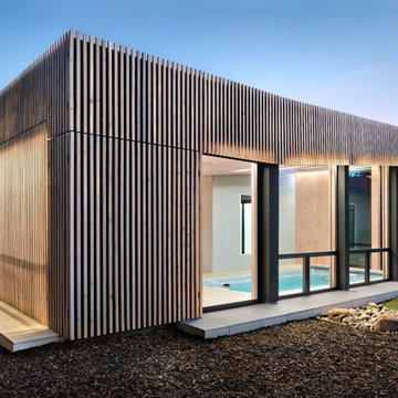
This project began as a design-build proposal to build an addition for an indoor swim spa and exercise room to a ranch style house. The Clients were seeking a functional and inviting space reminiscent of the luxury resorts and space they have visited during their international travels.
One of the biggest challenges was to fit the program within the site and buildable area constraints. In order to maximize floor area, the exterior walls of the addition were located parallel to the property lines along the required setbacks, which resulted in a non-orthagonal geometry in plan. The volume of the addition began to take shape with large floor to ceiling openings strengthening the connection to the outdoors with roof line that rises northward to capture daylight. A series of operable skylights ventilate the room and allow more daylight to penetrate into the adjacent existing den.
Inspired by modern additions made to historic structures in Europe, we made a conscious decision to not try to blend the addition into the language of the existing ranch house, choosing instead to juxtapose a structure that was layered and felt light next to the cement tile roof and framed picture windows. The interior walls were finished with a marine grade plywood to withstand a humid environment, and the exteriors were clad with a cedar rainscreen to give privacy where needed and gradually reduced to allow for more glass and visibility.
The Clients are immersed in the technological environment of Silicon Valley and appreciated the simple geometries and aesthetics of modern design.
c david wakely
 Drury Design
THE SETUP
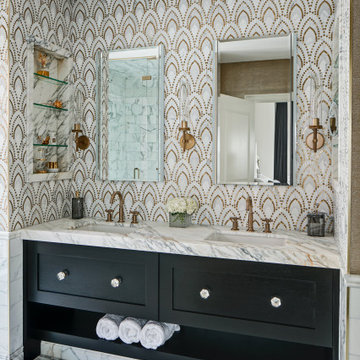
Located in a luxury high rise in Chicago’s Gold Coast Neighborhood, the condo’s existing primary bath was “fine,” but a bit underwhelming. It was a sea of beige, with very little personality or drama. The client is very well traveled, and wanted the space to feel luxe and glamorous, like a bath in a fine European hotel.
Design objectives:
- Add loads of beautiful high end finishes
- Create drama and contrast
- Create luxe showering and bathing experiences
- Improve storage for toiletries and essentials
THE REMODEL
Design challenges:
- Unable to reconfigure layout due to location in the high rise
- Seek out unique, dramatic tile materials
- Introduce “BLING”
- Find glamorous lighting
Design solutions:
- Keep existing layout, with change from built in to free-standing tub
- Gorgeous Calacatta gold marble was our inspiration
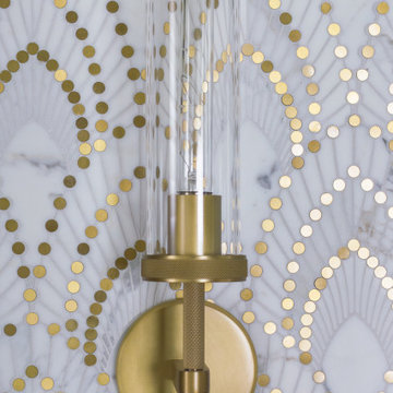
- Ornate Art deco marble mosaic to be the focal point, with satin gold accents to create shimmer
- Glass and crystal light fixtures add the needed sparkle
THE RENEWED SPACE
After the remodel began, our client’s vision for her bath took a turn that was inspired by a trip to Paris. Initially, the plan was a modest design to allocate resources for her kitchen’s marble slabs… but then she had a vision while admiring the marble bathroom of her Parisian hotel.
She was determined to infuse her bathroom with the same sense of luxury. They went back to the drawing board and started over with all-marble.
Her new stunning bath space radiates glamour and sophistication. The “bling” flows to her bedroom where we matched the gorgeous custom wall treatment that mimics grasscloth on an accent wall. With its marble landscape, shimmering tile and walls, the primary bath’s ambiance creates a swanky hotel feel that our client adores and considers her sanctuary.
 Maugel DeStefano Architects
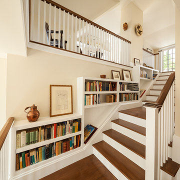
Located in the beautiful historic district on a quaint New England island, the existing home was a 1940s house with a 1970s addition. The home was meaningful to the fabric of the community and extensive approvals were sought and granted from the local Historic District Commission. The result is a beautiful four-story home, neatly tucked into the rock of the surrounding landscape.
The jewel of the home is an extraordinary central staircase, fashioned with low-rise, long-run stairs, and multiple landings to serve as resting spots. With over 200 linear feet of bookshelves, there is plenty of space to house distinguished artifacts and a book collection gathered from travels around the world. Amenities of the home include a garden room, a deck off the spacious living room, a high-end kitchen, a library, four bedrooms (including a bunk room for the grandchildren), a home office, an elevator, and a perch overlooking the Piscataqua River.
Photos:John Benford
 Cure Design Group
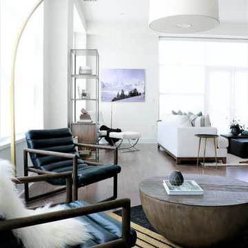
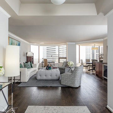
Stunning open, fresh and clean high rise condo renovation does not disappoint. Our clients wanted a chic urban oasis they could call home. Featuring multiple lounge spaces, open to the modern kitchen and waterfall edge 10 foot marble island. This space is truly unique.
 Maugel DeStefano Architects
Located in the beautiful historic district on a quaint New England island, the existing home was a 1940s house with a 1970s addition. The home was meaningful to the fabric of the community and extensive approvals were sought and granted from the local Historic District Commission. The result is a beautiful four-story home, neatly tucked into the rock of the surrounding landscape.
The jewel of the home is an extraordinary central staircase, fashioned with low-rise, long-run stairs, and multiple landings to serve as resting spots. With over 200 linear feet of bookshelves, there is plenty of space to house distinguished artifacts and a book collection gathered from travels around the world. Amenities of the home include a garden room, a deck off the spacious living room, a high-end kitchen, a library, four bedrooms (including a bunk room for the grandchildren), a home office, an elevator, and a perch overlooking the Piscataqua River.
Photos:John Benford

 Drury Design
THE SETUP
Located in a luxury high rise in Chicago’s Gold Coast Neighborhood, the condo’s existing primary bath was “fine,” but a bit underwhelming. It was a sea of beige, with very little personality or drama. The client is very well traveled, and wanted the space to feel luxe and glamorous, like a bath in a fine European hotel.
Design objectives:
- Add loads of beautiful high end finishes
- Create drama and contrast
- Create luxe showering and bathing experiences
- Improve storage for toiletries and essentials
THE REMODEL
Design challenges:
- Unable to reconfigure layout due to location in the high rise
- Seek out unique, dramatic tile materials
- Introduce “BLING”
- Find glamorous lighting
Design solutions:
- Keep existing layout, with change from built in to free-standing tub
- Gorgeous Calacatta gold marble was our inspiration
- Ornate Art deco marble mosaic to be the focal point, with satin gold accents to create shimmer
- Glass and crystal light fixtures add the needed sparkle
THE RENEWED SPACE
After the remodel began, our client’s vision for her bath took a turn that was inspired by a trip to Paris. Initially, the plan was a modest design to allocate resources for her kitchen’s marble slabs… but then she had a vision while admiring the marble bathroom of her Parisian hotel.
She was determined to infuse her bathroom with the same sense of luxury. They went back to the drawing board and started over with all-marble.
Her new stunning bath space radiates glamour and sophistication. The “bling” flows to her bedroom where we matched the gorgeous custom wall treatment that mimics grasscloth on an accent wall. With its marble landscape, shimmering tile and walls, the primary bath’s ambiance creates a swanky hotel feel that our client adores and considers her sanctuary.
 Maugel DeStefano Architects
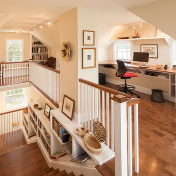
Located in the beautiful historic district on a quaint New England island, the existing home was a 1940s house with a 1970s addition. The home was meaningful to the fabric of the community and extensive approvals were sought and granted from the local Historic District Commission. The result is a beautiful four-story home, neatly tucked into the rock of the surrounding landscape.
The jewel of the home is an extraordinary central staircase, fashioned with low-rise, long-run stairs, and multiple landings to serve as resting spots. With over 200 linear feet of bookshelves, there is plenty of space to house distinguished artifacts and a book collection gathered from travels around the world. Amenities of the home include a garden room, a deck off the spacious living room, a high-end kitchen, a library, four bedrooms (including a bunk room for the grandchildren), a home office, an elevator, and a perch overlooking the Piscataqua River.
Photos:John Benford

 MESA Contracting, LLC
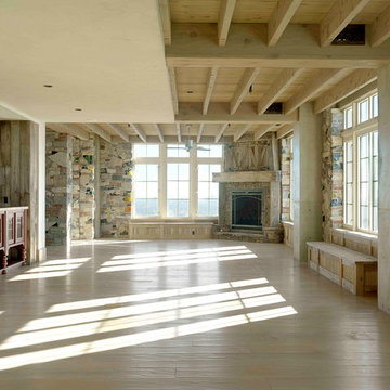
The Challenge: Create a rugged yet warm farmhouse feel in a high rise tower. Start with an entire 9600 gross square foot penthouse floor of raw concrete floor, walls and ceiling. Devise inventive ways to address intractable existing conditions including a plumbing layout inconsistent with our Client program, a relatively low ceiling and a massive elevator core and yet take of advantage of panoramic views of the city from all sides.
For example, rather than make a bulky drywall enclosure for existing pipes that poke thru the kitchen counter, they are wrapped with antique painted galvanized sheet metal to keep sight lines around the corner as open as possible. Or, transform an unattractive and inconveniently located 24” diameter vertical duct in the middle of Samantha’s and Hannah’s (grandchildren’s) guest bedroom into part of a lovely arched top bed nook. Or, disguise a chase for above floor plumbing runs as the base for an open buffet counter. The oppressive elevator lobby was shortened; terminating in handmade glass and steel garden doors at both ends. Custom details include a groined vaulted ceiling and arched openings with stone pilasters (for future trompe-l’oeil images of a Tuscany countryside). To maximize a feeling of height, the ceilings start low and get higher as they progress to the outside walls.
The Program: Create a five bedroom condo for an elderly couple with specific and different needs. Mr. likes his privacy and to stay up late into the night on the internet. He likes order. Mrs. has some physical limits that have been addressed in various ways such as shorter travel distances, a step down shower, raised dishwasher and custom cast (to ensure that they won’t rust) iron grab bars. She prefers more disorder.
Spaces should be visually arresting, full of detail and easy to maintain. Private spaces include separate master bathrooms, his and her offices and a multi screened Media Room. The balance of the floor must link spaces into one continuous open room along the south and east elevations using large elements yet keeping an intimate scale, sound control and privacy. For example, a substantial fireplace made of old barn timber framing, country stone and a hammered iron grill is strategically located at the critical Southeast corner. Above, black iron offset pintel hardware allow custom double doors to hide a large flat screen TV.
High technology is in place for inconspicuous yet easy use. Icon driven key pads operate lighting, window treatments, audio visual systems with multiple sources and access to movie and music databases and five HVAC zones with independent humidity controls.
Outstanding Features: Exterior masonry walls have stone culled from five quarries. Sprinkled throughout are surprises - bricks with words as messages from the past, wood trimmed niches and colored glass. Glass pieces set in window corners offer bursts of color when backlit by the sun. These materials are assembled in a rough irregular fashion to look like the work of a mason from the Italian countryside. Interior ceilings and walls have overlapping layers of two plaster colors. Perimeter ceilings are made of smooth random width cedar. Rough planed cedar beams hide ductwork and allow the maximum ceiling height between them.
Custom details are everywhere-consider the ten foot barn doors on overhead track at the service elevator, cedar benches/storage areas that run below window banks, antique air registers, acid washed piano hinges and transom window operators and existing concrete piers that are featured instead of hidden. The floors are made of random width wide plank old oak with hand planed faces and edges. Overall, the elements were carefully selected or painted/stained to form a soft muted gray palate
The Country kitchen features an old fashioned style ice box appearance for the refrigerator/freezer, a tin ceiling, a distressed assortment of cabinets in multiple heights, colors and woods such as the cherry wood buffet cabinet with sliding glass doors on both sides. A backlit breakfast counter, a hammered copper hood and chicken wire inserts are part of the effort to make a comfortable, eclectic old fashioned looking Kitchen while containing the latest appliances and storage systems.
Awards:
This project has won several kitchen and bath awards:
Felman Kitchen Awards
2009 St. Louis Homes and Lifestyles Kitchen of the Year – Gold Award
2008-2009 SubZero Wolf Kitchen Design Contest – Regional Winner, Regional Designer’s Choice
2010 NKBA Art of the Industry – Pinnacle of Design Award
2010 NKBA Art of the Industry – First Place Medium Kitchen
2010 NKBA Art of the Industry – Consumer’s Choice Award
2010 K&BB Kitchen of the Year Award
Felman Bath Awards
2010 Ladue News Award—Master Bathroom
 Maugel DeStefano Architects
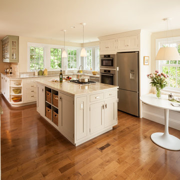
Located in the beautiful historic district on a quaint New England island, the existing home was a 1940s house with a 1970s addition. The home was meaningful to the fabric of the community and extensive approvals were sought and granted from the local Historic District Commission. The result is a beautiful four-story home, neatly tucked into the rock of the surrounding landscape.
The jewel of the home is an extraordinary central staircase, fashioned with low-rise, long-run stairs, and multiple landings to serve as resting spots. With over 200 linear feet of bookshelves, there is plenty of space to house distinguished artifacts and a book collection gathered from travels around the world. Amenities of the home include a garden room, a deck off the spacious living room, a high-end kitchen, a library, four bedrooms (including a bunk room for the grandchildren), a home office, an elevator, and a perch overlooking the Piscataqua River.
Photos:John Benford
 Richmond Commercial Painting
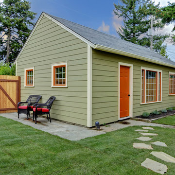
There are many challenges in Milwaukee commercial exterior painting.
With such a wide variety of building fascia materials requiring different coatings, materials and application equipment, there are varying environmental and atmospheric conditions to deal with and elaborate equipment required to complete many of the jobs. Hi-rise buildings need staging, weatherproofing, special machinery and applicator lifts to reach all surfaces.
One of the toughest challenges is the requirement to complete the Milwaukee commercial exterior painting project while the business or government office is in continuous operation. All of this requires professionalism, experience, expertise and knowledge that can only be gained by years of work with the diverse coatings and equipment that is necessary to complete large exterior commercial painting projects.
Richmond Painting is regularly selected by facility owners and general contracting firms. For the right commercial exterior painting job, we’ll travel as far south as Libertyville, IL and as far north as Mequon, WI. From where we are centrally located in Racine, WI, Richmond Commercial Painting dispatches professional crews and equipment to paint commercial building exteriors throughout the area.
Commercial Exterior Painting ServicesAt Richmond Commercial Painting our professionals are available to assist with every aspect of the exterior commercial painting project, from planning, to design, to budgeting, to application and completion. With a solid record of projects completed on time and within budget, our expertise will make any job move like a well-oiled machine; smoothly and quietly.
Whether the job requirements are for using elastomeric coatings to weatherproof masonry exterior walls, applying two-part epoxies, spraying high-solids paint for protecting exposed metal, or any of the other specialty architectural coatings, we have the experience, equipment and highly trained personnel to satisfactorily complete the project. We can also tap a network of competent tuck-and- point subcontractors to repair any joints, corners or sprawls in brick or masonry.
Our experienced project managers provide their years of background in all types of exterior coatings jobs to make every commercial painting project a successful joint venture with the owner, architect-designer and/or general contractor. We effectively dovetail our portion of the project with those of the other trades, contributing to a smooth “critical flow” on the job.
Our portfolio of successfully completed projects includes all types of commercial exterior painting projects: hotels, hi-rise office buildings, factories, warehouses, industrial parks, schools, churches, apartment buildings and just about every other type of commercial facility you can find around Milwaukee.
Our clients have learned that with the professional, commercial exterior painting services provided by Richmond Painting, Inc., a job done right the first time saves money over one that requires a number of return visits to the job to touch-up or correct flaws. Keeping that in mind, we’ve found that it really costs no more in the long run to hire the very best.
 Western DuPage Landscaping, Inc.
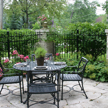
Since the completion of the home our company has maintained this property. Originally built by a local builder as a speculation home, it was purchased by two busy professionals.
Why is this important? Let's just say the clients are particular and like it when things aren't just so. Both have high level careers, travel often and expect their landscape to be pristine. Year after year our company rises to this challenge.
When originally installed, the builder wanted larger plant material to provide a full and mature look. The continued growth provides a pruning challenge, especially when the client prefers a clean, neat and "compact" landscape. We continually monitor growth and hand prune accordingly, including yearly winter pruning.
The backyard is particularly difficult due to the shade, moisture run-off from neighboring properties. The turf requires constant monitoring and adjustment to the irrigation system. The trees create a mess requiring clean up along with yearly power washing of the stone.
While the challenges are many, the fine maintenance has led to happy clients and numerous referrals.
2