
Search results for "Trending" in Home Design Ideas

 Trend Interior Design
Kitchen
Trend Interior Design
Example of a large transitional dark wood floor open concept kitchen design in Tampa with two islands, shaker cabinets, white cabinets, marble countertops, stone slab backsplash, paneled appliances and gray walls
Example of a large transitional dark wood floor open concept kitchen design in Tampa with two islands, shaker cabinets, white cabinets, marble countertops, stone slab backsplash, paneled appliances and gray walls

 Trend Interior Design
Master Bathroom
Trend Interior Design
WWW.TrendInteriorDesign.com
Transitional bathroom photo in Tampa
Transitional bathroom photo in Tampa
Find the right local pro for your project

 O’Hara Interiors
Martha O'Hara Interiors, Interior Design | L. Cramer Builders + Remodelers, Builder | Troy Thies, Photography | Shannon Gale, Photo Styling
Please Note: All “related,” “similar,” and “sponsored” products tagged or listed by Houzz are not actual products pictured. They have not been approved by Martha O’Hara Interiors nor any of the professionals credited. For information about our work, please contact design@oharainteriors.com.

 Village Home Stores
Black and White painted cabinetry paired with White Quartz and gold accents. A Black Stainless Steel appliance package completes the look in this remodeled Coal Valley, IL kitchen.
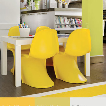
 PPG Voice of Color
I’m Pulse is a play on the word impulse but adapted to emphasize the individual consumer who is taking control of design output through the digital space to create what they want, when they want it and how they want it. The personality is plugged-in, social, connected and has grown up with a spirit of teamwork and togetherness. The color palette is vibrant and playful. It’s a mix of urban neutrals, like grays and whites, with single bright colors that seem to glow from within.
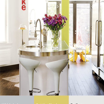 PPG Voice of Color
I’m Pulse is a play on the word impulse but adapted to emphasize the individual consumer who is taking control of design output through the digital space to create what they want, when they want it and how they want it. The personality is plugged-in, social, connected and has grown up with a spirit of teamwork and togetherness. The color palette is vibrant and playful. It’s a mix of urban neutrals, like grays and whites, with single bright colors that seem to glow from within.
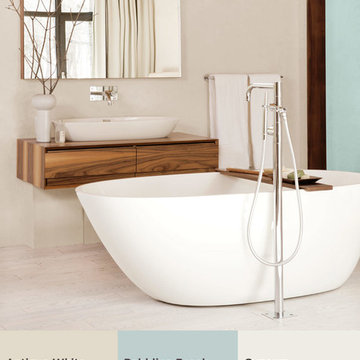 PPG Voice of Color
The IntroSense consumer is soulful, values privacy, quality and peace. The trend introduces a new direction in minimalistic styling that blends clean, pared-down designs with quiet nature. The IntroSense connection to nature is dry, discreet and non-living, like driftwood, stone, and bark. These elements are calming, quiet and muffled. The color palette includes a nuanced neutral with a subtle hint of blue-green paired with muffled off-whites and grays, and then anchored by a silent black.
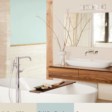 PPG Voice of Color
The IntroSense consumer is soulful, values privacy, quality and peace. The trend introduces a new direction in minimalistic styling that blends clean, pared-down designs with quiet nature. The IntroSense connection to nature is dry, discreet and non-living, like driftwood, stone, and bark. These elements are calming, quiet and muffled. The color palette includes a nuanced neutral with a subtle hint of blue-green paired with muffled off-whites and grays, and then anchored by a silent black.

 Merit Kitchens Langley Design Centre
Stand alone hood fans are making a statement this year. it is trending for 2020
Example of a trendy kitchen design in Vancouver
Example of a trendy kitchen design in Vancouver

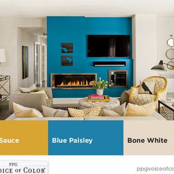 PPG Voice of Color
Co-leidoscope loves the spice of life, luxury of global travel and taste of the exotic. Complex patterns, ornate detailing, and fine materials captivate these customers. Embellished, eccentric mosaics, dazzling, laser-cut leathers, and colorful metallics and metals offer new, glamorous twists on classics. The color palette features our color of the year, Blue Paisley, paired with faded mid-tones inspired by the time-worn hues from once-brightly colored mosaics.


 User
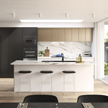
This large kitchen features all of the latest kitchen design trends and will help homeowners enjoy their space for years to come. http://arhomes.us/PortRoyale1277

 Schuler Cabinetry
Grays add a softness to the design, whether as a primary color, shown in the kitchen here, or as a secondary color, often on an island.
Gray is the perfect fit for the growing trend of Transitional design. The washed look and character of Peppercorn cherry paired with our Boardwalk door style creates a naturally calm and simple space. Designing with consistent horizontal sight lines, linear crown and a blended color palette are a few of the key elements to create a Transitional haven.
Pairing gray toned finishes, such as stain and paint, allows you to showcase multiple textures and values for creating depth through a layered approach.


 Village Home Stores
Black and White painted cabinetry paired with White Quartz and gold accents. A Black Stainless Steel appliance package completes the look in this remodeled Coal Valley, IL kitchen.
 Interior Pros - Design Studio
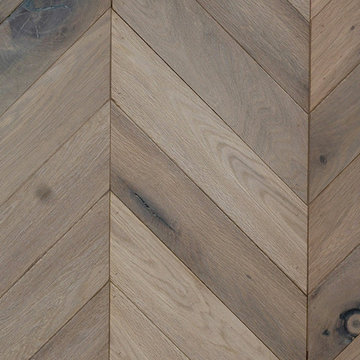
The grey trend has evolved in the last twelve months. Nowadays browns, beige and a touch of grey are in demand. Greige is the new buzzword.
Heavier hand scraped or contoured products, the rage that started around 2005 has taken a back seat in most areas, while a softer wire brushed "ceruse effect" seen mostly on White Oak has been remarkably strong showing no effects of becoming “dated” like the others mentioned.
Ceruse Color Possibilities
There are numerous color combinations to the "cerused" process with the most popular being white or off white. This design trend in hardwood flooring can have darker gray white oak with a mild ceruse off white effect.
There are limitless possibilities in either a prefinished hardwood floor or with what we can create for you in a custom on-site finished hardwood floor.
If something suits your fancy, contact us and we can work on creating just the look and sense of style you are looking for.
5