
Search results for "Two sitting areas" in Home Design Ideas
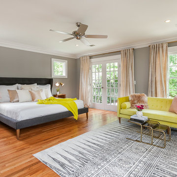
 WAKE + LOOM DESIGN
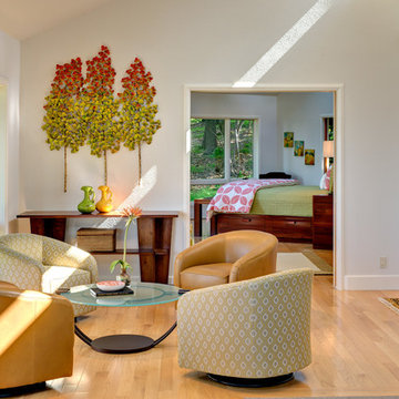
Bedroom - mid-sized 1960s guest light wood floor bedroom idea in Los Angeles with gray walls and no fireplace

 FineLine Kitchens, Inc.
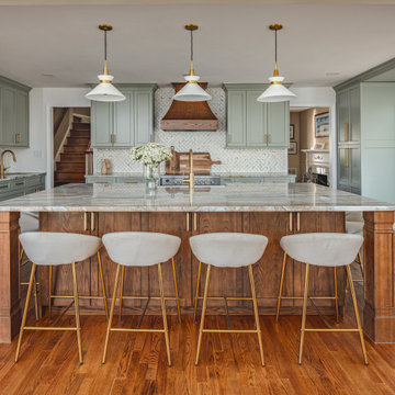
Hi everyone, I'm Sarah and Ogun we are here with fine line kitchens. So we are a couple working together. I do the interior design and remodeling of the space material selection meeting with the clients. And I handled operations outside, you know meaning all the construction work that is taking place the inside. The houses that we work in. I handle all the aspects of the construction, so today's project is very special. We're in Vienna and the client had a very big family. It's a family of seven that lives here. So we had a few aspects that we needed to keep in mind while designing this one. Having everybody be able to sit on the island. So we wanted plenty of seating all the way around. We didn't want anybody standing or anything like that. So what we did is we maximize the space. The center island is the biggest part of the kitchen. We use a natural stone to kind of give it a beautiful texture versus quartz. It's kind of standard white or kind of fabricated, so I wanted something very natural. We did this because I took my inspiration from the outside, so the inspiration if you look at the view right in front of me is there are so many greens there's a lot of brass accents and I wanted to bring this. Into this kitchen while designing it for my clients. She is very warm very. She wanted a very homey, comfy kind of look for the kitchen. So that's what we did today. As you can see, the cabinets are sage green, very light, so I still think it's a neutral, but it's a lighter color that again brings the outside in and we combine that with the oak right behind me so it's a slightly warm oak. It's not very dark. It's not very light. It's a medium brown and the same color went on the island. To kind of tie these two in and the backsplash, my favorite part is where you can see a little bit of design. It is, in my opinion still classic, but includes a pattern so the outside part is as we said in the beginning, is handled by my husband. I'd like him to speak a little bit about that. Thanks, Sarah, I want to talk to you guys a little bit about the construction part of this project. Originally this kitchen was located mostly in this area. They had their stove there sing. It was more of a peninsula layout in Sarah's and the customer vision they wanted. They wanted to get rid of the peninsula and they want to be able to have a huge island that can at least sit seven people because they're familiar with seven. So we wanted to make sure that we can achieve this design and bring it to life so that they can be happy with this layout. Some of the challenges we had, the house, the home being, you know, old home. There were a lot of you know the older electrical and plumbing that had to be replaced. We had to relocate the stove from here to this area. Over here we had put a nice foot fan that we had to relocate all the ductwork and the plumbing. Was being on the peninsula area. We had to relocate it to the center islands. So we achieved all this and kind of like bring it to bring in this kitchen up to date it looks beautiful. That's true, so yes, the old layout did not function for my clients because everything was kind of gathered on one side of the kitchen. So there was like a peninsula right there. So the end of this island kind of continued straight. And that was just the L shape. Kind of where everything was and there used to be another big table here, so they were using only kind of half of the space. So like I said at the beginning, our vision was to kind of feed everybody at the island, create some symmetry. 'cause I love that. So as you can see behind me, this is kind of the focal point symmetrical. Everything is kind of even we wanted to also panel the fridge here so it mimics the pantry and another size. So when you're looking at it, it is bringing again that symmetry back again. I hope you enjoyed this kitchen and this video and I'll see you soon. So how do you think this project turned out? It's nice. I like the color. I think it turned out nice. It's kind of like a little bit different color than what we always do. So I realize. Are you giving me a little bit of credit here that I did something different? Are you proud? I'm so proud of you. Other than that I like it. That they have kind of like a two sink. So if this was our kitchen, if we ever like you can have your own. I can have mine if we ever get into a fight then this can be like my own kitchen. Why are we gonna bring in a fight right now? So I'm cooking anyway. You're grilling most of the time, So what are you even talking about? My kitchen? That's my kitchen. You can just take the small sink. That's fine. It's always good to have your own space right there, so anyways. Thank you guys for watching. We hope to see you soon and if you have any questions please click the link below. It'll lead you to our website, house, YouTube and all of the social media is so nice to have you guys. We'll see you soon. Thanks bye bye-bye.
Find the right local pro for your project

 Fluidesign Studio
Building Design, Plans, and Interior Finishes by: Fluidesign Studio I Builder: Anchor Builders I Photographer: sethbennphoto.com
Example of a mid-sized classic slate floor mudroom design in Minneapolis with beige walls
Example of a mid-sized classic slate floor mudroom design in Minneapolis with beige walls
 FineLine Kitchens, Inc.
Hi everyone, I'm Sarah and Ogun we are here with fine line kitchens. So we are a couple working together. I do the interior design and remodeling of the space material selection meeting with the clients. And I handled operations outside, you know meaning all the construction work that is taking place the inside. The houses that we work in. I handle all the aspects of the construction, so today's project is very special. We're in Vienna and the client had a very big family. It's a family of seven that lives here. So we had a few aspects that we needed to keep in mind while designing this one. Having everybody be able to sit on the island. So we wanted plenty of seating all the way around. We didn't want anybody standing or anything like that. So what we did is we maximize the space. The center island is the biggest part of the kitchen. We use a natural stone to kind of give it a beautiful texture versus quartz. It's kind of standard white or kind of fabricated, so I wanted something very natural. We did this because I took my inspiration from the outside, so the inspiration if you look at the view right in front of me is there are so many greens there's a lot of brass accents and I wanted to bring this. Into this kitchen while designing it for my clients. She is very warm very. She wanted a very homey, comfy kind of look for the kitchen. So that's what we did today. As you can see, the cabinets are sage green, very light, so I still think it's a neutral, but it's a lighter color that again brings the outside in and we combine that with the oak right behind me so it's a slightly warm oak. It's not very dark. It's not very light. It's a medium brown and the same color went on the island. To kind of tie these two in and the backsplash, my favorite part is where you can see a little bit of design. It is, in my opinion still classic, but includes a pattern so the outside part is as we said in the beginning, is handled by my husband. I'd like him to speak a little bit about that. Thanks, Sarah, I want to talk to you guys a little bit about the construction part of this project. Originally this kitchen was located mostly in this area. They had their stove there sing. It was more of a peninsula layout in Sarah's and the customer vision they wanted. They wanted to get rid of the peninsula and they want to be able to have a huge island that can at least sit seven people because they're familiar with seven. So we wanted to make sure that we can achieve this design and bring it to life so that they can be happy with this layout. Some of the challenges we had, the house, the home being, you know, old home. There were a lot of you know the older electrical and plumbing that had to be replaced. We had to relocate the stove from here to this area. Over here we had put a nice foot fan that we had to relocate all the ductwork and the plumbing. Was being on the peninsula area. We had to relocate it to the center islands. So we achieved all this and kind of like bring it to bring in this kitchen up to date it looks beautiful. That's true, so yes, the old layout did not function for my clients because everything was kind of gathered on one side of the kitchen. So there was like a peninsula right there. So the end of this island kind of continued straight. And that was just the L shape. Kind of where everything was and there used to be another big table here, so they were using only kind of half of the space. So like I said at the beginning, our vision was to kind of feed everybody at the island, create some symmetry. 'cause I love that. So as you can see behind me, this is kind of the focal point symmetrical. Everything is kind of even we wanted to also panel the fridge here so it mimics the pantry and another size. So when you're looking at it, it is bringing again that symmetry back again. I hope you enjoyed this kitchen and this video and I'll see you soon. So how do you think this project turned out? It's nice. I like the color. I think it turned out nice. It's kind of like a little bit different color than what we always do. So I realize. Are you giving me a little bit of credit here that I did something different? Are you proud? I'm so proud of you. Other than that I like it. That they have kind of like a two sink. So if this was our kitchen, if we ever like you can have your own. I can have mine if we ever get into a fight then this can be like my own kitchen. Why are we gonna bring in a fight right now? So I'm cooking anyway. You're grilling most of the time, So what are you even talking about? My kitchen? That's my kitchen. You can just take the small sink. That's fine. It's always good to have your own space right there, so anyways. Thank you guys for watching. We hope to see you soon and if you have any questions please click the link below. It'll lead you to our website, house, YouTube and all of the social media is so nice to have you guys. We'll see you soon. Thanks bye bye-bye.
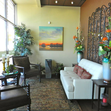
 Sandy Schargel Interiors
This 9' x 11' space was designed as a sitting area. The 54"w x 72"h wrought iron screen hanging above the small sofa adds height and interest to the area. Flanking the screen are two custom floral arrangement by Shannon Loves Flowers. The sound of water from the fountain adds an additional element to the serene environment. The art is from Gallery Direct.
 THINK Architecture, Inc.
Photo by: Joshua Caldwell
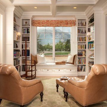
Mid-sized elegant enclosed medium tone wood floor and brown floor family room library photo in Salt Lake City with no fireplace
Mid-sized elegant enclosed medium tone wood floor and brown floor family room library photo in Salt Lake City with no fireplace

Sponsored
Columbus, OH

Hope Restoration & General Contracting
Columbus Design-Build, Kitchen & Bath Remodeling, Historic Renovations
 KC Drafting & Design
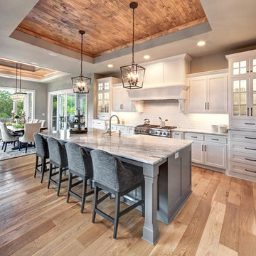
Example of a classic light wood floor and beige floor eat-in kitchen design in Kansas City with a farmhouse sink, white cabinets, white backsplash, subway tile backsplash, stainless steel appliances, an island, gray countertops and shaker cabinets

 Interiors by Popov
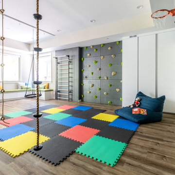
Having two young boys presents its own challenges, and when you have two of their best friends constantly visiting, you end up with four super active action heroes. This family wanted to dedicate a space for the boys to hangout. We took an ordinary basement and converted it into a playground heaven. A basketball hoop, climbing ropes, swinging chairs, rock climbing wall, and climbing bars, provide ample opportunity for the boys to let their energy out, and the built-in window seat is the perfect spot to catch a break. Tall built-in wardrobes and drawers beneath the window seat to provide plenty of storage for all the toys.
You can guess where all the neighborhood kids come to hangout now ☺
 Jessica Leigh Interiors
Stephani Buchman Photography
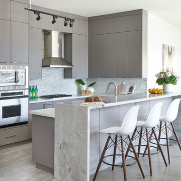
Kitchen - mid-sized contemporary u-shaped porcelain tile kitchen idea in Toronto with flat-panel cabinets, gray cabinets, granite countertops, gray backsplash, stone tile backsplash, stainless steel appliances and a peninsula
Kitchen - mid-sized contemporary u-shaped porcelain tile kitchen idea in Toronto with flat-panel cabinets, gray cabinets, granite countertops, gray backsplash, stone tile backsplash, stainless steel appliances and a peninsula
 Five Star Interiors
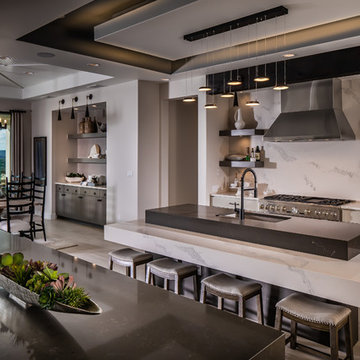
Cabinets: Dove Gray- Slab Door
Box shelves Shelves: Seagull Gray
Countertop: Perimeter/Dropped 4” mitered edge- Pacific shore Quartz Calacatta Milos
Countertop: Islands-4” mitered edge- Caesarstone Symphony Gray 5133
Backsplash: Run the countertop- Caesarstone Statuario Maximus 5031
Photographer: Steve Chenn
 Anna Hill Designs
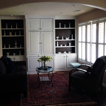
This is the "After" shot of the sitting area in my client's master bedroom. We added the milk glass collection she had in her home to the shelves, moved the foot stool, and added a glass coffee table to give the room a cozy feel.
Sponsored
Columbus, OH

Wannemacher Interiors
Customized Award-Winning Interior Design Solutions in Franklin Cnty OH

 KHD Homes
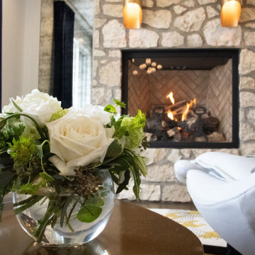
Detail of flowers in front of roaring fire. It's so cozy!
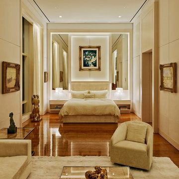
Minimalist bedroom photo in Calgary
Minimalist bedroom photo in Calgary


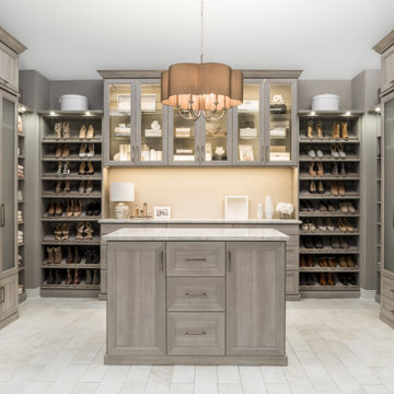
Sponsored
Westerville, OH

Inspired Closets Columbus
Innovative & Creative Custom Closet Designer Servicing Franklin County
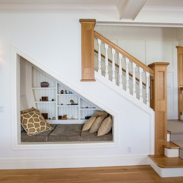
 Realogics Sotheby's International Realty
Mid-sized beach style wooden l-shaped staircase photo in Seattle with painted risers
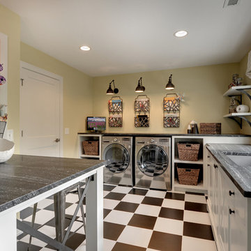
 REFINED LLC
Elegant multicolored floor laundry room photo in Minneapolis with white cabinets, a side-by-side washer/dryer and gray countertops

36