
Search results for "Typically basic" in Home Design Ideas
 SoNo architects
Architects: SoNo Arhitekti
www.sono.si
www.facebook.com/SonoArhitekti
Location: Slovenia
Architects in Charge: Edvard Blažko, Marko Volk, Nina Tešanović, Samo Radinja
Area: 230 sqm
Year: 2015
Photographs: Aljoša Videtič
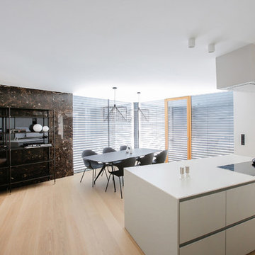
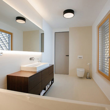
This family home is an example of a modern design filled with natural light and building blocks comprised of sustainable material – in this case wood, one of the if not the most strategic material of Slovenia . It's definitely not a typical prefabricated house out of catalogue as we tried to develop a residence that meets the needs of modern users while having functional floor plans and contemporary elegant exterior all appropriately settled into its landscape.
Main concept presents three volumes that are placed in a triangular composition partially overlayed with a rectangular form of the upper floor. While the dynamic shape of the groundfloor is covered with a flat roof, the 1st floor is completed with a gable –like roof, echoing the traditional architecture of the house's surroundings.
While we enter into an open spacious and dynamically shaped groundfloor we discover a pleasant intimate ambience. The living room and dining area offer a lot of natural light through the large glazed window surfaces. A prominent staircase leads us to the upper sleeping area that consists of the main bedroom with its own dressing room and a bathroom and children's rooms with a smaller bathroom.
Despite groundfloor's dynamic shape, its façade is monochrome - predominately a clean white surface in combination with bigger windows. On the contrary the simple form of the upper floor has a boldly designed façade - a combination of dark colour shades and natural larch wood’s textures.
Wood is the basic structural element and at the same time complements the facades, window frames, while also dominating the interiors.
 Angela Marchetti of Crown Avenue Interiors
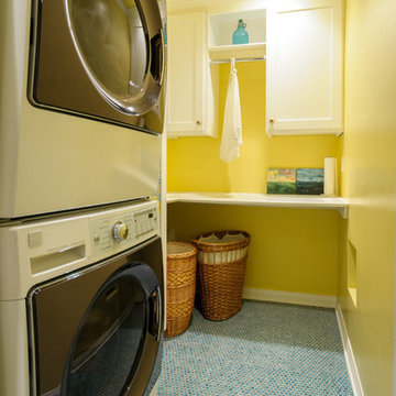
Laundry room converted from large hall closet. Pass-through laundry chute between boys' bathroom and laundry room.
Dedicated laundry room - small transitional galley dedicated laundry room idea in Los Angeles with shaker cabinets, white cabinets, wood countertops and a stacked washer/dryer
Dedicated laundry room - small transitional galley dedicated laundry room idea in Los Angeles with shaker cabinets, white cabinets, wood countertops and a stacked washer/dryer
 SoNo architects
Architects: SoNo Arhitekti
www.sono.si
www.facebook.com/SonoArhitekti
Location: Slovenia
Architects in Charge: Edvard Blažko, Marko Volk, Nina Tešanović, Samo Radinja
Area: 230 sqm
Year: 2015
Photographs: Aljoša Videtič
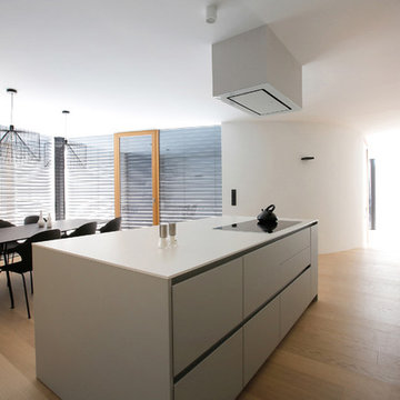
This family home is an example of a modern design filled with natural light and building blocks comprised of sustainable material – in this case wood, one of the if not the most strategic material of Slovenia . It's definitely not a typical prefabricated house out of catalogue as we tried to develop a residence that meets the needs of modern users while having functional floor plans and contemporary elegant exterior all appropriately settled into its landscape.
Main concept presents three volumes that are placed in a triangular composition partially overlayed with a rectangular form of the upper floor. While the dynamic shape of the groundfloor is covered with a flat roof, the 1st floor is completed with a gable –like roof, echoing the traditional architecture of the house's surroundings.
While we enter into an open spacious and dynamically shaped groundfloor we discover a pleasant intimate ambience. The living room and dining area offer a lot of natural light through the large glazed window surfaces. A prominent staircase leads us to the upper sleeping area that consists of the main bedroom with its own dressing room and a bathroom and children's rooms with a smaller bathroom.
Despite groundfloor's dynamic shape, its façade is monochrome - predominately a clean white surface in combination with bigger windows. On the contrary the simple form of the upper floor has a boldly designed façade - a combination of dark colour shades and natural larch wood’s textures.
Wood is the basic structural element and at the same time complements the facades, window frames, while also dominating the interiors.
Find the right local pro for your project
 SoNo architects
Architects: SoNo Arhitekti
www.sono.si
www.facebook.com/SonoArhitekti
Location: Slovenia
Architects in Charge: Edvard Blažko, Marko Volk, Nina Tešanović, Samo Radinja
Area: 230 sqm
Year: 2015
Photographs: Aljoša Videtič
This family home is an example of a modern design filled with natural light and building blocks comprised of sustainable material – in this case wood, one of the if not the most strategic material of Slovenia . It's definitely not a typical prefabricated house out of catalogue as we tried to develop a residence that meets the needs of modern users while having functional floor plans and contemporary elegant exterior all appropriately settled into its landscape.
Main concept presents three volumes that are placed in a triangular composition partially overlayed with a rectangular form of the upper floor. While the dynamic shape of the groundfloor is covered with a flat roof, the 1st floor is completed with a gable –like roof, echoing the traditional architecture of the house's surroundings.
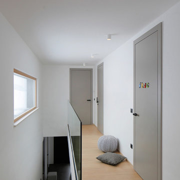
While we enter into an open spacious and dynamically shaped groundfloor we discover a pleasant intimate ambience. The living room and dining area offer a lot of natural light through the large glazed window surfaces. A prominent staircase leads us to the upper sleeping area that consists of the main bedroom with its own dressing room and a bathroom and children's rooms with a smaller bathroom.
Despite groundfloor's dynamic shape, its façade is monochrome - predominately a clean white surface in combination with bigger windows. On the contrary the simple form of the upper floor has a boldly designed façade - a combination of dark colour shades and natural larch wood’s textures.
Wood is the basic structural element and at the same time complements the facades, window frames, while also dominating the interiors.
 SoNo architects
Architects: SoNo Arhitekti
www.sono.si
www.facebook.com/SonoArhitekti
Location: Slovenia
Architects in Charge: Edvard Blažko, Marko Volk, Nina Tešanović, Samo Radinja
Area: 230 sqm
Year: 2015
Photographs: Aljoša Videtič
This family home is an example of a modern design filled with natural light and building blocks comprised of sustainable material – in this case wood, one of the if not the most strategic material of Slovenia . It's definitely not a typical prefabricated house out of catalogue as we tried to develop a residence that meets the needs of modern users while having functional floor plans and contemporary elegant exterior all appropriately settled into its landscape.
Main concept presents three volumes that are placed in a triangular composition partially overlayed with a rectangular form of the upper floor. While the dynamic shape of the groundfloor is covered with a flat roof, the 1st floor is completed with a gable –like roof, echoing the traditional architecture of the house's surroundings.
While we enter into an open spacious and dynamically shaped groundfloor we discover a pleasant intimate ambience. The living room and dining area offer a lot of natural light through the large glazed window surfaces. A prominent staircase leads us to the upper sleeping area that consists of the main bedroom with its own dressing room and a bathroom and children's rooms with a smaller bathroom.
Despite groundfloor's dynamic shape, its façade is monochrome - predominately a clean white surface in combination with bigger windows. On the contrary the simple form of the upper floor has a boldly designed façade - a combination of dark colour shades and natural larch wood’s textures.
Wood is the basic structural element and at the same time complements the facades, window frames, while also dominating the interiors.
 Jemm Interiors
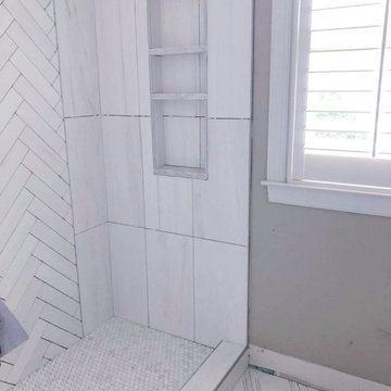
My client wanted to update her old builder grade basic powder room/bath. It was the only bath on the main floor, so it was important that we made this space memorable. The white custom vanity was created, with matching nine piece draw fronts, and beautiful classy polish nickel hardware, for a timeless look. We wanted this piece to look like a piece of furniture, and we topped it with a beautiful white marble top, that had subtle colors ranging from grays to warm golds. On the floor we went with a dolomite marble tile, that is like a geometric daisy. We also used the same dolomite marble behind the vanity wall. This time I decided to a herringbone pattern, as it was just the right amount of elegance needed, to leave that lasting impression. The same herringbone tile, was also repeated in the shower area, this time as a waterfall feature, along with a larger dolomite tile. The shower niche, was kept clean and simple, but we did use the same marble from the vanity top, for the niche shelves. The beautiful wall sconces, in polish nickel and acrylic, elevated the space, and was not your typical vanity light. All in all, I played with varying tones of white, that kept this space elegant.
Project completed by Reka Jemmott, Jemm Interiors desgn firm, which serves Sandy Springs, Alpharetta, Johns Creek, Buckhead, Cumming, Roswell, Brookhaven and Atlanta areas.
For more about Jemm Interiors, see here: https://jemminteriors.com/
https://www.houzz.com/hznb/projects/powder-room-pj-vj~6753789
 TKS Design Group
Typical of bungalows and city lots, the footprint of this home was narrow with living spaces in front, bedrooms in back and kitchen centrally located. However, unlike most bungalows, the hall running from front to back have been closed off to, presumably, accommodate a walk-in pantry. Couple that with the fact that this circa 1925 bungalow had seen a lot of living – read boisterous children and remodeling trends like z-brick, soffits, and fluorescent overhead lighting – the kitchen was due for a major overhaul.
Truly the hub of this house, the modest 11’ x 12’ kitchen was most in need of additional countertop space, convenient garbage/recycle bin, counter-depth refrigerator, storage aids, informal dining for two, and sound-proofing to enable this musically adept family to coexist despite varied schedules.
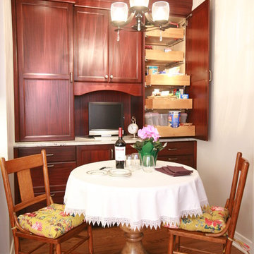
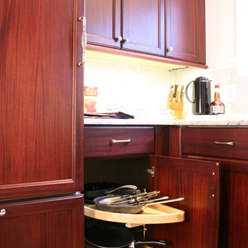
Gone are the wall soffits, boxy overhead lighting, six-foot baseboard heat unit, extra deep refrigerator, refurbished cabinets, laminate countertops, z-brick wall covering, and makeshift door swags. Enter rich mahogany cabinets, roll and pull-out storage units, endcap spice storage, gorgeous granite tops, marble backsplash, LED lighting, acoustic insulation and solid-wood doors.
Under the guise of such a handsome room, provisions such as a period style sink allow for more efficient use of corners with pull-out half-moon trays for storage. Redirecting the baseboard heat to a compact, toekick unit, means more cabinet and counter space – perfect for a baking and/or entertaining area removed from the basic work triangle. The eating area, also, doubles as a work station with drawers for office supplies and dedicated outlet for cable tv. Functional yet beautiful, this kitchen is at the ready as its owners look forward to their golden years.
Designed by: The Kitchen Studio of Glen Ellyn
Photography by: Dawn Jackman
For more information on kitchen and bath design ideas go to: www.kitchenstudio-ge.com
Sponsored
Columbus, OH

Hope Restoration & General Contracting
Columbus Design-Build, Kitchen & Bath Remodeling, Historic Renovations
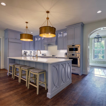

 Spire Integrated Systems Inc.
Sustainable Design Meets Smart Technology
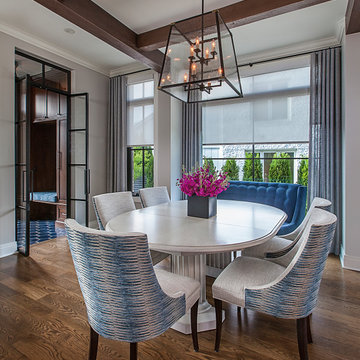
This home featured a request from the client to use as many environmentally friendly materials and fabrics as possible. Many common shade manufacturers use materials with PVC plastic, which is known for off-gassing hazardous chemicals that linger in the air in the home for years. The main floor roller shades met the client’s request for an eco-friendly fabric by utilizing motorized shades with GreenScreen fabric. In other rooms, the designer and client wanted the classic look and soft fabrics with roman shades and drapery tracks on several windows in the house. By partnering with the interior designer and fabric workroom, we were able to provide a custom solution for motorization of roman shades and drapery.
Lighting Control
The client is able control all of the lighting and window treatments in the house with a single control system. This eliminates the need for extra devices on the wall or remote controls that clutter up the space and get lost. By utilizing the custom window treatments, the house is able to conserve energy by keeping the house warmer in the winter, and cooler in the summer by providing insulation and blocking sunlight. The lighting control system further helps to conserve energy by beautifully dimming LED lights as well as using quick buttons that turn off all of the lights in the house, or un-occupied rooms, with the press of a single button.
Motorized Window Treatments
Motorized window treatments add a high level of convenience to any project, especially those with many windows in hard to reach places. The challenge with many manufacturers is a limitation of style and fabric selection, some may be a s basic as only roller shades. Often times these come with un-reliable, wireless controls.
On this Birmingham, MI project completed in March 2019, we partnered with the interior designer and drapery workroom to provide a truly unique solution. The homeowner and designer’s requests included many different styles of window treatments including rollers shades, roman shades and motorized draperies. Typically, this would result in a collection of various shade manufacturers with unsightly remotes scattered across each room or stuck to the wall for control. Utilizing standard offerings, coupled with an incredible team effort by the designer and drapery workroom, we provided all of the requested styles of window treatments, and were able to control them all on a single system. This means that each room has a single, elegant keypad built into the wall that controls not only the window treatments, but the lighting as well.
When leaving/entering the home, all of the window coverings can be raised or lowered with a single button press. Shades and draperies can also be set to operate based on the time of day for automatic day-to-day operation using sunlight as a guide. In the end, we achieved convenience, function and sophisticated style.
 TKS Design Group
Free ebook, Creating the Ideal Kitchen. DOWNLOAD NOW
The Klimala’s and their three kids are no strangers to moving, this being their fifth house in the same town over the 20-year period they have lived there. “It must be the 7-year itch, because every seven years, we seem to find ourselves antsy for a new project or a new environment. I think part of it is being a designer, I see my own taste evolve and I want my environment to reflect that. Having easy access to wonderful tradesmen and a knowledge of the process makes it that much easier”.
This time, Klimala’s fell in love with a somewhat unlikely candidate. The 1950’s ranch turned cape cod was a bit of a mutt, but it’s location 5 minutes from their design studio and backing up to the high school where their kids can roll out of bed and walk to school, coupled with the charm of its location on a private road and lush landscaping made it an appealing choice for them.
“The bones of the house were really charming. It was typical 1,500 square foot ranch that at some point someone added a second floor to. Its sloped roofline and dormered bedrooms gave it some charm.” With the help of architect Maureen McHugh, Klimala’s gutted and reworked the layout to make the house work for them. An open concept kitchen and dining room allows for more frequent casual family dinners and dinner parties that linger. A dingy 3-season room off the back of the original house was insulated, given a vaulted ceiling with skylights and now opens up to the kitchen. This room now houses an 8’ raw edge white oak dining table and functions as an informal dining room. “One of the challenges with these mid-century homes is the 8’ ceilings. I had to have at least one room that had a higher ceiling so that’s how we did it” states Klimala.
The kitchen features a 10’ island which houses a 5’0” Galley Sink. The Galley features two faucets, and double tiered rail system to which accessories such as cutting boards and stainless steel bowls can be added for ease of cooking. Across from the large sink is an induction cooktop. “My two teen daughters and I enjoy cooking, and the Galley and induction cooktop make it so easy.” A wall of tall cabinets features a full size refrigerator, freezer, double oven and built in coffeemaker. The area on the opposite end of the kitchen features a pantry with mirrored glass doors and a beverage center below.
The rest of the first floor features an entry way, a living room with views to the front yard’s lush landscaping, a family room where the family hangs out to watch TV, a back entry from the garage with a laundry room and mudroom area, one of the home’s four bedrooms and a full bath. There is a double sided fireplace between the family room and living room. The home features pops of color from the living room’s peach grass cloth to purple painted wall in the family room. “I’m definitely a traditionalist at heart but because of the home’s Midcentury roots, I wanted to incorporate some of those elements into the furniture, lighting and accessories which also ended up being really fun. We are not formal people so I wanted a house that my kids would enjoy, have their friends over and feel comfortable.”
The second floor houses the master bedroom suite, two of the kids’ bedrooms and a back room nicknamed “the library” because it has turned into a quiet get away area where the girls can study or take a break from the rest of the family. The area was originally unfinished attic, and because the home was short on closet space, this Jack and Jill area off the girls’ bedrooms houses two large walk-in closets and a small sitting area with a makeup vanity. “The girls really wanted to keep the exposed brick of the fireplace that runs up the through the space, so that’s what we did, and I think they feel like they are in their own little loft space in the city when they are up there” says Klimala.
Designed by: Susan Klimala, CKD, CBD
Photography by: Carlos Vergara
For more information on kitchen and bath design ideas go to: www.kitchenstudio-ge.com
 TKS Design Group
Typical of bungalows and city lots, the footprint of this home was narrow with living spaces in front, bedrooms in back and kitchen centrally located. However, unlike most bungalows, the hall running from front to back have been closed off to, presumably, accommodate a walk-in pantry. Couple that with the fact that this circa 1925 bungalow had seen a lot of living – read boisterous children and remodeling trends like z-brick, soffits, and fluorescent overhead lighting – the kitchen was due for a major overhaul.
Truly the hub of this house, the modest 11’ x 12’ kitchen was most in need of additional countertop space, convenient garbage/recycle bin, counter-depth refrigerator, storage aids, informal dining for two, and sound-proofing to enable this musically adept family to coexist despite varied schedules.
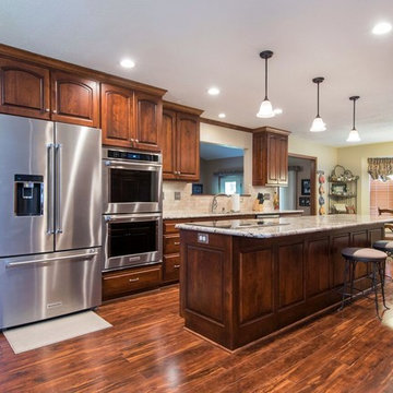
Gone are the wall soffits, boxy overhead lighting, six-foot baseboard heat unit, extra deep refrigerator, refurbished cabinets, laminate countertops, z-brick wall covering, and makeshift door swags. Enter rich mahogany cabinets, roll and pull-out storage units, endcap spice storage, gorgeous granite tops, marble backsplash, LED lighting, acoustic insulation and solid-wood doors.
Under the guise of such a handsome room, provisions such as a period style sink allow for more efficient use of corners with pull-out half-moon trays for storage. Redirecting the baseboard heat to a compact, toekick unit, means more cabinet and counter space – perfect for a baking and/or entertaining area removed from the basic work triangle. The eating area, also, doubles as a work station with drawers for office supplies and dedicated outlet for cable tv. Functional yet beautiful, this kitchen is at the ready as its owners look forward to their golden years.
Designed by: The Kitchen Studio of Glen Ellyn
Photography by: Dawn Jackman
For more information on kitchen and bath design ideas go to: www.kitchenstudio-ge.com
 Jemm Interiors
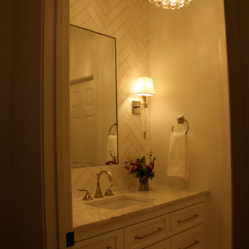
My client wanted to update her old builder grade basic powder room/bath. It was the only bath on the main floor, so it was important that we made this space memorable. The white custom vanity was created, with matching nine piece draw fronts, and beautiful classy polish nickel hardware, for a timeless look. We wanted this piece to look like a piece of furniture, and we topped it with a beautiful white marble top, that had subtle colors ranging from grays to warm golds. On the floor we went with a dolomite marble tile, that is like a geometric daisy. We also used the same dolomite marble behind the vanity wall. This time I decided to a herringbone pattern, as it was just the right amount of elegance needed, to leave that lasting impression. The same herringbone tile, was also repeated in the shower area, this time as a waterfall feature, along with a larger dolomite tile. The shower niche, was kept clean and simple, but we did use the same marble from the vanity top, for the niche shelves. The beautiful wall sconces, in polish nickel and acrylic, elevated the space, and was not your typical vanity light. All in all, I played with varying tones of white, that kept this space elegant.
Project completed by Reka Jemmott, Jemm Interiors desgn firm, which serves Sandy Springs, Alpharetta, Johns Creek, Buckhead, Cumming, Roswell, Brookhaven and Atlanta areas.
For more about Jemm Interiors, see here: https://jemminteriors.com/
https://www.houzz.com/hznb/projects/powder-room-pj-vj~6753789
 Jemm Interiors
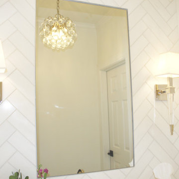
My client wanted to update her old builder grade basic powder room/bath. It was the only bath on the main floor, so it was important that we made this space memorable. The white custom vanity was created, with matching nine piece draw fronts, and beautiful classy polish nickel hardware, for a timeless look. We wanted this piece to look like a piece of furniture, and we topped it with a beautiful white marble top, that had subtle colors ranging from grays to warm golds. On the floor we went with a dolomite marble tile, that is like a geometric daisy. We also used the same dolomite marble behind the vanity wall. This time I decided to a herringbone pattern, as it was just the right amount of elegance needed, to leave that lasting impression. The same herringbone tile, was also repeated in the shower area, this time as a waterfall feature, along with a larger dolomite tile. The shower niche, was kept clean and simple, but we did use the same marble from the vanity top, for the niche shelves. The beautiful wall sconces, in polish nickel and acrylic, elevated the space, and was not your typical vanity light. All in all, I played with varying tones of white, that kept this space elegant.
Project completed by Reka Jemmott, Jemm Interiors desgn firm, which serves Sandy Springs, Alpharetta, Johns Creek, Buckhead, Cumming, Roswell, Brookhaven and Atlanta areas.
For more about Jemm Interiors, see here: https://jemminteriors.com/
https://www.houzz.com/hznb/projects/powder-room-pj-vj~6753789

 Jemm Interiors
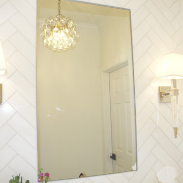
My client wanted to update her old builder grade basic powder room/bath. It was the only bath on the main floor, so it was important that we made this space memorable. The white custom vanity was created, with matching nine piece draw fronts, and beautiful classy polish nickel hardware, for a timeless look. We wanted this piece to look like a piece of furniture, and we topped it with a beautiful white marble top, that had subtle colors ranging from grays to warm golds. On the floor we went with a dolomite marble tile, that is like a geometric daisy. We also used the same dolomite marble behind the vanity wall. This time I decided to a herringbone pattern, as it was just the right amount of elegance needed, to leave that lasting impression. The same herringbone tile, was also repeated in the shower area, this time as a waterfall feature, along with a larger dolomite tile. The shower niche, was kept clean and simple, but we did use the same marble from the vanity top, for the niche shelves. The beautiful wall sconces, in polish nickel and acrylic, elevated the space, and was not your typical vanity light. All in all, I played with varying tones of white, that kept this space elegant.
Project completed by Reka Jemmott, Jemm Interiors desgn firm, which serves Sandy Springs, Alpharetta, Johns Creek, Buckhead, Cumming, Roswell, Brookhaven and Atlanta areas.
For more about Jemm Interiors, see here: https://jemminteriors.com/
https://www.houzz.com/hznb/projects/powder-room-pj-vj~6753789
 Jemm Interiors
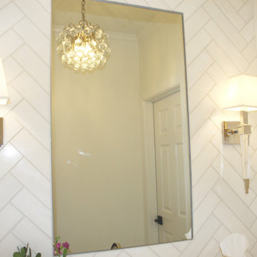
My client wanted to update her old builder grade basic powder room/bath. It was the only bath on the main floor, so it was important that we made this space memorable. The white custom vanity was created, with matching nine piece draw fronts, and beautiful classy polish nickel hardware, for a timeless look. We wanted this piece to look like a piece of furniture, and we topped it with a beautiful white marble top, that had subtle colors ranging from grays to warm golds. On the floor we went with a dolomite marble tile, that is like a geometric daisy. We also used the same dolomite marble behind the vanity wall. This time I decided to a herringbone pattern, as it was just the right amount of elegance needed, to leave that lasting impression. The same herringbone tile, was also repeated in the shower area, this time as a waterfall feature, along with a larger dolomite tile. The shower niche, was kept clean and simple, but we did use the same marble from the vanity top, for the niche shelves. The beautiful wall sconces, in polish nickel and acrylic, elevated the space, and was not your typical vanity light. All in all, I played with varying tones of white, that kept this space elegant.
Project completed by Reka Jemmott, Jemm Interiors desgn firm, which serves Sandy Springs, Alpharetta, Johns Creek, Buckhead, Cumming, Roswell, Brookhaven and Atlanta areas.
For more about Jemm Interiors, see here: https://jemminteriors.com/
https://www.houzz.com/hznb/projects/powder-room-pj-vj~6753789
 lavish
When a professional office space needs to make a lasting impression on clients and create an inspiring environment for staff, the design details matter just as much as they do at home. This thoughtful commercial interior refresh transformed a dated, purely functional office into a warm, sophisticated, and beautifully layered space — one that feels more like a high-end boutique or luxury residence than a typical workplace.
The guiding philosophy throughout was clear: every space, no matter how utilitarian its purpose, deserves intentional design. From the reception corridor to the staff break room, from the client restrooms to the storage corridor, each area received careful attention to finish, color, and texture.
Restrooms Reimagined
The two client-facing restrooms were the most dramatic transformations in the project. Rather than the builder-grade wallpaper and basic fixtures typically found in commercial spaces, both were treated as true design moments.
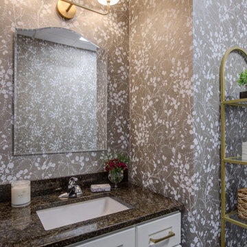
The first features floor-to-ceiling wallpaper in a rich taupe with a delicate white botanical branch pattern, creating an immersive, jewel-box feel. A white shaker vanity with dark granite countertop grounds the space, while an arched frameless mirror and brushed gold wall sconce add glamour. A tall gold and glass etagere serves as both decorative storage and a sculptural element, styled with woven baskets, greenery, and stacked accessories. Framed landscape watercolor art adds a serene, organic note, and a freestanding brass toilet paper holder elevates a typically overlooked detail.
The second restroom takes an entirely different but equally compelling direction — soft, dusty blue-grey grasscloth-style wallpaper printed with a tone-on-tone chevron leaf stripe wraps every wall, creating a calm, spa-like atmosphere. A weathered wood console provides casual charm beneath a large-scale botanical tulip artwork in sage and cream. The wall-mount sink with exposed plumbing adds an intentional, editorial touch. An arched mirror with a sleek multi-bulb bar sconce in brushed nickel completes the look, while a pair of sculptural brass branch wall sculptures mounted directly to the wallpaper serve as unexpected, memorable art.
Storage Made Beautiful
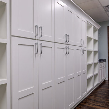
The internal storage corridor received a full wall of custom floor-to-ceiling white shaker cabinetry with chrome pulls, flanked by open shelving sections for accessible display and storage. Clean, crisp, and highly organized — this space proves that even a purely functional corridor can be architectural and refined.
The Break Room & Kitchenette
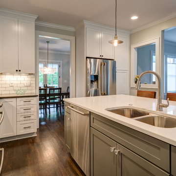
The staff break room was updated with white shaker cabinetry, light speckled granite countertops, stainless appliances — including a French door refrigerator, dishwasher, and over-counter microwave — and warm sage green walls that bring a restful, refreshing energy to the space. Dark hardwood luxury vinyl plank flooring runs throughout the room, warming the look considerably. A round walnut dining table with upholstered chairs creates a proper gathering space for the team, and framed landscape oil art in an ornate gold frame adds a touch of collected character to the room.
Reception & Corridor Details
The reception and corridor spaces were treated with deep navy blue paint — bold, sophisticated, and unexpected in a commercial setting. A large abstract landscape painting in warm blues, blush, and gold hangs in a gilded frame against the navy wall, making an immediate statement. A brass and lucite table lamp sits on a floating brass-trimmed shelf alongside a sculptural art object, creating a vignette that communicates creativity and intentionality from the moment clients arrive.
The result is a professional environment that communicates confidence, taste, and care — one that clients will remember long after their visit, and one that staff will genuinely enjoy working in every day.
 lavish
When a professional office space needs to make a lasting impression on clients and create an inspiring environment for staff, the design details matter just as much as they do at home. This thoughtful commercial interior refresh transformed a dated, purely functional office into a warm, sophisticated, and beautifully layered space — one that feels more like a high-end boutique or luxury residence than a typical workplace.
The guiding philosophy throughout was clear: every space, no matter how utilitarian its purpose, deserves intentional design. From the reception corridor to the staff break room, from the client restrooms to the storage corridor, each area received careful attention to finish, color, and texture.
Restrooms Reimagined
The two client-facing restrooms were the most dramatic transformations in the project. Rather than the builder-grade wallpaper and basic fixtures typically found in commercial spaces, both were treated as true design moments.
The first features floor-to-ceiling wallpaper in a rich taupe with a delicate white botanical branch pattern, creating an immersive, jewel-box feel. A white shaker vanity with dark granite countertop grounds the space, while an arched frameless mirror and brushed gold wall sconce add glamour. A tall gold and glass etagere serves as both decorative storage and a sculptural element, styled with woven baskets, greenery, and stacked accessories. Framed landscape watercolor art adds a serene, organic note, and a freestanding brass toilet paper holder elevates a typically overlooked detail.
The second restroom takes an entirely different but equally compelling direction — soft, dusty blue-grey grasscloth-style wallpaper printed with a tone-on-tone chevron leaf stripe wraps every wall, creating a calm, spa-like atmosphere. A weathered wood console provides casual charm beneath a large-scale botanical tulip artwork in sage and cream. The wall-mount sink with exposed plumbing adds an intentional, editorial touch. An arched mirror with a sleek multi-bulb bar sconce in brushed nickel completes the look, while a pair of sculptural brass branch wall sculptures mounted directly to the wallpaper serve as unexpected, memorable art.
Storage Made Beautiful
The internal storage corridor received a full wall of custom floor-to-ceiling white shaker cabinetry with chrome pulls, flanked by open shelving sections for accessible display and storage. Clean, crisp, and highly organized — this space proves that even a purely functional corridor can be architectural and refined.
The Break Room & Kitchenette
The staff break room was updated with white shaker cabinetry, light speckled granite countertops, stainless appliances — including a French door refrigerator, dishwasher, and over-counter microwave — and warm sage green walls that bring a restful, refreshing energy to the space. Dark hardwood luxury vinyl plank flooring runs throughout the room, warming the look considerably. A round walnut dining table with upholstered chairs creates a proper gathering space for the team, and framed landscape oil art in an ornate gold frame adds a touch of collected character to the room.
Reception & Corridor Details
The reception and corridor spaces were treated with deep navy blue paint — bold, sophisticated, and unexpected in a commercial setting. A large abstract landscape painting in warm blues, blush, and gold hangs in a gilded frame against the navy wall, making an immediate statement. A brass and lucite table lamp sits on a floating brass-trimmed shelf alongside a sculptural art object, creating a vignette that communicates creativity and intentionality from the moment clients arrive.
The result is a professional environment that communicates confidence, taste, and care — one that clients will remember long after their visit, and one that staff will genuinely enjoy working in every day.
Sponsored
Columbus, OH
Hope Restoration & General Contracting
Columbus Design-Build, Kitchen & Bath Remodeling, Historic Renovations
 lavish
When a professional office space needs to make a lasting impression on clients and create an inspiring environment for staff, the design details matter just as much as they do at home. This thoughtful commercial interior refresh transformed a dated, purely functional office into a warm, sophisticated, and beautifully layered space — one that feels more like a high-end boutique or luxury residence than a typical workplace.
The guiding philosophy throughout was clear: every space, no matter how utilitarian its purpose, deserves intentional design. From the reception corridor to the staff break room, from the client restrooms to the storage corridor, each area received careful attention to finish, color, and texture.
Restrooms Reimagined
The two client-facing restrooms were the most dramatic transformations in the project. Rather than the builder-grade wallpaper and basic fixtures typically found in commercial spaces, both were treated as true design moments.
The first features floor-to-ceiling wallpaper in a rich taupe with a delicate white botanical branch pattern, creating an immersive, jewel-box feel. A white shaker vanity with dark granite countertop grounds the space, while an arched frameless mirror and brushed gold wall sconce add glamour. A tall gold and glass etagere serves as both decorative storage and a sculptural element, styled with woven baskets, greenery, and stacked accessories. Framed landscape watercolor art adds a serene, organic note, and a freestanding brass toilet paper holder elevates a typically overlooked detail.
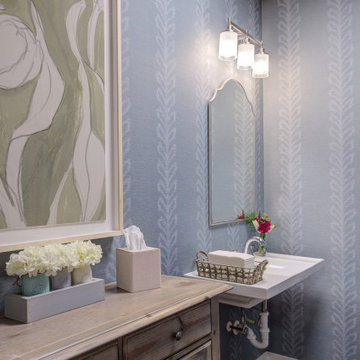
The second restroom takes an entirely different but equally compelling direction — soft, dusty blue-grey grasscloth-style wallpaper printed with a tone-on-tone chevron leaf stripe wraps every wall, creating a calm, spa-like atmosphere. A weathered wood console provides casual charm beneath a large-scale botanical tulip artwork in sage and cream. The wall-mount sink with exposed plumbing adds an intentional, editorial touch. An arched mirror with a sleek multi-bulb bar sconce in brushed nickel completes the look, while a pair of sculptural brass branch wall sculptures mounted directly to the wallpaper serve as unexpected, memorable art.
Storage Made Beautiful
The internal storage corridor received a full wall of custom floor-to-ceiling white shaker cabinetry with chrome pulls, flanked by open shelving sections for accessible display and storage. Clean, crisp, and highly organized — this space proves that even a purely functional corridor can be architectural and refined.
The Break Room & Kitchenette
The staff break room was updated with white shaker cabinetry, light speckled granite countertops, stainless appliances — including a French door refrigerator, dishwasher, and over-counter microwave — and warm sage green walls that bring a restful, refreshing energy to the space. Dark hardwood luxury vinyl plank flooring runs throughout the room, warming the look considerably. A round walnut dining table with upholstered chairs creates a proper gathering space for the team, and framed landscape oil art in an ornate gold frame adds a touch of collected character to the room.
Reception & Corridor Details
The reception and corridor spaces were treated with deep navy blue paint — bold, sophisticated, and unexpected in a commercial setting. A large abstract landscape painting in warm blues, blush, and gold hangs in a gilded frame against the navy wall, making an immediate statement. A brass and lucite table lamp sits on a floating brass-trimmed shelf alongside a sculptural art object, creating a vignette that communicates creativity and intentionality from the moment clients arrive.
The result is a professional environment that communicates confidence, taste, and care — one that clients will remember long after their visit, and one that staff will genuinely enjoy working in every day.
 lavish
When a professional office space needs to make a lasting impression on clients and create an inspiring environment for staff, the design details matter just as much as they do at home. This thoughtful commercial interior refresh transformed a dated, purely functional office into a warm, sophisticated, and beautifully layered space — one that feels more like a high-end boutique or luxury residence than a typical workplace.
The guiding philosophy throughout was clear: every space, no matter how utilitarian its purpose, deserves intentional design. From the reception corridor to the staff break room, from the client restrooms to the storage corridor, each area received careful attention to finish, color, and texture.
Restrooms Reimagined
The two client-facing restrooms were the most dramatic transformations in the project. Rather than the builder-grade wallpaper and basic fixtures typically found in commercial spaces, both were treated as true design moments.
The first features floor-to-ceiling wallpaper in a rich taupe with a delicate white botanical branch pattern, creating an immersive, jewel-box feel. A white shaker vanity with dark granite countertop grounds the space, while an arched frameless mirror and brushed gold wall sconce add glamour. A tall gold and glass etagere serves as both decorative storage and a sculptural element, styled with woven baskets, greenery, and stacked accessories. Framed landscape watercolor art adds a serene, organic note, and a freestanding brass toilet paper holder elevates a typically overlooked detail.
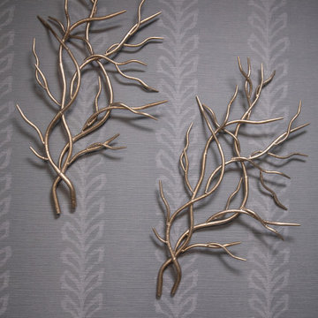
The second restroom takes an entirely different but equally compelling direction — soft, dusty blue-grey grasscloth-style wallpaper printed with a tone-on-tone chevron leaf stripe wraps every wall, creating a calm, spa-like atmosphere. A weathered wood console provides casual charm beneath a large-scale botanical tulip artwork in sage and cream. The wall-mount sink with exposed plumbing adds an intentional, editorial touch. An arched mirror with a sleek multi-bulb bar sconce in brushed nickel completes the look, while a pair of sculptural brass branch wall sculptures mounted directly to the wallpaper serve as unexpected, memorable art.
Storage Made Beautiful
The internal storage corridor received a full wall of custom floor-to-ceiling white shaker cabinetry with chrome pulls, flanked by open shelving sections for accessible display and storage. Clean, crisp, and highly organized — this space proves that even a purely functional corridor can be architectural and refined.
The Break Room & Kitchenette
The staff break room was updated with white shaker cabinetry, light speckled granite countertops, stainless appliances — including a French door refrigerator, dishwasher, and over-counter microwave — and warm sage green walls that bring a restful, refreshing energy to the space. Dark hardwood luxury vinyl plank flooring runs throughout the room, warming the look considerably. A round walnut dining table with upholstered chairs creates a proper gathering space for the team, and framed landscape oil art in an ornate gold frame adds a touch of collected character to the room.
Reception & Corridor Details
The reception and corridor spaces were treated with deep navy blue paint — bold, sophisticated, and unexpected in a commercial setting. A large abstract landscape painting in warm blues, blush, and gold hangs in a gilded frame against the navy wall, making an immediate statement. A brass and lucite table lamp sits on a floating brass-trimmed shelf alongside a sculptural art object, creating a vignette that communicates creativity and intentionality from the moment clients arrive.
The result is a professional environment that communicates confidence, taste, and care — one that clients will remember long after their visit, and one that staff will genuinely enjoy working in every day.
 lavish
When a professional office space needs to make a lasting impression on clients and create an inspiring environment for staff, the design details matter just as much as they do at home. This thoughtful commercial interior refresh transformed a dated, purely functional office into a warm, sophisticated, and beautifully layered space — one that feels more like a high-end boutique or luxury residence than a typical workplace.
The guiding philosophy throughout was clear: every space, no matter how utilitarian its purpose, deserves intentional design. From the reception corridor to the staff break room, from the client restrooms to the storage corridor, each area received careful attention to finish, color, and texture.
Restrooms Reimagined
The two client-facing restrooms were the most dramatic transformations in the project. Rather than the builder-grade wallpaper and basic fixtures typically found in commercial spaces, both were treated as true design moments.
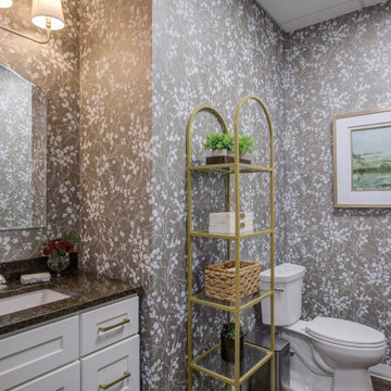
The first features floor-to-ceiling wallpaper in a rich taupe with a delicate white botanical branch pattern, creating an immersive, jewel-box feel. A white shaker vanity with dark granite countertop grounds the space, while an arched frameless mirror and brushed gold wall sconce add glamour. A tall gold and glass etagere serves as both decorative storage and a sculptural element, styled with woven baskets, greenery, and stacked accessories. Framed landscape watercolor art adds a serene, organic note, and a freestanding brass toilet paper holder elevates a typically overlooked detail.
The second restroom takes an entirely different but equally compelling direction — soft, dusty blue-grey grasscloth-style wallpaper printed with a tone-on-tone chevron leaf stripe wraps every wall, creating a calm, spa-like atmosphere. A weathered wood console provides casual charm beneath a large-scale botanical tulip artwork in sage and cream. The wall-mount sink with exposed plumbing adds an intentional, editorial touch. An arched mirror with a sleek multi-bulb bar sconce in brushed nickel completes the look, while a pair of sculptural brass branch wall sculptures mounted directly to the wallpaper serve as unexpected, memorable art.
Storage Made Beautiful
The internal storage corridor received a full wall of custom floor-to-ceiling white shaker cabinetry with chrome pulls, flanked by open shelving sections for accessible display and storage. Clean, crisp, and highly organized — this space proves that even a purely functional corridor can be architectural and refined.
The Break Room & Kitchenette
The staff break room was updated with white shaker cabinetry, light speckled granite countertops, stainless appliances — including a French door refrigerator, dishwasher, and over-counter microwave — and warm sage green walls that bring a restful, refreshing energy to the space. Dark hardwood luxury vinyl plank flooring runs throughout the room, warming the look considerably. A round walnut dining table with upholstered chairs creates a proper gathering space for the team, and framed landscape oil art in an ornate gold frame adds a touch of collected character to the room.
Reception & Corridor Details
The reception and corridor spaces were treated with deep navy blue paint — bold, sophisticated, and unexpected in a commercial setting. A large abstract landscape painting in warm blues, blush, and gold hangs in a gilded frame against the navy wall, making an immediate statement. A brass and lucite table lamp sits on a floating brass-trimmed shelf alongside a sculptural art object, creating a vignette that communicates creativity and intentionality from the moment clients arrive.
The result is a professional environment that communicates confidence, taste, and care — one that clients will remember long after their visit, and one that staff will genuinely enjoy working in every day.
23