
Search results for "Ultimate objectives" in Home Design Ideas
 Gallery KBNY
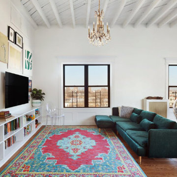
For this Brooklyn condo renovation, Gallery Kitchen and Bath updated the entire kitchen and both bathrooms, as well as painted and laid out new flooring throughout the entire apartment. The owners wanted to unite the seeming medley of the existing space into a cohesive design more representative of their own style. With its ultra-high ceilings and exposed joints and beams, the space already lent itself to the farmhouse look. The end result is a modernized, eclectic farmhouse style that we keenly carried throughout the home.
MORE DETAILS
Compelling textures and color combos reign supreme. The kitchen features semi-custom Shaker-style stone gray cabinets, a white subway tile backsplash running all the way up the wall, and white quartz countertops. We built the island in part to create a pleasing yet efficient flow from the kitchen into the living and dining areas as the space was opened up. We also painted the plumbing stack white to not make it stand out.
We also redesigned the bathrooms, giving each a unique treatment. In the master bath, we took a Victorian-goes-modern approach with coral walls, champagne fixtures, and a clawfoot tub. In the guest bathroom, we stuck to a transitional style that approaches modern without becoming contemporary, pairing herringbone marble floor tiles with a mix of subway and penny tiles on the walls and in the shower. Both maintain elements, such as tiles, fixtures, and colors, that coordinate with the overall eclectic farmhouse look.
HOW WE COLLABORATE
Collaboration with our clients to their desired degree is one of our core pillars. In this condo renovation, the clients wanted central air and were initially considering a true central air system. We advised against it, as not only would it take away from the unique beauty of unusually tall ceilings by adding unsightly ductwork, but it would also significantly detract from the farmhouse look. Instead, we suggested a mini-split system. Our recommended units were both cost-effective and much more complementary to the comprehensive theme. Of course, we ultimately always honor the clients’ choices but it’s just as important to us that we make sure to provide all the necessary information so our clients can make educated decisions that are best for their needs.
SPACE PLANNING
Another key element of the renovation process is space planning. From this perspective, we consider the placement and positioning of objects with regard to the overall flow of space. The building where this renovation took place is U-shaped at one end, which happens to be where this particular apartment is located. Uniquely-shaped spaces naturally require more concentration than those built in the standard rectangular shape. Questions we consider include: Where will people really spend time in this space? What will the flow of foot traffic be? Is there easy access to the kitchen island? Does it flow well into the hallways? Does the island protrude into anything? Working in New York, with its variety of homes and architectural styles, has greatly developed our experience with standard spaces and unconventional ones alike.
SOME HIGHLIGHTS
- Ultra-tall ceilings, allowing for stacked cabinets in the kitchen, as well as long pendant light fixtures and more chandeliers than usual throughout the home
- Completely refurbished cast iron clawfoot tub in one bathroom, with a 270-degree shower curtain around the tub
- Vibrant color choices, including an all-blue bedroom in various shades
- Treated exposed brick walls
Fun Fact: A client once showed us inspiration photos that they sourced online of this exact project, having no idea it was one of ours.
Thinking about renovating your condo? Contact us today to find out how you can benefit from our expertise in remodeling New York City condos. We are a design-and-build firm with a full-scale approach that handles every single aspect of your condo renovation from start to finish.
 Gallery KBNY
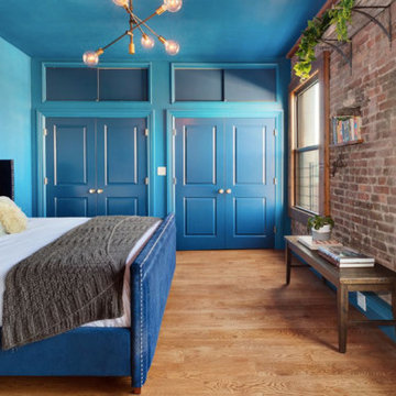
For this Brooklyn condo renovation, Gallery Kitchen and Bath updated the entire kitchen and both bathrooms, as well as painted and laid out new flooring throughout the entire apartment. The owners wanted to unite the seeming medley of the existing space into a cohesive design more representative of their own style. With its ultra-high ceilings and exposed joints and beams, the space already lent itself to the farmhouse look. The end result is a modernized, eclectic farmhouse style that we keenly carried throughout the home.
MORE DETAILS
Compelling textures and color combos reign supreme. The kitchen features semi-custom Shaker-style stone gray cabinets, a white subway tile backsplash running all the way up the wall, and white quartz countertops. We built the island in part to create a pleasing yet efficient flow from the kitchen into the living and dining areas as the space was opened up. We also painted the plumbing stack white to not make it stand out.
We also redesigned the bathrooms, giving each a unique treatment. In the master bath, we took a Victorian-goes-modern approach with coral walls, champagne fixtures, and a clawfoot tub. In the guest bathroom, we stuck to a transitional style that approaches modern without becoming contemporary, pairing herringbone marble floor tiles with a mix of subway and penny tiles on the walls and in the shower. Both maintain elements, such as tiles, fixtures, and colors, that coordinate with the overall eclectic farmhouse look.
HOW WE COLLABORATE
Collaboration with our clients to their desired degree is one of our core pillars. In this condo renovation, the clients wanted central air and were initially considering a true central air system. We advised against it, as not only would it take away from the unique beauty of unusually tall ceilings by adding unsightly ductwork, but it would also significantly detract from the farmhouse look. Instead, we suggested a mini-split system. Our recommended units were both cost-effective and much more complementary to the comprehensive theme. Of course, we ultimately always honor the clients’ choices but it’s just as important to us that we make sure to provide all the necessary information so our clients can make educated decisions that are best for their needs.
SPACE PLANNING
Another key element of the renovation process is space planning. From this perspective, we consider the placement and positioning of objects with regard to the overall flow of space. The building where this renovation took place is U-shaped at one end, which happens to be where this particular apartment is located. Uniquely-shaped spaces naturally require more concentration than those built in the standard rectangular shape. Questions we consider include: Where will people really spend time in this space? What will the flow of foot traffic be? Is there easy access to the kitchen island? Does it flow well into the hallways? Does the island protrude into anything? Working in New York, with its variety of homes and architectural styles, has greatly developed our experience with standard spaces and unconventional ones alike.
SOME HIGHLIGHTS
- Ultra-tall ceilings, allowing for stacked cabinets in the kitchen, as well as long pendant light fixtures and more chandeliers than usual throughout the home
- Completely refurbished cast iron clawfoot tub in one bathroom, with a 270-degree shower curtain around the tub
- Vibrant color choices, including an all-blue bedroom in various shades
- Treated exposed brick walls
Fun Fact: A client once showed us inspiration photos that they sourced online of this exact project, having no idea it was one of ours.
Thinking about renovating your condo? Contact us today to find out how you can benefit from our expertise in remodeling New York City condos. We are a design-and-build firm with a full-scale approach that handles every single aspect of your condo renovation from start to finish.
 Drury Design
Relocating from San Francisco, this young family immediately zeroed in on the wonderful historic homes around downtown Chicago. Most of the properties they saw checked a lot of wish list boxes, but none of them checked every box. The house they landed on had beautiful curb appeal, a dramatic entry with a welcoming porch and front hall, and a really nice yard. Unfortunately, it did not have a kitchen that was well set-up for cooking and entertaining. Reworking the kitchen area was the top priority.
The family had met with a few other designers and even had an architect take a crack at the space, but they were not able to come up with a viable solution. Here’s how Senior Designer Diana Burton approached the project…
Design Objectives:
Respect the home’s vintage feel while bringing the kitchen up to date
Open up the kitchen area to create an open space for gathering and entertaining
Upgrade appliances to top-of-the-line models
Include a large island with seating
Include seating for casual family meals in a space that won’t be a replacement for the adjacent formal dining room
THE REMODEL
Design Challenges:
Remove a load-bearing wall and combine smaller rooms to create one big kitchen
A powder room in the back corner of the existing kitchen was a huge obstacle to updating the layout
Maintain large windows with views of the yard while still providing ample storage
Design Solutions:
Relocating the powder room to another part of the first floor (a large closet under the stairs) opened up the space dramatically
Create space for a larger island by recessing the fridge/freezer and shifting the pantry to a space adjacent to the kitchen
A banquette saves space and offers a perfect solution for casual dining
The walnut banquette table beautifully complements the fridge/freezer armoire
Utilize a gap created by the new fridge location to create a tall shallow cabinet for liquor storage w/ a wine cubby
Closing off one doorway into the dining room and using the “between the studs” space for a tall storage cabinet
Dish organizing drawers offer handy storage for plates, bowls, and serving dishes right by main sink and dishwasher
Cabinetry backing up to the dining room offers ample storage for glassware and functions both as a coffee station and cocktail bar
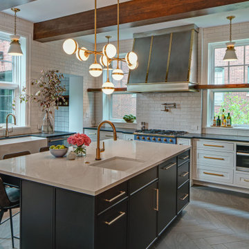
Open shelves flanking the hood add storage without blocking views and daylight
A beam was required where the wall was removed. Additional beams added architectural interest and helped integrate the beams into the space
Statement lighting adds drama and personality to the space
THE RENEWED SPACE
This project exemplifies the transformative power of good design. Simply put, good design allows you to live life artfully. The newly remodeled kitchen effortlessly combines functionality and aesthetic appeal, providing a delightful space for cooking and spending quality time together. It’s comfy for regular meals but ultimately outfitted for those special gatherings. Infused with classic finishes and a timeless charm, the kitchen emanates an enduring atmosphere that will never go out of style.
Find the right local pro for your project
 Advance Design Studio, Ltd.
After six years of living in their Huntley IL home, Chris and Meghan were tired of their dark, dingy, outdated kitchen and it was finally time for a long-anticipated change. “The kitchen is the place where we live, it’s where we do everything,” Meghan said. “It was important that it be a space where we wanted to be.” Meghan loves cooking and enjoys including their girls in healthy meal prepping, this led them to want a brighter, more enjoyable kitchen with increased functionality and improved storage.
For Chris especially, the laundry room was an entirely dysfunctional eyesore. “We had a washer and a dryer, but it was all kind-of cobbled together!” Chris said. “There were always laundry piles everywhere, we weren’t really sure what we wanted to do in there, but it was time for us to make a change.” The mess of the space was stressful every time they walked in the door from the garage each day. Kids’ backpacks and shoes piled up haphazardly in the makeshift boot-bench closet left the family feeling disorganized and stressed. They needed space for folding clothes and locker cubbies to help keep the family organized.
Having known Christine and Todd in the Huntley community for years, Chris and Meghan were familiar with their work. “We already trusted them personally and having seen their projects for years we knew they did top notch work. After we reviewed the initial round of designs, we knew that hiring them was definitely the right choice,” Meghan and Chris said. Although Chris had done a lot of work in their home himself, the kitchen and laundry room renovation was such a large undertaking that he didn’t want to steal time away from his family to spend what would surely be many long weekends doing the job himself. “That would not have been a wise choice for us,” Chris laughed.
“Our designer, Michelle was very, very, easy to work with; anything we wanted to see or weren’t sure about, she went above and beyond to make this easy for us. She was easy to get hold of and always quick to respond,” the couple said. Michelle pulled ideas that mirrored the couple’s taste and style and was adept at directing the couple to limited choices that didn’t overwhelm them and kept the process moving. “I have a hard time making decisions. Michelle made the decision-making process so easy. I loved how she listened to what I liked and then presented three great options for me to choose from,” Meghan said.
The main objectives for the kitchen were better storage solutions, they wanted the space to reflect their lifestyle and taste, and they wanted it to last for years with low maintenance. One of the first steps in creating a more functional kitchen was relocating the refrigerator, creating an improved workflow for the busy family.
“We didn’t know that we could even move the refrigerator to a new location where it is now, that was something that we never would have thought of,” Chris said. “The new refrigerator location makes the kitchen feel so much bigger. We didn’t add any space, but our whole kitchen with the new design just seems like it’s so much larger than before!” Meghan said.
The perimeter mist colored cabinets helped warm and brighten the entire room, while the graphite colored cabinets on the island added contrast. Using this fresh, clean color palette satisfied the couple’s desire for a bright space that was the exact opposite of what they had before. Organization accessories were also added to the cabinets such as a spice drawer tray and roll outs to create hidden convenience.
“I absolutely love the hidden spices – it makes cooking so much more enjoyable!” Chris said. “And all the pull outs, and the double trash bin, who would think you could get so excited about organization!” the couple said in unison.
One thing they hated in their original kitchen was how dark the space felt. Added lighting on the ceiling with the new light fixtures combined with the lighter cabinetry colors throughout solved this problem. “Our new kitchen has this warm, almost cozy feeling that our old kitchen never had, it’s just a space that I love spending my time in now,” Meghan said. The light airy feeling was accentuated with the use of floating white shelves on either side of the decorative range hood. “We have so much cabinetry space, the new design is amazing we actually have more storage space than we will ever need,” Meghan said.
The island was extended to create more work surface and added space for stool seating. “The new island changes how we live. Now the kids can be in the kitchen with us, doing homework, eating breakfast, and the three of us have special dinners there when Chris is working late,” Meghan said.
The Carrara Marmi Quartz countertops were chosen because they are, not only beautiful, but are made from hard-working material that doesn’t require maintenance. The white subway tile backsplash that wraps to the ceiling behind the focal point cooktop range/hood compliments the crisp white countertops perfectly, while brushed brass hardware and light fixtures keep the design fresh and new.
The couple had a few fears at the beginning of the project, as most homeowners do. Their biggest fear was being out of their kitchen and laundry room for an extended time. The crew made it very easy for the family to work in a limited space keeping the washer and dryer hooked up the majority of the time, and also getting appliances working with minimal downtime.
“They above and beyond accommodated us to get us through the process,” Meghan said. “They did a great job making sure we were as comfortable as possible throughout the process,” Chris added.
“Our project manager DJ did a great job. He was very good at updating us on schedule changes, getting guys in as quickly as possible. Everyone that stepped in the house was nice and did great work,” said Chris. They thought Advance’s carpenter was phenomenal and were impressed when he took a conceptual idea from a photograph and worked with designer Michelle to create a one of a kind range/hood that has become the topic of conversation with friends and family who visit the new kitchen. “He was in our house literally every day for several weeks. He was easy to work with and good at what he did,” Meghan and Chris said.
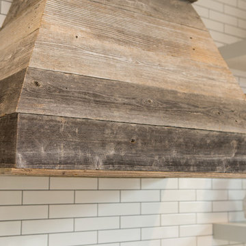
The focal point of the kitchen; a hand-crafted, custom-built ventilation hood was clad with handpicked reclaimed barnwood. Advance Design’s carpenter built the framework and the cladding to create a one-of-a-kind design element that the couple loves.
“I think it was especially fun for him to create something unique from scratch, showcasing his talent in this area,” Meghan said. “I love that my kitchen is not like everyone else’s. I got to pick out the wood on my hood and watch it being built and was able to choose what pieces of wood went where on it. It’s totally unique.”
Red Oak flooring was toothed-in throughout the kitchen and the rest of the first floor anywhere changes were made. Then the whole floor was refinished to tone down the orange undertones in the existing floor stain, ultimately changing the color complexion of the entire first floor. The result is a completely new feeling to the entire home.
Renovating the laundry room was extremely important to Meghan and Chris, but they had trouble visualizing what the possibilities were for the seemingly small space. Michelle produced beautiful 3D illustrations that helped them envision the space in a whole new way.
“I must have told Michelle 100 times that I am a visual person, seeing the designs in 3D made it so easy to make decisions and see what we could really do with our space,” Meghan said.
A dividing wall and doorway were removed between the existing laundry room and hallway formerly containing a coat closet, providing space to design specialized graphite colored cabinetry matching the kitchen island to house custom storage cubbies for each family member. Adding the tall utility cabinetry in the new laundry area helped solve the storage issue, tucking away cleaning supplies, household items, and even the cat got its own cubby.
“I love how everything is now hidden in its own space. I can’t tell you how much I hated coming home and seeing everything sitting around on counters,” Chris said.
Electrical outlets were planned for the inside of utility cabinets, so devices could charge in hidden locations. Stacking the washer and dryer allowed for wider countertop space to provide a folding area and a special space for clothes to hang. “The way I do laundry has been completely transformed! I can actually fold clothes and hang them now right out of the washer and dryer,” Meghan said.
“The end result in the kitchen and the laundry/mud room was an updated light and bright space, with a smarter work flow that better meets the needs of this family,” Michelle said.
“I would totally recommend Advance Design,” Meghan said. “Sometimes I sit and just look at my kitchen and laundry room and think ‘Wow, I can’t believe I get to live here!’ It’s an understatement to say we love our new space.”
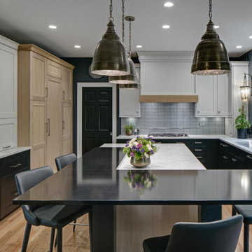 Drury Design
The original intent of this project was to replace the island, hood, countertops, and a few appliances. A primary bath remodel was the main priority. But once the couple realized certain features would enhance the functionality of the kitchen – not to mention completely change the aesthetic – they put the master bath on hold and decided to remodel the entire kitchen first.
Design objectives:
-Omit separate table, plan for a larger island that would seat 7 people
-Simple, clean lines – no rounded corners or weird angles
-Nothing trendy – use modern classic details
-Uncluttered countertops
-Better pantry storage for food & small appliances
-Integrated major appliances
-Coffee bar
-Avoid “1 color on perimeter with second color on island”
-Integrate a harmonious variety of finishes
-Integrate black & handmade metals
Design challenges:
-Island shape to fit within confines of existing half wall between kitchen & family room & bay window/door to backyard
-Narrow kitchen with major walkway
-Planning for 7 seats at the island
-Keep guest social area away from the cook’s zone
-Place appliances according to use
-Point-of-use storage for an avid cook within a relatively small space
-Integrate colors without looking too busy
THE NEW KITCHEN
-While the island is mostly rectangular, the seating area utilizes the bay extension without interfering with the exterior door
-All seating is placed on the outside perimeter of the island, giving the cook dedicated prep space
-The L-shaped seating area & adjacent coffee bar encourage guests to gather on the outside edge of the kitchen where they can still interact with the cook
-Island prep space includes 5 feet of versatile drawer storage, double waste basket and an open paper towel dispenser
-One pantry designated for food; the other for small appliances & bulk storage; creates visual armoire look
-Microwave drawer in island faces refrigerator for easy access & less interference with cook’s zone
-Appliance garages avoid clutter on the countertops
-Off-white upper cabinets make the kitchen look larger while the black bases offer contrast without closing in the space
Once the client committed to remodeling her entire kitchen, she had a good idea of the direction she wanted the space to take. Even so, there were many details that remained open to explore & contemplate. The end result is modern, clean and ultimately transitional – a creative vision anchored in functionality and artistry!
A powder room remodel was added to the project that beautifully compliments the kitchen aesthetic. The entire staircase, all trim & doors were painted in the same tones as the kitchen, transforming the entire first floor into a cohesive & welcoming space. It was a great collaborative partnership!
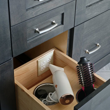 Drury Design
The original idea was to update the tile floor and the tub. That’s it.
A further discussion of wants and needs revealed intentions for an eventual larger shower and an improved vanity storage. It made sense to map out the possibilities and design our update with potential next steps in mind. The process was exciting, ultimately leading to the decision to do a full primary bath remodel.
Design Objectives:
-Maintain existing locations for all major bathroom functions
-Make the shower larger and more open
-Use luxurious materials throughout
-Improve vanity storage and define accessories for specific items
-Incorporate luxury shower fixtures
-Include the latest technology
Design Challenges
-Enlarging the shower in a typical rectangular shape would block the view and light from the alcove windows behind the tub
-Logical placement of the built-in shower caddy and all shower components in accordance with how and where they were to be used
-Keeping the long, back wall free from any shower modules to maintain the decorative tile design
-Combining the owner’s existing smart home system with a comprehensive shower system
-Planning cabinetry for hidden storage and use for various small appliances and make-up
-Integrating expensive shower wall tile with less expensive wall tile for aesthetic and budget purposes
-Incorporating special design features to balance the highly decorative shower tile
Design solutions:
-A clipped corner was planned for the shower bench seat – this allowed for a larger glass wall. The glass wall at the angled bench also brought more natural light into the shower
-Thoughtful shower space design prevented the crowding of features – the shower caddy and handheld shower head were placed on the full-height wall by the shower bench, the regular shower head and body sprays remained on the opposite wall, and the rain head was placed in the center of the shower
-A multi-port DTV system was installed, providing control of all shower components, including chromotherapy and music inside and outside the shower
-The lavish water-jet stone and glass decorative tile was paired with a less-expensive glass tile found in the mosaic
-Pull-out grooming organizers and electrical docking stations were incorporated into the cabinetry
Additional storage was created in the lower corner cabinet
The homeowners are thrilled with their new primary bathroom. Clear goals and carefully evaluated materials informed a fun and functional design that is both thoughtful and sumptuous!
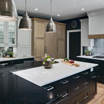 Drury Design
The original intent of this project was to replace the island, hood, countertops, and a few appliances. A primary bath remodel was the main priority. But once the couple realized certain features would enhance the functionality of the kitchen – not to mention completely change the aesthetic – they put the master bath on hold and decided to remodel the entire kitchen first.
Design objectives:
-Omit separate table, plan for a larger island that would seat 7 people
-Simple, clean lines – no rounded corners or weird angles
-Nothing trendy – use modern classic details
-Uncluttered countertops
-Better pantry storage for food & small appliances
-Integrated major appliances
-Coffee bar
-Avoid “1 color on perimeter with second color on island”
-Integrate a harmonious variety of finishes
-Integrate black & handmade metals
Design challenges:
-Island shape to fit within confines of existing half wall between kitchen & family room & bay window/door to backyard
-Narrow kitchen with major walkway
-Planning for 7 seats at the island
-Keep guest social area away from the cook’s zone
-Place appliances according to use
-Point-of-use storage for an avid cook within a relatively small space
-Integrate colors without looking too busy
THE NEW KITCHEN
-While the island is mostly rectangular, the seating area utilizes the bay extension without interfering with the exterior door
-All seating is placed on the outside perimeter of the island, giving the cook dedicated prep space
-The L-shaped seating area & adjacent coffee bar encourage guests to gather on the outside edge of the kitchen where they can still interact with the cook
-Island prep space includes 5 feet of versatile drawer storage, double waste basket and an open paper towel dispenser
-One pantry designated for food; the other for small appliances & bulk storage; creates visual armoire look
-Microwave drawer in island faces refrigerator for easy access & less interference with cook’s zone
-Appliance garages avoid clutter on the countertops
-Off-white upper cabinets make the kitchen look larger while the black bases offer contrast without closing in the space
Once the client committed to remodeling her entire kitchen, she had a good idea of the direction she wanted the space to take. Even so, there were many details that remained open to explore & contemplate. The end result is modern, clean and ultimately transitional – a creative vision anchored in functionality and artistry!
A powder room remodel was added to the project that beautifully compliments the kitchen aesthetic. The entire staircase, all trim & doors were painted in the same tones as the kitchen, transforming the entire first floor into a cohesive & welcoming space. It was a great collaborative partnership!
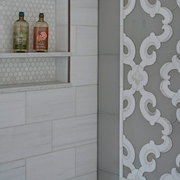 Drury Design
The original idea was to update the tile floor and the tub. That’s it.
A further discussion of wants and needs revealed intentions for an eventual larger shower and an improved vanity storage. It made sense to map out the possibilities and design our update with potential next steps in mind. The process was exciting, ultimately leading to the decision to do a full primary bath remodel.
Design Objectives:
-Maintain existing locations for all major bathroom functions
-Make the shower larger and more open
-Use luxurious materials throughout
-Improve vanity storage and define accessories for specific items
-Incorporate luxury shower fixtures
-Include the latest technology
Design Challenges
-Enlarging the shower in a typical rectangular shape would block the view and light from the alcove windows behind the tub
-Logical placement of the built-in shower caddy and all shower components in accordance with how and where they were to be used
-Keeping the long, back wall free from any shower modules to maintain the decorative tile design
-Combining the owner’s existing smart home system with a comprehensive shower system
-Planning cabinetry for hidden storage and use for various small appliances and make-up
-Integrating expensive shower wall tile with less expensive wall tile for aesthetic and budget purposes
-Incorporating special design features to balance the highly decorative shower tile
Design solutions:
-A clipped corner was planned for the shower bench seat – this allowed for a larger glass wall. The glass wall at the angled bench also brought more natural light into the shower
-Thoughtful shower space design prevented the crowding of features – the shower caddy and handheld shower head were placed on the full-height wall by the shower bench, the regular shower head and body sprays remained on the opposite wall, and the rain head was placed in the center of the shower
-A multi-port DTV system was installed, providing control of all shower components, including chromotherapy and music inside and outside the shower
-The lavish water-jet stone and glass decorative tile was paired with a less-expensive glass tile found in the mosaic
-Pull-out grooming organizers and electrical docking stations were incorporated into the cabinetry
Additional storage was created in the lower corner cabinet
The homeowners are thrilled with their new primary bathroom. Clear goals and carefully evaluated materials informed a fun and functional design that is both thoughtful and sumptuous!
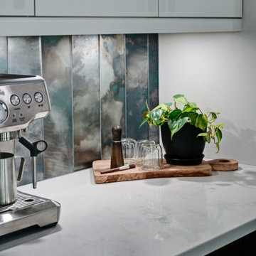 Drury Design
The original intent of this project was to replace the island, hood, countertops, and a few appliances. A primary bath remodel was the main priority. But once the couple realized certain features would enhance the functionality of the kitchen – not to mention completely change the aesthetic – they put the master bath on hold and decided to remodel the entire kitchen first.
Design objectives:
-Omit separate table, plan for a larger island that would seat 7 people
-Simple, clean lines – no rounded corners or weird angles
-Nothing trendy – use modern classic details
-Uncluttered countertops
-Better pantry storage for food & small appliances
-Integrated major appliances
-Coffee bar
-Avoid “1 color on perimeter with second color on island”
-Integrate a harmonious variety of finishes
-Integrate black & handmade metals
Design challenges:
-Island shape to fit within confines of existing half wall between kitchen & family room & bay window/door to backyard
-Narrow kitchen with major walkway
-Planning for 7 seats at the island
-Keep guest social area away from the cook’s zone
-Place appliances according to use
-Point-of-use storage for an avid cook within a relatively small space
-Integrate colors without looking too busy
THE NEW KITCHEN
-While the island is mostly rectangular, the seating area utilizes the bay extension without interfering with the exterior door
-All seating is placed on the outside perimeter of the island, giving the cook dedicated prep space
-The L-shaped seating area & adjacent coffee bar encourage guests to gather on the outside edge of the kitchen where they can still interact with the cook
-Island prep space includes 5 feet of versatile drawer storage, double waste basket and an open paper towel dispenser
-One pantry designated for food; the other for small appliances & bulk storage; creates visual armoire look
-Microwave drawer in island faces refrigerator for easy access & less interference with cook’s zone
-Appliance garages avoid clutter on the countertops
-Off-white upper cabinets make the kitchen look larger while the black bases offer contrast without closing in the space
Once the client committed to remodeling her entire kitchen, she had a good idea of the direction she wanted the space to take. Even so, there were many details that remained open to explore & contemplate. The end result is modern, clean and ultimately transitional – a creative vision anchored in functionality and artistry!
A powder room remodel was added to the project that beautifully compliments the kitchen aesthetic. The entire staircase, all trim & doors were painted in the same tones as the kitchen, transforming the entire first floor into a cohesive & welcoming space. It was a great collaborative partnership!
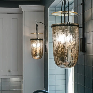 Drury Design
The original intent of this project was to replace the island, hood, countertops, and a few appliances. A primary bath remodel was the main priority. But once the couple realized certain features would enhance the functionality of the kitchen – not to mention completely change the aesthetic – they put the master bath on hold and decided to remodel the entire kitchen first.
Design objectives:
-Omit separate table, plan for a larger island that would seat 7 people
-Simple, clean lines – no rounded corners or weird angles
-Nothing trendy – use modern classic details
-Uncluttered countertops
-Better pantry storage for food & small appliances
-Integrated major appliances
-Coffee bar
-Avoid “1 color on perimeter with second color on island”
-Integrate a harmonious variety of finishes
-Integrate black & handmade metals
Design challenges:
-Island shape to fit within confines of existing half wall between kitchen & family room & bay window/door to backyard
-Narrow kitchen with major walkway
-Planning for 7 seats at the island
-Keep guest social area away from the cook’s zone
-Place appliances according to use
-Point-of-use storage for an avid cook within a relatively small space
-Integrate colors without looking too busy
THE NEW KITCHEN
-While the island is mostly rectangular, the seating area utilizes the bay extension without interfering with the exterior door
-All seating is placed on the outside perimeter of the island, giving the cook dedicated prep space
-The L-shaped seating area & adjacent coffee bar encourage guests to gather on the outside edge of the kitchen where they can still interact with the cook
-Island prep space includes 5 feet of versatile drawer storage, double waste basket and an open paper towel dispenser
-One pantry designated for food; the other for small appliances & bulk storage; creates visual armoire look
-Microwave drawer in island faces refrigerator for easy access & less interference with cook’s zone
-Appliance garages avoid clutter on the countertops
-Off-white upper cabinets make the kitchen look larger while the black bases offer contrast without closing in the space
Once the client committed to remodeling her entire kitchen, she had a good idea of the direction she wanted the space to take. Even so, there were many details that remained open to explore & contemplate. The end result is modern, clean and ultimately transitional – a creative vision anchored in functionality and artistry!
A powder room remodel was added to the project that beautifully compliments the kitchen aesthetic. The entire staircase, all trim & doors were painted in the same tones as the kitchen, transforming the entire first floor into a cohesive & welcoming space. It was a great collaborative partnership!
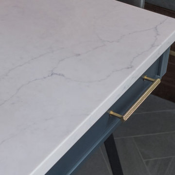 Drury Design
Design Objectives:
Respect the home’s vintage feel while bringing the kitchen up to date
Open up the kitchen area to create an open space for gathering and entertaining
Upgrade appliances to top-of-the-line models
Include a large island with seating
Include seating for casual family meals in a space that won’t be a replacement for the adjacent formal dining room
THE REMODEL
Design Challenges:
Remove a load-bearing wall and combine smaller rooms to create one big kitchen
A powder room in the back corner of the existing kitchen was a huge obstacle to updating the layout
Maintain large windows with views of the yard while still providing ample storage
Design Solutions:
Relocating the powder room to another part of the first floor (a large closet under the stairs) opened up the space dramatically
Create space for a larger island by recessing the fridge/freezer and shifting the pantry to a space adjacent to the kitchen
A banquette saves space and offers a perfect solution for casual dining
The walnut banquette table beautifully complements the fridge/freezer armoire
Utilize a gap created by the new fridge location to create a tall shallow cabinet for liquor storage w/ a wine cubby
Closing off one doorway into the dining room and using the “between the studs” space for a tall storage cabinet
Dish organizing drawers offer handy storage for plates, bowls, and serving dishes right by main sink and dishwasher
Cabinetry backing up to the dining room offers ample storage for glassware and functions both as a coffee station and cocktail bar
Open shelves flanking the hood add storage without blocking views and daylight
A beam was required where the wall was removed. Additional beams added architectural interest and helped integrate the beams into the space
Statement lighting adds drama and personality to the space
THE RENEWED SPACE
This project exemplifies the transformative power of good design. Simply put, good design allows you to live life artfully. The newly remodeled kitchen effortlessly combines functionality and aesthetic appeal, providing a delightful space for cooking and spending quality time together. It’s comfy for regular meals but ultimately outfitted for those special gatherings. Infused with classic finishes and a timeless charm, the kitchen emanates an enduring atmosphere that will never go out of style. This photo hones in on the lap drawers on seating side of island.
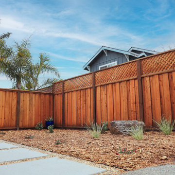
 K & D Landscaping, Inc.
Transform your outdoor space into a serene retreat with this expertly designed project, featuring a custom wood pergola, elegant planter boxes, a luxurious hot tub with a bespoke wood privacy screen, and stylish pavers and concrete pads. The centerpiece is a stunning wood pergola, crafted for both shade and style, providing a sophisticated focal point for lounging or dining alfresco. Complementing this are custom-built planter boxes that showcase vibrant greenery, adding a lush backdrop to the area. The hot tub, surrounded by a custom wood privacy screen, offers ultimate relaxation and seclusion while seamlessly integrating with the pergola’s design. High-quality pavers create a clean, elegant surface, enhancing the overall look and functionality of the space, while strategically placed concrete pads provide stability and support, contributing to the modern, polished aesthetic. This project masterfully blends functionality with design, resulting in a luxurious outdoor retreat perfect for unwinding or entertaining guests.
8