
Search results for "Undergoing" in Home Design Ideas
 Ginger Rabe Designs, LLC
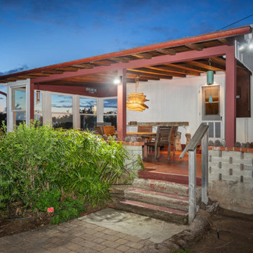
Outdoor Patio with Chandelier and concrete from the 1940's. We decided to stay with the architecture of the home.
The transformation of this ranch-style home in Carlsbad, CA, exemplifies a perfect blend of preserving the charm of its 1940s origins while infusing modern elements to create a unique and inviting space. By incorporating the clients' love for pottery and natural woods, the redesign pays homage to these preferences while enhancing the overall aesthetic appeal and functionality of the home. From building new decks and railings, surf showers, a reface of the home, custom light up address signs from GR Designs Line, and more custom elements to make this charming home pop.
The redesign carefully retains the distinctive characteristics of the 1940s style, such as architectural elements, layout, and overall ambiance. This preservation ensures that the home maintains its historical charm and authenticity while undergoing a modern transformation. To infuse a contemporary flair into the design, modern elements are strategically introduced. These modern twists add freshness and relevance to the space while complementing the existing architectural features. This balanced approach creates a harmonious blend of old and new, offering a timeless appeal.
The design concept revolves around the clients' passion for pottery and natural woods. These elements serve as focal points throughout the home, lending a sense of warmth, texture, and earthiness to the interior spaces. By integrating pottery-inspired accents and showcasing the beauty of natural wood grains, the design celebrates the clients' interests and preferences. A key highlight of the redesign is the use of custom-made tile from Japan, reminiscent of beautifully glazed pottery. This bespoke tile adds a touch of artistry and craftsmanship to the home, elevating its visual appeal and creating a unique focal point. Additionally, fabrics that evoke the elements of the ocean further enhance the connection with the surrounding natural environment, fostering a serene and tranquil atmosphere indoors.
The overall design concept aims to evoke a warm, lived-in feeling, inviting occupants and guests to relax and unwind. By incorporating elements that resonate with the clients' personal tastes and preferences, the home becomes more than just a living space—it becomes a reflection of their lifestyle, interests, and identity.
In summary, the redesign of this ranch-style home in Carlsbad, CA, successfully merges the charm of its 1940s origins with modern elements, creating a space that is both timeless and distinctive. Through careful attention to detail, thoughtful selection of materials, rebuilding of elements outside to add character, and a focus on personalization, the home embodies a warm, inviting atmosphere that celebrates the clients' passions and enhances their everyday living experience.
This project is on the same property as the Carlsbad Cottage and is a great journey of new and old.
Redesign of the kitchen, bedrooms, and common spaces, custom made tile, appliances from GE Monogram Cafe, bedroom window treatments custom from GR Designs Line, Lighting and Custom Address Signs from GR Designs Line, Custom Surf Shower, and more.
 Ginger Rabe Designs, LLC
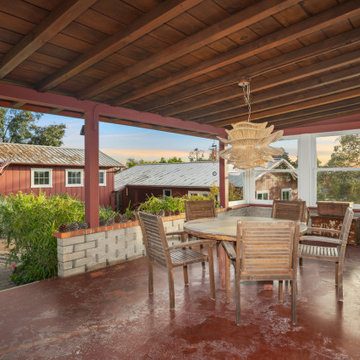
Outdoor Patio with Chandelier and concrete from the 1940's. We decided to stay with the architecture of the home.
The transformation of this ranch-style home in Carlsbad, CA, exemplifies a perfect blend of preserving the charm of its 1940s origins while infusing modern elements to create a unique and inviting space. By incorporating the clients' love for pottery and natural woods, the redesign pays homage to these preferences while enhancing the overall aesthetic appeal and functionality of the home. From building new decks and railings, surf showers, a reface of the home, custom light up address signs from GR Designs Line, and more custom elements to make this charming home pop.
The redesign carefully retains the distinctive characteristics of the 1940s style, such as architectural elements, layout, and overall ambiance. This preservation ensures that the home maintains its historical charm and authenticity while undergoing a modern transformation. To infuse a contemporary flair into the design, modern elements are strategically introduced. These modern twists add freshness and relevance to the space while complementing the existing architectural features. This balanced approach creates a harmonious blend of old and new, offering a timeless appeal.
The design concept revolves around the clients' passion for pottery and natural woods. These elements serve as focal points throughout the home, lending a sense of warmth, texture, and earthiness to the interior spaces. By integrating pottery-inspired accents and showcasing the beauty of natural wood grains, the design celebrates the clients' interests and preferences. A key highlight of the redesign is the use of custom-made tile from Japan, reminiscent of beautifully glazed pottery. This bespoke tile adds a touch of artistry and craftsmanship to the home, elevating its visual appeal and creating a unique focal point. Additionally, fabrics that evoke the elements of the ocean further enhance the connection with the surrounding natural environment, fostering a serene and tranquil atmosphere indoors.
The overall design concept aims to evoke a warm, lived-in feeling, inviting occupants and guests to relax and unwind. By incorporating elements that resonate with the clients' personal tastes and preferences, the home becomes more than just a living space—it becomes a reflection of their lifestyle, interests, and identity.
In summary, the redesign of this ranch-style home in Carlsbad, CA, successfully merges the charm of its 1940s origins with modern elements, creating a space that is both timeless and distinctive. Through careful attention to detail, thoughtful selection of materials, rebuilding of elements outside to add character, and a focus on personalization, the home embodies a warm, inviting atmosphere that celebrates the clients' passions and enhances their everyday living experience.
This project is on the same property as the Carlsbad Cottage and is a great journey of new and old.
Redesign of the kitchen, bedrooms, and common spaces, custom made tile, appliances from GE Monogram Cafe, bedroom window treatments custom from GR Designs Line, Lighting and Custom Address Signs from GR Designs Line, Custom Surf Shower, and more.


Find the right local pro for your project

 Ginger Rabe Designs, LLC
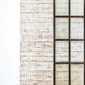
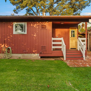
The transformation of this ranch-style home in Carlsbad, CA, exemplifies a perfect blend of preserving the charm of its 1940s origins while infusing modern elements to create a unique and inviting space. By incorporating the clients' love for pottery and natural woods, the redesign pays homage to these preferences while enhancing the overall aesthetic appeal and functionality of the home. From building new decks and railings, surf showers, a reface of the home, custom light up address signs from GR Designs Line, and more custom elements to make this charming home pop.
The redesign carefully retains the distinctive characteristics of the 1940s style, such as architectural elements, layout, and overall ambiance. This preservation ensures that the home maintains its historical charm and authenticity while undergoing a modern transformation. To infuse a contemporary flair into the design, modern elements are strategically introduced. These modern twists add freshness and relevance to the space while complementing the existing architectural features. This balanced approach creates a harmonious blend of old and new, offering a timeless appeal.
The design concept revolves around the clients' passion for pottery and natural woods. These elements serve as focal points throughout the home, lending a sense of warmth, texture, and earthiness to the interior spaces. By integrating pottery-inspired accents and showcasing the beauty of natural wood grains, the design celebrates the clients' interests and preferences. A key highlight of the redesign is the use of custom-made tile from Japan, reminiscent of beautifully glazed pottery. This bespoke tile adds a touch of artistry and craftsmanship to the home, elevating its visual appeal and creating a unique focal point. Additionally, fabrics that evoke the elements of the ocean further enhance the connection with the surrounding natural environment, fostering a serene and tranquil atmosphere indoors.
The overall design concept aims to evoke a warm, lived-in feeling, inviting occupants and guests to relax and unwind. By incorporating elements that resonate with the clients' personal tastes and preferences, the home becomes more than just a living space—it becomes a reflection of their lifestyle, interests, and identity.
In summary, the redesign of this ranch-style home in Carlsbad, CA, successfully merges the charm of its 1940s origins with modern elements, creating a space that is both timeless and distinctive. Through careful attention to detail, thoughtful selection of materials, rebuilding of elements outside to add character, and a focus on personalization, the home embodies a warm, inviting atmosphere that celebrates the clients' passions and enhances their everyday living experience.
This project is on the same property as the Carlsbad Cottage and is a great journey of new and old.
Redesign of the kitchen, bedrooms, and common spaces, custom-made tile, appliances from GE Monogram Cafe, bedroom window treatments custom from GR Designs Line, Lighting and Custom Address Signs from GR Designs Line, Custom Surf Shower, and more.
 Drury Design
THE SETUP
Client Background: Our clients, a couple who have transitioned into the empty nest phase, have cherished their home for over three decades without undergoing any significant renovations. With a newfound desire to adapt their living space to better suit their current lifestyle, they’ve embarked on a journey to reimagine their kitchen — the heart of their home. Their aspiration is to cultivate a serene, neutral-toned sanctuary on the first floor that seamlessly merges with their family room, ensuring a harmonious and inviting environment.
Design Inspiration: The renovation is inspired by the couple’s penchant for soft, calming neutrals, using their cherished family room and the kitchen’s existing tile flooring as the cornerstone for the color scheme. This approach aims to foster a sense of warmth and tranquility throughout.
Design Objectives:
Harmonize the kitchen with the family room by adopting a soothing, neutral color scheme, ensuring a seamless flow across the first floor.
Enhance kitchen functionality with thoughtfully designed cabinetry, providing a designated place for every item and maximizing storage efficiency.
Cultivate an inviting and comfortable atmosphere that reflects the homeowners’ desire for a calm and relaxing space.
Design Challenges:
The homeowners wish to retain the existing kitchen tile flooring and integrate it into a refreshed, modern design.
Accommodating a dining area spacious enough for family visits without compromising the kitchen’s open feel or functional layout.
Despite liking the current placement of plumbing and appliances, the homeowners aspire for a more open floor plan to facilitate better movement and interaction.
The need to amplify natural light in the kitchen, especially around the sink area, where existing lighting is insufficient.
Preserving the half-wall between the kitchen and family room, a feature the homeowners want to keep, while ensuring it complements the new design.
THE RENEWED SPACE
Design Solutions:
By choosing a neutral color palette that complements the existing tile, the design unifies the kitchen with the adjacent spaces. The tile’s grout was cleaned and restored, enhancing the floor’s appearance and integrating it seamlessly with the new kitchen aesthetic.
The inclusion of a larger island with seating for two, alongside maintaining a substantial dining table, was achieved by optimizing the spatial layout. This allowed for a sociable yet functional kitchen, accommodating large family gatherings without feeling crowded.
Minor adjustments to the kitchen’s layout maintained the preferred locations for plumbing and appliances while introducing an ‘open’ design concept. Strategic modifications, such as angling the pantry wall, improved the flow and accessibility within the space.
Replacing the garden window with a broader, standard window significantly increased natural light, transforming the sink area into a bright, welcoming space with enhanced views of the outdoors.
The decision to keep the half-wall was ingeniously leveraged to define the dining area while maintaining an open connection to the family room. This feature not only serves as a visual separator but also ties the two spaces together through the shared color scheme and design elements.
The homeowners are thrilled with their newly remodeled kitchen, which has become a hub of warmth and hospitality. Hosting a wedding shower and a birthday party, they have shared their renewed space with friends and family, who have been equally enamored. This remodel has not only met their functional and aesthetic desires but has also enriched their home with a fresh sense of serenity and joy.
The upstairs part of the home is shaping up nicely. Here’s their newly remodeled primary bathroom.

 L & L Home Restoration, LLC
Complete luxury with this large walk-in shower. Overhead rainfall panel and two separate shower heads keep you warm and relaxed. The tile is a rustic barnwood look with small travertine squares for the inset.

 TMD Custom Builders
Mid-sized transitional light wood floor kitchen photo in Denver with an undermount sink, shaker cabinets, light wood cabinets, onyx countertops, white backsplash, subway tile backsplash and stainless steel appliances
 Drury Design
THE SETUP
Client Background: Our clients, a couple who have transitioned into the empty nest phase, have cherished their home for over three decades without undergoing any significant renovations. With a newfound desire to adapt their living space to better suit their current lifestyle, they’ve embarked on a journey to reimagine their kitchen — the heart of their home. Their aspiration is to cultivate a serene, neutral-toned sanctuary on the first floor that seamlessly merges with their family room, ensuring a harmonious and inviting environment.
Design Inspiration: The renovation is inspired by the couple’s penchant for soft, calming neutrals, using their cherished family room and the kitchen’s existing tile flooring as the cornerstone for the color scheme. This approach aims to foster a sense of warmth and tranquility throughout.
Design Objectives:
Harmonize the kitchen with the family room by adopting a soothing, neutral color scheme, ensuring a seamless flow across the first floor.
Enhance kitchen functionality with thoughtfully designed cabinetry, providing a designated place for every item and maximizing storage efficiency.
Cultivate an inviting and comfortable atmosphere that reflects the homeowners’ desire for a calm and relaxing space.
Design Challenges:
The homeowners wish to retain the existing kitchen tile flooring and integrate it into a refreshed, modern design.
Accommodating a dining area spacious enough for family visits without compromising the kitchen’s open feel or functional layout.
Despite liking the current placement of plumbing and appliances, the homeowners aspire for a more open floor plan to facilitate better movement and interaction.
The need to amplify natural light in the kitchen, especially around the sink area, where existing lighting is insufficient.
Preserving the half-wall between the kitchen and family room, a feature the homeowners want to keep, while ensuring it complements the new design.
THE RENEWED SPACE
Design Solutions:
By choosing a neutral color palette that complements the existing tile, the design unifies the kitchen with the adjacent spaces. The tile’s grout was cleaned and restored, enhancing the floor’s appearance and integrating it seamlessly with the new kitchen aesthetic.
The inclusion of a larger island with seating for two, alongside maintaining a substantial dining table, was achieved by optimizing the spatial layout. This allowed for a sociable yet functional kitchen, accommodating large family gatherings without feeling crowded.
Minor adjustments to the kitchen’s layout maintained the preferred locations for plumbing and appliances while introducing an ‘open’ design concept. Strategic modifications, such as angling the pantry wall, improved the flow and accessibility within the space.
Replacing the garden window with a broader, standard window significantly increased natural light, transforming the sink area into a bright, welcoming space with enhanced views of the outdoors.
The decision to keep the half-wall was ingeniously leveraged to define the dining area while maintaining an open connection to the family room. This feature not only serves as a visual separator but also ties the two spaces together through the shared color scheme and design elements.
The homeowners are thrilled with their newly remodeled kitchen, which has become a hub of warmth and hospitality. Hosting a wedding shower and a birthday party, they have shared their renewed space with friends and family, who have been equally enamored. This remodel has not only met their functional and aesthetic desires but has also enriched their home with a fresh sense of serenity and joy.
The upstairs part of the home is shaping up nicely. Here’s their newly remodeled primary bathroom.
 Drury Design
THE SETUP
Client Background: Our clients, a couple who have transitioned into the empty nest phase, have cherished their home for over three decades without undergoing any significant renovations. With a newfound desire to adapt their living space to better suit their current lifestyle, they’ve embarked on a journey to reimagine their kitchen — the heart of their home. Their aspiration is to cultivate a serene, neutral-toned sanctuary on the first floor that seamlessly merges with their family room, ensuring a harmonious and inviting environment.
Design Inspiration: The renovation is inspired by the couple’s penchant for soft, calming neutrals, using their cherished family room and the kitchen’s existing tile flooring as the cornerstone for the color scheme. This approach aims to foster a sense of warmth and tranquility throughout.
Design Objectives:
Harmonize the kitchen with the family room by adopting a soothing, neutral color scheme, ensuring a seamless flow across the first floor.
Enhance kitchen functionality with thoughtfully designed cabinetry, providing a designated place for every item and maximizing storage efficiency.
Cultivate an inviting and comfortable atmosphere that reflects the homeowners’ desire for a calm and relaxing space.
Design Challenges:
The homeowners wish to retain the existing kitchen tile flooring and integrate it into a refreshed, modern design.
Accommodating a dining area spacious enough for family visits without compromising the kitchen’s open feel or functional layout.
Despite liking the current placement of plumbing and appliances, the homeowners aspire for a more open floor plan to facilitate better movement and interaction.
The need to amplify natural light in the kitchen, especially around the sink area, where existing lighting is insufficient.
Preserving the half-wall between the kitchen and family room, a feature the homeowners want to keep, while ensuring it complements the new design.
THE RENEWED SPACE
Design Solutions:
By choosing a neutral color palette that complements the existing tile, the design unifies the kitchen with the adjacent spaces. The tile’s grout was cleaned and restored, enhancing the floor’s appearance and integrating it seamlessly with the new kitchen aesthetic.
The inclusion of a larger island with seating for two, alongside maintaining a substantial dining table, was achieved by optimizing the spatial layout. This allowed for a sociable yet functional kitchen, accommodating large family gatherings without feeling crowded.
Minor adjustments to the kitchen’s layout maintained the preferred locations for plumbing and appliances while introducing an ‘open’ design concept. Strategic modifications, such as angling the pantry wall, improved the flow and accessibility within the space.
Replacing the garden window with a broader, standard window significantly increased natural light, transforming the sink area into a bright, welcoming space with enhanced views of the outdoors.
The decision to keep the half-wall was ingeniously leveraged to define the dining area while maintaining an open connection to the family room. This feature not only serves as a visual separator but also ties the two spaces together through the shared color scheme and design elements.
The homeowners are thrilled with their newly remodeled kitchen, which has become a hub of warmth and hospitality. Hosting a wedding shower and a birthday party, they have shared their renewed space with friends and family, who have been equally enamored. This remodel has not only met their functional and aesthetic desires but has also enriched their home with a fresh sense of serenity and joy.
The upstairs part of the home is shaping up nicely. Here’s their newly remodeled primary bathroom.

 Five Star Tree Care
Trees are an object of supreme beauty that brings a sense of pride and character to any property. In addition to being aesthetically pleasing, they also offer a wealth of additional benefits. They can help reduce the cost of heating and cooling as well as increase the curb appeal of a property. Trees also benefit the environment by reducing pollution and providing refuge to local wildlife. If you happen to have oak trees on your property, it is especially important to make sure your trees undergo general maintenance and tree care. One of the most common problems landowners with oak trees face is oak wilt. Five Star Tree Services is here to let you know how to spot and protect your green friends from this debilitating tree ailment.
What Is Oak Wilt?
Oak wilt is a very aggressive form of tree fungus that attacks the oak species in particular. It grows on the outer sapwood of the tree and slowly starts to sap away nutrients and water from the tree itself. Left untreated, oak wilt can cause the tree to dieback or even expire completely. Oak wilt targets healthy oak trees, mature oak trees, and stressed oak trees in equal measure. It is easiest to spot the symptoms of oak wilt in the early spring or summer. The most common signs of oak wilt are bronze and wilting foliage.
Where Does Oak Wilt Start?
Most oak wilt will start along the tips of the branches and the top of the oak tree. One reason it may take so long to spot a problem is that it begins out of the usual line of sight. Most homeowners will notice a sudden decline in the health of a usually healthy tree that starts along its crown.
Another sign of oak wilt is when the outer side of the tree bark starts to develop gum. This gum attracts other pests such as birds, insects, and squirrels who then carry the fungus from sick trees to healthy trees. Along with spores, the fungus can also spread through the root system of one oak tree to the other, but it is hard to notice unless you happen to be digging around the trees for another reason.
When Are Oak Trees Most Susceptible?
Healthy and stressed oak trees are equally prone to catching oak wilt, but is it more likely to occur in the spring. It is always best to avoid pruning oak trees in the spring to reduce the chance of new fungal infections or for infections from other trees being spread to healthy trees. Wounds or environmental damage during the spring should be cared for by professionals to help reduce the chances of oak wilt infection.
Is There A Cure For Oak Wilt?
There is no cure for oak wilt, so the best method is prevention. Avoid pruning and damage during growing seasons and stick to winter pruning in Richmond Hill to cut down on infection rates. If you do have an oak tree that is showing signs of oak wilt, the best course of action is to have it removed to prevent the fungus from spreading to other trees. If you think your oak trees may be showing signs of oak wilt, give Five Star Tree Services a call at (416) 990-3355 for an in-person assessment today.

 Woodwerd, LLC
Woodwerd
Inspiration for a large contemporary open concept family room remodel in Austin with gray walls
Inspiration for a large contemporary open concept family room remodel in Austin with gray walls
 Betty Wasserman Art & Interiors
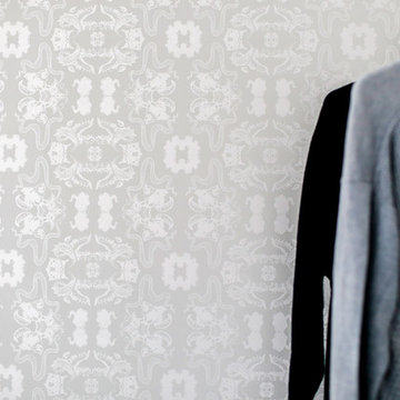
Modern luxury meets warm farmhouse in this Southampton home! Scandinavian inspired furnishings and light fixtures create a clean and tailored look, while the natural materials found in accent walls, casegoods, the staircase, and home decor hone in on a homey feel. An open-concept interior that proves less can be more is how we’d explain this interior. By accentuating the “negative space,” we’ve allowed the carefully chosen furnishings and artwork to steal the show, while the crisp whites and abundance of natural light create a rejuvenated and refreshed interior.
This sprawling 5,000 square foot home includes a salon, ballet room, two media rooms, a conference room, multifunctional study, and, lastly, a guest house (which is a mini version of the main house).
 Drury Design
The existing kitchen wasn’t cutting it anymore. The homeowners designed and built this home about 20 years ago, but since then, their taste and needs changed. The outdated finishes felt outdated. There weren’t enough work areas. Some counterspace stations were just awkward due to the layout. Adjoining spaces around the kitchen were also in need of an update, but it was decided that the kitchen would undergo a transformation first.
Design Objectives
-Rework the overall layout (kitchen, laundry and butler’s pantry) to have a better flow and utilize the space better
-Incorporate materials with wow and pizzazz to reflect the homeowner’s style
-Design large work areas for cooking with two or more people at a time
-Provide seating at an island in addition to table seating
-Update surrounding spaces since the kitchen is open to the rest of the home
Design Challenges:
-Include a vast array of cooking appliances while having enough of cabinet storage
-Adjacent rooms need to feel updated and flow with new Kitchen
-Having multiple focal points with different materials but not have the space feel like a hodge podge
-Provide different task, accent and overall lighting to brighten up space
Design Solutions:
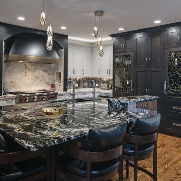
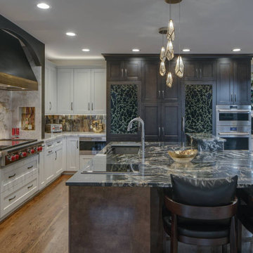
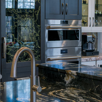
-The homeowner loves to cook and wanted to maximize her abilities. We incorporated a 48” rangetop with a griddle, a single oven, steam oven, microwave drawer and 15” induction cooktop next to a 48” Galley Ideal Workstation with two faucets. In order to have room for all of these appliances, the floor plan needed to accommodate more cabinetry. Both dining room entrances were closed off and the laundry room entrance were moved to the opposite end of the wall to allow two long walls for additional cabinets.
-The existing round columns throughout the first floor were outdated. To keep the architectural element of the columns, we wrapped the new columns to have a square shape with a flat panel on all four sides. Then, we painted them black (to tie in with the kitchen tops and curved hood surround) and added simple crown molding. For the flow of the space, closing up the odd corner that connected the laundry and dining room and relocating both room entrances allowed the space to actually feel larger and more continuous. --Adding the same square columns to the main dining room entrance, by the front door, also tied in the front of the house with the kitchen.
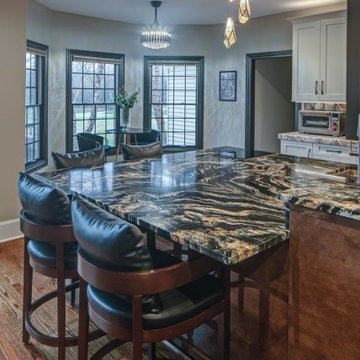
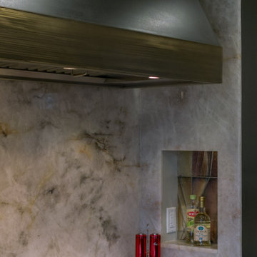
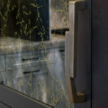
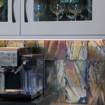
-The homeowner loves unique and bold materials. The main focal point of the kitchen is definitely the custom metal hood that incorporates two finishes and is set on a Lumix quartzite full-high back and side splashes. To make this area even more pronounced, a hearth-like drywall arch encloses the space. Once your eye moves off the hood, you start to notice the mirrored refrigerator panels, high gloss island cabinets, mirrored metal backsplash tile, delicate pendant island lights and the stunning island countertop material! There is a good mix of materials that make every space shine. The blacks, golds and pewter finishes help tie everything together.
-Lighting in a large kitchen is important. This space, besides getting a lot of natural light, needed lots of additional lighting due to the dark finishes. For overall lighting we have plenty of can lights in addition to lighting at the tops of the wall cabinets (that shine on the ceiling), undercabinet task lighting to make the tops sparkle and provide abundant lighting while prepping, pendant accent lighting over the island and a fandolier to add a little sparkle over the pub table. Voila!
 Drury Design
The existing kitchen wasn’t cutting it anymore. The homeowners designed and built this home about 20 years ago, but since then, their taste and needs changed. The outdated finishes felt outdated. There weren’t enough work areas. Some counterspace stations were just awkward due to the layout. Adjoining spaces around the kitchen were also in need of an update, but it was decided that the kitchen would undergo a transformation first.
Design Objectives
-Rework the overall layout (kitchen, laundry and butler’s pantry) to have a better flow and utilize the space better
-Incorporate materials with wow and pizzazz to reflect the homeowner’s style
-Design large work areas for cooking with two or more people at a time
-Provide seating at an island in addition to table seating
-Update surrounding spaces since the kitchen is open to the rest of the home
Design Challenges:
-Include a vast array of cooking appliances while having enough of cabinet storage
-Adjacent rooms need to feel updated and flow with new Kitchen
-Having multiple focal points with different materials but not have the space feel like a hodge podge
-Provide different task, accent and overall lighting to brighten up space
Design Solutions:
-The homeowner loves to cook and wanted to maximize her abilities. We incorporated a 48” rangetop with a griddle, a single oven, steam oven, microwave drawer and 15” induction cooktop next to a 48” Galley Ideal Workstation with two faucets. In order to have room for all of these appliances, the floor plan needed to accommodate more cabinetry. Both dining room entrances were closed off and the laundry room entrance were moved to the opposite end of the wall to allow two long walls for additional cabinets.
-The existing round columns throughout the first floor were outdated. To keep the architectural element of the columns, we wrapped the new columns to have a square shape with a flat panel on all four sides. Then, we painted them black (to tie in with the kitchen tops and curved hood surround) and added simple crown molding. For the flow of the space, closing up the odd corner that connected the laundry and dining room and relocating both room entrances allowed the space to actually feel larger and more continuous. --Adding the same square columns to the main dining room entrance, by the front door, also tied in the front of the house with the kitchen.
-The homeowner loves unique and bold materials. The main focal point of the kitchen is definitely the custom metal hood that incorporates two finishes and is set on a Lumix quartzite full-high back and side splashes. To make this area even more pronounced, a hearth-like drywall arch encloses the space. Once your eye moves off the hood, you start to notice the mirrored refrigerator panels, high gloss island cabinets, mirrored metal backsplash tile, delicate pendant island lights and the stunning island countertop material! There is a good mix of materials that make every space shine. The blacks, golds and pewter finishes help tie everything together.
-Lighting in a large kitchen is important. This space, besides getting a lot of natural light, needed lots of additional lighting due to the dark finishes. For overall lighting we have plenty of can lights in addition to lighting at the tops of the wall cabinets (that shine on the ceiling), undercabinet task lighting to make the tops sparkle and provide abundant lighting while prepping, pendant accent lighting over the island and a fandolier to add a little sparkle over the pub table. Voila!
 Drury Design
The existing kitchen wasn’t cutting it anymore. The homeowners designed and built this home about 20 years ago, but since then, their taste and needs changed. The outdated finishes felt outdated. There weren’t enough work areas. Some counterspace stations were just awkward due to the layout. Adjoining spaces around the kitchen were also in need of an update, but it was decided that the kitchen would undergo a transformation first.
Design Objectives
-Rework the overall layout (kitchen, laundry and butler’s pantry) to have a better flow and utilize the space better
-Incorporate materials with wow and pizzazz to reflect the homeowner’s style
-Design large work areas for cooking with two or more people at a time
-Provide seating at an island in addition to table seating
-Update surrounding spaces since the kitchen is open to the rest of the home
Design Challenges:
-Include a vast array of cooking appliances while having enough of cabinet storage
-Adjacent rooms need to feel updated and flow with new Kitchen
-Having multiple focal points with different materials but not have the space feel like a hodge podge
-Provide different task, accent and overall lighting to brighten up space
Design Solutions:
-The homeowner loves to cook and wanted to maximize her abilities. We incorporated a 48” rangetop with a griddle, a single oven, steam oven, microwave drawer and 15” induction cooktop next to a 48” Galley Ideal Workstation with two faucets. In order to have room for all of these appliances, the floor plan needed to accommodate more cabinetry. Both dining room entrances were closed off and the laundry room entrance were moved to the opposite end of the wall to allow two long walls for additional cabinets.
-The existing round columns throughout the first floor were outdated. To keep the architectural element of the columns, we wrapped the new columns to have a square shape with a flat panel on all four sides. Then, we painted them black (to tie in with the kitchen tops and curved hood surround) and added simple crown molding. For the flow of the space, closing up the odd corner that connected the laundry and dining room and relocating both room entrances allowed the space to actually feel larger and more continuous. --Adding the same square columns to the main dining room entrance, by the front door, also tied in the front of the house with the kitchen.
-The homeowner loves unique and bold materials. The main focal point of the kitchen is definitely the custom metal hood that incorporates two finishes and is set on a Lumix quartzite full-high back and side splashes. To make this area even more pronounced, a hearth-like drywall arch encloses the space. Once your eye moves off the hood, you start to notice the mirrored refrigerator panels, high gloss island cabinets, mirrored metal backsplash tile, delicate pendant island lights and the stunning island countertop material! There is a good mix of materials that make every space shine. The blacks, golds and pewter finishes help tie everything together.
-Lighting in a large kitchen is important. This space, besides getting a lot of natural light, needed lots of additional lighting due to the dark finishes. For overall lighting we have plenty of can lights in addition to lighting at the tops of the wall cabinets (that shine on the ceiling), undercabinet task lighting to make the tops sparkle and provide abundant lighting while prepping, pendant accent lighting over the island and a fandolier to add a little sparkle over the pub table. Voila!
 Drury Design
The existing kitchen wasn’t cutting it anymore. The homeowners designed and built this home about 20 years ago, but since then, their taste and needs changed. The outdated finishes felt outdated. There weren’t enough work areas. Some counterspace stations were just awkward due to the layout. Adjoining spaces around the kitchen were also in need of an update, but it was decided that the kitchen would undergo a transformation first.
Design Objectives
-Rework the overall layout (kitchen, laundry and butler’s pantry) to have a better flow and utilize the space better
-Incorporate materials with wow and pizzazz to reflect the homeowner’s style
-Design large work areas for cooking with two or more people at a time
-Provide seating at an island in addition to table seating
-Update surrounding spaces since the kitchen is open to the rest of the home
Design Challenges:
-Include a vast array of cooking appliances while having enough of cabinet storage
-Adjacent rooms need to feel updated and flow with new Kitchen
-Having multiple focal points with different materials but not have the space feel like a hodge podge
-Provide different task, accent and overall lighting to brighten up space
Design Solutions:
-The homeowner loves to cook and wanted to maximize her abilities. We incorporated a 48” rangetop with a griddle, a single oven, steam oven, microwave drawer and 15” induction cooktop next to a 48” Galley Ideal Workstation with two faucets. In order to have room for all of these appliances, the floor plan needed to accommodate more cabinetry. Both dining room entrances were closed off and the laundry room entrance were moved to the opposite end of the wall to allow two long walls for additional cabinets.
-The existing round columns throughout the first floor were outdated. To keep the architectural element of the columns, we wrapped the new columns to have a square shape with a flat panel on all four sides. Then, we painted them black (to tie in with the kitchen tops and curved hood surround) and added simple crown molding. For the flow of the space, closing up the odd corner that connected the laundry and dining room and relocating both room entrances allowed the space to actually feel larger and more continuous. --Adding the same square columns to the main dining room entrance, by the front door, also tied in the front of the house with the kitchen.
-The homeowner loves unique and bold materials. The main focal point of the kitchen is definitely the custom metal hood that incorporates two finishes and is set on a Lumix quartzite full-high back and side splashes. To make this area even more pronounced, a hearth-like drywall arch encloses the space. Once your eye moves off the hood, you start to notice the mirrored refrigerator panels, high gloss island cabinets, mirrored metal backsplash tile, delicate pendant island lights and the stunning island countertop material! There is a good mix of materials that make every space shine. The blacks, golds and pewter finishes help tie everything together.
-Lighting in a large kitchen is important. This space, besides getting a lot of natural light, needed lots of additional lighting due to the dark finishes. For overall lighting we have plenty of can lights in addition to lighting at the tops of the wall cabinets (that shine on the ceiling), undercabinet task lighting to make the tops sparkle and provide abundant lighting while prepping, pendant accent lighting over the island and a fandolier to add a little sparkle over the pub table. Voila!
 Drury Design
The existing kitchen wasn’t cutting it anymore. The homeowners designed and built this home about 20 years ago, but since then, their taste and needs changed. The outdated finishes felt outdated. There weren’t enough work areas. Some counterspace stations were just awkward due to the layout. Adjoining spaces around the kitchen were also in need of an update, but it was decided that the kitchen would undergo a transformation first.
Design Objectives
-Rework the overall layout (kitchen, laundry and butler’s pantry) to have a better flow and utilize the space better
-Incorporate materials with wow and pizzazz to reflect the homeowner’s style
-Design large work areas for cooking with two or more people at a time
-Provide seating at an island in addition to table seating
-Update surrounding spaces since the kitchen is open to the rest of the home
Design Challenges:
-Include a vast array of cooking appliances while having enough of cabinet storage
-Adjacent rooms need to feel updated and flow with new Kitchen
-Having multiple focal points with different materials but not have the space feel like a hodge podge
-Provide different task, accent and overall lighting to brighten up space
Design Solutions:
-The homeowner loves to cook and wanted to maximize her abilities. We incorporated a 48” rangetop with a griddle, a single oven, steam oven, microwave drawer and 15” induction cooktop next to a 48” Galley Ideal Workstation with two faucets. In order to have room for all of these appliances, the floor plan needed to accommodate more cabinetry. Both dining room entrances were closed off and the laundry room entrance were moved to the opposite end of the wall to allow two long walls for additional cabinets.
-The existing round columns throughout the first floor were outdated. To keep the architectural element of the columns, we wrapped the new columns to have a square shape with a flat panel on all four sides. Then, we painted them black (to tie in with the kitchen tops and curved hood surround) and added simple crown molding. For the flow of the space, closing up the odd corner that connected the laundry and dining room and relocating both room entrances allowed the space to actually feel larger and more continuous. --Adding the same square columns to the main dining room entrance, by the front door, also tied in the front of the house with the kitchen.
-The homeowner loves unique and bold materials. The main focal point of the kitchen is definitely the custom metal hood that incorporates two finishes and is set on a Lumix quartzite full-high back and side splashes. To make this area even more pronounced, a hearth-like drywall arch encloses the space. Once your eye moves off the hood, you start to notice the mirrored refrigerator panels, high gloss island cabinets, mirrored metal backsplash tile, delicate pendant island lights and the stunning island countertop material! There is a good mix of materials that make every space shine. The blacks, golds and pewter finishes help tie everything together.
-Lighting in a large kitchen is important. This space, besides getting a lot of natural light, needed lots of additional lighting due to the dark finishes. For overall lighting we have plenty of can lights in addition to lighting at the tops of the wall cabinets (that shine on the ceiling), undercabinet task lighting to make the tops sparkle and provide abundant lighting while prepping, pendant accent lighting over the island and a fandolier to add a little sparkle over the pub table. Voila!
 Drury Design
The existing kitchen wasn’t cutting it anymore. The homeowners designed and built this home about 20 years ago, but since then, their taste and needs changed. The outdated finishes felt outdated. There weren’t enough work areas. Some counterspace stations were just awkward due to the layout. Adjoining spaces around the kitchen were also in need of an update, but it was decided that the kitchen would undergo a transformation first.
Design Objectives
-Rework the overall layout (kitchen, laundry and butler’s pantry) to have a better flow and utilize the space better
-Incorporate materials with wow and pizzazz to reflect the homeowner’s style
-Design large work areas for cooking with two or more people at a time
-Provide seating at an island in addition to table seating
-Update surrounding spaces since the kitchen is open to the rest of the home
Design Challenges:
-Include a vast array of cooking appliances while having enough of cabinet storage
-Adjacent rooms need to feel updated and flow with new Kitchen
-Having multiple focal points with different materials but not have the space feel like a hodge podge
-Provide different task, accent and overall lighting to brighten up space
Design Solutions:
-The homeowner loves to cook and wanted to maximize her abilities. We incorporated a 48” rangetop with a griddle, a single oven, steam oven, microwave drawer and 15” induction cooktop next to a 48” Galley Ideal Workstation with two faucets. In order to have room for all of these appliances, the floor plan needed to accommodate more cabinetry. Both dining room entrances were closed off and the laundry room entrance were moved to the opposite end of the wall to allow two long walls for additional cabinets.
-The existing round columns throughout the first floor were outdated. To keep the architectural element of the columns, we wrapped the new columns to have a square shape with a flat panel on all four sides. Then, we painted them black (to tie in with the kitchen tops and curved hood surround) and added simple crown molding. For the flow of the space, closing up the odd corner that connected the laundry and dining room and relocating both room entrances allowed the space to actually feel larger and more continuous. --Adding the same square columns to the main dining room entrance, by the front door, also tied in the front of the house with the kitchen.
-The homeowner loves unique and bold materials. The main focal point of the kitchen is definitely the custom metal hood that incorporates two finishes and is set on a Lumix quartzite full-high back and side splashes. To make this area even more pronounced, a hearth-like drywall arch encloses the space. Once your eye moves off the hood, you start to notice the mirrored refrigerator panels, high gloss island cabinets, mirrored metal backsplash tile, delicate pendant island lights and the stunning island countertop material! There is a good mix of materials that make every space shine. The blacks, golds and pewter finishes help tie everything together.
-Lighting in a large kitchen is important. This space, besides getting a lot of natural light, needed lots of additional lighting due to the dark finishes. For overall lighting we have plenty of can lights in addition to lighting at the tops of the wall cabinets (that shine on the ceiling), undercabinet task lighting to make the tops sparkle and provide abundant lighting while prepping, pendant accent lighting over the island and a fandolier to add a little sparkle over the pub table. Voila!
 Drury Design
The existing kitchen wasn’t cutting it anymore. The homeowners designed and built this home about 20 years ago, but since then, their taste and needs changed. The outdated finishes felt outdated. There weren’t enough work areas. Some counterspace stations were just awkward due to the layout. Adjoining spaces around the kitchen were also in need of an update, but it was decided that the kitchen would undergo a transformation first.
Design Objectives
-Rework the overall layout (kitchen, laundry and butler’s pantry) to have a better flow and utilize the space better
-Incorporate materials with wow and pizzazz to reflect the homeowner’s style
-Design large work areas for cooking with two or more people at a time
-Provide seating at an island in addition to table seating
-Update surrounding spaces since the kitchen is open to the rest of the home
Design Challenges:
-Include a vast array of cooking appliances while having enough of cabinet storage
-Adjacent rooms need to feel updated and flow with new Kitchen
-Having multiple focal points with different materials but not have the space feel like a hodge podge
-Provide different task, accent and overall lighting to brighten up space
Design Solutions:
-The homeowner loves to cook and wanted to maximize her abilities. We incorporated a 48” rangetop with a griddle, a single oven, steam oven, microwave drawer and 15” induction cooktop next to a 48” Galley Ideal Workstation with two faucets. In order to have room for all of these appliances, the floor plan needed to accommodate more cabinetry. Both dining room entrances were closed off and the laundry room entrance were moved to the opposite end of the wall to allow two long walls for additional cabinets.
-The existing round columns throughout the first floor were outdated. To keep the architectural element of the columns, we wrapped the new columns to have a square shape with a flat panel on all four sides. Then, we painted them black (to tie in with the kitchen tops and curved hood surround) and added simple crown molding. For the flow of the space, closing up the odd corner that connected the laundry and dining room and relocating both room entrances allowed the space to actually feel larger and more continuous. --Adding the same square columns to the main dining room entrance, by the front door, also tied in the front of the house with the kitchen.
-The homeowner loves unique and bold materials. The main focal point of the kitchen is definitely the custom metal hood that incorporates two finishes and is set on a Lumix quartzite full-high back and side splashes. To make this area even more pronounced, a hearth-like drywall arch encloses the space. Once your eye moves off the hood, you start to notice the mirrored refrigerator panels, high gloss island cabinets, mirrored metal backsplash tile, delicate pendant island lights and the stunning island countertop material! There is a good mix of materials that make every space shine. The blacks, golds and pewter finishes help tie everything together.
-Lighting in a large kitchen is important. This space, besides getting a lot of natural light, needed lots of additional lighting due to the dark finishes. For overall lighting we have plenty of can lights in addition to lighting at the tops of the wall cabinets (that shine on the ceiling), undercabinet task lighting to make the tops sparkle and provide abundant lighting while prepping, pendant accent lighting over the island and a fandolier to add a little sparkle over the pub table. Voila!
35