
Search results for "Underscores" in Home Design Ideas
 McElroy Architecture, AIA
Eric Rorer
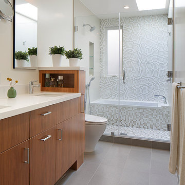
Inspiration for a contemporary white tile and mosaic tile bathroom remodel in San Francisco with flat-panel cabinets, medium tone wood cabinets and quartz countertops
Inspiration for a contemporary white tile and mosaic tile bathroom remodel in San Francisco with flat-panel cabinets, medium tone wood cabinets and quartz countertops
 Imagine Construction
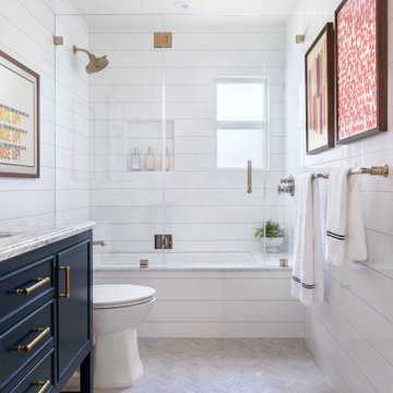
This guest bathroom was transformed into a whole new configuration. Included was a new soaking tub & shower enclosure. The wall to wall, horizontal, white tile was installed to look like shiplap. This included the painstaking task of two different grout colors to help hide the transitions, and make it look more like true, wood, shiplap.
 Daniel Contelmo Architects
Master bathroom
Photo by Peter Krupenye.
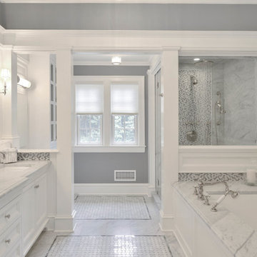
Example of a large classic master gray tile bathroom design in New York with white cabinets, gray walls and recessed-panel cabinets
Example of a large classic master gray tile bathroom design in New York with white cabinets, gray walls and recessed-panel cabinets
Find the right local pro for your project
 User
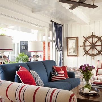
UserThis Martha's Vineyard style custom home includes many elements that establish a traditional East Coast home: white horizontal clapboard siding, tapered wood columns, shutters and red brick wainscoting. The predominantly red, white and blue color scheme honors the history of America, and a handmade American flag quilt underscores the theme. The outdoor space expands the living area, yet still feels intimate and contained.
 Jaimie Nelson Design
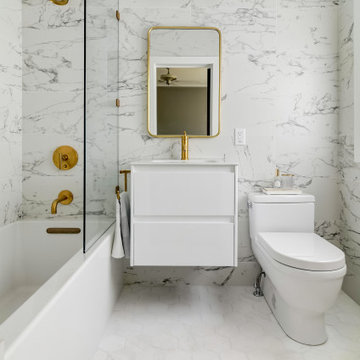
Bathroom - small contemporary master porcelain tile marble floor bathroom idea in Minneapolis
 Mister + Mrs Sharp
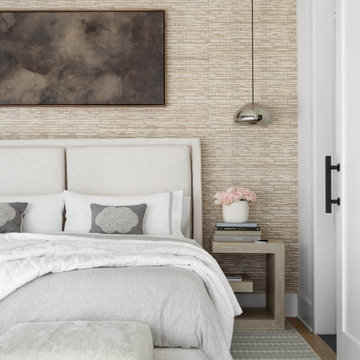
Example of a transitional medium tone wood floor, brown floor and wallpaper bedroom design in Atlanta with beige walls
 Crisp Architects
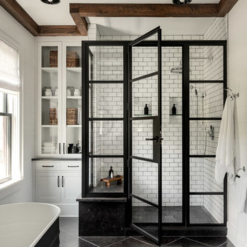
The shower in the Master Bathroom.
Photographer: Rob Karosis
Example of a large cottage master white tile and subway tile slate floor and black floor bathroom design in New York with white walls and a hinged shower door
Example of a large cottage master white tile and subway tile slate floor and black floor bathroom design in New York with white walls and a hinged shower door

 Studio Nish Interior Design
Studio Nish Interior Design
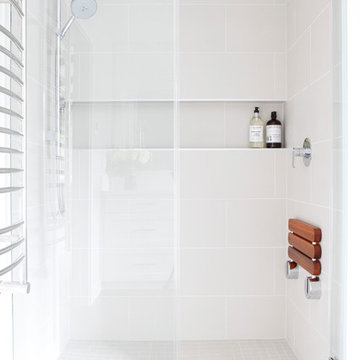
Master bath walk-in curbless shower.
Master Suite addition in Lafayette, CA. Concept for the master bath was to create a serene and contemporary spa-like environment. Clean lines and white-on-white layering of stone, tile and cabinetry are grounded by earthy dark tones in floor tiles. Luxury fixtures underscore the comfortable yet modern aesthetic.
 Klopf Architecture
From Mid-Century Classic to the Present
An iconic design updated with comfort, function, and flow for today.
A Remodel That Balances Past and Present
What started as a desire to update a classic Eichler soon became an exploration of how Mid-Century Modern design can successfully evolve for today. The client, a tech professional with a passion for scuba diving and underwater photography, wanted a home that would both honor its original character and feel tailored to his daily life. A lifelong technology enthusiast, he still owns the very first Mac desktop he saved up for as a teenager working at Radio Shack, a detail that underscores his appreciation for design that melds function and form.
Honoring Separation While Expanding Possibility
Unlike many contemporary remodels where walls are opened up to create expansive living spaces, this project took a more restrained approach. The client valued the defined rooms of the original plan and wanted to preserve as much wall space as possible for displaying his large-format underwater photography. The emphasis was not on dramatic spatial reinvention, but on thoughtful refinements. Klopf Architecture shaped a gallery-like backdrop while also expanding the primary suite, modernizing materials and fixtures throughout the home, and improving the functionality and layout of the kitchen. The finished home feels at once timeless and renewed, an Eichler that continues to inspire while fully supporting the lifestyle of its present-day owner.
A major turning point came mid-design. The original project brief had not included an addition, but as the reconfiguration of the primary bedroom and bath unfolded, it became clear that an expansion was the best approach to achieve the client’s vision of a more spacious suite. Fortunately, the adjustment came at a stage when revisions were still manageable and was integrated seamlessly, showing how thoughtful course corrections can strengthen a project rather than hinder it.
Navigating Challenges With Precision
The design development included multiple conceptual rounds, balancing preservation with subtle expansion. During construction, an existing post previously thought to be load-bearing turned out not to be. The structural engineer was able to pivot quickly, and both the post and the cross beam that had been intended to replace it could be omitted, allowing the original rhythm of the Eichler beam bays to be preserved.
Sustainability was not just a checklist item, but a way to align the home with the client’s values of simplicity, efficiency, and long-term functionality. R-38 roof insulation reduced energy usage, solar panels with battery storage provided independence and resilience, and passive comfort strategies eliminated the need forenergy-intensive air conditioning. An electric vehicle charger and an on-demand hot water recirculation system (with call buttons as opposed to having constant circulation) add to the home’s long-term efficiency factors. Together, these moves created a home that is quieter, more comfortable, and better equipped for the future, qualities that supported the client’s pragmatic approach to design and living lightly.
Details That Respect the Eichler DNA
The remodel carries forward the Eichler’s original spirit while introducing new layers of modern livability. Originally, the house was approached along a deep, narrow walk, with the garage on one side and the house on the other, leaving the front door tucked far back within this chasm-like space. By pulling the entry forward, the design reshaped the arrival experience, creating a clearer threshold and a natural drop-off zone for bags, shoes, and keys. This shift also made room for a custom bench at the entry that extends seamlessly through the glass sidelight. The bench and drop-off zone now work together as a single, integrated sequence that supports everyday living while offering a tactile reminder of Eichler’s philosophy of connectedness.
At the client’s request, Klopf reintroduced a classic Eichler gesture by extending the exterior siding into the entry and living room. The detail reinforces a sense of indoor/outdoor continuity while providing a subtle architectural surface that allows the client’s photography to take visual precedence.
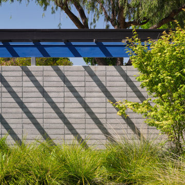
The signature concrete masonry wall at the front was reconstructed using blocks sourced to match the originals, now strengthened with rebar for seismic resilience while maintaining a private outdoor courtyard, visually extending the kitchen outward. A decorative trellis element, a detail borrowed from a neighboring Eichler, restores a familiar mid-century modern architectural motif. At the courtyard entry door, a custom etched glass sidelight with an ocean-themed design featuring kelp and jellyfish serves as a subtle homage to the client’s passion for deep-sea diving.
Landscaping became an integral part of the overall transformation. The homeowner engaged landscape architect Randi Johnsen of Third Nature Studio to shape a series of calm, inviting outdoor rooms that read as a natural extension of the interiors. While technically outside of the core construction scope, the landscape design proved central to achieving a sense of completeness and connectedness across the property. Such whole-property considerations often emerge as design ideas take shape, underscoring the importance of flexibility in planning and budgeting, as well as close collaboration among the design team starting early in the process.
The Value of Evolving Scope
As with many custom residential projects, the scope evolved during the design process. What began as a targeted remodel grew to include a new/expanded primary suite, a rebuilt CMU patio wall for strength and longevity, and a solar panel array and battery storage for energy resilience and carbon-reduction. Each thoughtful decision represented a conscious investment in the home’s performance and character, rather than a cost overrun.
The result was a project delivered on schedule, tailored precisely to the client’s lifestyle, and positioned to add long-term value both functionally and aesthetically. By embracing scope evolution as an opportunity rather than a challenge, and relying on good design paired with transparent communication, this remodel demonstrates how Eichler homes can be adapted for contemporary living without erasing their DNA.
Klopf Architecture project team: John Klopf, AIA, and Klara Kevane, Elise Webb and Nicholas LaNasa.
Contractor: Golden Cove Construction
Landscape Design: Third Nature Studio
Structural Engineer: Daniel Bastiao Design
Photography: ©2025 Mariko Reed
Year Completed: 2024
Location: Sunnyvale, CA
 Chad Mellon Photographer
Chad Mellon
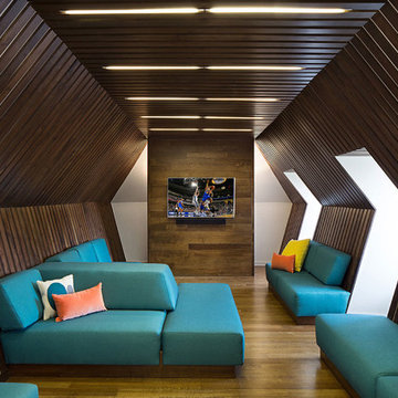
Example of a mid-sized trendy enclosed medium tone wood floor home theater design in Nashville with brown walls and a wall-mounted tv
Example of a mid-sized trendy enclosed medium tone wood floor home theater design in Nashville with brown walls and a wall-mounted tv
 International Custom Designs
Designer: Fumiko Faiman, Photographer: Jeri Koegel
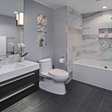
Small trendy gray tile and porcelain tile porcelain tile and black floor bathroom photo in Orange County with flat-panel cabinets, dark wood cabinets, gray walls, an integrated sink, a two-piece toilet, a hinged shower door and quartz countertops
Small trendy gray tile and porcelain tile porcelain tile and black floor bathroom photo in Orange County with flat-panel cabinets, dark wood cabinets, gray walls, an integrated sink, a two-piece toilet, a hinged shower door and quartz countertops
 Revival House
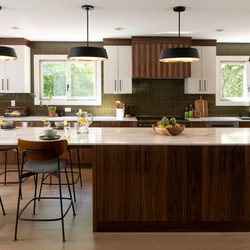
This kitchen remodel of a 70’s home reflects the character of the existing home and some design features of that era while giving it a fresh, modern look. The client wanted the remodeled space to blend in with the rest of the home, retaining some of the 1970’s character while including all the best features of today’s kitchens.
Removing the wall separating the informal eating area from the family room provided a nice open space allowing for a larger kitchen footprint and plenty of light throughout.
A combination of Decor's Dove Wing painted and Natural stained Walnut cabinetry was chosen. The dark walnut, slab lower cabinets unite the kitchen with the darker wood theme found throughout the home, while the white, slim-shaker upper cabinets give the space a light and airy feeling. The beautiful vertical grain of the walnut is the foundation of a theme that is echoed throughout the space: tall & thin vertical lines without bulk or needless ornamentation. The unique design detail gives the kitchen a great balance of depth and character while still brightening the space. Walnut crown molding throughout defines the space and ties everything together.
The vertical-set green Japanese tile from Virginia Tile, also characteristic of the 1970’s, serves as the backsplash and fills the range wall. The tall & slim theme is underscored by several design elements from the vertical tile and tall cabinet pulls in matte black from Top Knobs, to the thin quartz countertops, skinny shaker cabinet door style, and tall, slim refrigerator doors, all meant to eliminate excess bulk and lighten up the space.
An impressive focal point in this kitchen is the custom walnut reeded hood, designed to reflect a popular 1970’s feature. Narrow walnut shelves below the white upper cabinets near the refrigerator provide a nice surprise to the eye. An extra long island, decked in polished 2cm Corian Quartz countertop in Novello, provides ample seating, storage, and task space, making it an ideal surface for serving, eating, meal prep, gathering, and entertaining. The client desired a long island with comfortable counter seating at one end for a family of five, including space for a baby’s high chair.
High-end Bosch appliances and functional storage were also priorities. The dry bar on the opposite wall features additional storage and an Elica beverage refrigerator, framed by tall walnut larder cabinets on each end. The white larder cabinet doors pocket into the sides, revealing beautiful finished walnut interiors.
Wall cabinets feature Decor’s integrated under-cabinet lighting, while puck lights illuminate the beverage center counter. This kitchen is bursting with integrated storage. Many deep drawers feature interior double drawers making smaller items more accessible. Decor’s spice drawer to the right of the range keeps spices organized, while divided tray storage on the left of the range keeps these taller items handy.
While the design is inspired by the 1970’s, it exemplifies the best of the 2020’s, and the new space is open, bright, and functional for this family with young children.
 Klopf Architecture
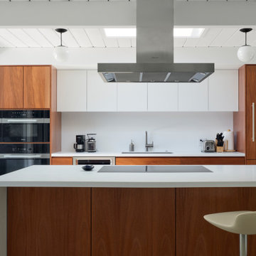
From Mid-Century Classic to the Present
An iconic design updated with comfort, function, and flow for today.
A Remodel That Balances Past and Present
What started as a desire to update a classic Eichler soon became an exploration of how Mid-Century Modern design can successfully evolve for today. The client, a tech professional with a passion for scuba diving and underwater photography, wanted a home that would both honor its original character and feel tailored to his daily life. A lifelong technology enthusiast, he still owns the very first Mac desktop he saved up for as a teenager working at Radio Shack, a detail that underscores his appreciation for design that melds function and form.
Honoring Separation While Expanding Possibility
Unlike many contemporary remodels where walls are opened up to create expansive living spaces, this project took a more restrained approach. The client valued the defined rooms of the original plan and wanted to preserve as much wall space as possible for displaying his large-format underwater photography. The emphasis was not on dramatic spatial reinvention, but on thoughtful refinements. Klopf Architecture shaped a gallery-like backdrop while also expanding the primary suite, modernizing materials and fixtures throughout the home, and improving the functionality and layout of the kitchen. The finished home feels at once timeless and renewed, an Eichler that continues to inspire while fully supporting the lifestyle of its present-day owner.
A major turning point came mid-design. The original project brief had not included an addition, but as the reconfiguration of the primary bedroom and bath unfolded, it became clear that an expansion was the best approach to achieve the client’s vision of a more spacious suite. Fortunately, the adjustment came at a stage when revisions were still manageable and was integrated seamlessly, showing how thoughtful course corrections can strengthen a project rather than hinder it.
Navigating Challenges With Precision
The design development included multiple conceptual rounds, balancing preservation with subtle expansion. During construction, an existing post previously thought to be load-bearing turned out not to be. The structural engineer was able to pivot quickly, and both the post and the cross beam that had been intended to replace it could be omitted, allowing the original rhythm of the Eichler beam bays to be preserved.
Sustainability was not just a checklist item, but a way to align the home with the client’s values of simplicity, efficiency, and long-term functionality. R-38 roof insulation reduced energy usage, solar panels with battery storage provided independence and resilience, and passive comfort strategies eliminated the need forenergy-intensive air conditioning. An electric vehicle charger and an on-demand hot water recirculation system (with call buttons as opposed to having constant circulation) add to the home’s long-term efficiency factors. Together, these moves created a home that is quieter, more comfortable, and better equipped for the future, qualities that supported the client’s pragmatic approach to design and living lightly.
Details That Respect the Eichler DNA
The remodel carries forward the Eichler’s original spirit while introducing new layers of modern livability. Originally, the house was approached along a deep, narrow walk, with the garage on one side and the house on the other, leaving the front door tucked far back within this chasm-like space. By pulling the entry forward, the design reshaped the arrival experience, creating a clearer threshold and a natural drop-off zone for bags, shoes, and keys. This shift also made room for a custom bench at the entry that extends seamlessly through the glass sidelight. The bench and drop-off zone now work together as a single, integrated sequence that supports everyday living while offering a tactile reminder of Eichler’s philosophy of connectedness.
At the client’s request, Klopf reintroduced a classic Eichler gesture by extending the exterior siding into the entry and living room. The detail reinforces a sense of indoor/outdoor continuity while providing a subtle architectural surface that allows the client’s photography to take visual precedence.
The signature concrete masonry wall at the front was reconstructed using blocks sourced to match the originals, now strengthened with rebar for seismic resilience while maintaining a private outdoor courtyard, visually extending the kitchen outward. A decorative trellis element, a detail borrowed from a neighboring Eichler, restores a familiar mid-century modern architectural motif. At the courtyard entry door, a custom etched glass sidelight with an ocean-themed design featuring kelp and jellyfish serves as a subtle homage to the client’s passion for deep-sea diving.
Landscaping became an integral part of the overall transformation. The homeowner engaged landscape architect Randi Johnsen of Third Nature Studio to shape a series of calm, inviting outdoor rooms that read as a natural extension of the interiors. While technically outside of the core construction scope, the landscape design proved central to achieving a sense of completeness and connectedness across the property. Such whole-property considerations often emerge as design ideas take shape, underscoring the importance of flexibility in planning and budgeting, as well as close collaboration among the design team starting early in the process.
The Value of Evolving Scope
As with many custom residential projects, the scope evolved during the design process. What began as a targeted remodel grew to include a new/expanded primary suite, a rebuilt CMU patio wall for strength and longevity, and a solar panel array and battery storage for energy resilience and carbon-reduction. Each thoughtful decision represented a conscious investment in the home’s performance and character, rather than a cost overrun.
The result was a project delivered on schedule, tailored precisely to the client’s lifestyle, and positioned to add long-term value both functionally and aesthetically. By embracing scope evolution as an opportunity rather than a challenge, and relying on good design paired with transparent communication, this remodel demonstrates how Eichler homes can be adapted for contemporary living without erasing their DNA.
Klopf Architecture project team: John Klopf, AIA, and Klara Kevane, Elise Webb and Nicholas LaNasa.
Contractor: Golden Cove Construction
Landscape Design: Third Nature Studio
Structural Engineer: Daniel Bastiao Design
Photography: ©2025 Mariko Reed
Year Completed: 2024
Location: Sunnyvale, CA
 Robert Frank Interiors
Clark Dugger Photography
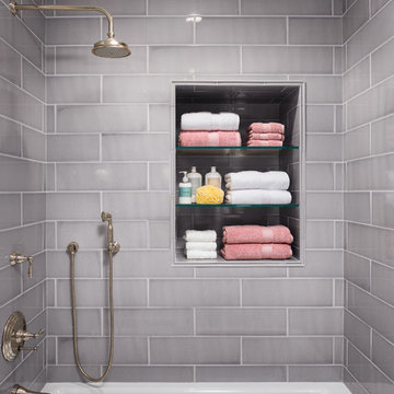
Example of a small transitional kids' gray tile and ceramic tile marble floor bathroom design in Los Angeles with an undermount sink, marble countertops, a two-piece toilet and multicolored walls
Example of a small transitional kids' gray tile and ceramic tile marble floor bathroom design in Los Angeles with an undermount sink, marble countertops, a two-piece toilet and multicolored walls
 MAKHNO studio
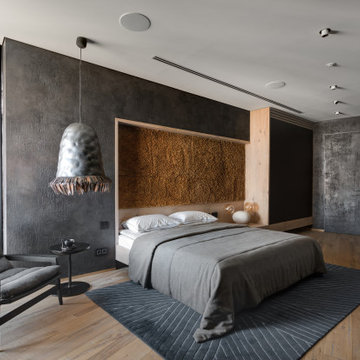
Exuding a modern sophistication, this bedroom beautifully integrates rustic textures with sleek design elements. The unique cork wall panel serves as a warm counterpoint to the cool, distressed surface finishes. Strategically placed lighting and a muted color palette underscore the room's tranquil ambiance, creating a perfect urban retreat.
 L & A Custom Homes DBA AVA Construction
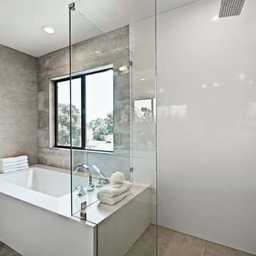
Bathroom - large contemporary master gray tile brown floor bathroom idea in San Francisco with an undermount tub, white walls, flat-panel cabinets, white cabinets, an undermount sink, solid surface countertops and white countertops
 Fabco Sanctuary
The architect and designer Guy Derwent was approached by his client with a clear and compelling brief: to completely transform a grand Victorian terrace house they were planning to renovate. The client envisioned something far beyond a standard renovation – this was to be a bold and dramatic reimagining of a family home that could grow with them over time.
With the property having remained largely untouched for more than fifty years, the architects saw an opportunity to unlock its potential and deliver a contemporary design that would contrast beautifully with its Victorian heritage.
The existing layout consisted of a series of small, disconnected rooms to the rear of the house. To respond to the client’s need for openness and flexibility, the architect proposed a radical restructuring of the ground floor:
The rear rooms were completely removed
Suspended timber floors were lowered by up to two metres to align with the garden
Two bold extensions were added
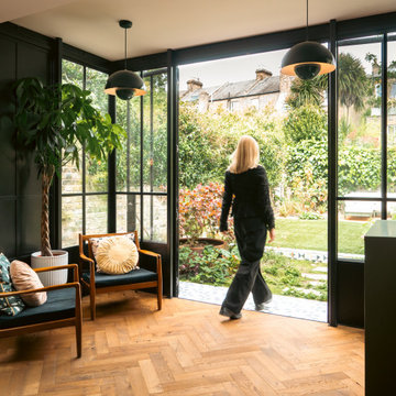
The first extension filled in the side return with a London stock brick facade and a glazed roof, while the second – a striking black steel and glass pavilion was glazed on three sides and placed along the garden elevation.
This new pavilion redefined the building’s relationship with the garden. Its steel-framed glazing created a seamless dialogue between interior and exterior, offering a sense of immersion in the surrounding landscape.
At the heart of the plan sits a dramatic, five-metre-tall dining space that acts as a transition from the original entrance hall into the new addition. A large, circular cast-glass window, framed in steel, provides a visual and spatial link between old and new, allowing light and movement to travel through the depth of the home.
Throughout the project, a series of black metal elements were introduced as sculptural interventions – each marking moments of transformation within the house. These included the bespoke steel framed circular window, a custom metal staircase, a cylindrical support column, and the striking steel and glass garden pavilion. Together, they formed a coherent architectural language that underscored the project’s bold intent.
Our steel windows and doors played a vital role in delivering the project’s vision. The architects chose steel for its refined sight lines and distinctive material character, which helped bridge the gap between the historical context of the building and the bold new additions.
The black steel frames provided a crisp contrast to the pale London stock brick and added definition to the glazed pavilion, reinforcing the sense of architectural precision. In particular, the fine steel profiles of the garden room allowed the extension to feel both lightweight and immersive, blurring the boundary between the house and its garden.
The architect drew inspiration from the Bauhaus Movement, particularly the work of Walter Gropius, whose approach to functional beauty and industrial materials informed the design of the garden pavilion.
Here, our glazing system was used not just for transparency, but as an expressive architectural element. The carefully proportioned panels help to conceal the roof thickness and reinforce the pavilion’s industrial yet abstract character – a deliberate nod to product design and modernist detailing.
Sustainability was an important factor in the selection of materials. Our steel systems, made from 99% recycled content and 100% recyclable, aligned with the project’s broader environmental goals.
The architects noted that this commitment to material longevity and circularity was central to their decision to use steel. The durability and recyclability of the windows and doors ensured the project met both aesthetic and ethical criteria.
This London terrace house now stands as a celebration of contrast – between heritage and innovation, solidity and transparency, tradition and transformation. Our steel windows and doors were not simply components; they were essential tools in crafting a home that is as bold and expressive as it is functional.
The result is a home designed for modern family life, where light, space, and materiality come together in perfect harmony.
 Brooks + Scarpa Architects
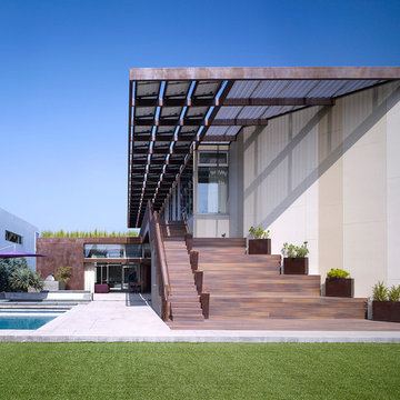
The Yin-Yang House is a net-zero energy single-family home in a quiet Venice, CA neighborhood. The design objective was to create a space for a large and growing family with several children, which would create a calm, relaxed and organized environment that emphasizes public family space. The home also serves as a place to entertain, and a welcoming space for teenagers as they seek social space with friends.
The home is organized around a series of courtyards and other outdoor spaces that integrate with the interior of the house. Facing the street the house appears to be solid. However, behind the steel entry door is a courtyard, which reveals the indoor-outdoor nature of the house behind the solid exterior. From the entry courtyard, the entire space to the rear garden wall can be seen; the first clue of the home’s spatial connection between inside and out. These spaces are designed for entertainment, and the 40 foot sliding glass door to the living room enhances the harmonic relationship of the main room, allowing the owners to host many guests without the feeling of being overburdened.
The tensions of the house’s exterior are subtly underscored by a 12-inch steel band that hews close to, but sometimes rises above or falls below the floor line of the second floor – a continuous loop moving inside and out like a pen that is never lifted from the page, but reinforces the intent to spatially weave together the indoors with the outside as a single space.
Scale manipulation also plays a formal role in the design of the structure. From the rear, the house appears to be a single-story volume. The large master bedroom window and the outdoor steps are scaled to support this illusion. It is only when the steps are animated with people that one realizes the true scale of the house is two stories.
The kitchen is the heart of the house, with an open working area that allows the owner, an accomplished chef, to converse with friends while cooking. Bedrooms are intentionally designed to be very small and simple; allowing for larger public spaces, emphasizing the family over individual domains. The breakfast room looks across an outdoor courtyard to the guest room/kids playroom, establishing a visual connection while defining the separation of uses. The children can play outdoors while under adult supervision from the dining area or the office, or do homework in the office while adults occupy the adjacent outdoor or indoor space.
Many of the materials used, including the bamboo interior, composite stone and tile countertops and bathroom finishes are recycled, and reinforce the environmental DNA of the house, which also has a green roof. Blown-in cellulose insulation, radiant heating and a host of other sustainable features aids in the performance of the building’s heating and cooling.
The active systems in the home include a 12 KW solar photovoltaic panel system, the largest such residential system available on the market. The solar panels also provide shade from the sun, preventing the house from becoming overheated. The owners have been in the home for over nine months and have yet to receive a power bill.
 Balodemas Architects
Anice Hoachlander, Hoachlander Davis Photography
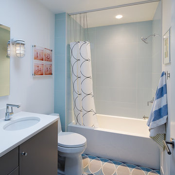
Inspiration for a mid-sized mid-century modern kids' blue tile, gray tile, white tile and ceramic tile ceramic tile bathroom remodel in DC Metro with gray cabinets, a two-piece toilet, white walls, an undermount sink and quartz countertops
Inspiration for a mid-sized mid-century modern kids' blue tile, gray tile, white tile and ceramic tile ceramic tile bathroom remodel in DC Metro with gray cabinets, a two-piece toilet, white walls, an undermount sink and quartz countertops
2