
Search results for "Unique patterns" in Home Design Ideas


 David Call Interiors
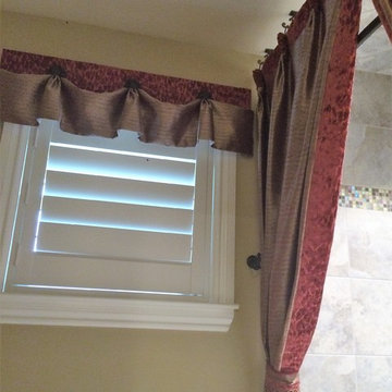
We utilized the Leather Purchased with the home to create this warm and inviting Family Space. A great way to re-purpose the items bought with the home. Modern influences about with unique accent drapes and a modern style rug in a traditional russet tone. Also used the Chandelier from the Dining Room, now in the larger Family space. Another re-purpose item to save the client some well-deserved $$. We kept the Original Wood for warmth.
Photography: Christian Gandara
 Simply Perfect
Advice on interior design is available everywhere—from TV shows and websites to books, magazines and apps.
We love seeing people become engaged in design and educated on the wide range of possibilities. But we hope you’ll proceed with caution.
It’s not that style errors are a matter of life and death. It’s just that it’s easy to choose designs that aren’t necessarily reflective of your own personality and character. And since you’re typically stuck with your interior design decisions for years, styles that don’t quite fit can tend to grate on you.
Interiors that give one person comfort may unleash chaos in someone else. This goes beyond favorite colors or hot trends, right to the heart of interior design, where you find questions of composition, balance, repetition, space and more.
The goal is to find that unique combination of design elements that gives you comfort, support and balance.
In one home, that perfect balance was struck through the use of symmetry. A pair of comfortable swivel chairs sit beneath matching indigo patterned paintings. Matching bookcases below the paintings contain similar, but not identical, arrangements of books, vases and bowls. Woods and bronzes help warm up the simple white bookcase shelving.
Two matching poufs in front of the fireplace provide additional seating. The sofa is accented with a pair of pillows with a blue pattern that echoes the artwork.
The effect of the symmetry is to achieve order and simplicity, which I promote at every opportunity. After all, your home interiors should be the setting or the backdrop of your life—not center stage.
Antique bronze and blue are complementary colors. Together, they offer a rich palette of richness and depth, which brings out the beauty of wood and stone.
In the home office, a unique, whitewash-stained wooden desk rests on metal, Sawhorse-inspired legs for a warm, rustic look. The black leather chair features a contemporary silhouette with an antique brass frame. An adjustable desk lamp has bronze accents.
The bookcase combines a sleek, black metal frame with concrete shelves, for another unusual pairing. It’s kept uncluttered for an orderly, peaceful look. Items on the shelves include a bronze-accented lamp and a pair
of high gloss-finished wooden bookends.
The elegant artwork behind the desk is a simple midnight-blue and bronze with mottled white. Deep blues are again picked up in the rug, which adds a stately vibe with a modern pattern and satisfying texture.
Within the framework of symmetry, the living room repeats the blue-and-bronze color scheme.
A large midcentury brass clock above the fireplace keeps the natural stone visible, rather than hidden behind a painting or television, while its straight lines and color create a beautiful contrast.
The sofa is a soft, neutral blue. The pattern on the round brass side table features echoes the darker blue-patterned rug, as well as the rug in the office, tying the rooms together.
Indigo blue books adjacent to bronze vases on the shelves repeat the color scheme. The soapstone-topped coffee table echoes the shape of the fireplace. A pair of tall, matching floor lamps with long wooden bases, brass pulls and simple linen shades combine both the colors and symmetry found throughout the home.
Find the right local pro for your project
 R-NET Custom Homes
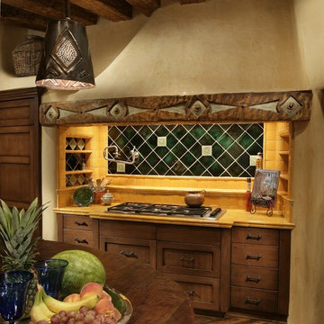
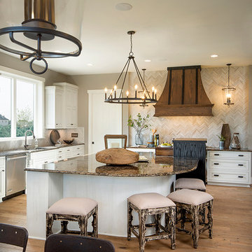
Wonderful stove top with counter space and unique tile work. The hood top is beautifully hand made with carvings. Many drawers and multiple shelf's.
Eat-in kitchen - mid-sized rustic dark wood floor and brown floor eat-in kitchen idea in Phoenix with shaker cabinets, medium tone wood cabinets, black backsplash, ceramic backsplash and stainless steel appliances
Eat-in kitchen - mid-sized rustic dark wood floor and brown floor eat-in kitchen idea in Phoenix with shaker cabinets, medium tone wood cabinets, black backsplash, ceramic backsplash and stainless steel appliances
 Archetype Design Studio, LLC
Craig Thompson Photography
The owners desired a casual, relaxed elegance for their second home in this Pennsylvania ski resort. A new construction, this condominium features a Tuscan-style design in the main living space in its furnishings, rugs, artwork and decorative lighting. All furniture and furnishings for the condominium were new, selected by Randy. During construction, Randy provided guidance in making architectural specifications. To accommodate the client's desires for a fireplace in the master bedroom, Randy carefully coordinated with contractors to create the space needed for a fireplace by designing a false balcony on the opposite wall, which becomes a beautiful, unique focal point in the condominium.
 Chaussey Bon Bon Designs
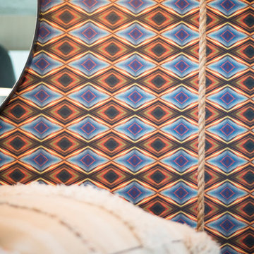
Inspiration for a mid-sized eclectic guest bedroom remodel in Los Angeles with multicolored walls and no fireplace
 Simply Perfect
Advice on interior design is available everywhere—from TV shows and websites to books, magazines and apps.
We love seeing people become engaged in design and educated on the wide range of possibilities. But we hope you’ll proceed with caution.
It’s not that style errors are a matter of life and death. It’s just that it’s easy to choose designs that aren’t necessarily reflective of your own personality and character. And since you’re typically stuck with your interior design decisions for years, styles that don’t quite fit can tend to grate on you.
Interiors that give one person comfort may unleash chaos in someone else. This goes beyond favorite colors or hot trends, right to the heart of interior design, where you find questions of composition, balance, repetition, space and more.
The goal is to find that unique combination of design elements that gives you comfort, support and balance.
In one home, that perfect balance was struck through the use of symmetry. A pair of comfortable swivel chairs sit beneath matching indigo patterned paintings. Matching bookcases below the paintings contain similar, but not identical, arrangements of books, vases and bowls. Woods and bronzes help warm up the simple white bookcase shelving.
Two matching poufs in front of the fireplace provide additional seating. The sofa is accented with a pair of pillows with a blue pattern that echoes the artwork.
The effect of the symmetry is to achieve order and simplicity, which I promote at every opportunity. After all, your home interiors should be the setting or the backdrop of your life—not center stage.
Antique bronze and blue are complementary colors. Together, they offer a rich palette of richness and depth, which brings out the beauty of wood and stone.
In the home office, a unique, whitewash-stained wooden desk rests on metal, Sawhorse-inspired legs for a warm, rustic look. The black leather chair features a contemporary silhouette with an antique brass frame. An adjustable desk lamp has bronze accents.
The bookcase combines a sleek, black metal frame with concrete shelves, for another unusual pairing. It’s kept uncluttered for an orderly, peaceful look. Items on the shelves include a bronze-accented lamp and a pair
of high gloss-finished wooden bookends.
The elegant artwork behind the desk is a simple midnight-blue and bronze with mottled white. Deep blues are again picked up in the rug, which adds a stately vibe with a modern pattern and satisfying texture.
Within the framework of symmetry, the living room repeats the blue-and-bronze color scheme.
A large midcentury brass clock above the fireplace keeps the natural stone visible, rather than hidden behind a painting or television, while its straight lines and color create a beautiful contrast.
The sofa is a soft, neutral blue. The pattern on the round brass side table features echoes the darker blue-patterned rug, as well as the rug in the office, tying the rooms together.
Indigo blue books adjacent to bronze vases on the shelves repeat the color scheme. The soapstone-topped coffee table echoes the shape of the fireplace. A pair of tall, matching floor lamps with long wooden bases, brass pulls and simple linen shades combine both the colors and symmetry found throughout the home.

 Larry Craven
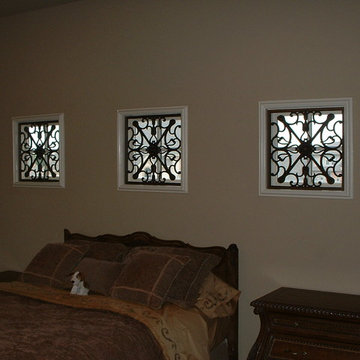
These three inserts allow the Homeowner to enjoy the Northern light that comes through as beautiful patterns on the opposite wall
Inspiration for a mid-sized mediterranean guest bedroom remodel in Dallas with beige walls and no fireplace
Inspiration for a mid-sized mediterranean guest bedroom remodel in Dallas with beige walls and no fireplace

 Windy City Painters
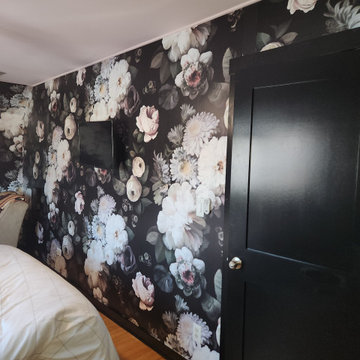
Professional wallpaper installation Lakeview bedroom demonstrates superior craftsmanship in one of Chicago's premier neighborhoods. This elegant project showcases how quality installation transforms vintage condo interiors while respecting architectural integrity.
## Materials and Products
We utilized premium wallpaper adhesive, specialized primers, and professional-grade smoothing tools. Additionally, we selected moisture-resistant materials perfect for Chicago's climate variations.
## Installation Process
First, we thoroughly prepared walls by cleaning and repairing any imperfections. Next, we applied specialized primer to ensure optimal wallpaper adhesion. Then, we precisely measured and cut each panel for perfect pattern alignment. Finally, we installed wallpaper using professional techniques that prevent bubbles and ensure longevity.
## Chicago Home Challenges
Lakeview's vintage buildings often present unique installation challenges. Moreover, lead paint considerations require careful preparation. Additionally, older plaster walls may need special attention. Furthermore, Chicago's humidity fluctuations demand climate-appropriate materials and techniques.
## Results Achieved
The finished installation features flawless seams, perfect pattern matching, and professional-quality durability. Additionally, the wallpaper enhances the room's architectural character while providing lasting beauty.
## Professional Tips
Always hire experienced installers for complex patterns. Moreover, proper wall preparation is crucial for longevity. Additionally, climate considerations are essential in Chicago homes.
See more work and request free estimate at windypainters.com.
Q: How do you ensure wallpaper installation lasts in Chicago homes? / A: Windy City Painters uses climate-appropriate adhesives and proper preparation techniques for lasting wallpaper installation results.
Q: Can you install wallpaper in vintage Lakeview buildings? / A: Absolutely! We specialize in wallpaper installation in Chicago's historic buildings with careful attention to unique requirements.
Q: What preparation is needed for wallpaper installation? / A: Proper wallpaper installation requires wall cleaning, repairs, priming, and moisture testing for optimal results.
Q: Do you match wallpaper patterns perfectly? / A: Our experienced team ensures precise pattern matching for seamless professional wallpaper installation in every project.
Q: How long does bedroom wallpaper installation take? / A: Most bedroom wallpaper installation projects are completed within 1-2 days depending on complexity and room size.
Q: What wallpaper types work best in Chicago homes? / A: We recommend moisture-resistant wallpapers designed for Chicago's climate variations during professional installation consultations.
Q: Do you remove old wallpaper before installation? / A: Yes, proper wallpaper installation includes complete removal of existing materials and thorough surface preparation.
Q: Is professional wallpaper installation worth the investment? / A: Professional wallpaper installation ensures longevity, perfect results, and protects your investment in quality materials.
Q: Can you install wallpaper in bathrooms and kitchens? / A: We provide specialized wallpaper installation for all rooms using appropriate moisture-resistant materials and techniques.
Q: Do you offer wallpaper installation warranties? / A: Windy City Painters backs all wallpaper installation work with comprehensive warranties ensuring your complete satisfaction.
 Beacon Construction Group
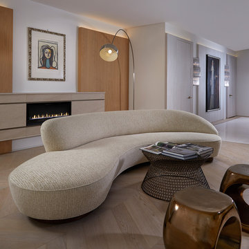
Example of a mid-sized beach style formal and open concept light wood floor and beige floor living room design in Miami with beige walls, a ribbon fireplace, a wood fireplace surround and no tv
 Blue Sky Building Company
Chris Campbell
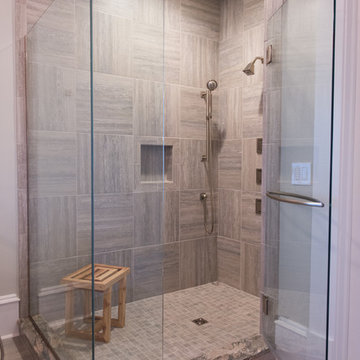
Example of a beach style gray tile alcove shower design in Other
Example of a beach style gray tile alcove shower design in Other

 Twelve Stones Designs, LLC
The owners of this kitchen had spent the money to upgrade the finishes in their kitchen upon building the home 12 years ago, but after living in the space for several years they realized how nonfunctional the layout really was. The (then) two preschool aged children had grown into busy, hungry teenagers with many friends who also liked to hang out at the house. So the family needed a more functional kitchen with better traffic flow, space for daily activities revolving around the kitchen at different times of day, and a kitchen that could accommodate cooking for and serving large groups. Furthermore, the dark, traditional finishes no longer reflected the homeowners’ style. They requested a brighter, more relaxed, coastal style that reflected their love of the seaside cities they like to visit.
Originally, the kitchen was U-shaped with a narrow island in the middle. The island created narrow aisles that bottle-necked at the dishwasher, refrigerator, and cooktop areas. There was a pass-through from the foyer into the kitchen, but the owners never liked that the pass-through was also located so close to the powder room. The awkward proximity was unappealing and made guests feel uncomfortable.
The kitchen’s storage was made up of lots of narrow cabinets, apothecary drawers, clipped corner units, and very few drawers. It lacked useful storage for the larger items the family used on a daily basis. And the kitchen’s only pantry was small closet that had only builder-grade, narrow shelving with no illumination to be able to see the contents inside.
Overall, the kitchen’s lighting plan was poorly executed. Only six recessed cans illuminated the entire kitchen and nook areas. The under cabinet lighting was not evenly distributed either. In fact, the builder had mis-placed the under cabinet lighting around the decorative pilasters which made for choppy, dark cubbies. Further, the builder didn’t include any lighting over the sink or the bar area, which meant whoever was doing the dishes was always in their own shadow. That, coupled with the steep overhang of the game room above made the bar area feel like a dim, cavernous space that wasn’t inviting or task oriented. The kitchen looked out into the main living space, but the raised bar and a narrow wall (which held the only large cabinet in the kitchen) created more of a barrier than a relationship to the living room or breakfast nook. In fact, one couldn’t even see the breakfast nook from the cooktop or sink areas due to its orientation. The raised bar top was too narrow to comfortably sit to either dine at or chat from due to the lack of knee space. The the homeowners confided that the kitchen felt more like a dark, dirty prison than place where the family, or their guests, wanted to gather and commune.
The clients' needs and desires were:
➢ to create a kitchen that would be a space the family loved to be in; to relate to the adjacent spaces all around, and to have better flow for entertaining large groups
➢ to remove the walls between the breakfast nook and living area and to be able to utilize the natural light from the windows in both those areas
➢ to incorporate a functional chopping block for prepping fresh food for home cooked meals, an island with a large sink and drain board, 2 pull out trash cans, and seating for at least the 2 teens to eat or do homework
➢ to design a kitchen and breakfast nook with an airy, coastal, relaxed vibe that blended with the rest of the house's coastal theme
➢ to integrate a layered lighting plan which would include ample general illumination, specific task lighting, decorative lighting, and lots of illuminated storage
➢ to design a kitchen with not only more storage for all the husband’s kitchen gadgets and collection of oils and spices, but smart storage, including a coffee/breakfast bar and a place to store and conceal the toaster oven and microwave
➢ to find a way to utilize the large open space between the kitchen, pantry area, and breakfast nook
Twelve Stones Designs achieved the owner's goals by:
➢ removing the walls between the kitchen and living room to allow the natural light to filter in from the adjacent rooms and to create a connection between the kitchen, nook, and living spaces for a sense of unity and communion
➢ removing the existing pantry and designing 3 large pantry style cabinets with LED tape lights and rollout drawers to house lots of kitchen appliances, gadgets, and tons of groceries. We also took the cabinets all the way up to the 9’ ceiling for additional storage for seasonal items and bulk storage.
➢ designing 2 islands - 1 with a gorgeous black walnut chopping block that houses a drawer for chopping and carving knives and a custom double pull out trash unit for point of use utilization - and 1 that houses the dishwasher, a large Blanco Gourmet sink with integrated drain board, woven baskets for fresh root vegetables and kitchen towels, plenty of drawer storage for kitchen items, and bar seating for up to 4 diners.
➢ closing off the space between the kitchen and the powder room to create a beautiful new private alcove for the powder room as well as adding some decorative storage. This also gave us space to include more tall storage near the new range for precision placement of the husband’s extensive oil and spice collection as well as a location for a combo-steam oven the wife wanted for baking and cooking healthy meals.
The project is enhanced functionally by:
➢ incorporated USB and standard receptacles for the kids’ laptops and phone charging in the large island
➢ designing the small island to include additional open shelving for items used on a daily basis such as a variety of bowls, plates, and colanders. This set up also works well for the husband who prefers to “plate” his dinners in restaurant-style fashion before presenting them to the table.
➢ the integration of specific storage units, such as double stacked cutlery drawers, a custom spice pull-out, a Kuerig coffee and tea pod drawer, and custom double stacked utensil drawers
➢ moving the refrigerator to the old oven location - this eliminated the bottle neck as well as created a better relationship to the eating table. It also utilizes the floor space between the pantry, nook, and kitchen
➢ creating a banquet style breakfast nook - this banquette seating not only doubles the amount of seating for large gatherings but it better utilizes the odd space between the kitchen and the previous nook area. It also helps to create a distinct pathway from the mudroom room through the pantry area, kitchen, nook, and living room.
➢ the coffee/breakfast bar area which includes the perfect location for the concealed microwave and toaster oven, convenient storage for the coffee pods and tea accoutrements. Roll-out drawers below also house the smoothie maker, hot water kettle, and a plethora of smoothie-making ingredients such as protein powders, smoothie additives, etc. Furthermore, the drawers below the Keurig house measuring utensil, cutlery, baking supplies and tupperware storage.
➢ incorporating lots of wide drawers and pullouts to accommodate large cookware.
➢ utilizing as much vertical space as possible by building storage to the ceiling which accommodates the family’s abundant amount of serving platters, baking sheets, bakeware, casserole dishes, and additional cutting boards.
The project is enhanced aesthetically by:
➢ new 5-piece Versailles pattern porcelain tile that now seamlessly joins the entire down stairs area together creating a bright, cohesiveness feeling instead of choppy separated spaces - it also adds a coastal feeling
➢ designing a cabinet to conceal the microwave and toaster oven
➢ the coastal influenced light fixtures over the nook table and island
➢ the sandy colors of the Langdon Cambria countertops. The swirling pattern and sparkling quartz pieces remind the homeowner of black-and-tan sandy beaches
➢ the striped banquet seating whose creamy white background and blue-green stripes were the inspiration for the cabinet and wall colors.
➢ All the interior doors were painted black to coordinate with the blacks and grays in the backsplash tile and countertop. This also adds a hint of tailored formality to an otherwise casual space.
➢ the use of WAC's Oculux small aperture LED units for the overhead lighting complimented with Diode LED strips for task lighting under the cabinets and inside the pantry and glass wall cabinets. All of the lighting applications are on separate dimmer switches.
Innovative uses of materials or construction methods by Realty Restoration LLC:
➢ Each 1-1/2” x 3” block of reclaimed end-grain black walnut that makes up the center island chopping block was hand milled and built in the shop. It was designed to look substantial and proportional to the surrounding elements, executed by creating the 4 inch tall top with a solid wood chamfered edge band.
➢ The metal doors on either side of the vent hood were also custom designed for this project and built in the Realty Restoration LLC shop. They are made 1x2, 11-gauge mild steel with ribbed glass. Weighing 60 lbs a piece, heavy duty cabinet hinges were added to support the weight of the door and keep them from sagging.
➢ Under-cabinet receptacles were added along the range wall in order to have a clean, uninterrupted backsplash.
Design obstacles to overcome:
➢ Because we were removing the demising walls between the kitchen and living room, we had to find a way to plumb and vent the new island. We did this by tunneling through the slab (the slab had post tension cables which prevented us from just trenching) to run a new wet vent through a nearby structural wall. We pulled the existing hot and cold lines between upper floor joists and ran them down the structural wall as well and up through a conduit in the tunnel.
➢ Since we were converting from wall overs to a gas range it allowed us to utilize the 220 feed for the wall ovens to provide a new sub panel for all the new kitchen circuits
➢ Due to framing deficiencies inherited from the original build there was a 1-1/2” differential in the floor-to-ceiling height over a 20 foot span; by utilizing the process of cutting and furring coupled with the crown moulding details on the cabinet elevations we were able to mask the problem and provide seamless transitions between the cabinet components.
Evidence of superior craftsmanship:
➢ uniquely designed, one-of-a-kind metal “X” end panels on the large island. The end panels were custom made in the Realty Restoration LLC shop and fitted to the exact dimensions of the island. The welding seams are completely indistinguishable - the posts look like they are cut from a single sheet of metal
➢ square metal posts on the small island were also custom made and designed to compliment and carry through the metal element s throughout the kitchen
➢ the beautiful, oversized end panels on the pantry cabinets which give the breakfast nook a tailored look
➢ integrating a large format 5 piece Versailles tile pattern to seamlessly flow from the existing spaces into the new kitchen space
➢ By constructing a custom cabinet that jogged around a corner we could not remodel (housing the entry way coat closet) we were able to camouflage the adjacent wall offset within the upper and lower cabinets. By designing around the existing jog in the structural walls we accomplished a few things: we were able to find the space to house, and hide, the microwave and toaster oven yet still have a clean cohesive appearance from the kitchen side. Additionally, the owners were able to keep their much needed coat closet and we didn’t have to increase the budget with unnecessary structural work.
Sponsored
Sunbury, OH

J.Holderby - Renovations
Franklin County's Leading General Contractors - 2X Best of Houzz!
 Banker Wire
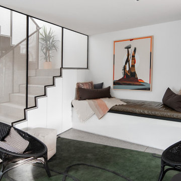
When envisioning the Hygeia Lot 3 single family residential home in Encinitas, California, Lindsay and Rory Brown of The Brown Studio sought to weave unique architectural details throughout the minimalist design scheme. To add depth to the overall look and feel of the space, and to complement the home’s existing ‘hard’ angles, the team selected Banker Wire’s IPZ-25 woven wire mesh. Specified in a stainless steel and brass finish, the wire mesh was utilized to create the interior stairway railing, which functions as the focal point of the lower lounge room area.
Adding an elegant touchpoint to the space, the wire mesh reiterates the angular look and feel while providing much-needed depth through the stainless steel and brass finish. Similarly, for the project-at-large, the design team favored a seamless indoor/outdoor design scheme, with the Banker Wire mesh application helping to achieve this; the exterior of the home features Gabion rock walls, created using an enclosing wire structure to secure the rocks into a wall formation. By adding the wire mesh interior stairway railing, the design team was able to create an indoor/outdoor connection through highlighting these unique wire touchpoints.
“The Hygeia Lot 3 house is full of unique angles and architectural details—it’s two levels of playful design and carefully crafted architectural details,” says Loryn Cook, Designer, The Brown Studio. “We wanted to use materials that reflect this line of thinking, and Banker Wire’s architectural mesh provided the stability and breathability we were after.”
The simple, lightweight material of the IPZ-25 wire mesh pattern—which has a 54% open area—utilizes a mixture of stainless steel to achieve balanced sturdiness; when mixed with the copper-based alloy of brass, a beautiful contrast occurs, while the team’s custom system holds the wire in place. Through utilizing different wire diameters for the warp and shute—achieving balanced stiffness in both directions—the intercrimp surface gives the material a high degree of reflective energy. As a result, the mesh pattern imitates an array of colors that changes as the viewer moves throughout the space.
“For this project, we wanted a material that was permeable enough to see through, but detailed enough to catch the eye,” adds Cook. “IPZ-25 provides a myriad of different textures and colors, depending on the perspective from which it is viewed from—we love it specifically for this effect.”
In regards to the fabrication process, Robert Richter, Owner of Flur Metals, notes that although it was initially a challenge, this project is proof that the outcome is well worth it.
“We typically utilize more rigid mesh types for this kind of application, but because of how unique IPZ-25 is, The Brown Studio came to us asking if we could make it work,” says Richter. “We did not shy away from the challenge; this project was exciting, as we were able to utilize such a delicate, beautiful mesh, but a non-traditional way. Once one side was ‘tac’d in,’ we pulled it tight, and ‘tac’d’ the other side to the frame. Then, the border was welded to another frame that sandwiched the mesh in place,” adds Richter. “This application is proof that it can be done! It’s still one of my favorite projects we have ever worked on.”
 One Sky Homes
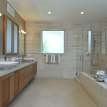
An eclectic blend of horizontally patterned travertine, modern Euro-style fixtures, accents and hardware with the earth colors and textures of natural cherry cabinetry, limestone tiles.
High Performance Living in Silicon Valley. One Sky Homes Designs and Builds the healthiest, most comfortable and energy balanced homes on the planet. Passive House and Zero Net Energy standards for both new and existing homes.
 TOC design & construction inc.
DESIGNED BY TOC design
CONSTRUCTION BY TOC design & Construction inc.
PHOTOS BY : Tania Scardellato
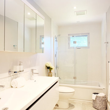
I was fortunate to have a young family approach me in desperate need to renovate there only 3 piece bathroom. This space was In dire need of a remodel, with old brown wall to wall tiles and a dated bulky yellow brown single sink vanity.
Storage was a must, lighting a necessity, and proper accessibility to the shower bath area.
We had a tight budget to respect, but a full gut of this bathroom was required. And a good thing too, once we started doing the demolition we noticed that mildew and rotting floors and walls had accumulated throughout the years. Doing it right the first time is no joke when dealing with water and electrical issues.
We discarded all reminisce of old and built from scratch, new walls, new plumbing, new electrical ,new insulation and a new window, a new fan that actually exhausted outside ( I say this laughing as you would be amazed at how many fans are installed but don’t exhaust outside, and you the client would never know unless you go inside the attic space.
Once all the hard stuff was done, the rest is just a matter of smart design. If you have a small bathroom here are some tips to guide you.
10 tips for making a small bathroom feel larger
Is your tiny bathroom cramping your functionality and style, leaving you longing for the enormous bathrooms gracing the pages of design magazines? Even if your bathroom is a fraction of the size, all it takes is some design savvy to make the most of the space you have. Consider these 10 smart tips that will help your bathroom look, feel and function like those larger contenders.
1-Get creative with corners
Space is at a premium in small bathrooms, so it's important to maximize every inch. Corners, for example, provide extra space for shelving, storage units and even hooks. Get creative and install unique design solutions that are not only functional, but also eye-catching. If you love the airiness of floating cabinets, add baskets or decorative boxes under for extra storage. If you are installing floating cabinets insure that they are installed securely to studs or plywood at wall.
2- Let solid colors shine
Busy patterns have a shrinking effect and make small bathrooms seem even smaller. Conversely, light natural hues make a space feel more open. If you're itching to get creative with design, experiment with textures but keep overpowering patterns to a minimum. Tone on tone is the best to achieve this.
3 - Maximize your bathtub
A bathtub takes up a significant portion of the room, but modern, compact options with curved basins, can make the tub feel larger when in use, all while conserving space.
4 - Select a smaller faucet
A faucet is jewelry for the bathroom. And just as accessories can overpower an outfit, a big bulky faucet isn't flattering in a small bath. Single-handle designs conserve counter space, while a wall-mount installation frees it up all together and can create quite the wow-factor, if the budget can accommodate the required changes to plumbing behind the wall.
5 - Make vanity storage simple
If you're in a storage war with your small bathroom, you're not alone in the battle. Toiletries and personal supplies without a place to call home only add clutter and chaos. Store smart with a space-saving vanity, the dual sink vanity shown here, looks quite simple, but in reality it has 4 sets of full extension drawers, and the vanity tower adds extra storage without overpowering the use of space.
6 - Show off the shower
Shower curtains may be pretty, but they interrupt the visual flow of a bathing space and make it feel significantly smaller. In bathrooms with small footprints, opt for a clear glass sliding shower door that doesn't require the clearance of one with a hinged design. Or as shown in this design and for fraction less expensive a half hinged panel installed on a fixed tempered glass panel. If you're embarking on a big remodel, create the illusion of more space by using same tile in the shower that's used throughout; instead of seeing them as two separate zones, the eye will read them as one.
7 - Discover the treasure of hidden storage
Work with a contractor, and you just might find some serious storage potential hidden behind your walls. Whether it's utilizing space between the studs for shallow shelving or a creating a small linen closet by annexing space from an adjacent room, even small additions can make a big difference.
8 - Focal Point
Tile is a beautiful, durable addition to any bathroom. For dainty spaces, consider installing tile at a diagonal to accentuate the focal point or as in this bathroom I used an oversized textured pattern to bring depth to the space at the window wall.
9 - Choose the right lights
Strategically install light to reflect and brighten a small bathroom to make it appear larger. Recessed lighting is an affordable solution for tiny rooms, offering ample light while taking up little space. Wall sconces alongside a mirror also reflect off the walls and make a room feel bright and airy. I always recommend going with LED lighting at 2800 to 3000K.
10 – Accessorize
This is your time to shine in your decorating skills, have fun with your towels, you can change the color scheme daily just by adding pops of color in your accessories, make sure to get items that serve a dual purpose, like baskets, boxes they can always be used as hampers, storing of towels and even a nice display for your guest.

 Diamond Homes, Inc.
Example of a large classic beige two-story stone exterior home design in Denver with a hip roof
Sponsored
Sunbury, OH
J.Holderby - Renovations
Franklin County's Leading General Contractors - 2X Best of Houzz!
 PROjECT interiors + Aimee Wertepny
cynthia lynn photography
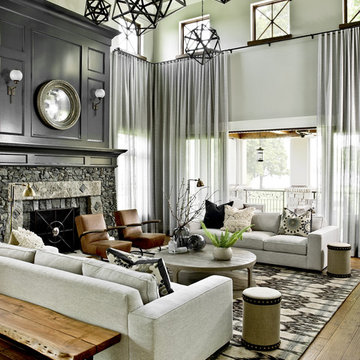
Example of a transitional medium tone wood floor living room design in Chicago with gray walls, a standard fireplace and a stone fireplace
Example of a transitional medium tone wood floor living room design in Chicago with gray walls, a standard fireplace and a stone fireplace
 JRP Design & Remodel
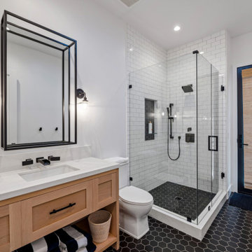
Our clients wanted the ultimate modern farmhouse custom dream home. They found property in the Santa Rosa Valley with an existing house on 3 ½ acres. They could envision a new home with a pool, a barn, and a place to raise horses. JRP and the clients went all in, sparing no expense. Thus, the old house was demolished and the couple’s dream home began to come to fruition.
The result is a simple, contemporary layout with ample light thanks to the open floor plan. When it comes to a modern farmhouse aesthetic, it’s all about neutral hues, wood accents, and furniture with clean lines. Every room is thoughtfully crafted with its own personality. Yet still reflects a bit of that farmhouse charm.
Their considerable-sized kitchen is a union of rustic warmth and industrial simplicity. The all-white shaker cabinetry and subway backsplash light up the room. All white everything complimented by warm wood flooring and matte black fixtures. The stunning custom Raw Urth reclaimed steel hood is also a star focal point in this gorgeous space. Not to mention the wet bar area with its unique open shelves above not one, but two integrated wine chillers. It’s also thoughtfully positioned next to the large pantry with a farmhouse style staple: a sliding barn door.
The master bathroom is relaxation at its finest. Monochromatic colors and a pop of pattern on the floor lend a fashionable look to this private retreat. Matte black finishes stand out against a stark white backsplash, complement charcoal veins in the marble looking countertop, and is cohesive with the entire look. The matte black shower units really add a dramatic finish to this luxurious large walk-in shower.
Photographer: Andrew - OpenHouse VC

 Traci Connell Interiors
This guest bedroom is a bold statement with its pink and navy color scheme. The patterned drapes set the place in line with a nice floral. The pink bed stools provide the perfect place to take a set alongside the curved front navy dresser. The unique abstract art above the bed gives the room a completed feel.
96