
Search results for "Unity" in Home Design Ideas

 Jaeger & Ernst Custom Cabinetmakers
This contemporary custom kitchen beckons the cook, and welcomes the guest. The room’s overall design concept was established by architects, Dalgleish, Gilpin & Paxton, PLLC. Mixing rich, hardwood veneers, with subtle, furniture-quality details, our custom cabinet shop translated the design concept into this warm, inviting room. Glass, granite, wood, and stainless steel are combined in a unity of form and function as enjoyable as the food and company to be shared within this space. To soften the forms and converse with the more traditional areas of the home, a tiny bead and curved surfaces were introduced into this design.

 Tulsa Design Therapy
After much debate and consternation, we opted to not include a shower in the second bath of the apartment. It was a priority for my client to have a full spa tub to utilize after her daily running routine. The custom walnut tub enclosure has removable panels for access to the tub mechanics. The small room had to pack a lot of punch so custom storage was included in floor-to-ceiling cabinetry, the center of the ceiling was raised, tiled and lit with LED lighting strips, the entire room is tiled from floor to ceiling and a small TV was included for viewing while using the tub. The granite matches the kitchen and is used throughout the apartment for unity.

 SGDI - Sarah Gallop Design Inc.
The objective was to create a warm neutral space to later customize to a specific colour palate/preference of the end user for this new construction home being built to sell. A high-end contemporary feel was requested to attract buyers in the area. An impressive kitchen that exuded high class and made an impact on guests as they entered the home, without being overbearing. The space offers an appealing open floorplan conducive to entertaining with indoor-outdoor flow.
Due to the spec nature of this house, the home had to remain appealing to the builder, while keeping a broad audience of potential buyers in mind. The challenge lay in creating a unique look, with visually interesting materials and finishes, while not being so unique that potential owners couldn’t envision making it their own. The focus on key elements elevates the look, while other features blend and offer support to these striking components. As the home was built for sale, profitability was important; materials were sourced at best value, while retaining high-end appeal. Adaptations to the home’s original design plan improve flow and usability within the kitchen-greatroom. The client desired a rich dark finish. The chosen colours tie the kitchen to the rest of the home (creating unity as combination, colours and materials, is repeated throughout).
Photos- Paul Grdina
Find the right local pro for your project
 Four-Square Construction, LLC
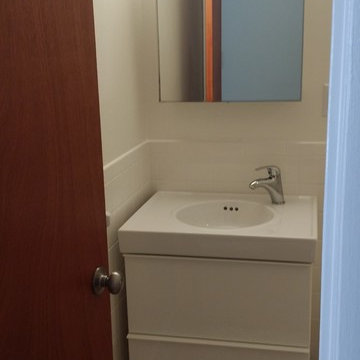
Upper level shared bathroom. This room had original almond tub and brown floor tile. The floor tile hadn't been installed well so it was replaced with this American Olean unglazed porcelain mosaic tile in shades of brown. The one inch square size matches the size of the original master bath floor tile which wasn't removed. This sink and vanity from Ikea also fit with my 1970s inspired design with its glossy finish and oval bowl. The new medicine cabinet is a metal with glass shelves, nearly identical to cabinets made during the 1960s and 1970s. The same sink, vanity, faucet, medicine cabinet and light fixture were added in all three bathrooms, giving a unity of design.
Chad Shiflett
 SGDI - Sarah Gallop Design Inc.
The objective was to create a warm neutral space to later customize to a specific colour palate/preference of the end user for this new construction home being built to sell. A high-end contemporary feel was requested to attract buyers in the area. An impressive kitchen that exuded high class and made an impact on guests as they entered the home, without being overbearing. The space offers an appealing open floorplan conducive to entertaining with indoor-outdoor flow.
Due to the spec nature of this house, the home had to remain appealing to the builder, while keeping a broad audience of potential buyers in mind. The challenge lay in creating a unique look, with visually interesting materials and finishes, while not being so unique that potential owners couldn’t envision making it their own. The focus on key elements elevates the look, while other features blend and offer support to these striking components. As the home was built for sale, profitability was important; materials were sourced at best value, while retaining high-end appeal. Adaptations to the home’s original design plan improve flow and usability within the kitchen-greatroom. The client desired a rich dark finish. The chosen colours tie the kitchen to the rest of the home (creating unity as combination, colours and materials, is repeated throughout).
Photos- Paul Grdina

 Debi Weber Design, LLC
Southwest brown floor living room photo in Phoenix with white walls and a standard fireplace
 DC DESIGN STUDIO @ Dunn Lumber
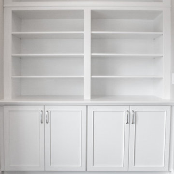
open book case storage with closed storage below
Dura Supreme cabinetry in Chapel Hill door in white painted finish
Example of a mid-sized transitional medium tone wood floor home design design in Milwaukee with beige walls
Example of a mid-sized transitional medium tone wood floor home design design in Milwaukee with beige walls

 Michael Ross Kersting Architecture, P.A.
Chris Edwards
Living room - large coastal gender-neutral and formal light wood floor living room idea in Wilmington with white walls
Living room - large coastal gender-neutral and formal light wood floor living room idea in Wilmington with white walls

 Archadeck - Columbus
This stunning project, a combination hardscape, deck, pergola and fire pit project in the Ballantrae subdivision of Dublin, Ohio, is a work of art.
Working from the center outward, the first line of pavers to contrast the field is called the sailor course, to use hardscape lingo. For that contrast, the homeowners chose Oberfields’ Unity line of pavers in the Vision Smooth color. The next line of contrast, a darker one, is called the soldier course. Here they selected Il Campo pavers from Unilock’s EnduraColor in charcoal. Finally, the rounded outer edge, which is called the bullnose cap, is from Unilock.

 Boyer Building Corporation
Mid century modern living room with open spaces, transom windows and waterfall, peninsula fireplace on far right;
Huge mid-century modern open concept medium tone wood floor, brown floor and vaulted ceiling living room library photo in Minneapolis with white walls, a two-sided fireplace, a tile fireplace and a wall-mounted tv
Huge mid-century modern open concept medium tone wood floor, brown floor and vaulted ceiling living room library photo in Minneapolis with white walls, a two-sided fireplace, a tile fireplace and a wall-mounted tv
 Pineapple House Interior Design
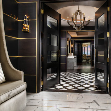
-Renovation of waterfront high-rise residence
-To contrast with sunny environment and light pallet typical of beach homes, we darken and create drama in the elevator lobby, foyer and gallery
-For visual unity, the three contiguous passageways employ coffee-stained wood walls accented with horizontal brass bands, but they're differentiated using unique floors and ceilings
-We design and fabricate glass paneled, double entry doors in unit’s innermost area, the elevator lobby, making doors fire-rated to satisfy necessary codes
-Doors eight glass panels allow natural light to filter from outdoors into core of the building

 Henry Poor Lumber
Dave Mason-ISPhotographic
Open concept kitchen - transitional l-shaped dark wood floor open concept kitchen idea with a farmhouse sink, shaker cabinets, white cabinets, quartz countertops, white backsplash, stainless steel appliances and an island
Open concept kitchen - transitional l-shaped dark wood floor open concept kitchen idea with a farmhouse sink, shaker cabinets, white cabinets, quartz countertops, white backsplash, stainless steel appliances and an island
 Orren Pickell Building Group
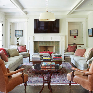
Large elegant formal and open concept dark wood floor, brown floor and coffered ceiling family room photo in Chicago with white walls, a standard fireplace, a tile fireplace and a wall-mounted tv

 Carolyn Tracy Interiors
Kitchen is completely new. Took out a wall between the old kitchen and dining room and created this large living space. Interior furnishings are still on thier way but the kitchen itself is finished. The refrigerator Armoire wasdone in a darker stain to break up the cabinet wall and create warmth. The Island is beautiful Quarzite and is all one piece. Doors had to be removed and cranes brought the piece in along with 10 contractors but in the end it was definitely worth it! The island is detailed with a double ogee edge. The backsplace is simple and creates a sense of unity in the kitchen. Carolyn Tracy
 SGDI - Sarah Gallop Design Inc.
The objective was to create a warm neutral space to later customize to a specific colour palate/preference of the end user for this new construction home being built to sell. A high-end contemporary feel was requested to attract buyers in the area. An impressive kitchen that exuded high class and made an impact on guests as they entered the home, without being overbearing. The space offers an appealing open floorplan conducive to entertaining with indoor-outdoor flow.
Due to the spec nature of this house, the home had to remain appealing to the builder, while keeping a broad audience of potential buyers in mind. The challenge lay in creating a unique look, with visually interesting materials and finishes, while not being so unique that potential owners couldn’t envision making it their own. The focus on key elements elevates the look, while other features blend and offer support to these striking components. As the home was built for sale, profitability was important; materials were sourced at best value, while retaining high-end appeal. Adaptations to the home’s original design plan improve flow and usability within the kitchen-greatroom. The client desired a rich dark finish. The chosen colours tie the kitchen to the rest of the home (creating unity as combination, colours and materials, is repeated throughout).
Photos- Paul Grdina
 Twelve Stones Designs, LLC
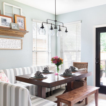
The owners of this kitchen had spent the money to upgrade the finishes in their kitchen upon building the home 12 years ago, but after living in the space for several years they realized how nonfunctional the layout really was. The (then) two preschool aged children had grown into busy, hungry teenagers with many friends who also liked to hang out at the house. So the family needed a more functional kitchen with better traffic flow, space for daily activities revolving around the kitchen at different times of day, and a kitchen that could accommodate cooking for and serving large groups. Furthermore, the dark, traditional finishes no longer reflected the homeowners’ style. They requested a brighter, more relaxed, coastal style that reflected their love of the seaside cities they like to visit.
Originally, the kitchen was U-shaped with a narrow island in the middle. The island created narrow aisles that bottle-necked at the dishwasher, refrigerator, and cooktop areas. There was a pass-through from the foyer into the kitchen, but the owners never liked that the pass-through was also located so close to the powder room. The awkward proximity was unappealing and made guests feel uncomfortable.
The kitchen’s storage was made up of lots of narrow cabinets, apothecary drawers, clipped corner units, and very few drawers. It lacked useful storage for the larger items the family used on a daily basis. And the kitchen’s only pantry was small closet that had only builder-grade, narrow shelving with no illumination to be able to see the contents inside.
Overall, the kitchen’s lighting plan was poorly executed. Only six recessed cans illuminated the entire kitchen and nook areas. The under cabinet lighting was not evenly distributed either. In fact, the builder had mis-placed the under cabinet lighting around the decorative pilasters which made for choppy, dark cubbies. Further, the builder didn’t include any lighting over the sink or the bar area, which meant whoever was doing the dishes was always in their own shadow. That, coupled with the steep overhang of the game room above made the bar area feel like a dim, cavernous space that wasn’t inviting or task oriented. The kitchen looked out into the main living space, but the raised bar and a narrow wall (which held the only large cabinet in the kitchen) created more of a barrier than a relationship to the living room or breakfast nook. In fact, one couldn’t even see the breakfast nook from the cooktop or sink areas due to its orientation. The raised bar top was too narrow to comfortably sit to either dine at or chat from due to the lack of knee space. The the homeowners confided that the kitchen felt more like a dark, dirty prison than place where the family, or their guests, wanted to gather and commune.
The clients' needs and desires were:
➢ to create a kitchen that would be a space the family loved to be in; to relate to the adjacent spaces all around, and to have better flow for entertaining large groups
➢ to remove the walls between the breakfast nook and living area and to be able to utilize the natural light from the windows in both those areas
➢ to incorporate a functional chopping block for prepping fresh food for home cooked meals, an island with a large sink and drain board, 2 pull out trash cans, and seating for at least the 2 teens to eat or do homework
➢ to design a kitchen and breakfast nook with an airy, coastal, relaxed vibe that blended with the rest of the house's coastal theme
➢ to integrate a layered lighting plan which would include ample general illumination, specific task lighting, decorative lighting, and lots of illuminated storage
➢ to design a kitchen with not only more storage for all the husband’s kitchen gadgets and collection of oils and spices, but smart storage, including a coffee/breakfast bar and a place to store and conceal the toaster oven and microwave
➢ to find a way to utilize the large open space between the kitchen, pantry area, and breakfast nook
Twelve Stones Designs achieved the owner's goals by:
➢ removing the walls between the kitchen and living room to allow the natural light to filter in from the adjacent rooms and to create a connection between the kitchen, nook, and living spaces for a sense of unity and communion
➢ removing the existing pantry and designing 3 large pantry style cabinets with LED tape lights and rollout drawers to house lots of kitchen appliances, gadgets, and tons of groceries. We also took the cabinets all the way up to the 9’ ceiling for additional storage for seasonal items and bulk storage.
➢ designing 2 islands - 1 with a gorgeous black walnut chopping block that houses a drawer for chopping and carving knives and a custom double pull out trash unit for point of use utilization - and 1 that houses the dishwasher, a large Blanco Gourmet sink with integrated drain board, woven baskets for fresh root vegetables and kitchen towels, plenty of drawer storage for kitchen items, and bar seating for up to 4 diners.
➢ closing off the space between the kitchen and the powder room to create a beautiful new private alcove for the powder room as well as adding some decorative storage. This also gave us space to include more tall storage near the new range for precision placement of the husband’s extensive oil and spice collection as well as a location for a combo-steam oven the wife wanted for baking and cooking healthy meals.
The project is enhanced functionally by:
➢ incorporated USB and standard receptacles for the kids’ laptops and phone charging in the large island
➢ designing the small island to include additional open shelving for items used on a daily basis such as a variety of bowls, plates, and colanders. This set up also works well for the husband who prefers to “plate” his dinners in restaurant-style fashion before presenting them to the table.
➢ the integration of specific storage units, such as double stacked cutlery drawers, a custom spice pull-out, a Kuerig coffee and tea pod drawer, and custom double stacked utensil drawers
➢ moving the refrigerator to the old oven location - this eliminated the bottle neck as well as created a better relationship to the eating table. It also utilizes the floor space between the pantry, nook, and kitchen
➢ creating a banquet style breakfast nook - this banquette seating not only doubles the amount of seating for large gatherings but it better utilizes the odd space between the kitchen and the previous nook area. It also helps to create a distinct pathway from the mudroom room through the pantry area, kitchen, nook, and living room.
➢ the coffee/breakfast bar area which includes the perfect location for the concealed microwave and toaster oven, convenient storage for the coffee pods and tea accoutrements. Roll-out drawers below also house the smoothie maker, hot water kettle, and a plethora of smoothie-making ingredients such as protein powders, smoothie additives, etc. Furthermore, the drawers below the Keurig house measuring utensil, cutlery, baking supplies and tupperware storage.
➢ incorporating lots of wide drawers and pullouts to accommodate large cookware.
➢ utilizing as much vertical space as possible by building storage to the ceiling which accommodates the family’s abundant amount of serving platters, baking sheets, bakeware, casserole dishes, and additional cutting boards.
The project is enhanced aesthetically by:
➢ new 5-piece Versailles pattern porcelain tile that now seamlessly joins the entire down stairs area together creating a bright, cohesiveness feeling instead of choppy separated spaces - it also adds a coastal feeling
➢ designing a cabinet to conceal the microwave and toaster oven
➢ the coastal influenced light fixtures over the nook table and island
➢ the sandy colors of the Langdon Cambria countertops. The swirling pattern and sparkling quartz pieces remind the homeowner of black-and-tan sandy beaches
➢ the striped banquet seating whose creamy white background and blue-green stripes were the inspiration for the cabinet and wall colors.
➢ All the interior doors were painted black to coordinate with the blacks and grays in the backsplash tile and countertop. This also adds a hint of tailored formality to an otherwise casual space.
➢ the use of WAC's Oculux small aperture LED units for the overhead lighting complimented with Diode LED strips for task lighting under the cabinets and inside the pantry and glass wall cabinets. All of the lighting applications are on separate dimmer switches.
Innovative uses of materials or construction methods by Realty Restoration LLC:
➢ Each 1-1/2” x 3” block of reclaimed end-grain black walnut that makes up the center island chopping block was hand milled and built in the shop. It was designed to look substantial and proportional to the surrounding elements, executed by creating the 4 inch tall top with a solid wood chamfered edge band.
➢ The metal doors on either side of the vent hood were also custom designed for this project and built in the Realty Restoration LLC shop. They are made 1x2, 11-gauge mild steel with ribbed glass. Weighing 60 lbs a piece, heavy duty cabinet hinges were added to support the weight of the door and keep them from sagging.
➢ Under-cabinet receptacles were added along the range wall in order to have a clean, uninterrupted backsplash.
Design obstacles to overcome:
➢ Because we were removing the demising walls between the kitchen and living room, we had to find a way to plumb and vent the new island. We did this by tunneling through the slab (the slab had post tension cables which prevented us from just trenching) to run a new wet vent through a nearby structural wall. We pulled the existing hot and cold lines between upper floor joists and ran them down the structural wall as well and up through a conduit in the tunnel.
➢ Since we were converting from wall overs to a gas range it allowed us to utilize the 220 feed for the wall ovens to provide a new sub panel for all the new kitchen circuits
➢ Due to framing deficiencies inherited from the original build there was a 1-1/2” differential in the floor-to-ceiling height over a 20 foot span; by utilizing the process of cutting and furring coupled with the crown moulding details on the cabinet elevations we were able to mask the problem and provide seamless transitions between the cabinet components.
Evidence of superior craftsmanship:
➢ uniquely designed, one-of-a-kind metal “X” end panels on the large island. The end panels were custom made in the Realty Restoration LLC shop and fitted to the exact dimensions of the island. The welding seams are completely indistinguishable - the posts look like they are cut from a single sheet of metal
➢ square metal posts on the small island were also custom made and designed to compliment and carry through the metal element s throughout the kitchen
➢ the beautiful, oversized end panels on the pantry cabinets which give the breakfast nook a tailored look
➢ integrating a large format 5 piece Versailles tile pattern to seamlessly flow from the existing spaces into the new kitchen space
➢ By constructing a custom cabinet that jogged around a corner we could not remodel (housing the entry way coat closet) we were able to camouflage the adjacent wall offset within the upper and lower cabinets. By designing around the existing jog in the structural walls we accomplished a few things: we were able to find the space to house, and hide, the microwave and toaster oven yet still have a clean cohesive appearance from the kitchen side. Additionally, the owners were able to keep their much needed coat closet and we didn’t have to increase the budget with unnecessary structural work.
 Kiến Trúc Nam Cường
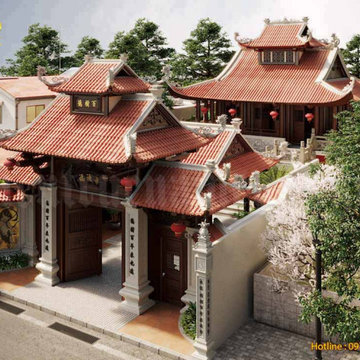
Vietnam is a country rich in culture and tradition, and one of its most remarkable features is its ancestral temples. Ancestral temples are significant cultural heritage sites that serve as a place of worship and commemoration for ancestors. These temples are beautifully designed, with intricate details and unique architectural styles that have been passed down from generation to generation. In northern Vietnam, ancestral temples are particularly prevalent, with each one boasting its own unique design model.
In this article, we'll explore the design model of ancestral temples in northern Vietnam, their significance, and what makes them so unique.
The Significance of Ancestral Temples in Northern Vietnam:
Ancestral temples play a crucial role in the spiritual and cultural lives of the Vietnamese people. They are considered a sacred place where ancestors are honored and worshipped. Ancestral temples are also seen as a symbol of family unity and continuity, as they serve as a place where families can come together and pay their respects to their ancestors.
Learn more: https://kientrucnamcuong.com/tong-hop-cac-mau-thiet-ke-nha-tho-ho-dep
Design by Kiến Trúc Nam Cường.

 Hartmann&Forbes
Natural Roman Shade: LE1239 Dapple
Designer: Mendleson Group
Photographer: Eric Piasecki
Dining room - eclectic dining room idea in Portland
Dining room - eclectic dining room idea in Portland
 Western Cabinets
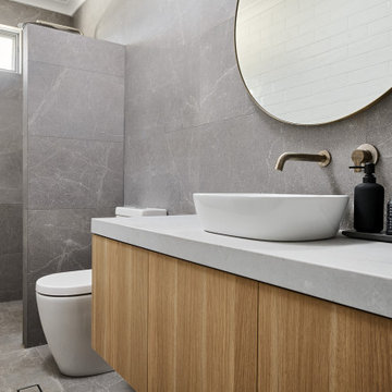
Natural planked oak, paired with chalky white and concrete sheeting highlights our Jackson Home as a Scandinavian Interior. With each room focused on materials blending cohesively, the rooms holid unity in the home‘s interior. A curved centre peice in the Kitchen encourages the space to feel like a room with customised bespoke built in furniture rather than your every day kitchen.
My clients main objective for the homes interior, forming a space where guests were able to interact with the host at times of entertaining. Unifying the kitchen, dining and living spaces will change the layout making the kitchen the focal point of entrace into the home.

 Moss Building & Design
Upon entering the home from the screened porch, MOSS installed floor to ceiling semi-custom cabinetry to be used as a sort of butler’s pantry to store kitchen items, additional entertainment ware, guests’ coats, cleaning equipment and supplies, and more. The use of the unique green tone was a beautiful touch as the color green is used throughout the home’s updated décor and brings a sense of unity to the overall space. Immediately off the long hallway is the home’s kitchen, which was completely updated. Square footage was not affected but MOSS re-designed the space so that it could be used in a more functional manner. A massive kitchen island with a beautiful soapstone countertop dominates the room. Semi-custom white cabinetry lines the perimeters. New large windows provide an incredible view of the yard. Finally, a seating area with built-ins was added to supply more space for seating and for the dining room table to be moved from the center of the kitchen, previously, to the side. The kitchen also features a beautiful fireplace which had its wooden surround updated. The home’s sunroom, located next to the kitchen, was previously a few feet lower than the rest of the home. To bring a better flow to the space, MOSS raised the entire floor of the room up to meet the rest of the main level. Stunningly, the hardwood floor matches to a “T”. In the home’s living room and office, full wall built-ins were added, allowing the homeowners to display their favorite books on topics ranging from art to history, as well as showcasing statues and art sculptures and other items that are meaningful to their family. The living room fireplace’s stone and wooden surrounds were updated by MOSS as well.
100