
Search results for "Up sell ebay" in Home Design Ideas
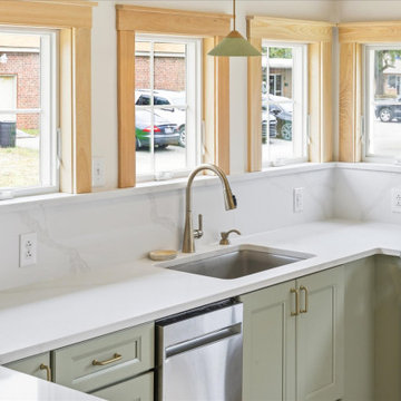
 Reico Kitchen & Bath
Alice Mulvey from Reico Kitchen & Bath in Wilmington, NC, designed a cottage-style kitchen remodel featuring Yorktowne Cabinetry in the Evan door style with a Bay Leaf painted finish. The space is complemented by Calacatta Elysio quartz countertops and a matching backsplash with ledge.
The clients shared, “We are absolutely thrilled with our kitchen renovation. The transformation in our total home remodel is incredible. Our Yorktowne Cabinetry is beautifully crafted, and the Bay Leaf finish really enhances the space. Alice Mulvey played a big part in the success of our project. Thanks to her guidance on cabinet placement, end cup ideas, and ways to maximize space, we ended up with a beautiful and functional kitchen. We are grateful for her insight and the Reico Team. Alice also communicated clearly and consistently throughout the process.”
Alice explained, “The clients knew exactly what they wanted and were easy to work with. Their goal was to maximize storage in a very small space. Communication was excellent, which made the whole process smooth and easy.”
Photos courtesy of Shoot to Sell Media.

 Alair Homes Scottsdale
The client wanted to update this 1950's home into something more modern; with high efficiency windows, air conditioner, and functionality, as she was planning to sell.
The floor plan changed slightly & made a huge impact. The most notable was the kitchen opening up into the living room. This allowed light to enter the kitchen & make a more cohesive floor plan where all family members could enjoy the space. The other big change was the Front door entered directly into the stove. We closed that in and created a much needed pantry. Another area is the living/dining room entry into the great room. It went from a small single doorway into a large entry way. This enabled the fireplace to be enjoyed from most of the home. There was a strange window cut-out / pass through in the middle of the wall between the dining room and family room, this was closed off.
In the end the client was overjoyed and received her full asking price after less than one month on the market.

 TJ Simone at Ethan Allen Princeton
Here we observe the entire living space as one design. You can see easily why each fabric and texture was chosen. The pattern of the conversation area picks up on the neutral tones in the area with the sectional and helps to differentiate each space while also connecting them together.
Find the right local pro for your project

 Woodcraft Furniture
Clean lines, modern design. Thanks to its minimalist aspects, the Arcadia feels at home anywhere from your heritage house to your brand new loft.
Pictured here at 46"x130", no extensions. Wood is Brown Cherry with a beautiful "speckled cherry" finish. Large family? This is the table for you.

 Mark Brand Architecture
We were approached by a San Francisco firefighter to design a place for him and his girlfriend to live while also creating additional units he could sell to finance the project. He grew up in the house that was built on this site in approximately 1886. It had been remodeled repeatedly since it was first built so that there was only one window remaining that showed any sign of its Victorian heritage. The house had become so dilapidated over the years that it was a legitimate candidate for demolition. Furthermore, the house straddled two legal parcels, so there was an opportunity to build several new units in its place. At our client’s suggestion, we developed the left building as a duplex of which they could occupy the larger, upper unit and the right building as a large single-family residence. In addition to design, we handled permitting, including gathering support by reaching out to the surrounding neighbors and shepherding the project through the Planning Commission Discretionary Review process. The Planning Department insisted that we develop the two buildings so they had different characters and could not be mistaken for an apartment complex. The duplex design was inspired by Albert Frey’s Palm Springs modernism but clad in fibre cement panels and the house design was to be clad in wood. Because the site was steeply upsloping, the design required tall, thick retaining walls that we incorporated into the design creating sunken patios in the rear yards. All floors feature generous 10 foot ceilings and large windows with the upper, bedroom floors featuring 11 and 12 foot ceilings. Open plans are complemented by sleek, modern finishes throughout.


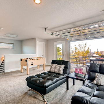
 Bradford Smith - High Rock Real Estate
$8,000 Builder credit paid to you towards window coverings, closing costs or interest buy-down! Magazine quality kitchen w/ expensive high gloss white finish, frosted glass showcase and soft close / pull-out cabinetry * Upgraded touch faucet * Upgraded composite granite sink for durability * Upgraded GE Cafe SS appliances * Upgraded 4" solid hardwood flooring * Upgraded slimline fireplace * Upgraded tankless water heater for high efficiency* Upgraded solid core doors throughout (twice the price of standard hollow core) * Upgraded custom handmade wrought-iron rail / with butcher block wood stairsystem * Rec/Media Room w/ upgraded roll-up garage door double pane & insulated for energy efficiency * Expansive patio with panoramic unobstructed city skyline AND mountain views perfect for entertaining* Full wet bar w/ wine refrigerator, sink and storage * 4 bedroom potential (call broker for specs) * 2 car detached garage * Ample storage space in 14' garage and temp controlled 3' crawl space.
Sponsored
Sunbury, OH

J.Holderby - Renovations
Franklin County's Leading General Contractors - 2X Best of Houzz!
 Mark Brand Architecture
We were approached by a San Francisco firefighter to design a place for him and his girlfriend to live while also creating additional units he could sell to finance the project. He grew up in the house that was built on this site in approximately 1886. It had been remodeled repeatedly since it was first built so that there was only one window remaining that showed any sign of its Victorian heritage. The house had become so dilapidated over the years that it was a legitimate candidate for demolition. Furthermore, the house straddled two legal parcels, so there was an opportunity to build several new units in its place. At our client’s suggestion, we developed the left building as a duplex of which they could occupy the larger, upper unit and the right building as a large single-family residence. In addition to design, we handled permitting, including gathering support by reaching out to the surrounding neighbors and shepherding the project through the Planning Commission Discretionary Review process. The Planning Department insisted that we develop the two buildings so they had different characters and could not be mistaken for an apartment complex. The duplex design was inspired by Albert Frey’s Palm Springs modernism but clad in fibre cement panels and the house design was to be clad in wood. Because the site was steeply upsloping, the design required tall, thick retaining walls that we incorporated into the design creating sunken patios in the rear yards. All floors feature generous 10 foot ceilings and large windows with the upper, bedroom floors featuring 11 and 12 foot ceilings. Open plans are complemented by sleek, modern finishes throughout.

 Donovan Design / Staging Places Southampton
"Before & After" A small & dated 1967 country ranch bathroom gets a French inspired makeover and becomes the perfect, relaxing retreat. Using honey maple 'wood color' ceramic plank shaped tiles, the floor seamlessly blends with the overall look and wood floors throughout the home. The 'flamingo pink' flea- market sconces, ( once repainted) converted, dark wood French chest, unfinished brass details and 'Antique Pearl' ( Ben Moore/eggshell finish) completed this wonderful, low cost renovation. Good news! Less cold to the touch, the acrylic, claw foot tub, holds the heats ( and bubbles ) much longer than porcelain.
Copyright Staging Places

 Fantastic Floors
Cascade Mountain, made from the truly unique, visually stunning species called Kupay, provides an abundance of natural color variation that is sure to bring a whole new character to any home. This beautiful natural variation gives each color a whole different life with its light sapwood boards as the canvas married up with a natural dark to black mineral as randomly dispersed as each tree produced it.
This highly unique species married up with a subtle timeworn surface texture on 4 proven industry-leading color options are easily compatible with a wide range of furniture, styles, and tastes. As mentioned before, this floor can have such vast natural color variation that it needs to be clearly communicated that the moldings aren’t
designed to match to each color within the floor, but to the lightest shade in the varying pallet.
In the flooring industry, there’s no shortage of competition. If you’re looking for hardwoods, you’ll find thousands of product options and hundreds of people willing to install them for you. The same goes for tile, carpet, laminate, etc.
At Fantastic Floors, our mission is to provide a quality product, at a competitive price, with a level of service that exceeds our competition. We don’t “sell” floors. We help you find the perfect floors for your family in our design center or bring the showroom to you free of charge. We take the time to listen to your needs and help you select the best flooring option to fit your budget and lifestyle. We can answer any questions you have about how your new floors are engineered and why they make sense for you…all in the comfort of our home or yours.
We work with designers, retail customers, commercial builders, and real estate investors to improve an existing space or create one that is totally new and unique...and we’d love to work with you.

 Guggenheim Architecture + Design Studio
Josh Partee Photography
With sweeping views of the Willamette river and Mt. Hood, this Atwater Place condo was designed with a balance of minimalism and livability in mind. A complete kitchen remodel brought a dark interior kitchen to the light and a full furnishings package welcomed Los Angeles transplants home to their new modern and bright residence. Our clients, a retired camera operator for both feature films and television and a producer/production manager on numerous television series including Weeds and The Middle, relocated from their traditionally-styled LA bungalow to Portland in the Summer of 2014. The couple sought a design departure from their long-term California residence and a fresh start for their new life in the South Waterfront.
With only two pieces of sentimental furniture and a handful of artwork included in the plan, we set out to create a comfortable and clean-lined furnishings package complimenting the broad southeast views. Organically shaped upholstery pieces juxtaposed with angular steel and wood tables create a soft balance in the open floor plan. Several custom pieces, including a dining table designed by our studio and a custom hand-blown glass chandelier crafted by Scott Schiesel with Lightlite compliment timeless pieces from Knoll, Herman Miller, and B&B Italia.
The kitchen is designed to reflect light and create brilliance in a space that is otherwise naturally dark. A material balance of stainless steel, back painted glass, quartz composite, lacquer, and mirror all play their part in creating a vibrant cooking environment. We collectively decided to forgo the traditional island pendant for a linear commercial fixture that provides tremendous light to the prep surface and creates an unexpected architectural element. The mirrored prep island creates the illusion of open space while concealing casework and wine storage on the working side of the kitchen.
It is worth noting that this project was designed and installed almost entirely while our clients were still living in LA and wrapping up professional obligations and selling their home. This afforded us the tremendous opportunity to send our clients to showrooms not available in Portland to view key pieces before final specification. Textiles and finish samples were approved via mail and communication took place over e-mail, telephone, and an occasional office visit. This unique process lead to a successful result and a beautifully balanced living environment.

 Kari P
When I bought my house in May 2014, there was one thing I really didn’t like about it – the 1950s bathroom complete with pink tile and mismatched gaudy fixtures was absolutely hideous. I knew redoing the bathroom would be a big, expensive project, so I vowed to just live with it while I fixed up parts of the house that were easier to update, such as putting a fresh coat of paint on the walls and updating the curtains (which I still haven’t done, by the way). Well my first winter in the new house turned out to be a bad one, and in February 2015, I noticed water stains on the walls and ceiling of the second bedroom that only got worse and worse each day. The water damage quickly spread to other rooms, and when contractors came to the house to access and fix the damage, they discovered moisture behind the pink tiled walls of my bathroom. And so started the bathroom remodel.
Start to finish, this project took close to six months, due to going back and forth with insurance and difficulty finding a contractor I liked. I lived without a shower for at least four of those months, showering at the gym where I worked or in a pop-up tent in my backyard once it was warm enough out. My friend Eric and I demoed the bathroom and for the remodel, I picked out all of the design components and had a local contractor, Fred Haas do the work. I kept the original layout – as my bathroom was small to begin with and it was both impractical and expensive to start moving things around – but just about everything else about the bathroom is new, except for maybe the window and door. New tub, sink, and toilet, new tile floor and shower surround, new walls and ceiling, fresh paint, new fixtures and mirror, updated lighting, and a better ventilation system were all added.
Tub – Sterling Vikrell
Toilet – Kohler Wellworth® two-piece round-front dual-flush toilet
Sink – Kohler Veer™ 21" pedestal bathroom sink
Fixtures – Kohler Alteo® line
Tile floor and shower surround – American Olean Laurel Heights ceramic tile in Summit Gray
Lighting – I don't remember... will have to see if I can find it
Ventilation system – NuTone
Mirror – Ikea
Paint – Behr
Shower Curtain – eBay
Here are photos of my project from start to finish. As you can see, I probably still need a thing or two (a toilet paper holder, mini storage shelf, and some art wouldn’t hurt, nor would replacing the door or painting it white), but overall I’m really happy with how my new bathroom came out. I LOVE it, which is the exact opposite of how I felt about the original bathroom.
Photos © Kari Post
 Mark Brand Architecture
We were approached by a San Francisco firefighter to design a place for him and his girlfriend to live while also creating additional units he could sell to finance the project. He grew up in the house that was built on this site in approximately 1886. It had been remodeled repeatedly since it was first built so that there was only one window remaining that showed any sign of its Victorian heritage. The house had become so dilapidated over the years that it was a legitimate candidate for demolition. Furthermore, the house straddled two legal parcels, so there was an opportunity to build several new units in its place. At our client’s suggestion, we developed the left building as a duplex of which they could occupy the larger, upper unit and the right building as a large single-family residence. In addition to design, we handled permitting, including gathering support by reaching out to the surrounding neighbors and shepherding the project through the Planning Commission Discretionary Review process. The Planning Department insisted that we develop the two buildings so they had different characters and could not be mistaken for an apartment complex. The duplex design was inspired by Albert Frey’s Palm Springs modernism but clad in fibre cement panels and the house design was to be clad in wood. Because the site was steeply upsloping, the design required tall, thick retaining walls that we incorporated into the design creating sunken patios in the rear yards. All floors feature generous 10 foot ceilings and large windows with the upper, bedroom floors featuring 11 and 12 foot ceilings. Open plans are complemented by sleek, modern finishes throughout.
Sponsored
Sunbury, OH
J.Holderby - Renovations
Franklin County's Leading General Contractors - 2X Best of Houzz!
 Mark Brand Architecture
We were approached by a San Francisco firefighter to design a place for him and his girlfriend to live while also creating additional units he could sell to finance the project. He grew up in the house that was built on this site in approximately 1886. It had been remodeled repeatedly since it was first built so that there was only one window remaining that showed any sign of its Victorian heritage. The house had become so dilapidated over the years that it was a legitimate candidate for demolition. Furthermore, the house straddled two legal parcels, so there was an opportunity to build several new units in its place. At our client’s suggestion, we developed the left building as a duplex of which they could occupy the larger, upper unit and the right building as a large single-family residence. In addition to design, we handled permitting, including gathering support by reaching out to the surrounding neighbors and shepherding the project through the Planning Commission Discretionary Review process. The Planning Department insisted that we develop the two buildings so they had different characters and could not be mistaken for an apartment complex. The duplex design was inspired by Albert Frey’s Palm Springs modernism but clad in fibre cement panels and the house design was to be clad in wood. Because the site was steeply upsloping, the design required tall, thick retaining walls that we incorporated into the design creating sunken patios in the rear yards. All floors feature generous 10 foot ceilings and large windows with the upper, bedroom floors featuring 11 and 12 foot ceilings. Open plans are complemented by sleek, modern finishes throughout.
 Kari P
When I bought my house in May 2014, there was one thing I really didn’t like about it – the 1950s bathroom complete with pink tile and mismatched gaudy fixtures was absolutely hideous. I knew redoing the bathroom would be a big, expensive project, so I vowed to just live with it while I fixed up parts of the house that were easier to update, such as putting a fresh coat of paint on the walls and updating the curtains (which I still haven’t done, by the way). Well my first winter in the new house turned out to be a bad one, and in February 2015, I noticed water stains on the walls and ceiling of the second bedroom that only got worse and worse each day. The water damage quickly spread to other rooms, and when contractors came to the house to access and fix the damage, they discovered moisture behind the pink tiled walls of my bathroom. And so started the bathroom remodel.
Start to finish, this project took close to six months, due to going back and forth with insurance and difficulty finding a contractor I liked. I lived without a shower for at least four of those months, showering at the gym where I worked or in a pop-up tent in my backyard once it was warm enough out. My friend Eric and I demoed the bathroom and for the remodel, I picked out all of the design components and had a local contractor, Fred Haas do the work. I kept the original layout – as my bathroom was small to begin with and it was both impractical and expensive to start moving things around – but just about everything else about the bathroom is new, except for maybe the window and door. New tub, sink, and toilet, new tile floor and shower surround, new walls and ceiling, fresh paint, new fixtures and mirror, updated lighting, and a better ventilation system were all added.
Tub – Sterling Vikrell
Toilet – Kohler Wellworth® two-piece round-front dual-flush toilet
Sink – Kohler Veer™ 21" pedestal bathroom sink
Fixtures – Kohler Alteo® line
Tile floor and shower surround – American Olean Laurel Heights ceramic tile in Summit Gray
Lighting – I don't remember... will have to see if I can find it
Ventilation system – NuTone
Mirror – Ikea
Paint – Behr
Shower Curtain – eBay
Here are photos of my project from start to finish. As you can see, I probably still need a thing or two (a toilet paper holder, mini storage shelf, and some art wouldn’t hurt, nor would replacing the door or painting it white), but overall I’m really happy with how my new bathroom came out. I LOVE it, which is the exact opposite of how I felt about the original bathroom.
Photos © Kari Post
 Mark Brand Architecture
We were approached by a San Francisco firefighter to design a place for him and his girlfriend to live while also creating additional units he could sell to finance the project. He grew up in the house that was built on this site in approximately 1886. It had been remodeled repeatedly since it was first built so that there was only one window remaining that showed any sign of its Victorian heritage. The house had become so dilapidated over the years that it was a legitimate candidate for demolition. Furthermore, the house straddled two legal parcels, so there was an opportunity to build several new units in its place. At our client’s suggestion, we developed the left building as a duplex of which they could occupy the larger, upper unit and the right building as a large single-family residence. In addition to design, we handled permitting, including gathering support by reaching out to the surrounding neighbors and shepherding the project through the Planning Commission Discretionary Review process. The Planning Department insisted that we develop the two buildings so they had different characters and could not be mistaken for an apartment complex. The duplex design was inspired by Albert Frey’s Palm Springs modernism but clad in fibre cement panels and the house design was to be clad in wood. Because the sit
e was steeply upsloping, the design required tall, thick retaining walls that we incorporated into the design creating sunken patios in the rear yards. All floors feature generous 10 foot ceilings and large windows with the upper, bedroom floors featuring 11 and 12 foot ceilings. Open plans are complemented by sleek, modern finishes throughout.

 SGDI - Sarah Gallop Design Inc.
The objective was to create a warm neutral space to later customize to a specific colour palate/preference of the end user for this new construction home being built to sell. A high-end contemporary feel was requested to attract buyers in the area. An impressive kitchen that exuded high class and made an impact on guests as they entered the home, without being overbearing. The space offers an appealing open floorplan conducive to entertaining with indoor-outdoor flow.
Due to the spec nature of this house, the home had to remain appealing to the builder, while keeping a broad audience of potential buyers in mind. The challenge lay in creating a unique look, with visually interesting materials and finishes, while not being so unique that potential owners couldn’t envision making it their own. The focus on key elements elevates the look, while other features blend and offer support to these striking components. As the home was built for sale, profitability was important; materials were sourced at best value, while retaining high-end appeal. Adaptations to the home’s original design plan improve flow and usability within the kitchen-greatroom. The client desired a rich dark finish. The chosen colours tie the kitchen to the rest of the home (creating unity as combination, colours and materials, is repeated throughout).
Photos- Paul Grdina
Sponsored
Columbus, OH
Free consultation for landscape design!

Peabody Landscape Group
Franklin County's Reliable Landscape Design & Contracting

 Main Line Kitchen Design
The best kitchen showroom in your area may be closer closer than you think. The four designers there are some of the most experienced award winning kitchen designers in the Delaware Valley. They design in and sell 6 national cabinet lines. And their pricing for cabinetry is slightly less than at home centers in apples to apples comparisons. Where is this kitchen showroom and how come you don’t remember seeing it when it is so close by? It’s in your own home!
Main Line Kitchen Design brings all the same samples you select from when you travel to other showrooms to your home. We make design changes on our laptops in 20-20 CAD with you present usually in the very kitchen being renovated. Understanding what designs will look like and how sample kitchen cabinets, doors, and finishes will look in your home is easy when you are standing in the very room being renovated. Design changes can be emailed to you to print out and discuss with friends and family if you choose. Best of all our design time is free since it is incorporated into the very competitive pricing of your cabinetry when you purchase a kitchen from Main Line Kitchen Design.
Finally there is a kitchen business model and design team that carries the highest quality cabinetry, is experienced, convenient, and reasonably priced. Call us today and find out why we get the best reviews on the internet or Google us and check. We look forward to working with you.
As our company tag line says:
“The world of kitchen design is changing…”
Scott Fredrick Photography


 Lindsey Markel
Photo By: Lindsey Neumann
This kitchen remodel was fueled by the customer wanting an updated kitchen. They wanted to update with the thought of selling sometime down the road. The new kitchen needed to please them but timeless for the next owners. They love the modern look but didn't want to take it to the extreme. White, flat panel, cabinets keep it fresh and classic. Adding the vertical marble and glass tile give it a little more modern feel. It is truly a beautiful kitchen that will be pleasing to all that live there.
Selections:
Mid Continent Cabinetry, Allen door, Maple, Painted White, Quartz color-Coarse Pepper, Natural Marble and glass tile, Top Knobs hardware, Blanco Silgranite sink color-Truffle, Lighting-Shades of Light, Appliances-KitchenAid, U-Line wine captain
87