
Search results for "Upper body" in Home Design Ideas
 C&K Custom Remodeling Inc.
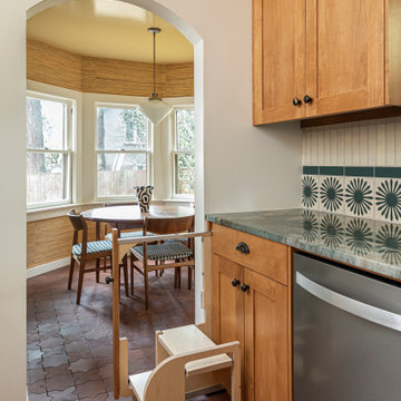
This kitchen in a 1911 Craftsman home has taken on a new life full of color and personality. Inspired by the client’s colorful taste and the homes of her family in The Philippines, we leaned into the wild for this design. The first thing the client told us is that she wanted terra cotta floors and green countertops. Beyond this direction, she wanted a place for the refrigerator in the kitchen since it was originally in the breakfast nook. She also wanted a place for waste receptacles, to be able to reach all the shelves in her cabinetry, and a special place to play Mahjong with friends and family.
The home presented some challenges in that the stairs go directly over the space where we wanted to move the refrigerator. The client also wanted us to retain the built-ins in the dining room that are on the opposite side of the range wall, as well as the breakfast nook built ins. The solution to these problems were clear to us, and we quickly got to work. We lowered the cabinetry in the refrigerator area to accommodate the stairs above, as well as closing off the unnecessary door from the kitchen to the stairs leading to the second floor. We utilized a recycled body porcelain floor tile that looks like terra cotta to achieve the desired look, but it is much easier to upkeep than traditional terra cotta. In the breakfast nook we used bold jungle themed wallpaper to create a special place that feels connected, but still separate, from the kitchen for the client to play Mahjong in or enjoy a cup of coffee. Finally, we utilized stair pullouts by all the upper cabinets that extend to the ceiling to ensure that the client can reach every shelf.

 Quax
Quax loves contemporary design and with the Havana room the sleek line and solid wood get a place in the range, confirming its place on the international design scene. Tested by internationally recognized bodies on EN-716 for the beds and EN-12221 for the changing tables and with long-term use in mind.
The metal base is finished with a black powder coating. The upper structures are a mix of lacquered and solid wood panels. The charm of solid wood is reflected in its pristine patina and is the guarantee of a natural product that over time becomes increasingly unique and valuable. A contribution that should not be underestimated to the natural and the cozy interior, a caress for the senses. Depending on the tree’s habitat, color differences are possible and proof of its essence.
At Quax we use sustainable materials. All the furniture boards meet the strict E1 standard on formaldehyde emissions. We support durable forestry and ask our suppliers to submit the PEFC and FSC certificates. Special care also goes to the furniture fittings. Only reputable suppliers provide us with, among others, quality sliders for the drawers and reliable connecting techniques. The paint finish is another point of attention, we only work with international quality supplierssuch as Akzo Nobel and no local producers. All producers are responsible for the certificates of their products, for example EN 71-3 with attention for the migration of harmful elements.
Design also plays an important role in the business philosophy of Quax. In the Havana room the bars are milled out in the Mdf board, which does not only contribute to the fancy nature of this range but also to the sturdiness of the sideframes, not comparable to traditional bars.
The range includes beds 120x60 cm, 140x70 cm with optional bedrail, a chest of four drawers with optional changing extension and a two or three-door wardrobe.
Kris Van Damme for Quax
 C&K Custom Remodeling Inc.
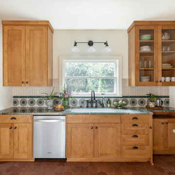
This kitchen in a 1911 Craftsman home has taken on a new life full of color and personality. Inspired by the client’s colorful taste and the homes of her family in The Philippines, we leaned into the wild for this design. The first thing the client told us is that she wanted terra cotta floors and green countertops. Beyond this direction, she wanted a place for the refrigerator in the kitchen since it was originally in the breakfast nook. She also wanted a place for waste receptacles, to be able to reach all the shelves in her cabinetry, and a special place to play Mahjong with friends and family.
The home presented some challenges in that the stairs go directly over the space where we wanted to move the refrigerator. The client also wanted us to retain the built-ins in the dining room that are on the opposite side of the range wall, as well as the breakfast nook built ins. The solution to these problems were clear to us, and we quickly got to work. We lowered the cabinetry in the refrigerator area to accommodate the stairs above, as well as closing off the unnecessary door from the kitchen to the stairs leading to the second floor. We utilized a recycled body porcelain floor tile that looks like terra cotta to achieve the desired look, but it is much easier to upkeep than traditional terra cotta. In the breakfast nook we used bold jungle themed wallpaper to create a special place that feels connected, but still separate, from the kitchen for the client to play Mahjong in or enjoy a cup of coffee. Finally, we utilized stair pullouts by all the upper cabinets that extend to the ceiling to ensure that the client can reach every shelf.
Find the right local pro for your project
 C&K Custom Remodeling Inc.
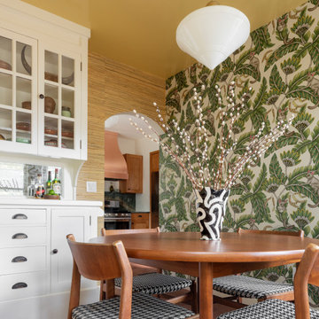
This kitchen in a 1911 Craftsman home has taken on a new life full of color and personality. Inspired by the client’s colorful taste and the homes of her family in The Philippines, we leaned into the wild for this design. The first thing the client told us is that she wanted terra cotta floors and green countertops. Beyond this direction, she wanted a place for the refrigerator in the kitchen since it was originally in the breakfast nook. She also wanted a place for waste receptacles, to be able to reach all the shelves in her cabinetry, and a special place to play Mahjong with friends and family.
The home presented some challenges in that the stairs go directly over the space where we wanted to move the refrigerator. The client also wanted us to retain the built-ins in the dining room that are on the opposite side of the range wall, as well as the breakfast nook built ins. The solution to these problems were clear to us, and we quickly got to work. We lowered the cabinetry in the refrigerator area to accommodate the stairs above, as well as closing off the unnecessary door from the kitchen to the stairs leading to the second floor. We utilized a recycled body porcelain floor tile that looks like terra cotta to achieve the desired look, but it is much easier to upkeep than traditional terra cotta. In the breakfast nook we used bold jungle themed wallpaper to create a special place that feels connected, but still separate, from the kitchen for the client to play Mahjong in or enjoy a cup of coffee. Finally, we utilized stair pullouts by all the upper cabinets that extend to the ceiling to ensure that the client can reach every shelf.
 C&K Custom Remodeling Inc.
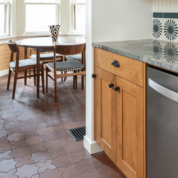
This kitchen in a 1911 Craftsman home has taken on a new life full of color and personality. Inspired by the client’s colorful taste and the homes of her family in The Philippines, we leaned into the wild for this design. The first thing the client told us is that she wanted terra cotta floors and green countertops. Beyond this direction, she wanted a place for the refrigerator in the kitchen since it was originally in the breakfast nook. She also wanted a place for waste receptacles, to be able to reach all the shelves in her cabinetry, and a special place to play Mahjong with friends and family.
The home presented some challenges in that the stairs go directly over the space where we wanted to move the refrigerator. The client also wanted us to retain the built-ins in the dining room that are on the opposite side of the range wall, as well as the breakfast nook built ins. The solution to these problems were clear to us, and we quickly got to work. We lowered the cabinetry in the refrigerator area to accommodate the stairs above, as well as closing off the unnecessary door from the kitchen to the stairs leading to the second floor. We utilized a recycled body porcelain floor tile that looks like terra cotta to achieve the desired look, but it is much easier to upkeep than traditional terra cotta. In the breakfast nook we used bold jungle themed wallpaper to create a special place that feels connected, but still separate, from the kitchen for the client to play Mahjong in or enjoy a cup of coffee. Finally, we utilized stair pullouts by all the upper cabinets that extend to the ceiling to ensure that the client can reach every shelf.
 C&K Custom Remodeling Inc.
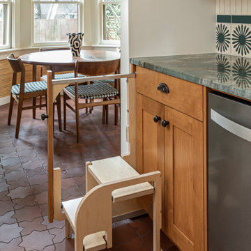
This kitchen in a 1911 Craftsman home has taken on a new life full of color and personality. Inspired by the client’s colorful taste and the homes of her family in The Philippines, we leaned into the wild for this design. The first thing the client told us is that she wanted terra cotta floors and green countertops. Beyond this direction, she wanted a place for the refrigerator in the kitchen since it was originally in the breakfast nook. She also wanted a place for waste receptacles, to be able to reach all the shelves in her cabinetry, and a special place to play Mahjong with friends and family.
The home presented some challenges in that the stairs go directly over the space where we wanted to move the refrigerator. The client also wanted us to retain the built-ins in the dining room that are on the opposite side of the range wall, as well as the breakfast nook built ins. The solution to these problems were clear to us, and we quickly got to work. We lowered the cabinetry in the refrigerator area to accommodate the stairs above, as well as closing off the unnecessary door from the kitchen to the stairs leading to the second floor. We utilized a recycled body porcelain floor tile that looks like terra cotta to achieve the desired look, but it is much easier to upkeep than traditional terra cotta. In the breakfast nook we used bold jungle themed wallpaper to create a special place that feels connected, but still separate, from the kitchen for the client to play Mahjong in or enjoy a cup of coffee. Finally, we utilized stair pullouts by all the upper cabinets that extend to the ceiling to ensure that the client can reach every shelf.
 Cascada Showers
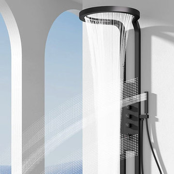
Designed by Cascada Showers, AquaTech Elite 80 focuses on quality and new design ideas. The wall-mounted design ensures:
Easy installation: Integrates seamlessly into any bathroom style.
Durability and maintenance: Built to last, maintaining its high performance with minimal effort.
This is the beauty of a finished shower panel system that adds versatility to your showering habits. This elegant showerhead from the Cascada AquaTech Elite 80 range is designed with today’s home in mind, taking your bathroom experience to new heights not only when it comes to performance but also when it comes to design, simplicity and user-friendliness.
4 Mode Function:
Circular Rainfall Mode
Upper Back Spray Mode
Lower Back Spray Mode
Handheld Showers
Technical Details:
Brand Name: Cascada Showers
Model Number: CSSPBF500
Model Name: AquaTech Elite
Package Dimensions: 83 x 22 x 26 Inches
Gross Weight: 40 lbs
Product Size: 80 x 20 Inches (Length x Width)
Material: Stainless Steel
Shape: Circular
Finish: Polished Chrome, Matt Black and Brushed Gold
Water Flow Rate (gallons per minute): 2.5 Gallons per minute (GPM) per each function.
Installation Method: Wall Mounted
Maximum Pressure: 120 PSI
Hose Length: 59 inches
Handle/Lever Placement: Center
Number of Handles: 5 Square Knobs
Thread Size: G1/2"
Batteries Included? No
Batteries Required? No
Package Includes:
80" Shower Panel System (Circular Showerhead)
1 x hand shower + ss shower hose+ brass holder
1 x 5-knob (Square) Valve
Installation Instructions
Sponsored
Columbus, OH

Trish Takacs Design
Award Winning & Highly Skilled Kitchen & Bath Designer in Columbus

 Julie Kardatzke Architect, LLC
The existing wood siding and wood trim and much of at the existing stucco were replaced with engineered wood lap siding and shakes. The new exterior color scheme of french blue with accents of white and pale gray gives a more nautical feel to the house.
The original cottage was wrapped by a deck on all four sides, most of which was not used. The new composite deck is located primarily on the south (lake) side of the house, as well as at the entry. The chalet-style railings were replaced with crisp-looking cable railings. Scalloped trim connects the posts supporting the new deck.
Lowering the grade between the house and the garage placed the entry walkway at the same level as the back patio, eliminating the need to walk up a set of stairs to get from the back yard to the front.
 Cascade West Development
Paint by Sherwin Williams
Body Color : Coming Soon!
Trim Color : Coming Soon!
Entry Door Color by Northwood Cabinets
Door Stain : Coming Soon!
Flooring & Tile by Macadam Floor and Design
Foyer Tile by Emser Tile
Tile Product : Motion in Advance
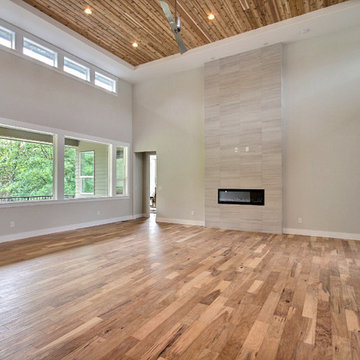
Great Room Hardwood by Wanke Cascade
Hardwood Product : Terra Living Natural Durango
Kitchen Backsplash Tile by Florida Tile
Backsplash Tile Product : Streamline in Arctic
Slab Countertops by Cosmos Granite & Marble
Quartz, Granite & Marble provided by Wall to Wall Countertops
Countertop Product : True North Quartz in Blizzard
Great Room Fireplace by Heat & Glo
Fireplace Product : Primo 48”
Fireplace Surround by Emser Tile
Surround Product : Motion in Advance
Custom Storage by Northwood Cabinets
Handlesets and Door Hardware by Kwikset
Windows by Milgard Window + Door
Window Product : Style Line Series
Supplied by TroyCo


 IQnewswire
The End of the Ultra-Slim Wedding Suit
For several years, men’s formalwear was dominated by narrow lapels, short jackets and trousers cut close to the leg. The style created a sharp outline, but it often left little room for sitting, dancing or eating comfortably. Current tailoring is moving towards a more balanced shape, with cleaner shoulders, a defined waist and trousers that follow the leg without gripping it.This change does not mean that wedding suits have become oversized. The newer approach sits between skinny and loose. It keeps the structure expected of formal clothing while allowing the cloth to hang properly. For grooms, that balance is useful during a day that may involve a ceremony, photographs, dinner and several hours on the dance floor.
Look For Shape Rather Than Tightness
A well-fitted suit should create a clear outline without relying on tension. Collections of Marc Darcy suits include tailored three-piece designs, checks and textured fabrics that suit the current preference for visible structure and considered proportions.
The jacket should sit close enough to define the waist, but the front button should fasten without pulling the cloth into an X-shaped crease. At the shoulders, the seam should finish close to the natural shoulder point. Extra width can make the jacket look borrowed, while a shoulder that is too narrow may cause the upper sleeve to collapse.
Fit should be assessed while moving as well as standing. Reach forward, sit down and raise both arms. A tailored jacket will never feel like casual sportswear, but it should allow the groom to carry out ordinary movements without sharp restriction across the back or chest.
Give The Jacket Enough Length
Very short suit jackets became common alongside skinny trousers, but they can disrupt the proportions of a three-piece outfit. If the jacket finishes too high, the waistcoat may appear longer than the outer layer and the trousers may look as though they begin too low.
A more traditional jacket length usually covers most of the seat and divides the body more evenly. This can make the legs appear longer without shortening the jacket excessively. The correct length depends on height and body proportions, so two men wearing the same chest size may still need different jacket lengths.
View the suit from the back and side rather than relying on a front-facing mirror. The vents should lie flat, and the hem should not lift away from the body. A side photograph can reveal an unbalanced jacket more clearly than the changing-room mirror.
Choose Trousers That Fall Cleanly
The move away from very tight tailoring is most noticeable in suit trousers. A modern tailored leg can still be neat at the ankle, but it should provide enough room through the seat and thigh for the fabric to fall without horizontal lines.
Trouser pockets offer a useful fit check. If they pull open while standing, the waist or hips may be too tight. The fly should lie flat, and the waistband should remain in place without depending on an overtightened belt. Higher-rise trousers can work particularly well with a waistcoat because they reduce the chance of shirt fabric appearing between the two pieces.
The hem should make gentle contact with the shoe rather than gathering heavily around it. A short hem can work with narrow trousers but taking it too far may make the suit look dated once the current cropped style moves on. A slight break is easier to wear with different formal shoes and tends to look balanced in full-length wedding photographs.
Let The Waistcoat Support the Silhouette
A waistcoat adds structure through the centre of the outfit, but only when it fits correctly. It should lie flat against the shirt and cover the trouser waistband. Tightening the back strap cannot correct a waistcoat that is the wrong size or too short.
Current three-piece styling often places greater emphasis on the waistcoat. Double-breasted designs, contrasting fabrics and wider openings can distinguish the groom without requiring a brightly coloured jacket. When the groom removes the jacket later, the waistcoat keeps the outfit looking complete.
Allow room for a full meal and several hours of wear. A waistcoat that feels acceptably close during a brief fitting may become uncomfortable at dinner. Sit down with every button fastened and check whether the lower edge presses into the waist or causes the front to bow.
Use Stronger Lapels Carefully
Wider notch and peak lapels are returning after years of extremely narrow designs. A broader lapel can frame the shirt and tie, balance the shoulders and give the jacket a more formal character. Peak lapels create a particularly strong line on double-breasted jackets and evening suits.
The lapel width should still suit the wearer. A very broad lapel can overwhelm a smaller frame, while an extremely narrow one may look out of proportion on a broad chest. The shirt collar, tie width and lapel should relate to one another without matching exactly.
A wider lapel also leaves less need for decorative extras. A simple buttonhole flower or plain pocket square may be enough. Large lapel pins can crowd the upper part of the jacket, especially when the cloth already contains a check.
Avoid Buying According to the Size Label Alone
The same labelled size can fit differently across designs because cut, fabric and construction affect the garment. Begin with accurate chest, waist, inside-leg and approximate jacket-length measurements. Compare those figures with the retailer’s size information rather than ordering the size worn in another brand without checking.
If the jacket fits at the shoulders but needs slight shaping through the waist, a tailor can often make the adjustment. Sleeves and trouser hems are also commonly altered. Major changes to the shoulder line or jacket length are more difficult and may not be economical.
Do not choose the smallest size that can be fastened. A suit that looks tight in the fitting room is unlikely to become more comfortable during a long wedding day. Cloth should skim the body and return to a clean position after movement.
Balance a checked suit with simple styling
Texture and checks remain popular in wedding tailoring, particularly for country houses, converted barns and traditional venues. These fabrics already add depth to the outfit, so the cut should remain controlled and the accessories relatively quiet.
A plain white, pale blue or cream shirt gives a checked suit a clear foundation. Choose a tie from one of the secondary colours in the cloth rather than introducing another strong pattern. A white pocket square works when the suit contains several shades and does not need further decoration.
Shoes should support the proportions of the trousers. A very slim shoe may appear too small beneath a fuller hem, while a heavy casual sole can pull attention away from the tailoring. Oxfords, Derbies and refined brogues usually provide enough visual weight without looking bulky.
Coordinate the wedding party without forcing one fit
Matching groomsmen suits can become difficult when every member of the party has a different build. Insisting on an identical close fit may leave some men comfortable and others visibly restricted. A better approach is to keep the cloth, colour and main design consistent while adjusting jacket and trouser sizes for each person.
The groom can stand apart through a waistcoat, lapel shape or accessory rather than wearing a suit cut much tighter than everyone else. This creates a connection across the group without treating one silhouette as suitable for every body.
Arrange fittings early enough to identify size and alteration issues. Group orders should be checked well before the wedding, particularly when trousers need hemming or jackets require sleeve adjustments. Each person should try the complete outfit with the intended shirt and shoes.
Judge the suit by the whole day
A wedding fitting often lasts less than half an hour, while the suit may be worn for twelve hours or more. Comfort should therefore be tested under realistic conditions. Sit for several minutes, walk upstairs and check the waistband after moving around.
Pay attention to the parts that cannot be seen clearly in a mirror. The collar should remain close to the shirt at the back of the neck. Jacket vents should not pull apart, and the trouser seat should follow the body without sagging or strain.
The current move towards balanced tailoring gives grooms more room to choose clothes that look formal without feeling restrictive. Clean shoulders, a shaped jacket and trousers with a natural fall will outlast extreme proportions. A suit that allows the groom to stand, sit and celebrate comfortably is also more likely to look composed in photographs taken throughout the day.
 Cascade West Development
Paint by Sherwin Williams
Body Color - Wool Skein - SW 6148
Flex Suite Color - Universal Khaki - SW 6150
Downstairs Guest Suite Color - Silvermist - SW 7621
Downstairs Media Room Color - Quiver Tan - SW 6151
Exposed Beams & Banister Stain - Northwood Cabinets - Custom Truffle Stain
Gas Fireplace by Heat & Glo
Flooring & Tile by Macadam Floor & Design
Hardwood by Shaw Floors
Hardwood Product Kingston Oak in Tapestry
Carpet Products by Dream Weaver Carpet
Main Level Carpet Cosmopolitan in Iron Frost
Downstairs Carpet Santa Monica in White Orchid
Kitchen Backsplash by Z Tile & Stone
Tile Product - Textile in Ivory
Kitchen Backsplash Mosaic Accent by Glazzio Tiles
Tile Product - Versailles Series in Dusty Trail Arabesque Mosaic
Sinks by Decolav
Slab Countertops by Wall to Wall Stone Corp
Main Level Granite Product Colonial Cream
Downstairs Quartz Product True North Silver Shimmer
Windows by Milgard Windows & Doors
Window Product Style Line® Series
Window Supplier Troyco - Window & Door
Window Treatments by Budget Blinds
Lighting by Destination Lighting
Interior Design by Creative Interiors & Design
Custom Cabinetry & Storage by Northwood Cabinets
Customized & Built by Cascade West Development
Photography by ExposioHDR Portland
Original Plans by Alan Mascord Design Associates


Sponsored
Columbus, OH

Hope Restoration & General Contracting
Columbus Design-Build, Kitchen & Bath Remodeling, Historic Renovations

 Housetrends Magazine
Since moving into her Dublin home two and a half years ago, Nancy Sanford has been peeling off the decades—quite literally. Built in the 1980s, the home was “very well-maintained, but very little had been done to it” in terms of updating the finishes or style, Sanford says. Plush white carpet ran from wall-to-wall-to-wall, almond-colored laminate coated the kitchen cabinets and wallpaper ran rampant—even covering some ceilings.
Despite her efforts, Sanford knew it was going to take more than cosmetic editing to shake the ‘80s and make the home her own. Although she lives in the traditional-leaning Muirfield community, Sanford adores a minimalist, contemporary style—and admits to devouring design magazines “ad nauseam.”
To implement her thoroughly modern vision, Sanford turned to Brigid Norton, an interior designer and family friend, and Kristi Youles, a kitchen designer with The JAE Company. Working together, the trio created a carefully considered contemporary design that’s easy on the eyes, and the body.
In addition to improving the flow of the kitchen—by removing a V-shaped peninsula that angled out into the room—and adding appliances like a stainless steel refrigerator, Sanford’s short list of must-haves included clean, uncluttered lines and no wall cabinets over the countertops. “I’ve found as I’ve aged, I’ve gotten shorter and just don’t use the upper cabinets,” Sanford explains.
Easy-access, smooth-slide drawers with clean slab fronts were the answer—resulting in strong visual lines, an open, airy feel and enhanced ergonomics. Starting with a “needs assessment,” Youles and Norton designed the space quite literally around Nancy. By looking at factors such as her height and which items she uses most frequently, they were able to determine the optimum placement for everything from canned goods in the pantry to cutlery, pans and plates in the customized drawers, all of which helped to achieve the ultimate kitchen organization.
But there’s more to the kitchen cabinets smooth façade than clean-lined storage. Walnut drawer fronts—found on the oven and the base of the island—are book-matched, allowing the grain to continue from drawer to drawer. And even in spaces where drawers weren’t feasible, beneath the sink and in a desk area, the designers continued the look with cabinet doors crafted to resemble drawers.
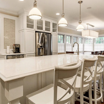
The visual continuity of these lines might not be as impactful if it weren’t for the careful selection of contrasting finishes. The designers filled the space with pure, glossy white—using a specific type of quartz, White Cliff by Cambria, to accent the bold rectangular design of the island. Then, to break up the expanse of accompanying white painted drawers, walnut was selected to bring the contrasting warmth and grain of wood without red undertones. It is commonly found in modern furniture design, as well as current productions of mid-century designs like the iconic Eames Lounge Chair from Herman Miller, Youles says.
 Newversal
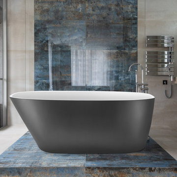
Our acrylic Freestanding bathtubs will be popular among most families, especially for the material of arcylic are the most popular choice for freestanding tubs because They are perhaps the best all-around material in terms of durability, versatility, and affordability.They are strong and lightweight, which makes them easier to carry and install, especially on upper levels. They won't require floor reinforcements, unlike other heavier materials like cast iron and stone.Acrylic bathtubs have a smooth, comfortable surface that is perfect for bathing. Because it is non-porous, acrylic is resistant to staining and discoloration; it is also resistant to scratches.
What's Included?
Drain Assembly/ Waste
Overflow Drain
Features
Our bathtub is made out of 100% high gloss white LUCITE acrylic and reinforced with resin and fiberglass . All of these are top quality material which are rarely used by others due to a relatively high cost.
Solid brass Brushed Chrome drain, stainless steel Brushed Nickel overflow, user and instruction manual. Besides, extremely solid package - very firm carton box is used to transport bathtubs, making sure a safe delivery.
Acrylic and reinforced with fiberglass for long lasting durability. Bottom with stainless steel bracket makes the bearing capacity is up to 1000 LBS, Double Walled reinforce design bringing maximum insulation and keeping water at its desired temperature longer and suitable for 1 Or 2 persons bathing.
Easy clean, easy maintenance, stain-resistant, scratch resistant surface that maintains its high gloss. Can be use for a long time. And keep bright and clean as new.
This Freestanding bathtub is luxury, comfort and chic style. Its size is ample yet economical allowing it to fit a variety of spaces. Gently sloping lines follow the natural curves of your body providing exceptional comfort.
Product Details
Primary Material: Acrylic
Faucet Included: No
Drain Placement: Right
 Newversal
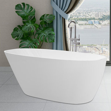
Our acrylic Freestanding bathtubs will be popular among most families, especially for the material of arcylic are the most popular choice for freestanding tubs because They are perhaps the best all-around material in terms of durability, versatility, and affordability.They are strong and lightweight, which makes them easier to carry and install, especially on upper levels. They won't require floor reinforcements, unlike other heavier materials like cast iron and stone.Acrylic bathtubs have a smooth, comfortable surface that is perfect for bathing. Because it is non-porous, acrylic is resistant to staining and discoloration; it is also resistant to scratches.
What's Included?
Drain Assembly/ Waste
Overflow Drain
Features
Our bathtub is made out of 100% high gloss white LUCITE acrylic and reinforced with resin and fiberglass . All of these are top quality material which are rarely used by others due to a relatively high cost.
Solid brass Brushed Chrome drain, stainless steel Brushed Nickel overflow, user and instruction manual. Besides, extremely solid package - very firm carton box is used to transport bathtubs, making sure a safe delivery.
Acrylic and reinforced with fiberglass for long lasting durability. Bottom with stainless steel bracket makes the bearing capacity is up to 1000 LBS, Double Walled reinforce design bringing maximum insulation and keeping water at its desired temperature longer and suitable for 1 Or 2 persons bathing.
Easy clean, easy maintenance, stain-resistant, scratch resistant surface that maintains its high gloss. Can be use for a long time. And keep bright and clean as new.
This Freestanding bathtub is luxury, comfort and chic style. Its size is ample yet economical allowing it to fit a variety of spaces. Gently sloping lines follow the natural curves of your body providing exceptional comfort.
Product Details
Primary Material: Acrylic
Faucet Included: No
Drain Placement: Right
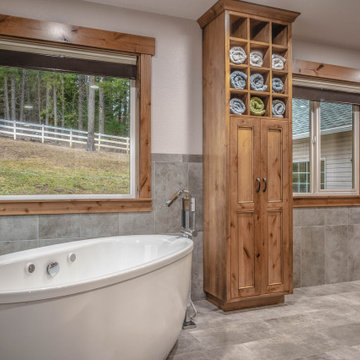
 Elite Empire Construction Inc.
Hayden Estate Spa: Curated Wellness and Specialized Comfort
This perspective highlights the total dedication to comfort and function that defines this Hayden, Idaho, master en-suite. We designed this bathing sanctuary as a quiet retreat, pairing high-performance Kohler technology with artisan-level custom storage. Every element here is curated to extend the spa experience, prioritizing wellness from the moment you step onto the thermostat-controlled heated floor.
Specialized Design & Feature Highlights:
Freestanding Kohler Air Tub: The centerpiece of this area is the Kohler freestanding air bath, providing a gentle, effervescent massage for deep relaxation. It is served by a precision floor-mounted Kohler tub filler, offering a clean, modern contrast to the wood and stone surrounds.
Integrated Towel Warmer: For the ultimate post-bath experience, we installed a professional-grade white hydronic towel warmer next to the window. This ensures that a warm, inviting towel is always within reach, completing the total sensory wellness loop of the space.
Custom Millwork Storage: Anchoring the wall is a custom, floor-to-ceiling tower built from hand-selected Knotty Alder wood. Note the specialized upper section featuring open-lattice towel cubbies for clean, visual access and efficient air circulation, balanced by traditional Shaker-style lower cabinetry for concealed storage.
Porcelain & Wood Contrast: The large-format Italian porcelain body tile creates a sophisticated, low-maintenance foundation. This cool stone contrasts beautifully with the warm, rustic texture of the custom Knotty Alder window casings, framing the peaceful views of the Idaho forest.
Technical Flow: This view showcases the seamless flow of high-end materials, from the dark, polished granite vanity counter to the precision tile wainscot, ensuring that the room's high-tech features (like the hidden heated floor) are balanced by a clean architectural aesthetic.
Sponsored
Columbus, OH
Hope Restoration & General Contracting
Columbus Design-Build, Kitchen & Bath Remodeling, Historic Renovations
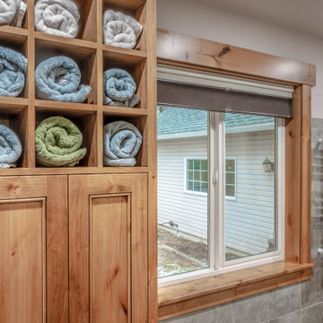 Elite Empire Construction Inc.
These zoomed-in details of the Hayden, Idaho master suite really drive home the high-end "Spa" atmosphere. The combination of the custom woodwork and the professional heating technology is exactly what luxury clients look for on Houzz.
Master Spa Artisan Details: Custom Storage & Thermal Comfort
This perspective showcases the thoughtful, "Creative and Expensive" details that transform a master bathroom into a high-performance wellness sanctuary. By integrating specialized Knotty Alder millwork with professional-grade warming technology, we ensured that every element of the post-shower routine is as luxurious as the 18-head hydrotherapy experience itself.
Artisan Features & Thermal Engineering:
Custom Towel Command Center: We designed this floor-to-ceiling Knotty Alder cabinet with a specialized upper cubby grid. These 12 individual cubicles provide a clean, organized, and "boutique spa" feel for rolled towels, keeping them within arm's reach of the soaking tub.
Professional Towel Warmer: To the right of the wood-cased window, we installed a high-efficiency hydronic towel warmer in a crisp white finish. This ensures a consistent "warm wrap" experience, bridging the gap between the heated water and the climate-controlled room.
Integrated Warmth: The entire space is anchored by a thermostat-controlled radiant floor heating system installed beneath the Italian porcelain body tile. This provides invisible, consistent heat that keeps the large-format tile at a comfortable temperature year-round.
Knotty Alder Window Casings: The thick, hand-finished wood trim frames the serene Hayden landscape, grounding the modern heating tech with the organic, rustic textures that define the Inland Northwest style.
Functional Sophistication: The lower Shaker-style cabinet doors feature heavy-duty hardware and furniture-grade joinery, proving that even the most functional storage in a high-end estate should be built to an artisan standard.

 Polhemus Savery DaSilva
Pleasant Heights is a newly constructed home that sits atop a large bluff in Chatham overlooking Pleasant Bay, the largest salt water estuary on Cape Cod.
-
Two classic shingle style gambrel roofs run perpendicular to the main body of the house and flank an entry porch with two stout, robust columns. A hip-roofed dormer—with an arch-top center window and two tiny side windows—highlights the center above the porch and caps off the orderly but not too formal entry area. A third gambrel defines the garage that is set off to one side. A continuous flared roof overhang brings down the scale and helps shade the first-floor windows. Sinuous lines created by arches and brackets balance the linear geometry of the main mass of the house and are playful and fun. A broad back porch provides a covered transition from house to landscape and frames sweeping views.
-
Inside, a grand entry hall with a curved stair and balcony above sets up entry to a sequence of spaces that stretch out parallel to the shoreline. Living, dining, kitchen, breakfast nook, study, screened-in porch, all bedrooms and some bathrooms take in the spectacular bay view. A rustic brick and stone fireplace warms the living room and recalls the finely detailed chimney that anchors the west end of the house outside.
-
PSD Scope Of Work: Architecture, Landscape Architecture, Construction |
Living Space: 6,883ft² |
Photography: Brian Vanden Brink |
 Cascade West Development
The Aerius - Modern American Craftsman on Acreage in Ridgefield Washington by Cascade West Development Inc.
Welcome to the Aerius. Don’t let the Northwest inspired appearance fool you. As you step inside; the interwoven transitional, modern and contemporary elements make personal solitude, friendly gatherings, and extended family stays simultaneously conceivable. The thoughtful division of rooms and amenities insure space for each member of the household to act independently or to come together as a whole and share in the quiet sophistication of the common areas. The family that lives here values independence as well as inclusion. Functionality and freedom are the principles of this nest; from which a family can take flight.
At first glance this home seems to disappear into it’s surroundings. The dark, natural appearance of the rock borrows hues and rough texture from the surrounding forest. A soft, powder blue paint gives no clear chromatic indication between structure and sky. With this in mind the dark shingles seem to float above a stoney foundation. Unexpected levitation isn’t the only aerial endeavor this home embarks upon. With lofty interiors and dismissible separation from the outdoors; people, air and conversation can flow freely throughout the combined space. Overall the home echoes the popular American Craftsman style, which dots the Pacific Northwest landscape. This home’s many peaks; supported by visible gables and lower exterior masonry denote common treatments found throughout Clark County. However, within the championed modern features of this home, touches of originality can still be found. From the driveway to the dining room, the design guides the viewer through the home while maintaining a comfortable and creative atmosphere.
Cascade West Facebook: https://goo.gl/MCD2U1
Cascade West Website: https://goo.gl/XHm7Un
These photos, like many of ours, were taken by the good people of ExposioHDR - Portland, Or
Exposio Facebook: https://goo.gl/SpSvyo
Exposio Website: https://goo.gl/Cbm8Ya
30