
Search results for "Usable creative" in Home Design Ideas
 Simply Home Decorating
This beautiful North Vancouver home belongs to a nature-loving and health-conscious couple, Emma and Vince (names changed), their two young children, and their dog, Jasper. When they contacted us about renovating and furnishing their kitchen and family room, we walked in and saw a world of potential waiting to be uncovered.
Before: Larkhall Crescent Home:
Like many original North Vancouver homes, the interior was definitely dated. We encountered late ‘80s finishes in powder pink and teal green, old carpet, and a kitchen that wasn’t maximized to suit this family’s modern-day lifestyle. However, the size of the rooms offered us a ton of space with which to get creative.
Knowing our clients’ love of cooking, need for work spaces (Emma and Vince both work remotely), and growing family, we developed a design concept that would increase usable space, optimize storage, and create intimacy in this large area. As for the style, we were inspired by their European roots, inventing a new and modern take on “Belgian Farmhouse” style. Now, the home is truly one-of-a-kind.
After: Warm & Cozy Family Room:
Fresh, bright, and comfortable, this living area has been transformed! We started with the fireplace as a focal point, selecting aged brick tiles for added texture and a crisp wood mantle. The taupe-coloured sectional infuses the room with visual warmth and serves the added purpose of separating the family room from the kitchen.
Emma and Vince were also keen on using non-toxic materials in their home, and we were happy to oblige. To meet their needs, we sourced natural wood elements and sought out Canadian-made products - that adhere to high health standards - whenever possible.
Look closer at the elements of this space, and you will find this stunning, honeycomb-patterned rug in earthy gold, beige, and charcoal tones. It’s plush to the touch and full of visual texture that brings this room’s colour palette together. We sourced these two-tone chairs with caning, petrified wood side table, black sconces, and botanical prints in greyscale from local artist, Heather Johnston.
We topped off the space with this dark wood and rattan console that offers storage facing the kitchen and presents an opportunity to display cherished items. The result is a cozy lounging space brimming with comfort and functionality. It’s perfect for enjoying quality family time, or Emma can simply slide the coffee table away to make room for her morning yoga practice.
Now, let’s turn around and give some attention to the kitchen. Do you remember what the original kitchen looked like? If not, scroll back up, because the transformation is shocking…
Moody & Welcoming Kitchen for Healthy Living:
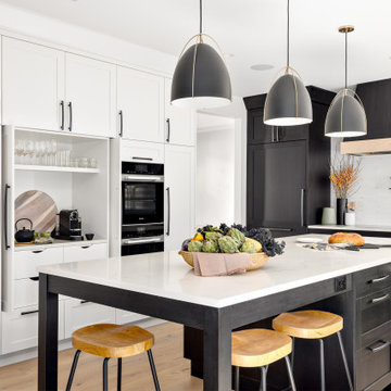
This kitchen looks very different from how it started, right? Though we didn’t touch any walls, the kitchen has almost doubled in usable space! We created a long, extended island with storage, an outlet for small appliances, and seating for comfortable prep, after-school snacking, or mingling among friends.
On the other side of the island, the family has even more storage and an integrated dishwasher within easy reach of the sink, perfect for quick clean-up. From this angle, you can also see the expansive custom Shaker cabinetry in white and the integrated double ovens. These facilitate their cooking experience and gave us the opportunity to add an additional surprise…
A coffee garage station and more hidden storage! Keeping these items located along the perimeter allows them to be accessed by the family or their guests without someone getting under the cook’s feet. These are the little details that make everyday life easier and more enjoyable.
Moving deeper into the kitchen, the seamless induction cooktop topped with a freestanding concealed hood fan commands attention in a soft yet prominent way. The natural wood accent mirrors the fireplace mantle, and the choice of off-black wood-grain cabinets not only continues our black-and-white colour palette but adds a sense of depth and contrast. The corner sink is located to the right and perfectly positioned with a view of their thriving backyard.
To invite more of this family’s character into the space, we mixed metals for interest — matte black, dark pewter, and warm brass — and created open shelves in white oak for their plants and decor. You can also glimpse the tumbled edge of the backsplash tile, which echoes the rustic brick of the fireplace. It adds that farmhouse charm while still feeling timeless and sophisticated.
Last but not least, we designed this dining banquette in the bay window (with integrated bench storage, of course), where the family can share a meal together, the kids can do homework, or Emma and Vince can work and enjoy a change of scenery from their offices. Like the other spaces in the home, it was designed to be beautiful, multi-functional, and long-lasting.
Praise from Our Clients:
It is clear that we love this home, but what did our clients have to say?
“Lori is a visionary and masters execution to the finest detail all at the same time. When she first met us to know more about who we are and how we live, she could right away envision how we could use the space in our kitchen and living room…The results exceeded our expectations.
Lori and her team were also a delight to work with — coordination with all the trades, fast problem-solving, regular updates, professional and friendly attitude of her entire team — made it the dream team. Thank you SHD for making our space so beautiful!”
In turn, we are so grateful for this family’s trust, their open communication, and for being wonderful people with whom to work. (So, thank you!)
 Simply Home Decorating
This beautiful North Vancouver home belongs to a nature-loving and health-conscious couple, Emma and Vince (names changed), their two young children, and their dog, Jasper. When they contacted us about renovating and furnishing their kitchen and family room, we walked in and saw a world of potential waiting to be uncovered.
Before: Larkhall Crescent Home:
Like many original North Vancouver homes, the interior was definitely dated. We encountered late ‘80s finishes in powder pink and teal green, old carpet, and a kitchen that wasn’t maximized to suit this family’s modern-day lifestyle. However, the size of the rooms offered us a ton of space with which to get creative.
Knowing our clients’ love of cooking, need for work spaces (Emma and Vince both work remotely), and growing family, we developed a design concept that would increase usable space, optimize storage, and create intimacy in this large area. As for the style, we were inspired by their European roots, inventing a new and modern take on “Belgian Farmhouse” style. Now, the home is truly one-of-a-kind.
After: Warm & Cozy Family Room:
Fresh, bright, and comfortable, this living area has been transformed! We started with the fireplace as a focal point, selecting aged brick tiles for added texture and a crisp wood mantle. The taupe-coloured sectional infuses the room with visual warmth and serves the added purpose of separating the family room from the kitchen.
Emma and Vince were also keen on using non-toxic materials in their home, and we were happy to oblige. To meet their needs, we sourced natural wood elements and sought out Canadian-made products - that adhere to high health standards - whenever possible.
Look closer at the elements of this space, and you will find this stunning, honeycomb-patterned rug in earthy gold, beige, and charcoal tones. It’s plush to the touch and full of visual texture that brings this room’s colour palette together. We sourced these two-tone chairs with caning, petrified wood side table, black sconces, and botanical prints in greyscale from local artist, Heather Johnston.
We topped off the space with this dark wood and rattan console that offers storage facing the kitchen and presents an opportunity to display cherished items. The result is a cozy lounging space brimming with comfort and functionality. It’s perfect for enjoying quality family time, or Emma can simply slide the coffee table away to make room for her morning yoga practice.
Now, let’s turn around and give some attention to the kitchen. Do you remember what the original kitchen looked like? If not, scroll back up, because the transformation is shocking…
Moody & Welcoming Kitchen for Healthy Living:
This kitchen looks very different from how it started, right? Though we didn’t touch any walls, the kitchen has almost doubled in usable space! We created a long, extended island with storage, an outlet for small appliances, and seating for comfortable prep, after-school snacking, or mingling among friends.
On the other side of the island, the family has even more storage and an integrated dishwasher within easy reach of the sink, perfect for quick clean-up. From this angle, you can also see the expansive custom Shaker cabinetry in white and the integrated double ovens. These facilitate their cooking experience and gave us the opportunity to add an additional surprise…
A coffee garage station and more hidden storage! Keeping these items located along the perimeter allows them to be accessed by the family or their guests without someone getting under the cook’s feet. These are the little details that make everyday life easier and more enjoyable.
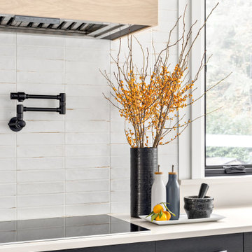
Moving deeper into the kitchen, the seamless induction cooktop topped with a freestanding concealed hood fan commands attention in a soft yet prominent way. The natural wood accent mirrors the fireplace mantle, and the choice of off-black wood-grain cabinets not only continues our black-and-white colour palette but adds a sense of depth and contrast. The corner sink is located to the right and perfectly positioned with a view of their thriving backyard.
To invite more of this family’s character into the space, we mixed metals for interest — matte black, dark pewter, and warm brass — and created open shelves in white oak for their plants and decor. You can also glimpse the tumbled edge of the backsplash tile, which echoes the rustic brick of the fireplace. It adds that farmhouse charm while still feeling timeless and sophisticated.
Last but not least, we designed this dining banquette in the bay window (with integrated bench storage, of course), where the family can share a meal together, the kids can do homework, or Emma and Vince can work and enjoy a change of scenery from their offices. Like the other spaces in the home, it was designed to be beautiful, multi-functional, and long-lasting.
Praise from Our Clients:
It is clear that we love this home, but what did our clients have to say?
“Lori is a visionary and masters execution to the finest detail all at the same time. When she first met us to know more about who we are and how we live, she could right away envision how we could use the space in our kitchen and living room…The results exceeded our expectations.
Lori and her team were also a delight to work with — coordination with all the trades, fast problem-solving, regular updates, professional and friendly attitude of her entire team — made it the dream team. Thank you SHD for making our space so beautiful!”
In turn, we are so grateful for this family’s trust, their open communication, and for being wonderful people with whom to work. (So, thank you!)
 TVL Creative Ltd.
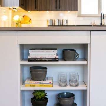
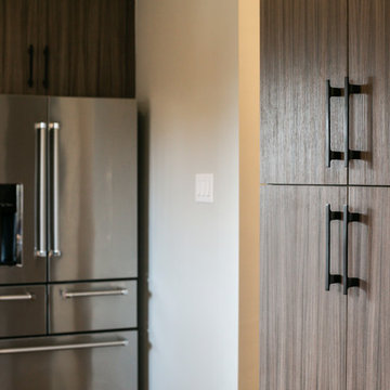
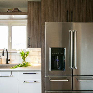
This 1950s home was sporting elements of the original kitchen and the dark space was not meeting our client’s needs. The original kitchen didn’t have much to offer in the way of functionality, so our first order of business was to create a design that would exponentially increase the usability of the kitchen. We brought in functional cabinetry, introduced uninterrupted work surfaces, and added plenty of lighting to brighten up their kitchen. They also wanted to open the new kitchen to the living room and create space for a larger dining table, so we started by removing the existing cabinetry that was visually cut the living space in two and minimized the power of the dramatic vaulted ceiling. We also extended the wood flooring into the kitchen as well to create seamless transitions between spaces. We fell in love with the idea of a two-toned cabinetry design for this kitchen and ultimately went head over heels for clean white painted base cabinets and a textured wood-look melamine on the uppers. This gave us a crisp backdrop that allowed us to bring is fun forms like the black light fixture over the table and the gorgeous silhouettes on the hardware. We played a lot with directionality in this space. The elongated open shelves and rectangular backsplash tiles give us wonderfully clean horizontal lines, but to balance those out we brought in a vertical grain pattern on the wall cabinets and added long black cabinetry pulls that emphasize the verticality of the space. The clients have a green thumb and wanted to make sure we created a home for their growing plant collection. The open shelving gives us plenty of opportunities for foliage and to showcase fun kitchen accessories. This design feels like home and brings together the clean lines and crisp finishes our clients were looking for.
Find the right local pro for your project
 Plants Creative Landscapes
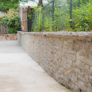
We regraded the entire backyard to create a usable, kid-friendly lawn area, in addition to installing a new stacked stone retaining wall to create more space, a permeable paver driveway to connect the existing driveway to the backyard alley access, and a stacked stone firepit. The homeowners wanted a backyard landscape where their kids could play safely and they could enjoy the space as a family.
 TVL Creative Ltd.
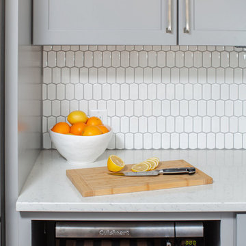
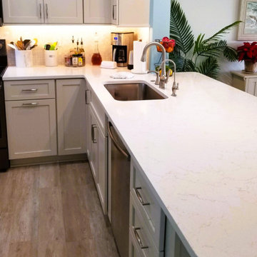
Our clients have been raising their family in this charming Lakewood ranch home for several years and were ready to make some updates to their home to make it better fit their lifestyle. In particular, the existing kitchen just wasn’t meeting their needs. They were sacrificing usable square footage to redundant circulation and the kitchen wasn’t connecting well with the other spaces in their home, so things had to change. We started by reworking the entry to the kitchen and switching up their layout to allow the kitchen to flow seamlessly with the rest of the house. To add to the open feeling we were striving for, we removed the existing ceiling soffits and created a clean transition between the kitchen and dining room, and installed the same wood flooring throughout the entire home. Aesthetically we wanted to create an inviting kitchen that felt clean and bright but could still stand up to a busy family. Soft grey shaker cabinets gave us the welcoming air we were looking for while providing a subtle contrast against the white quartz counters and backsplash tile. We utilized the same elegant pulls on all of the cabinets to add to the cohesive look of the kitchen and keep things from feeling too cluttered. We wanted to have a little fun with the backsplash without loosing the clean feeling we were going for, so we selected a crisp white picket tile to add a pop of texture. Updating the dining room light fixture and adding a pendant over the sink help to personalize the space and the charming shelves provide an opportunity to display original sculpture.
 TVL Creative Ltd.
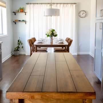
Our clients have been raising their family in this charming Lakewood ranch home for several years and were ready to make some updates to their home to make it better fit their lifestyle. In particular, the existing kitchen just wasn’t meeting their needs. They were sacrificing usable square footage to redundant circulation and the kitchen wasn’t connecting well with the other spaces in their home, so things had to change. We started by reworking the entry to the kitchen and switching up their layout to allow the kitchen to flow seamlessly with the rest of the house. To add to the open feeling we were striving for, we removed the existing ceiling soffits and created a clean transition between the kitchen and dining room, and installed the same wood flooring throughout the entire home. Aesthetically we wanted to create an inviting kitchen that felt clean and bright but could still stand up to a busy family. Soft grey shaker cabinets gave us the welcoming air we were looking for while providing a subtle contrast against the white quartz counters and backsplash tile. We utilized the same elegant pulls on all of the cabinets to add to the cohesive look of the kitchen and keep things from feeling too cluttered. We wanted to have a little fun with the backsplash without loosing the clean feeling we were going for, so we selected a crisp white picket tile to add a pop of texture. Updating the dining room light fixture and adding a pendant over the sink help to personalize the space and the charming shelves provide an opportunity to display original sculpture.
 Linen & Elm Creative Services
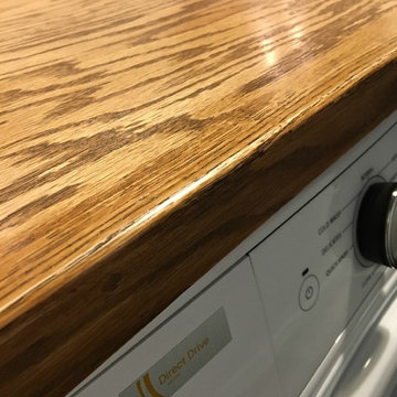
Builders grade pass-through laundry room. Upgraded into a usable, modern farmhouse space. Handmade over-door valet. Folding table. Custom built cabinetry. Pergo Outlast+ Molasses Maple Flooring. By SnazzyLittleThings.com

 TVL Creative Ltd.
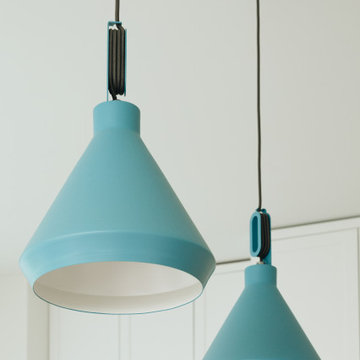
This 1950s home was sporting elements of the original kitchen and the dark space was not meeting our client’s needs. The original kitchen didn’t have much to offer in the way of functionality, so our first order of business was to create a design that would exponentially increase the usability of the kitchen. We brought in functional cabinetry, introduced uninterrupted work surfaces, and added plenty of lighting to brighten up their kitchen. They also wanted to open the new kitchen to the living room and create space for a larger dining table, so we started by removing the existing cabinetry that was visually cut the living space in two and minimized the power of the dramatic vaulted ceiling. We also extended the wood flooring into the kitchen as well to create seamless transitions between spaces. We fell in love with the idea of a two-toned cabinetry design for this kitchen and ultimately went head over heels for clean white painted base cabinets and a textured wood-look melamine on the uppers. This gave us a crisp backdrop that allowed us to bring is fun forms like the black light fixture over the table and the gorgeous silhouettes on the hardware. We played a lot with directionality in this space. The elongated open shelves and rectangular backsplash tiles give us wonderfully clean horizontal lines, but to balance those out we brought in a vertical grain pattern on the wall cabinets and added long black cabinetry pulls that emphasize the verticality of the space. The clients have a green thumb and wanted to make sure we created a home for their growing plant collection. The open shelving gives us plenty of opportunities for foliage and to showcase fun kitchen accessories. This design feels like home and brings together the clean lines and crisp finishes our clients were looking for.
 Duncan's Creative Kitchens
We transformed a cramped and enclosed kitchen in a Bradenton condo into a contemporary and open-concept space. The original layout felt closed off and inefficient, so our primary goal was to improve the flow and functionality of the home's main living area.
By strategically removing the existing wall and reconfiguring the floor plan, we were able to create a seamless transition from the living room to the kitchen. The new design features a large, central island that serves as both a prep area and a breakfast bar, maximizing usable space. Modern white cabinetry, sleek countertops, and updated appliances complete the look, resulting in a kitchen that is not only beautiful but also a true hub for entertaining and daily life.
 TVL Creative Ltd.
This 1950s home was sporting elements of the original kitchen and the dark space was not meeting our client’s needs. The original kitchen didn’t have much to offer in the way of functionality, so our first order of business was to create a design that would exponentially increase the usability of the kitchen. We brought in functional cabinetry, introduced uninterrupted work surfaces, and added plenty of lighting to brighten up their kitchen. They also wanted to open the new kitchen to the living room and create space for a larger dining table, so we started by removing the existing cabinetry that was visually cut the living space in two and minimized the power of the dramatic vaulted ceiling. We also extended the wood flooring into the kitchen as well to create seamless transitions between spaces. We fell in love with the idea of a two-toned cabinetry design for this kitchen and ultimately went head over heels for clean white painted base cabinets and a textured wood-look melamine on the uppers. This gave us a crisp backdrop that allowed us to bring is fun forms like the black light fixture over the table and the gorgeous silhouettes on the hardware. We played a lot with directionality in this space. The elongated open shelves and rectangular backsplash tiles give us wonderfully clean horizontal lines, but to balance those out we brought in a vertical grain pattern on the wall cabinets and added long black cabinetry pulls that emphasize the verticality of the space. The clients have a green thumb and wanted to make sure we created a home for their growing plant collection. The open shelving gives us plenty of opportunities for foliage and to showcase fun kitchen accessories. This design feels like home and brings together the clean lines and crisp finishes our clients were looking for.
 Creative Design Landscapes
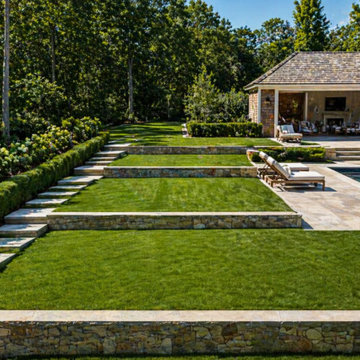
Project Description: Tiered Landscape & Pool Integration
This project centers on transforming a sloped property into a structured, highly functional outdoor space through precise elevation management and clean, linear design.
Rather than forcing the grade, the landscape was carefully terraced to create a series of defined levels that guide movement naturally across the property. Low-profile stone retaining walls establish each transition, allowing the space to step down gradually while maintaining visual continuity from the upper lawn to the pool area.
Wide lawn panels were intentionally sized and leveled to create usable, open space, while integrated stone steps provide a clear, uninterrupted path between elevations. The layout maintains strong sightlines throughout, ensuring the pool, lounge areas, and surrounding landscape feel connected rather than segmented.
Planting was kept structured and restrained. Layered hedging and hydrangea borders soften the hardscape while reinforcing the geometry of the design, providing privacy without disrupting the overall order of the space.
Material selection focused on durability and cohesion—natural stone was used throughout for walls, steps, and pool surround to create a consistent foundation that ties each level together.
 TVL Creative Ltd.
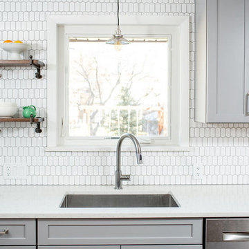
Our clients have been raising their family in this charming Lakewood ranch home for several years and were ready to make some updates to their home to make it better fit their lifestyle. In particular, the existing kitchen just wasn’t meeting their needs. They were sacrificing usable square footage to redundant circulation and the kitchen wasn’t connecting well with the other spaces in their home, so things had to change. We started by reworking the entry to the kitchen and switching up their layout to allow the kitchen to flow seamlessly with the rest of the house. To add to the open feeling we were striving for, we removed the existing ceiling soffits and created a clean transition between the kitchen and dining room, and installed the same wood flooring throughout the entire home. Aesthetically we wanted to create an inviting kitchen that felt clean and bright but could still stand up to a busy family. Soft grey shaker cabinets gave us the welcoming air we were looking for while providing a subtle contrast against the white quartz counters and backsplash tile. We utilized the same elegant pulls on all of the cabinets to add to the cohesive look of the kitchen and keep things from feeling too cluttered. We wanted to have a little fun with the backsplash without loosing the clean feeling we were going for, so we selected a crisp white picket tile to add a pop of texture. Updating the dining room light fixture and adding a pendant over the sink help to personalize the space and the charming shelves provide an opportunity to display original sculpture.
 TVL Creative Ltd.
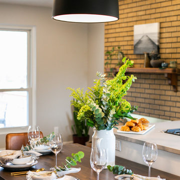
This 1950s home was sporting elements of the original kitchen and the dark space was not meeting our client’s needs. The original kitchen didn’t have much to offer in the way of functionality, so our first order of business was to create a design that would exponentially increase the usability of the kitchen. We brought in functional cabinetry, introduced uninterrupted work surfaces, and added plenty of lighting to brighten up their kitchen. They also wanted to open the new kitchen to the living room and create space for a larger dining table, so we started by removing the existing cabinetry that was visually cut the living space in two and minimized the power of the dramatic vaulted ceiling. We also extended the wood flooring into the kitchen as well to create seamless transitions between spaces. We fell in love with the idea of a two-toned cabinetry design for this kitchen and ultimately went head over heels for clean white painted base cabinets and a textured wood-look melamine on the uppers. This gave us a crisp backdrop that allowed us to bring is fun forms like the black light fixture over the table and the gorgeous silhouettes on the hardware. We played a lot with directionality in this space. The elongated open shelves and rectangular backsplash tiles give us wonderfully clean horizontal lines, but to balance those out we brought in a vertical grain pattern on the wall cabinets and added long black cabinetry pulls that emphasize the verticality of the space. The clients have a green thumb and wanted to make sure we created a home for their growing plant collection. The open shelving gives us plenty of opportunities for foliage and to showcase fun kitchen accessories. This design feels like home and brings together the clean lines and crisp finishes our clients were looking for.
 Duncan's Creative Kitchens
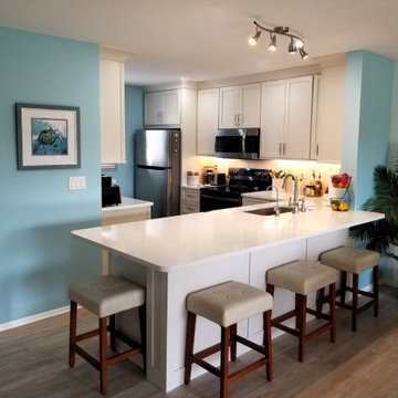
We transformed a cramped and enclosed kitchen in a Bradenton condo into a contemporary and open-concept space. The original layout felt closed off and inefficient, so our primary goal was to improve the flow and functionality of the home's main living area.
By strategically removing the existing wall and reconfiguring the floor plan, we were able to create a seamless transition from the living room to the kitchen. The new design features a large, central island that serves as both a prep area and a breakfast bar, maximizing usable space. Modern white cabinetry, sleek countertops, and updated appliances complete the look, resulting in a kitchen that is not only beautiful but also a true hub for entertaining and daily life.
 TVL Creative Ltd.
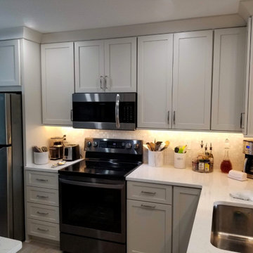
This 1950s home was sporting elements of the original kitchen and the dark space was not meeting our client’s needs. The original kitchen didn’t have much to offer in the way of functionality, so our first order of business was to create a design that would exponentially increase the usability of the kitchen. We brought in functional cabinetry, introduced uninterrupted work surfaces, and added plenty of lighting to brighten up their kitchen. They also wanted to open the new kitchen to the living room and create space for a larger dining table, so we started by removing the existing cabinetry that was visually cut the living space in two and minimized the power of the dramatic vaulted ceiling. We also extended the wood flooring into the kitchen as well to create seamless transitions between spaces. We fell in love with the idea of a two-toned cabinetry design for this kitchen and ultimately went head over heels for clean white painted base cabinets and a textured wood-look melamine on the uppers. This gave us a crisp backdrop that allowed us to bring is fun forms like the black light fixture over the table and the gorgeous silhouettes on the hardware. We played a lot with directionality in this space. The elongated open shelves and rectangular backsplash tiles give us wonderfully clean horizontal lines, but to balance those out we brought in a vertical grain pattern on the wall cabinets and added long black cabinetry pulls that emphasize the verticality of the space. The clients have a green thumb and wanted to make sure we created a home for their growing plant collection. The open shelving gives us plenty of opportunities for foliage and to showcase fun kitchen accessories. This design feels like home and brings together the clean lines and crisp finishes our clients were looking for.
 Duncan's Creative Kitchens
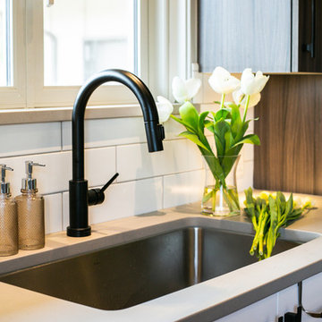
We transformed a cramped and enclosed kitchen in a Bradenton condo into a contemporary and open-concept space. The original layout felt closed off and inefficient, so our primary goal was to improve the flow and functionality of the home's main living area.
By strategically removing the existing wall and reconfiguring the floor plan, we were able to create a seamless transition from the living room to the kitchen. The new design features a large, central island that serves as both a prep area and a breakfast bar, maximizing usable space. Modern white cabinetry, sleek countertops, and updated appliances complete the look, resulting in a kitchen that is not only beautiful but also a true hub for entertaining and daily life.
 TVL Creative Ltd.
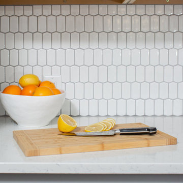
Our clients have been raising their family in this charming Lakewood ranch home for several years and were ready to make some updates to their home to make it better fit their lifestyle. In particular, the existing kitchen just wasn’t meeting their needs. They were sacrificing usable square footage to redundant circulation and the kitchen wasn’t connecting well with the other spaces in their home, so things had to change. We started by reworking the entry to the kitchen and switching up their layout to allow the kitchen to flow seamlessly with the rest of the house. To add to the open feeling we were striving for, we removed the existing ceiling soffits and created a clean transition between the kitchen and dining room, and installed the same wood flooring throughout the entire home. Aesthetically we wanted to create an inviting kitchen that felt clean and bright but could still stand up to a busy family. Soft grey shaker cabinets gave us the welcoming air we were looking for while providing a subtle contrast against the white quartz counters and backsplash tile. We utilized the same elegant pulls on all of the cabinets to add to the cohesive look of the kitchen and keep things from feeling too cluttered. We wanted to have a little fun with the backsplash without loosing the clean feeling we were going for, so we selected a crisp white picket tile to add a pop of texture. Updating the dining room light fixture and adding a pendant over the sink help to personalize the space and the charming shelves provide an opportunity to display original sculpture.
 TVL Creative Ltd.
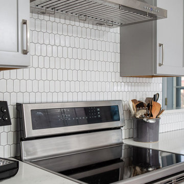
Our clients have been raising their family in this charming Lakewood ranch home for several years and were ready to make some updates to their home to make it better fit their lifestyle. In particular, the existing kitchen just wasn’t meeting their needs. They were sacrificing usable square footage to redundant circulation and the kitchen wasn’t connecting well with the other spaces in their home, so things had to change. We started by reworking the entry to the kitchen and switching up their layout to allow the kitchen to flow seamlessly with the rest of the house. To add to the open feeling we were striving for, we removed the existing ceiling soffits and created a clean transition between the kitchen and dining room, and installed the same wood flooring throughout the entire home. Aesthetically we wanted to create an inviting kitchen that felt clean and bright but could still stand up to a busy family. Soft grey shaker cabinets gave us the welcoming air we were looking for while providing a subtle contrast against the white quartz counters and backsplash tile. We utilized the same elegant pulls on all of the cabinets to add to the cohesive look of the kitchen and keep things from feeling too cluttered. We wanted to have a little fun with the backsplash without loosing the clean feeling we were going for, so we selected a crisp white picket tile to add a pop of texture. Updating the dining room light fixture and adding a pendant over the sink help to personalize the space and the charming shelves provide an opportunity to display original sculpture.
9