
Search results for "Valuable seating" in Home Design Ideas

 TVL Creative Ltd.
Cramped kitchen be gone! That was the project motto and top priority. The goal was to transform the current layout from multiple smaller spaces into a connected whole that would activate the main level for our clients, a young family of four.
The biggest obstacle was the wall dividing the kitchen and the dining room. Removing this wall was central to opening up and integrating the main living spaces, but the existing ductwork that ran right through the center of the wall posed a design challenge, er design opportunity. The resulting design solution features a central pantry that captures the ductwork and provides valuable storage- especially when compared to the original kitchen's 18" wide pantry cabinet. The pantry also anchors the kitchen island and serves as a visual separation of space between the kitchen and homework area.
Through our design development process, we learned the formal living room was of no service to their lifestyle and therefore space they rarely spent time in. With that in mind, we proposed to eliminate the unused living room and make it the new dining room. Relocating the dining room to this space inherently felt right given the soaring ceiling and ample room for holiday dinners and celebrations. The new dining room was spacious enough for us to incorporate a conversational seating area in the warm, south-facing window alcove.
Now what to do with the old dining room?! To answer that question we took inspiration from our clients' shared profession in education and developed a craft area/homework station for both of their boys. The semi-custom cabinetry of the desk area carries over to the adjacent wall and forms window bench base with storage that we topped with butcher block for a touch of warmth. While the boys are young, the bench drawers are the perfect place for a stash of toys close to the kitchen.
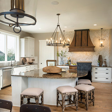
The kitchen begins just beyond the window seat with their refrigerator enclosure. Opposite the refrigerator is the new pantry with twenty linear feet of shelving and space for brooms and a stick vacuum. Extending from the backside of the pantry the kitchen island design incorporates counter seating on the family room side and a cabinetry configuration on the kitchen side with drawer storage, a trashcan center, farmhouse sink, and dishwasher.
We took careful time in design and execution to align the range and sink because while it might seem like a small detail, it plays an important role in supporting the symmetrical configuration of the back wall of the kitchen. The rear wall design utilizes an appliance garage mirrors the visual impact of the refrigerator enclosure and helps keep the now open kitchen tidy. Between the appliance garage and refrigerator enclosure is the cooking zone with 30" of cabinetry and work surface on either side of the range, a chimney style vent hood, and a bold graphic tile backsplash.
The backsplash is just one of many personal touches we added to the space to reflect our client's modern eclectic style and love of color. Swooping lines of the mid-mod style barstools compliment the pendants and backsplash pattern. A pop of vibrant green on the frame of the pantry door adds a fresh wash of color to an otherwise neutral space. The big show stopper is the custom charcoal gray and copper chevron wall installation in the dining room. This was an idea our clients softly suggested, and we excitedly embraced the opportunity. It is also a kickass solution to the head-scratching design dilemma of how to fill a large and lofty wall.
We are so grateful to bring this design to life for our clients and now dear friends.
 TVL Creative Ltd.
Cramped kitchen be gone! That was the project motto and top priority. The goal was to transform the current layout from multiple smaller spaces into a connected whole that would activate the main level for our clients, a young family of four.
The biggest obstacle was the wall dividing the kitchen and the dining room. Removing this wall was central to opening up and integrating the main living spaces, but the existing ductwork that ran right through the center of the wall posed a design challenge, er design opportunity. The resulting design solution features a central pantry that captures the ductwork and provides valuable storage- especially when compared to the original kitchen's 18" wide pantry cabinet. The pantry also anchors the kitchen island and serves as a visual separation of space between the kitchen and homework area.
Through our design development process, we learned the formal living room was of no service to their lifestyle and therefore space they rarely spent time in. With that in mind, we proposed to eliminate the unused living room and make it the new dining room. Relocating the dining room to this space inherently felt right given the soaring ceiling and ample room for holiday dinners and celebrations. The new dining room was spacious enough for us to incorporate a conversational seating area in the warm, south-facing window alcove.
Now what to do with the old dining room?! To answer that question we took inspiration from our clients' shared profession in education and developed a craft area/homework station for both of their boys. The semi-custom cabinetry of the desk area carries over to the adjacent wall and forms window bench base with storage that we topped with butcher block for a touch of warmth. While the boys are young, the bench drawers are the perfect place for a stash of toys close to the kitchen.
The kitchen begins just beyond the window seat with their refrigerator enclosure. Opposite the refrigerator is the new pantry with twenty linear feet of shelving and space for brooms and a stick vacuum. Extending from the backside of the pantry the kitchen island design incorporates counter seating on the family room side and a cabinetry configuration on the kitchen side with drawer storage, a trashcan center, farmhouse sink, and dishwasher.
We took careful time in design and execution to align the range and sink because while it might seem like a small detail, it plays an important role in supporting the symmetrical configuration of the back wall of the kitchen. The rear wall design utilizes an appliance garage mirrors the visual impact of the refrigerator enclosure and helps keep the now open kitchen tidy. Between the appliance garage and refrigerator enclosure is the cooking zone with 30" of cabinetry and work surface on either side of the range, a chimney style vent hood, and a bold graphic tile backsplash.
The backsplash is just one of many personal touches we added to the space to reflect our client's modern eclectic style and love of color. Swooping lines of the mid-mod style barstools compliment the pendants and backsplash pattern. A pop of vibrant green on the frame of the pantry door adds a fresh wash of color to an otherwise neutral space. The big show stopper is the custom charcoal gray and copper chevron wall installation in the dining room. This was an idea our clients softly suggested, and we excitedly embraced the opportunity. It is also a kickass solution to the head-scratching design dilemma of how to fill a large and lofty wall.
We are so grateful to bring this design to life for our clients and now dear friends.
 TVL Creative Ltd.
Cramped kitchen be gone! That was the project motto and top priority. The goal was to transform the current layout from multiple smaller spaces into a connected whole that would activate the main level for our clients, a young family of four.
The biggest obstacle was the wall dividing the kitchen and the dining room. Removing this wall was central to opening up and integrating the main living spaces, but the existing ductwork that ran right through the center of the wall posed a design challenge, er design opportunity. The resulting design solution features a central pantry that captures the ductwork and provides valuable storage- especially when compared to the original kitchen's 18" wide pantry cabinet. The pantry also anchors the kitchen island and serves as a visual separation of space between the kitchen and homework area.
Through our design development process, we learned the formal living room was of no service to their lifestyle and therefore space they rarely spent time in. With that in mind, we proposed to eliminate the unused living room and make it the new dining room. Relocating the dining room to this space inherently felt right given the soaring ceiling and ample room for holiday dinners and celebrations. The new dining room was spacious enough for us to incorporate a conversational seating area in the warm, south-facing window alcove.
Now what to do with the old dining room?! To answer that question we took inspiration from our clients' shared profession in education and developed a craft area/homework station for both of their boys. The semi-custom cabinetry of the desk area carries over to the adjacent wall and forms window bench base with storage that we topped with butcher block for a touch of warmth. While the boys are young, the bench drawers are the perfect place for a stash of toys close to the kitchen.
The kitchen begins just beyond the window seat with their refrigerator enclosure. Opposite the refrigerator is the new pantry with twenty linear feet of shelving and space for brooms and a stick vacuum. Extending from the backside of the pantry the kitchen island design incorporates counter seating on the family room side and a cabinetry configuration on the kitchen side with drawer storage, a trashcan center, farmhouse sink, and dishwasher.
We took careful time in design and execution to align the range and sink because while it might seem like a small detail, it plays an important role in supporting the symmetrical configuration of the back wall of the kitchen. The rear wall design utilizes an appliance garage mirrors the visual impact of the refrigerator enclosure and helps keep the now open kitchen tidy. Between the appliance garage and refrigerator enclosure is the cooking zone with 30" of cabinetry and work surface on either side of the range, a chimney style vent hood, and a bold graphic tile backsplash.
The backsplash is just one of many personal touches we added to the space to reflect our client's modern eclectic style and love of color. Swooping lines of the mid-mod style barstools compliment the pendants and backsplash pattern. A pop of vibrant green on the frame of the pantry door adds a fresh wash of color to an otherwise neutral space. The big show stopper is the custom charcoal gray and copper chevron wall installation in the dining room. This was an idea our clients softly suggested, and we excitedly embraced the opportunity. It is also a kickass solution to the head-scratching design dilemma of how to fill a large and lofty wall.
We are so grateful to bring this design to life for our clients and now dear friends.
Find the right local pro for your project
 TVL Creative Ltd.
Cramped kitchen be gone! That was the project motto and top priority. The goal was to transform the current layout from multiple smaller spaces into a connected whole that would activate the main level for our clients, a young family of four.
The biggest obstacle was the wall dividing the kitchen and the dining room. Removing this wall was central to opening up and integrating the main living spaces, but the existing ductwork that ran right through the center of the wall posed a design challenge, er design opportunity. The resulting design solution features a central pantry that captures the ductwork and provides valuable storage- especially when compared to the original kitchen's 18" wide pantry cabinet. The pantry also anchors the kitchen island and serves as a visual separation of space between the kitchen and homework area.
Through our design development process, we learned the formal living room was of no service to their lifestyle and therefore space they rarely spent time in. With that in mind, we proposed to eliminate the unused living room and make it the new dining room. Relocating the dining room to this space inherently felt right given the soaring ceiling and ample room for holiday dinners and celebrations. The new dining room was spacious enough for us to incorporate a conversational seating area in the warm, south-facing window alcove.
Now what to do with the old dining room?! To answer that question we took inspiration from our clients' shared profession in education and developed a craft area/homework station for both of their boys. The semi-custom cabinetry of the desk area carries over to the adjacent wall and forms window bench base with storage that we topped with butcher block for a touch of warmth. While the boys are young, the bench drawers are the perfect place for a stash of toys close to the kitchen.
The kitchen begins just beyond the window seat with their refrigerator enclosure. Opposite the refrigerator is the new pantry with twenty linear feet of shelving and space for brooms and a stick vacuum. Extending from the backside of the pantry the kitchen island design incorporates counter seating on the family room side and a cabinetry configuration on the kitchen side with drawer storage, a trashcan center, farmhouse sink, and dishwasher.
We took careful time in design and execution to align the range and sink because while it might seem like a small detail, it plays an important role in supporting the symmetrical configuration of the back wall of the kitchen. The rear wall design utilizes an appliance garage mirrors the visual impact of the refrigerator enclosure and helps keep the now open kitchen tidy. Between the appliance garage and refrigerator enclosure is the cooking zone with 30" of cabinetry and work surface on either side of the range, a chimney style vent hood, and a bold graphic tile backsplash.
The backsplash is just one of many personal touches we added to the space to reflect our client's modern eclectic style and love of color. Swooping lines of the mid-mod style barstools compliment the pendants and backsplash pattern. A pop of vibrant green on the frame of the pantry door adds a fresh wash of color to an otherwise neutral space. The big show stopper is the custom charcoal gray and copper chevron wall installation in the dining room. This was an idea our clients softly suggested, and we excitedly embraced the opportunity. It is also a kickass solution to the head-scratching design dilemma of how to fill a large and lofty wall.
We are so grateful to bring this design to life for our clients and now dear friends.
 TVL Creative Ltd.
Cramped kitchen be gone! That was the project motto and top priority. The goal was to transform the current layout from multiple smaller spaces into a connected whole that would activate the main level for our clients, a young family of four.
The biggest obstacle was the wall dividing the kitchen and the dining room. Removing this wall was central to opening up and integrating the main living spaces, but the existing ductwork that ran right through the center of the wall posed a design challenge, er design opportunity. The resulting design solution features a central pantry that captures the ductwork and provides valuable storage- especially when compared to the original kitchen's 18" wide pantry cabinet. The pantry also anchors the kitchen island and serves as a visual separation of space between the kitchen and homework area.
Through our design development process, we learned the formal living room was of no service to their lifestyle and therefore space they rarely spent time in. With that in mind, we proposed to eliminate the unused living room and make it the new dining room. Relocating the dining room to this space inherently felt right given the soaring ceiling and ample room for holiday dinners and celebrations. The new dining room was spacious enough for us to incorporate a conversational seating area in the warm, south-facing window alcove.
Now what to do with the old dining room?! To answer that question we took inspiration from our clients' shared profession in education and developed a craft area/homework station for both of their boys. The semi-custom cabinetry of the desk area carries over to the adjacent wall and forms window bench base with storage that we topped with butcher block for a touch of warmth. While the boys are young, the bench drawers are the perfect place for a stash of toys close to the kitchen.
The kitchen begins just beyond the window seat with their refrigerator enclosure. Opposite the refrigerator is the new pantry with twenty linear feet of shelving and space for brooms and a stick vacuum. Extending from the backside of the pantry the kitchen island design incorporates counter seating on the family room side and a cabinetry configuration on the kitchen side with drawer storage, a trashcan center, farmhouse sink, and dishwasher.
We took careful time in design and execution to align the range and sink because while it might seem like a small detail, it plays an important role in supporting the symmetrical configuration of the back wall of the kitchen. The rear wall design utilizes an appliance garage mirrors the visual impact of the refrigerator enclosure and helps keep the now open kitchen tidy. Between the appliance garage and refrigerator enclosure is the cooking zone with 30" of cabinetry and work surface on either side of the range, a chimney style vent hood, and a bold graphic tile backsplash.
The backsplash is just one of many personal touches we added to the space to reflect our client's modern eclectic style and love of color. Swooping lines of the mid-mod style barstools compliment the pendants and backsplash pattern. A pop of vibrant green on the frame of the pantry door adds a fresh wash of color to an otherwise neutral space. The big show stopper is the custom charcoal gray and copper chevron wall installation in the dining room. This was an idea our clients softly suggested, and we excitedly embraced the opportunity. It is also a kickass solution to the head-scratching design dilemma of how to fill a large and lofty wall.
We are so grateful to bring this design to life for our clients and now dear friends.
 TVL Creative Ltd.
Cramped kitchen be gone! That was the project motto and top priority. The goal was to transform the current layout from multiple smaller spaces into a connected whole that would activate the main level for our clients, a young family of four.
The biggest obstacle was the wall dividing the kitchen and the dining room. Removing this wall was central to opening up and integrating the main living spaces, but the existing ductwork that ran right through the center of the wall posed a design challenge, er design opportunity. The resulting design solution features a central pantry that captures the ductwork and provides valuable storage- especially when compared to the original kitchen's 18" wide pantry cabinet. The pantry also anchors the kitchen island and serves as a visual separation of space between the kitchen and homework area.
Through our design development process, we learned the formal living room was of no service to their lifestyle and therefore space they rarely spent time in. With that in mind, we proposed to eliminate the unused living room and make it the new dining room. Relocating the dining room to this space inherently felt right given the soaring ceiling and ample room for holiday dinners and celebrations. The new dining room was spacious enough for us to incorporate a conversational seating area in the warm, south-facing window alcove.
Now what to do with the old dining room?! To answer that question we took inspiration from our clients' shared profession in education and developed a craft area/homework station for both of their boys. The semi-custom cabinetry of the desk area carries over to the adjacent wall and forms window bench base with storage that we topped with butcher block for a touch of warmth. While the boys are young, the bench drawers are the perfect place for a stash of toys close to the kitchen.
The kitchen begins just beyond the window seat with their refrigerator enclosure. Opposite the refrigerator is the new pantry with twenty linear feet of shelving and space for brooms and a stick vacuum. Extending from the backside of the pantry the kitchen island design incorporates counter seating on the family room side and a cabinetry configuration on the kitchen side with drawer storage, a trashcan center, farmhouse sink, and dishwasher.
We took careful time in design and execution to align the range and sink because while it might seem like a small detail, it plays an important role in supporting the symmetrical configuration of the back wall of the kitchen. The rear wall design utilizes an appliance garage mirrors the visual impact of the refrigerator enclosure and helps keep the now open kitchen tidy. Between the appliance garage and refrigerator enclosure is the cooking zone with 30" of cabinetry and work surface on either side of the range, a chimney style vent hood, and a bold graphic tile backsplash.
The backsplash is just one of many personal touches we added to the space to reflect our client's modern eclectic style and love of color. Swooping lines of the mid-mod style barstools compliment the pendants and backsplash pattern. A pop of vibrant green on the frame of the pantry door adds a fresh wash of color to an otherwise neutral space. The big show stopper is the custom charcoal gray and copper chevron wall installation in the dining room. This was an idea our clients softly suggested, and we excitedly embraced the opportunity. It is also a kickass solution to the head-scratching design dilemma of how to fill a large and lofty wall.
We are so grateful to bring this design to life for our clients and now dear friends.
 TVL Creative Ltd.
Cramped kitchen be gone! That was the project motto and top priority. The goal was to transform the current layout from multiple smaller spaces into a connected whole that would activate the main level for our clients, a young family of four.
The biggest obstacle was the wall dividing the kitchen and the dining room. Removing this wall was central to opening up and integrating the main living spaces, but the existing ductwork that ran right through the center of the wall posed a design challenge, er design opportunity. The resulting design solution features a central pantry that captures the ductwork and provides valuable storage- especially when compared to the original kitchen's 18" wide pantry cabinet. The pantry also anchors the kitchen island and serves as a visual separation of space between the kitchen and homework area.
Through our design development process, we learned the formal living room was of no service to their lifestyle and therefore space they rarely spent time in. With that in mind, we proposed to eliminate the unused living room and make it the new dining room. Relocating the dining room to this space inherently felt right given the soaring ceiling and ample room for holiday dinners and celebrations. The new dining room was spacious enough for us to incorporate a conversational seating area in the warm, south-facing window alcove.
Now what to do with the old dining room?! To answer that question we took inspiration from our clients' shared profession in education and developed a craft area/homework station for both of their boys. The semi-custom cabinetry of the desk area carries over to the adjacent wall and forms window bench base with storage that we topped with butcher block for a touch of warmth. While the boys are young, the bench drawers are the perfect place for a stash of toys close to the kitchen.
The kitchen begins just beyond the window seat with their refrigerator enclosure. Opposite the refrigerator is the new pantry with twenty linear feet of shelving and space for brooms and a stick vacuum. Extending from the backside of the pantry the kitchen island design incorporates counter seating on the family room side and a cabinetry configuration on the kitchen side with drawer storage, a trashcan center, farmhouse sink, and dishwasher.
We took careful time in design and execution to align the range and sink because while it might seem like a small detail, it plays an important role in supporting the symmetrical configuration of the back wall of the kitchen. The rear wall design utilizes an appliance garage mirrors the visual impact of the refrigerator enclosure and helps keep the now open kitchen tidy. Between the appliance garage and refrigerator enclosure is the cooking zone with 30" of cabinetry and work surface on either side of the range, a chimney style vent hood, and a bold graphic tile backsplash.
The backsplash is just one of many personal touches we added to the space to reflect our client's modern eclectic style and love of color. Swooping lines of the mid-mod style barstools compliment the pendants and backsplash pattern. A pop of vibrant green on the frame of the pantry door adds a fresh wash of color to an otherwise neutral space. The big show stopper is the custom charcoal gray and copper chevron wall installation in the dining room. This was an idea our clients softly suggested, and we excitedly embraced the opportunity. It is also a kickass solution to the head-scratching design dilemma of how to fill a large and lofty wall.
We are so grateful to bring this design to life for our clients and now dear friends.

 TVL Creative Ltd.
Cramped kitchen be gone! That was the project motto and top priority. The goal was to transform the current layout from multiple smaller spaces into a connected whole that would activate the main level for our clients, a young family of four.
The biggest obstacle was the wall dividing the kitchen and the dining room. Removing this wall was central to opening up and integrating the main living spaces, but the existing ductwork that ran right through the center of the wall posed a design challenge, er design opportunity. The resulting design solution features a central pantry that captures the ductwork and provides valuable storage- especially when compared to the original kitchen's 18" wide pantry cabinet. The pantry also anchors the kitchen island and serves as a visual separation of space between the kitchen and homework area.
Through our design development process, we learned the formal living room was of no service to their lifestyle and therefore space they rarely spent time in. With that in mind, we proposed to eliminate the unused living room and make it the new dining room. Relocating the dining room to this space inherently felt right given the soaring ceiling and ample room for holiday dinners and celebrations. The new dining room was spacious enough for us to incorporate a conversational seating area in the warm, south-facing window alcove.
Now what to do with the old dining room?! To answer that question we took inspiration from our clients' shared profession in education and developed a craft area/homework station for both of their boys. The semi-custom cabinetry of the desk area carries over to the adjacent wall and forms window bench base with storage that we topped with butcher block for a touch of warmth. While the boys are young, the bench drawers are the perfect place for a stash of toys close to the kitchen.
The kitchen begins just beyond the window seat with their refrigerator enclosure. Opposite the refrigerator is the new pantry with twenty linear feet of shelving and space for brooms and a stick vacuum. Extending from the backside of the pantry the kitchen island design incorporates counter seating on the family room side and a cabinetry configuration on the kitchen side with drawer storage, a trashcan center, farmhouse sink, and dishwasher.
We took careful time in design and execution to align the range and sink because while it might seem like a small detail, it plays an important role in supporting the symmetrical configuration of the back wall of the kitchen. The rear wall design utilizes an appliance garage mirrors the visual impact of the refrigerator enclosure and helps keep the now open kitchen tidy. Between the appliance garage and refrigerator enclosure is the cooking zone with 30" of cabinetry and work surface on either side of the range, a chimney style vent hood, and a bold graphic tile backsplash.
The backsplash is just one of many personal touches we added to the space to reflect our client's modern eclectic style and love of color. Swooping lines of the mid-mod style barstools compliment the pendants and backsplash pattern. A pop of vibrant green on the frame of the pantry door adds a fresh wash of color to an otherwise neutral space. The big show stopper is the custom charcoal gray and copper chevron wall installation in the dining room. This was an idea our clients softly suggested, and we excitedly embraced the opportunity. It is also a kickass solution to the head-scratching design dilemma of how to fill a large and lofty wall.
We are so grateful to bring this design to life for our clients and now dear friends.
 TVL Creative Ltd.
Cramped kitchen be gone! That was the project motto and top priority. The goal was to transform the current layout from multiple smaller spaces into a connected whole that would activate the main level for our clients, a young family of four.
The biggest obstacle was the wall dividing the kitchen and the dining room. Removing this wall was central to opening up and integrating the main living spaces, but the existing ductwork that ran right through the center of the wall posed a design challenge, er design opportunity. The resulting design solution features a central pantry that captures the ductwork and provides valuable storage- especially when compared to the original kitchen's 18" wide pantry cabinet. The pantry also anchors the kitchen island and serves as a visual separation of space between the kitchen and homework area.
Through our design development process, we learned the formal living room was of no service to their lifestyle and therefore space they rarely spent time in. With that in mind, we proposed to eliminate the unused living room and make it the new dining room. Relocating the dining room to this space inherently felt right given the soaring ceiling and ample room for holiday dinners and celebrations. The new dining room was spacious enough for us to incorporate a conversational seating area in the warm, south-facing window alcove.
Now what to do with the old dining room?! To answer that question we took inspiration from our clients' shared profession in education and developed a craft area/homework station for both of their boys. The semi-custom cabinetry of the desk area carries over to the adjacent wall and forms window bench base with storage that we topped with butcher block for a touch of warmth. While the boys are young, the bench drawers are the perfect place for a stash of toys close to the kitchen.
The kitchen begins just beyond the window seat with their refrigerator enclosure. Opposite the refrigerator is the new pantry with twenty linear feet of shelving and space for brooms and a stick vacuum. Extending from the backside of the pantry the kitchen island design incorporates counter seating on the family room side and a cabinetry configuration on the kitchen side with drawer storage, a trashcan center, farmhouse sink, and dishwasher.
We took careful time in design and execution to align the range and sink because while it might seem like a small detail, it plays an important role in supporting the symmetrical configuration of the back wall of the kitchen. The rear wall design utilizes an appliance garage mirrors the visual impact of the refrigerator enclosure and helps keep the now open kitchen tidy. Between the appliance garage and refrigerator enclosure is the cooking zone with 30" of cabinetry and work surface on either side of the range, a chimney style vent hood, and a bold graphic tile backsplash.
The backsplash is just one of many personal touches we added to the space to reflect our client's modern eclectic style and love of color. Swooping lines of the mid-mod style barstools compliment the pendants and backsplash pattern. A pop of vibrant green on the frame of the pantry door adds a fresh wash of color to an otherwise neutral space. The big show stopper is the custom charcoal gray and copper chevron wall installation in the dining room. This was an idea our clients softly suggested, and we excitedly embraced the opportunity. It is also a kickass solution to the head-scratching design dilemma of how to fill a large and lofty wall.
We are so grateful to bring this design to life for our clients and now dear friends.
 TVL Creative Ltd.
Cramped kitchen be gone! That was the project motto and top priority. The goal was to transform the current layout from multiple smaller spaces into a connected whole that would activate the main level for our clients, a young family of four.
The biggest obstacle was the wall dividing the kitchen and the dining room. Removing this wall was central to opening up and integrating the main living spaces, but the existing ductwork that ran right through the center of the wall posed a design challenge, er design opportunity. The resulting design solution features a central pantry that captures the ductwork and provides valuable storage- especially when compared to the original kitchen's 18" wide pantry cabinet. The pantry also anchors the kitchen island and serves as a visual separation of space between the kitchen and homework area.
Through our design development process, we learned the formal living room was of no service to their lifestyle and therefore space they rarely spent time in. With that in mind, we proposed to eliminate the unused living room and make it the new dining room. Relocating the dining room to this space inherently felt right given the soaring ceiling and ample room for holiday dinners and celebrations. The new dining room was spacious enough for us to incorporate a conversational seating area in the warm, south-facing window alcove.
Now what to do with the old dining room?! To answer that question we took inspiration from our clients' shared profession in education and developed a craft area/homework station for both of their boys. The semi-custom cabinetry of the desk area carries over to the adjacent wall and forms window bench base with storage that we topped with butcher block for a touch of warmth. While the boys are young, the bench drawers are the perfect place for a stash of toys close to the kitchen.
The kitchen begins just beyond the window seat with their refrigerator enclosure. Opposite the refrigerator is the new pantry with twenty linear feet of shelving and space for brooms and a stick vacuum. Extending from the backside of the pantry the kitchen island design incorporates counter seating on the family room side and a cabinetry configuration on the kitchen side with drawer storage, a trashcan center, farmhouse sink, and dishwasher.
We took careful time in design and execution to align the range and sink because while it might seem like a small detail, it plays an important role in supporting the symmetrical configuration of the back wall of the kitchen. The rear wall design utilizes an appliance garage mirrors the visual impact of the refrigerator enclosure and helps keep the now open kitchen tidy. Between the appliance garage and refrigerator enclosure is the cooking zone with 30" of cabinetry and work surface on either side of the range, a chimney style vent hood, and a bold graphic tile backsplash.
The backsplash is just one of many personal touches we added to the space to reflect our client's modern eclectic style and love of color. Swooping lines of the mid-mod style barstools compliment the pendants and backsplash pattern. A pop of vibrant green on the frame of the pantry door adds a fresh wash of color to an otherwise neutral space. The big show stopper is the custom charcoal gray and copper chevron wall installation in the dining room. This was an idea our clients softly suggested, and we excitedly embraced the opportunity. It is also a kickass solution to the head-scratching design dilemma of how to fill a large and lofty wall.
We are so grateful to bring this design to life for our clients and now dear friends.
 Accent Window Fashions LLC
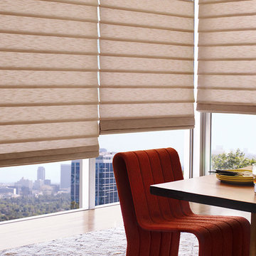
HUNTER DOUGLAS ALUSTRA® VIGNETTE®
Designer fabrics that fold perfectly!
The dramatic look of Hunter Douglas Alustra® Vignette® Modern Roman Shades make a room. Exclusive fabrics, rich textures and a finished look with no exposed cords make these shades a defining fashion statement.
Design Inspiration EXCLUSIVE FABRICS
Our handpicked premium fabrics turn ordinary rooms into ones of beauty and distinction. When framed with our fabric-covered hardware, these fabrics create window fashions that can complement your décor and create welcoming, comfortable spaces.
Traditional™ fold SOFT YET MODERN
A 4-inch contoured fold for that traditional, yet modern, look at the window.
Tailored™ fold CRISP AND SOPHISTICATED
A 6-inch flat fold that is nicely pressed for a defined finish.
Tiered™ STACKED SOFTNESS
This option allows shades to stack up, down or anywhere in between.
Absorb Sound REDUCE OUTSIDE NOISE
Improve your room’s acoustics while reducing the intensity of outside sound. It starts at the windows. Simple. The degree of sound control will depend on the fabric you choose, so if this is an important feature to you, be sure to discuss it with your sales expert.
UV Protection SUNSCREEN FOR YOUR VALUABLES
Protect your furniture, flooring and artwork from fading with at least 75% protection from harmful UV rays.
Top-Down/Bottom-Up PRIVACY WITH A VIEW
A more versatile approach to light control. Open from the top, from the bottom, or find somewhere in-between–for the perfect balance of privacy and light.
Platinum™ Technology
CONTROL FROM YOUR PHONE OR TABLET
Controlling your window treatments with a mobile device means you can set your blinds to movie mode, work mode, or 8 a.m. mode with the touch of a button, without leaving your seat. It’s effortless, fun and smart—with perfectly smooth operation.
Accents by the Yard™ FABRICS FOR YOUR ROOM DECOR
Fabrics are available by the yard, so you can create decorative accents for any room with matching fabric.
Lifetime Guarantee FOR LIFE
Hunter Douglas products are designed and custom-assembled in the U.S. with the highest level of quality. But just in case, every window treatment from Hunter Douglas is covered by our lifetime limited guarantee. Read the Hunter Douglas Warranty to learn more.
Hunter Douglas Alustra® Vignette® Modern Roman Shades with UltraGlide®
Hunter Douglas Alustra® Vignette® Modern Roman Shades with UltraGlide®
Fabric: Drake
Color: Birch
Available from Accent Window Fashions LLC
Hunter Douglas Showcase Priority Dealer
Hunter Douglas Certified Installer
Hunter Douglas Certified Professional Dealer
#Hunter_Douglas #Alustra #Vignette #Modern_Roman_Shades #Roman_Shades #UltraGlide #Window_Treatments #HunterDouglas #Accent_Window_Fashions
Copyright 2001-2014 Hunter Douglas, Inc. All rights reserved.
 Drury Design
THE SETUP
When we first encountered this basement for a family with three boys, we saw a space with untapped potential. Though previously remodeled, it lacked a cohesive design strategy. The expansive area housed various entertainment pieces (a shuffleboard table, air hockey, foosball, etc.) scattered haphazardly throughout the space.
While the basement included a workout room and a rudimentary kitchen area, it lacked a dedicated game room or proper bar. Excessive storage closets along the back wall consumed valuable real estate that could be repurposed for more engaging uses.
In essence, the basement was spacious but disjointed—functional for family use but falling short as an entertainment hub. It didn’t align with the sophistication of the rest of the home. Our clients envisioned a transformation: a fresh, organized space that would not only serve their family’s needs but also shine as an inviting arena for entertaining friends and hosting gatherings – especially sports-focused gatherings!
Design Objectives:
Reimagine the basement layout, creating distinct zones for varied activities.
Expand the workout area to accommodate new equipment, including a Smith machine.
Implement a multi-screen setup inspired by high-end sports bars, allowing guests to follow multiple games while socializing.
Enhance existing features while developing new areas:
Optimize a workout space for all equipment needs
Establish a dedicated children’s space with guest room capabilities
Create an integrated bar and entertainment area
Retain and incorporate the existing projector setup
Design Challenges:
Navigate layout constraints in the new workout room due to fixed utility areas.
Carve out a distinct space for kids within the open plan.
Revitalize an underutilized section of the basement.
Elevate the existing big screen area with purposeful design elements.
Develop a full-fledged bar area while maintaining kitchen functions applicable for hangout snacking.
Work around immovable structural elements (soffits, load-bearing support columns)
THE RENEWED SPACE
Design Solutions:
Install a stylish barn door for the utility area of the new workout space, improving aesthetics and accessibility.
Repurpose the former workout room into a dedicated game room for kids, utilizing couches with pull-out beds so the area can double as overflow guest accommodations.
Transform the unused area into a vibrant pub-style area for card and table games.
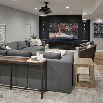
Enhance the big screen area with elegant wainscoting and ambient theatre-style lighting.
Design a multi-functional wet bar area featuring varied seating, prep areas, and a microwave.
Base the bar sink area width off the soffit above it.
In the big screen area, use the soffit to inform the width of a wainscoting section.
For the immovable support columns, dress one up to match the wainscoting of the nearby big screen wall. Hide the other one in a new wall.
Final Thoughts:
The reimagined basement has exceeded our clients’ expectations, evolving into the ultimate entertainment hub. With seven strategically placed screens, it’s perfect for gatherings focused on major sporting events and casual gatherings, as well. The space strikes a balance between adult sophistication and family-friendly functionality, featuring distinct zones for various activities.
The new design not only maximizes functionality for modern, multi-screen entertainment but also elevates the aesthetic appeal. It integrates flawlessly with the rest of the home’s transitional style while allowing each basement section to maintain its unique character. The result is a versatile space that caters to both intimate family time and large-scale entertaining.
 Accent Window Fashions LLC
HUNTER DOUGLAS VIGNETTE®
The Modern Roman Shade
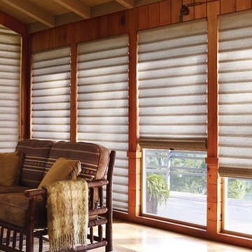
Vignette® Modern Roman Shades feature consistent folds and no exposed rear cords, keeping windows uncluttered. Choose from different fold styles and sizes, and a horizontal or vertical orientation.
Traditional™ Fold SOFT YET MODERN
A 4-inch contoured fold for that traditional, yet modern, look at the window.
Tailored™ Fold CRISP AND SOPHISTICATED
A 6-inch flat fold that is nicely pressed for a defined finish.
Architella® COOL IN THE SUMMER, WARM IN THE WINTER
Our most energy-efficient version of the classic Vignette design – these shades trap air, creating an extra layer of insulation to keep your home cooler in the summer and warmer in the winter.
Tiered™ STACKED SOFTNESS
This option allows shades to stack up, down or anywhere in between.
Traversed with Vertiglide™ FOR LARGE WINDOWS AND SLIDING DOORS
Vertiglide offers an exceptional solution for large expanses of windows and sliding glass doors.
REDUCE OUTSIDE NOISE
Improve your room’s acoustics while reducing the intensity of outside sound. It starts at the windows. Simple. The degree of sound control will depend on the fabric you choose, so if this is an important feature to you, be sure to discuss it with your sales expert.
UV Protection SUNSCREEN FOR YOUR VALUABLES
Protect your furniture, flooring and artwork from fading with at least 75% protection from harmful UV rays.
Top-Down/Bottom-Up PRIVACY WITH A VIEW
A more versatile approach to light control. Open from the top, from the bottom, or find somewhere in-between–for the perfect balance of privacy and light.
Platinum™ Technology CONTROL FROM YOUR PHONE OR TABLET
Controlling your window treatments with a mobile device means you can set your blinds to movie mode, work mode, or 8 a.m. mode with the touch of a button, without leaving your seat. It’s effortless, fun and smart—with perfectly smooth operation.
Accents by the Yard™ FABRICS FOR YOUR ROOM DECOR
Fabrics are available by the yard, so you can create decorative accents for any room with matching fabric.
Lifetime Guarantee FOR LIFE
Hunter Douglas products are designed and custom-assembled in the U.S. with the highest level of quality. But just in case, every window treatment from Hunter Douglas is covered by our lifetime limited guarantee. Read the Hunter Douglas Warranty to learn more.
Hunter Douglas Vignette® Tiered™ Modern Roman Shades with LiteRise®
Vignette®
Fabric/Material: Sahara
Color: Mirage
Operating Systems: LiteRise
Room: Living Room
Room Styles: Rustic
Available from Accent Window Fashions LLC
Hunter Douglas Showcase Priority Dealer
Hunter Douglas Certified Installer
Hunter Douglas Certified Professional Dealer
#Hunter_Douglas #Vignette #Tiered #Modern #Roman #Shades #LiteRise #Living_Room #Rustic #Window_Fashions #Window_Shadings #Window_Treatments #HunterDouglas #Accent_Window_Fashions
Copyright 2001-2014 Hunter Douglas, Inc. All rights reserved.
 Swatch Design Group
As a part of a larger transformation, the kitchen served as an anchor for rethinking how the home could feel and function. The goal was to create a space that felt truly integrated, flowed naturally within itself, and connected seamlessly to the outdoors. Storage was a top priority, with an emphasis on keeping countertops clean and the space feeling calm and open. Flow was equally important. What began as a layout optimized for entertaining evolved into a more intentional approach, where every sightline and transition was thoughtfully considered. The clients also needed the kitchen to work hard for their lifestyle, with a commercial-size refrigerator and freezer, generous prep space, and room to gather. The challenge was to bring purpose and polish to a space that didn’t quite feel like it belonged. The result is a kitchen that’s not only highly functional but finally feels like part of the home.
Project challenges:
- Maximizing storage was a primary challenge, especially with the inclusion of a commercial-sized fridge and freezer that occupied valuable cabinetry space.
- The need for clean, uninterrupted lines throughout the kitchen required thoughtful detailing, especially around cabinetry transitions and appliance integration.
- The oversized island design required two stone slabs and waterfall edges on both sides which posed both visual and logistical challenges.
- Incorporating electrical outlets into the island in a way that felt intentional and unobtrusive demanded creative problem-solving.
- The unique rooflines created strong visual angles that required a considered design approach to ensure the space felt cohesive rather than disjointed.
- Balancing symmetry and flow in a kitchen with structural constraints required precise layout planning to maintain a cohesive visual rhythm.
- Creating an intentional indoor/outdoor living flow, especially in the transitional space between the sliding doors to the backyard and the kitchen.
Project solutions:
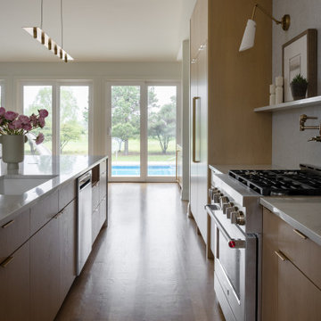
- To balance the visual weight of the commercial-grade fridge and freezer, we flanked the range and hood with full-height pocket cabinetry, which created symmetry while reclaiming storage space. We also took a look into internal organization and carefully mapped out where every kitchen item would live. This allowed us to make informed decisions about drawer versus door configurations, and when to incorporate features like roll-out shelving to maximize accessibility and function.
- Linear light fixtures above the island were chosen for their low visual impact, allowing sightlines to remain clear and emphasizing the thoughtful spatial layout.
- The oversized island was carefully executed using two coordinated slabs, with a subtle brass inlay detail between them to turn a logistical challenge into a design feature.
- Pop-up electrical outlets were integrated into the island to keep surfaces clutter-free while maintaining easy access, which combined form and function seamlessly.
- With multiple focal points and a peaked vaulted ceiling, layout precision was key. The island, hood, and adjacent staircase were all perfectly centered on the vault, creating a sense of alignment across the open space.
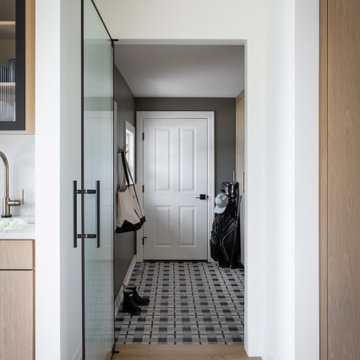
- In the transitional area between kitchen and backyard, we added a wet bar that visually and functionally connects the indoor space with the outdoors. This addition provides extra storage and creates a dedicated entertainment spot for guests, enhancing the overall flow and usability of the home.
 Accent Window Fashions LLC
HUNTER DOUGLAS ALUSTRA® VIGNETTE®
Designer fabrics that fold perfectly!
The dramatic look of Hunter Douglas Alustra® Vignette® Modern Roman Shades make a room. Exclusive fabrics, rich textures and a finished look with no exposed cords make these shades a defining fashion statement.
Design Inspiration EXCLUSIVE FABRICS
Our handpicked premium fabrics turn ordinary rooms into ones of beauty and distinction. When framed with our fabric-covered hardware, these fabrics create window fashions that can complement your décor and create welcoming, comfortable spaces.
Traditional™ fold SOFT YET MODERN
A 4-inch contoured fold for that traditional, yet modern, look at the window.
Tailored™ fold CRISP AND SOPHISTICATED
A 6-inch flat fold that is nicely pressed for a defined finish.
Tiered™ STACKED SOFTNESS
This option allows shades to stack up, down or anywhere in between.
Absorb Sound REDUCE OUTSIDE NOISE
Improve your room’s acoustics while reducing the intensity of outside sound. It starts at the windows. Simple. The degree of sound control will depend on the fabric you choose, so if this is an important feature to you, be sure to discuss it with your sales expert.
UV Protection SUNSCREEN FOR YOUR VALUABLES
Protect your furniture, flooring and artwork from fading with at least 75% protection from harmful UV rays.
Top-Down/Bottom-Up PRIVACY WITH A VIEW
A more versatile approach to light control. Open from the top, from the bottom, or find somewhere in-between–for the perfect balance of privacy and light.
Platinum™ Technology CONTROL FROM YOUR PHONE OR TABLET
Controlling your window treatments with a mobile device means you can set your blinds to movie mode, work mode, or 8 a.m. mode with the touch of a button, without leaving your seat. It’s effortless, fun and smart—with perfectly smooth operation.
Accents by the Yard™ FABRICS FOR YOUR ROOM DECOR
Fabrics are available by the yard, so you can create decorative accents for any room with matching fabric.
Lifetime Guarantee FOR LIFE
Hunter Douglas products are designed and custom-assembled in the U.S. with the highest level of quality. But just in case, every window treatment from Hunter Douglas is covered by our lifetime limited guarantee. Read the Hunter Douglas Warranty to learn more.
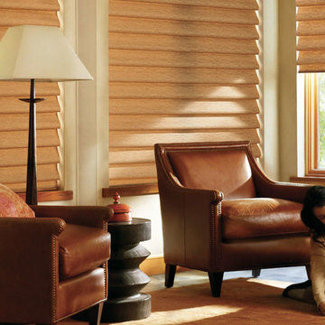
Hunter Douglas Alustra® Vignette® Modern Roman Shades with UltraGlide®
Hunter Douglas Alustra® Vignette® Modern Roman Shades with UltraGlide®
Fabric: Taos
Color: Copper Fields
Operating Systems: UltraGlide
Room: Living Room
Room Styles: Eclectic, Rustic. Casual
Available from Accent Window Fashions LLC
Hunter Douglas Showcase Priority Dealer
Hunter Douglas Certified Installer
Hunter Douglas Certified Professional Dealer
#Hunter_Douglas #Alustra #Vignette #Modern_Roman_Shades #UltraGlide #Roman_Shades #Living_Room #Eclectic #Rustic #Casual #Window_Treatments #HunterDouglas #Accent_Window_Fashions
Copyright 2001-2014 Hunter Douglas, Inc. All rights reserved.
 Swatch Design Group
As a part of a larger transformation, the kitchen served as an anchor for rethinking how the home could feel and function. The goal was to create a space that felt truly integrated, flowed naturally within itself, and connected seamlessly to the outdoors. Storage was a top priority, with an emphasis on keeping countertops clean and the space feeling calm and open. Flow was equally important. What began as a layout optimized for entertaining evolved into a more intentional approach, where every sightline and transition was thoughtfully considered. The clients also needed the kitchen to work hard for their lifestyle, with a commercial-size refrigerator and freezer, generous prep space, and room to gather. The challenge was to bring purpose and polish to a space that didn’t quite feel like it belonged. The result is a kitchen that’s not only highly functional but finally feels like part of the home.
Project challenges:
- Maximizing storage was a primary challenge, especially with the inclusion of a commercial-sized fridge and freezer that occupied valuable cabinetry space.
- The need for clean, uninterrupted lines throughout the kitchen required thoughtful detailing, especially around cabinetry transitions and appliance integration.
- The oversized island design required two stone slabs and waterfall edges on both sides which posed both visual and logistical challenges.
- Incorporating electrical outlets into the island in a way that felt intentional and unobtrusive demanded creative problem-solving.
- The unique rooflines created strong visual angles that required a considered design approach to ensure the space felt cohesive rather than disjointed.
- Balancing symmetry and flow in a kitchen with structural constraints required precise layout planning to maintain a cohesive visual rhythm.
- Creating an intentional indoor/outdoor living flow, especially in the transitional space between the sliding doors to the backyard and the kitchen.
Project solutions:
- To balance the visual weight of the commercial-grade fridge and freezer, we flanked the range and hood with full-height pocket cabinetry, which created symmetry while reclaiming storage space. We also took a look into internal organization and carefully mapped out where every kitchen item would live. This allowed us to make informed decisions about drawer versus door configurations, and when to incorporate features like roll-out shelving to maximize accessibility and function.
- Linear light fixtures above the island were chosen for their low visual impact, allowing sightlines to remain clear and emphasizing the thoughtful spatial layout.
- The oversized island was carefully executed using two coordinated slabs, with a subtle brass inlay detail between them to turn a logistical challenge into a design feature.
- Pop-up electrical outlets were integrated into the island to keep surfaces clutter-free while maintaining easy access, which combined form and function seamlessly.
- With multiple focal points and a peaked vaulted ceiling, layout precision was key. The island, hood, and adjacent staircase were all perfectly centered on the vault, creating a sense of alignment across the open space.
- In the transitional area between kitchen and backyard, we added a wet bar that visually and functionally connects the indoor space with the outdoors. This addition provides extra storage and creates a dedicated entertainment spot for guests, enhancing the overall flow and usability of the home.
 Swatch Design Group
As a part of a larger transformation, the kitchen served as an anchor for rethinking how the home could feel and function. The goal was to create a space that felt truly integrated, flowed naturally within itself, and connected seamlessly to the outdoors. Storage was a top priority, with an emphasis on keeping countertops clean and the space feeling calm and open. Flow was equally important. What began as a layout optimized for entertaining evolved into a more intentional approach, where every sightline and transition was thoughtfully considered. The clients also needed the kitchen to work hard for their lifestyle, with a commercial-size refrigerator and freezer, generous prep space, and room to gather. The challenge was to bring purpose and polish to a space that didn’t quite feel like it belonged. The result is a kitchen that’s not only highly functional but finally feels like part of the home.
Project challenges:
- Maximizing storage was a primary challenge, especially with the inclusion of a commercial-sized fridge and freezer that occupied valuable cabinetry space.
- The need for clean, uninterrupted lines throughout the kitchen required thoughtful detailing, especially around cabinetry transitions and appliance integration.
- The oversized island design required two stone slabs and waterfall edges on both sides which posed both visual and logistical challenges.
- Incorporating electrical outlets into the island in a way that felt intentional and unobtrusive demanded creative problem-solving.
- The unique rooflines created strong visual angles that required a considered design approach to ensure the space felt cohesive rather than disjointed.
- Balancing symmetry and flow in a kitchen with structural constraints required precise layout planning to maintain a cohesive visual rhythm.
- Creating an intentional indoor/outdoor living flow, especially in the transitional space between the sliding doors to the backyard and the kitchen.
Project solutions:
- To balance the visual weight of the commercial-grade fridge and freezer, we flanked the range and hood with full-height pocket cabinetry, which created symmetry while reclaiming storage space. We also took a look into internal organization and carefully mapped out where every kitchen item would live. This allowed us to make informed decisions about drawer versus door configurations, and when to incorporate features like roll-out shelving to maximize accessibility and function.
- Linear light fixtures above the island were chosen for their low visual impact, allowing sightlines to remain clear and emphasizing the thoughtful spatial layout.
- The oversized island was carefully executed using two coordinated slabs, with a subtle brass inlay detail between them to turn a logistical challenge into a design feature.
- Pop-up electrical outlets were integrated into the island to keep surfaces clutter-free while maintaining easy access, which combined form and function seamlessly.
- With multiple focal points and a peaked vaulted ceiling, layout precision was key. The island, hood, and adjacent staircase were all perfectly centered on the vault, creating a sense of alignment across the open space.
- In the transitional area between kitchen and backyard, we added a wet bar that visually and functionally connects the indoor space with the outdoors. This addition provides extra storage and creates a dedicated entertainment spot for guests, enhancing the overall flow and usability of the home.
Sponsored
Sunbury, OH

J.Holderby - Renovations
Franklin County's Leading General Contractors - 2X Best of Houzz!
 Swatch Design Group
As a part of a larger transformation, the kitchen served as an anchor for rethinking how the home could feel and function. The goal was to create a space that felt truly integrated, flowed naturally within itself, and connected seamlessly to the outdoors. Storage was a top priority, with an emphasis on keeping countertops clean and the space feeling calm and open. Flow was equally important. What began as a layout optimized for entertaining evolved into a more intentional approach, where every sightline and transition was thoughtfully considered. The clients also needed the kitchen to work hard for their lifestyle, with a commercial-size refrigerator and freezer, generous prep space, and room to gather. The challenge was to bring purpose and polish to a space that didn’t quite feel like it belonged. The result is a kitchen that’s not only highly functional but finally feels like part of the home.
Project challenges:
- Maximizing storage was a primary challenge, especially with the inclusion of a commercial-sized fridge and freezer that occupied valuable cabinetry space.
- The need for clean, uninterrupted lines throughout the kitchen required thoughtful detailing, especially around cabinetry transitions and appliance integration.
- The oversized island design required two stone slabs and waterfall edges on both sides which posed both visual and logistical challenges.
- Incorporating electrical outlets into the island in a way that felt intentional and unobtrusive demanded creative problem-solving.
- The unique rooflines created strong visual angles that required a considered design approach to ensure the space felt cohesive rather than disjointed.
- Balancing symmetry and flow in a kitchen with structural constraints required precise layout planning to maintain a cohesive visual rhythm.
- Creating an intentional indoor/outdoor living flow, especially in the transitional space between the sliding doors to the backyard and the kitchen.
Project solutions:
- To balance the visual weight of the commercial-grade fridge and freezer, we flanked the range and hood with full-height pocket cabinetry, which created symmetry while reclaiming storage space. We also took a look into internal organization and carefully mapped out where every kitchen item would live. This allowed us to make informed decisions about drawer versus door configurations, and when to incorporate features like roll-out shelving to maximize accessibility and function.
- Linear light fixtures above the island were chosen for their low visual impact, allowing sightlines to remain clear and emphasizing the thoughtful spatial layout.
- The oversized island was carefully executed using two coordinated slabs, with a subtle brass inlay detail between them to turn a logistical challenge into a design feature.
- Pop-up electrical outlets were integrated into the island to keep surfaces clutter-free while maintaining easy access, which combined form and function seamlessly.
- With multiple focal points and a peaked vaulted ceiling, layout precision was key. The island, hood, and adjacent staircase were all perfectly centered on the vault, creating a sense of alignment across the open space.
- In the transitional area between kitchen and backyard, we added a wet bar that visually and functionally connects the indoor space with the outdoors. This addition provides extra storage and creates a dedicated entertainment spot for guests, enhancing the overall flow and usability of the home.
 Swatch Design Group
As a part of a larger transformation, the kitchen served as an anchor for rethinking how the home could feel and function. The goal was to create a space that felt truly integrated, flowed naturally within itself, and connected seamlessly to the outdoors. Storage was a top priority, with an emphasis on keeping countertops clean and the space feeling calm and open. Flow was equally important. What began as a layout optimized for entertaining evolved into a more intentional approach, where every sightline and transition was thoughtfully considered. The clients also needed the kitchen to work hard for their lifestyle, with a commercial-size refrigerator and freezer, generous prep space, and room to gather. The challenge was to bring purpose and polish to a space that didn’t quite feel like it belonged. The result is a kitchen that’s not only highly functional but finally feels like part of the home.
Project challenges:
- Maximizing storage was a primary challenge, especially with the inclusion of a commercial-sized fridge and freezer that occupied valuable cabinetry space.
- The need for clean, uninterrupted lines throughout the kitchen required thoughtful detailing, especially around cabinetry transitions and appliance integration.
- The oversized island design required two stone slabs and waterfall edges on both sides which posed both visual and logistical challenges.
- Incorporating electrical outlets into the island in a way that felt intentional and unobtrusive demanded creative problem-solving.
- The unique rooflines created strong visual angles that required a considered design approach to ensure the space felt cohesive rather than disjointed.
- Balancing symmetry and flow in a kitchen with structural constraints required precise layout planning to maintain a cohesive visual rhythm.
- Creating an intentional indoor/outdoor living flow, especially in the transitional space between the sliding doors to the backyard and the kitchen.
Project solutions:
- To balance the visual weight of the commercial-grade fridge and freezer, we flanked the range and hood with full-height pocket cabinetry, which created symmetry while reclaiming storage space. We also took a look into internal organization and carefully mapped out where every kitchen item would live. This allowed us to make informed decisions about drawer versus door configurations, and when to incorporate features like roll-out shelving to maximize accessibility and function.
- Linear light fixtures above the island were chosen for their low visual impact, allowing sightlines to remain clear and emphasizing the thoughtful spatial layout.
- The oversized island was carefully executed using two coordinated slabs, with a subtle brass inlay detail between them to turn a logistical challenge into a design feature.
- Pop-up electrical outlets were integrated into the island to keep surfaces clutter-free while maintaining easy access, which combined form and function seamlessly.
- With multiple focal points and a peaked vaulted ceiling, layout precision was key. The island, hood, and adjacent staircase were all perfectly centered on the vault, creating a sense of alignment across the open space.
- In the transitional area between kitchen and backyard, we added a wet bar that visually and functionally connects the indoor space with the outdoors. This addition provides extra storage and creates a dedicated entertainment spot for guests, enhancing the overall flow and usability of the home.
 Swatch Design Group
As a part of a larger transformation, the kitchen served as an anchor for rethinking how the home could feel and function. The goal was to create a space that felt truly integrated, flowed naturally within itself, and connected seamlessly to the outdoors. Storage was a top priority, with an emphasis on keeping countertops clean and the space feeling calm and open. Flow was equally important. What began as a layout optimized for entertaining evolved into a more intentional approach, where every sightline and transition was thoughtfully considered. The clients also needed the kitchen to work hard for their lifestyle, with a commercial-size refrigerator and freezer, generous prep space, and room to gather. The challenge was to bring purpose and polish to a space that didn’t quite feel like it belonged. The result is a kitchen that’s not only highly functional but finally feels like part of the home.
Project challenges:
- Maximizing storage was a primary challenge, especially with the inclusion of a commercial-sized fridge and freezer that occupied valuable cabinetry space.
- The need for clean, uninterrupted lines throughout the kitchen required thoughtful detailing, especially around cabinetry transitions and appliance integration.
- The oversized island design required two stone slabs and waterfall edges on both sides which posed both visual and logistical challenges.
- Incorporating electrical outlets into the island in a way that felt intentional and unobtrusive demanded creative problem-solving.
- The unique rooflines created strong visual angles that required a considered design approach to ensure the space felt cohesive rather than disjointed.
- Balancing symmetry and flow in a kitchen with structural constraints required precise layout planning to maintain a cohesive visual rhythm.
- Creating an intentional indoor/outdoor living flow, especially in the transitional space between the sliding doors to the backyard and the kitchen.
Project solutions:
- To balance the visual weight of the commercial-grade fridge and freezer, we flanked the range and hood with full-height pocket cabinetry, which created symmetry while reclaiming storage space. We also took a look into internal organization and carefully mapped out where every kitchen item would live. This allowed us to make informed decisions about drawer versus door configurations, and when to incorporate features like roll-out shelving to maximize accessibility and function.
- Linear light fixtures above the island were chosen for their low visual impact, allowing sightlines to remain clear and emphasizing the thoughtful spatial layout.
- The oversized island was carefully executed using two coordinated slabs, with a subtle brass inlay detail between them to turn a logistical challenge into a design feature.
- Pop-up electrical outlets were integrated into the island to keep surfaces clutter-free while maintaining easy access, which combined form and function seamlessly.
- With multiple focal points and a peaked vaulted ceiling, layout precision was key. The island, hood, and adjacent staircase were all perfectly centered on the vault, creating a sense of alignment across the open space.
- In the transitional area between kitchen and backyard, we added a wet bar that visually and functionally connects the indoor space with the outdoors. This addition provides extra storage and creates a dedicated entertainment spot for guests, enhancing the overall flow and usability of the home.
26