
Search results for "Videos changed" in Home Design Ideas


 C.E. Pontz Sons
This Backyard Waterfall project included installation of a pondless waterfall approximately 15' in length on a sloped bank at the area next to the existing pool. The backyard waterfall cascades down the existing embankment. There is still retaining wall work in progress as of this video and pictures being shot. Future landscaping will be installed once surrounding hardscaping has been complete. Rocks and Boulders for this project were chosen and supplied by home owner. This pondless waterfall project was installed in Mohnton (Berks County), PA.
Pondless Waterfalls are simply a re-circulating waterfall and/or stream without the presence of a pond. You can enjoy the sight and sound of running water without the maintenance of a pond.
The waterfall is undoubtedly the most beautiful and favored feature in a water garden. If space is lacking in your yard or you have safety concerns with a pond, go Pondless! The name basically explains it all. It’s a waterfall and stream, without the pond. So why would you want a waterfall without a pond? The truth is that a Pondless Waterfall isn’t for everyone, but it can be a great alternative for someone who isn’t quite sure if a pond is right for their family.
Because there is no pool of water, a Pondless Waterfall is a great option if you are concerned about safety issues associated with a traditional pond.
Cost can be a big factor when considering the type of pond you want to build. In most cases, the price of a Pondless waterfall will be less than a pond, because there is less labor involved, as well as less rock and materials. Operating costs are also less. Because you’re not dealing with an established ecosystem, it’s not necessary to run the pump 24/7.
The small size of the Pondless Waterfall means you can build and enjoy a beautiful waterfall anywhere in you yard. Taking care of your Pondless Waterfall is easy. Filling the reservoir every few weeks to compensate for water loss because of evaporation is all that’s required.
Perhaps the best part of the Pondless Waterfall is the possibility for the future. If you change your mind later, wishing you’d build a pond, that’s ok! If you leave enough room around the base of the waterfall, it’s easy to add a pond onto a Pondless Waterfall.
A Pondless Waterfall works much like a regular pond. The hole, deeper than a normal pond, is dug then lined with rock and gravel, and filled with water. The water is then circulated from beneath the rocks and gravel by a pump that sits on the bottom, inside a Snorkel™ Vault and Centipede™ Module. A pipe runs from there up to a BioFalls Filter and into an overflowing waterfall, where it falls back into the reservoir. Since the water level never pools above the level of the rock and gravel fill, it give the appearance of a waterfall without a pond, when in fact, the “pond” is there but not visible.
The Pondless Waterfall has made many water-lovers who were previously unable to indulge in the sweet sounds of falling water, very happy. It’s a great alternative for those who are trying to get their feet wet, or looking to fit a little bit of paradise into their own backyard. In other words, when all else fails … go Pondless!
 C.E. Pontz Sons
This Backyard Waterfall project included installation of a pondless waterfall approximately 15' in length on a sloped bank at the area next to the existing pool. The backyard waterfall cascades down the existing embankment. There is still retaining wall work in progress as of this video and pictures being shot. Future landscaping will be installed once surrounding hardscaping has been complete. Rocks and Boulders for this project were chosen and supplied by home owner. This pondless waterfall project was installed in Mohnton (Berks County), PA.
Pondless Waterfalls are simply a re-circulating waterfall and/or stream without the presence of a pond. You can enjoy the sight and sound of running water without the maintenance of a pond.
The waterfall is undoubtedly the most beautiful and favored feature in a water garden. If space is lacking in your yard or you have safety concerns with a pond, go Pondless! The name basically explains it all. It’s a waterfall and stream, without the pond. So why would you want a waterfall without a pond? The truth is that a Pondless Waterfall isn’t for everyone, but it can be a great alternative for someone who isn’t quite sure if a pond is right for their family.
Because there is no pool of water, a Pondless Waterfall is a great option if you are concerned about safety issues associated with a traditional pond.
Cost can be a big factor when considering the type of pond you want to build. In most cases, the price of a Pondless waterfall will be less than a pond, because there is less labor involved, as well as less rock and materials. Operating costs are also less. Because you’re not dealing with an established ecosystem, it’s not necessary to run the pump 24/7.
The small size of the Pondless Waterfall means you can build and enjoy a beautiful waterfall anywhere in you yard. Taking care of your Pondless Waterfall is easy. Filling the reservoir every few weeks to compensate for water loss because of evaporation is all that’s required.
Perhaps the best part of the Pondless Waterfall is the possibility for the future. If you change your mind later, wishing you’d build a pond, that’s ok! If you leave enough room around the base of the waterfall, it’s easy to add a pond onto a Pondless Waterfall.
A Pondless Waterfall works much like a regular pond. The hole, deeper than a normal pond, is dug then lined with rock and gravel, and filled with water. The water is then circulated from beneath the rocks and gravel by a pump that sits on the bottom, inside a Snorkel™ Vault and Centipede™ Module. A pipe runs from there up to a BioFalls Filter and into an overflowing waterfall, where it falls back into the reservoir. Since the water level never pools above the level of the rock and gravel fill, it give the appearance of a waterfall without a pond, when in fact, the “pond” is there but not visible.
The Pondless Waterfall has made many water-lovers who were previously unable to indulge in the sweet sounds of falling water, very happy. It’s a great alternative for those who are trying to get their feet wet, or looking to fit a little bit of paradise into their own backyard. In other words, when all else fails … go Pondless!
Find the right local pro for your project
 C.E. Pontz Sons
This Backyard Waterfall project included installation of a pondless waterfall approximately 15' in length on a sloped bank at the area next to the existing pool. The backyard waterfall cascades down the existing embankment. There is still retaining wall work in progress as of this video and pictures being shot. Future landscaping will be installed once surrounding hardscaping has been complete. Rocks and Boulders for this project were chosen and supplied by home owner. This pondless waterfall project was installed in Mohnton (Berks County), PA.
Pondless Waterfalls are simply a re-circulating waterfall and/or stream without the presence of a pond. You can enjoy the sight and sound of running water without the maintenance of a pond.
The waterfall is undoubtedly the most beautiful and favored feature in a water garden. If space is lacking in your yard or you have safety concerns with a pond, go Pondless! The name basically explains it all. It’s a waterfall and stream, without the pond. So why would you want a waterfall without a pond? The truth is that a Pondless Waterfall isn’t for everyone, but it can be a great alternative for someone who isn’t quite sure if a pond is right for their family.
Because there is no pool of water, a Pondless Waterfall is a great option if you are concerned about safety issues associated with a traditional pond.
Cost can be a big factor when considering the type of pond you want to build. In most cases, the price of a Pondless waterfall will be less than a pond, because there is less labor involved, as well as less rock and materials. Operating costs are also less. Because you’re not dealing with an established ecosystem, it’s not necessary to run the pump 24/7.
The small size of the Pondless Waterfall means you can build and enjoy a beautiful waterfall anywhere in you yard. Taking care of your Pondless Waterfall is easy. Filling the reservoir every few weeks to compensate for water loss because of evaporation is all that’s required.
Perhaps the best part of the Pondless Waterfall is the possibility for the future. If you change your mind later, wishing you’d build a pond, that’s ok! If you leave enough room around the base of the waterfall, it’s easy to add a pond onto a Pondless Waterfall.
A Pondless Waterfall works much like a regular pond. The hole, deeper than a normal pond, is dug then lined with rock and gravel, and filled with water. The water is then circulated from beneath the rocks and gravel by a pump that sits on the bottom, inside a Snorkel™ Vault and Centipede™ Module. A pipe runs from there up to a BioFalls Filter and into an overflowing waterfall, where it falls back into the reservoir. Since the water level never pools above the level of the rock and gravel fill, it give the appearance of a waterfall without a pond, when in fact, the “pond” is there but not visible.
The Pondless Waterfall has made many water-lovers who were previously unable to indulge in the sweet sounds of falling water, very happy. It’s a great alternative for those who are trying to get their feet wet, or looking to fit a little bit of paradise into their own backyard. In other words, when all else fails … go Pondless!

 Bella Tile and Stone
Mid-sized transitional enclosed light wood floor and beige floor family room photo with white walls, a standard fireplace, a tile fireplace and no tv

 InnovationLand
This Houston bathroom remodel has it all - from its contemporary, en suite design to its Carrara marble to its luxury spa shower and his-and-her closets!
It's just one example of Outdoor Homescapes of Houston's bathroom remodeling projects - known for their meticulous attention to beauty and perfection.
Like what you see and want your own Houston bathroom remodeled? Just contact us!
Check out the images for more project shots and details.
"You'll notice a lot of differences between the original renderings and the final project," notes Wayne Franks, owner of Outdoor Homescapes of Houston. "That's why our realistic, detailed 3D graphic renderings and virtual video tours are so useful to clients who can't visualize the end result in their heads. With us, they can preview the project from every angle and make sure they get exactly what they want."
Check out the new, 10-foot-long by 4-feet-deep closet for her. It was built along the wall of the new addition, as you can see in the 3D graphic created for the client below.
The first door on the left leads to this closet. The next two doors down lead to the original, 6-foot-long by 4-feet-long by 4-feet-deep closet shared by the couple, but now reserved for him.
As you can see in the graphic, a small, private commode was added onto the back of the new shower. Recessed lighting was also added for more ambient light, along with brushed nickel lighting fixtures.
The closeup of the new shower and dressing suite, meanwhile, shows the black-and-grey border and accents in the shower. The border and accents are a stone-and-glass tile mix from Floor & Décor. The shower floor - a flat mosaic marble pebble - is also from Floor & Décor.
Also notice the view of the Houston bath remodel, looking toward the back yard from the master bedroom. On the right, after the towel hooks and before the French doors, a flat-screen TV has been added for viewing from the shower and dressing area.
This Houston bathroom remodel sprung out of a bachelor's engagement. The original, 300-square-foot master bathroom - still in the 80s with brass fixtures and wallpaper - desperately needed a redesign that could accommodate his future bride.
So Outdoor Homescapes gutted the original bathroom and doubled the size with a 300-square-foot addition off the back of the house.
Check out the full-on view of the project. (This is where our 3D graphic renderings, which allow clients to preview their project from every angle and make changes, come in handy. As you can see, the client went with white instead of dark-wood vanity cabinets, ditched the glass shower surround and scrapped the second vanity area).
 InnovationLand
This Houston bathroom remodel has it all - from its contemporary, en suite design to its Carrara marble to its luxury spa shower and his-and-her closets!
It's just one example of Outdoor Homescapes of Houston's bathroom remodeling projects - known for their meticulous attention to beauty and perfection.
Like what you see and want your own Houston bathroom remodeled? Just contact us!
Check out the images for more project shots and details.
"You'll notice a lot of differences between the original renderings and the final project," notes Wayne Franks, owner of Outdoor Homescapes of Houston. "That's why our realistic, detailed 3D graphic renderings and virtual video tours are so useful to clients who can't visualize the end result in their heads. With us, they can preview the project from every angle and make sure they get exactly what they want."
Check out the new, 10-foot-long by 4-feet-deep closet for her. It was built along the wall of the new addition, as you can see in the 3D graphic created for the client below.
The first door on the left leads to this closet. The next two doors down lead to the original, 6-foot-long by 4-feet-long by 4-feet-deep closet shared by the couple, but now reserved for him.
As you can see in the graphic, a small, private commode was added onto the back of the new shower. Recessed lighting was also added for more ambient light, along with brushed nickel lighting fixtures.
The closeup of the new shower and dressing suite, meanwhile, shows the black-and-grey border and accents in the shower. The border and accents are a stone-and-glass tile mix from Floor & Décor. The shower floor - a flat mosaic marble pebble - is also from Floor & Décor.
Also notice the view of the Houston bath remodel, looking toward the back yard from the master bedroom. On the right, after the towel hooks and before the French doors, a flat-screen TV has been added for viewing from the shower and dressing area.
This Houston bathroom remodel sprung out of a bachelor's engagement. The original, 300-square-foot master bathroom - still in the 80s with brass fixtures and wallpaper - desperately needed a redesign that could accommodate his future bride.
So Outdoor Homescapes gutted the original bathroom and doubled the size with a 300-square-foot addition off the back of the house.
Check out the full-on view of the project. (This is where our 3D graphic renderings, which allow clients to preview their project from every angle and make changes, come in handy. As you can see, the client went with white instead of dark-wood vanity cabinets, ditched the glass shower surround and scrapped the second vanity area).
Sponsored
Fredericksburg, OH

High Point Cabinets
Columbus' Experienced Custom Cabinet Builder | 4x Best of Houzz Winner


 RAJ Kitchen and Bath, LLC
**Check out the video of this transformation on our website**
This small kitchen was way too small for this 2 bedrooms, 2 bathrooms apartment. Not only was it a very small kitchen, but the physical location of it made it very difficult to make it any bigger. There wasn't much that could have been done without incurring astronomical cost, which would get little or no return on the investment. The client wanted a kitchen that can be optimized in its current location to add a ton of value for resale.
This was difficult to do, because there was no moving of any mechanical around in the kitchen and even if we wanted to, the management of the building would not allow. For those of you who live in condos, co-ops or apartment building, you know how difficult it is to rework these foot prints. When we showed up, we saw the problems, but we also saw a huge opportunity where we can achieve those goals in the small space. This was accomplished by making some key changes and to incorporate some new things that was not possible when this kitchen was built years ago.
The crucial part of the design that would drive the entire new layout, was selecting the only appliance; that was the Refrigerator. Once we nailed down that refrigerator, we then proceeded to design the kitchen around it. We moved it to the other side of the wall where the sink was so that we can tap into the water line from the sink plumbing. It was crucial that it stays exactly 24" deep, not an inch more because we had to keep the entry as open as possible. Also, it was going to be directly in front of another big storage unit - The pantry. It is not ideal in most cases, but we needed the rest of the space to ramp up the design and open feel towards the side where all of the activities would take place, which happend to be the dining room and the view.
Once all that was figured out, we re-positioned the sink, dishwasher and the range and proceeded to wrap the cabinets around the columns to integrate them into the space. Thirty- six inches cabinets height was used so that they can be installed higher towards the ceiling height to give more room rather than the standard 18" required height between the counter tops. This was done to make the room feel a lot bigger than it really was. Not to mention, we also didn't want the faucet to be buried under the cabinets so that was also a necessary design detail for the space.
We then lowered both knee walls so that the counter top can sit on top of them, by removing that stop point that would have otherwise defined the kitchen area. This allowed us to pick up that extra footprint into the room for added prep space and enabled us to create the illusion of a kitchen that is looking longer than it really is. Every inch mattered when designing this kitchen and we made a conscious decision to use every one of that inch.
White cabinets were selected to do just what white cabinets are design to do; make a small or dark room appear bigger, brighter and more open. In this kitchen, this was amplified the more because of the kitchen location. It was perfect! We knew we did justice to the space because while we were there taking some photos, a few potential buyers walked in and went straight for the kitchen! They said its design just to fit the apartment.
Pantry roll out shelving, Double recycle bin, fancy handles, LED lighting, Quartz counter top, beautiful backslash tiles and grey linen floors finished off the kitchen which looked over a beautiful view of the George Washington Bridge from the top of this lovely 4th floor apartment.
Credit to Masterpiece Tile and Marble (Annmarie on the selection of Tiles and countertop and Val on the Construction to complete this project).
Davor Kokic Photography

 Ehrlich Yanai Rhee Chaney Architects
The ground floor volumes wrapped in an elongated hand-fired brick, emphasizing the horizontality of the architecture that lays solidly on the land.
(Photography by: Matthew Millman)
 RAJ Kitchen and Bath, LLC
**Check out the video of this transformation on our website**
This small kitchen was way too small for this 2 bedrooms, 2 bathrooms apartment. Not only was it a very small kitchen, but the physical location of it made it very difficult to make it any bigger. There wasn't much that could have been done without incurring astronomical cost, which would get little or no return on the investment. The client wanted a kitchen that can be optimized in its current location to add a ton of value for resale.
This was difficult to do, because there was no moving of any mechanical around in the kitchen and even if we wanted to, the management of the building would not allow. For those of you who live in condos, co-ops or apartment building, you know how difficult it is to rework these foot prints. When we showed up, we saw the problems, but we also saw a huge opportunity where we can achieve those goals in the small space. This was accomplished by making some key changes and to incorporate some new things that was not possible when this kitchen was built years ago.
The crucial part of the design that would drive the entire new layout, was selecting the only appliance; that was the Refrigerator. Once we nailed down that refrigerator, we then proceeded to design the kitchen around it. We moved it to the other side of the wall where the sink was so that we can tap into the water line from the sink plumbing. It was crucial that it stays exactly 24" deep, not an inch more because we had to keep the entry as open as possible. Also, it was going to be directly in front of another big storage unit - The pantry. It is not ideal in most cases, but we needed the rest of the space to ramp up the design and open feel towards the side where all of the activities would take place, which happend to be the dining room and the view.
Once all that was figured out, we re-positioned the sink, dishwasher and the range and proceeded to wrap the cabinets around the columns to integrate them into the space. Thirty- six inches cabinets height was used so that they can be installed higher towards the ceiling height to give more room rather than the standard 18" required height between the counter tops. This was done to make the room feel a lot bigger than it really was. Not to mention, we also didn't want the faucet to be buried under the cabinets so that was also a necessary design detail for the space.
We then lowered both knee walls so that the counter top can sit on top of them, by removing that stop point that would have otherwise defined the kitchen area. This allowed us to pick up that extra footprint into the room for added prep space and enabled us to create the illusion of a kitchen that is looking longer than it really is. Every inch mattered when designing this kitchen and we made a conscious decision to use every one of that inch.
White cabinets were selected to do just what white cabinets are design to do; make a small or dark room appear bigger, brighter and more open. In this kitchen, this was amplified the more because of the kitchen location. It was perfect! We knew we did justice to the space because while we were there taking some photos, a few potential buyers walked in and went straight for the kitchen! They said its design just to fit the apartment.
Pantry roll out shelving, Double recycle bin, fancy handles, LED lighting, Quartz counter top, beautiful backslash tiles and grey linen floors finished off the kitchen which looked over a beautiful view of the George Washington Bridge from the top of this lovely 4th floor apartment.
Credit to Masterpiece Tile and Marble (Annmarie on the selection of Tiles and countertop and Val on the Construction to complete this project).
Davor Kokic Photography
 RAJ Kitchen and Bath, LLC
**Check out the video of this transformation on our website**
This small kitchen was way too small for this 2 bedrooms, 2 bathrooms apartment. Not only was it a very small kitchen, but the physical location of it made it very difficult to make it any bigger. There wasn't much that could have been done without incurring astronomical cost, which would get little or no return on the investment. The client wanted a kitchen that can be optimized in its current location to add a ton of value for resale.
This was difficult to do, because there was no moving of any mechanical around in the kitchen and even if we wanted to, the management of the building would not allow. For those of you who live in condos, co-ops or apartment building, you know how difficult it is to rework these foot prints. When we showed up, we saw the problems, but we also saw a huge opportunity where we can achieve those goals in the small space. This was accomplished by making some key changes and to incorporate some new things that was not possible when this kitchen was built years ago.
The crucial part of the design that would drive the entire new layout, was selecting the only appliance; that was the Refrigerator. Once we nailed down that refrigerator, we then proceeded to design the kitchen around it. We moved it to the other side of the wall where the sink was so that we can tap into the water line from the sink plumbing. It was crucial that it stays exactly 24" deep, not an inch more because we had to keep the entry as open as possible. Also, it was going to be directly in front of another big storage unit - The pantry. It is not ideal in most cases, but we needed the rest of the space to ramp up the design and open feel towards the side where all of the activities would take place, which happend to be the dining room and the view.
Once all that was figured out, we re-positioned the sink, dishwasher and the range and proceeded to wrap the cabinets around the columns to integrate them into the space. Thirty- six inches cabinets height was used so that they can be installed higher towards the ceiling height to give more room rather than the standard 18" required height between the counter tops. This was done to make the room feel a lot bigger than it really was. Not to mention, we also didn't want the faucet to be buried under the cabinets so that was also a necessary design detail for the space.
We then lowered both knee walls so that the counter top can sit on top of them, by removing that stop point that would have otherwise defined the kitchen area. This allowed us to pick up that extra footprint into the room for added prep space and enabled us to create the illusion of a kitchen that is looking longer than it really is. Every inch mattered when designing this kitchen and we made a conscious decision to use every one of that inch.
White cabinets were selected to do just what white cabinets are design to do; make a small or dark room appear bigger, brighter and more open. In this kitchen, this was amplified the more because of the kitchen location. It was perfect! We knew we did justice to the space because while we were there taking some photos, a few potential buyers walked in and went straight for the kitchen! They said its design just to fit the apartment.
Pantry roll out shelving, Double recycle bin, fancy handles, LED lighting, Quartz counter top, beautiful backslash tiles and grey linen floors finished off the kitchen which looked over a beautiful view of the George Washington Bridge from the top of this lovely 4th floor apartment.
Credit to Masterpiece Tile and Marble (Annmarie on the selection of Tiles and countertop and Val on the Construction to complete this project).
Davor Kokic Photography

 Cassoni Furniture & Accessories
- SENDAI BOOKCASE. Sendai Crystal is the new glass version of the famous bookcase-sculpture that the architect Toyo Ito, winner of the 2013 Pritzker Prize, designed for Horm in 2004. Movement and flexibility express the emotional power of Toyo Ito, who in this domestic sculpture has captured the essence of the design of the Sendai Mediathèque in Japan, which he also designed.
48''7/8W x 18''7/8D x 76’’H.
Other width: 75’’5/8.
http://ow.ly/3yBxlk
- MILOS SOFA. Milos is a family of upholstered armchairs and sofas characterized by soft and seductive shapes. The Milos project is a collaboration of Horm with the Design Center of Orizzonti, a renowned brand from the Brianza region in Northern Italy, which offers a large and highly-specialized collection of upholstered beds for the sleeping area. Milos was born from the idea that every home is indeed unique and reflects the personality and lifestyle of its guests. For this reason, Milos sofas are removable and can be dressed and covered in a flash with over 240 fabrics from the Orizzonti collection, assuming a relaxed and playful yet elegant and sophisticated aspect, or that of great luxury and preciousness.
58''5/8W x 36''5/8D x 30’’H.
86''1/4W x 36''5/8D x 30’’H.
Seat Height: 18’’1/8.
http://ow.ly/3zwFbs
- COBRA TV STAND. Cobra is a dynamic TV stand, both from a visual and usage standpoint, built with curved plywood polished entirely by hand and featuring brake-fitted wheels and mood lighting, which is projected on the floor. Equipped with multiple sockets to power the eventual audio-visual components to set on the shelf, it features a hidden and discreet cable inlet that connects them to the video signal.
35''3/8W x 26''3/4D x 47''5/8H.
http://ow.ly/3yAqgy
- INFINITY SIDEBOARD. The Infinity series containers are made of square units of 19''5/8W x 18''7/8D x 19''5/8H with lacquered frame (11 Horm colors) and doors veneered with bois blond stained beech (Horm finish). The doors are covered with three elements of decorative lacquered laminate attached by means of hidden magnets and whose arrangement determines the line pattern shown on the front of each container. Interestingly enough, each line moves across doors in a continued and seemingly infinite pattern, regardless of the chosen arrangement. Furthermore, the magnetic attachment allows changing the element arrangement at will to produce dynamic, original designs.
59''W x 18''7/8D x 20''1/2H.
Other height: 40’’1/8.
http://ow.ly/3yAuZl
- SINAPSI SHELF. Sinapsi is the modular shelf system created by the Chilean artist Sebastian Errazuriz and inspired by the electrical impulses of brain cells. The result is a single lacquered-polyurethane element designed to organically decorate your wall without any constraints. Simply repeat the various Synapsi combinations, side by side, rotating, or mirroring them to create many different compositions and decorate walls using your own imagination.
51''1/8W x 8''1/4D x 23''5/8H.
http://ow.ly/3yzS5i


 DEZAI | ONLINE INTERIOR DESIGN
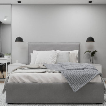
Monochrome grey bedroom in Scandinavian style.
Bedroom - small contemporary bedroom idea in London
Bedroom - small contemporary bedroom idea in London

 Star-Doors com LLC
Sliding door with barn hardware for laundry closet.
Door made with laminated clear white glass and assembled with aluminum frames.
Inspiration for a small modern galley laundry closet remodel in Miami with a concealed washer/dryer
Inspiration for a small modern galley laundry closet remodel in Miami with a concealed washer/dryer

 RAJ Kitchen and Bath, LLC
**Check out the video of this transformation on our website**
This small kitchen was way too small for this 2 bedrooms, 2 bathrooms apartment. Not only was it a very small kitchen, but the physical location of it made it very difficult to make it any bigger. There wasn't much that could have been done without incurring astronomical cost, which would get little or no return on the investment. The client wanted a kitchen that can be optimized in its current location to add a ton of value for resale.
This was difficult to do, because there was no moving of any mechanical around in the kitchen and even if we wanted to, the management of the building would not allow. For those of you who live in condos, co-ops or apartment building, you know how difficult it is to rework these foot prints. When we showed up, we saw the problems, but we also saw a huge opportunity where we can achieve those goals in the small space. This was accomplished by making some key changes and to incorporate some new things that was not possible when this kitchen was built years ago.
The crucial part of the design that would drive the entire new layout, was selecting the only appliance; that was the Refrigerator. Once we nailed down that refrigerator, we then proceeded to design the kitchen around it. We moved it to the other side of the wall where the sink was so that we can tap into the water line from the sink plumbing. It was crucial that it stays exactly 24" deep, not an inch more because we had to keep the entry as open as possible. Also, it was going to be directly in front of another big storage unit - The pantry. It is not ideal in most cases, but we needed the rest of the space to ramp up the design and open feel towards the side where all of the activities would take place, which happend to be the dining room and the view.
Once all that was figured out, we re-positioned the sink, dishwasher and the range and proceeded to wrap the cabinets around the columns to integrate them into the space. Thirty- six inches cabinets height was used so that they can be installed higher towards the ceiling height to give more room rather than the standard 18" required height between the counter tops. This was done to make the room feel a lot bigger than it really was. Not to mention, we also didn't want the faucet to be buried under the cabinets so that was also a necessary design detail for the space.
We then lowered both knee walls so that the counter top can sit on top of them, by removing that stop point that would have otherwise defined the kitchen area. This allowed us to pick up that extra footprint into the room for added prep space and enabled us to create the illusion of a kitchen that is looking longer than it really is. Every inch mattered when designing this kitchen and we made a conscious decision to use every one of that inch.
White cabinets were selected to do just what white cabinets are design to do; make a small or dark room appear bigger, brighter and more open. In this kitchen, this was amplified the more because of the kitchen location. It was perfect! We knew we did justice to the space because while we were there taking some photos, a few potential buyers walked in and went straight for the kitchen! They said its design just to fit the apartment.
Pantry roll out shelving, Double recycle bin, fancy handles, LED lighting, Quartz counter top, beautiful backslash tiles and grey linen floors finished off the kitchen which looked over a beautiful view of the George Washington Bridge from the top of this lovely 4th floor apartment.
Credit to Masterpiece Tile and Marble (Annmarie on the selection of Tiles and countertop and Val on the Construction to complete this project).
Davor Kokic Photography
 RAJ Kitchen and Bath, LLC
**Check out the video of this transformation on our website**
This small kitchen was way too small for this 2 bedrooms, 2 bathrooms apartment. Not only was it a very small kitchen, but the physical location of it made it very difficult to make it any bigger. There wasn't much that could have been done without incurring astronomical cost, which would get little or no return on the investment. The client wanted a kitchen that can be optimized in its current location to add a ton of value for resale.
This was difficult to do, because there was no moving of any mechanical around in the kitchen and even if we wanted to, the management of the building would not allow. For those of you who live in condos, co-ops or apartment building, you know how difficult it is to rework these foot prints. When we showed up, we saw the problems, but we also saw a huge opportunity where we can achieve those goals in the small space. This was accomplished by making some key changes and to incorporate some new things that was not possible when this kitchen was built years ago.
The crucial part of the design that would drive the entire new layout, was selecting the only appliance; that was the Refrigerator. Once we nailed down that refrigerator, we then proceeded to design the kitchen around it. We moved it to the other side of the wall where the sink was so that we can tap into the water line from the sink plumbing. It was crucial that it stays exactly 24" deep, not an inch more because we had to keep the entry as open as possible. Also, it was going to be directly in front of another big storage unit - The pantry. It is not ideal in most cases, but we needed the rest of the space to ramp up the design and open feel towards the side where all of the activities would take place, which happend to be the dining room and the view.
Once all that was figured out, we re-positioned the sink, dishwasher and the range and proceeded to wrap the cabinets around the columns to integrate them into the space. Thirty- six inches cabinets height was used so that they can be installed higher towards the ceiling height to give more room rather than the standard 18" required height between the counter tops. This was done to make the room feel a lot bigger than it really was. Not to mention, we also didn't want the faucet to be buried under the cabinets so that was also a necessary design detail for the space.
We then lowered both knee walls so that the counter top can sit on top of them, by removing that stop point that would have otherwise defined the kitchen area. This allowed us to pick up that extra footprint into the room for added prep space and enabled us to create the illusion of a kitchen that is looking longer than it really is. Every inch mattered when designing this kitchen and we made a conscious decision to use every one of that inch.
White cabinets were selected to do just what white cabinets are design to do; make a small or dark room appear bigger, brighter and more open. In this kitchen, this was amplified the more because of the kitchen location. It was perfect! We knew we did justice to the space because while we were there taking some photos, a few potential buyers walked in and went straight for the kitchen! They said its design just to fit the apartment.
Pantry roll out shelving, Double recycle bin, fancy handles, LED lighting, Quartz counter top, beautiful backslash tiles and grey linen floors finished off the kitchen which looked over a beautiful view of the George Washington Bridge from the top of this lovely 4th floor apartment.
Credit to Masterpiece Tile and Marble (Annmarie on the selection of Tiles and countertop and Val on the Construction to complete this project).
Davor Kokic Photography
 RAJ Kitchen and Bath, LLC
**Check out the video of this transformation on our website**
This small kitchen was way too small for this 2 bedrooms, 2 bathrooms apartment. Not only was it a very small kitchen, but the physical location of it made it very difficult to make it any bigger. There wasn't much that could have been done without incurring astronomical cost, which would get little or no return on the investment. The client wanted a kitchen that can be optimized in its current location to add a ton of value for resale.
This was difficult to do, because there was no moving of any mechanical around in the kitchen and even if we wanted to, the management of the building would not allow. For those of you who live in condos, co-ops or apartment building, you know how difficult it is to rework these foot prints. When we showed up, we saw the problems, but we also saw a huge opportunity where we can achieve those goals in the small space. This was accomplished by making some key changes and to incorporate some new things that was not possible when this kitchen was built years ago.
The crucial part of the design that would drive the entire new layout, was selecting the only appliance; that was the Refrigerator. Once we nailed down that refrigerator, we then proceeded to design the kitchen around it. We moved it to the other side of the wall where the sink was so that we can tap into the water line from the sink plumbing. It was crucial that it stays exactly 24" deep, not an inch more because we had to keep the entry as open as possible. Also, it was going to be directly in front of another big storage unit - The pantry. It is not ideal in most cases, but we needed the rest of the space to ramp up the design and open feel towards the side where all of the activities would take place, which happend to be the dining room and the view.
Once all that was figured out, we re-positioned the sink, dishwasher and the range and proceeded to wrap the cabinets around the columns to integrate them into the space. Thirty- six inches cabinets height was used so that they can be installed higher towards the ceiling height to give more room rather than the standard 18" required height between the counter tops. This was done to make the room feel a lot bigger than it really was. Not to mention, we also didn't want the faucet to be buried under the cabinets so that was also a necessary design detail for the space.
We then lowered both knee walls so that the counter top can sit on top of them, by removing that stop point that would have otherwise defined the kitchen area. This allowed us to pick up that extra footprint into the room for added prep space and enabled us to create the illusion of a kitchen that is looking longer than it really is. Every inch mattered when designing this kitchen and we made a conscious decision to use every one of that inch.
White cabinets were selected to do just what white cabinets are design to do; make a small or dark room appear bigger, brighter and more open. In this kitchen, this was amplified the more because of the kitchen location. It was perfect! We knew we did justice to the space because while we were there taking some photos, a few potential buyers walked in and went straight for the kitchen! They said its design just to fit the apartment.
Pantry roll out shelving, Double recycle bin, fancy handles, LED lighting, Quartz counter top, beautiful backslash tiles and grey linen floors finished off the kitchen which looked over a beautiful view of the George Washington Bridge from the top of this lovely 4th floor apartment.
Credit to Masterpiece Tile and Marble (Annmarie on the selection of Tiles and countertop and Val on the Construction to complete this project).
Davor Kokic Photography
26