
Search results for "Videos current" in Home Design Ideas

 Custom Surface Solutions
 (www.css-tile.com) - Owner Craig Thompson (512) 430-1215. This album shows a master bathroom roman tub to shower conversion. American Olean 9" x 12" ceramic travertine tile installed on offset pattern on walls plus two accent bands. Ceramic travertine mosaic shower floor tile. Marble corner shelves. 18" x 18" porcelain travertine floor tile.
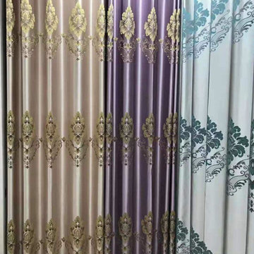
 Cheery Curtains
These faux silk panels are of great quality. The faux silks are perfect for a luxurious look. A light luxury, a pure art, a life enjoyment. Original design, smooth texture, healthy and environmental protection. The low-saturation colors that are not eye-catching. Light and comfortable, making your room more spacious and relaxing. This brocade fabric can make your room more luxurious and beautiful, you deserve it. Beautiful patterns are like flowers blooming in your room.

Find the right local pro for your project

 Builder Boy
Santa Barbara stucco is a low-maintenance, weather-resistant finish that features a completely smooth surface similar to early California adobe.
Trendy exterior home photo in Los Angeles
Trendy exterior home photo in Los Angeles




 RAJ Kitchen and Bath, LLC
**Check out the video of this transformation on our website**
This small kitchen was way too small for this 2 bedrooms, 2 bathrooms apartment. Not only was it a very small kitchen, but the physical location of it made it very difficult to make it any bigger. There wasn't much that could have been done without incurring astronomical cost, which would get little or no return on the investment. The client wanted a kitchen that can be optimized in its current location to add a ton of value for resale.
This was difficult to do, because there was no moving of any mechanical around in the kitchen and even if we wanted to, the management of the building would not allow. For those of you who live in condos, co-ops or apartment building, you know how difficult it is to rework these foot prints. When we showed up, we saw the problems, but we also saw a huge opportunity where we can achieve those goals in the small space. This was accomplished by making some key changes and to incorporate some new things that was not possible when this kitchen was built years ago.
The crucial part of the design that would drive the entire new layout, was selecting the only appliance; that was the Refrigerator. Once we nailed down that refrigerator, we then proceeded to design the kitchen around it. We moved it to the other side of the wall where the sink was so that we can tap into the water line from the sink plumbing. It was crucial that it stays exactly 24" deep, not an inch more because we had to keep the entry as open as possible. Also, it was going to be directly in front of another big storage unit - The pantry. It is not ideal in most cases, but we needed the rest of the space to ramp up the design and open feel towards the side where all of the activities would take place, which happend to be the dining room and the view.
Once all that was figured out, we re-positioned the sink, dishwasher and the range and proceeded to wrap the cabinets around the columns to integrate them into the space. Thirty- six inches cabinets height was used so that they can be installed higher towards the ceiling height to give more room rather than the standard 18" required height between the counter tops. This was done to make the room feel a lot bigger than it really was. Not to mention, we also didn't want the faucet to be buried under the cabinets so that was also a necessary design detail for the space.
We then lowered both knee walls so that the counter top can sit on top of them, by removing that stop point that would have otherwise defined the kitchen area. This allowed us to pick up that extra footprint into the room for added prep space and enabled us to create the illusion of a kitchen that is looking longer than it really is. Every inch mattered when designing this kitchen and we made a conscious decision to use every one of that inch.
White cabinets were selected to do just what white cabinets are design to do; make a small or dark room appear bigger, brighter and more open. In this kitchen, this was amplified the more because of the kitchen location. It was perfect! We knew we did justice to the space because while we were there taking some photos, a few potential buyers walked in and went straight for the kitchen! They said its design just to fit the apartment.
Pantry roll out shelving, Double recycle bin, fancy handles, LED lighting, Quartz counter top, beautiful backslash tiles and grey linen floors finished off the kitchen which looked over a beautiful view of the George Washington Bridge from the top of this lovely 4th floor apartment.
Credit to Masterpiece Tile and Marble (Annmarie on the selection of Tiles and countertop and Val on the Construction to complete this project).
Davor Kokic Photography
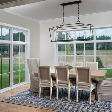

 RAJ Kitchen and Bath, LLC
**Check out the video of this transformation on our website**
This small kitchen was way too small for this 2 bedrooms, 2 bathrooms apartment. Not only was it a very small kitchen, but the physical location of it made it very difficult to make it any bigger. There wasn't much that could have been done without incurring astronomical cost, which would get little or no return on the investment. The client wanted a kitchen that can be optimized in its current location to add a ton of value for resale.
This was difficult to do, because there was no moving of any mechanical around in the kitchen and even if we wanted to, the management of the building would not allow. For those of you who live in condos, co-ops or apartment building, you know how difficult it is to rework these foot prints. When we showed up, we saw the problems, but we also saw a huge opportunity where we can achieve those goals in the small space. This was accomplished by making some key changes and to incorporate some new things that was not possible when this kitchen was built years ago.
The crucial part of the design that would drive the entire new layout, was selecting the only appliance; that was the Refrigerator. Once we nailed down that refrigerator, we then proceeded to design the kitchen around it. We moved it to the other side of the wall where the sink was so that we can tap into the water line from the sink plumbing. It was crucial that it stays exactly 24" deep, not an inch more because we had to keep the entry as open as possible. Also, it was going to be directly in front of another big storage unit - The pantry. It is not ideal in most cases, but we needed the rest of the space to ramp up the design and open feel towards the side where all of the activities would take place, which happend to be the dining room and the view.
Once all that was figured out, we re-positioned the sink, dishwasher and the range and proceeded to wrap the cabinets around the columns to integrate them into the space. Thirty- six inches cabinets height was used so that they can be installed higher towards the ceiling height to give more room rather than the standard 18" required height between the counter tops. This was done to make the room feel a lot bigger than it really was. Not to mention, we also didn't want the faucet to be buried under the cabinets so that was also a necessary design detail for the space.
We then lowered both knee walls so that the counter top can sit on top of them, by removing that stop point that would have otherwise defined the kitchen area. This allowed us to pick up that extra footprint into the room for added prep space and enabled us to create the illusion of a kitchen that is looking longer than it really is. Every inch mattered when designing this kitchen and we made a conscious decision to use every one of that inch.
White cabinets were selected to do just what white cabinets are design to do; make a small or dark room appear bigger, brighter and more open. In this kitchen, this was amplified the more because of the kitchen location. It was perfect! We knew we did justice to the space because while we were there taking some photos, a few potential buyers walked in and went straight for the kitchen! They said its design just to fit the apartment.
Pantry roll out shelving, Double recycle bin, fancy handles, LED lighting, Quartz counter top, beautiful backslash tiles and grey linen floors finished off the kitchen which looked over a beautiful view of the George Washington Bridge from the top of this lovely 4th floor apartment.
Credit to Masterpiece Tile and Marble (Annmarie on the selection of Tiles and countertop and Val on the Construction to complete this project).
Davor Kokic Photography
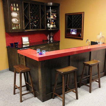
 DeVance Electronic Lifestyle
Suad Bejtovic
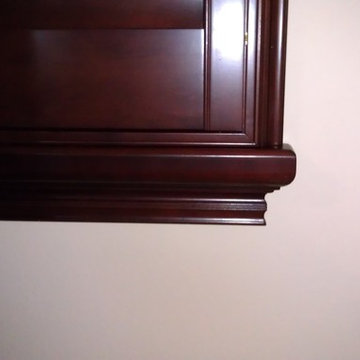
The DeVance Team has collaborated with various synergistic partners in order to create a one-of-a-kind ‘Experience Center’ in the North Dallas corridor. This Electronic Lifestyle facility has quickly become a savvy social and entertaining environment; set up to demonstrate just a few things one can do in their home or office to enhance their quality of life through the use of technology. Guests are dazzled by a plethora of custom electronic selections, incorporated into the latest technology in a cozy, yet high-end residential-style environment. The entire space is home to dozens of custom paintings by local artists and master-crafted wood works and built in cabinetry. The reception area is complimented with a 55” custom designed Art Screen TV with retractable art that rolls up into a motorized casing to reveal a 4K TV screen. The additional spaces show beautifully, with a modern family room, a sophisticated entertainment lounge, and fully functional, stocked wet bar. An acoustically treated 2-Channel listening room houses the finest in McIntosh audio equipment complete with a turntable. This room was designed for vinyl record or streaming music for ‘audiophile enthusiasts.’ The DeVance 18 seat movie theater boasts a state-of-the-art perforated ten foot screen, JBL Synthesis 7.1 surround sound system and crystal clear Runco projection system. Guests enjoy luxurious motorized leather theater seating complete with warm throws and leather ottomans for comfortable movie viewing. The DeVance restrooms continue the Electronic Lifestyle theme on a more personal level, as they are equipped with the top of the line sensor faucets and sinks by TOTO USA, Electric Mirror TVs and the ‘cleaner and greener’ electronic TOTO USA Washlets!
The ultimate vision for the DeVance Experience was to create an environment unlike any retail storefront or big box shop, where a unique and exciting experience awaits existing and prospective clients, guests, trade partners and business associates. Collaborating partners are encouraged to utilize the space as a mini-custom showroom of their own; accessing a relaxing environment to lay out clients’ space plans and select samples for custom countertops, specialized cabinet designs, fabrics, paint, carpets, etc. Essentially, The DeVance Experience Center is the hottest design/build/electronic lifestyle showroom around, lending a whole new meaning to “industry partnerships!” Based on current knowledge, there is no other showroom that is comparable.
The layout of the new Experience Center was designed specifically for event marketing. To name a few, continuing education classes and training seminars for builders, remodelers, architects, and interior designers, professional meet up groups and local business functions. Private client tours, relationship appreciation functions, sports and movie watching parties are just a smattering of the promotional campaign lineup. The center provides a professional, yet relaxing and entertaining venue for professional industry trade gatherings and events.
The Experience Center offers a showcase for user-friendly automation and control and variety of electronic lifestyle systems throughout the space via the use of an iPhone, iPad or smart tablet. With ease and elegance, guests may choose to control the lighting, shades and draperies, thermostats, whole house music, multiple televisions and video displays (many of which are concealed behind beautifully framed artwork). Mimicking many of the latest possibilities for the high-end homeowner, all of this in a comfortable and luxurious environment that makes them feel right at home!
Showroom Exchange Partners include woodworking cabinetry Concepts Realized by Walt Ring, custom artwork by Mark Whitmarsh, Ric Falster, Dawn Cleaves, and Jenny Williamson. Theater millwork interiors by Mancave DFW, custom theater seating, leather furnishings, and wood tables by Touch of France, Silestone surfaces by Cosentino USA, stone fabrication services by A-A Marble also contributing exotic granite vanity tops, faucets, sinks and toilets by TOTO USA, and Kane theater carpeting by Natural Selections.





Sponsored
Columbus, OH

Structural Remodeling
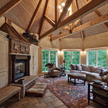
Franklin County's Heavy Timber Specialists | Best of Houzz 2020!

 HaiJoe Stamped Concrete Patios and Decks
Stamped concrete walkway and landing
Mid-sized elegant backyard stamped concrete patio photo
Mid-sized elegant backyard stamped concrete patio photo

 Gallery Amoire
Structural Holographic Wall Systems
Inspiration for a contemporary wire bedroom remodel in Toronto
Inspiration for a contemporary wire bedroom remodel in Toronto



 Cheery Curtains
These faux silk panels are of great quality. The faux silks are perfect for a luxurious look. A light luxury, a pure art, a life enjoyment. Original design, smooth texture, healthy and environmental protection. The low-saturation colors that are not eye-catching. Light and comfortable, making your room more spacious and relaxing. This brocade fabric can make your room more luxurious and beautiful, you deserve it. Beautiful patterns are like flowers blooming in your room.
31