
Search results for "Viewpoints" in Home Design Ideas

 Quality Edge
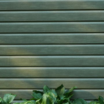
TruCedar Steel Siding shown in 6" Dutch Lap in Mountain Laurel.
Example of a trendy two-story metal green home design design in Grand Rapids
Example of a trendy two-story metal green home design design in Grand Rapids


Find the right local pro for your project


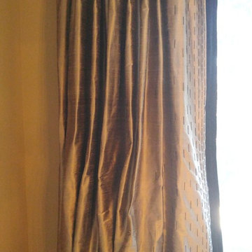
 Valerie J Johnson Custom Tailored Home Furnishings
Example of a mid-sized transitional porcelain tile hallway design in Kansas City with beige walls
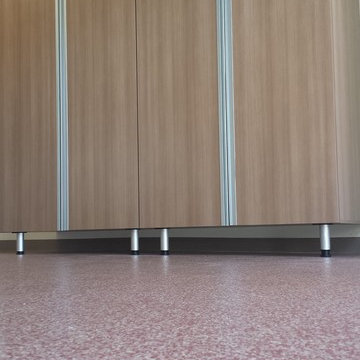
 The Garage Enhancement Company
This garage in Vero Beach, Florida had our epoxy and polyaspartic flake floor coating installed along with garage cabinets. Now the customer's Vero Beach garage has functional garage storage and a durable floor coating that replaced his old peeling garage floor paint.
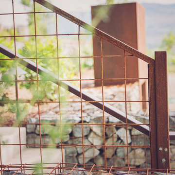
 Regenesis Ecological Design
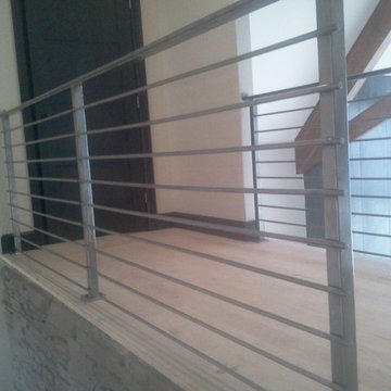
Rusted steel guard rail supports a powder coated handrail along the staircase.
Inspiration for a large modern partial sun backyard concrete paver retaining wall landscape.
Inspiration for a large modern partial sun backyard concrete paver retaining wall landscape.
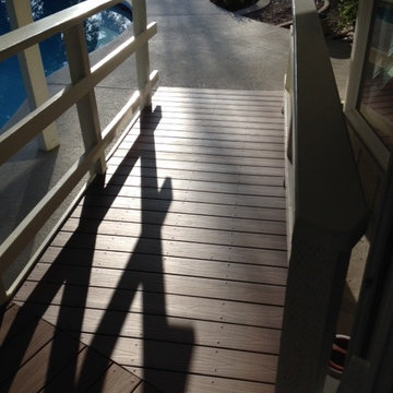




 LO STUDIO DEL COLORE
Wallpaper Jannelli & Volpi in vinyl foam on tnt , washable. The rolls are 10:05 mt x 53cm .
You can see all the samples on the site under the heading www.lostudiodelcolore.com Parati>Modern
Shipping costs are calculated extra . Contact the Company by email at: info@lostudiodelcolore.com
 Daniel Scerri Periti
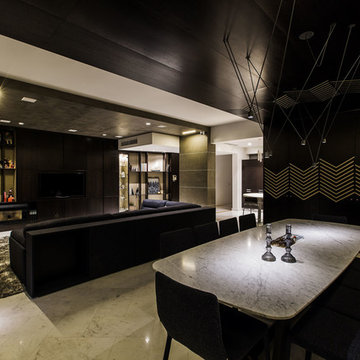
We were approached with a request to design the furnishings for an existing ‘finished’ apartment. The intention was to move in relatively fast, and the property already had an existing marble floor, kitchen and bathrooms which had to be kept. The property also boasted a fantastic 270 degree view, seen from most of the apartment. The clients had a very important role in the completion of the project. They were very involved during the design process and through various decoration choices. The final design was kept as a rigid guideline when faced with picking out all the different elements.
Once clear of all previous furniture, the space felt cold and bare; so we immediately felt the need for warmth, and raw, natural elements and textures to complement the cold marble floor while visually tying in the design of the whole apartment together.
Since the existing kitchen had a touch of dark walnut stain, we felt this material was one we should add to the palette of materials to contest the stark materials. A raw cement finish was another material we felt would add an interesting contrast and could be used in a variety of ways, from cabinets to walls and ceilings, to tie up the design of various areas of the apartment.
To warm up the living/dining area, keeping the existing marble floor but visually creating zones within the large living/dining area without hindering the flow, a dark timber custom-made soffit, continuous with a floor-to-ceiling drinks cabinet zones the dining area, giving it a degree of much-needed warmth.
The various windows with a stupendous 270 degree view needed to be visually tied together. This was done by introducing a continuous sheer [drape] which also doubled up as a sound-absorbing material along 2 of the 4 walls of the space.
A very large sofa was required to fill up the space correctly, also required for the size of the young family.
Services were integrated within the units and soffits, while a customized design in the corner between the kitchen and the living room took into consideration the viewpoints from the main areas to create a pantry without hindering the flow or views. A strategically placed floor-to-ceiling mirror doubles up the space and extends the view to the inner parts of the apartment.
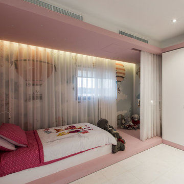
The daughter’s bedroom was a small challenge in itself, and a fun task, where we wanted to achieve the perception of a cozy niche with its own enclosed reading nook [for reading fairy tales], behind see-through curtains and a custom-ordered wall print sporting the girl’s favorite colors.
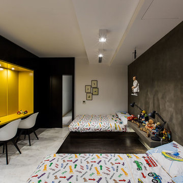
The sons’ bedroom had double the requirements in terms of space needed: more wardrobe, more homework desk space, a tv/play station area… “We combined a raised platform area between the boys’ beds to become an area with cushions where the kids can lay down and play, and face a hidden screen behind the homework desk’s sliding back panel for their play station”. The color of the homework desk was chosen in relation to the boys’ ages. A more masculine material palette was chosen for this room, in contrast to the light pastel palette of the girl’s bedroom. Again, this colour can easily be changed over time for a more mature look.
PROJECT DATA:
St. Paul’s Bay, Malta
DESIGN TEAM:
Perit Rebecca Zammit, Perit Daniel Scerri, Elyse Tonna
OTHER CREDITS:
Photography: Tonio Lombardi
Styling : TKS

 Daniel Scerri Periti
We were approached with a request to design the furnishings for an existing ‘finished’ apartment. The intention was to move in relatively fast, and the property already had an existing marble floor, kitchen and bathrooms which had to be kept. The property also boasted a fantastic 270 degree view, seen from most of the apartment. The clients had a very important role in the completion of the project. They were very involved during the design process and through various decoration choices. The final design was kept as a rigid guideline when faced with picking out all the different elements.
Once clear of all previous furniture, the space felt cold and bare; so we immediately felt the need for warmth, and raw, natural elements and textures to complement the cold marble floor while visually tying in the design of the whole apartment together.
Since the existing kitchen had a touch of dark walnut stain, we felt this material was one we should add to the palette of materials to contest the stark materials. A raw cement finish was another material we felt would add an interesting contrast and could be used in a variety of ways, from cabinets to walls and ceilings, to tie up the design of various areas of the apartment.
To warm up the living/dining area, keeping the existing marble floor but visually creating zones within the large living/dining area without hindering the flow, a dark timber custom-made soffit, continuous with a floor-to-ceiling drinks cabinet zones the dining area, giving it a degree of much-needed warmth.
The various windows with a stupendous 270 degree view needed to be visually tied together. This was done by introducing a continuous sheer [drape] which also doubled up as a sound-absorbing material along 2 of the 4 walls of the space.
A very large sofa was required to fill up the space correctly, also required for the size of the young family.
Services were integrated within the units and soffits, while a customized design in the corner between the kitchen and the living room took into consideration the viewpoints from the main areas to create a pantry without hindering the flow or views. A strategically placed floor-to-ceiling mirror doubles up the space and extends the view to the inner parts of the apartment.
The daughter’s bedroom was a small challenge in itself, and a fun task, where we wanted to achieve the perception of a cozy niche with its own enclosed reading nook [for reading fairy tales], behind see-through curtains and a custom-ordered wall print sporting the girl’s favorite colors.
The sons’ bedroom had double the requirements in terms of space needed: more wardrobe, more homework desk space, a tv/play station area… “We combined a raised platform area between the boys’ beds to become an area with cushions where the kids can lay down and play, and face a hidden screen behind the homework desk’s sliding back panel for their play station”. The color of the homework desk was chosen in relation to the boys’ ages. A more masculine material palette was chosen for this room, in contrast to the light pastel palette of the girl’s bedroom. Again, this colour can easily be changed over time for a more mature look.
PROJECT DATA:
St. Paul’s Bay, Malta
DESIGN TEAM:
Perit Rebecca Zammit, Perit Daniel Scerri, Elyse Tonna
OTHER CREDITS:
Photography: Tonio Lombardi
Styling : TKS
 Breathe Design Studio
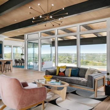
Our Austin studio decided to go bold with this project by ensuring that each space had a unique identity in the Mid-Century Modern style bathroom, butler's pantry, and mudroom. We covered the bathroom walls and flooring with stylish beige and yellow tile that was cleverly installed to look like two different patterns. The mint cabinet and pink vanity reflect the mid-century color palette. The stylish knobs and fittings add an extra splash of fun to the bathroom.
The butler's pantry is located right behind the kitchen and serves multiple functions like storage, a study area, and a bar. We went with a moody blue color for the cabinets and included a raw wood open shelf to give depth and warmth to the space. We went with some gorgeous artistic tiles that create a bold, intriguing look in the space.
In the mudroom, we used siding materials to create a shiplap effect to create warmth and texture – a homage to the classic Mid-Century Modern design. We used the same blue from the butler's pantry to create a cohesive effect. The large mint cabinets add a lighter touch to the space.
 Villa & Mission Imports
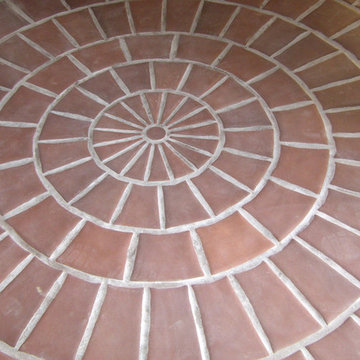
Custom made Red High Fire Paver with Pillow Edges. They have a hand look that will give your space a realistic view but with the quality of a High Fire Tile Paver.

 Art Glass and Metal
Chattering Cardinals Window..... Etched Glass Window ...Privacy Glass
Inspiration for a large timeless enclosed home design remodel in San Diego
Inspiration for a large timeless enclosed home design remodel in San Diego

 Melissa Renee
This modern, contemporary, glossy, underwater resin on wood panel is layered with aqua, aquamarine, Aruba blue pigments, white epoxy paste, and hints of sparkle. A cool toned color palette was used to create this multi-layered dimensional seascape.
 Daniel Scerri Periti
We were approached with a request to design the furnishings for an existing ‘finished’ apartment. The intention was to move in relatively fast, and the property already had an existing marble floor, kitchen and bathrooms which had to be kept. The property also boasted a fantastic 270 degree view, seen from most of the apartment. The clients had a very important role in the completion of the project. They were very involved during the design process and through various decoration choices. The final design was kept as a rigid guideline when faced with picking out all the different elements.
Once clear of all previous furniture, the space felt cold and bare; so we immediately felt the need for warmth, and raw, natural elements and textures to complement the cold marble floor while visually tying in the design of the whole apartment together.
Since the existing kitchen had a touch of dark walnut stain, we felt this material was one we should add to the palette of materials to contest the stark materials. A raw cement finish was another material we felt would add an interesting contrast and could be used in a variety of ways, from cabinets to walls and ceilings, to tie up the design of various areas of the apartment.
To warm up the living/dining area, keeping the existing marble floor but visually creating zones within the large living/dining area without hindering the flow, a dark timber custom-made soffit, continuous with a floor-to-ceiling drinks cabinet zones the dining area, giving it a degree of much-needed warmth.
The various windows with a stupendous 270 degree view needed to be visually tied together. This was done by introducing a continuous sheer [drape] which also doubled up as a sound-absorbing material along 2 of the 4 walls of the space.
A very large sofa was required to fill up the space correctly, also required for the size of the young family.
Services were integrated within the units and soffits, while a customized design in the corner between the kitchen and the living room took into consideration the viewpoints from the main areas to create a pantry without hindering the flow or views. A strategically placed floor-to-ceiling mirror doubles up the space and extends the view to the inner parts of the apartment.
The daughter’s bedroom was a small challenge in itself, and a fun task, where we wanted to achieve the perception of a cozy niche with its own enclosed reading nook [for reading fairy tales], behind see-through curtains and a custom-ordered wall print sporting the girl’s favorite colors.
The sons’ bedroom had double the requirements in terms of space needed: more wardrobe, more homework desk space, a tv/play station area… “We combined a raised platform area between the boys’ beds to become an area with cushions where the kids can lay down and play, and face a hidden screen behind the homework desk’s sliding back panel for their play station”. The color of the homework desk was chosen in relation to the boys’ ages. A more masculine material palette was chosen for this room, in contrast to the light pastel palette of the girl’s bedroom. Again, this colour can easily be changed over time for a more mature look.
PROJECT DATA:
St. Paul’s Bay, Malta
DESIGN TEAM:
Perit Rebecca Zammit, Perit Daniel Scerri, Elyse Tonna
OTHER CREDITS:
Photography: Tonio Lombardi
Styling : TKS
57