
Search results for "Visual elements" in Home Design Ideas
 Interiology Design Co.
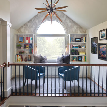
The oversized multi-arm pendant adds a striking visual element to this bright library, with a mix of metals and a modern edge. The loft area is open and inviting, updated with Farrow & Ball wallpaper on the accent wall. The balusters are painted nearly black in Railings by Farrow & Ball, adding a rich custom look to the staircase and surround.
 Lanson B. Jones & Co, Inc.
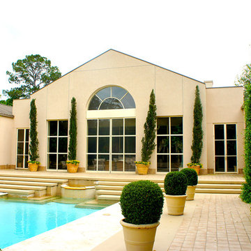
This palatial River Oaks estate embodies a neoteric, mediterranean influence. The backyard boasts an ornate, poolside retreat. Container grown Italian cypress and spiral juniper add interesting visual elements and a grand, ivy-covered wall give the space a geometric, art deco appeal. Ivy arches, carved columns, and sharply pruned boxwood spheres create a stunning, yet cohesive, impact.
 Constantine Design Group, Inc.
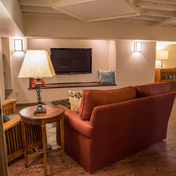
This early 20th century Indianapolis, IN basement remodel was in desperate need of help. The original and still operating hydronic radiant heating system had its plumbing configured without regard to any other use of the space. Fearful of harming the aged system and the high cost of doing so, these Clients were adamant that the existing system remain intact. Architect Lee Constantine developed a design that maintained the existing heating system while creating "niches" around the perimeter that would conceal the unsightly plumbing. Additionally, by removing free-standing structural supporting posts, amore flexible and inviting space was achieved. Because of an already low ceiling condition, the floor-ceiling structure above was kept exposed, painted and highlighted with indirect lighting to avoid further reducing the ceiling height. Constantine incorporated "clouds" on this ceiling to conceal certain existing components that either were cost prohibitive to relocate or couldn't be relocated. These "clouds"become a "visual element" through their geometry and hidden "indirect" light source rather than an undesirable complication. Now this family entertains frequently in the basement and reports "it doesn't feel like we're in a basement anymore"
Find the right local pro for your project
 Wilber & King
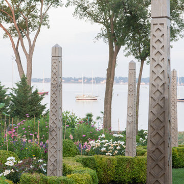
Using antique European junction signs as our inspiration, we designed and milled a series of obelisks to anchor this boxwood isle. Each obelisk is an original design and was created from a single piece of locust wood. These obelisks are a wonderful visual element, add warmth to the garden and connect the homes indoor and outdoor spaces.
 kul grilles
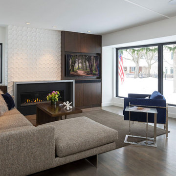
The living room has a combination of contrasting elements. The dark hardwood floor and paneled feature wall provide a striking contrast to the bright, white walls and large windows. This interplay of dark and light creates a visually appealing dynamic within the space.
Adding to the overall aesthetic of the living room are the kul grilles vent covers. These vent covers are mentioned as providing an extra layer of clean sophistication to the room. They serve as a design element that enhances the overall aesthetic appeal and adds refinement. By mentioning that the vent covers complement the sleek lines of the furniture, it suggests that they harmonize with the modern and streamlined style of the furnishings in the room. This cohesiveness helps to create a unified and visually pleasing space.
Architect Randy Buffie believes in striking a balance between artistry and solid construction methods in good home design. This philosophy is reflected in his choice of kul grilles vent covers for this particular design build. By selecting these vent covers, it implies that they not only contribute to the visual aspect of the living room but also meet the architect's standards for high-quality construction.
 Globe Electric
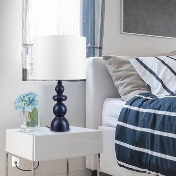
The Brooks Table Lamp is simply gorgeous. The sculptural base adds a dynamic visual element to your space while the navy and white color palette brings a modern coastal feel to your home or office. You'll dream of your next vacation with this lamp beside your bed or instantly return to a calm state of mind after a long day. It's like looking at a breath of fresh air. Decorate with the Novogratz and Globe Electric - lighting made easy.
 Mio Metals
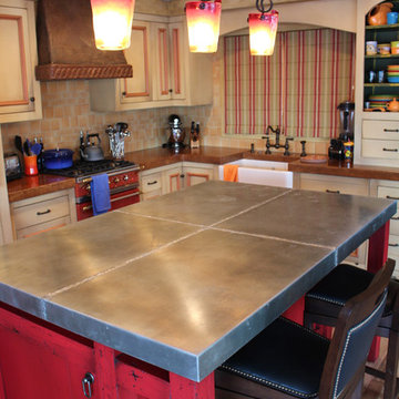
This zinc island countertop was designed just for this homeowner. At their request, the seams were built up with solder to add a visual element that continued the rustic look. Photo and zinc countertop by Mio Metals, Inc


 Klopf Architecture
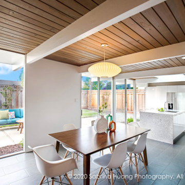
Joseph Eichler developed his moderately priced houses for the mass-market starting in 1949. His homes were designed using affordable materials and simple construction techniques. Nearly 70 years later these homes are in need of updating and remodeling an Eichler home today can become an imposing and costly project if you’re not careful. For this project the clients, who had undergone several previous house renovations, were determined to stick with an established budget from the beginning. Klopf Architecture helped them modernize their Eichler with a premium appearance on a reasonable budget.
The clients challenged the Klopf team to create a design that had a high-end feel and nicely done while adhering to their budget. That meant not all of the initial project scope could be built. Like many other Eichler homes, the original floor plan did not meet the family’s needs leaving them feeling disconnected from one room to another. While an early goal was to expand the house into a carport and create a larger garage, it did not survive the contractor pricing phase of the project.
The goals that did survive through to the end of the project included blurring some of the boundaries and opening up some of the spaces, making them more functional and creating a smoother flow in the house. The Klopf team joined the former separate kitchen and formal living room into one large space and shift the dining room where it is now connected to the kitchen. Klopf swapped the family room to the front alongside the living room, so the spaces feel more cohesive and are now better suited for family activities. The functional layout of the master bathroom was changed to include a large, curbless shower.
Installing a complete IKEA kitchen including cabinets, countertops, appliances, light fixtures, and furnishings was key to staying within budget. Bath fixtures in this house are also exclusively IKEA. Klopf Architecture has designed many homes using IKEA products, which are quite compatible offering an affordable, contemporary take on Eichler homes. The clients saved additional money from the simplicity and availability of IKEA products and by orchestrating the orders and purchases themselves. Following each construction meeting, the clients would make a run to IKEA and purchase items, pick up needed spare parts, and bring them back right away to stay ahead of the contractor’s schedule and minimize the chance of delays and bottlenecks.
Klopf balanced material selections by retaining some of the original woodwork and simply refinishing the mahogany paneling. They were able to retain the original windows and sliding doors which were still in good shape, avoiding some of the most costly replacement expenses. Additionally interior doors were simply refinished and the exterior siding cleaned up and repainted. Formerly dark interiors are now illuminated with new slimmer semi-recessed lighting eliminating the need for costly roof work.
Attention to design details allowed the Klopf team to ensure the house ended up with a high quality feel. Key visual elements were strictly aligned and Klopf worked with the clients to select a unified materials palette throughout the spaces so the house flows seamlessly together. Aligning the tile layout with the trusses and keeping it level with the concrete slab outside allowed them to achieve a level of quality that may otherwise be missed.
The clients were able to keep their budget on track by determining clear goals and making critical decisions upfront, choosing materials and furnishings wisely, working with the right design and construction teams in place and to a large part, their willingness to participate throughout the process. In the end the clients were much happier with their reconfigured Eichler home and Klopf Architecture managed to keep their remodeling costs to about $325/sf – a good amount below the average Bay Area Eichler remodel.
Project Team: John Klopf, Angela Todorova, Sherry Tan
Contractor: Keycon Construction
Structural Engineer: Sezen & Moon
Photography: Sabrina Huang
Year Completed: 2020
 Lilola Home
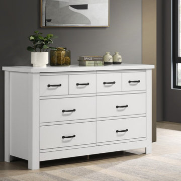
The Cassini White 6-Drawer Dresser offers ample storage with its six spacious drawers,providing you with the perfect solution to keep your belongings organized and easily accessible. A unique visual element with its top drawers is the split design while maintaining their full size. Each drawer features sleek black handles that not only add a modern touch but also ensure convenient opening and closing. With its clean and contemporary design,the Cassini White 6-Drawer Dresser effortlessly complements a variety of interior styles,from minimalist to modern. Whether you place it in your bedroom,guest room,or even your living room,this dresser adds both functionality and aesthetic appeal to any space.
 Klopf Architecture
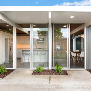
Joseph Eichler developed his moderately priced houses for the mass-market starting in 1949. His homes were designed using affordable materials and simple construction techniques. Nearly 70 years later these homes are in need of updating and remodeling an Eichler home today can become an imposing and costly project if you’re not careful. For this project the clients, who had undergone several previous house renovations, were determined to stick with an established budget from the beginning. Klopf Architecture helped them modernize their Eichler with a premium appearance on a reasonable budget.
The clients challenged the Klopf team to create a design that had a high-end feel and nicely done while adhering to their budget. That meant not all of the initial project scope could be built. Like many other Eichler homes, the original floor plan did not meet the family’s needs leaving them feeling disconnected from one room to another. While an early goal was to expand the house into a carport and create a larger garage, it did not survive the contractor pricing phase of the project.
The goals that did survive through to the end of the project included blurring some of the boundaries and opening up some of the spaces, making them more functional and creating a smoother flow in the house. The Klopf team joined the former separate kitchen and formal living room into one large space and shift the dining room where it is now connected to the kitchen. Klopf swapped the family room to the front alongside the living room, so the spaces feel more cohesive and are now better suited for family activities. The functional layout of the master bathroom was changed to include a large, curbless shower.
Installing a complete IKEA kitchen including cabinets, countertops, appliances, light fixtures, and furnishings was key to staying within budget. Bath fixtures in this house are also exclusively IKEA. Klopf Architecture has designed many homes using IKEA products, which are quite compatible offering an affordable, contemporary take on Eichler homes. The clients saved additional money from the simplicity and availability of IKEA products and by orchestrating the orders and purchases themselves. Following each construction meeting, the clients would make a run to IKEA and purchase items, pick up needed spare parts, and bring them back right away to stay ahead of the contractor’s schedule and minimize the chance of delays and bottlenecks.
Klopf balanced material selections by retaining some of the original woodwork and simply refinishing the mahogany paneling. They were able to retain the original windows and sliding doors which were still in good shape, avoiding some of the most costly replacement expenses. Additionally interior doors were simply refinished and the exterior siding cleaned up and repainted. Formerly dark interiors are now illuminated with new slimmer semi-recessed lighting eliminating the need for costly roof work.
Attention to design details allowed the Klopf team to ensure the house ended up with a high quality feel. Key visual elements were strictly aligned and Klopf worked with the clients to select a unified materials palette throughout the spaces so the house flows seamlessly together. Aligning the tile layout with the trusses and keeping it level with the concrete slab outside allowed them to achieve a level of quality that may otherwise be missed.
The clients were able to keep their budget on track by determining clear goals and making critical decisions upfront, choosing materials and furnishings wisely, working with the right design and construction teams in place and to a large part, their willingness to participate throughout the process. In the end the clients were much happier with their reconfigured Eichler home and Klopf Architecture managed to keep their remodeling costs to about $325/sf – a good amount below the average Bay Area Eichler remodel.
Project Team: John Klopf, Angela Todorova, Sherry Tan
Contractor: Keycon Construction
Structural Engineer: Sezen & Moon
Photography: Sabrina Huang
Year Completed: 2020
 J. Pocker
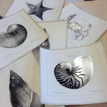
Black and silver ocean themed artwork will look lovely once framed.
Living room - coastal living room idea in New York
Living room - coastal living room idea in New York
 Elite Landscaping Omaha
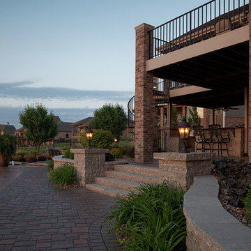
Water features abound in this backyard paradise. Elite Landscaping designed this tiered backyard with low-profile hardscaping for an unobscured view of the lake from the property. Lined with flagstone and river rock, a gorgeous stream flows through the entire outdoor environment. Complementary paver pathways and landscaping preserve the natural look of the lakeside property. A waterfall and three fountain heads nestled in a bed of natural stone provide the peaceful sounds of flowing water, and add the perfect, synergistic visual elements. The large, paver patio enclosed with a custom gated fence offers a seamless transition from the house to the natural landscape below. A customized, circular fire pit sits just below the patio, offering a comfortable place to watch a sunset or enjoy an evening with family and friends. The in ground swimming pool situated next to the lake makes this the premium spot for outdoor recreation.
 Phoenix Home Remodeling
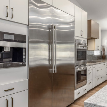
Debbie and Art craved an upgrade for their outdated kitchen space. The color palette was a mix of vintage shades, reminiscent of the early 90s Arizona style. Earthy browns dominated the space, creating a warm but somewhat dated ambiance.
Their kitchen was transformed into a modern, bright, and minimalist haven. The renovation began with the removal of the old cabinets, countertops, backsplash, and lighting, paving the way for a contemporary redesign.
The Waypoint 530 Painted Vanilla cabinets instantly brightened the space. Their sleek design and light color brought an airy and spacious feel. Jeffery Alexander Milan handles added a touch of elegance and modern sophistication.
A new kitchen island became the centerpiece of the space. Built with Waypoint 530 Latte cabinets and topped with Berwyn Quartz countertops, it provides a stylish and functional area for cooking and socializing.
Replacing the previous perimeter countertops, the Tawny Quartz now provides a durable and aesthetically pleasing surface that seamlessly complements the new cabinetry. Their subtle elegance elevated the kitchen's overall look.
The backsplash was transformed with MSI Brick Mosaic, adding a stunning visual element that complemented the minimalist theme.
The Blanco Precis Single Cascade Sink and the Delta Emmeline Touch faucet brought in a sleek, functional elegance. The new range hood not only improved ventilation but also acted as a stylish focal point.
Sponsored
Columbus, OH

Snider & Metcalf Interior Design, LTD
Leading Interior Designers in Columbus, Ohio & Ponte Vedra, Florida
 Cabinet Tree Studio, LLC
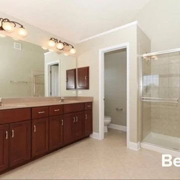
This bathroom is a harmonious blend of contemporary design and minimalist elegance. It features a neutral color palette, predominantly in shades of soft grey that evoke a serene and tranquil atmosphere. The vaulted ceiling adds a sense of grandeur and openness to the space, while the geometric chandelier with matte black finish and vintage bulbs creates a striking visual element that draws the eye upward.
The flooring extends the minimalist theme with wood-look tiles in a light grey hue, providing the aesthetic appeal of wood with the practicality of tile. The expansive layout includes a large freestanding cabinet that echoes the shaker-style design of the vanity, offering ample storage while maintaining the sleek look with matte black hardware.
At the heart of the room is the glossy white freestanding bathtub, strategically placed under a window to benefit from the natural light, enhancing the room's airy vibe and offering a relaxing soak with a view. The window treatments are simple, ensuring privacy and allowing light to filter through, contributing to the calming ambiance.
Overall, the bathroom design is meticulously curated to balance style and function, resulting in a luxurious retreat that combines clean lines, refined materials, and thoughtful details to create an inviting and modern sanctuary.
 Simply Home Decorating
This penthouse condo in Raven Woods is home to an adventurous, nature-loving couple. With their children grown and starting families of their own, Jeremy and Cynthia (names changed) chose to downsize their livable space and “upsize” in quality and luxury.
The couple hired us to help them achieve several well-defined goals: feeling immersed and connected to nature, having warm and welcoming spaces to host their family and friends, and selecting pieces that would support local makers and artisans. (If you know me, you know that nature, connection, and community are some of my most important values, personally and professionally — the perfect fit!)
Using our comprehensive design process, we spent months designing, procuring, and installing their new, long-time home. The resulting spaces are breathtaking, creating a daily living experience that is full of serenity and bliss.
Welcoming & Bright Home with Forest Views:
Ahhh… can you imagine coming home to a space as bright and soothing as this one? To find inspiration for this home’s interiors, we needed to look no further than out the windows, where mountain views greet us to the north and the ocean beckons from the south.
Paying homage to their locale, we curated a colour palette of subtle blues and grays, warm-toned woods, and natural materials, all set against a crisp, white backdrop. These help us create a seamless visual transition between the interior and exterior. Let’s start our tour in the living area…
A Cozy Living Area with Warmth & Dimension:
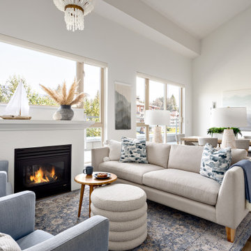
In the living area, the fireplace was the starting point for the design, as it determined the size of the space and the scale of our furnishings. To keep this area feeling cozy but not crowded, we selected this soft ottoman to serve as a table surface with a tray or as additional seating when Jeremy and Cynthia host guests. (Multi-purpose items are one of the 5 elements of The Simple Home.)
Additional textures — the sofa, upholstered swivel chairs, pillows, and ceramic wall art reminiscent of sand dollars — offer further depth and dimension in this simple yet layered space. The result is a cozy living room area perfect for a relaxing read on an overcast day or a social evening by the fire.
While daunting at first, this home’s small and open footprint offered a special opportunity for us to design thoughtful “zones”. To create a defined living space, we used an area rug to establish a border and situated the larger seating (the sofa) on the right. Its visual weight serves as a grounding barrier that naturally separates the living and dining areas.
Overhead, the centrally located brass and glass chandelier serves as another focal point, making the entire living area feel like one unit. Last but not least…
Styled with tall decorative lamps, this light oak and rattan console sits just behind the sofa, creating an additional visual barrier between the living and dining areas. We styled it with accessories that complement the overall palette, and it has the added benefit of providing storage right where Jeremy and Cynthia need it, the dining area.
An Art-Infused Dining Area:
The dining area is warm, woodsy, and filled with locally sourced art that Jeremy and Cynthia love. Next to the console is a custom textile piece from Vancouver artist, With Strings Attached, that mimics the scenic, mountain backdrop. The blue hues of the piece work in harmony with the warm wood dining table, cool gray upholstered chairs, and neutral stools at the kitchen bar.
On the other side of the space, is Jeremy’s and Cynthia’s favourite piece, a commissioned work of art by local maker, Katie Napier. Carefully positioned in a central location and framed by two modern sconces, this piece captures the feel of gentle waters on a misty day and evokes calm.
Other curated pieces include this rectangular vessel centrepiece by sculptural artist, Martha Sturdy, bearing a stunning moss arrangement by Soul Roots Moss Art. As this couple can attest, a treasured memento or piece of art can transform your space and your mood, transporting you to a relaxed and peaceful state.
A Bedroom Full of Light & Texture:
This beautiful bedroom is another manifestation of Jeremy and Cynthia’s favourite experiences: hiking the rainforest trails and enjoying the spray of the sea. The blue-and-green branching pattern found in the window treatments and pillows ground the space, while bright turquoise lamps — akin to sea glass — infuse the room with a touch of coastal vibrance.
Similar to the living area, we added comfort through texture and warm tones, incorporating oak end tables, natural woven wall decor above the headboard, knitted ottomans at the foot of the bed, a textured duvet, and an extra plush area rug.
A Loft Inspired by Flora & Fauna:
For the loft space, we moved away from coastal elements and decided to ground the space in the more earthy elements of nature: flora and fauna. We selected an umber-hued sofa complemented by floral decorative pillows and walls adorned with botanical prints by Heather Johnston.
This multi-purpose space serves as a reprieve for our clients to read, practice yoga, and relax. Alternatively, a Frame TV intentionally meant to blend as art allows the space to function as a secondary entertainment space or a place for their granddaughter to play and sleep over.
Praise from Our Clients:
This home’s small footprint pushed us to be more resourceful in our furniture sourcing and more creative in our space planning. The result is a home as livable, beautiful, and intentional as any larger home would be. Most importantly, Jeremy and Cynthia love it!
“Lori listened to our love of nature and designed our condo reflecting that love. It is beautiful, serene, and welcoming. We couldn't be happier.”
If you’re ready to uncover the hidden potential in your home, that is what we do best. Contact us here or download our complimentary guide below to discover more.
 Sansa Interiors
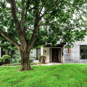
Sansa Interiors transformed what used to be a 1950s outdated bungalow into a simple, functional and bright space for a family of four.
The original interior was gut renovated while incorporating a second level as an addition to the building structure. The facade remains true to the feel of the neighbourhood, balancing a clean traditional ground level and a slick minimal upper plane.
Choosing an interior palette that consists of white tones and warm greys allows the home to feel even more spacious and serene. Introducing white oak accents through out the home brings in an extra layer of warmth.
We worked very closely with our clients to tailor the space to their lifestyle, entertainment needs and basic functional requirements. We provided an open riser staircase as a visual element that connects all levels of the home and allows light through.
The greatest part about this renovation is that it allowed us to place large windows, bringing nature in and constantly opening the home up to ultimate daylight.
Location: Mississauga
 Ezyjamb
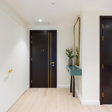
The striking black and gold finishings are contrasted by the EzyJamb openings which don't draw attention away from these visual elements.
Minimalist entryway photo in London
Minimalist entryway photo in London
Sponsored
Columbus, OH

Trish Takacs Design
Award Winning & Highly Skilled Kitchen & Bath Designer in Columbus
 Monaco Interiors
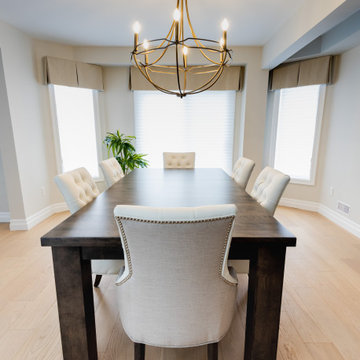
A modern, contemporary take on the popular farmhouse style, this open-concept kitchen/dining room.
Our clients gave up an eat-in kitchen for a counter stool galley style adjacent to a new dining room.
This table had to be durable and able to seat as many as 12 people. With leaves, this table expands to their requested size, and for daily use, it is both durable and provides the overall design with an elegant take on a farmhouse table. The chairs, with complimentary front and back fabrics, keep the open space from seeming too casual, and with fronts being leather, are child-friendly!
The true show stopper in this space is the oversized chandelier. Simple yet elegant curved lines without the weight of shades, creates a stunning visual element.
 SM Design
Bridle Path Residence — Classic Luxury Kitchen
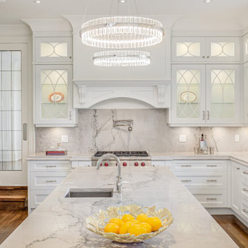
This Bridle Path Residence kitchen is designed as a sophisticated interpretation of the classic estate kitchen, combining traditional architectural detailing with the scale, functionality, and visual refinement expected of a contemporary luxury home. The design is intentionally layered, using millwork, stone, glass, metal, and lighting to create a kitchen that feels established and timeless rather than trend-driven.
The cabinetry forms the architectural backbone of the space. Custom white millwork extends across the walls in a highly considered composition, integrating refrigeration, storage, display cabinetry, and the cooking zone into one cohesive envelope. The detailing is deliberately traditional, with framed doors, decorative moulding, fluted and curved elements, and carefully proportioned cabinetry creating a sense of permanence.
One of the strongest design moments is the range wall. Rather than treating the cooking area as purely utilitarian, the design gives it the presence of a built-in architectural focal point. The sculptural hood surround, decorative corbels, arched detailing, and integrated backsplash create a furniture-like composition around the range, giving the kitchen the character of a bespoke room rather than a collection of appliances.
The marble is used extensively to establish continuity throughout the space. The expressive veining across the backsplash and island creates natural movement against the otherwise quiet white palette. Carrying the stone across multiple surfaces allows the material to become an architectural element, while the restrained cabinetry provides the necessary balance.
Glass-front display cabinets introduce another layer of craftsmanship. Their decorative glazing breaks up the extensive white cabinetry and creates illuminated moments for curated objects and serveware. This balance between concealed storage and open visual display gives the kitchen a more residential, collected character.
The oversized island is designed as both a functional work surface and the social centre of the kitchen. Its generous proportions provide ample preparation space while creating a natural gathering point. The waterfall-like continuity of the stone surface emphasizes the scale of the island and reinforces the luxurious material palette.
Lighting is treated as an architectural feature rather than simply task illumination. Two substantial contemporary crystal ring pendants float above the island, introducing sparkle and a modern counterpoint to the traditional cabinetry. Their circular geometry also softens the predominantly rectilinear architecture and creates a strong focal point when viewed from the adjoining spaces.
Warm hardwood flooring provides an important grounding element. Its natural tone prevents the extensive white and marble palette from feeling overly cool, while creating continuity with the surrounding areas of the residence. The result is a kitchen that feels bright and refined while retaining warmth and residential comfort.
The overall design is built around timeless craftsmanship with contemporary luxury. Traditional millwork establishes character, dramatic natural stone provides visual richness, decorative glass adds refinement, and modern lighting introduces a fresh layer of glamour. The result is a highly tailored kitchen designed not only for cooking, but also for entertaining, gathering, and everyday living.
 Sansa Interiors
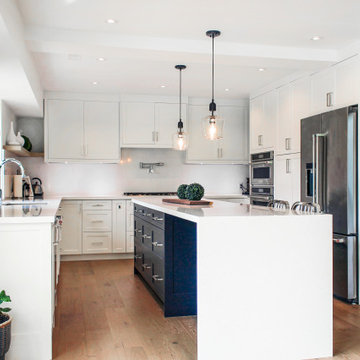
Sansa Interiors transformed what used to be a 1950s outdated bungalow into a simple, functional and bright space for a family of four.
The original interior was gut renovated while incorporating a second level as an addition to the building structure. The facade remains true to the feel of the neighbourhood, balancing a clean traditional ground level and a slick minimal upper plane.
Choosing an interior palette that consists of white tones and warm greys allows the home to feel even more spacious and serene. Introducing white oak accents through out the home brings in an extra layer of warmth.
We worked very closely with our clients to tailor the space to their lifestyle, entertainment needs and basic functional requirements. We provided an open riser staircase as a visual element that connects all levels of the home and allows light through.
The greatest part about this renovation is that it allowed us to place large windows, bringing nature in and constantly opening the home up to ultimate daylight.
Location: Mississauga
41