
Search results for "Visual" in Home Design Ideas




Find the right local pro for your project

 Urban Pad
Transitional gender-neutral carpeted and gray floor nursery photo in Little Rock with gray walls

 Lark Architecture
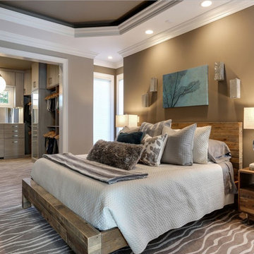
A single wall in this tiny condo separates the multiple functions of a fully functional home. The open, public area includes a living room, full kitchen, and ample storage, with wall space and lighted cubbies to showcase art and personal items. Bright white walls and a simple color pallete help keep the small space clean and inviting.
Photography by Cynthia Lynn Photography

 Domiteaux Garza Architecture
Photo: Charles Davis Smith, AIA
Example of an urban medium tone wood floor eat-in kitchen design in Dallas with a farmhouse sink, open cabinets, stainless steel cabinets, wood countertops, brick backsplash, stainless steel appliances and an island
Example of an urban medium tone wood floor eat-in kitchen design in Dallas with a farmhouse sink, open cabinets, stainless steel cabinets, wood countertops, brick backsplash, stainless steel appliances and an island


 Catalyst Architects, LLC
Photo by Greg Butler - Prime Folio Inc.
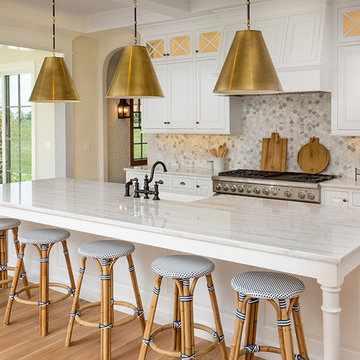
Example of a beach style white three-story exterior home design in Charleston
Example of a beach style white three-story exterior home design in Charleston
 Sona Visual Real Estate Marketing Solutions
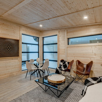
Knotty Pine Cabins captured by Sona Visual, real estate photographers.
Please visit www.SonaVisual.com
Cottage chic home design photo in Edmonton
Cottage chic home design photo in Edmonton


 Neolithic Materials
Lime stone tub was custom carved, antique maltese flooring used throughout..
For inquiries, contact us at (310) 289-0414 or info@neolithicmaterials.com

 Mindful Designs, Inc.
Gibeon Photography
Example of a trendy l-shaped medium tone wood floor kitchen design with open cabinets, white cabinets, concrete countertops, white backsplash, subway tile backsplash, stainless steel appliances and an island
Example of a trendy l-shaped medium tone wood floor kitchen design with open cabinets, white cabinets, concrete countertops, white backsplash, subway tile backsplash, stainless steel appliances and an island


 Aha Development Group, Inc.
Photo by Adam Dubich Photography
Elegant mosaic tile drop-in bathtub photo in Orange County
Elegant mosaic tile drop-in bathtub photo in Orange County

 Adrienne DeRosa
Photo: Adrienne DeRosa © 2015 Houzz
"It is my island in the storm," Weiss says of the master bedroom. Washed in varying degrees of whites and creams, the space is reflective and bright. Weiss painted the ceiling to match the walls - a move that gives the space a greater sense of softness, but also elevates the space even more.
One of the few new purchases that the couple made for their home is the headboard. Once part of the set for the film Intolerable Cruelty, the couple found and purchased it from High Point Market, a semi-annual trade show for the interior design industry. Its grand scale compliments the vastness of the space, and as Will considers it, "it stands as the centerpiece of the room."
 TKS Design Group
Download our free ebook, Creating the Ideal Kitchen. DOWNLOAD NOW
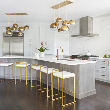
This client was referred to us from a past client. They are a busy 2-career household with young children and enjoy entertaining friends and family in their home. They have a beautiful open concept home but unfortunately the kitchen was not fitting for the rest of the home. They were not quite sure what to do with the space. We talked about trying to refresh it or do more of a minor remodel, but in the end they decided a full gut would get them to where they wanted to be.
One problem was there was no place for guests to hang out other than the large and awkward banquette area. The brick wall and tiled hood area were feeling a bit dated and tired. The space was just not functional for their lifestyle. There was no prep space near the cooktop and no landing area for items coming out of the ovens or refrigerator, plus a big dead zone in the center of the room.
Banquettes, like the one they previously had in the space, are great for small spaces, but when they get really large like this one, it makes getting in and out of the seating area awkward and uncomfortable. Plus, there was room for a large table, so we eliminated the awkward built in.
We started by removing the faux brick wall between the kitchen and back entry. We relocated the entry to the garage over a couple feet in order to get every last inch out of the new kitchen. We also made the decision to close up the primary window that faced the pretty ho hum brick wall of the neighbor’s house. There was plenty of light coming in from the seating area, so we just didn’t feel the window was adding much to the room.
Construction went smoothy. There was a bit of rework with electrical, flooring and HVAC, but in the end, we think it was well worth it.
The clients really wanted a sleek contemporary look, and we originally had planned for a full height slab backsplash, but due to it’s size, it was a budget buster. Instead, we got creative and settled on large format porcelain tiles that have a similar feel but were a fraction of the cost. We made sure the wall was plumb and level so that the fit and finish would mimic that of slab material.
The final space was quite a change. A large prep sink sits directly across from the new pro-style range with plenty additional prep space on the large island. The refrigerator and ovens now have miles of landing space, and a nice tight work triangle makes cooking a breeze.
Since we wanted a more contemporary feel, not many wall cabinets were included. Instead, we outfitted some of the drawers for dish storage with a peg system. Two large pantries flanking the refrigerator hold baking supplies and small appliances. Large drawers by the cooktop hold pots and pans, and an appliance garage tucked away to the left of the range hides away miscellaneous items. The large island also houses a microwave drawer and tons of storage, most of which is drawers offering maximum convenience.
The island now seats 5-6 people comfortably along with the new table in the seating area which can seat up to 8. Entertaining will be a breeze in this space. With such a clean backdrop, we knew we would need some drama with the lighting, so we chose two sets of staggered pendants, which we adjusted for the right visual balance above the island.
We also included a small coffee station to the right of the main kitchen, which helps keep the coffee clutter out of the kitchen proper. Two tones of complimentary gray are featured in this kitchen. The perimeter is a light gray that reads almost white. The island is a gray stain that adds some depth and interest with the visible wood texture. The countertops are clean white quartz, and the hardware, barstools and light fixtures add warm brass tones. I see lots of cooking and entertaining with family and friends in the near future in this bright and airy new space.
Designed by: Susan Klimala, CKD, CBD
Photography by: Michael Kaskel
For more information on kitchen and bath design ideas go to: www.kitchenstudio-ge.com

Sponsored
Columbus, OH

Snider & Metcalf Interior Design, LTD
Leading Interior Designers in Columbus, Ohio & Ponte Vedra, Florida

 Growsgreen Landscape Design
Designed by Growsgreen Landscape Design: growsgreen.com.
Example of a minimalist deck design in San Francisco
Example of a minimalist deck design in San Francisco

 Litchfield Builders
Tuscan dark wood floor living room photo in Santa Barbara with gray walls, a standard fireplace, a wall-mounted tv and a tile fireplace

184