
Search results for "Visually expanded" in Home Design Ideas
 Walczak Design And Build
This long-time family home was ready for a thoughtful evolution. Originally built years ago, the homeowners came to us seeking a comprehensive renovation that better reflected how they live today — entertaining frequently, welcoming their grown children home for holidays and summers, and desiring spaces that feel elevated, functional, and deeply personal. What began as a kitchen and bath update ultimately became a whole-home transformation, touching every floor — from the main living level to the bedroom floor and even the attic.
On the first floor, we completed a full gut renovation and thoughtful reconfiguration of the layout. Walls were removed — including a former pantry and powder room — to dramatically improve sightlines and flow between the kitchen and living room. The kitchen footprint was expanded to accommodate a generously sized island designed for gathering. A two-tone cabinetry palette establishes subtle zoning: Farrow & Ball Stiffkey Blue anchors the island and refrigerator surround, while White Tie brightens the perimeter cabinetry. Paneled appliances conceal the dishwasher and trash, while a stainless refrigerator adds balance and contrast. Antique brass hardware and oversized statement pendants layer in warmth and charm. Inside the cabinetry, custom storage solutions — from built-in spice racks and pull-out trays to a dedicated Tupperware drawer with lid dividers — ensure everything has its place.
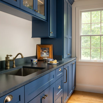
The former dining room was reimagined as a full-service butler’s pantry, complete with a second prep sink, paneled beverage drawers, an ice maker, glass display cabinetry, and abundant storage. Two built-in desks and a bench create a flexible zone for puzzles, homework, or casual seating. By relocating coffee and cocktail service to this dedicated space, the main kitchen remains uncluttered — even during large gatherings.
The powder room was thoughtfully relocated to support the new layout and transformed into a jewel-box moment for guests. Schumacher’s Romantic Bosphorus mural wallpaper creates a hand-painted, immersive experience. A custom console vanity with a Carrara marble top and backsplash pairs beautifully with an antique brass wall-mounted faucet, layered with warm lighting and brass finishes for an unforgettable impression.
Beyond the kitchen, we opened up the living room and installed a custom bi-fold door system that seamlessly connects the interior to the screened-in porch, enhancing indoor-outdoor living. A bespoke music room was also created on the main level, complete with integrated soundproofing and custom cabinetry designed to house instruments, sheet music, a piano, and a concealed sound system — allowing the family’s love of music to be fully supported without visual clutter. Throughout the home, existing hardwood floors were refinished, and new decorative lighting and upgraded recessed lighting were installed to elevate both ambiance and functionality.
On the bedroom floor, every space received a refresh. Each bedroom was thoughtfully updated with custom wallpaper and wall coverings, while the shared bathroom was fully renovated to incorporate a highly functional laundry area. Durable finishes, smart storage solutions, and a clean layout ensure it works seamlessly for adult children when home while still serving daily needs year-round.
The primary bathroom was transformed into a serene retreat designed for daily restoration. A soft neutral palette and layered materials create a calming environment, while half of the space functions as a wet room where the tub and shower share one expansive area. Porcelain tile with a Calacatta marble look delivers timeless elegance without the maintenance of natural stone. Champagne Bronze fixtures complement natural cherry cabinetry — a nod to the homeowner’s passion for woodworking — and thoughtful recessed niches provide clean, hidden storage.
Even the attic was elevated to support modern living. Previously underutilized, the space was upgraded to serve as a dedicated home office for the homeowner, who works there daily. Improved lighting, finishes, and function transformed it into a productive and comfortable retreat tucked away from the main living areas.
Integrated technology plays a key role throughout the home. A Control4 smart home automation system was implemented to seamlessly manage sound, lighting, and comfort. Custom blinds, drapery, and upholstery were carefully coordinated and fabricated to complement each space, adding softness and cohesion from room to room.
This project represents more than a renovation — it is a full reimagining of how the home supports gathering, creativity, comfort, and daily life. Every floor was thoughtfully considered. Every space was elevated. And the result is a sophisticated yet welcoming home designed to serve this family beautifully for years to come.
 Sosna Inc
Our returning clients, middle-aged professionals, reached out to us to remodel their bathrooms as they transition from raising children to focusing on their own comfort and living space. They asked us to modernize their ensuite and shared bathroom, both of which had become outdated and impractical for their current needs.
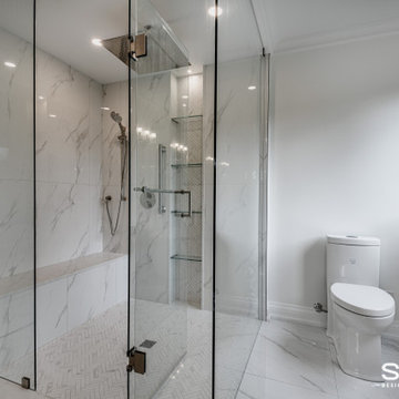
In the ensuite bathroom, we removed a partition wall to redesign and expand the shower and toilet areas, creating a spacious open-concept layout. We added custom cabinetry with pull-out pantries, finished in a bright paint, and a large linear perimeter for ample storage and countertop space. The countertops and backsplash feature dusk veining, paired with brushed nickel sinks, faucets, and cabinet hardware, giving the space a contemporary yet timeless update. A new curbless glass enclosure adds a striking focal point, while the removal of an underused angled jetted tub creates space for an elegant freestanding tub.
In the shared bathroom, we replaced the tub with a modern curbed shower and enhanced the aesthetic with large, colorful porcelain floor tiles that tie together the artistic essence of the home.
The result is a significantly more functional and visually appealing space that reflects our clients' unique style and needs.
 Donald A. Gardner Architects
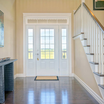
Multiple gables, a center dormer with arched clerestory window, and a striking front staircase create visual excitement for this three bedroom coastal home. Vaulted ceilings in the foyer and great room highlight a dramatic second floor balcony that connects the two upstairs bedrooms, each with its own bath and private porch. The great room is generously proportioned with built-ins on either side of the fireplace and access to a spacious rear deck, which expands the room even more. Private back porches enhance the dining room and the master suite as well. The master suite boasts his and her walk-in closets and a magnificent bath with dual vanities, a garden tub, and separate shower.
Find the right local pro for your project
 Whitefish Architecture
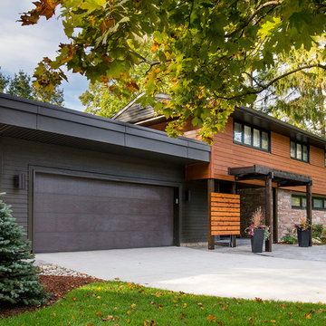
This garage addition and rehabilitation of a mid century modern home expands and enhances the original while respecting the scale and low, linear feel.
All exterior finishes are updated with the exception of the stone. A new entrance creates layers of screening to invite inquiry as well as create privacy and a sense of place. The garage is downplayed with dark materials to allow it to recede relative to the main house, which is deliberately brighter, warmer, and varied to remain the visual focus.
Lead Designer - Alex Jenkins
Designer - Valerie Wright
Photography - Steve Edgar
 Deep River Partners
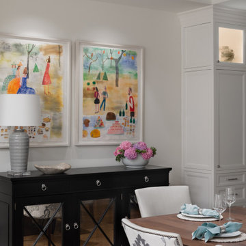
Fulfilling a vision of the future to gather an expanding family, the open home is designed for multi-generational use, while also supporting the everyday lifestyle of the two homeowners. The home is flush with natural light and expansive views of the landscape in an established Wisconsin village. Charming European homes, rich with interesting details and fine millwork, inspired the design for the Modern European Residence. The theming is rooted in historical European style, but modernized through simple architectural shapes and clean lines that steer focus to the beautifully aligned details. Ceiling beams, wallpaper treatments, rugs and furnishings create definition to each space, and fabrics and patterns stand out as visual interest and subtle additions of color. A brighter look is achieved through a clean neutral color palette of quality natural materials in warm whites and lighter woods, contrasting with color and patterned elements. The transitional background creates a modern twist on a traditional home that delivers the desired formal house with comfortable elegance.
 San Luis Kitchen Co.
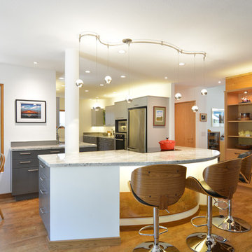
Slab style doors in shades of gray lend drama to this landscape architecture professor/artist’s kitchen. Special heights and depths culminate in a top alignment that defines a visual upper plane extending from the kitchen to the great room (at the tops of the windows and doors) creating a unified interior horizon. On a more prosaic front, the upper cabinets were held somewhat low to be easier to reach for a shortish cook. Differing cabinet depths allow for a structural post to be integrated through the island cabinetry; the oven cabinet is held forward to align with a full depth refrigerator; and depth was added at the washer/dryer surround for needed ventilation. Also, the base cabinets were pulled forward for deeper counters to accommodate several small appliances and still allow for work area. In addition, the client wanted a built-in shelf unit to blend with existing rough hewn paneling in which to display objets d’art.
An organically shaped island breaks with tradition and softens the otherwise linear nature of the room. A unique sweeping curve expands and defines the bar seating -- the wall beneath is lined with an accent stripe of cork (same materials as in the flooring) to act as a shoe-scuff deterrent for the wall. A small but significant detail - the upper doors and side of the tall microwave cabinet had to be finished Silvermist (light) while the interior, edge banding and bottom drawerhead needed to be finished in the darker Slate to continue the color theme of the kitchen. Integrated lighting was also a mandatory component of this kitchen - indirect top, bottom, picture and toe lights can all be adjusted myriad ways; and we can’t forget the very unique undulating pendant lighting at the island..
 Klopf Architecture
Malibu Glass Box House by Klopf Architecture
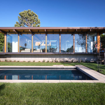
Following the devastating Woolsey Fire of 2018, the site in Malibu offered a unique opportunity to rebuild not just a home, but a new architectural composition that highlighted the property’s potential while navigating strict fire-rebuild codes in the area. Designed by Klopf Architecture, this project embraced a set of limitations and translated them into an architectural asset.
The city’s fire-rebuild process required the new structure to remain close to the original footprint, size and bulk, a constraint that ultimately clarified the architectural direction. Perched near the front of a long, narrow lot, the new home frames and overlooks a private, park-like rear expanse, an uncommon luxury especially in this part of Malibu .
Without a fixed program, the design process allowed for a different kind of creative focus allowing Klopf Architecture the opportunity to explore how a modernist home could best respond to this site. The team approached the project not with a list of requirements, but with a question: How might a modernist live here? What spatial qualities would inspire calm, connection, and a sense of wonder in this setting? The process became less about problem-solving and more about architectural storytelling—letting the site, the light, and the principles of modern design guide the form and flow of the home.
The response emerged in the form of a glass-box pavilion, an open, Mid-Century Modern inspired living, dining, and kitchen space that floats at the edge of the property’s natural descent. Connected to the more enclosed, private areas of the home by a glass-walled hallway, the living pavilion becomes a distinct centerpiece of the design. It opens on all four sides to the landscape with decks and patios on the flanks, an internal garden and water feature to the north, and a dramatic unguarded view of the expansive backyard and ocean horizon to the south.
Because of the mandated footprint, careful planning was required to ensure every space could still engage with light, landscape, or both. Strategic voids in the form of atriums and courtyards allow daylight to filter deep into the home’s core, while offering moments of surprise and retreat. These design gestures allow natural light to filter deep into the interior, creating a sense of brightness and openness throughout the day. At the same time, they expand the perceptual boundaries between inside and out, making the home feel more expansive while anchoring its connection to the surrounding landscape.
The siting of the house is what gives it its unique character. Rather than receding into the backyard like the neighboring homes, the house holds a slight prominence. From the central living pavilion, stepping down into the landscape feels more like entering a secluded park where a separate existing accessory structure, trail, and recreational areas await. The home’s modest street presence gives way to this unfolding drama of space, view, and nature.
Fire-resilient materials and assemblies are integrated seamlessly throughout including triple-pane glazing, under-slab and roof insulation, and locally sourced fire-rated cladding ensure the house not only meets Calfornia’s rigorous wildland-urban interface (WUI) standards, but feels effortlessly aligned with them. While technical decisions like fire-hardening and mechanical systems presented some construction challenges, particularly around the cantilevered glass box, the team found a functional compromise that preserved the integrity of the design.
Inside, a restrained palette and exposed post and beam design celebrate the ethos of mid-century modernism. A central circulation spine extends from the entry to the rear glass wall, offering a continuous visual link from street to ocean. Spaces such as the library and office, though more intimate in scale, are never cut off from nature as each opens to its own unique courtyard or garden view.
Though born out of a strict regulatory framework and developed without a specific client, the rebuild design unfolded with remarkable clarity. Grounded in site logic, refined by limitations and an emphasis on timeless spatial relationships – light, proportion, and a strong connection to nature, the resulting design feels both effortless and uplifting. The home lives lightly on the land, opens generously to its surroundings, and strikes a careful balance between privacy, openness, and calm. For Klopf Architecture, it stands as a compelling case study in how site, code, and circumstantial constraints can inspire enduring, modernist architecture. With years of experience reimagining mid-century modern design for how people live today, the firm took the project’s limitations as an opportunity. The result is a home shaped by open, flowing spaces, strong indoor-outdoor connections, and a calm, clear sense of structure. It’s a good reminder that even with strict constraints, there’s still room for architecture to breathe—and for modernism to keep moving forward.
Klopf Architecture project team: Geoff Campen, John Klopf, AIA, and Sherry Tan
Structural Engineer: ZFA
Contractor: Maison D’Artiste
Photography: ©2025 Mariko Reed
Year Completed: 2023


 Stohlman & Kilner Remodeling Contractors
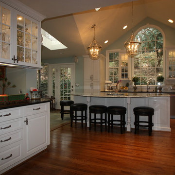
This project involved expanding the existing kitchen space and remodeling the interior of the existing house to compliment the addition. The ceiling heights in the kitchen and windows were arranged to allow views of the owner’s meticulously maintained lawn and custom stone walls. The addition was designed to be compatible with the character of the existing house.
 The Amendola Group, Inc.
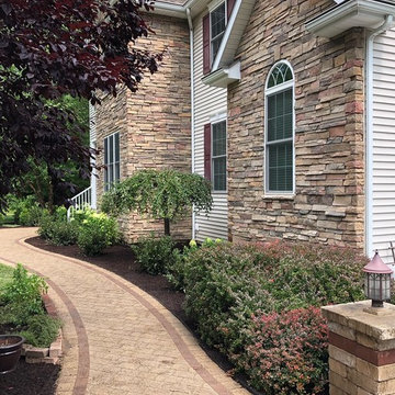
This Gristmill Lane project’s stunning pool and patio area showcase exceptional masonry craftsmanship. Expanding the area’s use long into the late fall season, an outdoor fireplace and large pavilion area feature stonework chosen to complement the home. An intricate paver walkway greets guests to the home while hinting at the visual surprises that await.
 Klopf Architecture
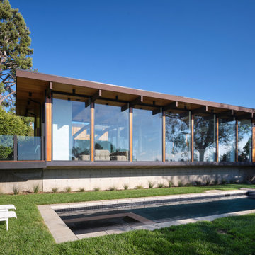
Malibu Glass Box House by Klopf Architecture
Following the devastating Woolsey Fire of 2018, the site in Malibu offered a unique opportunity to rebuild not just a home, but a new architectural composition that highlighted the property’s potential while navigating strict fire-rebuild codes in the area. Designed by Klopf Architecture, this project embraced a set of limitations and translated them into an architectural asset.
The city’s fire-rebuild process required the new structure to remain close to the original footprint, size and bulk, a constraint that ultimately clarified the architectural direction. Perched near the front of a long, narrow lot, the new home frames and overlooks a private, park-like rear expanse, an uncommon luxury especially in this part of Malibu .
Without a fixed program, the design process allowed for a different kind of creative focus allowing Klopf Architecture the opportunity to explore how a modernist home could best respond to this site. The team approached the project not with a list of requirements, but with a question: How might a modernist live here? What spatial qualities would inspire calm, connection, and a sense of wonder in this setting? The process became less about problem-solving and more about architectural storytelling—letting the site, the light, and the principles of modern design guide the form and flow of the home.
The response emerged in the form of a glass-box pavilion, an open, Mid-Century Modern inspired living, dining, and kitchen space that floats at the edge of the property’s natural descent. Connected to the more enclosed, private areas of the home by a glass-walled hallway, the living pavilion becomes a distinct centerpiece of the design. It opens on all four sides to the landscape with decks and patios on the flanks, an internal garden and water feature to the north, and a dramatic unguarded view of the expansive backyard and ocean horizon to the south.
Because of the mandated footprint, careful planning was required to ensure every space could still engage with light, landscape, or both. Strategic voids in the form of atriums and courtyards allow daylight to filter deep into the home’s core, while offering moments of surprise and retreat. These design gestures allow natural light to filter deep into the interior, creating a sense of brightness and openness throughout the day. At the same time, they expand the perceptual boundaries between inside and out, making the home feel more expansive while anchoring its connection to the surrounding landscape.
The siting of the house is what gives it its unique character. Rather than receding into the backyard like the neighboring homes, the house holds a slight prominence. From the central living pavilion, stepping down into the landscape feels more like entering a secluded park where a separate existing accessory structure, trail, and recreational areas await. The home’s modest street presence gives way to this unfolding drama of space, view, and nature.
Fire-resilient materials and assemblies are integrated seamlessly throughout including triple-pane glazing, under-slab and roof insulation, and locally sourced fire-rated cladding ensure the house not only meets Calfornia’s rigorous wildland-urban interface (WUI) standards, but feels effortlessly aligned with them. While technical decisions like fire-hardening and mechanical systems presented some construction challenges, particularly around the cantilevered glass box, the team found a functional compromise that preserved the integrity of the design.
Inside, a restrained palette and exposed post and beam design celebrate the ethos of mid-century modernism. A central circulation spine extends from the entry to the rear glass wall, offering a continuous visual link from street to ocean. Spaces such as the library and office, though more intimate in scale, are never cut off from nature as each opens to its own unique courtyard or garden view.
Though born out of a strict regulatory framework and developed without a specific client, the rebuild design unfolded with remarkable clarity. Grounded in site logic, refined by limitations and an emphasis on timeless spatial relationships – light, proportion, and a strong connection to nature, the resulting design feels both effortless and uplifting. The home lives lightly on the land, opens generously to its surroundings, and strikes a careful balance between privacy, openness, and calm. For Klopf Architecture, it stands as a compelling case study in how site, code, and circumstantial constraints can inspire enduring, modernist architecture. With years of experience reimagining mid-century modern design for how people live today, the firm took the project’s limitations as an opportunity. The result is a home shaped by open, flowing spaces, strong indoor-outdoor connections, and a calm, clear sense of structure. It’s a good reminder that even with strict constraints, there’s still room for architecture to breathe—and for modernism to keep moving forward.
Klopf Architecture project team: Geoff Campen, John Klopf, AIA, and Sherry Tan
Structural Engineer: ZFA
Contractor: Maison D’Artiste
Photography: ©2025 Mariko Reed
Year Completed: 2023
 Ground One Landscape Design + Build
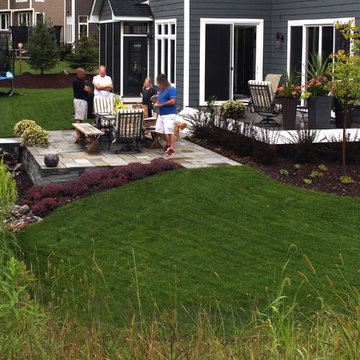
Ground One designed and built a deck off the back of the house for casual sitting, mirroring the house’s front porch. This deck and the screened porch steps descend to a patio terrace. To expand the entertaining space and accommodate the setback restrictions for a permitted gas firepit, we excavated the lot’s back slope to gain bonus space and create a rustic campfire spot. Large boulders found on the site during house construction are incorporated into a retaining wall. Colonial bluestone fills the gaps between these large accent stones and surrounds the firepit. Additional boulders hold up the patio and a slab of bluestone bridges the terrace and patio, preserving the overall drainage pattern. Bluestone is the common thread throughout the project, but it is used in different forms; clean lines closer to the house transition to a more weathered look as you move toward the natural area. The swale is a variety of boulder sizes and river rock to create a more visually-compelling creekbed.
The firepit patio is comfortable for just two people, but can also accommodate a larger group. It is close to the dining space, but physical separation allows for entertaining in different configurations: pre-dinner cocktails around the fire, a roaring flame as backdrop during dinner, kids roasting marshmallows while the adults linger within sight at the dining table, or the gang huddled around a bonfire.
 Kitchen Magic
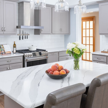
Oak wood cabinets went against the grain for this homeowner. Previously, the former kitchen yielded a yawn-worthy amount of neutral sub-par wood grains. Now, the new remodel is enveloped in warm, inviting taupe hues. Going from woodgrain to flat color instantly infuses a clean, fresh palette. The combination of flat color in a warm tone offers the same warmth of wood.
From traditional to a modern minimalist sensibility, the homeowners refaced existing cabinets in Prestige Statesman Beaded Edge style doors are accented with satin nickel hardware. Additionally, the homeowners knew refacing was an excellent choice. Refacing offers a quicker solution to transform sturdy existing cabinetry to a brand-new effect.
As for the countertops, Cambria Quartz in Brittanicca brings a fresh, rich effect with a simple cream swirl to coordinate perfectly with the stone-hued cabinetry. A round over edge brings a minimalistic look to make a designer statement. The Brittanicca pattern in engineered quartz suggests the look of marble yet offers significantly more durability and antimicrobial properties.
Meanwhile, a solution for the underused space over the kitchen radiator was needed, adding that the area now serves as a highly functional pantry. The custom pantry was the "icing on the cake," particularly with glass front doors, to create a focal point. In all, the design choice also works to expand the kitchen visually.
 Infinite Home
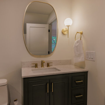
The primary bathroom needed to feel like a true retreat—a space where our clients could unwind and start or end their day feeling relaxed. The existing layout wasn’t giving them that sense of calm, so we reimagined the space to make it both functional and serene.
We started by designing a spacious, glass-enclosed shower finished in a
porcelain marble-style tile and accented with modern brushed brass fixtures and a built-in niche for everyday convenience. While our clients loved having a double vanity, they also wanted a little more breathing room to get ready. To create that separation, we utilized an unused area of the bathroom—relocating the toilet into its own private enclosure and expanding the vanity wall for a more open layout.
The warm wood base of the vanity now adds an inviting, organic touch, while the Kichler Aviv wall sconces add sleek visual interest to the room. Now their bathroom feels calm, refreshing, and timeless.
Exterior
Curb appeal was important to our clients—not just for looks, but for creating a welcoming first impression that matched the warmth of their home’s interior. Beyond that, there were also a few major structural updates needed to bring the exterior up to date.
The most significant transformation came from removing two outdated screened-in porches and replacing them with a new deck that connects seamlessly to the living room, creating an easy flow between indoor and outdoor living. On the back of the home, we replaced the siding and brick, while a new front door and trim added instant charm to the entryway. A fresh coat of paint on both the siding and shutters pulled everything together, giving the exterior a refreshed yet natural, blending perfectly with the surrounding foliage.


 Sosna Inc
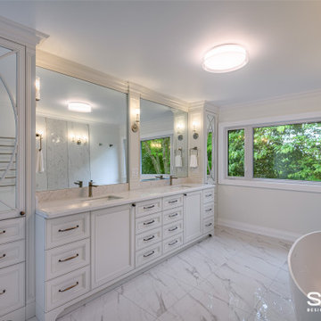
Our returning clients, middle-aged professionals, reached out to us to remodel their bathrooms as they transition from raising children to focusing on their own comfort and living space. They asked us to modernize their ensuite and shared bathroom, both of which had become outdated and impractical for their current needs.
In the ensuite bathroom, we removed a partition wall to redesign and expand the shower and toilet areas, creating a spacious open-concept layout. We added custom cabinetry with pull-out pantries, finished in a bright paint, and a large linear perimeter for ample storage and countertop space. The countertops and backsplash feature dusk veining, paired with brushed nickel sinks, faucets, and cabinet hardware, giving the space a contemporary yet timeless update. A new curbless glass enclosure adds a striking focal point, while the removal of an underused angled jetted tub creates space for an elegant freestanding tub.
In the shared bathroom, we replaced the tub with a modern curbed shower and enhanced the aesthetic with large, colorful porcelain floor tiles that tie together the artistic essence of the home.
The result is a significantly more functional and visually appealing space that reflects our clients' unique style and needs.
 Klopf Architecture
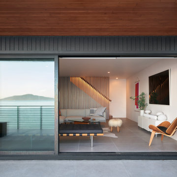
Set on a narrow hillside lot overlooking the San Francisco Bay in Point Richmond, California, Bay Heirloom is a Mid-Century Modern family home restored, modernized and adapted for contemporary living. Oriented south-southwest toward the Marin Headlands, with views of the Golden Gate Bridge, the residence captures shifting Bay light throughout the day, from fog-muted mornings to vivid, glowing sunsets.
The home was built by Karlyn Neel’s grandfather, the owner of the construction company Flo-Crete, one of the Bay Area’s early concrete pumping firms. Flo-Crete completed the foundation and structural concrete work, with family photographs documenting the original cinderblock walls and pours. The firm also contributed to major regional infrastructure projects, including the Transbay BART tube and Candlestick Park, situating the house within a broader legacy of Bay Area construction. Growing up, Neel spent considerable time in the home, developing an early appreciation for mid-century modern principles. Instead of parting with this family heirloom, she purchased the home from her grandfather’s estate.
While her grandfather continued to live in the Point Richmond house, Neel purchased a Mid-Century Modern residence in Palm Desert. In contrast to the Bay Area’s cool temperatures, salt air, and persistent winds, the desert home is shaped by heat and sun and requires a different material response. A substantial renovation she led there emphasized thermal performance, filtered light, and restrained detailing. The experience later informed the restoration of her Bay Area family home.
What began as a modest Mid-Century Modern update expanded when decades of exposure to marine conditions revealed leaks and significant structural and seismic deficiencies. Neel was determined to honor her grandfather’s perseverance and without hesitation pivoted to a much more intensive project. Addressing these challenges required close coordination between Neel, Klopf Architecture and Kasten Builders, with architectural restraint and construction precision guiding each intervention. Rather than alter the home’s defining features, the project focused on reinforcing the structure from within. Discreet beams were embedded along the rear facade and in an upstairs wall, strengthening the building while maximizing the wall of glass facing the Bay and opening the wall between the kitchen and the living space. These structural interventions allowed the space to open fully to the Bay without visual interruption, with the kitchen repositioned as the social and functional core of an open, continuous living space. The building envelope was updated using weather- and corrosion-resistant materials appropriate to the marine environment.
The house unfolds vertically from the street, beginning with a modest garage level and workshop, with the main living spaces located below. Original slate flooring at the entry was preserved, along with select furnishings and artwork collected by Neel’s grandfather, anchoring the restored interior in its past. A restrained palette of black accents and pale, natural finishes replaces darker wood tones, reinforcing openness and calm. A naturally illuminated stair connects to the lowest level, where a former basement was transformed into a guest suite and family room opening onto a deck. From there, steps lead directly to a small concrete boat ramp at the water’s edge.
Throughout the project, decisions were guided by continuity rather than transformation for its own sake. Lessons drawn from both desert and coastal climates informed a material strategy rooted in performance and restraint. Bay Heirloom stands as a measured evolution of a family house, structurally renewed and carefully modernized, grounded in the discipline and care that first shaped it.
Klopf Architecture Project Team: John Klopf, AIA, Angela Todorova and Fernanda Bernardes
Landscape Architect: Huettl Landscape Architecture
General Contractor: Kasten Builders
Photography: ©2025 Mariko Reed
Year Completed: 2022
Location: Point Richmond, CA
 Driftwood Studio, Inc
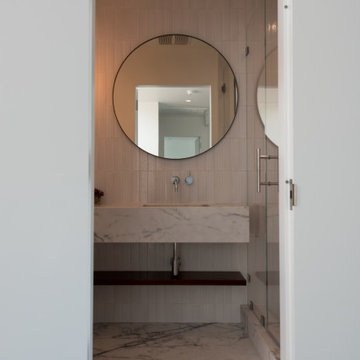
This bathroom showcases a refined, minimalist design defined by its custom marble-wrapped vanity and clean vertical tile cladding. A large round mirror adds soft geometry, reflecting natural light and expanding the space visually. The seamless floor transition in matching marble enhances the spa-like feel, while the warm wood shelf offers contrast and functional elegance. Framed by a simple doorway, the composition highlights craftsmanship, material continuity, and modern restraint.
 Clever Design & Remodeling
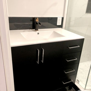
Bedroom and bathroom addition in Sunnyvale, CA - For this project we added on an additional bathroom and bedroom to the existing home to expand the owners living space. The owner had impecable style and wanted a bold and striking black and white modern bathroom. Custom accent tiles added in the shower create visual interest and highlight the gorgeous modern shower fixtures.

Sponsored
Columbus, OH

Snider & Metcalf Interior Design, LTD
Leading Interior Designers in Columbus, Ohio & Ponte Vedra, Florida
 H. Bero Interiors
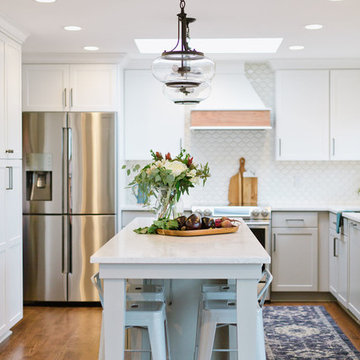
We said good-bye to an outdated 60's ranch home kitchen that was closed off and dark. By removing the wall between the kitchen and small eating area we were able to expand the footprint of the kitchen and create a large island with comfortable seating for four. The kitchen is now open to the living and dining room to create the open plan that works perfectly for our clients that love to entertain.
 Miccaro Designs/Interiors by Michele
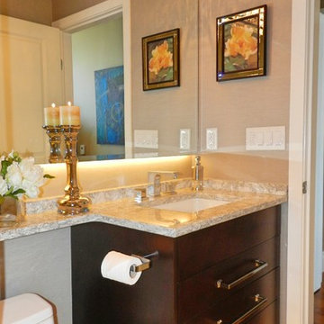
The floating vanity is lit from below using LED lighting offering ambient light and helps to expand the space visually. A quartz counter is teamed with an under mount sink and drawers in the vanity help to offer organized storage.
 Studio Terpeluk
The project was a renovation of a 1974 two-story house designed by prominent San Francisco architect Albert Lanier (husband of Ruth Asawa). Each level is framed by exterior courtyards which provide both sheltered intimacy with nature and visual connection to the city beyond. The owners were interested in increasing the volume of the house while maintaining its original DNA as defined by angular geometries, redwood interiors and exterior courtyards.
Our approach was to expand and surgically modify the house in an architecturally non-aggressive manner. Spaces were opened up and flow and views were maximized. Color, texture, light and vegetation were used to harmonize with the vintage redwood tonalities and the owners’ eclecticism.
Dark-knotted douglas fir flooring, fabricated from locally reclaimed pier pilings, was used throughout the house to balance the dark redwood living level with the lighter-hued floors below. The sculptural blackened steel stair anchors the house, weaving together the floors and their diverse spatial character. Hard materials including terrazzo, concrete and mottled gray marble were used to counterbalance the warm softwoods. The house façades and cascading courtyards were reclad in irregular western red cedar planks.
We collaborated with our friend and designer Beatrice Santiccioli to create a color language that expresses a natural interaction with the light and materials in the environment, transitioning from bold to atmospheric as you pass downward through the house. Italian landscape designer Monica Viarengo designed the outdoor areas including the intimate entry courtyard and the terraced back garden with expansive views of the city. Her work shifts from curated to wild as your move through the property.
83