
Search results for "Visually expanded" in Home Design Ideas
 Inviniti Cellar Design
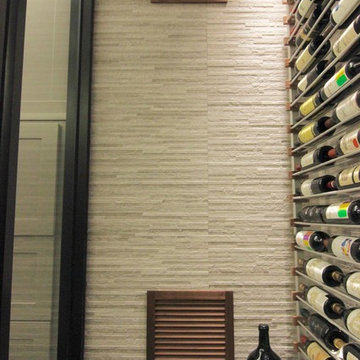
A small existing crawl space was dug out and expanded to make room for this amazing entertainment area / office. The glass wall and double glass doors at the end of the room allows for the dramatic visual while providing a sealed space for the mechanical cooling to keep the wine at the optimum temperature. The combination of label forward aluminum racking with wood end caps and the clear-coated walnut cabinetry is a welcoming contrast.
The cellar holds 373 bottles of unique wines. The Diamond bins, drawers, bottle display and picture opening provides for various bottle sizes. Up lighting from the floor and LED lighting within the racking supports the ever-changing ambiance of the room.
Photos taken by Inviniti Cellar Design
 Artscape Garden Associates Ltd
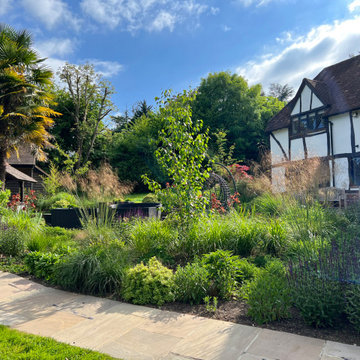
This paving and planting scheme features new hard landscaping elements and a new planting scheme. Artscape was initially briefed to extend and enhance the patio in the garden of a lovely home in the village of Cookham Dean in Berkshire. Our clients wanted to increase the size of the paved area so they could use it more frequently for relaxing and dining in the sun during the day. As well as increasing its size and practicality, they wanted the terrace to look and feel more inviting. The existing site was a mixture of brick paving, which was slippery underfoot, and tired concrete crazy paving. The patio also had stone retaining walls surrounded by sloped lawns and a few poorly maintained and mismatched shrubs.
Redesigned and repaved area
We first created a new, larger layout with a series of wider steps closer to the house, making a more inviting and welcoming area. Our landscapers paved the area with coursed sandstone, renowned for its incredible strength and durability. The earthy tones and unique texture of the sandstone gives it a natural timeless look which blends sympathetically with the garden setting. The worn finish of the paving also makes the surface safer to walk on. The edge of the paving curves in line from the end of the house to visually link the areas.
Bullnosed edges enhance looks and safety
Bullnosing provides the garden step edges with a smooth, luxury appearance, which also enhance safety. Safety is an important factor to consider when renovating or building new steps and paved areas. Smooth, rounded bullnosed steps or edges means there won’t be any harshly cut, sharp edges to injure someone should they trip or fall. Our Artscape paving experts can advise on the best bespoke, professionally profiled bullnose edges to suit the needs of your garden project.
Replacing sloped lawns with plants
Our initial brief was to create a new planted border just around the paved area. However, after various discussions and designs, our clients decided to follow our recommendation to expand the planting, so it included the whole sloping bank. The planting design also included the addition of small trees to create vertical interest.
New nature-friendly planting
The planting features an easy-to-maintain mix of perennials, grasses, and shrubs. This adds softness to the seating area and brings an everchanging display of flowers, foliage, textures and colours to the garden. The plants will attract more birds and butterflies to the garden, and will be beneficial for insects too.
The lawn was doing very little to support a diversity of insects and birds. Replacing even a small section of lawn with perennial flowers, shrubs, grasses, wildflowers, or groundcovers will benefit nature and wildlife. As well as supporting greater biodiversity, plants are more environmentally friendly than maintaining a lawn. Lawns are drought tolerant and will recover even if the grass has turned brown and patchy in a heatwave. But to keep the lawn looking lush, green, and beautiful in a hot, dry spell will require constant and wasteful watering.
The planting is informal and includes grasses, taking inspiration from the fields opposite. Ornamental grasses soften the scheme and bring movement to the garden as they shimmer in the slightest of breezes. Grasses are easy to grow and require little ongoing care. The main maintenance task is to cut the planting back in spring ready for the new growth to come through.
To keep the whole project within our client’s budget, we retained the existing walls, simply carrying out some small repairs and modifications where necessary. We were also able to add stunning new atmospheric lighting to the older existing lighting circuit to illuminate the area at night.
 Lori Ramsay Design
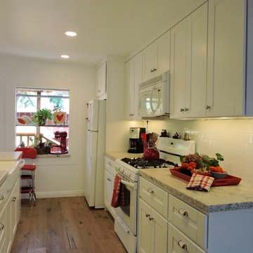
This lovely kitchen lives larger than it's compact square footage. By removing the wall to the right side of the kitchen and expanding the cabinets along that wall we created additional storage as well as a visual opening of the small kitchen.
Find the right local pro for your project
 Capital Kitchen & Bath
This kitchen remodel is the definition of elevated everyday living, where clean lines, warm textures, and intentional function come together in a space designed to truly perform.
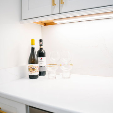
The quartz countertops & full height backsplash give the entire kitchen a clean, luminous feel while providing durable, low-maintenance performance for real everyday living.
A large statement island was created by expanding the kitchen footprint and eliminating the unused formal dining room. The island adds generous prep space, comfortable seating, and the perfect gathering spot for morning coffee or evening entertaining.
Tucked seamlessly into the cabinetry is a hidden walk-in pantry with wet bar & storage galore, keeping the kitchen's visual lines beautifully uncluttered.
And for effortless hosting, a dedicated beverage station- in the kitchen- featuring an ice maker and refrigerator creates a functional mini-hub for drinks, snacks, and celebrations.
Modern. Functional. Timeless. This is more than a kitchen remodel, it’s a space designed to make daily life feel beautiful and effortless.
 Kathleen Donohue, Neil Kelly Co.
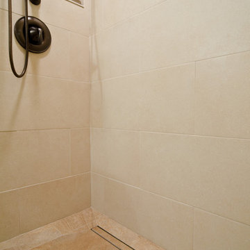
The curbless shower features a trench drain, located at the rear of the shower. Large format porcelain tiles used on the floor are continued into the shower floor to help expand the small space visually. Ross Chandler Photography
 Dallas Builders Association
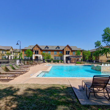
Britain Way Apartments, located at 333 Lane St. in Irving, has reborn with a fresh rejuvenated appeal. Built in 1962, the original development structure had been noticeably deteriorating in recent years. It had limited amenities, 17 repetitive, monotonous buildings with dull colors and obsolete mansard roofs in dilapidated condition. There was poor on-site drainage and lighting, no perimeter fencing, and several city code violations were recorded in prior years. The Developer’s mission was to convert this dated project into a high quality, eco-friendly, modern, and affordable housing community for the citizens of Irving.
After the remodel was completed, enhanced features include visually pleasing facades using heavy stone accents and sloping roofs, and lush landscaping distributed throughout the site. Additional improvements include expanded kitchen areas with upgraded interior amenities and energy efficient appliances; second bathrooms added to select two- and three-bedroom units; a brand-new spacious clubhouse and community center was provided; pool and picnic areas and an on-site resident activities coordinator to lead an abundance of community services provided to residents at no extra cost. Strategic partnerships, with community-based organizations, local volunteer groups and non-profits offer lifestyle and learning activities such as arts and crafts and after-school reading and tutoring for children, computer classes, lifestyle enrichment classes, nutrition classes and aquatic activities for children and adults.
Britain Way is the first LEED Gold Certified affordable multifamily community in the city of Irving. LEED certification ensures the property will be healthier and safer for residents in addition to providing lower utility expenses, as well as, conserving energy and water. Obtaining LEED Gold Certification for a 60-year-old project was a herculean effort.
Further enhancing the project’s resident quality of life initiatives, the new, stylish Britain Way is designed per implementing “Crime Prevention Through Environmental Design” (CPTED) requirements. Among several other updates, the property was made safer by adding perimeter fencing and increasing lighting levels throughout the site.
To tour Britain Way or for more information on availability of this apartment community or any other available properties, please visit www.omhousing.com or https://www.britainwayapts.com/
This Home of the Week is presented by the Dallas Builders Association. For information on the Association please visit www.dallasbuilders.com.
 Ground One Landscape Design + Build
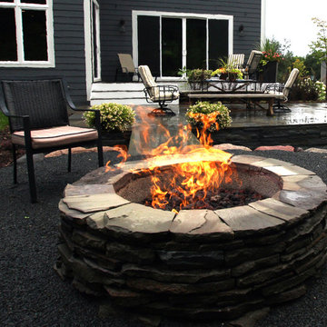
Ground One designed and built a deck off the back of the house for casual sitting, mirroring the house’s front porch. This deck and the screened porch steps descend to a patio terrace. To expand the entertaining space and accommodate the setback restrictions for a permitted gas firepit, we excavated the lot’s back slope to gain bonus space and create a rustic campfire spot. Large boulders found on the site during house construction are incorporated into a retaining wall. Colonial bluestone fills the gaps between these large accent stones and surrounds the firepit. Additional boulders hold up the patio and a slab of bluestone bridges the terrace and patio, preserving the overall drainage pattern. Bluestone is the common thread throughout the project, but it is used in different forms; clean lines closer to the house transition to a more weathered look as you move toward the natural area. The swale is a variety of boulder sizes and river rock to create a more visually-compelling creekbed.
The firepit patio is comfortable for just two people, but can also accommodate a larger group. It is close to the dining space, but physical separation allows for entertaining in different configurations: pre-dinner cocktails around the fire, a roaring flame as backdrop during dinner, kids roasting marshmallows while the adults linger within sight at the dining table, or the gang huddled around a bonfire.

Sponsored
Columbus, OH

Snider & Metcalf Interior Design, LTD
Leading Interior Designers in Columbus, Ohio & Ponte Vedra, Florida
 Maria Iacobucci Design
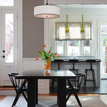
The original 3'w door between the two rooms was expanded to a 9' opening, allowing greater visual and physical access between the kitchen and dining room
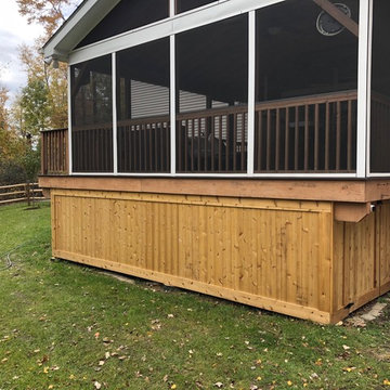
 The Amendola Group, Inc.
This Gristmill Lane project’s stunning pool and patio area showcase exceptional masonry craftsmanship. Expanding the area’s use long into the late fall season, an outdoor fireplace and large pavilion area feature stonework chosen to complement the home. An intricate paver walkway greets guests to the home while hinting at the visual surprises that await.
 VESTA
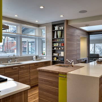
VESTAThis home is located in the in the heart of Northcenter and situated on an oversized lot with a tremendous view of a landscaped backyard garden. The client’s desire was to open the back kitchen wall to take advantage of the garden view and to incorporate the kitchen into the rest of the home. By adding a 3’-0” deep addition at the sink wall and increasing the overall size of the windows, Vesta was able to expand the views and to open the floor plan to create a functional island. The island in turn, added space for food prep & prep sink along with casual seating. By removing the adjoining Dining Room wall, Vesta created an open floor plan that enhanced the Owners everyday living experiences. The new Dining Buffet added storageand a visual break while maintaining the open feel. By using warm horizontal walnut tones, it allowed a reference back to the original mid-century feel of the décor of the home. Adding playful highlights of apple green, we took advantage of a palette that brought the natural outside elements back into the environment.
 Brittanys Design
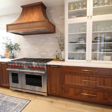
Client’s were seeking a luminous, coastal-inspired kitchen that honored Puget Sound views, the clients required a high-functioning space for an expanding family, including four adult children and future in-laws. The plan prioritizes abundant storage, intuitive cooking and cleanup zones, and seamless guest circulation that preserves the workflow. Custom walnut base cabinetry lends resilience, warmth, and visual depth, balanced by honed quartz and airy wall cabinetry. Navy island cabinetry, nautical fixtures, and a mixed hue backsplash evoke the shoreline without feeling overly thematic.
 Rebecca Schnier Architecture
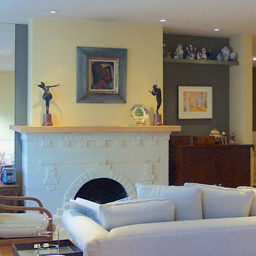
A new simple wood mantel was installed above the original fireplace. The entire wall to the left was covered with a mirror. The mirror tricks the eye into thinking the space is much larger than it actually is. Repeating the contrasting paint colors in the adjacent stair hall also expands the sense of space as visually connects the two areas.
 La Costa Cabinets & Design
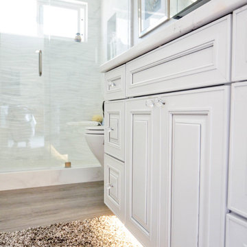
A classic marble white and marble motif play beautifully off the weathered engineered wood flooring in the guest bathroom renovation. A walk in shower replaced the unused tub, and the frameless glass shower door and tiled wainscoting make this small space seem much larger than its footprint. A wall hung toilet and toe kick lighting expands the floor visually, allowing for the small tiled in window to truly brighten this small space. Marble countertops compliment the marbled sculpted large format Porcelanosa wall tile, and satin nickel fixtures pop against the white background. Truly a retreat!


 Michael Nash Design, Build & Homes
2011 CHRYSALIS AWARD WINNER, ADDITION $100,000-$250,000
The owners of this small rambler in Arlington were tired of living in cramped quarters. The home’s kitchen was only 8’ x 11’ and they wanted to add a family room. Because the home is built on a slab, with no basement, the decision was made to expand out into the backyard.
Their contractor, Michael Nash Design, Build & Homes, proposed an addition to back of the home, which would also be built on a slab to match the existing elevation. To make room, they had to remove the home’s original patio and then remove the 30’ wall running across the back of the home.
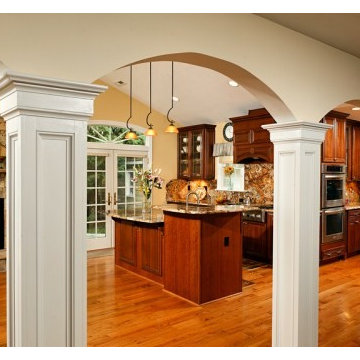
In their place, a new 16’x32’ addition was built with high cathedral ceilings, skylights and French doors topped with arched transoms. An archway and decorative columns were put in place to connect the old and new areas.
The new kitchen starts in the old kitchen area and wraps its way into the new addition, ending with a large two-tier island and prep sink topped with exotic granite. The main sink is in the corner of the old kitchen, easily accessible from both ends of the work area.
Beautiful custom-made cabinets include a wooden range hood and floor-to-ceiling pantry with wine rack. Stainless steel Energy Star appliances include a professional-quality gas cooktop and double wall ovens.
The kitchen flows into the new family room via an open concept design. A beautiful floor-to-ceiling natural stone fire place located in the middle of the back wall serves as a visual separation for the space. A round window is uniquely embedded in the stone work near the ceiling.
Wide plank oak flooring runs the length of the room, providing a uniform look throughout the space. Opposite the kitchen is the home’s new family room, with comfortable leather seating and plenty of windows to brighten up the space. A new stone patio off the kitchen provides the finishing touch to this remodel. In the end, the project provided the homeowners with the space they wanted and plenty of amenities to make family time or entertaining guests a pleasure.
 Modern Outdoor
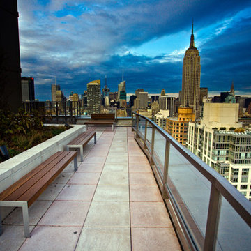
Casual yet elegant, the Etra Collection by Modern Outdoor offers a modern aesthetic that is constructed for outdoor use while being suitable for indoor settings. Etra’s visual inspiration is derived from its architectural-based frame system. Designed using structural angle steel that is mitered and ground, a clean and seamless surface gives Etra its pure appeal.
Frame Options:
• 304 stainless steel that is brushed and electropolished
• marine-grade 316 stainless steel that is brushed and electropolished for use within one mile of salt air, available for an upcharge
• powder coated carbon steel in our standard silver finish
• custom powder coat colors, available for an upcharge
Surface Options:
• sustainably harvested ipe – a beautiful South American hardwood that is three times as dense as teak — naturally resistant to rot, insects, UV exposure, ice, salt, abrasion and splintering – all without the need for toxic chemicals — considered a 25+ year wood
• marine-grade polyboard – a UV stabilized high-density polyethylene material that is non-corrosive and chip resistant – available in six colors for expanded design choices
Fabric Options:
• six standard colors of 100% solution dyed acrylic treated for outdoor use are offered
• custom fabrics and COM service are also available
Cushion Options:
• our standard foam cushions are made from outdoor appropriate high-resiliency (HR) foam
• for clients that prefer less maintenance, a flow-through foam that allows water and moisture to escape the cushion is also available for an upcharge
Etra is a full-breadth line with dining, bar height, lounge, cafe, patio and pool setting pieces included. The pieces are readily customizable for individual client needs.
 Taylor & Taylor, Inc.
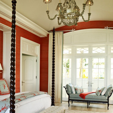
A mahogany four-poster bed features notched headboard panels. Wool-and-silk rug in a lattice pattern sit on bleached, hand-scraped oak floors.
Inspiration for a coastal bedroom remodel in Miami
Inspiration for a coastal bedroom remodel in Miami
 RoomService 360
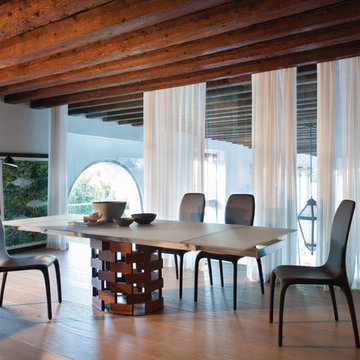
Founded in 1975 by Gianni Tonin, the Italian modern furniture company Tonin Casa has long been viewed by European designers as one of the best interior design firms in the business, but it is only within the last five years that the company expanded their market outside Italy. As an authorized dealer of Tonin Casa contemporary furnishings, room service 360° is able to offer an extensive line of Tonin Casa designs.
Tonin Casa furniture features a wide range of distinctive styles to ensure the right selection for any contemporary home. The room service 360° collection includes a broad array of chairs, nightstands, consoles, television stands, dining tables, coffee tables and mirrors. Quality materials, including an extensive use of tempered glass, mark Tonin Casa furnishings with style and sophistication.
Tonin Casa modern furniture combines style and function by merging modern technology with the Italian tradition of innovative style and quality craftsmanship. Each piece complements homes styled in the modern style, yet each piece offers visual style on its own as well, with imaginative designs that are sure to add a note of distinction to any contemporary home.

Sponsored
Columbus, OH
Snider & Metcalf Interior Design, LTD
Leading Interior Designers in Columbus, Ohio & Ponte Vedra, Florida
 Drury Design
The Setup
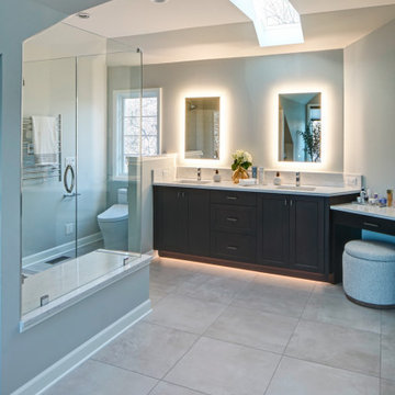
For this primary bathroom project, the homeowners wanted to transform their large, T-shaped bathroom into a functional, multi-purpose sanctuary. The existing layout was inefficient, with a bulky built-in tub, a closed-off shower, and an awkward footprint that limited practical use.
This remodel also presented a unique challenge – the homeowners wanted to use the space for workouts as well. The design needed to maximize the large open area in the middle of the T, providing enough room for yoga and light free-weight exercises while maintaining the bathroom’s aesthetic and functionality.
Design objectives:
Expand and brighten the shower area without major layout changes
Replace the oversized built-in tub with a sleek freestanding alternative
Create a flexible space for workouts while maintaining the bathroom’s design integrity
Address cold flooring with added comfort solutions
Enhance lighting for both beauty and functionality
Incorporate storage for workout equipment and everyday essentials
Integrate natural elements to accommodate the homeowners’ love of plants
The Remodel
Design challenges to be solved:
Shower Expansion – The homeowners want a more open, spa-like shower but don’t want to dramatically alter the footprint.
Workout Integration – Balancing fitness functionality with a serene bathroom design will require creative layout adjustments.
Storage Solutions – With workout gear to stow away, the space needs discrete and versatile storage options.
Lighting – Enhancing both natural and artificial lighting to brighten the large space.
Cold Floors – Positioned above the garage, the bathroom tends to feel colder than the adjacent primary bedroom. A solution is needed to add warmth and comfort during use, without the need to reconfigure the home’s overall heating system.
The Renewed Space
Design solutions:
Spa-Like Shower Expansion – Removing a wall and replacing it with glass transformed the shower into an open, airy retreat, allowing natural light to flow freely through the space. A curved black river rock floor and neutral linear wall tiles add warmth and texture, while carefully placed niche lighting enhances the tranquil, luxurious atmosphere.
Workout-Friendly Layout – A custom full-length mirror was strategically placed to accommodate multiple uses, creating a fitness studio-like experience for yoga or light weight training. The mirror’s size and positioning allow for clear visibility during workouts, while also enhancing the room by adding light and a greater sense of depth.
Custom Storage Solutions – A custom cabinet with a wood top was crafted to discreetly store workout equipment, preserving the clean, open feel of the space. Its design not only enhances functionality but also creates a sense of symmetry, bringing visual balance and cohesion to the overall layout.
Enhanced Lighting – Replacing the shower wall with glass, installing a full-length mirror, and incorporating vanity mirrors with built-in lighting dramatically brighten the space. LED strip lighting under the cabinets, along the tub half wall, and in both the side and shower niches adds layered illumination, enhancing both function and ambiance.
Heated Floors – Installing heated flooring provides consistent warmth and comfort year-round, enhancing the space for both workouts and daily routines. A European-style towel warmer brings additional warmth and a touch of luxury, elevating the overall experience.
Final Thoughts:
This transformed bathroom blends luxury with intentional design. By addressing the homeowners’ needs – from workout flexibility to spa-inspired details – the space now serves multiple purposes without compromise. The warm cabinetry, black accents and thoughtful lighting tie the design together, while the curved textures and plant-friendly ledge add a personalized touch. This bathroom is now a bright, welcoming sanctuary for daily routines and mindful moments.
 Klopf Architecture
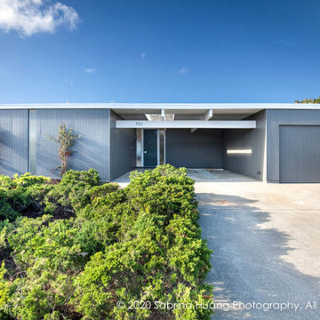
Joseph Eichler developed his moderately priced houses for the mass-market starting in 1949. His homes were designed using affordable materials and simple construction techniques. Nearly 70 years later these homes are in need of updating and remodeling an Eichler home today can become an imposing and costly project if you’re not careful. For this project the clients, who had undergone several previous house renovations, were determined to stick with an established budget from the beginning. Klopf Architecture helped them modernize their Eichler with a premium appearance on a reasonable budget.
The clients challenged the Klopf team to create a design that had a high-end feel and nicely done while adhering to their budget. That meant not all of the initial project scope could be built. Like many other Eichler homes, the original floor plan did not meet the family’s needs leaving them feeling disconnected from one room to another. While an early goal was to expand the house into a carport and create a larger garage, it did not survive the contractor pricing phase of the project.
The goals that did survive through to the end of the project included blurring some of the boundaries and opening up some of the spaces, making them more functional and creating a smoother flow in the house. The Klopf team joined the former separate kitchen and formal living room into one large space and shift the dining room where it is now connected to the kitchen. Klopf swapped the family room to the front alongside the living room, so the spaces feel more cohesive and are now better suited for family activities. The functional layout of the master bathroom was changed to include a large, curbless shower.
Installing a complete IKEA kitchen including cabinets, countertops, appliances, light fixtures, and furnishings was key to staying within budget. Bath fixtures in this house are also exclusively IKEA. Klopf Architecture has designed many homes using IKEA products, which are quite compatible offering an affordable, contemporary take on Eichler homes. The clients saved additional money from the simplicity and availability of IKEA products and by orchestrating the orders and purchases themselves. Following each construction meeting, the clients would make a run to IKEA and purchase items, pick up needed spare parts, and bring them back right away to stay ahead of the contractor’s schedule and minimize the chance of delays and bottlenecks.
Klopf balanced material selections by retaining some of the original woodwork and simply refinishing the mahogany paneling. They were able to retain the original windows and sliding doors which were still in good shape, avoiding some of the most costly replacement expenses. Additionally interior doors were simply refinished and the exterior siding cleaned up and repainted. Formerly dark interiors are now illuminated with new slimmer semi-recessed lighting eliminating the need for costly roof work.
Attention to design details allowed the Klopf team to ensure the house ended up with a high quality feel. Key visual elements were strictly aligned and Klopf worked with the clients to select a unified materials palette throughout the spaces so the house flows seamlessly together. Aligning the tile layout with the trusses and keeping it level with the concrete slab outside allowed them to achieve a level of quality that may otherwise be missed.
The clients were able to keep their budget on track by determining clear goals and making critical decisions upfront, choosing materials and furnishings wisely, working with the right design and construction teams in place and to a large part, their willingness to participate throughout the process. In the end the clients were much happier with their reconfigured Eichler home and Klopf Architecture managed to keep their remodeling costs to about $325/sf – a good amount below the average Bay Area Eichler remodel.
Project Team: John Klopf, Angela Todorova, Sherry Tan
Contractor: Keycon Construction
Structural Engineer: Sezen & Moon
Photography: Sabrina Huang
Year Completed: 2020
 Cantoni Los Angeles
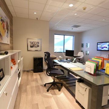
While Cantoni’s Founder & CEO, Michael Wilkov (aka MW) was away at the fall 2014 High Point Market, Cantoni’s Dallas Visuals Team came out to play…spearheading the secret operation known as “MW’s Office Makeover,” Anne Mancuso gathered her troops to give the big boss’ office a serious and much needed facelift in just 4 days! To read the full story, visit the Cantoni Blog here: http://cantoni.com/blog/2014/11/office-makeover/
Photos by David DeLeon
86