
Search results for "Visually expanded" in Home Design Ideas
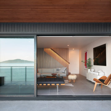
 Klopf Architecture
Set on a narrow hillside lot overlooking the San Francisco Bay in Point Richmond, California, Bay Heirloom is a Mid-Century Modern family home restored, modernized and adapted for contemporary living. Oriented south-southwest toward the Marin Headlands, with views of the Golden Gate Bridge, the residence captures shifting Bay light throughout the day, from fog-muted mornings to vivid, glowing sunsets.
The home was built by Karlyn Neel’s grandfather, the owner of the construction company Flo-Crete, one of the Bay Area’s early concrete pumping firms. Flo-Crete completed the foundation and structural concrete work, with family photographs documenting the original cinderblock walls and pours. The firm also contributed to major regional infrastructure projects, including the Transbay BART tube and Candlestick Park, situating the house within a broader legacy of Bay Area construction. Growing up, Neel spent considerable time in the home, developing an early appreciation for mid-century modern principles. Instead of parting with this family heirloom, she purchased the home from her grandfather’s estate.
While her grandfather continued to live in the Point Richmond house, Neel purchased a Mid-Century Modern residence in Palm Desert. In contrast to the Bay Area’s cool temperatures, salt air, and persistent winds, the desert home is shaped by heat and sun and requires a different material response. A substantial renovation she led there emphasized thermal performance, filtered light, and restrained detailing. The experience later informed the restoration of her Bay Area family home.
What began as a modest Mid-Century Modern update expanded when decades of exposure to marine conditions revealed leaks and significant structural and seismic deficiencies. Neel was determined to honor her grandfather’s perseverance and without hesitation pivoted to a much more intensive project. Addressing these challenges required close coordination between Neel, Klopf Architecture and Kasten Builders, with architectural restraint and construction precision guiding each intervention. Rather than alter the home’s defining features, the project focused on reinforcing the structure from within. Discreet beams were embedded along the rear facade and in an upstairs wall, strengthening the building while maximizing the wall of glass facing the Bay and opening the wall between the kitchen and the living space. These structural interventions allowed the space to open fully to the Bay without visual interruption, with the kitchen repositioned as the social and functional core of an open, continuous living space. The building envelope was updated using weather- and corrosion-resistant materials appropriate to the marine environment.
The house unfolds vertically from the street, beginning with a modest garage level and workshop, with the main living spaces located below. Original slate flooring at the entry was preserved, along with select furnishings and artwork collected by Neel’s grandfather, anchoring the restored interior in its past. A restrained palette of black accents and pale, natural finishes replaces darker wood tones, reinforcing openness and calm. A naturally illuminated stair connects to the lowest level, where a former basement was transformed into a guest suite and family room opening onto a deck. From there, steps lead directly to a small concrete boat ramp at the water’s edge.
Throughout the project, decisions were guided by continuity rather than transformation for its own sake. Lessons drawn from both desert and coastal climates informed a material strategy rooted in performance and restraint. Bay Heirloom stands as a measured evolution of a family house, structurally renewed and carefully modernized, grounded in the discipline and care that first shaped it.
Klopf Architecture Project Team: John Klopf, AIA, Angela Todorova and Fernanda Bernardes
Landscape Architect: Huettl Landscape Architecture
General Contractor: Kasten Builders
Photography: ©2025 Mariko Reed
Year Completed: 2022
Location: Point Richmond, CA
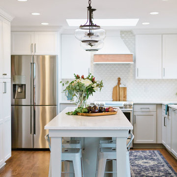
 H. Bero Interiors
We said good-bye to an outdated 60's ranch home kitchen that was closed off and dark. By removing the wall between the kitchen and small eating area we were able to expand the footprint of the kitchen and create a large island with comfortable seating for four. The kitchen is now open to the living and dining room to create the open plan that works perfectly for our clients that love to entertain.
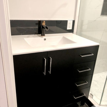
 Clever Design & Remodeling
Bedroom and bathroom addition in Sunnyvale, CA - For this project we added on an additional bathroom and bedroom to the existing home to expand the owners living space. The owner had impecable style and wanted a bold and striking black and white modern bathroom. Custom accent tiles added in the shower create visual interest and highlight the gorgeous modern shower fixtures.
Find the right local pro for your project
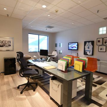
 Cantoni Dallas
While Cantoni’s Founder & CEO, Michael Wilkov (aka MW) was away at the fall 2014 High Point Market, Cantoni’s Dallas Visuals Team came out to play…spearheading the secret operation known as “MW’s Office Makeover,” Anne Mancuso gathered her troops to give the big boss’ office a serious and much needed facelift in just 4 days! To read the full story, visit the Cantoni Blog here: http://cantoni.com/blog/2014/11/office-makeover/
Photos by David DeLeon
 Walczak Design And Build
This long-time family home was ready for a thoughtful evolution. Originally built years ago, the homeowners came to us seeking a comprehensive renovation that better reflected how they live today — entertaining frequently, welcoming their grown children home for holidays and summers, and desiring spaces that feel elevated, functional, and deeply personal. What began as a kitchen and bath update ultimately became a whole-home transformation, touching every floor — from the main living level to the bedroom floor and even the attic.
On the first floor, we completed a full gut renovation and thoughtful reconfiguration of the layout. Walls were removed — including a former pantry and powder room — to dramatically improve sightlines and flow between the kitchen and living room. The kitchen footprint was expanded to accommodate a generously sized island designed for gathering. A two-tone cabinetry palette establishes subtle zoning: Farrow & Ball Stiffkey Blue anchors the island and refrigerator surround, while White Tie brightens the perimeter cabinetry. Paneled appliances conceal the dishwasher and trash, while a stainless refrigerator adds balance and contrast. Antique brass hardware and oversized statement pendants layer in warmth and charm. Inside the cabinetry, custom storage solutions — from built-in spice racks and pull-out trays to a dedicated Tupperware drawer with lid dividers — ensure everything has its place.
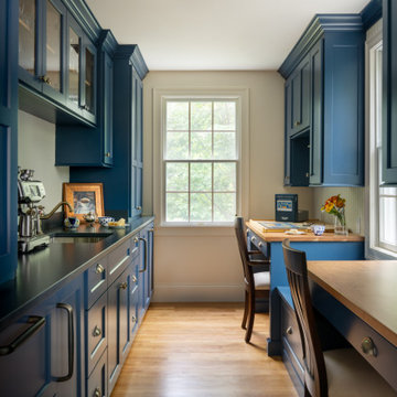
The former dining room was reimagined as a full-service butler’s pantry, complete with a second prep sink, paneled beverage drawers, an ice maker, glass display cabinetry, and abundant storage. Two built-in desks and a bench create a flexible zone for puzzles, homework, or casual seating. By relocating coffee and cocktail service to this dedicated space, the main kitchen remains uncluttered — even during large gatherings.
The powder room was thoughtfully relocated to support the new layout and transformed into a jewel-box moment for guests. Schumacher’s Romantic Bosphorus mural wallpaper creates a hand-painted, immersive experience. A custom console vanity with a Carrara marble top and backsplash pairs beautifully with an antique brass wall-mounted faucet, layered with warm lighting and brass finishes for an unforgettable impression.
Beyond the kitchen, we opened up the living room and installed a custom bi-fold door system that seamlessly connects the interior to the screened-in porch, enhancing indoor-outdoor living. A bespoke music room was also created on the main level, complete with integrated soundproofing and custom cabinetry designed to house instruments, sheet music, a piano, and a concealed sound system — allowing the family’s love of music to be fully supported without visual clutter. Throughout the home, existing hardwood floors were refinished, and new decorative lighting and upgraded recessed lighting were installed to elevate both ambiance and functionality.
On the bedroom floor, every space received a refresh. Each bedroom was thoughtfully updated with custom wallpaper and wall coverings, while the shared bathroom was fully renovated to incorporate a highly functional laundry area. Durable finishes, smart storage solutions, and a clean layout ensure it works seamlessly for adult children when home while still serving daily needs year-round.
The primary bathroom was transformed into a serene retreat designed for daily restoration. A soft neutral palette and layered materials create a calming environment, while half of the space functions as a wet room where the tub and shower share one expansive area. Porcelain tile with a Calacatta marble look delivers timeless elegance without the maintenance of natural stone. Champagne Bronze fixtures complement natural cherry cabinetry — a nod to the homeowner’s passion for woodworking — and thoughtful recessed niches provide clean, hidden storage.
Even the attic was elevated to support modern living. Previously underutilized, the space was upgraded to serve as a dedicated home office for the homeowner, who works there daily. Improved lighting, finishes, and function transformed it into a productive and comfortable retreat tucked away from the main living areas.
Integrated technology plays a key role throughout the home. A Control4 smart home automation system was implemented to seamlessly manage sound, lighting, and comfort. Custom blinds, drapery, and upholstery were carefully coordinated and fabricated to complement each space, adding softness and cohesion from room to room.
This project represents more than a renovation — it is a full reimagining of how the home supports gathering, creativity, comfort, and daily life. Every floor was thoughtfully considered. Every space was elevated. And the result is a sophisticated yet welcoming home designed to serve this family beautifully for years to come.
 Zion Home and Building, LLC
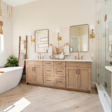
The goal for this master suite was to replace a dated, heavy layout with a sense of "Warm Minimalism." We wanted to trade visual clutter for intentional textures. By pairing the natural grain of White Oak with the crisp, architectural lines of Matte Black fixtures, we created a space that feels grounded, airy, and deeply restorative.
A master bath is a high-stakes environment where every inch counts. We took absolute ownership of the "inch-by-inch" planning required to expand the shower and incorporate a freestanding soaking tub without making the room feel crowded. Our Guided Process ensured the client felt confident in the bold choice of vertical stack tile—a design-forward move that draws the eye upward and adds a custom, boutique-hotel feel to the space.
This is a "Host’s Private Oasis." While the rest of the home is ready for guests, this bathroom is a master-grade sanctuary for the homeowners. The elite craftsmanship is visible in the precision of the tile alignments and the seamless integration of the natural wood elements, providing a feeling of pride and daily joy.
 Klopf Architecture
Joseph Eichler developed his moderately priced houses for the mass-market starting in 1949. His homes were designed using affordable materials and simple construction techniques. Nearly 70 years later these homes are in need of updating and remodeling an Eichler home today can become an imposing and costly project if you’re not careful. For this project the clients, who had undergone several previous house renovations, were determined to stick with an established budget from the beginning. Klopf Architecture helped them modernize their Eichler with a premium appearance on a reasonable budget.
The clients challenged the Klopf team to create a design that had a high-end feel and nicely done while adhering to their budget. That meant not all of the initial project scope could be built. Like many other Eichler homes, the original floor plan did not meet the family’s needs leaving them feeling disconnected from one room to another. While an early goal was to expand the house into a carport and create a larger garage, it did not survive the contractor pricing phase of the project.
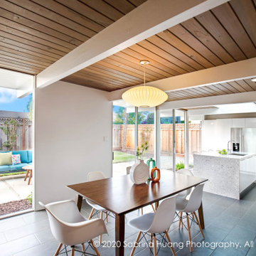
The goals that did survive through to the end of the project included blurring some of the boundaries and opening up some of the spaces, making them more functional and creating a smoother flow in the house. The Klopf team joined the former separate kitchen and formal living room into one large space and shift the dining room where it is now connected to the kitchen. Klopf swapped the family room to the front alongside the living room, so the spaces feel more cohesive and are now better suited for family activities. The functional layout of the master bathroom was changed to include a large, curbless shower.
Installing a complete IKEA kitchen including cabinets, countertops, appliances, light fixtures, and furnishings was key to staying within budget. Bath fixtures in this house are also exclusively IKEA. Klopf Architecture has designed many homes using IKEA products, which are quite compatible offering an affordable, contemporary take on Eichler homes. The clients saved additional money from the simplicity and availability of IKEA products and by orchestrating the orders and purchases themselves. Following each construction meeting, the clients would make a run to IKEA and purchase items, pick up needed spare parts, and bring them back right away to stay ahead of the contractor’s schedule and minimize the chance of delays and bottlenecks.
Klopf balanced material selections by retaining some of the original woodwork and simply refinishing the mahogany paneling. They were able to retain the original windows and sliding doors which were still in good shape, avoiding some of the most costly replacement expenses. Additionally interior doors were simply refinished and the exterior siding cleaned up and repainted. Formerly dark interiors are now illuminated with new slimmer semi-recessed lighting eliminating the need for costly roof work.
Attention to design details allowed the Klopf team to ensure the house ended up with a high quality feel. Key visual elements were strictly aligned and Klopf worked with the clients to select a unified materials palette throughout the spaces so the house flows seamlessly together. Aligning the tile layout with the trusses and keeping it level with the concrete slab outside allowed them to achieve a level of quality that may otherwise be missed.
The clients were able to keep their budget on track by determining clear goals and making critical decisions upfront, choosing materials and furnishings wisely, working with the right design and construction teams in place and to a large part, their willingness to participate throughout the process. In the end the clients were much happier with their reconfigured Eichler home and Klopf Architecture managed to keep their remodeling costs to about $325/sf – a good amount below the average Bay Area Eichler remodel.
Project Team: John Klopf, Angela Todorova, Sherry Tan
Contractor: Keycon Construction
Structural Engineer: Sezen & Moon
Photography: Sabrina Huang
Year Completed: 2020


 C2 | Studio Landscape Architecture
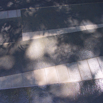
The concept for this project was to reveal the sensation of an active, living landscape in flux and echo the vitality and energy of the wetland that comprises much of this rural site. A mosaic of shifting concrete slabs, set in a field of limestone bands and chip seal, flows through screens of bamboo, set in motion by the slightest breeze. The implied motion of the ground plane blurs the boundary where the terrace and parking court meet, serving the dual purpose of expanded entertaining area or overflow parking during large gatherings. The clipped formal hedge that folds around the house and delineates the lawn stands in stark opposition to the unrestrained hemlock forest that envelops the property, heightening the contrast between the two. The shifting planes of the boardwalk entrance connects these volumes, defining the primary visual and functional axes of the site.
Scott Carman
 Croes Renovations
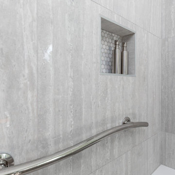
A white 66" freestanding tub takes up less physical and visual space than the previous built-in tub and allowed for an expanded shower. The original layout had the sinks on opposite sides of the room. Joining the sinks in a single vanity over 8' allowed the space for a huge linen closet. Custom wainscoting keeps the traditional feel of the rest of the home
 Harmony Design Northwest
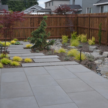
Transforming the blank canvas of a basic builder’s backyard into a captivating retreat, we turned a grass-dominated space into an effortlessly elegant low-maintenance haven with a distinct Asian flair. At the heart of this metamorphosis is the expanded patio and walkway, featuring offset architectural pavers that not only captivate the eye but also contribute to a dynamic sense of flow throughout the elongated backyard.
A key focal point is the thoughtfully designed rain garden, adorned with strategically placed boulders that manages stormwater runoff in an aesthetically pleasing way.
The carefully curated plant palette plays a pivotal role in achieving the desired aesthetic. The deliberate choice of low grasses and foliage-forward perennials, coupled with the inclusion of small evergreen plants and vibrant Japanese maples, creates a harmonious blend of colors, shapes, and sizes. This contrasting arrangement not only ensures visual interest year-round but also infuses the space with a timeless allure inspired by Asian design principles.
The result is a backyard oasis that transcends the ordinary, offering a serene escape with minimal upkeep requirements. The strategic combination of hardscape elements, lush greenery, and carefully selected plants transforms this space into a sanctuary where the beauty of nature meets the sophistication of thoughtful design.
 Klopf Architecture
Set on a narrow hillside lot overlooking the San Francisco Bay in Point Richmond, California, Bay Heirloom is a Mid-Century Modern family home restored, modernized and adapted for contemporary living. Oriented south-southwest toward the Marin Headlands, with views of the Golden Gate Bridge, the residence captures shifting Bay light throughout the day, from fog-muted mornings to vivid, glowing sunsets.
The home was built by Karlyn Neel’s grandfather, the owner of the construction company Flo-Crete, one of the Bay Area’s early concrete pumping firms. Flo-Crete completed the foundation and structural concrete work, with family photographs documenting the original cinderblock walls and pours. The firm also contributed to major regional infrastructure projects, including the Transbay BART tube and Candlestick Park, situating the house within a broader legacy of Bay Area construction. Growing up, Neel spent considerable time in the home, developing an early appreciation for mid-century modern principles. Instead of parting with this family heirloom, she purchased the home from her grandfather’s estate.
While her grandfather continued to live in the Point Richmond house, Neel purchased a Mid-Century Modern residence in Palm Desert. In contrast to the Bay Area’s cool temperatures, salt air, and persistent winds, the desert home is shaped by heat and sun and requires a different material response. A substantial renovation she led there emphasized thermal performance, filtered light, and restrained detailing. The experience later informed the restoration of her Bay Area family home.
What began as a modest Mid-Century Modern update expanded when decades of exposure to marine conditions revealed leaks and significant structural and seismic deficiencies. Neel was determined to honor her grandfather’s perseverance and without hesitation pivoted to a much more intensive project. Addressing these challenges required close coordination between Neel, Klopf Architecture and Kasten Builders, with architectural restraint and construction precision guiding each intervention. Rather than alter the home’s defining features, the project focused on reinforcing the structure from within. Discreet beams were embedded along the rear facade and in an upstairs wall, strengthening the building while maximizing the wall of glass facing the Bay and opening the wall between the kitchen and the living space. These structural interventions allowed the space to open fully to the Bay without visual interruption, with the kitchen repositioned as the social and functional core of an open, continuous living space. The building envelope was updated using weather- and corrosion-resistant materials appropriate to the marine environment.
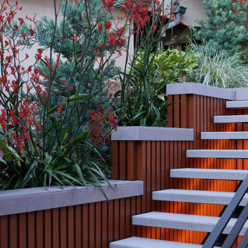
The house unfolds vertically from the street, beginning with a modest garage level and workshop, with the main living spaces located below. Original slate flooring at the entry was preserved, along with select furnishings and artwork collected by Neel’s grandfather, anchoring the restored interior in its past. A restrained palette of black accents and pale, natural finishes replaces darker wood tones, reinforcing openness and calm. A naturally illuminated stair connects to the lowest level, where a former basement was transformed into a guest suite and family room opening onto a deck. From there, steps lead directly to a small concrete boat ramp at the water’s edge.
Throughout the project, decisions were guided by continuity rather than transformation for its own sake. Lessons drawn from both desert and coastal climates informed a material strategy rooted in performance and restraint. Bay Heirloom stands as a measured evolution of a family house, structurally renewed and carefully modernized, grounded in the discipline and care that first shaped it.
Klopf Architecture Project Team: John Klopf, AIA, Angela Todorova and Fernanda Bernardes
Landscape Architect: Huettl Landscape Architecture
General Contractor: Kasten Builders
Photography: ©2025 Mariko Reed
Year Completed: 2022
Location: Point Richmond, CA
 Zion Home and Building, LLC
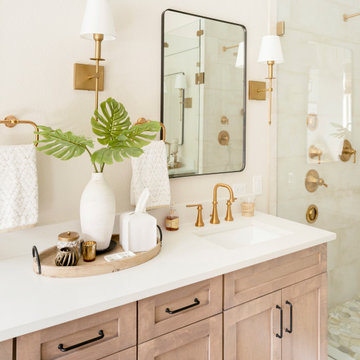
The goal for this master suite was to replace a dated, heavy layout with a sense of "Warm Minimalism." We wanted to trade visual clutter for intentional textures. By pairing the natural grain of White Oak with the crisp, architectural lines of Matte Black fixtures, we created a space that feels grounded, airy, and deeply restorative.
A master bath is a high-stakes environment where every inch counts. We took absolute ownership of the "inch-by-inch" planning required to expand the shower and incorporate a freestanding soaking tub without making the room feel crowded. Our Guided Process ensured the client felt confident in the bold choice of vertical stack tile—a design-forward move that draws the eye upward and adds a custom, boutique-hotel feel to the space.
This is a "Host’s Private Oasis." While the rest of the home is ready for guests, this bathroom is a master-grade sanctuary for the homeowners. The elite craftsmanship is visible in the precision of the tile alignments and the seamless integration of the natural wood elements, providing a feeling of pride and daily joy.
 Sha Studio Inc.
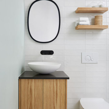
A 'slow-designed' bathroom that places importance on using sustainable materials while supporting the community at large. It is our belief that beautiful bathrooms don't have to cost our earth. Our goal with this project was to use materials that were kinder to our planet while still offering a design impact through aesthetics. We scouted for tile suppliers who are conscious of their environmental impact and found a Canadian maker of the terrazzo tile. It is a mix of marble, granite and natural stone aggregate hand cast in a cement base. We then paired that with a ceramic tile, one of the most eco-friendly options and partnered with local tradespeople to craft this highly functional and statement-making bathroom.


 Klopf Architecture
Malibu Glass Box House by Klopf Architecture
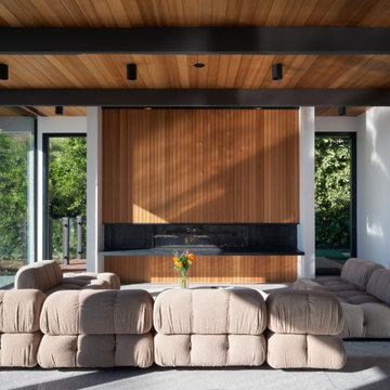
Following the devastating Woolsey Fire of 2018, the site in Malibu offered a unique opportunity to rebuild not just a home, but a new architectural composition that highlighted the property’s potential while navigating strict fire-rebuild codes in the area. Designed by Klopf Architecture, this project embraced a set of limitations and translated them into an architectural asset.
The city’s fire-rebuild process required the new structure to remain close to the original footprint, size and bulk, a constraint that ultimately clarified the architectural direction. Perched near the front of a long, narrow lot, the new home frames and overlooks a private, park-like rear expanse, an uncommon luxury especially in this part of Malibu .
Without a fixed program, the design process allowed for a different kind of creative focus allowing Klopf Architecture the opportunity to explore how a modernist home could best respond to this site. The team approached the project not with a list of requirements, but with a question: How might a modernist live here? What spatial qualities would inspire calm, connection, and a sense of wonder in this setting? The process became less about problem-solving and more about architectural storytelling—letting the site, the light, and the principles of modern design guide the form and flow of the home.
The response emerged in the form of a glass-box pavilion, an open, Mid-Century Modern inspired living, dining, and kitchen space that floats at the edge of the property’s natural descent. Connected to the more enclosed, private areas of the home by a glass-walled hallway, the living pavilion becomes a distinct centerpiece of the design. It opens on all four sides to the landscape with decks and patios on the flanks, an internal garden and water feature to the north, and a dramatic unguarded view of the expansive backyard and ocean horizon to the south.
Because of the mandated footprint, careful planning was required to ensure every space could still engage with light, landscape, or both. Strategic voids in the form of atriums and courtyards allow daylight to filter deep into the home’s core, while offering moments of surprise and retreat. These design gestures allow natural light to filter deep into the interior, creating a sense of brightness and openness throughout the day. At the same time, they expand the perceptual boundaries between inside and out, making the home feel more expansive while anchoring its connection to the surrounding landscape.
The siting of the house is what gives it its unique character. Rather than receding into the backyard like the neighboring homes, the house holds a slight prominence. From the central living pavilion, stepping down into the landscape feels more like entering a secluded park where a separate existing accessory structure, trail, and recreational areas await. The home’s modest street presence gives way to this unfolding drama of space, view, and nature.
Fire-resilient materials and assemblies are integrated seamlessly throughout including triple-pane glazing, under-slab and roof insulation, and locally sourced fire-rated cladding ensure the house not only meets Calfornia’s rigorous wildland-urban interface (WUI) standards, but feels effortlessly aligned with them. While technical decisions like fire-hardening and mechanical systems presented some construction challenges, particularly around the cantilevered glass box, the team found a functional compromise that preserved the integrity of the design.
Inside, a restrained palette and exposed post and beam design celebrate the ethos of mid-century modernism. A central circulation spine extends from the entry to the rear glass wall, offering a continuous visual link from street to ocean. Spaces such as the library and office, though more intimate in scale, are never cut off from nature as each opens to its own unique courtyard or garden view.
Though born out of a strict regulatory framework and developed without a specific client, the rebuild design unfolded with remarkable clarity. Grounded in site logic, refined by limitations and an emphasis on timeless spatial relationships – light, proportion, and a strong connection to nature, the resulting design feels both effortless and uplifting. The home lives lightly on the land, opens generously to its surroundings, and strikes a careful balance between privacy, openness, and calm. For Klopf Architecture, it stands as a compelling case study in how site, code, and circumstantial constraints can inspire enduring, modernist architecture. With years of experience reimagining mid-century modern design for how people live today, the firm took the project’s limitations as an opportunity. The result is a home shaped by open, flowing spaces, strong indoor-outdoor connections, and a calm, clear sense of structure. It’s a good reminder that even with strict constraints, there’s still room for architecture to breathe—and for modernism to keep moving forward.
Klopf Architecture project team: Geoff Campen, John Klopf, AIA, and Sherry Tan
Structural Engineer: ZFA
Contractor: Maison D’Artiste
Photography: ©2025 Mariko Reed
Year Completed: 2023
 Croes Renovations
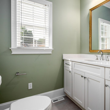
A white 66" freestanding tub takes up less physical and visual space than the previous built-in tub and allowed for an expanded shower. The original layout had the sinks on opposite sides of the room. Joining the sinks in a single vanity over 8' allowed the space for a huge linen closet. Custom wainscoting keeps the traditional feel of the rest of the home
 Zion Home and Building, LLC
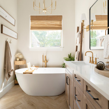
The goal for this master suite was to replace a dated, heavy layout with a sense of "Warm Minimalism." We wanted to trade visual clutter for intentional textures. By pairing the natural grain of White Oak with the crisp, architectural lines of Matte Black fixtures, we created a space that feels grounded, airy, and deeply restorative.
A master bath is a high-stakes environment where every inch counts. We took absolute ownership of the "inch-by-inch" planning required to expand the shower and incorporate a freestanding soaking tub without making the room feel crowded. Our Guided Process ensured the client felt confident in the bold choice of vertical stack tile—a design-forward move that draws the eye upward and adds a custom, boutique-hotel feel to the space.
This is a "Host’s Private Oasis." While the rest of the home is ready for guests, this bathroom is a master-grade sanctuary for the homeowners. The elite craftsmanship is visible in the precision of the tile alignments and the seamless integration of the natural wood elements, providing a feeling of pride and daily joy.
 Monaco Interiors
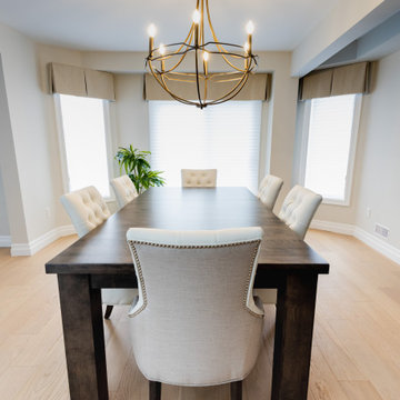
A modern, contemporary take on the popular farmhouse style, this open-concept kitchen/dining room.
Our clients gave up an eat-in kitchen for a counter stool galley style adjacent to a new dining room.
This table had to be durable and able to seat as many as 12 people. With leaves, this table expands to their requested size, and for daily use, it is both durable and provides the overall design with an elegant take on a farmhouse table. The chairs, with complimentary front and back fabrics, keep the open space from seeming too casual, and with fronts being leather, are child-friendly!
The true show stopper in this space is the oversized chandelier. Simple yet elegant curved lines without the weight of shades, creates a stunning visual element.

Sponsored
Columbus, OH

Snider & Metcalf Interior Design, LTD
Leading Interior Designers in Columbus, Ohio & Ponte Vedra, Florida
 Refinery Interiors
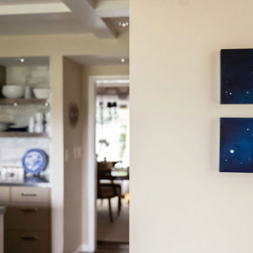
This kitchen was taken down to the studs and expanded to create a true gathering space. Marble was salvaged from the Idaho Capitol remodel to create the stove backsplash and countertops. Stainless steel counters flank the stove for exceptional durability. Open shelves add visual impact as well as function. Art by Cate Brigden.
 User
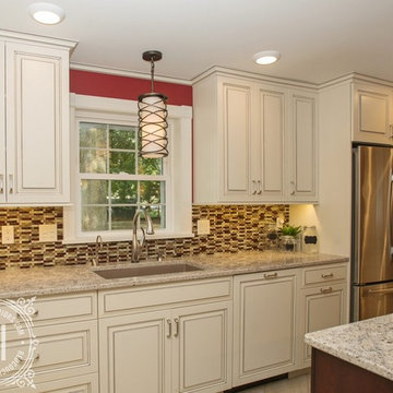
UserOur approach to the dining room wall was a key decision for the entire project. The wall was load bearing and the homeowners considered only removing half of it. In the end, keeping the overall open concept design was important to the homeowners, therefore we installed a load bearing beam in the ceiling. The beam was finished with drywall to be cohesive so it looked like it was a part of the original design. Now that the kitchen and dining room were open, paint colors were used to designate the spaces and create visual boundaries. This made each area feel like it’s its own space without using any structures.
The original L-shaped kitchen was cut short because of bay windows that overlooked the backyard patio. These windows were lost in the space and not functional; they were replaced with double French doors leading onto the patio. A brick layer was brought in to patch up the window swap and now it looks like the French doors always existed. New crown molding was installed throughout and painted to match the kitchen cabinets.
This window/door replacement allowed for a large pantry cabinet to be installed next to the refrigerator which was not in the old cabinet configuration. The replaced perimeter cabinets host custom storage solutions, like a mixer stand, spice organization, recycling center and functional corner cabinet with pull out shelving. The perimeter kitchen cabinets are painted with a glaze and the island is a cherry stain with glaze to amplify the raised panel door style.
We tripled the size of the kitchen island to expand countertop space. It seats five people and hosts charging stations for the family’s busy lifestyle. It was important that the cooktop in the island had a built in downdraft system because the homeowners did not want a ventilation hood in the center of the kitchen because it would obscure the open concept design.
The countertops are quartz and feature an under mount granite composite kitchen sink with a low divide center. The kitchen faucet, which features hands free and touch technology, and an instant hot water dispenser were added for convenience because of the homeowners’ busy lifestyle. The backsplash is a favorite, with a teal and red glass mosaic basket weave design. It stands out and holds its own among the expansive kitchen cabinets.
All recessed, under cabinet and decorative lights were installed on dimmer switches to allow the homeowners to adjust the lighting in each space of the project. All exterior and interior door hardware, hinges and knobs were replaced in oil rubbed bronze to match the dark stain throughout the space. The entire first floor remodel project uses 12x24 ceramic tile laid in a herringbone pattern. Since tile is typically cold, the flooring was also heated from below. This will also help with the homeowners’ original heating issues.
When accessorizing the kitchen, we used functional, everyday items the homeowners use like cutting boards, canisters for dry goods and place settings on the island. Ultimately, this project transformed their small, outdated kitchen into an expansive and functional workspace.
 C2 | Studio Landscape Architecture
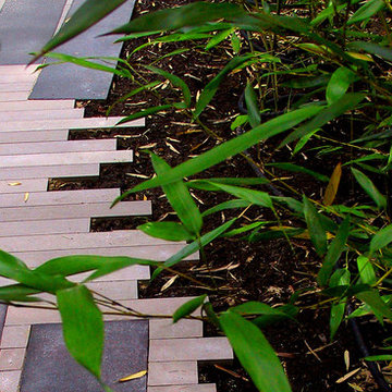
The concept for this project was to reveal the sensation of an active, living landscape in flux and echo the vitality and energy of the wetland that comprises much of this rural site. A mosaic of shifting concrete slabs, set in a field of limestone bands and chip seal, flows through screens of bamboo, set in motion by the slightest breeze. The implied motion of the ground plane blurs the boundary where the terrace and parking court meet, serving the dual purpose of expanded entertaining area or overflow parking during large gatherings. The clipped formal hedge that folds around the house and delineates the lawn stands in stark opposition to the unrestrained hemlock forest that envelops the property, heightening the contrast between the two. The shifting planes of the boardwalk entrance connects these volumes, defining the primary visual and functional axes of the site.
Scott Carman
98