
Search results for "Watchful eye" in Home Design Ideas

 Alair Homes Plano
This house was built in 1994 and our clients have been there since day one. They wanted a complete refresh in their kitchen and living areas and a few other changes here and there; now that the kids were all off to college! They wanted to replace some things, redesign some things and just repaint others. They didn’t like the heavy textured walls, so those were sanded down, re-textured and painted throughout all of the remodeled areas.
The kitchen change was the most dramatic by painting the original cabinets a beautiful bluish-gray color; which is Benjamin Moore Gentleman’s Gray. The ends and cook side of the island are painted SW Reflection but on the front is a gorgeous Merola “Arte’ white accent tile. Two Island Pendant Lights ‘Aideen 8-light Geometric Pendant’ in a bronze gold finish hung above the island. White Carrara Quartz countertops were installed below the Viviano Marmo Dolomite Arabesque Honed Marble Mosaic tile backsplash. Our clients wanted to be able to watch TV from the kitchen as well as from the family room but since the door to the powder bath was on the wall of breakfast area (no to mention opening up into the room), it took up good wall space. Our designers rearranged the powder bath, moving the door into the laundry room and closing off the laundry room with a pocket door, so they can now hang their TV/artwork on the wall facing the kitchen, as well as another one in the family room!
We squared off the arch in the doorway between the kitchen and bar/pantry area, giving them a more updated look. The bar was also painted the same blue as the kitchen but a cool Moondrop Water Jet Cut Glass Mosaic tile was installed on the backsplash, which added a beautiful accent! All kitchen cabinet hardware is ‘Amerock’ in a champagne finish.
In the family room, we redesigned the cabinets to the right of the fireplace to match the other side. The homeowners had invested in two new TV’s that would hang on the wall and display artwork when not in use, so the TV cabinet wasn’t needed. The cabinets were painted a crisp white which made all of their decor really stand out. The fireplace in the family room was originally red brick with a hearth for seating. The brick was removed and the hearth was lowered to the floor and replaced with E-Stone White 12x24” tile and the fireplace surround is tiled with Heirloom Pewter 6x6” tile.
The formal living room used to be closed off on one side of the fireplace, which was a desk area in the kitchen. The homeowners felt that it was an eye sore and it was unnecessary, so we removed that wall, opening up both sides of the fireplace into the formal living room. Pietra Tiles Aria Crystals Beach Sand tiles were installed on the kitchen side of the fireplace and the hearth was leveled with the floor and tiled with E-Stone White 12x24” tile.
The laundry room was redesigned, adding the powder bath door but also creating more storage space. Waypoint flat front maple cabinets in painted linen were installed above the appliances, with Top Knobs “Hopewell” polished chrome pulls. Elements Carrara Quartz countertops were installed above the appliances, creating that added space. 3x6” white ceramic subway tile was used as the backsplash, creating a clean and crisp laundry room! The same tile on the hearths of both fireplaces (E-Stone White 12x24”) was installed on the floor.
The powder bath was painted and 12x36” Ash Fiber Ceramic tile was installed vertically on the wall behind the sink. All hardware was updated with the Signature Hardware “Ultra”Collection and Shades of Light “Sleekly Modern” new vanity lights were installed.
All new wood flooring was installed throughout all of the remodeled rooms making all of the rooms seamlessly flow into each other. The homeowners love their updated home!
Design/Remodel by Hatfield Builders & Remodelers | Photography by Versatile Imaging

 Archadeck of Nova Scotia
At Archadeck of Nova Scotia we love any size project big or small. But, that being said, we have a soft spot for the projects that let us show off our talents! This Halifax house was no exception. The owners wanted a space to suit their outdoor lifestyle with materials to last far into the future. The choices were quite simple: stone veneer, Timbertech composite decking and glass railing.
What better way to create that stability than with a solid foundation, concrete columns and decorative stone veneer? The posts were all wrapped with stone and match the retaining wall which was installed to help with soil retention and give the backyard more definition (it’s not too hard on the eyes either).
A set of well-lit steps will guide you up the multi-level deck. The built-in planters soften the hardness of the Timbertech composite deck and provide a little visual relief. The two-tone aesthetic of the deck and railing are a stunning feature which plays up contrasting tones.
From there it’s a game of musical chairs; we recommend the big round one on a September evening with a glass of wine and cozy blanket.
We haven’t gotten there quite yet, but this property has an amazing view (you will see soon enough!). As to not spoil the view, we installed TImbertech composite railing with glass panels. This allows you to take in the surrounding sights while relaxing and not have those pesky balusters in the way.
In any Canadian backyard, there is always the dilemma of dealing with mosquitoes and black flies! Our solution to this itchy problem is to incorporate a screen room as part of your design. This screen room in particular has space for dining and lounging around a fireplace, perfect for the colder evenings!
Ahhh…there’s the view! From the top level of the deck you can really get an appreciation for Nova Scotia. Life looks pretty good from the top of a multi-level deck. Once again, we installed a composite and glass railing on the new composite deck to capture the scenery.
What puts the cherry on top of this project is the balcony! One of the greatest benefits of composite decking and railing is that it can be curved to create beautiful soft edges. Imagine sipping your morning coffee and watching the sunrise over the water.
If you want to know more about composite decking, railing or anything else you’ve seen that sparks your interest; give us a call! We’d love to hear from you.


Find the right local pro for your project
 Archadeck of Nova Scotia
At Archadeck of Nova Scotia we love any size project big or small. But, that being said, we have a soft spot for the projects that let us show off our talents! This Halifax house was no exception. The owners wanted a space to suit their outdoor lifestyle with materials to last far into the future. The choices were quite simple: stone veneer, Timbertech composite decking and glass railing.
What better way to create that stability than with a solid foundation, concrete columns and decorative stone veneer? The posts were all wrapped with stone and match the retaining wall which was installed to help with soil retention and give the backyard more definition (it’s not too hard on the eyes either).
A set of well-lit steps will guide you up the multi-level deck. The built-in planters soften the hardness of the Timbertech composite deck and provide a little visual relief. The two-tone aesthetic of the deck and railing are a stunning feature which plays up contrasting tones.
From there it’s a game of musical chairs; we recommend the big round one on a September evening with a glass of wine and cozy blanket.
We haven’t gotten there quite yet, but this property has an amazing view (you will see soon enough!). As to not spoil the view, we installed TImbertech composite railing with glass panels. This allows you to take in the surrounding sights while relaxing and not have those pesky balusters in the way.
In any Canadian backyard, there is always the dilemma of dealing with mosquitoes and black flies! Our solution to this itchy problem is to incorporate a screen room as part of your design. This screen room in particular has space for dining and lounging around a fireplace, perfect for the colder evenings!
Ahhh…there’s the view! From the top level of the deck you can really get an appreciation for Nova Scotia. Life looks pretty good from the top of a multi-level deck. Once again, we installed a composite and glass railing on the new composite deck to capture the scenery.
What puts the cherry on top of this project is the balcony! One of the greatest benefits of composite decking and railing is that it can be curved to create beautiful soft edges. Imagine sipping your morning coffee and watching the sunrise over the water.
If you want to know more about composite decking, railing or anything else you’ve seen that sparks your interest; give us a call! We’d love to hear from you.
 Archadeck of Nova Scotia
At Archadeck of Nova Scotia we love any size project big or small. But, that being said, we have a soft spot for the projects that let us show off our talents! This Halifax house was no exception. The owners wanted a space to suit their outdoor lifestyle with materials to last far into the future. The choices were quite simple: stone veneer, Timbertech composite decking and glass railing.
What better way to create that stability than with a solid foundation, concrete columns and decorative stone veneer? The posts were all wrapped with stone and match the retaining wall which was installed to help with soil retention and give the backyard more definition (it’s not too hard on the eyes either).
A set of well-lit steps will guide you up the multi-level deck. The built-in planters soften the hardness of the Timbertech composite deck and provide a little visual relief. The two-tone aesthetic of the deck and railing are a stunning feature which plays up contrasting tones.
From there it’s a game of musical chairs; we recommend the big round one on a September evening with a glass of wine and cozy blanket.
We haven’t gotten there quite yet, but this property has an amazing view (you will see soon enough!). As to not spoil the view, we installed TImbertech composite railing with glass panels. This allows you to take in the surrounding sights while relaxing and not have those pesky balusters in the way.
In any Canadian backyard, there is always the dilemma of dealing with mosquitoes and black flies! Our solution to this itchy problem is to incorporate a screen room as part of your design. This screen room in particular has space for dining and lounging around a fireplace, perfect for the colder evenings!
Ahhh…there’s the view! From the top level of the deck you can really get an appreciation for Nova Scotia. Life looks pretty good from the top of a multi-level deck. Once again, we installed a composite and glass railing on the new composite deck to capture the scenery.
What puts the cherry on top of this project is the balcony! One of the greatest benefits of composite decking and railing is that it can be curved to create beautiful soft edges. Imagine sipping your morning coffee and watching the sunrise over the water.
If you want to know more about composite decking, railing or anything else you’ve seen that sparks your interest; give us a call! We’d love to hear from you.

 Olamar Interiors
The clients are a younger couple with no pets or children. They asked me to help them with the Great Room in their brand new townhouse. The space is open concept with 9-foot ceilings. When the clients moved in they had very little furniture and the walls were white and bare. The husband had his eye on a very large original work of art that he wanted to purchase and incorporate into the design. They love to cook and entertain. They asked for a tranquil, neutral space with some color accents, comfortable and flexible seating, a wall-mounted TV with some storage for media equipment, and a bar. The room has several large windows and two sets of sliding glass doors so there is a lot of natural light, which the clients didn’t want to block, but also a lack of privacy. The couple also requested lighting over the kitchen island and some counter stools.
I was challenged by the lack of architectural detail in the room and a tight budget. I decided to choose furniture and accessories with classic modern lines so they would last for a long time. To offset all of the straight lines and neutral colors of the main furniture pieces, and to add visual interest, I introduced organic elements, texture and movement. I did this with wallpaper on the fireplace wall and on the kitchen island (in the case of the island, I railroaded the paper for some interest), a textured rug, some greenery, rough wood on the pedestals next to the fireplace, window shades in natural woven wood, and accessories (particularly two ceramic vases) in interesting shapes. I used the husband’s art piece as the starting point for the color scheme and overall design. I added balance and harmony by adding a large art piece and large pedestals across the room from the large art piece and carrying the teal color across the room in the sofa cushion and ottoman fabrics, art above the mantel and a vase in the niche next to the fireplace. I chose large green glass pendant lights for the kitchen to add color and to match the scale of the room.
One major challenge was that the clients wanted ottomans so they could put their feet up while watching TV. I couldn’t accommodate ottomans and a coffee table, so I opted just to have one large ottoman and added casters so it could be moved closer to the sofa; however, the husband is very tall and the wife is very petite so they wanted separate ottomans to accommodate their different leg lengths. My solution was to design an ottoman that provides maximum flexibility: the two pieces can be joined and a tray added to make it a coffee table, or pulled apart and used either as party seating or individual ottomans for the homeowners. They were thrilled with the solution.
Photographer:
Jon W. Miller

 Linda Stotts Interiors
The Great Coverup in San Antonio did all the custom bed treatments, pillows, and windows for this cliient. My designs were interrupted by The Great Coverup and without a doubt made the room exactly what I had envisioned.
The headboard was custom made by what I believe to be the best in Sam Antonio. It is Vervins on Rhaspody. They do all my upholsterty work and creative work on casegoods as well.
This bedroom needed to be easy to maintain, soft and easy on the eye, an inviting place to get away from it all, and at the same time be cover shot photo ready to show off the excellent tastes of the client with guidance from the interior designer. The alcove was already there when I took over the project. So I used the space for a wall mounted tufted headboard of decorative antique brass and clear crystal insets every fourth button to keep it dressed "down" and not using all the glam, with a silver/gold wood frame to fit under the existing windows of the floor plan, All just fit so nice and compactly while giving the feeling of large and luxurious. The drapes were mounted as high was I could to go in between the two projections at the upper part of the walls. The drapery is on a center draw with a pulley mounted draw that makes it easy for the owner to open and close. The silver "butterfly" chair and ottoman for reading along with the custom chaise made the room inviting just to sit and read or watch TV. All the bed treatments were custom made with the duvet cover being the same fabric on each side so if the bed were left unmade then it would still look put together. I did not do a lot of pillows because the owner wanted it easy to throw them anywhere in the room, on any piece of furniture and they would look good. So many times these accent pillows are on different furniture and all still looks like it belongs together. As the owner repeated, beautiful, easy to make up, no pressure for pillows to be any certain place, all must be quickly made up or even left undone and still the bed looks inviting. The sheets are soft blue and high thread count, so when they are showing when the duvet is pulled back and unmade it still looks fabulous. The TV armoire was custom made to fit the TV and components and the finish matches the two night tables next to the bed. With that it is a wrap!!
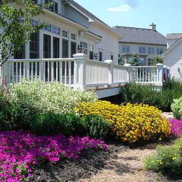
Sponsored
Columbus, OH
Free consultation for landscape design!

Peabody Landscape Group
Franklin County's Reliable Landscape Design & Contracting
 TKS Design Group
Download our free ebook, Creating the Ideal Kitchen. DOWNLOAD NOW
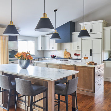
The homeowner and his wife had lived in this beautiful townhome in Oak Brook overlooking a small lake for over 13 years. The home is open and airy with vaulted ceilings and full of mementos from world adventures through the years, including to Cambodia, home of their much-adored sponsored daughter. The home, full of love and memories was host to a growing extended family of children and grandchildren. This was THE place. When the homeowner’s wife passed away suddenly and unexpectedly, he became determined to create a space that would continue to welcome and host his family and the many wonderful family memories that lay ahead but with an eye towards functionality.
We started out by evaluating how the space would be used. Cooking and watching sports were key factors. So, we shuffled the current dining table into a rarely used living room whereby enlarging the kitchen. The kitchen now houses two large islands – one for prep and the other for seating and buffet space. We removed the wall between kitchen and family room to encourage interaction during family gatherings and of course a clear view to the game on TV. We also removed a dropped ceiling in the kitchen, and wow, what a difference.
Next, we added some drama with a large arch between kitchen and dining room creating a stunning architectural feature between those two spaces. This arch echoes the shape of the large arch at the front door of the townhome, providing drama and significance to the space. The kitchen itself is large but does not have much wall space, which is a common challenge when removing walls. We added a bit more by resizing the double French doors to a balcony at the side of the house which is now just a single door. This gave more breathing room to the range wall and large stone hood but still provides access and light.
We chose a neutral pallet of black, white, and white oak, with punches of blue at the counter stools in the kitchen. The cabinetry features a white shaker door at the perimeter for a crisp outline. Countertops and custom hood are black Caesarstone, and the islands are a soft white oak adding contrast and warmth. Two large built ins between the kitchen and dining room function as pantry space as well as area to display flowers or seasonal decorations.
We repeated the blue in the dining room where we added a fresh coat of paint to the existing built ins, along with painted wainscot paneling. Above the wainscot is a neutral grass cloth wallpaper which provides a lovely backdrop for a wall of important mementos and artifacts. The dining room table and chairs were refinished and re-upholstered, and a new rug and window treatments complete the space. The room now feels ready to host more formal gatherings or can function as a quiet spot to enjoy a cup of morning coffee.

 Westover Landscape Design
Not everyone would see the hidden beauty in the Yonkers property destined for the wrecking ball in 2000. But one family took the serious fixer-upper under their wing. Crumbling walls, overgrown maples (indeed, saplings were busting through the brick walls), and deer living in the basement was the state of affairs when Westover Landscape Design initially arrived on the scene. A year of intensive, meticulous, thoughtful renovation by the homeowner followed while the house was brought up to speed. When the last construction machine finally rumbled out, that’s when Robert Welsch and his crew began their odyssey.
The goal was to honor the newly restored relic and deliver it into the future with fitting surroundings. “We wanted to bring that treasure back to life,” Robert Welsch explains. Working closely with the homeowner as well as the city of Yonkers to guide the restoration, their first feat was to install a proper drainage system with catchments capable of keeping storm water from the massive roof flowing away. Before anything was visible on the surface, extensive work was accomplished underground. Meanwhile, a plan was drafted to honor the era of the house. Westover chose bluestone as the primary path material for its easy maintenance and simplicity when laying the swank configuration of pathways around the house and outward to an entertaining pavilion. By cleverly hemming the bluestone with period brick that echoes the building material for the house for continuity, the result is a smart and sophisticated finish to a promenade that constantly draws the family and their pets outdoors. Brick was also used to rebuild the walled gardens for the much-needed privacy in a close-knit Yonkers community. And a graceful wrought iron gate enhances the arrival experience. But walls and gates were not the only element to screen and reveal views—plant selection was critical.
Few landscapers would go the extra mile to find period perfect plants for a 19th Century restoration, but Robert Welsch saw the importance of authenticity in creating the mood. He repeated large trees—such as an exquisite London plane tree in the front yard—to balance the expression in the back. Recognizing the need for immediate stature, he selected a weeping willow to gain instant volume, giving the landscape a sense of deep roots. A weeping Camperdown elm adds sophisticated drama to the walled stroll gardens. Hydrangeas were incorporated for their billowy stature, easy maintenance, and long blooming season. Similarly, all the plants in residence play their part in the display that goes beyond the usual spring fling to extend throughout the growing season—offering visual interest even when they are not performing. From spring bulbs to autumn perennials, there is never a dull moment. Meanwhile, every step along the way was a collaboration working hand-in-hand with the homeowner and the city to make certain that the historic landmark status of the property was upheld and honored.
The result goes beyond a landscape that is just old faithful. It adds life to the picture, creating a jewel-like setting for the newly proud house. In a word, it is sublime. By planting wisely and using sustainable elements, the restored house and its surroundings are ready for the next generation and beyond. This Yonkers gem remains meticulously groomed under the watchful eye and skill of Westover Landscape Design’s team of gardeners—It’s a keeper.
 Olamar Interiors
The clients are a younger couple with no pets or children. They asked me to help them with the Great Room in their brand new townhouse. The space is open concept with 9-foot ceilings. When the clients moved in they had very little furniture and the walls were white and bare. The husband had his eye on a very large original work of art that he wanted to purchase and incorporate into the design. They love to cook and entertain. They asked for a tranquil, neutral space with some color accents, comfortable and flexible seating, a wall-mounted TV with some storage for media equipment, and a bar. The room has several large windows and two sets of sliding glass doors so there is a lot of natural light, which the clients didn’t want to block, but also a lack of privacy. The couple also requested lighting over the kitchen island and some counter stools.
I was challenged by the lack of architectural detail in the room and a tight budget. I decided to choose furniture and accessories with classic modern lines so they would last for a long time. To offset all of the straight lines and neutral colors of the main furniture pieces, and to add visual interest, I introduced organic elements, texture and movement. I did this with wallpaper on the fireplace wall and on the kitchen island (in the case of the island, I railroaded the paper for some interest), a textured rug, some greenery, rough wood on the pedestals next to the fireplace, window shades in natural woven wood, and accessories (particularly two ceramic vases) in interesting shapes. I used the husband’s art piece as the starting point for the color scheme and overall design. I added balance and harmony by adding a large art piece and large pedestals across the room from the large art piece and carrying the teal color across the room in the sofa cushion and ottoman fabrics, art above the mantel and a vase in the niche next to the fireplace. I chose large green glass pendant lights for the kitchen to add color and to match the scale of the room.
One major challenge was that the clients wanted ottomans so they could put their feet up while watching TV. I couldn’t accommodate ottomans and a coffee table, so I opted just to have one large ottoman and added casters so it could be moved closer to the sofa; however, the husband is very tall and the wife is very petite so they wanted separate ottomans to accommodate their different leg lengths. My solution was to design an ottoman that provides maximum flexibility: the two pieces can be joined and a tray added to make it a coffee table, or pulled apart and used either as party seating or individual ottomans for the homeowners. They were thrilled with the solution.
Photography: Jon W. Miller
 Olamar Interiors
The clients are a younger couple with no pets or children. They asked me to help them with the Great Room in their brand new townhouse. The space is open concept with 9-foot ceilings. When the clients moved in they had very little furniture and the walls were white and bare. The husband had his eye on a very large original work of art that he wanted to purchase and incorporate into the design. They love to cook and entertain. They asked for a tranquil, neutral space with some color accents, comfortable and flexible seating, a wall-mounted TV with some storage for media equipment, and a bar. The room has several large windows and two sets of sliding glass doors so there is a lot of natural light, which the clients didn’t want to block, but also a lack of privacy. The couple also requested lighting over the kitchen island and some counter stools.
I was challenged by the lack of architectural detail in the room and a tight budget. I decided to choose furniture and accessories with classic modern lines so they would last for a long time. To offset all of the straight lines and neutral colors of the main furniture pieces, and to add visual interest, I introduced organic elements, texture and movement. I did this with wallpaper on the fireplace wall and on the kitchen island (in the case of the island, I railroaded the paper for some interest), a textured rug, some greenery, rough wood on the pedestals next to the fireplace, window shades in natural woven wood, and accessories (particularly two ceramic vases) in interesting shapes. I used the husband’s art piece as the starting point for the color scheme and overall design. I added balance and harmony by adding a large art piece and large pedestals across the room from the large art piece and carrying the teal color across the room in the sofa cushion and ottoman fabrics, art above the mantel and a vase in the niche next to the fireplace. I chose large green glass pendant lights for the kitchen to add color and to match the scale of the room.
One major challenge was that the clients wanted ottomans so they could put their feet up while watching TV. I couldn’t accommodate ottomans and a coffee table, so I opted just to have one large ottoman and added casters so it could be moved closer to the sofa; however, the husband is very tall and the wife is very petite so they wanted separate ottomans to accommodate their different leg lengths. My solution was to design an ottoman that provides maximum flexibility: the two pieces can be joined and a tray added to make it a coffee table, or pulled apart and used either as party seating or individual ottomans for the homeowners. They were thrilled with the solution.
Photographer: Jon W. Miller
 Archadeck of Nova Scotia
At Archadeck of Nova Scotia we love any size project big or small. But, that being said, we have a soft spot for the projects that let us show off our talents! This Halifax house was no exception. The owners wanted a space to suit their outdoor lifestyle with materials to last far into the future. The choices were quite simple: stone veneer, Timbertech composite decking and glass railing.
What better way to create that stability than with a solid foundation, concrete columns and decorative stone veneer? The posts were all wrapped with stone and match the retaining wall which was installed to help with soil retention and give the backyard more definition (it’s not too hard on the eyes either).
A set of well-lit steps will guide you up the multi-level deck. The built-in planters soften the hardness of the Timbertech composite deck and provide a little visual relief. The two-tone aesthetic of the deck and railing are a stunning feature which plays up contrasting tones.
From there it’s a game of musical chairs; we recommend the big round one on a September evening with a glass of wine and cozy blanket.
We haven’t gotten there quite yet, but this property has an amazing view (you will see soon enough!). As to not spoil the view, we installed TImbertech composite railing with glass panels. This allows you to take in the surrounding sights while relaxing and not have those pesky balusters in the way.
In any Canadian backyard, there is always the dilemma of dealing with mosquitoes and black flies! Our solution to this itchy problem is to incorporate a screen room as part of your design. This screen room in particular has space for dining and lounging around a fireplace, perfect for the colder evenings!
Ahhh…there’s the view! From the top level of the deck you can really get an appreciation for Nova Scotia. Life looks pretty good from the top of a multi-level deck. Once again, we installed a composite and glass railing on the new composite deck to capture the scenery.
What puts the cherry on top of this project is the balcony! One of the greatest benefits of composite decking and railing is that it can be curved to create beautiful soft edges. Imagine sipping your morning coffee and watching the sunrise over the water.
If you want to know more about composite decking, railing or anything else you’ve seen that sparks your interest; give us a call! We’d love to hear from you.
 Alair Homes Plano
This house was built in 1994 and our clients have been there since day one. They wanted a complete refresh in their kitchen and living areas and a few other changes here and there; now that the kids were all off to college! They wanted to replace some things, redesign some things and just repaint others. They didn’t like the heavy textured walls, so those were sanded down, re-textured and painted throughout all of the remodeled areas.
The kitchen change was the most dramatic by painting the original cabinets a beautiful bluish-gray color; which is Benjamin Moore Gentleman’s Gray. The ends and cook side of the island are painted SW Reflection but on the front is a gorgeous Merola “Arte’ white accent tile. Two Island Pendant Lights ‘Aideen 8-light Geometric Pendant’ in a bronze gold finish hung above the island. White Carrara Quartz countertops were installed below the Viviano Marmo Dolomite Arabesque Honed Marble Mosaic tile backsplash. Our clients wanted to be able to watch TV from the kitchen as well as from the family room but since the door to the powder bath was on the wall of breakfast area (no to mention opening up into the room), it took up good wall space. Our designers rearranged the powder bath, moving the door into the laundry room and closing off the laundry room with a pocket door, so they can now hang their TV/artwork on the wall facing the kitchen, as well as another one in the family room!
We squared off the arch in the doorway between the kitchen and bar/pantry area, giving them a more updated look. The bar was also painted the same blue as the kitchen but a cool Moondrop Water Jet Cut Glass Mosaic tile was installed on the backsplash, which added a beautiful accent! All kitchen cabinet hardware is ‘Amerock’ in a champagne finish.
In the family room, we redesigned the cabinets to the right of the fireplace to match the other side. The homeowners had invested in two new TV’s that would hang on the wall and display artwork when not in use, so the TV cabinet wasn’t needed. The cabinets were painted a crisp white which made all of their decor really stand out. The fireplace in the family room was originally red brick with a hearth for seating. The brick was removed and the hearth was lowered to the floor and replaced with E-Stone White 12x24” tile and the fireplace surround is tiled with Heirloom Pewter 6x6” tile.
The formal living room used to be closed off on one side of the fireplace, which was a desk area in the kitchen. The homeowners felt that it was an eye sore and it was unnecessary, so we removed that wall, opening up both sides of the fireplace into the formal living room. Pietra Tiles Aria Crystals Beach Sand tiles were installed on the kitchen side of the fireplace and the hearth was leveled with the floor and tiled with E-Stone White 12x24” tile.
The laundry room was redesigned, adding the powder bath door but also creating more storage space. Waypoint flat front maple cabinets in painted linen were installed above the appliances, with Top Knobs “Hopewell” polished chrome pulls. Elements Carrara Quartz countertops were installed above the appliances, creating that added space. 3x6” white ceramic subway tile was used as the backsplash, creating a clean and crisp laundry room! The same tile on the hearths of both fireplaces (E-Stone White 12x24”) was installed on the floor.
The powder bath was painted and 12x36” Ash Fiber Ceramic tile was installed vertically on the wall behind the sink. All hardware was updated with the Signature Hardware “Ultra”Collection and Shades of Light “Sleekly Modern” new vanity lights were installed.
All new wood flooring was installed throughout all of the remodeled rooms making all of the rooms seamlessly flow into each other. The homeowners love their updated home!
Design/Remodel by Hatfield Builders & Remodelers | Photography by Versatile Imaging

 Olamar Interiors
The clients are a younger couple with no pets or children. They asked me to help them with the Great Room in their brand new townhouse. The space is open concept with 9-foot ceilings. When the clients moved in they had very little furniture and the walls were white and bare. The husband had his eye on a very large original work of art that he wanted to purchase and incorporate into the design. They love to cook and entertain. They asked for a tranquil, neutral space with some color accents, comfortable and flexible seating, a wall-mounted TV with some storage for media equipment, and a bar. The room has several large windows and two sets of sliding glass doors so there is a lot of natural light, which the clients didn’t want to block, but also a lack of privacy. The couple also requested lighting over the kitchen island and some counter stools.
I was challenged by the lack of architectural detail in the room and a tight budget. I decided to choose furniture and accessories with classic modern lines so they would last for a long time. To offset all of the straight lines and neutral colors of the main furniture pieces, and to add visual interest, I introduced organic elements, texture and movement. I did this with wallpaper on the fireplace wall and on the kitchen island (in the case of the island, I railroaded the paper for some interest), a textured rug, some greenery, rough wood on the pedestals next to the fireplace, window shades in natural woven wood, and accessories (particularly two ceramic vases) in interesting shapes. I used the husband’s art piece as the starting point for the color scheme and overall design. I added balance and harmony by adding a large art piece and large pedestals across the room from the large art piece and carrying the teal color across the room in the sofa cushion and ottoman fabrics, art above the mantel and a vase in the niche next to the fireplace. I chose large green glass pendant lights for the kitchen to add color and to match the scale of the room.
One major challenge was that the clients wanted ottomans so they could put their feet up while watching TV. I couldn’t accommodate ottomans and a coffee table, so I opted just to have one large ottoman and added casters so it could be moved closer to the sofa; however, the husband is very tall and the wife is very petite so they wanted separate ottomans to accommodate their different leg lengths. My solution was to design an ottoman that provides maximum flexibility: the two pieces can be joined and a tray added to make it a coffee table, or pulled apart and used either as party seating or individual ottomans for the homeowners. They were thrilled with the solution.
Photographer: Jon W. Miller
 LANDFORM Inc.
They say home is where the heart is. A place where people enter as guests and leave as friends. A place to laugh with your neighbors and watch as your children run, laugh and play. The O’Connor’s were seeking a way to transform their yard into usable space to provide all these things. As families grow and change it was time to update their landscape to reflect the maturing family and provide the perfect home setting for all.
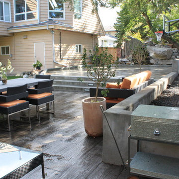
The first thing that needed change was the high maintenance existing pond. This has been designed to be a beautiful, natural focal point in the south side of the backyard. Transformed to a low maintenance waterfall, this gorgeous site hides the noise from the alley and gives the backyard a tranquil, relaxed atmosphere. The water feature borders the boundary of the kid’s new sports court complete with an adjustable basketball hoop. This 93 square meter court is designed to be used in all four seasons. Designed with proper drainage to ensure the kids get optimal basketball time and a 6” curb was installed to allow for an outdoor rink in our colder months. The west side of the sports court is enclosed by a 0.75 meter high concrete retaining wall which contains mature spruce trees for shelter. One special request was to incorporate 2 existing large sandstone boulders into the new landscape. These were placed accordingly in between 2 spruce that have the largest open space between them, creating a natural, interesting sitting area for the kids. Landscape lighting was also incorporated into this bed to highlight the mature spruce trees at night.
The retaining wall continues along the west fence line and leads your eyes to a hidden seating area. The area is dropped down three steps from the sports court and secluded by an existing garden bed of trees and shrubs giving it a very cozy setting. The concrete was completed with a stamped Boardwalk pattern, allowing for 49 square meters of an inviting outdoor dining and BBQ area. When designing this area, future plans to phase in a BBQ island and pergola were implemented. To plan for this, the existing shed and BBQ area were removed, and extra concrete footings were installed accordingly to accommodate any added weight of a masonry outdoor kitchen addition.
Tucked away in the urban setting, the O’Connor’s new backyard is ready to share with friends and family. The kids now have room to run and play between the sports court and remaining grass area and the adults can relax while enjoying the sounds and smells of the outdoors.
 Olamar Interiors
The clients are a younger couple with no pets or children. They asked me to help them with the Great Room in their brand new townhouse. The space is open concept with 9-foot ceilings. When the clients moved in they had very little furniture and the walls were white and bare. The husband had his eye on a very large original work of art that he wanted to purchase and incorporate into the design. They love to cook and entertain. They asked for a tranquil, neutral space with some color accents, comfortable and flexible seating, a wall-mounted TV with some storage for media equipment, and a bar. The room has several large windows and two sets of sliding glass doors so there is a lot of natural light, which the clients didn’t want to block, but also a lack of privacy. The couple also requested lighting over the kitchen island and some counter stools.
I was challenged by the lack of architectural detail in the room and a tight budget. I decided to choose furniture and accessories with classic modern lines so they would last for a long time. To offset all of the straight lines and neutral colors of the main furniture pieces, and to add visual interest, I introduced organic elements, texture and movement. I did this with wallpaper on the fireplace wall and on the kitchen island (in the case of the island, I railroaded the paper for some interest), a textured rug, some greenery, rough wood on the pedestals next to the fireplace, window shades in natural woven wood, and accessories (particularly two ceramic vases) in interesting shapes. I used the husband’s art piece as the starting point for the color scheme and overall design. I added balance and harmony by adding a large art piece and large pedestals across the room from the large art piece and carrying the teal color across the room in the sofa cushion and ottoman fabrics, art above the mantel and a vase in the niche next to the fireplace. I chose large green glass pendant lights for the kitchen to add color and to match the scale of the room.
One major challenge was that the clients wanted ottomans so they could put their feet up while watching TV. I couldn’t accommodate ottomans and a coffee table, so I opted just to have one large ottoman and added casters so it could be moved closer to the sofa; however, the husband is very tall and the wife is very petite so they wanted separate ottomans to accommodate their different leg lengths. My solution was to design an ottoman that provides maximum flexibility: the two pieces can be joined and a tray added to make it a coffee table, or pulled apart and used either as party seating or individual ottomans for the homeowners. They were thrilled with the solution.
Photographer: Jon W. Miller
 Westover Landscape Design
Not everyone would see the hidden beauty in the Yonkers property destined for the wrecking ball in 2000. But one family took the serious fixer-upper under their wing. Crumbling walls, overgrown maples (indeed, saplings were busting through the brick walls), and deer living in the basement was the state of affairs when Westover Landscape Design initially arrived on the scene. A year of intensive, meticulous, thoughtful renovation by the homeowner followed while the house was brought up to speed. When the last construction machine finally rumbled out, that’s when Robert Welsch and his crew began their odyssey.
The goal was to honor the newly restored relic and deliver it into the future with fitting surroundings. “We wanted to bring that treasure back to life,” Robert Welsch explains. Working closely with the homeowner as well as the city of Yonkers to guide the restoration, their first feat was to install a proper drainage system with catchments capable of keeping storm water from the massive roof flowing away. Before anything was visible on the surface, extensive work was accomplished underground. Meanwhile, a plan was drafted to honor the era of the house. Westover chose bluestone as the primary path material for its easy maintenance and simplicity when laying the swank configuration of pathways around the house and outward to an entertaining pavilion. By cleverly hemming the bluestone with period brick that echoes the building material for the house for continuity, the result is a smart and sophisticated finish to a promenade that constantly draws the family and their pets outdoors. Brick was also used to rebuild the walled gardens for the much-needed privacy in a close-knit Yonkers community. And a graceful wrought iron gate enhances the arrival experience. But walls and gates were not the only element to screen and reveal views—plant selection was critical.
Few landscapers would go the extra mile to find period perfect plants for a 19th Century restoration, but Robert Welsch saw the importance of authenticity in creating the mood. He repeated large trees—such as an exquisite London plane tree in the front yard—to balance the expression in the back. Recognizing the need for immediate stature, he selected a weeping willow to gain instant volume, giving the landscape a sense of deep roots. A weeping Camperdown elm adds sophisticated drama to the walled stroll gardens. Hydrangeas were incorporated for their billowy stature, easy maintenance, and long blooming season. Similarly, all the plants in residence play their part in the display that goes beyond the usual spring fling to extend throughout the growing season—offering visual interest even when they are not performing. From spring bulbs to autumn perennials, there is never a dull moment. Meanwhile, every step along the way was a collaboration working hand-in-hand with the homeowner and the city to make certain that the historic landmark status of the property was upheld and honored.
The result goes beyond a landscape that is just old faithful. It adds life to the picture, creating a jewel-like setting for the newly proud house. In a word, it is sublime. By planting wisely and using sustainable elements, the restored house and its surroundings are ready for the next generation and beyond. This Yonkers gem remains meticulously groomed under the watchful eye and skill of Westover Landscape Design’s team of gardeners—It’s a keeper.
Sponsored
Columbus, OH
Free consultation for landscape design!
Peabody Landscape Group
Franklin County's Reliable Landscape Design & Contracting

 StarStyle® Productions, LLC
In My Sister’s Garden-A Wistful Romp through a Drought Resistant Oasis
"Spring is the time of the year, when it is summer in the sun and winter in the shade." - Charles Dickens
One of the great things about growing up on a farm in the boondocks is that your tribe is your family. We five siblings were as thick as thieves as we climbed trees, worked the fields, pulled fences, drove tractors, branded cattle, and planted the spring garden. We played, we quarreled, and we dug in the dirt together. By the time May arrived, we ached to get our hands grubby in the vegetable patch. Waiting for the vegetables to sprout and be harvested taught us patience and responsibility. Of course, Mom’s beautiful flower gardens would already be abloom by this time of year getting us into constant trouble because we were forever picking bouquets not only for her, but, for teachers, 4-H leaders, and Sunday masses.
As we grew into adults, our love of the earth grew as well. Following in the big shoes of my Father, my brother continued the family tradition of being a farmer and has one of the most beautiful vineyards in the county. Our Mother’s love of gardening instructed the gardens of her girls.
Recently I walked with my sister Debbie through her eclectic garden. There is a saying that “you can take the girl out of the country, but you can never take the country out of the girl.” With Deb, she’s never left the land where we were born. She is a country cowgirl through and through. She’s always adorned with her cowboy hat, rodeo belt buckle, and boots! She hunts, fishes, grows her food, and would have relished being a pioneer in the 1870’s.
Debbie and her husband are the ultimate recyclers and re-purposers. With their barnyard of adopted animals-pigs, goats, donkeys, chickens, even Texas long horns at one time, all the weeds and garden cuttings feed the animals and the manure is then recycled back to the garden. They collect rooftop rain runoff in used wine barrels then pipe it to a storage tank to help with summer watering. It’s never enough, but every drop helps. Their garden art includes rusted plows, wooden swings, a plethora of homemade birdhouses, multiple fountains made from found objects, wagon wheels, antlers, the cutest country chicken coop you ever did see, and a sleeping shed outfitted with a bear hide, antique fishing gear, pinecones, and found treasures of every sort. From their patio they watch the wildlife on their hillside property-deer, bobcats, raccoons, turkeys, skunks, and the occasional mountain lion. It’s a playful, restful garden setting, albeit with a watchful eye for the rattlesnakes that enjoy this oasis as well.
What I love about Debbie’s garden is how it reflects her unique personality, her love of the land, and her admiration for the history of the Wild West. As we ambled around the property with her happy dogs in the lead, the songbirds sang, a bevy of butterflies delicately landed on her flowers, and the koi in the pond swam to the surface to greet me. This time together immersed in this sustainable landscape nurtured my soul and brought our childhood memories to vivid life. Although we grow the same plants, shrubs, trees, and succulents in both of our yards, our designs and esthetics are completely different. And that’s the beauty of creating a garden, making it your own special paradise where you can find peace, tranquility, and restoration in tandem with the wild kingdom.
TIPS TO CREATING YOUR OWN UNIQUE PLAYGROUND
⎫ Don’t over-think it! Make lists of everything you enjoy in a garden then do it.
⎫ Be conservation conscious as well as considerate of nature.
⎫ Be creative. Think swathes, angles, circles, and flow. There is nothing more boring than a box.
⎫ The hardscape must include natural materials: rocks, gravel, barn wood, shells, or anything meaningful to you.
⎫ Instead of buying art, repurpose childhood toys, old sinks, even a commode overflowing with flowers can be comical.
⎫ Be playful. When you are going to spend time in the outdoors, you want to enjoy yourself. Allow your personality to shine.
⎫ Add surprises, secret gardens, hedged rooms, anything that will enhance the whimsical and magical element to your garden experience.
⎫ Lead to a focal point or view with meandering paths, walkways, and trails.
⎫ Invite the pollinators; bees, butterflies, and birds by providing housing, nectar flowers, protection, fountains, and ponds.
⎫ Mix it up. For a drought resistant garden, consider an array of beautiful succulents, cactus, lavender, bulbs, iris, daylily, geraniums, and other plants that will add color, texture, form, and structure, yet require little maintenance and minimal water.
⎫ A potager, pots, or area designated for edibles and herbs is a must have. There is nothing better than picking your dinner from your own property.
⎫ Benches, swings, lounge chairs, umbrellas, and places to unwind, watch the clouds, savor sunsets, and marvel at the stars make your garden your home.
`
What’s so fun about our family gardening experience is the sharing that we all do in giving each other clips, snips, cuttings, bulbs, and volunteers. We grow the same specimens and as we stroll and admire our handiwork, we can’t remember who gave what to whom first.
As I said farewell to my sister, she handed me a hand-painted tin filled with blooming echeveria from clippings I had given her a few years before. We shared a laugh.
Little did I know this would be the last walk with my sister. She died just a few days before this article was published. She would have loved to have seen her passion in print. Debbie may you garden in the heavens. The circle of life continues.
Happy Trails to you, Debbie. Until we meet again...
Read more: https://www.lam
orindaweekly.com/archive/issue1006/Digging-Deep-with-Cynthia-Brian.html
Scribd: https://www.scribd.com/doc/313702488/My-Sister-s-Garden-Digging-Deep-With-Cynthia-Brian
Radio Broadcast: http://www.voiceamerica.com/episode/92459/porn-alarm-effective-apologies-in-my-sisters-garden
Press Pass: http://vapresspass.com/2016/05/24/in-my-sisters-garden-a-wistful-romp-through-a-drought-resistant-oasis-by-cynthia-brian/
©2016
Cynthia Brian
The Goddess Gardener
Starstyle® Productions, llc
Cynthia@GoddessGardener.com
www.GoddessGardener.com
925-377-STAR
Tune into Cynthia’s Radio show at www.StarStyleRadio.com
I am available as a speaker, designer, and consultant.
Keywords: Debbie’s garden my sister’s garden, a cowboy western garden, drought resistant plants, cynthia brian, lamorinda weekly, starstyle, goddess gardener.
 Olamar Interiors
The clients are a younger couple with no pets or children. They asked me to help them with the Great Room in their brand new townhouse. The space is open concept with 9-foot ceilings. When the clients moved in they had very little furniture and the walls were white and bare. The husband had his eye on a very large original work of art that he wanted to purchase and incorporate into the design. They love to cook and entertain. They asked for a tranquil, neutral space with some color accents, comfortable and flexible seating, a wall-mounted TV with some storage for media equipment, and a bar. The room has several large windows and two sets of sliding glass doors so there is a lot of natural light, which the clients didn’t want to block, but also a lack of privacy. The couple also requested lighting over the kitchen island and some counter stools.
I was challenged by the lack of architectural detail in the room and a tight budget. I decided to choose furniture and accessories with classic modern lines so they would last for a long time. To offset all of the straight lines and neutral colors of the main furniture pieces, and to add visual interest, I introduced organic elements, texture and movement. I did this with wallpaper on the fireplace wall and on the kitchen island (in the case of the island, I railroaded the paper for some interest), a textured rug, some greenery, rough wood on the pedestals next to the fireplace, window shades in natural woven wood, and accessories (particularly two ceramic vases) in interesting shapes. I used the husband’s art piece as the starting point for the color scheme and overall design. I added balance and harmony by adding a large art piece and large pedestals across the room from the large art piece and carrying the teal color across the room in the sofa cushion and ottoman fabrics, art above the mantel and a vase in the niche next to the fireplace. I chose large green glass pendant lights for the kitchen to add color and to match the scale of the room.
One major challenge was that the clients wanted ottomans so they could put their feet up while watching TV. I couldn’t accommodate ottomans and a coffee table, so I opted just to have one large ottoman and added casters so it could be moved closer to the sofa; however, the husband is very tall and the wife is very petite so they wanted separate ottomans to accommodate their different leg lengths. My solution was to design an ottoman that provides maximum flexibility: the two pieces can be joined and a tray added to make it a coffee table, or pulled apart and used either as party seating or individual ottomans for the homeowners. They were thrilled with the solution.
Photographer: Jon W. Miller
 Olamar Interiors
The clients are a younger couple with no pets or children. They asked me to help them with the Great Room in their brand new townhouse. The space is open concept with 9-foot ceilings. When the clients moved in they had very little furniture and the walls were white and bare. The husband had his eye on a very large original work of art that he wanted to purchase and incorporate into the design. They love to cook and entertain. They asked for a tranquil, neutral space with some color accents, comfortable and flexible seating, a wall-mounted TV with some storage for media equipment, and a bar. The room has several large windows and two sets of sliding glass doors so there is a lot of natural light, which the clients didn’t want to block, but also a lack of privacy. The couple also requested lighting over the kitchen island and some counter stools.
I was challenged by the lack of architectural detail in the room and a tight budget. I decided to choose furniture and accessories with classic modern lines so they would last for a long time. To offset all of the straight lines and neutral colors of the main furniture pieces, and to add visual interest, I introduced organic elements, texture and movement. I did this with wallpaper on the fireplace wall and on the kitchen island (in the case of the island, I railroaded the paper for some interest), a textured rug, some greenery, rough wood on the pedestals next to the fireplace, window shades in natural woven wood, and accessories (particularly two ceramic vases) in interesting shapes. I used the husband’s art piece as the starting point for the color scheme and overall design. I added balance and harmony by adding a large art piece and large pedestals across the room from the large art piece and carrying the teal color across the room in the sofa cushion and ottoman fabrics, art above the mantel and a vase in the niche next to the fireplace. I chose large green glass pendant lights for the kitchen to add color and to match the scale of the room.
One major challenge was that the clients wanted ottomans so they could put their feet up while watching TV. I couldn’t accommodate ottomans and a coffee table, so I opted just to have one large ottoman and added casters so it could be moved closer to the sofa; however, the husband is very tall and the wife is very petite so they wanted separate ottomans to accommodate their different leg lengths. My solution was to design an ottoman that provides maximum flexibility: the two pieces can be joined and a tray added to make it a coffee table, or pulled apart and used either as party seating or individual ottomans for the homeowners. They were thrilled with the solution.
Photographer: Jon W. Miller
27