
Search results for "Wedding party" in Home Design Ideas

 Naturescape Landscape & Irrigation LLC
Patio - large craftsman backyard stone patio idea with no cover

 Susan Yeley Homes
This gem of a house was built in the 1950s, when its neighborhood undoubtedly felt remote. The university footprint has expanded in the 70 years since, however, and today this home sits on prime real estate—easy biking and reasonable walking distance to campus.
When it went up for sale in 2017, it was largely unaltered. Our clients purchased it to renovate and resell, and while we all knew we'd need to add square footage to make it profitable, we also wanted to respect the neighborhood and the house’s own history. Swedes have a word that means “just the right amount”: lagom. It is a guiding philosophy for us at SYH, and especially applied in this renovation. Part of the soul of this house was about living in just the right amount of space. Super sizing wasn’t a thing in 1950s America. So, the solution emerged: keep the original rectangle, but add an L off the back.
With no owner to design with and for, SYH created a layout to appeal to the masses. All public spaces are the back of the home--the new addition that extends into the property’s expansive backyard. A den and four smallish bedrooms are atypically located in the front of the house, in the original 1500 square feet. Lagom is behind that choice: conserve space in the rooms where you spend most of your time with your eyes shut. Put money and square footage toward the spaces in which you mostly have your eyes open.
In the studio, we started calling this project the Mullet Ranch—business up front, party in the back. The front has a sleek but quiet effect, mimicking its original low-profile architecture street-side. It’s very Hoosier of us to keep appearances modest, we think. But get around to the back, and surprise! lofted ceilings and walls of windows. Gorgeous.

 Evok Design Co
. Here is the BEFORE PHOTO of a great room redesign for a mountain retreat in the beautiful blue ridge mountains. Our challenge was to make this space feel warm and comfortable despite the amazing high ceilings. Before we got to it, this space felt cold and cavernous! But after we were done, it literally had a warm glow, and we hosted a party of 200 in this home for a wedding reception the night after the install was complete! (whew!) The owners of this home are a celebrity couple, who wish to remain unnamed, but they were thrilled with the results and so were we! The transition was AMAZING! We had the help of the best window treatment creators in town! We brought the ceiling down with some warm lighting, and used local photography. This is the couples third home, so the budget was not astronomical, but it sufficed. We used Bradington Young and Norwalk furniture, and luxury accessories from all over NC. We also had a custom mantle piece built after these photos were taken.
Find the right local pro for your project

 Fantastic Floors
Having dinner parties and get-togethers in the spacious dining room will be a cinch. Upgrade your home with beautiful carpet from Fantastic Floors.
In the flooring industry, there’s no shortage of competition. If you’re looking for hardwoods, you’ll find thousands of product options and hundreds of people willing to install them for you. The same goes for tile, carpet, laminate, etc.
At Fantastic Floors, our mission is to provide a quality product, at a competitive price, with a level of service that exceeds our competition. We don’t “sell” floors. We help you find the perfect floors for your family in our design center or bring the showroom to you free of charge. We take the time to listen to your needs and help you select the best flooring option to fit your budget and lifestyle. We can answer any questions you have about how your new floors are engineered and why they make sense for you…all in the comfort of our home or yours.
We work with designers, retail customers, commercial builders, and real estate investors to improve an existing space or create one that is totally new and unique...and we’d love to work with you.

 DesignHAUS 24
Deck container garden - eclectic rooftop rooftop deck container garden idea in DC Metro with no cover
 Serene Spaces Living
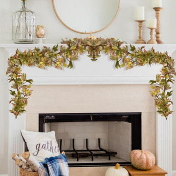
Add a touch of nature to your home with this artificial fall maple leaf garland made of plastic and polyester. The foliage has different shades of fall colors for a realistic look. This fall silk garland works well for draping over a doorframe or window, decorating your fireplace mantel, hanging around the staircase banisters, kitchen decorations, office decor and more. Use for your Halloween party decoration, as a thanksgiving garland for a dinner table centerpiece surrounded by pumpkins, rustic farmhouse decor is easy with this maple garland. Our autumn leaf garland will add a merry, woodland touch wherever you display it. You can also use it to liven up a nature-inspired wedding or event. This fake garland stays fresh year-round so you don't have to worry about maintenance. Sold individually, the Fall Colors garland measures 60" in length and Green & Rust garland measures 57" long. Serene Spaces Living encourages easy DIY decorating and we hope this pretty artificial garland will be a great addition to your holiday decor!
 Fantastic Floors
This fun family room incorporates a game and entertainment room with a dining room. Great for hosting parties or getting the family together after work, this living space is very versatile.
In the flooring industry, there’s no shortage of competition. If you’re looking for hardwoods, you’ll find thousands of product options and hundreds of people willing to install them for you. The same goes for tile, carpet, laminate, etc.
At Fantastic Floors, our mission is to provide a quality product, at a competitive price, with a level of service that exceeds our competition. We don’t “sell” floors. We help you find the perfect floors for your family in our design center or bring the showroom to you free of charge. We take the time to listen to your needs and help you select the best flooring option to fit your budget and lifestyle. We can answer any questions you have about how your new floors are engineered and why they make sense for you…all in the comfort of our home or yours.
We work with designers, retail customers, commercial builders, and real estate investors to improve an existing space or create one that is totally new and unique...and we’d love to work with you.
 Susan Yeley Homes
This gem of a house was built in the 1950s, when its neighborhood undoubtedly felt remote. The university footprint has expanded in the 70 years since, however, and today this home sits on prime real estate—easy biking and reasonable walking distance to campus.
When it went up for sale in 2017, it was largely unaltered. Our clients purchased it to renovate and resell, and while we all knew we'd need to add square footage to make it profitable, we also wanted to respect the neighborhood and the house’s own history. Swedes have a word that means “just the right amount”: lagom. It is a guiding philosophy for us at SYH, and especially applied in this renovation. Part of the soul of this house was about living in just the right amount of space. Super sizing wasn’t a thing in 1950s America. So, the solution emerged: keep the original rectangle, but add an L off the back.
With no owner to design with and for, SYH created a layout to appeal to the masses. All public spaces are the back of the home--the new addition that extends into the property’s expansive backyard. A den and four smallish bedrooms are atypically located in the front of the house, in the original 1500 square feet. Lagom is behind that choice: conserve space in the rooms where you spend most of your time with your eyes shut. Put money and square footage toward the spaces in which you mostly have your eyes open.
In the studio, we started calling this project the Mullet Ranch—business up front, party in the back. The front has a sleek but quiet effect, mimicking its original low-profile architecture street-side. It’s very Hoosier of us to keep appearances modest, we think. But get around to the back, and surprise! lofted ceilings and walls of windows. Gorgeous.
 Serene Spaces Living
Make your space serene with our DIY kit of a beautiful tea flower bouquet and a stylish vase, which creates a warm, fresh feeling. Our petite faux tea flower arrangements are tied with natural raffia, giving them a vintage dream-like appearance. The curvaceous vase is a one-of-a-kind piece. Whether you’re looking for a stylish vase for home decor, as an event table setting, or something entirely unexpected, our glass ball pedestal vase will look just right! This pair is a great gift for birthdays, mother's day, anniversaries, bridal showers, baby showers, housewarmings, and parties. Sold as a DIY kit: includes a bouquet measuring 7" Diameter & 10" Tall and a vase measuring 7" Diameter & 12" Tall. You can count on quality, design, and manufacturing when you order from Serene Spaces Living, where we curate everything with love.

 Sitka Projects
Doug Gorsline ashcreekphoto.com
Example of a large classic u-shaped dark wood floor open concept kitchen design in Portland with a farmhouse sink, raised-panel cabinets, white cabinets, wood countertops, beige backsplash, stainless steel appliances and an island
Example of a large classic u-shaped dark wood floor open concept kitchen design in Portland with a farmhouse sink, raised-panel cabinets, white cabinets, wood countertops, beige backsplash, stainless steel appliances and an island
 Susan Yeley Homes
This gem of a house was built in the 1950s, when its neighborhood undoubtedly felt remote. The university footprint has expanded in the 70 years since, however, and today this home sits on prime real estate—easy biking and reasonable walking distance to campus.
When it went up for sale in 2017, it was largely unaltered. Our clients purchased it to renovate and resell, and while we all knew we'd need to add square footage to make it profitable, we also wanted to respect the neighborhood and the house’s own history. Swedes have a word that means “just the right amount”: lagom. It is a guiding philosophy for us at SYH, and especially applied in this renovation. Part of the soul of this house was about living in just the right amount of space. Super sizing wasn’t a thing in 1950s America. So, the solution emerged: keep the original rectangle, but add an L off the back.
With no owner to design with and for, SYH created a layout to appeal to the masses. All public spaces are the back of the home--the new addition that extends into the property’s expansive backyard. A den and four smallish bedrooms are atypically located in the front of the house, in the original 1500 square feet. Lagom is behind that choice: conserve space in the rooms where you spend most of your time with your eyes shut. Put money and square footage toward the spaces in which you mostly have your eyes open.
In the studio, we started calling this project the Mullet Ranch—business up front, party in the back. The front has a sleek but quiet effect, mimicking its original low-profile architecture street-side. It’s very Hoosier of us to keep appearances modest, we think. But get around to the back, and surprise! lofted ceilings and walls of windows. Gorgeous.
 Highland Builders LLC
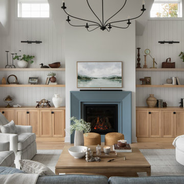
A calm and inviting modern farmhouse great room featuring vertical paneling, natural white oak built-ins, and a soft blue fireplace surround as the focal point. Layered textures, warm wood tones, and simple styling create a relaxed, collected feel while large windows fill the space with natural light.

 Easton Landscape Design and Construction
This gem speaks for itself! This is our second landscape we designed for Vancouver builder, Salari. Our design included all walkways, stairs, patio, garden bed layout, deck design and a new west coast contemporary planting scheme. The deck design leads off from the dinning room, where dishes, outdoor eating and entertaining are easily enjoyed. Big enough for a large dinning table, barbq and upper seating area for mingling at large parties or family gatherings.
A bronze/copper paperbark maple was planted closely to the deck for visual interest, as well as providing some shading in the hot summer months. Under planted was ligularia Othello rayflower dotted with ‘river mist’ sea oats for a striking contrast. Blood red lobelia ‘elm fire’ and phormium are placed about for structural vertical interest. While nico red and northern mandarin lights azaleas will put on a show in the spring.
In the front meet and greet garden, large basalt columns, under planted in moss and wintergreen gaultheria, welcome you up the stairs. Cherry brandy rudebeckia, hot coral and salsa red Echinacea line the front garden bed borders with stunning Russian Olive trees on either side. Lastly liquid amber ‘slender silhouette’ trees were added to brighten, frame and ground the concrete wall and home.
 Susan Yeley Homes
This gem of a house was built in the 1950s, when its neighborhood undoubtedly felt remote. The university footprint has expanded in the 70 years since, however, and today this home sits on prime real estate—easy biking and reasonable walking distance to campus.
When it went up for sale in 2017, it was largely unaltered. Our clients purchased it to renovate and resell, and while we all knew we'd need to add square footage to make it profitable, we also wanted to respect the neighborhood and the house’s own history. Swedes have a word that means “just the right amount”: lagom. It is a guiding philosophy for us at SYH, and especially applied in this renovation. Part of the soul of this house was about living in just the right amount of space. Super sizing wasn’t a thing in 1950s America. So, the solution emerged: keep the original rectangle, but add an L off the back.
With no owner to design with and for, SYH created a layout to appeal to the masses. All public spaces are the back of the home--the new addition that extends into the property’s expansive backyard. A den and four smallish bedrooms are atypically located in the front of the house, in the original 1500 square feet. Lagom is behind that choice: conserve space in the rooms where you spend most of your time with your eyes shut. Put money and square footage toward the spaces in which you mostly have your eyes open.
In the studio, we started calling this project the Mullet Ranch—business up front, party in the back. The front has a sleek but quiet effect, mimicking its original low-profile architecture street-side. It’s very Hoosier of us to keep appearances modest, we think. But get around to the back, and surprise! lofted ceilings and walls of windows. Gorgeous.
 Susan Yeley Homes
This gem of a house was built in the 1950s, when its neighborhood undoubtedly felt remote. The university footprint has expanded in the 70 years since, however, and today this home sits on prime real estate—easy biking and reasonable walking distance to campus.
When it went up for sale in 2017, it was largely unaltered. Our clients purchased it to renovate and resell, and while we all knew we'd need to add square footage to make it profitable, we also wanted to respect the neighborhood and the house’s own history. Swedes have a word that means “just the right amount”: lagom. It is a guiding philosophy for us at SYH, and especially applied in this renovation. Part of the soul of this house was about living in just the right amount of space. Super sizing wasn’t a thing in 1950s America. So, the solution emerged: keep the original rectangle, but add an L off the back.
With no owner to design with and for, SYH created a layout to appeal to the masses. All public spaces are the back of the home--the new addition that extends into the property’s expansive backyard. A den and four smallish bedrooms are atypically located in the front of the house, in the original 1500 square feet. Lagom is behind that choice: conserve space in the rooms where you spend most of your time with your eyes shut. Put money and square footage toward the spaces in which you mostly have your eyes open.
In the studio, we started calling this project the Mullet Ranch—business up front, party in the back. The front has a sleek but quiet effect, mimicking its original low-profile architecture street-side. It’s very Hoosier of us to keep appearances modest, we think. But get around to the back, and surprise! lofted ceilings and walls of windows. Gorgeous.
 Susan Yeley Homes
This gem of a house was built in the 1950s, when its neighborhood undoubtedly felt remote. The university footprint has expanded in the 70 years since, however, and today this home sits on prime real estate—easy biking and reasonable walking distance to campus.
When it went up for sale in 2017, it was largely unaltered. Our clients purchased it to renovate and resell, and while we all knew we'd need to add square footage to make it profitable, we also wanted to respect the neighborhood and the house’s own history. Swedes have a word that means “just the right amount”: lagom. It is a guiding philosophy for us at SYH, and especially applied in this renovation. Part of the soul of this house was about living in just the right amount of space. Super sizing wasn’t a thing in 1950s America. So, the solution emerged: keep the original rectangle, but add an L off the back.
With no owner to design with and for, SYH created a layout to appeal to the masses. All public spaces are the back of the home--the new addition that extends into the property’s expansive backyard. A den and four smallish bedrooms are atypically located in the front of the house, in the original 1500 square feet. Lagom is behind that choice: conserve space in the rooms where you spend most of your time with your eyes shut. Put money and square footage toward the spaces in which you mostly have your eyes open.
In the studio, we started calling this project the Mullet Ranch—business up front, party in the back. The front has a sleek but quiet effect, mimicking its original low-profile architecture street-side. It’s very Hoosier of us to keep appearances modest, we think. But get around to the back, and surprise! lofted ceilings and walls of windows. Gorgeous.

 Vernon Wentz
The lighting design in this rustic barn with a modern design was the designed and built by lighting designer Mike Moss. This was not only a dream to shoot because of my love for rustic architecture but also because the lighting design was so well done it was a ease to capture. Photography by Vernon Wentz of Ad Imagery

 IQnewswire
The End of the Ultra-Slim Wedding Suit
For several years, men’s formalwear was dominated by narrow lapels, short jackets and trousers cut close to the leg. The style created a sharp outline, but it often left little room for sitting, dancing or eating comfortably. Current tailoring is moving towards a more balanced shape, with cleaner shoulders, a defined waist and trousers that follow the leg without gripping it.This change does not mean that wedding suits have become oversized. The newer approach sits between skinny and loose. It keeps the structure expected of formal clothing while allowing the cloth to hang properly. For grooms, that balance is useful during a day that may involve a ceremony, photographs, dinner and several hours on the dance floor.
Look For Shape Rather Than Tightness
A well-fitted suit should create a clear outline without relying on tension. Collections of Marc Darcy suits include tailored three-piece designs, checks and textured fabrics that suit the current preference for visible structure and considered proportions.
The jacket should sit close enough to define the waist, but the front button should fasten without pulling the cloth into an X-shaped crease. At the shoulders, the seam should finish close to the natural shoulder point. Extra width can make the jacket look borrowed, while a shoulder that is too narrow may cause the upper sleeve to collapse.
Fit should be assessed while moving as well as standing. Reach forward, sit down and raise both arms. A tailored jacket will never feel like casual sportswear, but it should allow the groom to carry out ordinary movements without sharp restriction across the back or chest.
Give The Jacket Enough Length
Very short suit jackets became common alongside skinny trousers, but they can disrupt the proportions of a three-piece outfit. If the jacket finishes too high, the waistcoat may appear longer than the outer layer and the trousers may look as though they begin too low.
A more traditional jacket length usually covers most of the seat and divides the body more evenly. This can make the legs appear longer without shortening the jacket excessively. The correct length depends on height and body proportions, so two men wearing the same chest size may still need different jacket lengths.
View the suit from the back and side rather than relying on a front-facing mirror. The vents should lie flat, and the hem should not lift away from the body. A side photograph can reveal an unbalanced jacket more clearly than the changing-room mirror.
Choose Trousers That Fall Cleanly
The move away from very tight tailoring is most noticeable in suit trousers. A modern tailored leg can still be neat at the ankle, but it should provide enough room through the seat and thigh for the fabric to fall without horizontal lines.
Trouser pockets offer a useful fit check. If they pull open while standing, the waist or hips may be too tight. The fly should lie flat, and the waistband should remain in place without depending on an overtightened belt. Higher-rise trousers can work particularly well with a waistcoat because they reduce the chance of shirt fabric appearing between the two pieces.
The hem should make gentle contact with the shoe rather than gathering heavily around it. A short hem can work with narrow trousers but taking it too far may make the suit look dated once the current cropped style moves on. A slight break is easier to wear with different formal shoes and tends to look balanced in full-length wedding photographs.
Let The Waistcoat Support the Silhouette
A waistcoat adds structure through the centre of the outfit, but only when it fits correctly. It should lie flat against the shirt and cover the trouser waistband. Tightening the back strap cannot correct a waistcoat that is the wrong size or too short.
Current three-piece styling often places greater emphasis on the waistcoat. Double-breasted designs, contrasting fabrics and wider openings can distinguish the groom without requiring a brightly coloured jacket. When the groom removes the jacket later, the waistcoat keeps the outfit looking complete.
Allow room for a full meal and several hours of wear. A waistcoat that feels acceptably close during a brief fitting may become uncomfortable at dinner. Sit down with every button fastened and check whether the lower edge presses into the waist or causes the front to bow.
Use Stronger Lapels Carefully
Wider notch and peak lapels are returning after years of extremely narrow designs. A broader lapel can frame the shirt and tie, balance the shoulders and give the jacket a more formal character. Peak lapels create a particularly strong line on double-breasted jackets and evening suits.
The lapel width should still suit the wearer. A very broad lapel can overwhelm a smaller frame, while an extremely narrow one may look out of proportion on a broad chest. The shirt collar, tie width and lapel should relate to one another without matching exactly.
A wider lapel also leaves less need for decorative extras. A simple buttonhole flower or plain pocket square may be enough. Large lapel pins can crowd the upper part of the jacket, especially when the cloth already contains a check.
Avoid Buying According to the Size Label Alone
The same labelled size can fit differently across designs because cut, fabric and construction affect the garment. Begin with accurate chest, waist, inside-leg and approximate jacket-length measurements. Compare those figures with the retailer’s size information rather than ordering the size worn in another brand without checking.
If the jacket fits at the shoulders but needs slight shaping through the waist, a tailor can often make the adjustment. Sleeves and trouser hems are also commonly altered. Major changes to the shoulder line or jacket length are more difficult and may not be economical.
Do not choose the smallest size that can be fastened. A suit that looks tight in the fitting room is unlikely to become more comfortable during a long wedding day. Cloth should skim the body and return to a clean position after movement.
Balance a checked suit with simple styling
Texture and checks remain popular in wedding tailoring, particularly for country houses, converted barns and traditional venues. These fabrics already add depth to the outfit, so the cut should remain controlled and the accessories relatively quiet.
A plain white, pale blue or cream shirt gives a checked suit a clear foundation. Choose a tie from one of the secondary colours in the cloth rather than introducing another strong pattern. A white pocket square works when the suit contains several shades and does not need further decoration.
Shoes should support the proportions of the trousers. A very slim shoe may appear too small beneath a fuller hem, while a heavy casual sole can pull attention away from the tailoring. Oxfords, Derbies and refined brogues usually provide enough visual weight without looking bulky.
Coordinate the wedding party without forcing one fit
Matching groomsmen suits can become difficult when every member of the party has a different build. Insisting on an identical close fit may leave some men comfortable and others visibly restricted. A better approach is to keep the cloth, colour and main design consistent while adjusting jacket and trouser sizes for each person.
The groom can stand apart through a waistcoat, lapel shape or accessory rather than wearing a suit cut much tighter than everyone else. This creates a connection across the group without treating one silhouette as suitable for every body.
Arrange fittings early enough to identify size and alteration issues. Group orders should be checked well before the wedding, particularly when trousers need hemming or jackets require sleeve adjustments. Each person should try the complete outfit with the intended shirt and shoes.
Judge the suit by the whole day
A wedding fitting often lasts less than half an hour, while the suit may be worn for twelve hours or more. Comfort should therefore be tested under realistic conditions. Sit for several minutes, walk upstairs and check the waistband after moving around.
Pay attention to the parts that cannot be seen clearly in a mirror. The collar should remain close to the shirt at the back of the neck. Jacket vents should not pull apart, and the trouser seat should follow the body without sagging or strain.
The current move towards balanced tailoring gives grooms more room to choose clothes that look formal without feeling restrictive. Clean shoulders, a shaped jacket and trousers with a natural fall will outlast extreme proportions. A suit that allows the groom to stand, sit and celebrate comfortably is also more likely to look composed in photographs taken throughout the day.
 Susan Yeley Homes
This gem of a house was built in the 1950s, when its neighborhood undoubtedly felt remote. The university footprint has expanded in the 70 years since, however, and today this home sits on prime real estate—easy biking and reasonable walking distance to campus.
When it went up for sale in 2017, it was largely unaltered. Our clients purchased it to renovate and resell, and while we all knew we'd need to add square footage to make it profitable, we also wanted to respect the neighborhood and the house’s own history. Swedes have a word that means “just the right amount”: lagom. It is a guiding philosophy for us at SYH, and especially applied in this renovation. Part of the soul of this house was about living in just the right amount of space. Super sizing wasn’t a thing in 1950s America. So, the solution emerged: keep the original rectangle, but add an L off the back.
With no owner to design with and for, SYH created a layout to appeal to the masses. All public spaces are the back of the home--the new addition that extends into the property’s expansive backyard. A den and four smallish bedrooms are atypically located in the front of the house, in the original 1500 square feet. Lagom is behind that choice: conserve space in the rooms where you spend most of your time with your eyes shut. Put money and square footage toward the spaces in which you mostly have your eyes open.
In the studio, we started calling this project the Mullet Ranch—business up front, party in the back. The front has a sleek but quiet effect, mimicking its original low-profile architecture street-side. It’s very Hoosier of us to keep appearances modest, we think. But get around to the back, and surprise! lofted ceilings and walls of windows. Gorgeous.
 User
The homeowner requested MHG Greens&Gardens to “spruce up” their well kept, but overgrown and monotonous garden.
Both, the front and the backyard areas have excellent possibilities for their youngest daughter’s December wedding photo shooting, but they need to be brought into time.
The garden was once the family meeting place, with the endless swimming pool parties, the weekend BBQ’s at the gazebo, but the children left for college, and…
The challenge was to perk up this once a family garden kingdom, it wasn’t going to be an easy road to revitalization. There were thousands of family memories on each corner of this garden.
We drew a plan, first we started in those areas that need to be worked on and that would make a difference, such as the side garden next to the cover patio.
This specific area had several add on throw the years, and they were not too attractive, but extremely need. The home owner had added up to date utilities, solar power equipment and other modern technology necessary. Our challenge was to hide or cover all of them from the human eyes.
We designed a live wall with Firebush, a semi-woody shrub with bright red flowers that attracts hummingbirds and butterflies. Rain Joe or ‘Sunshine’ Ligustrums were set in the front of the firebush hedge, because they perform well in full sun and are ideal as a low-growing hedge and fast-growing in the landscape.
To add additional interest, we used two boulders and garlanded them with 'Born of Fire' Bromeliads. The plants were bordered with red mulch and zoysia grass.
The gazebo had turn into the temporary storage space. All the outdoor kitchen equipment in the gazebo has been updated and the walkways were festooned.
The existing palms on each gazebo walkways, a native coconut palm tree and a fox tail palm tree were surrounded with zoysia grass, ferns, caladiums, cordylines, and several old Spanish urns, family treasures found hidden in the garden, were creatively placed.
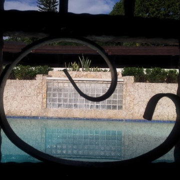
The swimming pool’s back wall area was bejeweled with cordylines, Podocarpus conifers and Poinsettias.
The swimming pool’s water feature and its three tiers of planters were adorned with Crineon (Festival Burgundy Cordyline/ Cordyline x 'JURred') a glossy, exceptionally dark, rich red-burgundy leaves that are spectacular during December (during the weeding days) with its light pink and white blooms and hedged by Café de la India shrubs (Rubiaceae flowering hedge).
The top tier, the crown of the garden was decked with three species of Sansevieria. As I have heard from my childhood years, these plants are commonly known as cow tongue or mother-in-law’s tongue, but I also heard that they were used to attract good luck to the household and ward off evil spirits.
“Without a doubt, that there will be classic and elegant weddings pictures at our spruced up tropical garden” said the father of the bride to MHG Greens&Gardens.
25