
Search results for "Worst case situation" in Home Design Ideas
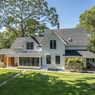
 The Red Shutters - Marina Case
Martha’s Vineyard; Vineyard Haven, MA
This home, located in Martha's Vineyard, embodies the classic New England coastal aesthetic with a timeless design that is both elegant and inviting. The white-painted home features a traditional gabled roofline and multiple dormer windows, creating a distinct architectural profile. Its charm is enhanced by a wide wraparound porch that extends along the front and side of the house, providing a covered outdoor space perfect for relaxation.
The exterior is bright and clean, with a combination of clapboard siding and large windows that allow natural light to fill the interior. A prominent feature is the enclosed sunroom on the first floor, which offers a versatile living area that can be enjoyed year-round. The house is situated on a well-manicured lawn and surrounded by mature, leafy trees that provide shade and a sense of privacy. The landscaping is simple and classic, with a pathway leading to the main entrance. The home’s design successfully blends traditional details with a functional, comfortable layout, making it a perfect retreat.
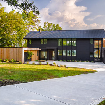
 Cluck Design Collaborative
Most lakefront homes create a barrier — a large, unnatural obstacle that blocks beautiful views of the lake and natural surroundings. In the case of the Greyfriars Residence, the client wanted the house to become part of the landscape so visitors could enjoy the lake from anywhere on the property.
The 5000 square-foot, two-story gable house was situated on the lot to maximize the incredible Lake Norman view from as much of the house as possible. Additionally, the lake can be seen through the delicate, modern silhouette from the street. This effect is achieved by adding a passage between the house and the garage. The main structure was then cross-cut, with walls and windows arranged to create a framed view from street to water’s edge.
Winner of 2019 AIA North Carolina Merit Award
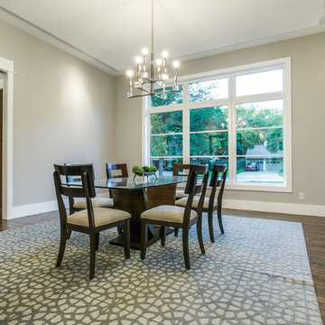
 Tag & Associates, LLC
One of the biggest differences between formal and functional dining rooms is where the room is located within your home. Formal dining rooms tend to be a completely separate room, often with pocket doors, French doors or ornate double doors, to further sequester them from the rest of the house. Casual dining rooms often share space with the kitchen or living room and are wide open. Even separate casual dining rooms tend to have open doorways, instead of closable doors. The purpose of a formal dining room is for elegant dinners, classy social gatherings and meals almost ceremonial in nature with proper etiquette and fine embellishments. A functional dining room isn't even always used for eating situations. They often serve dual purposes that make them even more utilitarian, such as a homework area for the kids or gaming table for family night.
Find the right local pro for your project
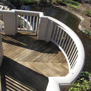
 Morpurgo Architects
Morpurgo Architects was retained by a Fortune 100 CEO and his wife, owners of this grand brick manor house, to renovate the lower level of their home and increase the existing area for a spa and entertainment. Above this new space, we created an expansive deck, accessible from the kitchen and the first floor living areas.
Our firm surmounted numerous challenges presented by the significant height of the deck and our clients’ desire for immediacy to the pond below. We mitigated and resolved the height differences by designing a system of stairs and platforms that provide overlooks to the landscape, thereby facilitating transitions among the many levels.
Between the first floor and the lower level, we have constructed a mezzanine that is situated between two levels of stairs. This spacious landing prompts one to pause and view the family room through a wood-arched ceiling, with flanking wood display cases, before entering this well-appointed social area that contains the family room with a fireplace, pub, billiard room and solarium. A separate apartment, full-service cabana with kitchen and two bathrooms, sauna and a gym were also developed to satisfy the owner’s program.
Morpurgo Architects is known for its fastidious detailing, exemplified in this magnificent home by walnut-blasted oak paneling and built-ins that the firm designed to enhance the family’s entertainment space.
 Visbeen Architects
Builder: AVB Inc.
Interior Design: Vision Interiors by Visbeen
Photographer: Ashley Avila Photography
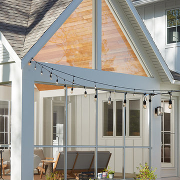
The Holloway blends the recent revival of mid-century aesthetics with the timelessness of a country farmhouse. Each façade features playfully arranged windows tucked under steeply pitched gables. Natural wood lapped siding emphasizes this homes more modern elements, while classic white board & batten covers the core of this house. A rustic stone water table wraps around the base and contours down into the rear view-out terrace.
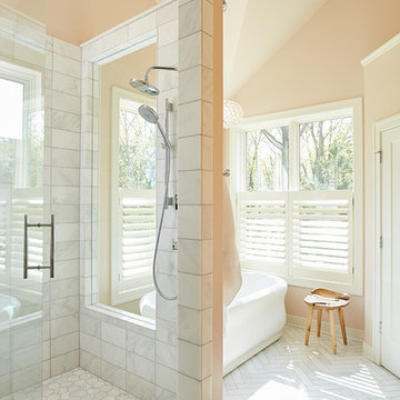
Inside, a wide hallway connects the foyer to the den and living spaces through smooth case-less openings. Featuring a grey stone fireplace, tall windows, and vaulted wood ceiling, the living room bridges between the kitchen and den. The kitchen picks up some mid-century through the use of flat-faced upper and lower cabinets with chrome pulls. Richly toned wood chairs and table cap off the dining room, which is surrounded by windows on three sides. The grand staircase, to the left, is viewable from the outside through a set of giant casement windows on the upper landing. A spacious master suite is situated off of this upper landing. Featuring separate closets, a tiled bath with tub and shower, this suite has a perfect view out to the rear yard through the bedrooms rear windows. All the way upstairs, and to the right of the staircase, is four separate bedrooms. Downstairs, under the master suite, is a gymnasium. This gymnasium is connected to the outdoors through an overhead door and is perfect for athletic activities or storing a boat during cold months. The lower level also features a living room with view out windows and a private guest suite.
 Realtor/Broker Associate with the Harmon Team at K
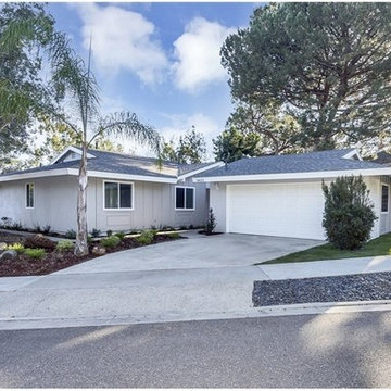
Stunning, single level home situated on a premium corner lot with a golf course view and ocean breezes. Located in the highly desirable City of Laguna Niguel. Every inch of this beautiful home has been completely remodeled. New gourmet kitchen that is a chef’s dream with upgraded stainless steel appliances, sleek quartz countertops, beautiful white raised panel cabinets with soft close doors, drawers and recessed lighting. Spacious and open concept great room with remodeled fireplace and beautiful mantle. Gorgeous engineered hardwood floors throughout the main living areas. Smooth raised ceilings, new dual pane windows and slider throughout the home. New two-panel doors, door casings, upgraded baseboards, designer paint, plugs and switches throughout. AC and newer heater. Two (2) fully remodeled bathrooms with stunning quartz counter vanities, new sinks, faucets, fixtures, newly tiled tub/shower surrounds, and new mirrors. Three (3) bedrooms including a master with en-suite bath, all with new plush carpet, mirrored wardrobe closet doors. Spacious yard, with new fencing perfect for entertaining! NO HOA. NO MELLO-ROOS. Short distance to shopping, golf, parks, and the beach! Outstanding opportunity to purchase a move in ready home you will be proud to call your own!
 kimberly peck architect
photos by Pedro Marti
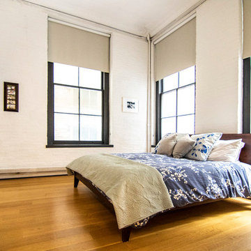
This large light-filled open loft in the Tribeca neighborhood of New York City was purchased by a growing family to make into their family home. The loft, previously a lighting showroom, had been converted for residential use with the standard amenities but was entirely open and therefore needed to be reconfigured. One of the best attributes of this particular loft is its extremely large windows situated on all four sides due to the locations of neighboring buildings. This unusual condition allowed much of the rear of the space to be divided into 3 bedrooms/3 bathrooms, all of which had ample windows. The kitchen and the utilities were moved to the center of the space as they did not require as much natural lighting, leaving the entire front of the loft as an open dining/living area. The overall space was given a more modern feel while emphasizing it’s industrial character. The original tin ceiling was preserved throughout the loft with all new lighting run in orderly conduit beneath it, much of which is exposed light bulbs. In a play on the ceiling material the main wall opposite the kitchen was clad in unfinished, distressed tin panels creating a focal point in the home. Traditional baseboards and door casings were thrown out in lieu of blackened steel angle throughout the loft. Blackened steel was also used in combination with glass panels to create an enclosure for the office at the end of the main corridor; this allowed the light from the large window in the office to pass though while creating a private yet open space to work. The master suite features a large open bath with a sculptural freestanding tub all clad in a serene beige tile that has the feel of concrete. The kids bath is a fun play of large cobalt blue hexagon tile on the floor and rear wall of the tub juxtaposed with a bright white subway tile on the remaining walls. The kitchen features a long wall of floor to ceiling white and navy cabinetry with an adjacent 15 foot island of which half is a table for casual dining. Other interesting features of the loft are the industrial ladder up to the small elevated play area in the living room, the navy cabinetry and antique mirror clad dining niche, and the wallpapered powder room with antique mirror and blackened steel accessories.

Sponsored
Fredericksburg, OH

High Point Cabinets
Columbus' Experienced Custom Cabinet Builder | 4x Best of Houzz Winner
 Cook Construction
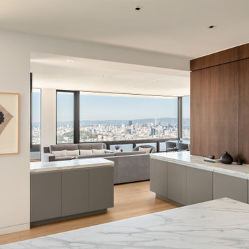
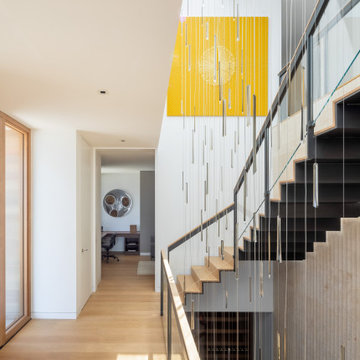
This 7,000 square foot, single family home, nestled at the base of San Francisco’s skyline Landmark, Sutro Tower, is an impressive representation of the quality of work Cook Construction produces. Designed by visionary John Maniscalco Architects, this 4 story modern marvel has impressive 23’ custom windows revealing breathtaking panoramic views of the city and surrounding bay. Its’ expansive kitchen and living areas include state-of-the-art appliances, European cabinetry and Lucifer mud-in lighting. A handsomely showcased wine room, a nourishing spa, complete with sauna, steam room and custom stainless hot tub, and large fitness studio with garden views, are only some of its elegantly conceived amenities. Floor to ceiling pocket doors, trim-less casings and baseboards, and other hidden reveals situated throughout this home create a sleek yet functional gravitas.
 Cook Construction
This 7,000 square foot, single family home, nestled at the base of San Francisco’s skyline Landmark, Sutro Tower, is an impressive representation of the quality of work Cook Construction produces. Designed by visionary John Maniscalco Architects, this 4 story modern marvel has impressive 23’ custom windows revealing breathtaking panoramic views of the city and surrounding bay. Its’ expansive kitchen and living areas include state-of-the-art appliances, European cabinetry and Lucifer mud-in lighting. A handsomely showcased wine room, a nourishing spa, complete with sauna, steam room and custom stainless hot tub, and large fitness studio with garden views, are only some of its elegantly conceived amenities. Floor to ceiling pocket doors, trim-less casings and baseboards, and other hidden reveals situated throughout this home create a sleek yet functional gravitas.
 Tile Doctor Ltd
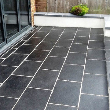
Along with internal tiled floors at residential and commercial properties, we also specialise in the cleaning, restoration and sealing of all types of external tiled floors, including patios.
This customer, who lives in the small town of Brackley in Northamptonshire, had made the unfortunate mistake of sealing a brand new Slate tiled patio without removing the layer of grout haze smeared across the surface of the tile first. With the grout trapped between the tile and the new sealant the sealer was unable to fulfil its potential and the entire floor appeared really dull and patchy. The customer contacted me about setting the situation right.
My initial course of action was to remove the new sealer using Tile Doctor Remove & Go, which is specially designed to strip away sealant, as well as adhesives and paints in cases where building and decorating works have left the tiles stained. The product was applied liberally across the surface area of the patio and agitated using a rotary machine fitted with a special stripping pad. Of course, this was necessary because the grout haze could not be treated without removing the sealant first. The soiled cleaning solution was promptly soaked up using a wet-vac machine.
Once the tiles were exposed I applied Tile Doctor Acid Gel, which is a blend of phosphoric and hydrochloric acids in more manageable gel form, all over the patio and allowed it to dwell for ten minutes to begin neutralising the grout haze. I then added a little water and worked the product into the patio with a stiff scrubbing brush and a rotary machine to ensure all grout haze was removed from the surface of the tiles. The remaining slurry was then removed using the wet vacuum, and I rinsed the area twice with plain water to ensure all cleaning products had been removed. It was them left to dry completely.
I returned to the property several days later to give the patio a fresh seal now that it was free from grout haze. First, I gave the patio a vacuum and light mop to remove any dust and debris. The customer wanted the tiles as dark as possible, therefore I suggested we use Tile Doctor Stone Oil before sealing, as this would darken the Slate significantly.
Once this was agreed, I applied one coat of Stone Oil, allowed an hour for the product to dry, and then followed this applying two coats of Tile Doctor Colour Grow sealer. This is our impregnating, colour enhancing sealant which provides maximum protection against ingrained dirt and stains, as well as a durable no-sheen finish.
As you can see from the photographs, the Slate tiles experienced an impressive transformation. The fresh sealant, combined with the Stone Oil, really took the appearance of the tiles to a new level and, what’s more, it will be easier for the happy customer to keep it clean in the future.
Phil Vissian
Northamptonshire Tile Doctor
 Fenstermann LLC
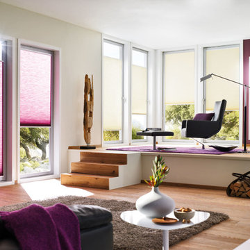
Honeycomb Pleated Blinds are available in translucent and black out. With their unique bottom up top down operation and the minimal required depth for the installation, they are perfect for tilt and turn windows and doors or wood casing installation. Several options for the installation from inside mount to surface mount, clue clips and strips as well as custom solutions cater to almost any situation.
 Vision Interiors
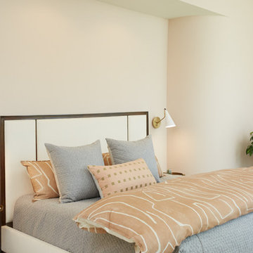
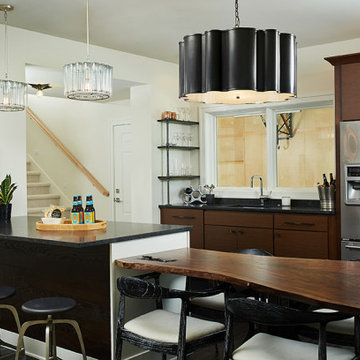
The Holloway blends the recent revival of mid-century aesthetics with the timelessness of a country farmhouse. Each façade features playfully arranged windows tucked under steeply pitched gables. Natural wood lapped siding emphasizes this homes more modern elements, while classic white board & batten covers the core of this house. A rustic stone water table wraps around the base and contours down into the rear view-out terrace.
Inside, a wide hallway connects the foyer to the den and living spaces through smooth case-less openings. Featuring a grey stone fireplace, tall windows, and vaulted wood ceiling, the living room bridges between the kitchen and den. The kitchen picks up some mid-century through the use of flat-faced upper and lower cabinets with chrome pulls. Richly toned wood chairs and table cap off the dining room, which is surrounded by windows on three sides. The grand staircase, to the left, is viewable from the outside through a set of giant casement windows on the upper landing. A spacious master suite is situated off of this upper landing. Featuring separate closets, a tiled bath with tub and shower, this suite has a perfect view out to the rear yard through the bedroom's rear windows. All the way upstairs, and to the right of the staircase, is four separate bedrooms. Downstairs, under the master suite, is a gymnasium. This gymnasium is connected to the outdoors through an overhead door and is perfect for athletic activities or storing a boat during cold months. The lower level also features a living room with a view out windows and a private guest suite.
Architect: Visbeen Architects
Photographer: Ashley Avila Photography
Builder: AVB Inc.
 Vision Interiors
The Holloway blends the recent revival of mid-century aesthetics with the timelessness of a country farmhouse. Each façade features playfully arranged windows tucked under steeply pitched gables. Natural wood lapped siding emphasizes this homes more modern elements, while classic white board & batten covers the core of this house. A rustic stone water table wraps around the base and contours down into the rear view-out terrace.
Inside, a wide hallway connects the foyer to the den and living spaces through smooth case-less openings. Featuring a grey stone fireplace, tall windows, and vaulted wood ceiling, the living room bridges between the kitchen and den. The kitchen picks up some mid-century through the use of flat-faced upper and lower cabinets with chrome pulls. Richly toned wood chairs and table cap off the dining room, which is surrounded by windows on three sides. The grand staircase, to the left, is viewable from the outside through a set of giant casement windows on the upper landing. A spacious master suite is situated off of this upper landing. Featuring separate closets, a tiled bath with tub and shower, this suite has a perfect view out to the rear yard through the bedroom's rear windows. All the way upstairs, and to the right of the staircase, is four separate bedrooms. Downstairs, under the master suite, is a gymnasium. This gymnasium is connected to the outdoors through an overhead door and is perfect for athletic activities or storing a boat during cold months. The lower level also features a living room with a view out windows and a private guest suite.
Architect: Visbeen Architects
Photographer: Ashley Avila Photography
Builder: AVB Inc.


 Charles River Wine Cellars
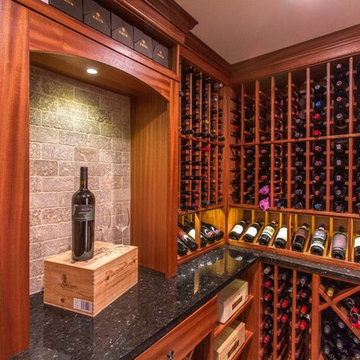
This traditional style cellar contains all the elements of a classic wine cellar: mahogany wine racking, diamond bins, display rows, stone work, granite countertops, and glass door. Situated conveniently off the kitchen, this wine cellar offers convenience while also serving as an entertaining destination.
 Coast to Coast Imports, LLC
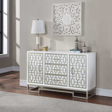
Dreamy White and Champagne Lights, even the name of the finish makes you want to ooooh and aaaah, and this stunning Cabinet definitely lives up to it's name! The clean lines of the body gleam in the Dreamy White, and provide the perfect backdrop to the geometric Champagne overlays that front the two doors and three drawers. Matching hardware and an open metal base complete the visual, and help to make this Cabinet a standout in any situation!
 kimberly peck architect
photos by Pedro Marti
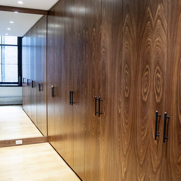
This large light-filled open loft in the Tribeca neighborhood of New York City was purchased by a growing family to make into their family home. The loft, previously a lighting showroom, had been converted for residential use with the standard amenities but was entirely open and therefore needed to be reconfigured. One of the best attributes of this particular loft is its extremely large windows situated on all four sides due to the locations of neighboring buildings. This unusual condition allowed much of the rear of the space to be divided into 3 bedrooms/3 bathrooms, all of which had ample windows. The kitchen and the utilities were moved to the center of the space as they did not require as much natural lighting, leaving the entire front of the loft as an open dining/living area. The overall space was given a more modern feel while emphasizing it’s industrial character. The original tin ceiling was preserved throughout the loft with all new lighting run in orderly conduit beneath it, much of which is exposed light bulbs. In a play on the ceiling material the main wall opposite the kitchen was clad in unfinished, distressed tin panels creating a focal point in the home. Traditional baseboards and door casings were thrown out in lieu of blackened steel angle throughout the loft. Blackened steel was also used in combination with glass panels to create an enclosure for the office at the end of the main corridor; this allowed the light from the large window in the office to pass though while creating a private yet open space to work. The master suite features a large open bath with a sculptural freestanding tub all clad in a serene beige tile that has the feel of concrete. The kids bath is a fun play of large cobalt blue hexagon tile on the floor and rear wall of the tub juxtaposed with a bright white subway tile on the remaining walls. The kitchen features a long wall of floor to ceiling white and navy cabinetry with an adjacent 15 foot island of which half is a table for casual dining. Other interesting features of the loft are the industrial ladder up to the small elevated play area in the living room, the navy cabinetry and antique mirror clad dining niche, and the wallpapered powder room with antique mirror and blackened steel accessories.
 Visbeen Architects
Builder: AVB Inc.
Interior Design: Vision Interiors by Visbeen
Photographer: Ashley Avila Photography
The Holloway blends the recent revival of mid-century aesthetics with the timelessness of a country farmhouse. Each façade features playfully arranged windows tucked under steeply pitched gables. Natural wood lapped siding emphasizes this homes more modern elements, while classic white board & batten covers the core of this house. A rustic stone water table wraps around the base and contours down into the rear view-out terrace.
Inside, a wide hallway connects the foyer to the den and living spaces through smooth case-less openings. Featuring a grey stone fireplace, tall windows, and vaulted wood ceiling, the living room bridges between the kitchen and den. The kitchen picks up some mid-century through the use of flat-faced upper and lower cabinets with chrome pulls. Richly toned wood chairs and table cap off the dining room, which is surrounded by windows on three sides. The grand staircase, to the left, is viewable from the outside through a set of giant casement windows on the upper landing. A spacious master suite is situated off of this upper landing. Featuring separate closets, a tiled bath with tub and shower, this suite has a perfect view out to the rear yard through the bedrooms rear windows. All the way upstairs, and to the right of the staircase, is four separate bedrooms. Downstairs, under the master suite, is a gymnasium. This gymnasium is connected to the outdoors through an overhead door and is perfect for athletic activities or storing a boat during cold months. The lower level also features a living room with view out windows and a private guest suite.

Sponsored
Columbus, OH
Free consultation for landscape design!

Peabody Landscape Group
Columbus' Reliable Landscape Design & Contracting
 Ferriss - Architectural Renderings
Top 10 house planning mistakes
Mistake # 1: placing wet areas away from communications.
Architects always foresee in advance the placement of wet areas in the immediate vicinity of communications, so you should not move the kitchen or bathrooms to more distant distances.
Mistake # 2: arrangement of living rooms and kitchens in rooms without natural light.
A person needs natural light when he is reading, studying or preparing food. Therefore, you should not plan living spaces, including the kitchen, in rooms without windows. Premises without natural light are mainly dressing rooms, storage rooms and bathrooms.
Mistake # 3: exit the bathroom to the living room or dining room.
Doors to bathrooms and utility rooms cannot open into public areas - living room or dining room. With such a planning decision, you will inconvenience guests and households, because no one will be able to enter or leave the premises unnoticed.
Mistake # 4: having one entrance to the house.
Plan 2-3 entrances to your home with each one serving a specific role. For example, through the front door you will meet guests, the entrance from the courtyard facade - to exit to the site in order to go around the house. The third entrance should lead from the street to the boiler room. Technicians enter through it and the equipment is replaced.
Mistake # 5: neglecting entrance hallways.
Do not plan grand halls and lounges when entering a house. Be sure to organize hallways with dressing rooms or spacious wardrobes.
Mistake # 6: placing a guest bathroom far from the entrance.
The concept of "guest bathroom" speaks for itself. To get into it, your friends do not need to go through all the rooms on the ground floor. Therefore, do not place it far from the front door.
Mistake # 7: Insufficient number of bathrooms on the floor.
One bathroom is not enough for a floor, especially if it is a bedroom. For the convenience of households and guests, each bedroom should be equipped with a separate bathroom.
Mistake #8: lack of an economic block.
In houses of any number of stores on the first or basement floor, a pantry with a sink should be provided for storing cleaning equipment, for storing vegetables or solid fuel. In this case, the exit from the storeroom to the floor must be isolated from the living rooms.
Mistake # 9: arrangement of walk-through living rooms.
Do not make the living room a walk-through, even if you plan to equip an office or living room in it. You and your guests will feel uncomfortable because the multiple doors leading to other rooms make the room look like a reception.
Mistake # 10: the wrong size of the corridors.
The width of the passage corridors should be at least 120 cm. First of all, the rule should be observed for the safety of residents and according to the rules of fire safety measures. An important role is played by ensuring sufficient ventilation of the premises: if the corridor is narrow and long, then there will be either a constant draft or stale air.
Also, in a narrow aisle, it will be extremely difficult to bring in and take out large-sized furniture or equipment. And the doors that open into the corridor should not block the passage, as a traumatic situation may arise.
If you have any polls that are not covered by this topic - write to us, we will be happy to advise you.
https://www.ferriss.co/
 Tile Doctor Ltd
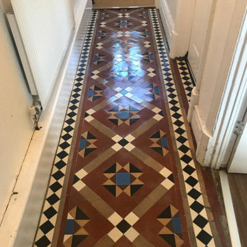
I recently worked on the restoration of a Victorian tiled hallway in Cwmbran Wales which is six miles North of Newport. As you can see from the photographs the floor was in quite a neglected dirty state and many of the the black and white border tiles needed removing and replacing. The worst part was the area by the front door where most of the tiles had been removed and then backfilled with concrete. I can only assume at some point in the past it was deemed to difficult or expensive to restore the floor, so they simply covered it up.
After visiting to survey the floor I did offer to source replacements for the concreted section and restore that as part of the work however my client’s budget would not stretch to that at the time. My quote was therefore focused on the main section of flooring and included replacing border tiles, deep cleaning the whole floor and then sealing the tiles to add protection. Although I did need to check that I could indeed source the replacement tiles before being able to provide the quote which as it turned out would not be an issue.
They were happy to go ahead and we arranged a suitable time to carry out the work which would enable me to work in the property whilst minimising contact with the owners due to the Covid-19 situation.
I spend the first day sorting out the black and white border tiles which needed to be gently prised out of position without upsetting the main part of the floor. The exposed subfloor was then cleaned up to remove old adhesive and replacements were fitted where required and secured into place. The floor would need to be solid before cleaning so that was left for day two so the new adhesive could go off overnight.
On day two I gave the floor an initial clean using a combination of Tile Doctor Pro-Clean and Remove and Go diluted with water. This produces a strong cleaner/stripper that will tackle dirt and remove coatings such as previous sealers. The old tiles had accumulated years of ingrained dirt, so I needed this extra power to remove the years of dirt and contaminates from the tile. It was sprayed onto the tiles and then left to soak in for ten minutes before being actively scrubbed into the tile using a rotary machine fitted with a black scrubbing pad. The soil was then rinsed off with water and extracted with a wet vacuum. The floor was inspected, and the process repeated on the tough stains until I was satisfied all the dirt had been removed.
Next the floor was treated to an acid wash using Tile Doctor Acid Gel using a similar method as before. This is an important treatment for these old Victorian floors that have no damp proof course as it neutralises efflorescent salts trapped in the tile which can appear as white salt deposits later. Once I was happy with the condition of the floor it was given a final rinse and left to dry off. I use a wet vacuum to remove liquids from the floor and on this last extraction I spent extra time to remove as much moisture from the tiles as possible.
I came back a few days later and after checking the tiles were dry using a damp meter, I started the application of the sealer. For this floor I applied seven coats of Tile Doctor Seal and Go for a satin finish. Tile Doctor Seal and Go is a specially formulated water-based sealer that provides both stain resistance and a durable low-sheen finish. It is perfect on a floor of this age where it leaves a lovely finish and will remain durable in what is a essentially a high traffic area.
Although we didn’t manage to sort out the area by the front door the client managed to fit a made to measure coir door mat along with carpet bar which was quite practical and looked fine so they were able to resolve that problem without blowing their budget.
The client was over the moon with results, the floor had a lovely pattern and the colours now shone through. I suggested the use of Tile Doctor Neutral Tile Cleaner to keep the floor clean and in good condition. It is neutral in pH so will ensure that the newly applied sealer stays in place and will ensure maintenance is nice and easy for them.
Paul Wales
Monmouthshire Tile Doctor
 kimberly peck architect
photos by Pedro Marti
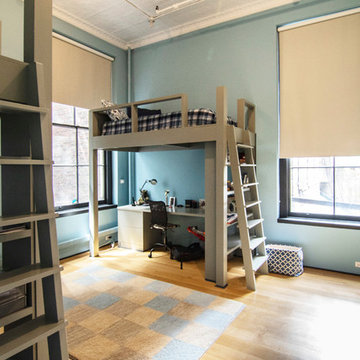
This large light-filled open loft in the Tribeca neighborhood of New York City was purchased by a growing family to make into their family home. The loft, previously a lighting showroom, had been converted for residential use with the standard amenities but was entirely open and therefore needed to be reconfigured. One of the best attributes of this particular loft is its extremely large windows situated on all four sides due to the locations of neighboring buildings. This unusual condition allowed much of the rear of the space to be divided into 3 bedrooms/3 bathrooms, all of which had ample windows. The kitchen and the utilities were moved to the center of the space as they did not require as much natural lighting, leaving the entire front of the loft as an open dining/living area. The overall space was given a more modern feel while emphasizing it’s industrial character. The original tin ceiling was preserved throughout the loft with all new lighting run in orderly conduit beneath it, much of which is exposed light bulbs. In a play on the ceiling material the main wall opposite the kitchen was clad in unfinished, distressed tin panels creating a focal point in the home. Traditional baseboards and door casings were thrown out in lieu of blackened steel angle throughout the loft. Blackened steel was also used in combination with glass panels to create an enclosure for the office at the end of the main corridor; this allowed the light from the large window in the office to pass though while creating a private yet open space to work. The master suite features a large open bath with a sculptural freestanding tub all clad in a serene beige tile that has the feel of concrete. The kids bath is a fun play of large cobalt blue hexagon tile on the floor and rear wall of the tub juxtaposed with a bright white subway tile on the remaining walls. The kitchen features a long wall of floor to ceiling white and navy cabinetry with an adjacent 15 foot island of which half is a table for casual dining. Other interesting features of the loft are the industrial ladder up to the small elevated play area in the living room, the navy cabinetry and antique mirror clad dining niche, and the wallpapered powder room with antique mirror and blackened steel accessories.
22