
Search results for "Worth thinking" in Home Design Ideas

 threshold interiors
Location: New York, NY, United States
This Loft was tastefully renovated back in the '90s, but was due for an update and an expansion of the kitchen and dining areas to accommodate the client's cooking skills and entertaining needs. EnlargIing the island and adding cabinetry to delineate the office, bar and dining areas was a priority. The bathroom was updated to feel like a tranquil spa with beautiful new tile, plumbing fixtures and cabinets. Our biggest challenge was coordinating the entire renovation while our client was out of town for the Summer!
Photographed by: James Salomon

 Lindsay Chambers Design
Lindsay Chambers Design, Roger Davies Photography
Freestanding bathtub - mid-sized transitional master white tile and marble tile freestanding bathtub idea in Los Angeles with shaker cabinets, purple cabinets, a two-piece toilet, an undermount sink, marble countertops and a hinged shower door
Freestanding bathtub - mid-sized transitional master white tile and marble tile freestanding bathtub idea in Los Angeles with shaker cabinets, purple cabinets, a two-piece toilet, an undermount sink, marble countertops and a hinged shower door

 Drewett Works
This photo: For a couple's house in Paradise Valley, architect C.P. Drewett created a sleek modern kitchen with Caesarstone counters and tile backsplashes from Art Stone LLC. Porcelain-tile floors from Villagio Tile & Stone provide contrast to the dark-stained vertical-grain white-oak cabinetry fabricated by Reliance Custom Cabinets.
Positioned near the base of iconic Camelback Mountain, “Outside In” is a modernist home celebrating the love of outdoor living Arizonans crave. The design inspiration was honoring early territorial architecture while applying modernist design principles.
Dressed with undulating negra cantera stone, the massing elements of “Outside In” bring an artistic stature to the project’s design hierarchy. This home boasts a first (never seen before feature) — a re-entrant pocketing door which unveils virtually the entire home’s living space to the exterior pool and view terrace.
A timeless chocolate and white palette makes this home both elegant and refined. Oriented south, the spectacular interior natural light illuminates what promises to become another timeless piece of architecture for the Paradise Valley landscape.
Project Details | Outside In
Architect: CP Drewett, AIA, NCARB, Drewett Works
Builder: Bedbrock Developers
Interior Designer: Ownby Design
Photographer: Werner Segarra
Publications:
Luxe Interiors & Design, Jan/Feb 2018, "Outside In: Optimized for Entertaining, a Paradise Valley Home Connects with its Desert Surrounds"
Awards:
Gold Nugget Awards - 2018
Award of Merit – Best Indoor/Outdoor Lifestyle for a Home – Custom
The Nationals - 2017
Silver Award -- Best Architectural Design of a One of a Kind Home - Custom or Spec
http://www.drewettworks.com/outside-in/
Find the right local pro for your project

 Anne Sneed Architectural Interiors
Jim Brady Architectural Photography
Example of a farmhouse deck design in San Diego with no cover and a fireplace
Example of a farmhouse deck design in San Diego with no cover and a fireplace

 Classy Closets San Diego
Example of a large trendy gender-neutral dark wood floor and brown floor walk-in closet design in San Diego with flat-panel cabinets and light wood cabinets
 Silver Maple Construction LLC
Photography by Susan Teare • www.susanteare.com
Huge trendy l-shaped slate floor home design photo in Burlington with a farmhouse sink, raised-panel cabinets, white cabinets, marble countertops, yellow backsplash, ceramic backsplash, stainless steel appliances and an island
Huge trendy l-shaped slate floor home design photo in Burlington with a farmhouse sink, raised-panel cabinets, white cabinets, marble countertops, yellow backsplash, ceramic backsplash, stainless steel appliances and an island

 VanderHorn Architects
Inspiration for a large country brown two-story wood gable roof remodel in New York
Sponsored
Columbus, OH
Transforming Spaces in Columbus

Daniel Home
Premier Interior Design Team Transforming Spaces in Franklin Co, Ohio

 Black Forest Design and Build
Photo by: Kelly Hess
Inspiration for a mid-sized farmhouse master brown tile and porcelain tile porcelain tile and beige floor walk-in shower remodel in Philadelphia with brown cabinets, a two-piece toilet, gray walls, an undermount sink, granite countertops and flat-panel cabinets
Inspiration for a mid-sized farmhouse master brown tile and porcelain tile porcelain tile and beige floor walk-in shower remodel in Philadelphia with brown cabinets, a two-piece toilet, gray walls, an undermount sink, granite countertops and flat-panel cabinets

 Hidden Creek Landscaping, Inc.
Architectural Photography by Trevor Boyle Studio
Example of a mountain style stone patio design in Columbus with a fire pit and a pergola
Example of a mountain style stone patio design in Columbus with a fire pit and a pergola


 Grandview Development & Construction Inc
Darren Edwards Photography
www.darrenedwardsphotography.com
Example of a trendy dark wood floor family room design in San Diego
Example of a trendy dark wood floor family room design in San Diego

 Adrienne DeRosa
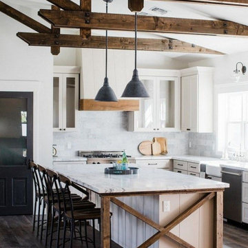
With respect to the notion of old-meets-new, the kitchen strikes a comfortable balance between materials. For the center island, Franklin repurposed original barn siding into cladding for the unit, painting it grey. The Corian counter top and stainless steel backsplash provide a cool contrast.
A set of antique barstools was a fortunate find for the homeowner. Sourced from a local bar that had closed, all they needed was a little elbow grease to realize their full potential. It took days to remove years worth of nicotine stains from them, but as Franklin exclaims, "It was worth it because the old stools found a new home in an old barn!"
The partial wall was designed to address a number of functional and aesthetic concerns. Dividing the workspace from the storage space, it keeps the pantry area out of view, and allows light to carry through this area of the home. Franklin also uses the wall as a means to display his growing teapot collection. "It’s funny," he confesses, "but I think they can entice people to sit down, have a cup of tea and converse (Imagine that in this world of technology!)"
Adrienne DeRosa Photography



 Sierra Sustainable Builders
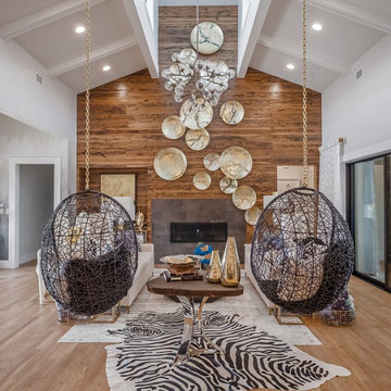
Inspiration for a huge transitional open concept dark wood floor and brown floor living room remodel with a standard fireplace, white walls, a plaster fireplace and no tv


 Blueberry Jones Design, LLC
Transitional open concept medium tone wood floor, brown floor, exposed beam and vaulted ceiling family room photo in Austin with gray walls, a standard fireplace, a stone fireplace and a media wall
Sponsored
Columbus, OH
Transforming Spaces in Columbus
Daniel Home
Premier Interior Design Team Transforming Spaces in Franklin Co, Ohio

 Yellowstone Traditions
MillerRoodell Architects // Benjamin Benschneider Photography
Inspiration for a mid-sized rustic freestanding desk medium tone wood floor home office remodel with a standard fireplace and a stone fireplace
Inspiration for a mid-sized rustic freestanding desk medium tone wood floor home office remodel with a standard fireplace and a stone fireplace

 Artisan Builders LLC
Huge mountain style backyard stone patio photo in Denver with no cover and a fire pit

 Tim Brinks Builders
Ashley Avila
Cottage open concept medium tone wood floor living room photo in Grand Rapids with beige walls and a media wall
Cottage open concept medium tone wood floor living room photo in Grand Rapids with beige walls and a media wall
3