
Search results for "Your own which" in Home Design Ideas
 Live your home - Interior Design
First own apartment
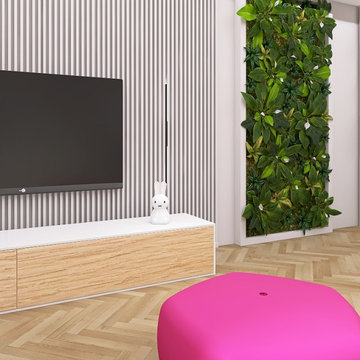
In this interior design project, we focused on a 2-bedroom apartment. It was the client's first own apartment as she recently moved to Vienna. She desired a feminine and minimalist interior design that was far from boring. Since it was a rental apartment, certain elements were predetermined, and we aimed to create a design that could easily be taken along in case of a move. For example, we incorporated natural white acoustic panels as accents behind the sofa and TV, providing texture without introducing color into the space.
We drew inspiration from the Pantone Color of the Year 2023, "Viva Magenta," for the accent color. Thus, we chose dining chairs and a pouf in shades from this color palette.
The kitchenette remained unchanged, but we added a beautiful floral wallpaper as an accent to the backsplash. However, the highlight of the design is undoubtedly the living plant wall. It creates a green focal point in the middle of the room. We decided against adding more plants since our client is often away for days, and regular care couldn't be guaranteed. The living wall requires less maintenance and is more manageable in this regard.
----
Erste eigene Wohnung in Wien
In diesem Einrichtungsprojekte ging es um eine 2-Zimmer-Wohnung. Es ist die erste eigene Wohnung der Kundin, die eben nach Wien gezogen ist. Sie wünschte sich ein feminines, schlichtes, jedoch nicht langweiliges Interiordesign. Da es sich um eine Mietwohnung handelt, waren einige Dinge gegeben und wir haben uns bemüht, alles so zu gestalten, dass es bei einem Umzug leicht mitgenommen werden kann. Wie z.B. die naturweißen Akustikpaneele, die als Akzent hinter dem Sofa sowie hinter dem TV angebracht wurden. Diese bieten Struktur, ohne Farbe in den Raum zu bringen.
Bei der Akzentfarbe wollten wir uns nämlich von der Pantone-Farbe 2023 “Viva Magenta” inspirieren lassen und haben somit die Esszimmer-Stühle sowie den Pouf farblich aus dieser Palette gewählt.
Die Küchenzeile blieb unverändert, jedoch haben wir der Rückwand mit einer hübschen Blüten-Tapete einen Akzent verliehen. Wahrscheinlich aber DAS Highlight ist die lebende Pflanzenwand. Diese bietet einen grünen Blickpunkt mitten im Raum. Auf weitere Pflanzen wurde verzichtet, da unsere Kunden oft tagelang nicht zuhause ist und die Pflege daher nicht garantiert wäre. Diese “Living wall” ist da weniger anspruchsvoll.


Find the right local pro for your project




 Bay Area Custom Homes, Inc.
Michele Lee Willson Photography
Example of a trendy metal railing balcony design in San Francisco with a bbq area
Example of a trendy metal railing balcony design in San Francisco with a bbq area


 Fernando Wong Outdoor Living Design
Example of a trendy white two-story stucco flat roof design in Miami
Sponsored
Delaware, OH

Buckeye Basements, Inc.
Central Ohio's Basement Finishing ExpertsBest Of Houzz '13-'21
 Live your home - Interior Design
First own apartment
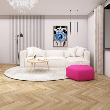
In this interior design project, we focused on a 2-bedroom apartment. It was the client's first own apartment as she recently moved to Vienna. She desired a feminine and minimalist interior design that was far from boring. Since it was a rental apartment, certain elements were predetermined, and we aimed to create a design that could easily be taken along in case of a move. For example, we incorporated natural white acoustic panels as accents behind the sofa and TV, providing texture without introducing color into the space.
We drew inspiration from the Pantone Color of the Year 2023, "Viva Magenta," for the accent color. Thus, we chose dining chairs and a pouf in shades from this color palette.
The kitchenette remained unchanged, but we added a beautiful floral wallpaper as an accent to the backsplash. However, the highlight of the design is undoubtedly the living plant wall. It creates a green focal point in the middle of the room. We decided against adding more plants since our client is often away for days, and regular care couldn't be guaranteed. The living wall requires less maintenance and is more manageable in this regard.
----
Erste eigene Wohnung in Wien
In diesem Einrichtungsprojekte ging es um eine 2-Zimmer-Wohnung. Es ist die erste eigene Wohnung der Kundin, die eben nach Wien gezogen ist. Sie wünschte sich ein feminines, schlichtes, jedoch nicht langweiliges Interiordesign. Da es sich um eine Mietwohnung handelt, waren einige Dinge gegeben und wir haben uns bemüht, alles so zu gestalten, dass es bei einem Umzug leicht mitgenommen werden kann. Wie z.B. die naturweißen Akustikpaneele, die als Akzent hinter dem Sofa sowie hinter dem TV angebracht wurden. Diese bieten Struktur, ohne Farbe in den Raum zu bringen.
Bei der Akzentfarbe wollten wir uns nämlich von der Pantone-Farbe 2023 “Viva Magenta” inspirieren lassen und haben somit die Esszimmer-Stühle sowie den Pouf farblich aus dieser Palette gewählt.
Die Küchenzeile blieb unverändert, jedoch haben wir der Rückwand mit einer hübschen Blüten-Tapete einen Akzent verliehen. Wahrscheinlich aber DAS Highlight ist die lebende Pflanzenwand. Diese bietet einen grünen Blickpunkt mitten im Raum. Auf weitere Pflanzen wurde verzichtet, da unsere Kunden oft tagelang nicht zuhause ist und die Pflege daher nicht garantiert wäre. Diese “Living wall” ist da weniger anspruchsvoll.

 Irish Builders LLC
Beautiful, simplistic bedroom with primed wood feature wall.
Kristian Walker Photography
Inspiration for a cottage guest medium tone wood floor bedroom remodel in Grand Rapids with white walls
Inspiration for a cottage guest medium tone wood floor bedroom remodel in Grand Rapids with white walls


 Mimi & Hill interiors
Garage converted to a game room
Example of a mid-sized beach style two-car garage design in New York
Example of a mid-sized beach style two-car garage design in New York

 TKS Design Group
Free ebook, Creating the Ideal Kitchen. DOWNLOAD NOW
Our clients had been in their home since the early 1980’s and decided it was time for some updates. We took on the kitchen, two bathrooms and a powder room.
The layout in the kitchen was functional for them, so we kept that pretty much as is. Our client wanted a contemporary-leaning transitional look — nice clean lines with a gray and white palette. Light gray cabinets with a slightly darker gray subway tile keep the northern exposure light and airy. They also purchased some new furniture for their breakfast room and adjoining family room, so the whole space looks completely styled and new. The light fixtures are staggered and give a nice rhythm to the otherwise serene feel.
The homeowners were not 100% sold on the flooring choice for little powder room off the kitchen when I first showed it, but now they think it is one of the most interesting features of the design. I always try to “push” my clients a little bit because that’s when things can get really fun and this is what you are paying for after all, ideas that you may not come up with on your own.
We also worked on the two upstairs bathrooms. We started first on the hall bath which was basically just in need of a face lift. The floor is porcelain tile made to look like carrera marble. The vanity is white Shaker doors fitted with a white quartz top. We re-glazed the cast iron tub.
The master bath was a tub to shower conversion. We used a wood look porcelain plank on the main floor along with a Kohler Tailored vanity. The custom shower has a barn door shower door, and vinyl wallpaper in the sink area gives a rich textured look to the space. Overall, it’s a pretty sophisticated look for its smaller fooprint.
Designed by: Susan Klimala, CKD, CBD
Photography by: Michael Alan Kaskel
For more information on kitchen and bath design ideas go to: www.kitchenstudio-ge.com

17