Software
Houzz Logo Print
sivyaleah

Need Backsplash Help

12 years ago
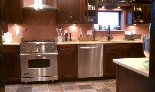
We moved into a 1915 Craftsman home 4 years ago. The kitchen had to be totally gutted. While I'm not entirely pleased with the outcome (lots of errors on the part of the contractor) overall, I like it and it's completely better than what was existing.
However, finding a back splash has been really difficult. The wall color is Benjamin Moore "Texas Rose". It has a slightly more rust tone than appears in the photo so it goes with the slate floor tiles tones (blues, rust, beige). I LOVE my Caesarstone counters - best design choice I made. The color is "Jerusalem Sand". Looks great with the cabinets, matches the floor tones again. Wall color looks good against it since the counter as a very slight mottling of a rust color in it. Sink is granite composite in a dark chocolate.c
Seems every tile I put against the Caesarstone looks wrong. I would like subway style as it's in keeping with the house style. I have even looked at hand painted tiles but no color combination seems to look good. When I look at neutral colors they all wind up looking too white or yellow against the backsplash. So, here I am 4 years later with no tile and I'm especially worried about the back of the range, as it's a safety hazard not having something fireproof back.
I'm in the design business, so this is especially annoying to me!
Any ideas? All are welcomed.

Comments (20)

  • 12 years ago
    Have you considered a grey color? Some shade of gray from the floor tile.
    Laurie thanked pitbulls
  • 12 years ago
    I'd change paint color of walls first. Then add cream subway tile.
  • 12 years ago
    last modified: 12 years ago
    I'd paint and then put a stainless panel behind the range to the height of the hood. One with texture would be interesting. If the 4" backsplash can be removed you have more options as long as you change wall color. You didn't ask, but the clutter on the counter is distracting, try a tray or two to consolidate and get drying mats instead of a rack. Except for the paint color, your choices were great so I think once you neutralize the color you'll be on your way.
  • 12 years ago
    last modified: 12 years ago
    It's the 2nd color we've put up there so, I'm loathe to do it again (we're older so would have to hire someone). I like the warmth of it and it's a color that makes me happy, which I think is important for a room one spends so much time in (well, I do anyway - my kitchen isn't meant to be a decorated showcase - I want it lived in looking).
    The counter backsplash can be removed. That was an error on the part of the counter manufacturer, so they let us keep it gratis -not like they could use it elsewhere.
    I like the idea of some kind of gray tho, it's something I didn't consider at all.
    BTW that photo is old, about 2 years ago. It was when it was freshly painted.
  • 12 years ago
    I think you should neutralizing your paint color and removing the 4 inch backsplash. This will give you a wide range of options. I think these two elements are getting in the way of you seeing that the tile you choose does not have to match the countertops exactly. With a neutral paint color I’m sure you will be able to find a tile that you love.
    Laurie thanked Gina P
  • 12 years ago
    last modified: 12 years ago

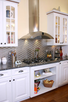
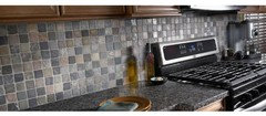
    What about stainless steel done with a smaller tile, in case you feel subway shape is too modern for your kitchen. Would work with everything you have.
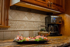
    [houzz=
    Kitchen Stove Area · More Info
    ]
    Laurie thanked Maureen
  • 12 years ago
    last modified: 12 years ago
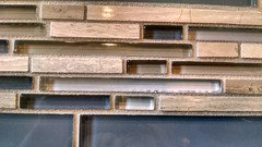
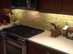
    I appreciate the suggestions, however, I think what's being missed is the counter color is the problem, not the paint. The walls in the cooking area will eventually be completely covered in tile, leaving very little paint on that wall at all other than the seating area (not shown). The tile needs to match very dark cabinets and the lighter tan/peachy/rust tones of the Caesarstone.

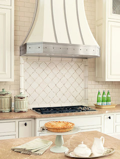
    I do like the white subway tile mixed with the Arabesque pattern that Gina posted. That one is very helpful; the counter color is somewhat similar to the Casesarstone. Perhaps, just having one sample of a tile color to play with doesn't quite give the effect I needed to make a judgement of whether or not it would work. Seeing that photo, made the overall outcome easier for me to visualize.

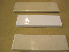
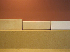
    I do have samples I was contemplating from Fireclay Tile, with a slight crackle glaze, but wasn't sure if any would work. Three of them are shown. I have a couple of others which are a tad darker; sort of a mushroom color and a fawn tone, both of which look good with all other elements.

    BTW I realize the lighting on these photos isn't very good. Again, taken a while ago. I've gotten a new camera since then, perhaps I will take new photos so that the colors are more accurate. The first photo of the counter does show the color correctly - more so than the other 2 photos.
  • 12 years ago
    Stick to a stone material pulling from the grey colors in the floor.

    The tiles are too close in color to the counter and the white is too much of a contrast.

    A room should have two main colors and a small amount of another for just a pop of color. Too many contrasting colors makes the room feel busy and random. You want the room to come together.

    I love what you have so far. It's beautiful.
    Laurie thanked Traci
  • 12 years ago
    last modified: 12 years ago

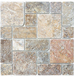
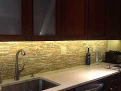
    Ok, LOVE that one! Thanks so much. It fits the bill of some color, rustic, right shape(s). Do you know who manufactures that one?
    EDIT: Found it! Lowes carries it at only $8.98 for a 12" x 12" piece.
  • PRO
    12 years ago
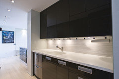
    One thing you might holes in you backsplash for outlets. You could use Angled Power Strips. they mount up under the cabinets with the outlets angled down at a 45 degree angle. I have attached some photos. We carry these also in addition to LED Lighting.
  • 12 years ago
    Any updates and pics?
  • 12 years ago
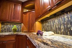
    I found a blue glass and off-white stone tile that looks good. But, the stone elements of the scheme as usual, didn't look well near the counter top. At least I have a direction now - the blue looked beautiful with everything, and I could just leave it at that, but am going to continue searching for a glass/stone combo since I'm not completely sold on doing just the glass. I've also resigned myself to the fact I'll probably have to paint the kitchen, for a third time.
  • 12 years ago
    How about this scabos travertine?
    Laurie thanked sph137
  • 12 years ago
    Why repaint your kitchen while you've already the right colour? You love it and like toolthymetraci mentioned before I also love what you have so far. It's really beautiful!
    The main colours are in your floor and the cabinets, countertop and walls make it pop. Adding more ( grouts) will make it look busy.

    Is there no option for leaving the walls as they are?
    And just add, for safety reasons, a stainless steel panel behind the stove.Or a glass panel all over so you still see the colour.

    I have no backsplash in my kitchen, just a ss panel behind the cooktop. I used water resistant paint and clean it with a mild soap.
    I'm looking forward to your updates :)
    Laurie thanked Monique Barrow
  • 12 years ago
    Actually, by coincidence Jesker, I had a Viking tech over last week. Needed a bit of a tune up (nothing major - had it for over 4 years with no problems so I'm not complaining). Vikind does make panels - I had considered it at that time, but decided against it - don't really remember the reason now. Anyway, I took advantage of having to call for service and spoke to one of the store reps about installing it now. They said yes, it can, however my unit isn't being made any longer so finding the right one might be an issue. I do like that look, and might be ok just going that route. Oh and attached is a photo of the tile I did like, just for comparisons sake of what has already been mentioned here. Not a great photo, was taken at the store, but does show the coloring pretty well. Last, I had seen some samples of reclaimed wood "tiles" which I loved but don't think they are appropriate for a back splash although they are being marketed as such (to people who don't really cook and make messes I guess lol). I can see using it used as a feature wall, and if I just put in the SS panel, it might be a nice way to bring more texture into the room without it looking too complicated pattern-wise.
  • 12 years ago
    Monique, I like the idea of doing clear glass back there also. It's something I hadn't considered and will look into. Thanks for that!
  • 12 years ago
    Try glass or stainless tiles as a backsplash.
  • 12 years ago
    The paint may look different in person but from here on my I Pad it looks like band aid color,if you change it to a gray you would have more options...four years later you are probably ready for an update,especially if you are in the biz
  • 12 years ago
    last modified: 12 years ago
    Bandaid? LOL. I don't see that at all but I do understand colors render differently on everyone's monitors. Maybe this "swatch" will help show the color better. Also, this color has only been up less than 2 years. I originally tried a light peach that looked awful once the room was more put together.