Software
Houzz Logo Print
minglee415

Go light or dark with grout color?

12 years ago
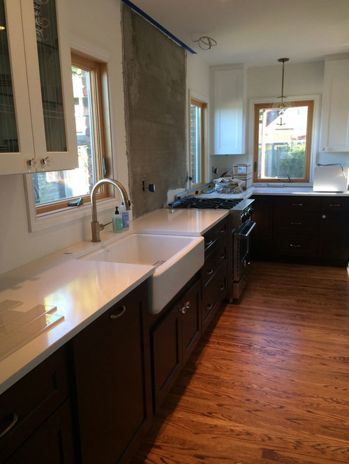
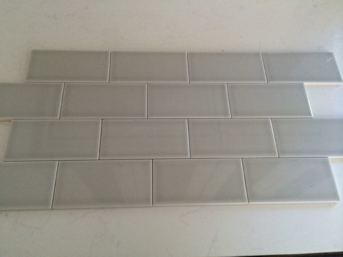
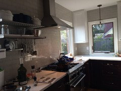
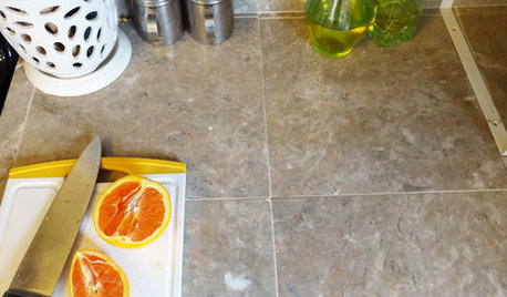
I'd love your opinion on whether you'd recommend a lighter grout or darker with my tile. As you can see from the picture of the tile, it has some shadowing and the edges are whitefish. (The tile is Bellavita tile H-Line in Pumice and the countertop is Pental Lattice) So a lighter grout would make the tiles look more seamless. But I kind of like the way the tiles look now…with a darker outline. My house is a 1932 Tudor. I'm not going for authentic (obviously, but more of a "new old") as my tiler says.
Personally I'm leaning towards doing a darker grout. Most of the historical older homes I've visited have a darker grout, then again "new old."

I'm grouting the whole wall (to the ceiling) not just the area that's being prepped in the photo. Tile will also to to the ceiling on the wall next to it that has the two narrow wall cabinets.

My tiler likes lighter grout and he says it's brighter. I'm not that worried about light as you can see I have four windows in the kitchen. Even for Seattle, the kitchen gets decent light year around.

Look forward to everyone's thoughts!
Thanks.

Comments (22)

  • PRO
    12 years ago
    Looks like you have some kind of glass tile, I would also recommend a light grout color
  • PRO
    12 years ago
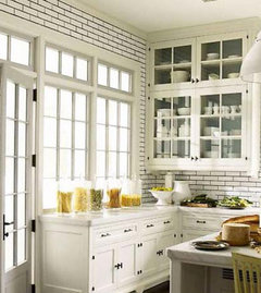
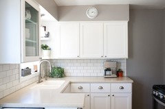
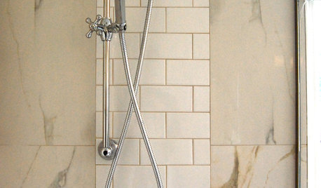
    I agree, it is mostly a preference thing. When you do use darker grout, it really highlights the shape and pattern of the tile - not a bad thing, just a preference. The first image below has very dark grout and a larger grout line. The second is a grey grout - a little softer and might be a happen medium for you.
    Lee Lacey thanked Deb Bayless - Design for Keeps
  • 12 years ago
    I'd try to match the tile colour as closely as possible. I'm really not a fan of dark grout.
  • PRO
    12 years ago
    The tiles pictured blend from grey to white, so white or light colored would likely blend the best. But as mentioned above, harder to clean.
  • PRO
    12 years ago
    I don't see a lot of textures or patterns on the counters or cabinets, so darker grout would break up the solid colors and add texture to the wall, while a lighter grout would be more subtle and generally looks cleaner (if you keep it clean!) The effect will also be very different on the entire wall than it is in a small section on the counter, think about what the room as a whole will look like with either option. Remember that you are the one that will have to look at it for years so be sure to like what you pick.
  • PRO
    12 years ago
    I'd match the tile color. Grout is very permanent, and with a darker color, you're introducing a strong pattern that you may or may not like over time. You can always introduce patterns and textures through less permanent features.

    https://www.etsy.com/shop/katshoa
  • 12 years ago
    Thanks everyone! I like the idea of adding texture as ACT Builder mentioned, the rest of the room is pretty "flat". But there will be a lot of tile so maybe it will look too busy. I'm going to have the tiler do two samples to make up my mind. :)
  • 12 years ago
    PS-I'll post a picture when I'm done...
  • PRO
    12 years ago
    I agree with Deb Bayless - Design for Keeps - the photo on the right shows a softer look with a neutral tone (not white) grout- and with your dark cabinetry a darker color may look more severe. It doesn't show now, but your glossy glass tiles will also reflect light - therefore, with your four windows and the reflective light you will have a very bright kitchen, so a neutral tone grout will be perfect. Also, use the grouts that are stain resistant - they cost more, but are so well worth it.
    Lee Lacey thanked Marin Designworks Glass Tile Design & Waterjet Art
  • 11 years ago
    Did you ever pick a grout color? We are using this tile and I would love to see what you chose if you could post a picture. :)
  • 11 years ago

    I am also using this tile....would love to see which grout you chose :)

  • 11 years ago
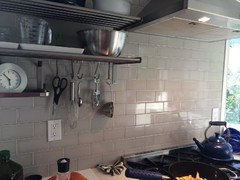
    I ended up using a dark gray grout. For a couple of reasons...I like the low maintenance/non-staining aspect of a darker grout. One thing I love about this tile is that the grout line is so thin. The darker color accentuates it more. And I think darker grout is more historically accurate, although that was least important. The kitchen is pretty plan so I wanted the tile to stand out. I took the pics today while
    making dinner. I love the way it looks!
  • 11 years ago
    I meant to say the kitchen is a little plain not plan! :)

    One other thing about these ceramic tiles is that they have a thin white border on the edge and the darker grout really makes it stand out. I like contrast in design so it works for me. If you like more even tones a lighter grout color might suit better.
  • PRO
    11 years ago

    You went for a darker grout, that's great. It's doesn't show dirt and stains that easily and it highlights the brick tile pattern.

  • PRO
    10 years ago

    Looks beautiful!

  • 9 years ago

    Lee Lacey, where did you order this tile from? I'm trying to get a sample and the one place I've seen where I can order does not do a sample size. It's risky to order without seeing it. sigh.. thanks!


  • 9 years ago
    I got the tile from Art Tile in Seattle. I'm not sure if they mail samples but it's worth a shot. They're a family owned store and great to work with. Here's their website:
    https://www.arttileco.net/
  • 9 years ago

    I am putting the same tile in my kitchen - would you mind sharing the specific grout color you used? This is beautiful!

  • 9 years ago

    Also, do you recall the grout width?? Thank you!

  • 9 years ago

    Did you use spacers when putting up the tiles! If so, what size? I am putting in white glass subway tiles and somewhere I read to use 1/8 spacers due to how glass reacts to changing temperatures. Wondering if this is true?

  • 8 years ago

    Yes, what size grout line did you use? 1/8?