Software
Houzz Logo Print
restonite

hallway decor

12 years ago
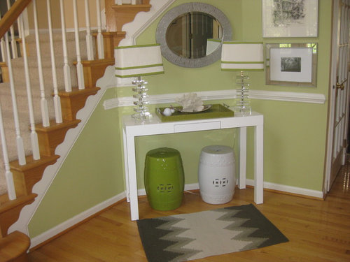
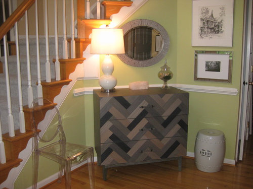
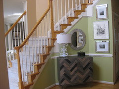
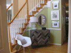
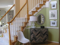
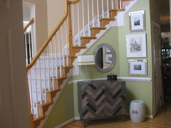
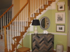
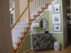
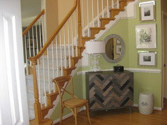
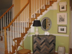
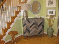
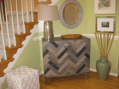
which look do you prefer?

Comments (74)

  • 12 years ago
    and the ultimate question is..."How do YOU like it?" LOL! You have worked hard, and it's fun to do it with houzzer help!
    konthip loatman thanked Design2 girl
  • 12 years ago
    It looks much better with less going on.
    konthip loatman thanked hayleydaniels
  • 12 years ago
    last modified: 12 years ago
    I just had to smile as I watched each new pic appear. You are the best to try every suggestion and look how it paid off. I think you now have the perfect foyer!
    konthip loatman thanked abbyjean
  • 12 years ago
    I love the last posted picture too! Glad to see the ghost chair go away ... looked kinda lost to me. I ADORE the little chest... where it from??? Have to admit... I love the green and did enjoy the #1 vignette you posted... but think your latest choice looks best. Got anywhere else to use one of the lamps and table from first posting? Very cute! Lamps from where? Good eye - good shopping!
    konthip loatman thanked AllAmericanAmy
  • 12 years ago
    Yes! I like the last photo very much. One little thing... :) I'd lower the mirror about one inch. It seems a bit too close to the stair trim. IF, you can still see yourself nicely lowered.
    konthip loatman thanked Darzy
  • 12 years ago
    last modified: 12 years ago
    Good suggestion to lower the mirror even one inch to move it from the trim......and one inch might mean the nail hole does not show and will easily be hidden and no one will know!!!
    konthip loatman thanked abbyjean
  • PRO
    12 years ago
    last modified: 12 years ago
    2 with the print not the mirror...:)
    konthip loatman thanked Mint Design
  • 12 years ago
    Two prints only. Agree.
    konthip loatman thanked Darzy
  • 12 years ago
    I like both but would put the dresser in the first picture from the 2nd picture :)!
    konthip loatman thanked Kimberly McCray-Moss
  • 12 years ago
    Tweat the 3 pictures just slightly by centering them with each other instead of flush right.
    konthip loatman thanked leelee
  • 12 years ago
    In my opinion, of the two choices posted -- picture 2 adds more interest as well as being functional. The accent items pictured blend well but I think you may need more color, and therefore you will add contrast... a book with a red binding perhaps? The pictures (2 )framed in black frames? Perhaps paint under the chair rail two shades darker than the top? Or spray paint mirror a deeper shade of gray/black?
    Although the garden stool is a "keeper" I don't think that you need it in this space.
    konthip loatman thanked mcr1288
  • 11 years ago
    I think the white lamp is too large for the space. Could you try just one of the crystal lamps with the green and white shade instead?
    konthip loatman thanked Nancy Walton
  • 11 years ago
    I agree with lowering the mirror and I think move just a bit to the right. What is the small white object on the right side of the chest? I'm with Nancy, show us the original lamp with the green stripe shade on the chest, just for fun.
    konthip loatman thanked Design2 girl
  • PRO
    11 years ago
    just got back from vacay but will try all the suggestions soon and post pix. thanks all. this is amazing and can't wait to put them into action!
  • PRO
    11 years ago
    allamericanamy -- the chest is from west elm on sale! i was able to use the desk in a spare bedroom upstairs. the previous lamps are from target and i just put some green ribbon trim on them. used to be in my bedroom before i redecorated it. will try one of them rather than the white lamp i have now to see what it would look like.
  • PRO
    11 years ago
    rhonda will definitely try the original lamp and post a pix. the small white object is a geode that has three tea lights inside.
  • PRO
    11 years ago
    lee lee - will also move the pix around and post a pix soon.
  • 11 years ago
    ooohhhh .... sales AND repurposing! Way to go! :)
    konthip loatman thanked AllAmericanAmy
  • 11 years ago
    last modified: 11 years ago
    Love the chest. I would suggest removing the garden stool and replacing the small white container on the chest with a black accessory about the same size.
    konthip loatman thanked grobby
  • 11 years ago
    You've got great taste, restonite! :D
    konthip loatman thanked greenyogini
  • 11 years ago
    I like the chest with the white lamp and the picture above instead of the mirror. The lamp shade looks a tad large to me. Maybe if you replaced it with an angled shade? I like the idea of a chair but not the one you have and not the stool. All in all, a nice look though! Pretty and functional too! Good job!
    konthip loatman thanked territheresa
  • PRO
    11 years ago
    territheresa - how about this lamp instead and sans stool and a choice of two chairs. also took one without stools or chairs. also added black accessories as someone suggested.
  • PRO
    11 years ago
    darcy i lowered the mirror and tried the green lamp nancy. i like the pix instead of pix too but the mirror is functional. should i lower it and move it over more? i could move the chest over a bit so the lamp is not as close to the mirror. what about the black box vs the white geode tea light holder?
  • PRO
    11 years ago
    whoops forgot the pix
  • PRO
    11 years ago
    rhonda - thanks for your comments. this hall has been such a problem and i don't know how many times i changed it. not sure what i like at this point until i get more comments on the latest postings. my photog is lousy but as an fyi the chest does not look as dark as the pix depending on lighting.
  • 11 years ago
    All of them look nice but I prefer the porcelain white lamp. I just think the lamp would look better with an angled shade to mimic the angle on the wood on the stairway and the slants on the dresser. I still like the picture above the dresser too. Do you have a small scale chair made of wood or ratan or a small upholstered ottoman? Use all your ideas as they are all good. Just swap them out when the mood strikes.
    konthip loatman thanked territheresa
  • PRO
    11 years ago
    by angled shade do you mean ones that are not so wide at the top and larger at the bottom -- bell shade vs drum? i will try one chair that in wood and an upolstered ottoman that might work and take a pix for you.
  • PRO
    11 years ago
    here we go again more pix!
  • 11 years ago
    I like the black lamp, replace mirror with large middle pic. keep little black box and remove chair and white stool. You seem to have too many things going on there, I would keep it simple.
    konthip loatman thanked Angel 18432
  • 11 years ago
    Personally I think that the green paint is throwing everything off. It just looks like it belongs in a shabby chic cottage, not behind a modern chest. I'd pick out one of the colors in the chest (like a gray or taupe) and repaint the wall.
    konthip loatman thanked crashkitchen
  • 11 years ago
    too many there is just too much stuff, less is more, the zig zag chest is just too visually busy for my taste. too many pictures, plus the mirror , it is visual overload. Why is that chair there? will anyone sit there or is it for show, I would get rid of it.
    konthip loatman thanked 2dogssashatess
  • PRO
    11 years ago
    crashkitchen, you can't tell but the living/dining room which is right off to the left is grey with touches of green and the rest of the rooms are a taupish color. i thought the green accent wall would brighten up the space and carry the touches of green from the living/dining room. i agree that grey might be better but i would have to paint the living room/dining room and that would have to be costly and meant for another time.
  • PRO
    11 years ago
    2dogssashaless - i agree the chair should go even though people do sit there to put their shoes on. will definitely rethink the pictures particularly when i repaint. the rest of the foyer has pictures from my travels that is why they are there. perhaps i could remove some of them. the chest holds winter accessories as my hallway closet is small. it's new and can't be returned but i could perhaps put it in one of the spare bedrooms but not sure what to replace it with. do you have any suggestions?
  • 11 years ago
    I really liked the original photo with the green stool and lamps. ;) (We're all giving you some good exercise, making you keep moving things around all the time!)

    Truly, though, while I *love* that grey chest, I've never felt it matched the feel of the space the way the stools and white console table did. It has a heavier feel and the colors don't seem quite right with the green (although that could be lighting/camera/monitor issues). I liked your two original photos best, along with the first couple of small changes you made with the grey chest.

    Why not go back to the basics and live with it for a while? You're the only one that really needs to love it. :) You've been a great sport taking all the suggestions and running with them, but I think now there are too many cooks in the kitchen, and combining all the ideas and opinions is making it less *you*.
    konthip loatman thanked greenyogini
  • PRO
    11 years ago
    greenyogini - i am indeed conflicted. as you suggested will live with the chest for a while. i did like the freshness of the white table but really needed some storage. hindsight, perhaps should have just bought a plain ikea chest in white.
  • 11 years ago
    Love the chest, the mirror and the two prints in the heavier frames on the side wall but suggest a large floor vase with some branches instead of the garden stool. Also a plainer shaped lamp something like a similar height beanpot base in a darker color and a medium sized bowl with a rough texture instead of the little box.
  • 11 years ago
    You could add a bench to sit on if you need a place to put on/off shoes.
  • PRO
    11 years ago
    ashtonchic - not sure what a bean pot shape lamp is but here's one that is darker at bottom. also incorporated floor vase (bamboo is too tall so will have to cut it or get something else), stool (white and natural) and choice of textured accessories instead of the black box.
  • 11 years ago
    I think silver lamp and white stool are perfect. What do you think? The silver ties the frames and mirror in so it looks more cohesive. The vase could maybe be a little taller in my opinion. Wooden tray is a great place to drop keys and mail. What a lovely entry! I'd like to see the rest of your house. You have some great pieces.
    konthip loatman thanked ashtonchic
  • PRO
    11 years ago
    i agree the silver lamp base ties in with the mirror. i will see if i have a taller vase but do you think the bamboo looks ok and shouldn't be shorter so it won't interere with the bottom of the picture frame. what about a taller vase but no bamboo. but then again it would look pretty much like the white garden stool???
  • 11 years ago
    What if you switch the vase and stool? Or you could remove the center print and just have the two with the heavier frames hung a little higher. (They looked really great in earlier photo). Then bamboo would be perfect height. Another alternative would be Curly willow style branches - they would look good as a contrast with the zigzag on the chest in taller dark vase - Maybe gray if that is the dark color in the chest. Would also be great contrast with the green walls.
    konthip loatman thanked ashtonchic
  • 11 years ago
    LOL! And she's *still going*!!!

    Restonite, I can't believe you are still bringing new items into the mix! ;) In fact, I think that's part of what's making it difficult for you - it seems you haven't lived with any of the options long enough to decide what you like and don't like about it for yourself.

    Don't despair - the chest *will* work. :) What you may need to do is take a step back, though. Take down everything but the chest, decide which pieces *must* go in that space - functionally, or because you love them there. (Hopefully there will only be 1-3 pieces that you feel *must* stay there.) Then play with those few pieces before adding things back in.

    For what it's worth, I liked the grey chest with the larger white image above it, as you started toward the beginning of the thread. I also felt that your initial instinct to position the mirror horizontally worked better than it does vertically. But that's just my opinion; we all have slightly different aesthetic preferences.

    You seem to want storage, seating, and your travel images. Is a lamp necessary there? Do you want/need a mirror?

    If the chest is staying (and it sounds like it is), I would suggest using some of the white accessories (white lamp, white ceramic stool) to keep the space brighter. The black lamp shade picks up on the darker tones of the chest and makes the space feel heavier, in my opinion. I also like the white chair/stool options because the wooden one blends in with the railing behind it, and while I love the ghost chair (and it allows more of the green wall to show through), it doesn't seem to work with the more rustic/industrial feel of the chest.

    (Also, I have to wonder where you're getting all the different lamps, chairs, etc. It's like you have a never-ending supply of gorgeous items from which to add to the space with every suggested change! LOL! :D You have some gorgeous pieces!)
  • 11 years ago
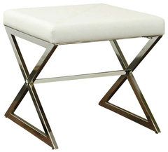
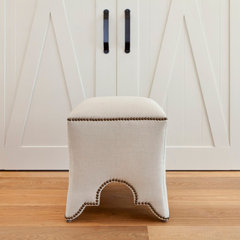
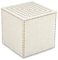
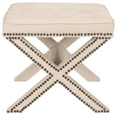
    What about something like this instead of the chair/stool (if you're still looking)?

    Coaster Faux Leather Ottoman With Metal Base, White · More Info

    Marrakech Stool · More Info

    Adora Square Ottoman in Patton White · More Info

    Safavieh Palmer X-bench Nailhead Beige Ottoman · More Info
    konthip loatman thanked greenyogini
  • PRO
    11 years ago
    love all of your stool selections green yogini. and yes i should probably live with one version for a while. i move things around a lot in my house. maybe that's my problem i like change!
  • 11 years ago
    I’m with Julia Mack Design, LLC. Too cluttered!
    konthip loatman thanked karelina
  • PRO
    11 years ago
    karelina - what would you take away? did any of the other versions seem less cluttered to you? would love your advice. do have an example of a good hallway design on one wall?
  • 11 years ago
    I’d really give Julie Mack’s suggestion (about 5th from the top above). Give it a try. Cleaner, uncluttered, and elegant in its simplicity.
    konthip loatman thanked karelina
  • 11 years ago
    Not so sure about the see through chair
    konthip loatman thanked camdenbenoit
  • 11 years ago
    You could use the white garden stool as a chair pulled out a bit from the table so you can sit on it without having to pull it out and the green as a side chair. It’s a small busy space. On the other hand, the see through chair would not add to the cluttered look. It’s not really my favorite chair, but it does have that advantage. Try both out for a couple of days: with the chair and with the stools. See which looks and works better in the space. Good luck!
    konthip loatman thanked karelina
  • 10 years ago
    Second but put lights in the first one