Software
Houzz Logo Print
amyfamyf

Exterior color?

12 years ago
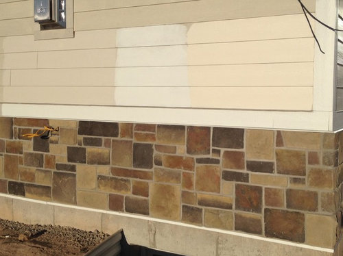
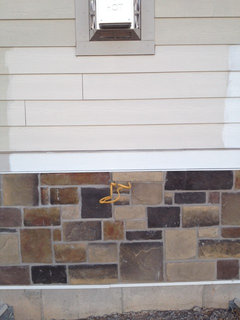
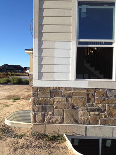
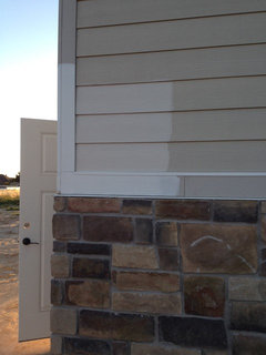
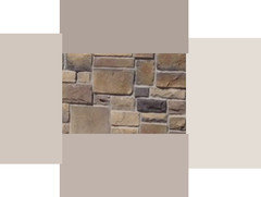
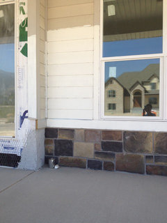
We have painted on three colors on our exterior. Please help us know if we are in the right direction and which color works best. To make things easier lets call the color on the left #1 the color in the middle #2 and the color on the right #3. The trim is in James Hardie Arctic White. Thank you! Any suggestions or comments will be very helpful!

Comments (45)

  • 12 years ago
    I like #1 best.
  • 12 years ago
    #1 works best with the stone and trim.
    amyfamyf thanked grobby
  • PRO
    12 years ago
    Definately 1. And def not 3. Way to apricots. I'd also try a shade or two darker than 1 to make the white trim pop a bit more
  • PRO
    12 years ago
    last modified: 12 years ago
    I thought you decided white on white?

    I'd vote for the color on the unpainted Hardie in the picture.

    Here are some other suggestions for lighter colors (I like the one on the far right), and some darker. Might use one of the darker colors as an accent.
    amyfamyf thanked PPF.
  • 12 years ago
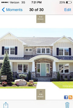
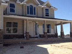
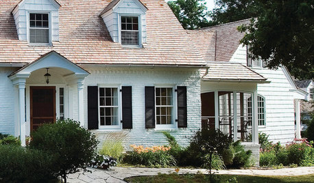
    Yes, the white trim would be the Arctic white paint we would use on all the trim. Here is a picture of the front of our house not painted yet and here is also an inspirational picture of the type of color scheme we are going for. The inspirational picture uses Arctic White and Cobblestone both James Hardie colors. Our Hardi board is already the cobblestone color but the inspirational picture looked lighter so #1 is actually cobblestone lightened 50%. Are we getting close? Do you think #1 will look like our inspiration photo and is this working with our house and stone?
  • 12 years ago
    #2 is the white on white but we were afraid we would loose all the cool trim detail so that's why we are trying some slightly off whites so that we can still get the trim accented. We liked the inspiration photo for that reason, it was still light but with the trim showing and it had a metal roof similar to ours.
  • 12 years ago
    Number one fits best with your stone and with your inspiration pic.
  • PRO
    12 years ago
    Your stone is very different from the stone on your inspiration house. Those colors work well with that stone and roof. Your stone is full of reds, browns, yellows and tans.
  • 12 years ago
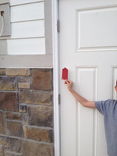
    Ppf, I'm so glad you posted a red color to go with the stone. This might be a crazy idea but we were actually playing with the idea of painting the double doors in the back with a pop of red. Is that crazy?
  • 12 years ago
    HI -- Number 1 is the best out of the three but do you see the darkest color in the stone ??..... that is the color I think would work.
  • 12 years ago
    #3
  • 12 years ago
    But #1 looks too much like the orig colour just saying
  • 12 years ago
    I think Ppf's color choices work much better than your samples. The only one I remotely like with the stone is #2. #3 would work if it was a couple of shades more yellow as in Ppf's second from the left color sample against your rock work.

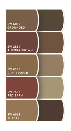
    If you go with a red door, I would go with a very brown red to tie it to the rock work. You don't want your door to look like a fire engine.
  • 12 years ago
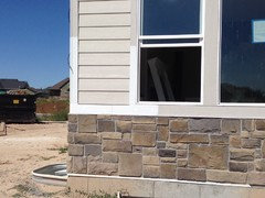
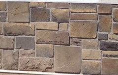
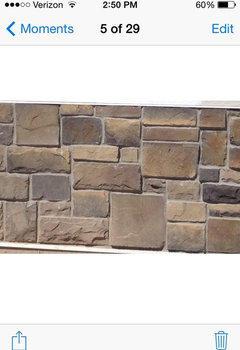
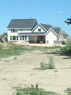
    These comments have been so helpful!! My husband and I are having a serious discussion with all the helpful remarks. We do have reds and browns in the stone, however we took the picture at sunset and I think it really accentuated those tones. Here are a few other pictures.
  • PRO
    12 years ago
    Not red like that sample.

    I'll repeat what I have suggested before. Buy/borrow several fan decks, sit down next to the stone and work through them noting colors that seem to work. Don't limit yourself, if you see any color that looks good, make a note. These "extra" colors are good for accents. And don't try to match some idea house -- your house is unique.

    Now go through your chosen colors picking possible paint colors. Take these around to several spots on the house. Sun/shade will make a big difference on how the colors appear on the house.

    If you find a color that is to dark, cut it back 50 or 75%. Buy samples and try them several places on the house.

    You will find the perfect color, I'm sure.

    I'll also suggest you consider adding just a bit of color to the white trim.
  • PRO
    12 years ago
    Using one of the above pictures -- much less red.
  • 12 years ago
    We've tried to do the fan deck thing and of course browns look good but we really don't want a brown or tannish house. I wish we had known then when we picked the stone what we know now. Maybe it was a bad pick on our part. We also don't want something too dark and loose the metal roof and dark shingles in a dark color house. We are just trying to pull together something light and fresh. So is the cobblestone color even a possibility? Back to the white on white ( that's the #2) would that be totally boring having the whole house white? We are leaning towards the #1 color. Is this a big mistake or would it work? I don't want to rush into a discussion but the painters are available this week if we can finalize a decision.
  • 12 years ago
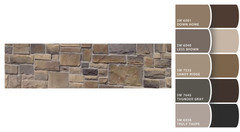
    That truly toupe looks nice. Thank you for the new color matches. Maybe we need to keep trying samples.
  • PRO
    12 years ago
    Truly Taupe does look good, and it works well with the black of your roof.

    Instead of trying to lighten a color, consider having it toned. A Tone is created by adding both White and Black.
  • PRO
    12 years ago
    Don't fight the house -- it's telling you what color it wants to be :)
  • 12 years ago
    What are those three colors on the picture you just sent. They do look really nice. Is the color on the right support to be the trim color or a Hardi option? I really like it. Could you please tell me what those colors are?
  • PRO
    12 years ago
    SW 6038 Truly Taupe on top, SW 6035 Gauzy White on right, SW 6037 Temperate Taupe on bottom, and SW 6036 Angora on the left.
  • 12 years ago
    number 1 from the original 3.
  • PRO
    12 years ago
    The light color could be the trim, but I'd want to see it on the house.
  • PRO
    12 years ago
    I am commenting on the colors at the top of this blog, not the others depicted just above my response. Perhaps you've already decided against them. Of course, the computer monitor is not the best way to choose a color, but assuming that the color is pretty true to the colors you have shown, I would choose #3. It is warm and offsets the stone nicely. If you were to name the brand and color number (or name), I would be able to offer a more sophisticated opinion. Don't use #2, it's too light and can be reserved for trim. #1 is safe, though rather uninteresting in my opinion. Then, again, I may like the use of unusual color more than most.
    amyfamyf thanked Cicely Hall Design
  • 12 years ago
    #1 is hardi cobblestone at 50 % lighter. The original new hardi is cobblestone too. #2 is Arctic White the same color as our trim (nothing is decided yet however, it is a brand new unpainted home) and #3 is BM ballet white.
  • 12 years ago
    I don't like any of them. Take a med color from stone and try that . Others are boring beige .
  • 12 years ago
    It's very hard for us to see true color on a computer.
  • 12 years ago
    Try an olive green. It would go nicely with the earthy colors in the stone.
  • PRO
    12 years ago
    last modified: 12 years ago
    Top is SW 6378 Crisp Linen, bottom is SW 7104 Cotton White.

    These colors are what I had in mind for your house. Maybe not these exact colors because I don't have the stone to match, but something similar. The lighter color is not too white, and the darker is just a bit darker. Enough to show up on the house, but not have too much contrast. And my samples look better than what is on my monitor.

    These colors would also work well with a red for accent.
  • 12 years ago
    Awesome!! That's much closer to what we were hoping to pull off with this home. I'm going to go pick up the chip cards of these samples. Thank you! I'll take a picture soon.
  • 12 years ago
    From looking at the picture--#1.
  • 12 years ago
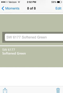
    I've also been told greens go with earthy tones! Can someone help me with light shades of green that might go with this stone? Just as an alternative to the other colors we are currently trying?
  • 12 years ago
    Something like this?
  • PRO
    12 years ago
    Wondered when you would get back to green.

    Greens will need to be darker.

    SW 7746, SW 7743, SW 7738, SW 7731, SW 7732, SW 7727, SW 2815
  • PRO
    12 years ago
    The original color looks best. Why fight a good thing? And it would be SOOOO easy!
  • 12 years ago
    The original color is just the unpainted hardi board they use on all the houses they built. It's just kind of a coincidence that it kinda goes with our stone. It's meant to be painted after it's installed.
  • PRO
    12 years ago
    #1 matches best with the stone and gives you the contrast on the trim you're looking for. I love the pop of the red door!!
  • 12 years ago
    #1 best for sure. It pairs well with the stone colors. #2 is okay if you're looking for a contrast with the stone, #3 is a definite no in my opinion - too pink which doesn't pair well with the stone or trim. I like the softened green above as well that amyfamyf posted.
  • PRO
    12 years ago
    You are getting a lot of opinions. Are you confused enough yet? I will offer a couple of other suggestions, in case you aren't sold on those colors yet. There is a color I have used a few times to good result, Benjamin Moore HC-27 (aka monterey white). If you want a red door, I recommend BM 1300, 1301, or 1309. All great reds, with varying degrees of brown in them. The red being held up in the picture seems a bit candy apple to me. The ones I have mentioned will give you the pop you seem to be looking for without feeling like you're entering Santa's workshop. Good luck!
  • 12 years ago
    I had a friend come help me who has done several parade of homes and model homes and she is raving about this white on our house. It's BM moonlight white and we are going for a southern farmhouse charm. I'm nervous but admit I do love white homes. I love how the white brightens up the front of the home which is always in the shade. We also have some awesome gooseneck farmhouse lighting for the front door and above the garage doors. What do you think? Could someone put in a red door on the back of my home with their computer to help me visualize what it might look like? Thanks everyone.
  • 12 years ago
    Why would you revert to white when you want white trim? You would then have to reverse and put some color on the trim, My favorite house color is cream with white trim and a periwinkle blue door. But that is neither here nor there.

    I am dubious of all the colors posted.

    Take a sample of the dominant stone in your set which seems to be a greyish square and a high quality picture, not a file you posted online, to Sherman Williams. Find the paint chip that is closest to that dominant grey stone (I am guessing from poor pictures, but it looks like it is repeated often. Also take a high quality picture of the front and back of the house and have them put the pictures into their computers. Hold that grey chip against candidates. You might want a light house with darker trim. Every stone home is a mixture of unique stone colors.
  • PRO
    12 years ago
    There are so many variables of white. Monterrey White has a tinge of the color you will find in your stone. I recommend you check it out for kicks. As for the red door, it will look excellent, I assure you, but you've got to get the right red. Don't go for fire engine or candy apple red, rather a warm Tuscan, Spanish or Moroccan (all pretty similar in tone).
  • PRO
    12 years ago
    The white looks good in the shade of the porch. Be sure to paint a sunny wall as well.
Sponsored
Wannemacher Interiors
Average rating: 5 out of 5 stars26 Reviews
Customized Award-Winning Interior Design Solutions in Franklin Cnty OH