Software
Houzz Logo Print
natashamckenzieinteriors

Something Missing

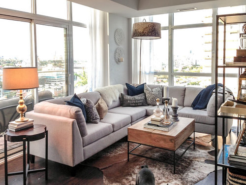
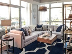
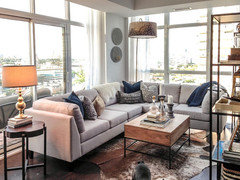
Looking for ideas! I feel as though something is missing in my living room space, (although I haven't painted yet, which I think will help when I get to it next month) but I need something to pop. Colour is not something I love (what I do love is serene monochromatic schemes) so adding any overly saturated tones is not an option for me. Maybe it is the navy cushions not working (too much contrast?) Can't quite put my finger on what is lacking/missing for me. Suggestions welcome!

Comments (94)

  • 12 years ago
    last modified: 12 years ago
    curious what state you're in? what's out that window!
  • 12 years ago
    Curtains for sure will add dimension, in greys and navy maybe? Less on coffee table too!
    Otherwise I like !
  • 12 years ago
    I love the idea of getting some green plants. In my opinion that#s the only thing missing. I love the overhanging lamp! I would agree that the coffee table looks a little cluttered.

    I quite like the looks of the walls. I think it makes it look simple and sophisticated. I wouldn't plaint it if it were mine.
  • PRO
    12 years ago
    Yes, I had not styled the coffee table yet when I snapped the pic, but I just have a couple of large books and my gold buddah on it now.
  • PRO
    12 years ago
    @everdebz - I'm in Toronto, Ontario :) I'm lucky to have a really fabulous view both day and night with the sparkle of all the city lights and the lake off the other side.
  • 12 years ago
    The table with the lamp makes way too many legs in a small area and spoils your clean look. Try a small wooden stained or black painted chest. Give you more storage and a bit more grounded look. Love the bare windows and the sofa. Agree with others re the coffee table decorations.
    I have not seen many rooms with arc lamps, so my eye is not used the lampshades in the room at different heights. Looks like a very cozy space.
  • PRO
    12 years ago
    Wow everything here looks very nice.
    Natasha McKenzie Interiors & Styling thanked Billiard Factory
  • 12 years ago
    The more I look at it the more I like the use of the books to stand the lamp on as well. :)
  • PRO
    12 years ago
    last modified: 12 years ago
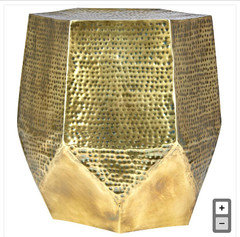
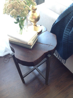
    What are everyone's thoughts on a more solid side table like this? (and I would loose that lamp obviously)
  • 12 years ago
    last modified: 12 years ago
    I am all about serene monochromatic too. I would follow the Coco Chanel idea of removing something. Less is more. Your textures are great and the arrangement of furniture is fabulous but I actually think you have too much going on here. Remember this is a small space. I would:

    - Remove the objects from your coffee table.
    - Get neutral throw pillows and blanket - maybe even the same color as the sofa.
    - Get neutral colored curtains that are not as sheer. I dig the Belgian linen mentioned above.
    - I would remove the lovely rug - use it elsewhere in your home. And get a large area rug that is square, neutral and all of the front legs of your sofa fit underneath it. It will anchor the space more and make it all feel less crowded.
    - I would not get the gold table you just posted. Too much look. I like that it has heft but the gold is too distracting for me.
  • 12 years ago
    Love your space and agree that less is more for a monochromatic design style. A pop of color is all you need! Designer sheers (not your mother's sheers anymore!) are the way to go to soften windows even if they are only dummy panels (like I used in this room so as not to obstruct the view). Good suggestions for staging coffee table as well as end table and lamp. Beautiful job!
  • 12 years ago
    last modified: 12 years ago
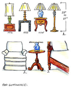
    Scattered through several posts, is what is "off" here: the spindly antique style table and lamp ( they are from another century,) the round sconces in the corner ( no impact) and the rug (making things seem busy.) Reference some RH rooms to nail your space. Additional drapes would help, since the sheers have no presence. Here's a chart to help with correctly sizing a new table and lamp.
  • PRO
    12 years ago
    I'm realizing that what you can't see in the photo is that the side table is actually a rustic wood tree stump/slab with black iron legs (not antique) (I see though how the angle of the pic is making it look that way) I agree lamp is not right. Time to start the hunt for the right fit! :D
  • PRO
    12 years ago
    If you love a serene look, the rug is too much movement and color. I love it, but I don't think it works with what you are trying to accomplish. Try a textured rug, shag perhaps, in subtle colors.
  • 12 years ago
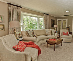
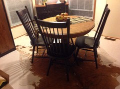
    Much as I love the cowhide, I think a rug like this would work better.
  • 12 years ago
    Well I do actually like., The cowhide! I have one and it's well liked ! Are you sorry you asked now Natasha! Lol
  • 12 years ago
    a couple of things I have to comment on is that I think you need a taller, different lamp so you can do away with the books under it. Also I think you have too many pillows on your couch. I would like to see one at the left end and two in the curve with a throw matching...such as red or the new lime green. A low plant (pathos, ivy, etc) and a chunky candlestick/candle on your coffee table will be enough. Your room is lovely and I like the windows/curtains and your sectional.
  • 12 years ago
    last modified: 12 years ago
    Try paint on the walls in a darker color to frame the view and set off the couch. Try some white pillows with the navy - the contrast will pop and may give you what you are looking for.
  • 12 years ago
    last modified: 12 years ago
    [that was a fun aha for cowhide lovers]..... and grover's blue is great!! and gives much more to grey sofa --then an elegant sheer shade to companion with your sheers --- even in Canada don't you have glare?! but I'm guessing you don't use tv/computer there.
  • 12 years ago
    Is it possible to get more views of the space.As is, it's difficult to give a reasonable suggestion for improvement.
  • 12 years ago
    Add a 3ft border of navy fabric with hem tape to your drapes. That will pop! Gray walls.
  • 12 years ago
    Love that idea, doing that on white drapes in Florida soon!
  • PRO
    12 years ago
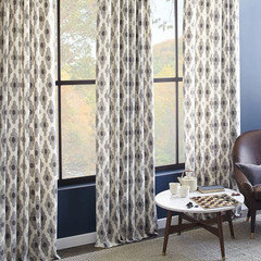
    Thoughts on these drapes? Too much? or nice hit of pattern?
  • 12 years ago
    I really like them for your space. Can you post any additional photos of the space from other angles?
  • PRO
    12 years ago
    I agree with the comment above: don't think you really need to add more pattern or color. I would switch out the side table and lamp as suggested but for something perhaps akin to the coffee table. Really nice, cozy looking space!!
  • 12 years ago
    Add some plants navy on curtain or may be wall colour
  • 12 years ago
    The only thing I would change is the round sconces on the wall. In a natural wood, brass or deep grey that would pull your eye toward the window.
  • 12 years ago
    last modified: 12 years ago
    Natasha, I read your initial post: something needs to pop and you like monochromatic.
    You wonder if there's too much contrast?of navy pillows with what the couch?

    Since you live there, please explain more, or post photos of what your place in basics looks like, But with pop and wow and shazam....... ? it would help.

    I haven't lived in a high-rise, but I've heard that you can leave the indoors more plain so as to not draw too much attention from the view outdoors. Do you think that way?
  • PRO
    12 years ago
    @everdebz - In reading my original post again as well, I realized shouldn't have used the words monochromatic and serene. What I should have said was subdued and casual (I'm not a fan of vibrant colours) but I like some eclecticism which I usually achieve with textures and/or patterns.
  • PRO
    12 years ago
    Ill take some more pics, later today
  • 12 years ago
    last modified: 12 years ago
    ok, that's good and funny how one day we see our rooms in a different light, as though we're seeing it twice as accurately....it can be hard to analyze this stuff, really...I'm taking many words, partly to say that it's good we get back to actual words, cause we can't be there! :) plus beauty is most certainly in the eye of the beholder.
  • PRO
    11 years ago
    Window treatments...that is what is missing!
  • PRO
    11 years ago
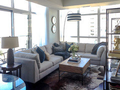
    I've change a couple of things. Got rid of the gold lamp (really started not liking it) Can't decide on the black and white striped shade. Thoughts?
  • 11 years ago
    last modified: 11 years ago
    It does do the job of directing the eye. The brain sees black and white hard geometric images first. I think I would prefer to direct the eye to the wall in back then give it an item with a hard color and some reflectivity on the table to center on.
  • 11 years ago
    Nice lamp!
  • PRO
    11 years ago
    last modified: 11 years ago
    It looks very hygienic now but nice, I like the eclectic vibe and warmth the previous shade on the floor lamp.
  • 11 years ago
    Don't love the gold lamp and I would either use a warmer color for the pillows and throw, or I would change the cowhide rug to something with some navy in it.
  • 11 years ago
    I prefer the gold and the gold side table lamp. Looked a little more high end to me, but that's just my opinion.
  • PRO
    11 years ago
    Susan Wahlman, thank you for your comment, the photo with the gold lamp is actually the old photo though. The new one is bottom of the thread just above your comment.
  • 11 years ago
    I love your room, then and now. :)
  • 11 years ago
    How about a white fuzzy yak or alpaca throw instead of the blue? And the two round objects on the wall are not strong enough to draw the eye past the blue pillows on the V of the sectional. Something long linear and bold will draw the eye to the far corner... Maybe a ficus benjamina in a fine tall pot...some living thing that can take your particular exposure...or a modern painting of a tree which does not require watering nor will it potentially damage your floor....
  • PRO
    11 years ago
    Thanks moccasinlanding. Yes I plan to facade that back wall/column in brick or wood and install potlights (which will direct some downlight onto the texture and art there)
  • 11 years ago
    I spray paint lots of items, black......adds some contrast to a room. Maybe the plates on wall? I have a new found love for black lately!!!! Lol
  • 11 years ago
    Love the idea of a wood wall too!
  • PRO
    11 years ago
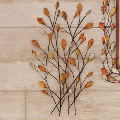
    To bring the wood to life and 'pop' maybe if possible you could try hanging some decorative branches keeping colours fairly neutral and just incorperating a few bits of metalic detail. I'd also consider just simple hanging navy drapes to go in the room providing a little colour but not over powering the balance of the look. Look forward to seeing the finished project, good luck :)
  • PRO
    10 years ago
    I would take off the navy blue pillows and add pillows, perhaps a bit larger, in a reddish brown or rust color to bring up the same tone from the rugs beneath the sofa.
  • 10 years ago

    Are you adding drapes or solar shades or remote shades?

  • PRO
    10 years ago

    I love what you have done so far and frequently use neutral and serene color palettes. I like the pop of blue in the pillows. I would switch out the darker more gold lamp for something in the grayish tones. I think drapery panels would add some warm but keep the fabric simple with texture. Good luck.

  • 10 years ago

    This is old are we done?

  • 10 years ago
    You can layer the cowhide rug over some light coloured large area rug, it will highlight the entire seating space and make it look a little less busy
    You can also add some window treatments preferably of a linens/cottons for a more cozy feel