Software
Houzz Logo Print
dolphinbaby

Help my wall!

11 years ago
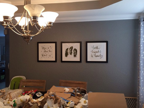
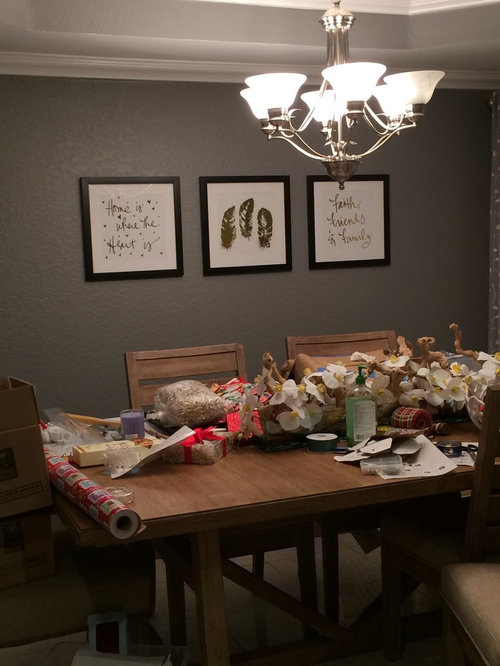
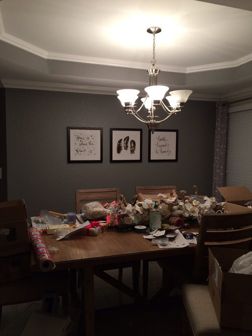
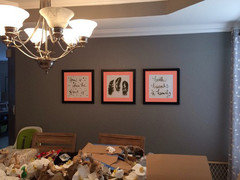
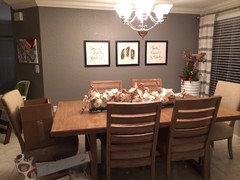
I was given these framed images by my grandfather who is sick for Xmas. They mean a lot to me and I want them in my dining room because it's where we always hang out and eat. However, they're obviously not enough for the wall. Any ideas??? Aside from sconces, which I want to avoid, I am drawing a blank! (Ignore the mess!!)

Comments (93)

  • 11 years ago
    I think this is fine considering there is obviously a child in the household. Did anyone see the highchair? If the kid is anything like my kids when they were toddlers lower is dangerous. It is also difficult to consider the space when you are using the table as a work area. Clean it up. Replace the lightbulb. That may help. I hate over decorating when there are children in a household. Simple is better. Take color cues from them until they are older...ie use a base palate that can accommodate bright energetic colors. Which you have done! Thanks for the opportunity to comment!
  • 11 years ago
    They should be hung a bit lower, but then you have to patch and repaint and hang them all over again...I think they look just fine and maybe with your dining room table centerpiece (instead of your gift wrapping project!), it will all look perfect together. I'm think if they go lower and everyone is seated at the table for a meal...those people on the opposite side of the table wouldn't be able to see the artwork because they have been hung lower and bodies are blocking the view! Good luck on what you decide on!
  • 11 years ago
    I hang art in galleries for a living. It's eye level when you are standing not sitting. That would look silly otherwise. You might choose a narrow credenza against the wall just to anchor the wall space. You can have a table scape on the credenza of some sort, flowers vases etc...
  • 11 years ago
    Way back in the dark ages, I seem to recall that art should be eye level of the mistress of the household. That always made sense to me. Except for mirrors. At 5'2", mirrors in homes where the owner is 5'8" cause me to stand on my tippy toes. :)
  • 11 years ago
    Art should be at eye level when standing. If you lower it, it will be hidden by the person sitting in the chair! The artwork is beautiful and clean. I would not add chains and bows and shelves. Try bringing the frames slightly closer. For colour, you could add a very small red frame inside the black one.
    The room looks sad. You could also paint that wall a bright colour (red?) , if you think that's too bold, get a bright tablecloth. I would repaint the bulhead and ceiling a lighter shade all the same colour, no white.

    A rectangle contemporary light fixture would be a good investment.
  • 11 years ago
    Lower by 4"-6" and you're done.
  • 11 years ago
    I would paint a contrasting or complimentary color rectangle inside a lovely wood molding. The artwork would pop.
  • 11 years ago
    I think a lot depends on the dining set. Right now it just sinks into the dark wall. Whitewashed chairs would be great, but maybe too much work (?) Will the table have anything placed on it like a runner or centerpiece? That might solve the balance issue. If not I think the larger frames with mats would be the answer.
  • 11 years ago
    Wow!!! Lots and lots of advice! But i really think your only issue is cemitry ... make sure the artwork is an average eye level ... space them at least 6 to 8 inches apart and raise the center piece of art an equal distance upward. Remember... less is more :)
  • 11 years ago
    They are beautiful just how they are. More might take away from the simplicity and beauty of the art and the message. If you need more, you can frame them about 5" bigger all around, then mat them with a triple mat with the center one being a color that is used in the dining room - or red or yellow. I like the black and white but if you feel you need color, that would be one way to do it. Thin black frame, wide white mat, thin red mat, then another white or black thin one. I don't have an example to show so I hope I've explained it clearly enough. If you then hang them with the hooks at the level they are now, they will be a little lower, but first, make sure you can see them when you are seated across from someone at the dining table. Hope this helps and I really like that you treasure these.
  • 11 years ago
    Love your room-wall color, dining set, etc! A couple ideas for you-

    1) add wainscot below. It would be a good amount of work, but would really dress up the dining room and go nicely with the ceiling

    2)or add wood trim to the wall around the frames to emphasize them

    Or 3) get a big, long mirror, hang it horizontally, and mount the 3 pictures on top of it to emphasize them.
  • 11 years ago
    Paint a larger square or rectangle in a shade 25% lighter or darker than your wall color. It acts like a larger frame for the three smaller prints. Find the right size with newsprint first...then tape and paint!
  • 11 years ago
    The pics and frames are great. I had a dilemma where I had only one wall to showcase my art collection due to the living room being all windows. the designer suggested picture wall shelves to add depth. She said you hang the biggest pieces on the ends for balance (staggered) and then add a 2 foot shelf and 2 three foot shelves. You can layer the art on the shelves and the shelves creates the depth. I've bought the shelves but haven't hung the art yet. but she was so right.

    I agree with other posters that an investment in a rectangular modern light fixture would really liven up the space. It would go with your elegant ceilings. The fixture could have a bit of glam to it and it would fit right in. I'm a huge fan of picture shelves and layering. Good luck!
  • 11 years ago
    I'd be good at placement also, if I do the splits, it would make me 5'5 so just contact me, I could go into business with Maureen
  • 11 years ago
    There is a simple solution to address height issues and spatial concerns. Reframe art in rectangular black frames with complementary (a couple shades lighter) grey matting. Hang vertically. Changing chandelier to black and perhaps adding pewter shades would complete the look for an elegant presentation.
  • PRO
    11 years ago
    Lots of advice here... I suggest just lowering the two outside prints. It will seem to take up more wall space.
  • PRO
    11 years ago
    Here's what I meant.
  • PRO
    11 years ago
    I suggest reframing the prints using oversize mats, perhaps in a natural linen, but keep the mats neutral. Try a frame with a simple profile in a soft silver or pewter finish rather than black. A narrow but substantial shelf in black would complete the arrangement - no other accessories needed!
  • 11 years ago
    It looks like you've gotten quite a few helpful ideas. What color paint is that on the wall? I love it!
  • 11 years ago
    last modified: 11 years ago
    You have contemporary wall art and the frames are too simple - faux drama...think about white or light, light grey frames with lots of detail / carving - perhaps 4-5 inches the more detail the more energy it will bring to the subtle pictures don't be afraid to find a cool frame and spray paint it.. You do have nice crown moldings - it would tie - I like the idea of a plant in the corner...part of the wall composition. AND color
  • 11 years ago
    I think they look fine.
    if you want, maybe paint a large rectangle ''frame'' on the wall behind them in some fun color. leave it or frame it out.
  • 11 years ago
    change the frames shape and size. Also you can space them farther apart and at different hights. Frames for mirrors tend to work well.
  • 11 years ago
    I disagree with ef1700. Less is More. And for anyone's information, my eye level is5', so it looks to me they are just right. Jagged hanging heights went out with Harvest Gold and Avocado Green, LOL!
  • 11 years ago
    Have you considered using museum lighting above each picture? That might be a simple fix that would really highlight the pictures and give them a truly special feeling.
  • 11 years ago
    They look great as they are. Clean and modern. Don't let anyone tell you otherwise. You don't need plants, new frames , shelves or lights.
  • 11 years ago
    @bichonbabe... I happen to agree with you but Wednesday dolphinbabe expressed a desire for a way to make them look more important and many suggestions have been offered. I'm hoping the OP will weigh in soon so that posters can continue to help or know that the job has been completed. :D
  • 11 years ago
    I agree that the art looks nice and clean as is. You could lower them a bit if it does not require extra patching work to the wall. Don't clutter the wall with excess framing or shelves, not needed.
  • 11 years ago
    Hi, I love the grey color of your wall and I would love to paint my house with the grey color and the skirting with the white color. Is it possible to give me the name of the colors you have used and what brand it was please.
  • 11 years ago
    Wow!!! Tons of AMAZING advice!!! I lowered them, changed the curtains and brought a vase in from my family room as a "temp" to see how I liked the idea. I MAY space them out a bit more as some have suggested. Thanks!! I love Houzz because of members like you!!!
  • 11 years ago
    The wall is behr paint in anonymous
  • 11 years ago
    I love the advice from
    blenheimnewzealand!!
  • 11 years ago
    So very nice right now! Happy Holidays and enjoy that art!!!
  • 11 years ago
    Jarrett Interiors: that doesn't really make sense, unless you are decorating for visitors (first impressions) rather than the people who live there. I'd say they should be lower for people seated at the dining table, especially as the ceiling is not very high.
  • 11 years ago
    last modified: 11 years ago
    I think that larger frames and black mats would be what i would use
  • 11 years ago
    they look pretty good...maybe get some more photo frames that are identical to what you already have there and put some coloured, patterned paper in them...and mix them all around with the ones you already have....that can look gorgeous and add a bit of colour that will help you 2 remember the happy things about ur grandfather.
  • 11 years ago
    Don't space them any further apart! Right now, they represent as a whole--with more space between them, they will just be separate pieces of art. You want them to be a cohesive whole.
  • 11 years ago
    Along with adding the hanging Black & White ribbon for hanging, I think it would be really cool to put Bow Ties where your nail or hanger would be. In that way, people will gravitate towards the pictures.

    Another Idea would be to add a couple square beveled mirrors in between the pictures (between first one and second) Have them just slightly smaller than your pictures so as to not overwhelm them. I would also separate each picture a couple inches. They need to be spread out just a little.

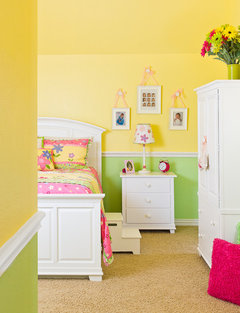
    Another idea: you can also put a nice light over them. Examples below & though one is a kids room, I am sure you have the idea here......

    Portfolio · More Info

    Dexter Space · More Info
  • PRO
    11 years ago
    You might want to lower them just a bit. Art work is hung at eye level, which is 62-66 inches. Such a special gift . . .enjoy. BTW, have them framed with archival glass to protect and preserve them.
  • 11 years ago
    as i said - i would add a couple of plain photo frames, but i would definatly not lower them or spread them apart any more.
    trust this helps you.
  • 11 years ago
    You could paint a rectangle behind them in an accent color...frames within a frame.
  • 11 years ago
    They are perfect just the way they are! The paint colour is excellent! The light is excellent! Room done , just fix the table clutter and move on to the next room! lore at job!!!!
  • 11 years ago
    " great job" was my last line!!! LOL
  • PRO
    11 years ago
    I'm a professional picture framer, and I can help you to dramatically improve the way how your art is presented in the room. You may contact me at your convenience at boris@strivingartists.com. Also, please take a look at samples of framing on my website www.strivingartists.com.
  • 11 years ago
    you could mat them and put in bigger frame. I would put a narrow mantel style shelf there , lean the pictures against the wall, and with a longer shelf you could put candlesticks between the pictures.
  • 11 years ago
    I too think your wall looks fine as is; however, perhaps a faux deer head (of white resin) on either side of the middle frame will give that something extra.
  • 11 years ago
    I think those deer heads are tacky, sorry.
  • PRO
    11 years ago
    JN Design LLC gave the best important advice to preserve and protect your Grandfather's artwork and that is with archival glass! Must use ?spacers? for the paper to not touch the glass. Depending upon the environment and climate you might find the artwork stuck to the glass.
  • 11 years ago
    Oh wow, Nance! Your cutting down of my suggestion is tacky. Try providing a suggestion to Dolphinbaby (the original poster) that doesn't slight anyone else's. Thanks.
  • 11 years ago
    Just my opinion, not a criticism if the poster, just as it your right to state your opinion.
  • 11 years ago
    HAPPY CHRISTMAS TO EVERYONE AT HOUZZ
Sponsored
Landscape Management Group
Average rating: 4.9 out of 5 stars33 Reviews
High Quality Landscaping Services in Columbus