

Need help with exterior paint
14 years ago
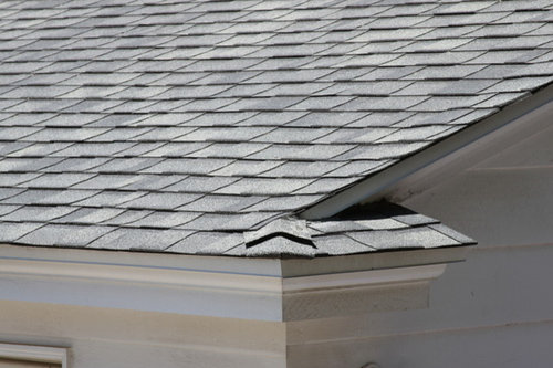
Would like to try something other than white for the body of the house.Will probably leave the trim white and change the shutters and door to something different. Roof is a blend of a green and a charcoal with a hint of blue. Leaning towards a muted green or ????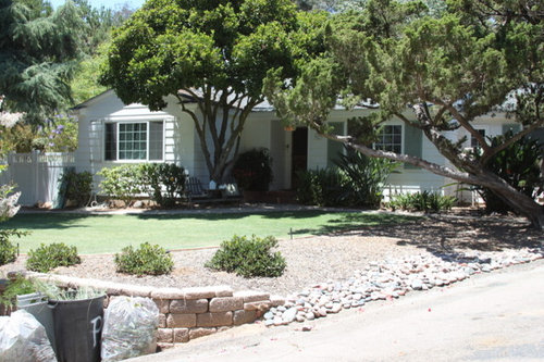
Featured Answer
Sort by:Oldest
Comments (68)

bellabell
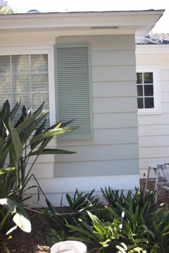
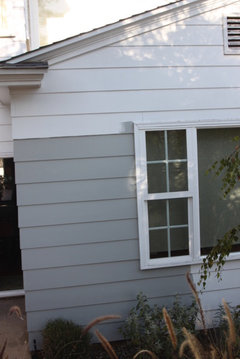
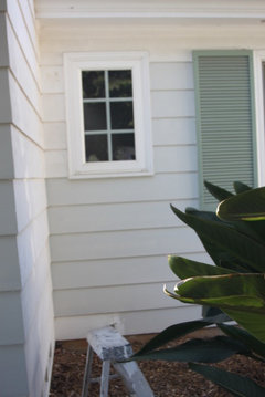
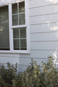
Original Author14 years agoTried on a few colors today: 1. Frazee's Cape Cod Gray which looked a little purple in certain light. 2. Frazee's version of BM Moonshine which is very pretty and light, but not much of a change and it was hard to see the contrast between the gray and white. 3. Frazee's version of BM Gray Horse which looks greenish/gray. Of course everyone had different opinions on which was the best. I was wondering if the Gray Horse would put me back to where I started as it has lots of green in it.Related Professionals
Wilmington Interior Designers & Decorators · Oxford Interior Designers & Decorators · Manchester Interior Designers & Decorators · Madison Interior Designers & Decorators · Superior Interior Designers & Decorators · Ottawa Interior Designers & Decorators · Palm Bay Architects & Building Designers · Annapolis Architects & Building Designers · Corpus Christi Architects & Building Designers · Sierra Vista Architects & Building Designers · Fresno Architects & Building Designers · Logan Architects & Building Designers · Dallas Kitchen & Bathroom Designers · Brainerd Kitchen & Bathroom Designers · Longview Kitchen & Bathroom Designers PRO14 years agoDoing samples is absolutely critical for the exterior. So I'm glad you did it. What you should be looking at is the character of the color. That is in addition to how it works on your home, the mood/style it creates, contrast and shadow. For example, noticing that cape cod gray has a little purple in certain light. Once your have narrowed your choices to two, put them on different parts of the house. And at this point do larger samples to get a better feel for how the color works. I say this because light colors, such as moonshine, have more impact when the whole house is done. So don't discard moonshine just yet. Also, if you like the character of moonshine, you can increase the formula. So doing moonshine at 150% strength means in the gallon, they put tinting for a gallon plus half the tinting of a gallon. It keeps the color (hue) the same but makes it darker (deeper value) from the added tinting.
You will keep your eves and fascia boards white, so that gives extra definition to your house and contrast.
I wasn't clear on what you mean by "I was wondering if the Gray Horse would put me back where I started as it has lots of green in it." Could you expand on that? 14 years agoLighting really changes up colors at times, We have 2 grey houses on our street One is Light grey with white trim Looks really nice but when it rains it looks greenish grey which is not bad The darker grey when it rains looks Lavender almost has purplish cast to it. Not real attractive when Wet. Beige's can take on a pink hue to it as well .Certain Tans take on greenish cast as well . Glad your taking the time and testing out color. Painting a house is a big expense and very big deal, I did several boards when we did our house a few months ago and took the board down at different times of the day to see how light changed it. Don't settle till you get it right.
Finally I got the right formula by doing what Chroma said by changing % Best of luck in finding whats pleasing to your eyes and surroundingsbellabell
Original Author14 years agoFeeny had mentioned a color similar to Moonshine called Gray Horse. I think it was next to Moonshine on a fanbook that I saw. It has much more of a green tint to the gray. We are actually leaning towards the Gray Horse or even one step up. Dunn Edwards had a color called Pebble Walk that was similar to the Gray Horse and a color called Stone Creek that was one step up. Both were grays with green undertones. Looked at the Chestertown Buff also. Back of the house actually looked good in it, but front looked dated. Possibly due to the fact that the house is not dressed out on the corners of the siding ( I think that's what it is called.) Moonshine is a really pretty color, just not sure if it is dramatic enough.bellabell
Original Author14 years agoWill have to look into increasing the strength of moonshine. Would that not just be similar to the next color in the fan book?- PRO14 years agolast modified: 14 years agoExcellent question!!! No, colors on the same page of a fan deck can be quite different. Some assume that it is essentially the same color on a light to dark gradient. Often there are changes in formula and it's not just proportions of tint. Although changes in the proportions of tint can greatly alter the hue. It can be the addition of a new tint, subtraction of another or a change in the type of tint used in a family. For example, there are 3 hues of tinting for yellow (generally speaking and some paint companies have more.) In laymens terms gold, butter yellow and orange yellow.
- PRO14 years agoGray horse is significantly deeper than moonshine. And since you also liked Chesterton buff, I would have to say moonshine, even beefed up, may be too light for you. A lighter color was my idea, but clearly not your preference. Gray horse is a terrific color and I think would suit your home well. I'm sorry I have no experience with Dunn Edwards. I looked at their website. But looking at paint samples on a monitor has limitations.
bellabell
Original Author14 years agoI understand the issue with the monitor. My painter is here doing prep work and he still leans towards the Moonshine. Have a few more days to decide. I know I should go with what I like, but I also would like something current. I am seeing lots of darker shades going on houses in this area recently. I don't necessarily want to look like every other house, but I don't want to be odd man out either. Trying to make sure I am on the upside not the downside of current trends while staying true to what I like. Problem is I like so many different shades. 14 years agoI would try a taupe/grey on the house with the white trim and frames with the shutters to go a charcoal with a tone of blue or green in it. Even the front edge of the window sills can be painted the same colour. If you are painting the fascia boards up by your gutters tie it in with the charcoal too. Make sure you use a UV paint if you do go for slightly darker shades so they are more resilient to the suns harsh rays. My sisters house is similar to the colours I mentioned but she went a little wrong by making the house colour too fawn rather than grey/taupe.
- 14 years agolove Taupe I think that would be a good choice . Looks great with landscaping as well NICE COLOR
bellabell
Original Author14 years agoHave not had time to post pictures today, but was wondering if I do go with the moonshine or Cape Cod Gray would charcoal shutters with white trim work. I was thinking of possibly adding a pop of color such as aqua or some bright green.- PRO14 years agoIf you do get a chance, i would appreciate it. Curiosity is killing me. But don't inconvience yourself. Oh yes, charcoal shutters would be good with either. Charcoal is so compatible.
I really like the idea of a pop of aqua or bright green. More the aqua, but that's just me. You were thinking of the doors, yes? Check out 2061-30 Bermuda blue. Bold, bright and daring without being obnoxious. bellabell
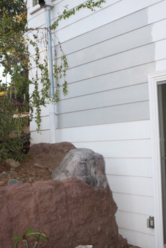
Original Author14 years agolast modified: 14 years agoFrazee's Cape Cod Gray which is similar to the BM AC-25 to AC 30 range. Probably closest to BM AC 26 Ozark Shadows. Not the exact color of Cape Cod due to the restrictions on the base color of the sample size in exterior grade paint. Maybe slightly different in gallon size.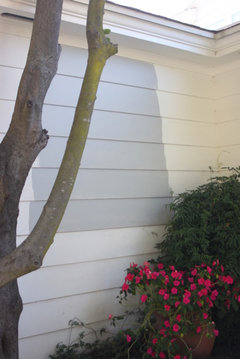
bellabell
Original Author14 years agoDunn Edward Pigeon Gray similar to SW Basket Beige on a color visualizer. I don't think the visualizers are very accurate.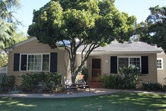
bellabell
Original Author14 years agoDunn Edwards Stone Creek on a color visualizer. Similar to SW 6165 Connected Gray. Put a sample of that on the house. It was horrible.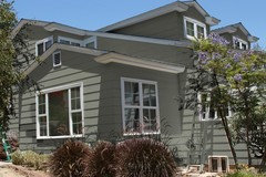
bellabell
Original Author14 years agoNarrowed down to wanting gray. Just concerned about having four colors. I thought, and I may be wrong, that I was suppose to keep it to two or three colors. I would have gray on the body, white trim, charcoal shutters, and a pop of aqua, blue, or whatever on the door.- PRO14 years agolast modified: 14 years agoFirst off, your placement is correct. Gray body, white trim, charcoal shutter, color door; all excellent and what I would recommend.
Now the colors. For me, it iis down to moonshine, so pretty and light. Or frazee's cape cod gray. Your telling me it was closest to AC-26 ozark shadows was very helpful. If that is the case it's a perfect color for your home.
The BM gray horse looked nice in the first pic and then sad and dark in the second pic. tough to say if I will still consider that in the running.
The other colors are out because you want a specific kind of gray.
Two great choices, in the end you'll have to go with your gut.
I think you'd be most happy with cape cod gray.
Good luck. Keep me posted, I'd love to see photos when you're done! bellabell
Original Author14 years agoThanks everyone for all the wonderful comments and help. I will post pictures when the painter is done. It is a one man show so he probably won't be finished until the second week of July due to the holiday. I will post pictures as soon as he wraps up.- 14 years agoHey Bella best of luck to you and you seem to have it all together now. One man show I painted a tri level myself and took me a week . So hopefully he is alot faster than I was Its going to look great. Cant wait to see what will look like a new house when your done
bellabell
Original Author14 years agoThanks Diann. Our house needs lots of prep work which as you probably know is the most time consuming. Should go much faster once he gets to the actual painting. You were very brave to take on such a project yourself. I hate working on ladders so a diy paint job really wasn't realistic, although the idea of saving $$ was really tempting. I saw a picture you had called "Colorful Cottage" that I thought was really pretty and happy. Hope to get that same vibe.bellabell
Original Author14 years agoChroma, sorry to keep picking your brain, but feel you have been leading me in the right direction with color choice. My painter is taking the week off, so I have another week to make my final decision on color. Although the two colors Cape Cod Grey and Moonshine are different I like them both. I still like and have reservations about each for different reasons. Saw this picture and really like it, but not sure if it is right for my house. Do you think this is too green? What do you think would be a close match in a SW color?. If I go with the Moonshine you originally stated white trim. Did that mean white shutters. I know you previously stated that charcoal would work too. Which would be better if I go that route? Front Entry · More Info
- PRO14 years agolast modified: 14 years agoHi Bella, I'm always glad to help. I'm curious as to what your reservations are for each color? I assume your reservation for moonshine is that it is light. Is the sample you put up at regular formula or beefed up? Elaborate more on cape cod gray, please. When I said white trim, I was referring to just the window and door casings, eves, and fascia boards. Whatever body color you choose it would be with charcoal shutters. Charcoal is such a universal color and all the body colors we have looked at are very suitable for it.
I thought from the beginning that your roof has too much green to select a pale green body color. Which is why I never suggested one. Tieing in that closely to the roof, you would lose the cottage charm and I fear it would look 50s style farmhouse. - PRO14 years agoA close match to that photo in a s.williams color would be sw7541 Grecian ivory just in case you want to scratch that itch!
bellabell
Original Author14 years agoSW 7541 Grecian ivory looks like what I thought taupe looked like. Not quite what I thought that house looked like on my laptop. As for the question of regular or beefed up sample I assume you mean did I get the 150% sample. If that is the case, then no I have not tried that as of yet. Yes ,I am afraid of the moonshine being a little light I think in the sun. Cape cod gray in certain light takes on a more blueish/purple characteristic. But remember I can't get the true color in the sample size. Will probably go and try to get the moonshine beefed up. Thanks for the warning on the 50's style farmhouse style, I definitely don't want to head in that direction.- PRO14 years agoYes, beefed up meant 150% strength. The house on my monitor looked like a soft natural green. I have found that looking on a paint company's website for their colors is often considerably off. Not sure of you saw the chip in person or looked at it on monitor. 7541 is a soft natural green.
Taupe is a brownish gray. A broad term, taupe can be influenced by mauve, gray-purples, rose, and yellow which makes some really funky hues.
At any rate, the two finalists are in the right gray scale. It doesnt surprise me that you see a blueish purple in the cape cod gray since you said it is the closest to BenMoore AC 26 ozark shadows. I felt that if it was only in certain light and not the main characteristic of the color, it would be good for your home. Reevaluate the two after getting the 150% moonshine.
Have a great 4th of July!!!  14 years agoWe had grey at one of are other houses with Burgundy shutters and door really popped and white around windows
bellabell
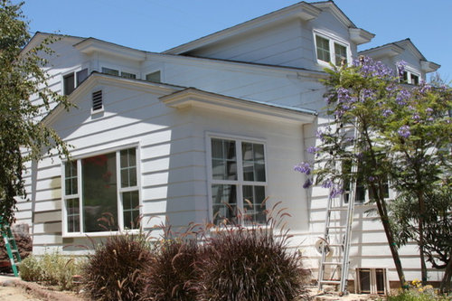
Original Author14 years agolast modified: 14 years agoChroma, Feeny, DiannI got a sample of the BM Moonshine at 150% looks very close to Gray Horse. If I go with the regular moonshine what Sherwin Williams white for the trim would you recommend? Also what charcoal?- PRO14 years agoEventhough you think moonshine at 150% looks like gray horse, the quality of the hues must be slightly different. Which one appeals to you more? If you do regular moonshine I suggest doing, regular right out of the can white. This will give you that added contrast needed for a light color to make it pop. Given the features of your home (dormers, molded fascia, generous eves, lots of angles) I would still recommend plain white to enhance those charming details.
For charcoal shutter, I suggest sw7046 anonymous with gray horse. And the comparatively lighter, slate like sw7642 pavestone with moonshine.  14 years agoI'm glad you responded with a recommendation, Chroma. I was holding off because I've only used moonshine and gray horse inside, and our interior trim is all off whites (which look great with those blue-green grays with indoor lighting), so I wasn't at all confident about making a recommendation for the exterior.
I'm actually going to check out that SW anonymous you are recommending for my own shutters, as we are switching to a charcoal (though the context is totally different, so it may not work. But it looks beautiful).
Best of luck to you with the paint job bellabell!bellabell
Original Author14 years agoForgot to answer about the color. Well, I do like the gray horse, but it has much more green in it as does the 150% Moonshine. I think the 150% moonshine has even more green in it than the Gray Horse which brings me back to the possibility of looking like a 50's farmhouse.The moonshine is growing on me and the painter. One reason, is it appears to hide the imperfections in the old siding a bit more than the gray horse and does change color depending on the lighting. Decisions, decisions. It is going to be very hot here this week, so we may have the painter wait until it cools off a bit. Great a little more time to stall this all out.- PRO14 years agoThanks for the feedback. As long as the green quality is a character of the gray and not the predominant note of the color then I don't see a problem. My concern was a pale green with no gray influence like in the photo you asked about last week.
Is Cape cod gray out of the running? bellabell
Original Author14 years agoI am not confident of what it looks like. Even though it is a Frazee color they were unable to give the actual color is a sample size. I went to SW and they gave me a sample. They don't look anything alike, so I am not sure which one is actually closer. It is really odd that when I take the fanbook and put it up against each version, I think each one matches until I look at the other one. Kinda crazy. My husband looked at it too, and he was under the same impression. Not sure if I see more gray or more green in the gray horse and 150% moonshine.- PRO14 years agoThat is crazy. I understand your hesitation using it then. Since you have time, look at the samples at different times of day in different light. Tape a square of white paper and black paper next to each other in the center of each sample to help judge the colors. Let me know what you think of the charcoal recommendations.
- 14 years agobella I feel for you . When I said before I had 20 sample cans of paint I did when it came to the trim I have 3 colors on our house the body color I lucked out with actually asked the owner of one house I SAW and loved it so I had them darken the paint 50%and it was so much better loved it more than the house that I asked for their fomula. I had that sw fan book and it made me nuts with buying paint and then putting it on only to see that the light changes paint through out the day. I wanted one where it looked basically the same all day long. I had this one paint that was to be used for trim it was exact paint as the people I asked about their formula yet because our house face the morning sun it looked nothing like their s it ended up looking flesh tone I could not believe it. light is tricky / So went down several shade on the strip had them mix it up and it was perfect never changes even in the morning sun. Talk about frustrated..
The house I told you I painted years ago in taupe. It was a new color out that year I had never seen it before. I was on the other side of town and a man was painting his house I got out of my car and said I love your house .He was such a gentleman when I ASKED what the name of it was. He actually went in his garage and got me a card with his name on it I took it to the store he bought it at and gave then the guys card I was so lucky they looked up his name and I was one happy woman . I couldn't wait to begin.. Bella if you go back to your sherwin W , store you can ask to have one of their color specialist come to your house. My friend up the street did that She was so nice she came and helped him with the outside as well as the entire inside
Not sure if they will do that in your store but if your really confused it might be worth asking bellabell
Original Author14 years agoDiann, thanks for the idea of the color specialist. I was out of town for a few days, so I didn't get a chance to contact them. I might give a quick call in the morning. I am pretty sure I am going with the light gray on the body, charcoal shutters, and white trim, however you never know until the paint has been purchased. I did something similar to what you did last year when we first started thinking that we would be painting the house. I saw a house that I loved and asked the owner what the color was. She didn't know, but she invited me to bring over a fanbook and try to match it. After thinking about it, and being the fickle person I am, I decided that it was a bit too dark for my house and roof. Her house was also a ranch style, however she had stucco instead of siding. I wasn't sure if it would give the same feel. I am glad to hear that after all your indecision that you were happy with the color you finally picked. There is hope.bellabell
Original Author14 years agoChroma, I still like the Moonshine, but will try the white/black color block suggestion tomorrow. As for the charcoal, I do like it. It is a bit lighter than I was originally thinking, however I was originally going a bit darker on the body also. I think it might work. Showed it to the painter today and he liked it. Do you know what the color BM Bermuda Blue is close to in a SW color? Thanks.- PRO14 years agoOk, just spent the last 90 minutes getting this all together. While pavestone is more mid tone than accent, it is comparatively dark to Moonshine. Quick aside: When I suggested anonymous to go with gray horse it was to keep a certain difference in value, therefore contrast.
So as we go lighter on the body, I wanted lighter on the shutters to maintain the same balance of difference between the two. It is in the same logic that I want to use out of the can white for trim to maximize the contrast to the light body, a very dark shutter can wash out a lighter body color. I get that you already understand this, I felt like recapping.
I also liked the taupey/ charcoal of pavestone as it related to moonshine. So I went on the hunt for a darker shutter that would still give the desired balance of value to moonshine. Nothing quite hit the mark in the charcoal tones. But I did find a darker shutter in the slate gray greens. The value difference is stronger, which I think you're looking for, yet by altering the hue I don't think it will wash out the body. And the bonus is I think overall the new shutter color goes better with Bermuda blue. While not an aqua, you didn't say you disliked it, so I'm comfortable going forward with it. I matched BM Bermuda blue with a SW color and tweaked it some so that all three are simpatico.
Body: moonshine
Shutter: SW 7622 hamburg gray
Doors: SW 6509 georgian bay
Going back to the moonshine pairing with pavestone, the taupey/ charcoal quality, which I still like, it was a little too disparate to Bermuda blue or it's match. So if you want to keep that pairing underconsideration, I changed the blue door choice to SW 7613 aqua-sphere. Bonus on that is it delivers the aqua you first asked for.
These somewhat funky door colors stretch my usual palette preference so I hope I'm on target :) bellabell
Original Author14 years agoChroma, thank you so much for all the time you have spent helping me figure this all out. When I mentioned it was that the Paverstone was lighter than expected, it didn't mean at all that I didn't like it. It has really grown on me. The Homburg Gray is also very nice. I don't mean to go off on another tangent, but do you think a more traditional color such as red would be a better choice with either of these two colors? I get the impression that you are not a big fan of the door colors. Am I reading you correctly?bellabell
Original Author14 years agoChroma, I also was wondering do you think I should just go with a more natural color door?- PRO14 years agoI like that you want to do bright and unexpected on the door. Its not the typical request I get. I do so many traditional colonial schemes so the door color ends up being a handsome, super-coordinated choice, but safe. Unique or atypical door colors don't come to me as naturally. I was just stressing out. I'm "all in" on this project so I really want to deliver.
Good, I'm glad you like pavestone for the shutters and I'm truly pleased with the new door color to go with it. Together, they're my handsdown favorite.
I wanted to offer you another choice. It was actually a good exercise for me to rethink your project and come up with another shutter option and a door color to go with it. It was a nice challenge. bellabell
Original Author14 years agoChroma, on may way to get the paint, except for the door. That will be last. I am going to look at it for a day or two and then make the final decision on it. I think it will really help seeing the other colors on the house before I commit to the door. You have been such a wonderful help. Thanks for all your patience and advise. Your great! Will keep you posted.bellabell
Original Author14 years agoHi, the project is coming along very slowly. The body and eaves have been painted. There are some runs so the painter will be sanding those out and touching up soon. Our painter has a family member with a chronic serious illness, so everything came to a standstill last week with an abrupt leaving of the project to tend to her. I am trying to be understanding, as I have been in his shoes before. Meanwhile, I have a complete mess around here and would love to tie it all up. It really get stressful having everything a muck. Putting that all aside, I really am enjoying the color. It has just the right amount of a soft green undertone in certain light to make it interesting. It has somewhat of a beachy look to it. I am not sure if the front will still have that feel when the shutters get painted. I like that as I look around I don't see anyone else with this type of color, although it doesn't at all stand out like being odd. Just what I was looking for. As for the door, it has been primed and I have yet to make that final decision. I have not ruled out the Aqua sphere, but am thinking it still may be a bit light. It probably won't matter too much, as I still have a screen door up. I kind of need to keep it for now. I have been all over the board on the color for the door. I guess if I pick a color and end up not being thrilled it can be repainted easily enough. Ah, maybe? Now that the house paint is just about finished, I can't wait to get the driveway re-asphalted, some new plants in front. I love the birds of paradise, just not where they are at. Have always wanted to move them, but since they were established, I have left them alone. We also would love to put some sort of a deck/patio in front to make the entry a bit more inviting. We were thinking of extending the raised area out and making the steps into larger landings/pads headed towards the driveway. Probably will make it uncovered, due to the door being somewhat in a corner and the roof line. We also need to pick a railing for the deck in the back of the house. Ordered a new sectional for the family room, and I am sure I have opened up a whole new can of worms in that room. So many projects, so little time and money. Will keep you posted. Thanks!- PRO14 years agoI'm so glad you are happy with the body color!
I certainly understand the stress a homeowner can experience with a large project. How nice of you to be understanding with the family situation of your painter. I'm not one to deal well with a mess either, hopefully this will be over soon.
As for the door color, Aqua-Sphere has a medium value. So that means it is somewhat dark; it's the amount of pure blue that gives it a brightness that may lead you to believe it is lighter than it truly is. I felt those characteristics, (medium value, higher chroma) were right for your door since it is setback and would draw the eye more. Repainting the door would be easy if you don't like it, but I think it hits the pop of color you wished for.
The front should maintain the beachy feel with the pavestone color on the shutters. It is not too dominant and it was chosen for its lower contrast to the body color. I was very particular about having the right balance between the two.
I'd be happy to make suggestions on extending the raised area at the front door and the larger landings. When you're ready to dive into that, please take more and closer pictures of the space so I can understand it better. And start a new discussion for that, just let me know when you do.
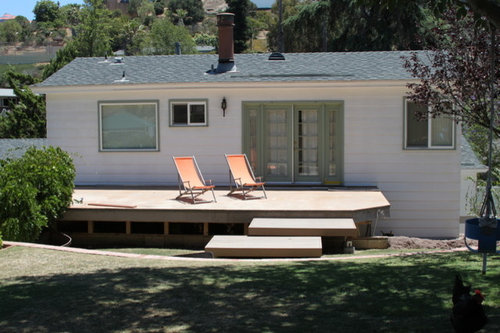
You'll have a clearer sense of what to do with the deck railing when the painting is completed. Post a new pic of the back so I can give an opinion.
I can't wait to see the final result of the painting!!!
Related Stories

EXTERIORSHelp! What Color Should I Paint My House Exterior?
Real homeowners get real help in choosing paint palettes. Bonus: 3 tips for everyone on picking exterior colors
Full Story
ENTRYWAYSHelp! What Color Should I Paint My Front Door?
We come to the rescue of three Houzzers, offering color palette options for the front door, trim and siding
Full Story
COLORPick-a-Paint Help: How to Quit Procrastinating on Color Choice
If you're up to your ears in paint chips but no further to pinning down a hue, our new 3-part series is for you
Full Story
COLORPick-a-Paint Help: 11 Ways to Mine Your World for Colors
Color, color everywhere. Discover the paint palettes that are there for the taking in nature, shops and anywhere else you roam
Full Story
COLORColor Palette Extravaganza: Room-by-Room Help for Your Paint Picks
Take the guesswork out of choosing paint colors with these conveniently collected links to well-considered interior palettes
Full Story
COLORPaint-Picking Help and Secrets From a Color Expert
Advice for wall and trim colors, what to always do before committing and the one paint feature you should completely ignore
Full Story
EXTERIORSSawtooth Roofs Help Homes Look Sharp
By John Hill
Creating a distinct exterior is just one benefit of the sawtooth roof — it can help bring daylight into interiors as well
Full Story
CURB APPEAL7 Questions to Help You Pick the Right Front-Yard Fence
Get over the hurdle of choosing a fence design by considering your needs, your home’s architecture and more
Full Story
HOUZZ TOURSMy Houzz: Saturated Colors Help a 1920s Fixer-Upper Flourish
By Mad Mod Home
Bright paint and cheerful patterns give this Spanish-style Los Angeles home a thriving new personality
Full Story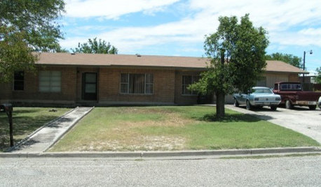
Sponsored

Kuhns Contracting, Inc.
Average rating: 5 out of 5 stars26 Reviews
Central Ohio's Trusted Home Remodeler Specializing in Kitchens & Baths
kara9