Software
Houzz Logo Print
anubhajairam

color consultants

14 years ago
last modified: 14 years ago
i recently decided to hire a color consultant-- i was quite surpised by the rate per hour! what's normal range? We are in S.FL/suburban area, and not near maimi, she has "many years" of experience but no formal color certification, she works for a chain paint store, is not an interiror desinger, and is not 'famous'... she also charges the same per hour rate for travel time-- is this the usual?

Comments (270)

  • PRO
    14 years ago
    Well, we can do that. So now, put your blue paint inside the panels and leave the moldings gray. Mock up and let's see.
  • PRO
    14 years ago
    I like the moldings on the base. Good symmetry and balance.
  • PRO
    14 years ago
    Also, I'd like you to try silver pillars with moldings on panels in silver, with the blue inset.
  • PRO
    14 years ago
    last modified: 14 years ago
    I have something for you. These are 12" high but you can do them with less height. The shape is important and the addition of a silver (or gray) inset might help you think of them as unique rather than too traditional?
    Master Hall · More Info
  • 14 years ago
    last modified: 14 years ago
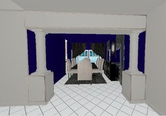
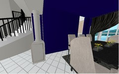
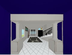
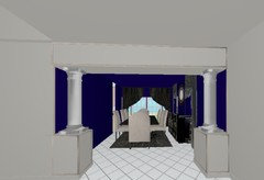
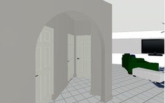
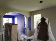
    blue inside DR mid panels, molding gray, rest of panels gray
    L to R: from LR, under archway, from DR

    silver pillars on bottom right pic (dont like it) -- less is more;)
  • PRO
    14 years ago
    Oops, molding will be facing different directions on top panel vs base, which keeps us from having a clean paint line. So all gray everywhere except inside those panels on the walls? I'm good with that if you are. At least you've managed to pull your blue forward, which is what you wanted.
  • PRO
    14 years ago
    If you are good with the detailing at the pillars, do you want to address the bi-fold door?...or have you made a decision on that?
  • 14 years ago
    last modified: 14 years ago
    yes, pillars are fine now, thanks

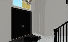
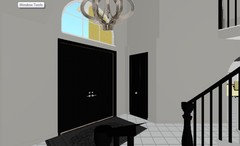
    DOORS: (fyi walls w/b eggshell, trim w/b satin)
    *coat closet: same color as walls, but eggshell or satin?
    *front door: black (which one?! def do not want off black or a shaded black, but SW has 3-4 black-looking blacks!), SEMI GLOSS
    *stair railing: same black and same sheen as doors
    *other doors (down hallways): black OR a lighter version of repose gray OR dec white (color in FamRm)? SATIN
  • 14 years ago
    sorry last pic didnt attach, this is w DEC WHT doors
  • PRO
    14 years ago
    I have a theory about doors and most especially in this instance as you are not doing white baseboard. Unless you have a front door finished in a wood tone or a color (black), you can do all the other doors in your contrasting baseboard. You have no baseboard trim as you have painted them out. If you had the white to reference then a black front door with all other doors in your baseboard trim would have been the correct way to address them. To paint them out in the wall color will actually make them stand out. You don't want to do that. So, the only solution is to make all the doors the same as their proximity one to another requires that treatment. The only black I've ever found that read black without being black, black was Surrey Black by Ralph Lauren. I wanted to use black in a kitchen but found black, black to be harsh. That was very successful. If you have anything black in the foyer area, then I would def do the full-on black. If you don't, then you might want to get a sample of the Ralph Lauren just to see what you think.
  • 14 years ago
    KP i'm a bit preplexed which doors you were referring to here:
    "the only solution is to make all the doors the same as their proximity one to another requires that treatment. "

    ..were you referring to JUST the doors in the hallway (the coat closet door is not near that hallway, see pic)
  • 14 years ago
    last modified: 14 years ago
    the "black" items in the foyer area will be the staircase-- also you can see the black sideboard and mirror in the DR. I looked up surrey by RL, but find it 'off-black' or even dark gray...
  • PRO
    14 years ago
    When I say close proximity, that means down the hallway as well, as you will have the same gray walls. Thought I was looking at bi-fold and 2 more doors in that last pix. As for the Surrey Black reading off, the chip is misleading. When that color stands alone it will read black. You are far enough away from the dining room, so the sideboard won't matter. If you are happy with the full-on black then go for it.
  • PRO
    14 years ago
    So, if the only two doors you can see from the foyer are the bi-fold and the front doors, then you can keep the black there. If the other doors can't been seen from that area, then you could go to a white for the others. It's just that I generally try to keep all the same where ever the same wall color runs. If the door into your family room? opens in and you keep that door open, then it could present a problem for that room with the black door side, unless of course you have something in the room that relates to the black. Best case scenario is total continuity whenever it's possible and practical.
  • 14 years ago
    here's where those doors are located w/r/t the closet door, if this helps?

    im thinking youre saying go with black doors overall, period. I guess if i dont like the coset door blk i can always repaint later to the wall color repose gray. The front door is steel 8 paneled, but the coat closet bi-door and all other doors are fibergalss w/ wood tex (ick), 6 paneled.

    KP, can you help w/ sheens, as i mentioned i'd like satin for the baseboards for durability, but semigloss for the front door+casing. Can the coat closet bifold and all other doors be satin?

    i will pick up sample chips for the RL surrey color, thanks :)
  • PRO
    14 years ago
    last modified: 14 years ago
    If you do the two doors side by side in a different finish they will actually read different shades of black. I feel your pain with the wood tex! You can def do the satin down in the hall area. As for your bi-fold, I would suggest you consider a wood bi-fold with panels. Cost would not be that much and it is a detail that would make a big difference.
  • PRO
    14 years ago
    Gray or white are not options for the bi-fold. Worst case scenario is you keep the bi-fold as is but you will need to try a satin finish next to the semi-gloss. That the doors face different directions will also impact the look, depending on how they individually and collectively reflect light. Since you will already have the satin for the hall doors, you might as well give it a try.
  • 14 years ago
    sounds like a plan! thanks KP. It's really coming together, couldnt have done it w.o you! :)
  • PRO
    14 years ago
    My pleasure. Glad I could help. :)
  • 14 years ago
    last modified: 14 years ago
    hopefully i have no more color related issues to harass and challenge your genius mind with-- i will def post finished pics ;)
  • PRO
    14 years ago
    Pics will be fun. Thanks
  • 14 years ago
    i knew i i forgot something-- what %dilution for the ceiling for the indigo colored DR paint (to get it to look visually SAME as the walls, not lighter)? what about for LR/foyer celings for the repose gray paint (or is it too light to need dilution)? thx!!!
  • PRO
    14 years ago
    last modified: 14 years ago
    Lighting will always impact. Do the full Monty. Normally I would cut by 25% but I'm afraid your blue might get a little wonky on you. If it's darker, it will be fine. For the gray, I wouldn't try to equate the hue of the wall. A little lighter is better and that would be the 25% cut in the formula. Good luck! :)
  • 14 years ago
    last modified: 14 years ago
    ecelctic is good, wonky is NOT-- so FULL color for the DR ceiling.

    How EXACTLY do i ask for this, btw, "25% color or 25% white or...?"-- reason i ask is cus our local SW store workers have some language barriers, and are often confoozed by terms i feel they should know, and i just cant take a risk ;)
  • PRO
    14 years ago
    Tell the technician you are doing a ceiling and that you want to cut back the formula 25%. In other words he will be shooting only 3/4's of the pigment called for in the full formula. You can ask for the formula (if you like) and do the math for them: divide by 4 and multiply by 3 for each pigment color. LOL Sometimes it's more than a language barrier. Sometimes you need to get a manager if you're a real control freak. :) Always good to fully understand the process so you can "help". :)
  • 14 years ago
    perfect, yes i do like to "help" ;) thanks KP!
  • 14 years ago
    last modified: 14 years ago
    i got good n bad news: the DR looks abso-freakin-mazing! i keep goin' in there and just standing there with a grin on my face! I'm going to send pics to housebeautiful/arc digest etc when i have it done up! ((in the pics below, the purple is not really that bright, the LR pic color is more accurate for the DR color)

    the LR soft gray looks fine, the foyer and halls (it's the SAME soft gray) looks dark and almost greenish! ick... :/ i miss my white walls there, they bounced around so much light they made the whole area look huge.... *sigh* maybe i'll grow into it? I'm thinking we're going to have to get white lights for the chandelier and highhats up there, to cool down the gray, i just dont like how the incandecents are making the color look...
  • PRO
    14 years ago
    Thank you all for the enjoyable information from the experts!
  • 14 years ago
    *forever grateful*, will update pics once done ;)
  • PRO
    14 years ago
    Your incandescent lights will always read green on your paint. There is a solution for that. I just finished a project in gray and had at least 4 different types of lighting to contend with. So, when you are ready let's walk through it and address what you have, what it does, and how it can be changed. So glad your dining room turned out well. Let's get the same satisfaction from the remainder. It is a process that takes much tweaking and patience.
  • 14 years ago
    Love the DR color!
  • 14 years ago
    last modified: 14 years ago
    KP sounds good, thank you-- unfortunately some tiles in the DR cracked and we have to fix THAT ---so the chandlr budget went to heck :( For now though, I found a nice (well ok, not NICE, but "more ok") one at lowes, its around 32" round..

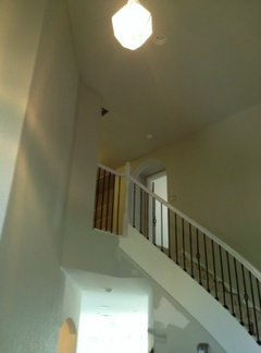
    There's a transom abv the door , 48", theres a (small cheap) light fixture on the second hallway, that celing is just shy of 9ft.

    I also have 2 high hats up there, the lightbulbs are out so they are replacing them for me-- so what type of indoor flood type light would i get? Flourescent? How many watts? THANKS!!!
  • 14 years ago
    should i repost this (new) discussion under lighting i wonder? that way everyone can benefit of the glorious experts as i am sure im not the first person to have gray paint issues!?
  • 14 years ago
    Ninjabetic, perhaps you are having a mild case of "buyers remorse". Any color change from builder's white was going to be an initial shock to the eye. When we painted our great room with Tyler Taupe, it initially looked hideous against the white primer...kind of like baby poo. However, once the painting was complete and furnishings were in place, it was the perfect golden tan. Give that gray some time!
  • 14 years ago
    Agree completely, michigammemom. My husband has learned to ignore everything I say for a week after we paint or redecorate anything in our house. I go around shrieking that we've made a terrible mistake because I'm just not used to the different look yet. Then after a week or so I calm down and can see it with an unbiased eye.
  • 14 years ago
    last modified: 14 years ago
    michigammemom thx, i was thinking yesterday that i need to hurry up and furnish the place so i dont have to look at so much of the walls! haha! :D
  • PRO
    14 years ago
    Yes, I think to do a lighting forum for your situation is an excellent idea. Because your gray will read differently on every wall your ability to control the cri (color rendition index) and the kelvins employed is critical with your chandelier and your high hats. Generally speaking you will want a high cri 95+ and kelvins at around 4500 to 5000 max. Over 5000, you will begin to get too blue. Under 4500, you will be moving more toward the yellow end of the spectrum. So, you may want to have some experts on to get you started. Nice thing about lamps is you can experiment until you get the right mix. There's always a compromise when it comes to color rendition. Sometimes you get the look of natural light for the objects you are illuminating but not so good for your face. You might want to get your lighting squared away on the chandelier first as that is the closest light (8') from the floor. Then you can work with your recessed lights and get a mix going.
  • 14 years ago
    last modified: 14 years ago
    Ninjabetic did you start a new lighting forum? Thanks.
  • PRO
    14 years ago
    Ok, now we have to see finished pictures of the space! Phew!!!
  • 14 years ago
    Kelli I'm cleaning up still.. will DEF post more pics though dont worry :) thx for keeping track and your interest!
  • PRO
    14 years ago
    Whew!! I'm tired and I didn't even lift a paintbrush. I hope more folks take the time to read this entire discussion. Most of my clients think all we have to do us run into the paint store and "pick up" some paint. LOL. Karen and Cynthia you have been so gracious to share your time, expert knowledge and experience with Ninjabetic and the rest of us. It is a process!! Am anxious to see pics.
  • 14 years ago
    These posts have been amazing to read! I am dealing with color issues in a "new" 1937 traditional... Decorator wants beige, I want Hawthorne yellow with a glaze(?) to go with all the dark antiques, asian silk wallhangings, and 8foot coral-pink Chippendale sofa! I like color!
  • 14 years ago
    sav7 - follow you insticts! There is enough greige in this world already. Besides, what is more cheery than yellow?
  • 14 years ago
    last modified: 14 years ago
    sav7 thx for following the post-- i have some bits of advice! 1> Hawthrone yellow is very dark, and i LOVE yellow-- you definitely want to paint a large spot on your darkest wall and see if youre ok with that ;)
    2> I've also learned in my adventure that light affects paint aLOT so make sure youre ok with that color in all the possible lighting situations ;)
    3> The legend's TRUE! Yellow DOES come out more yellow on walls than you think it will-- I painted my bathroom walls Moonlight which i thought was bordering on cream and it came out a medium yellow, almost too much! In retrospect i may have gone with Windham Cream to get the light yellow efffect i wanted.
  • 14 years ago
    Interesting that you find Hawthorne Yellow dark?!k. Everyone seemes to think it is hthe chalkiest fo the group, with Concord Ivory getting more votes. That, to me, is too dark and goes tan at night. Just imigine me wearing Lily Pulitzer all year 'round, and that it wht I like! Now throw in the traditional dark antiques and chinoiserie, and a few cherner chairs and saarinen tables and that's my cdesign in a verysmall nutshell! So, still trying....
  • 13 years ago
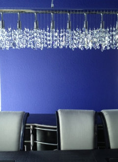
    ninjabethic, I just read through this entire post and learned a lot I will be using during a kitchen remodel I am starting in March. I love the blue of your dinning room as it came out in your pictures. I am wondering if you can tell me what the sparkly, ice cycle is across the top of the picture. Is it your chandelier? If so can you tell me who makes it? I love it!

    Thanks
  • PRO
    12 years ago
    wow! I was very hesitant to post here, but I find it hard not to. I always want to be involved someone is choosing color. I read many of the posts/comments here, but frankly I just got a bit bored reading through them.
    I feel obliged to add my input. Please take it politely as I know words can come across different in type.

    I am a color specialist. I have been on & off for many years. I have worked in furniture, design, and motherhood in between..and some travel. First, all color specialists/advisors/consultants charge different rates depending on their relationship with retail stores and working independently, based on experience, and region. I find 75 a little high, but I cannot judge from here..neither can any of us. I don't carry a portfolio or images of any of my work, nor have I ever. I have never needed to. If I have a client who is suspicious of my experience, I welcome them to politely dismiss me if they feel they are not getting their money-worth. I am yet to be dismissed. I also know from experience that 'too many cooks spoil the stew'. Do you get it? There are many correct answers to choosing color/palette, sheen, product, etc. I also discourage clients from using samples as it can often be confusing and they tend to 'take votes' from visitors and family which will result in something like sharing your baby-to-be's name before he or she is born...get it? (sending to prevent loosing this...)
  • PRO
    12 years ago
    Colors can be chosen by any color consultant worth experience and if you have good communication with her/him, you will be happy with your palette by the time they leave. I charge an 'Initial Consult' rate and a reduced hourly rate of picking becomes tedious or the home/project is larger than normal. Asking your consultant questions over the phone will validate their level of experience like asking about lighting, tones, products, sheens, pricing, quantity, and flow. You should be able to just drop words like these and he/she should be able to blab all day about color and experience eloquently...if they are good, and/or experienced.
    Am I right all of you designers reading this?
    Paying multiple visits to Benjamin Moore Stores, Home Depot, and wherever else may just confuse you.
    I could pick thousands of different palettes for the same house/project depending on many things including the lighting (in your house, the BM Store, and Home Depot, etc) so you will only confuse yourself.

    Keep it simple.

    Perhaps have a phone conversation with a few color consultants until you feel like you click with one and feel comfortable with her/him enough to pay a rate you are comfortable with as well. We all have our price and should never have to apologize for it if it is parallel with our expertise.

    Good luck with your project.
    ...and perhaps tone-down the blue. ;)
  • PRO
    12 years ago
    typo correction: Colors can be chosen by any color consultant WITH experience
  • PRO
    12 years ago
    I will do my best to read through all of this as soon as I find time, but it seems it has been 9 months since the last comment so I hope you have sorted it all out by now and hope even more that you truly love the colors in your home!