

Really need help with choosing backsplash
14 years ago
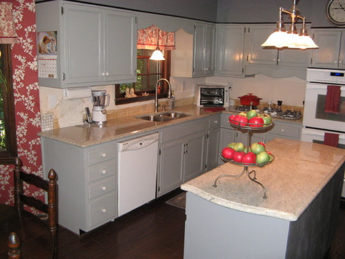
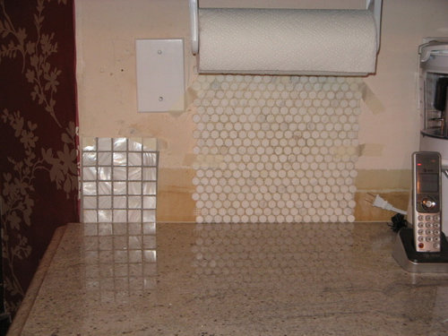
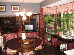
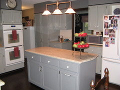
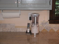
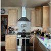
Here are the details. We are refurbishing a 40 year old kitchen. The look is transitional. Our cabinets are light to medium gray painted in oil base and we just installed Kashmir White granite counter tops. All appliances are white which include a glass cook top and glass oven. The sink, faucet, sink pendant, 3 light island pendant and the kitchen table chandelier are all in brushed pewter. The floor is 5" wood in coffee bean. The wallpaper in the bay window area is a silvery pewter vine pattern on a burgundy background so the accents in the kitchen are the dark red. The refrigerator side of the kitchen is not shown but it does have two small cabinets where back splash would be used.I need any and all suggestions for the back splash. I am considering one in calcutta penny round and the other in a pearl glass 1" mosaic. Would I be better off to tone down the shinny by using a matte back splash? Or perhaps going dark. Kashmire White granite is basically light grey and white with a touch of beige, veins of charcoal, and flecks of pearl and burgundy. Thanks for your input.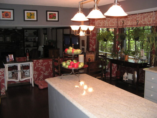
Featured Answer
Sort by:Oldest
Comments (52)
 PRO14 years agoThe pearl Calcutta penny would be terrific. I think the sheen is a plus. And the smaller penny and its less structured configuration is better suited to the movement in the wallpaper. The square tile is grid like and may bring more attention to the "semi grid" created by the partial overlay of the doors and drawers.
Related Professionals
New Orleans Interior Designers & Decorators · California Interior Designers & Decorators · Gulfport Interior Designers & Decorators · Tulsa Interior Designers & Decorators · Parkersburg Interior Designers & Decorators · Shreveport Architects & Building Designers · Toms River Architects & Building Designers · Waco Architects & Building Designers · Waterbury Architects & Building Designers · Beatrice Architects & Building Designers · Allentown Architects & Building Designers · Amarillo Architects & Building Designers · Boston Kitchen & Bathroom Designers · Plymouth Kitchen & Bathroom Designers · Bismarck Kitchen & Bathroom Designers
nanainatl
Original Author14 years agoThanks for your imput. The penny round is actually Calcutta white honed marble but I may be able to find a polished version. I am not aware of a penny round in pearl. If you know of one, please give me a source.- PRO14 years agoAvailability is up to what your local supply house carries. Polished is preferred to honed but I have a strong preference for penny shape.
- 14 years agoI second the subway tiles...but I would recommend white grout for a uniform look. Good Luck!
nanainatl
Original Author14 years agoI really appreciate these good suggestions. Stone & tile are so difficult to select. Unlike paint or fabric and perhaps even wallpaper, once you make a choice it would be so difficult and very expenstive to change. It is often a matter of personal opinion more than right or wrong but it is comforting to feel validated.- 14 years agoOf the two, the pearl squares work better with the feel of your kitchen-picking up all the colors of your palette as the previous poster mentioned and it's much easier on the eyes. THe penny round seems much too busy/fussy and competes with the wallpaper and the counter top. As an alternate suggestion, have you considered a subway tile with a design relief in it or the newer arabesque tile designs that have come out? Easy
to find on the internet. The tile is bigger in scale than your mosaic (comes in two sizes) and would echo the lines and movement of your wallpaper without competing. In white (with white or dove gray grout) would be the best choice for a clean look and for the chance that you actually may remodel/redecorate/redesign your kitchen's palette at some point. Good luck. Love the color of your cabinets! I've attached an image of my newly remodeled 1920 kitchen as well for inspiration.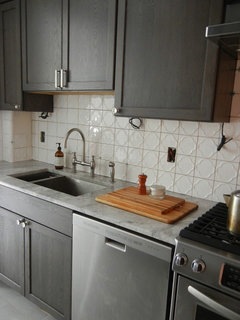
 14 years agoThe penny round you have picked is better for both color/finish and shape. The shie of the pearl looks strange against the different shine of the countertop surface. You want the backsplash to corrdinate not compete with the counter.
nanainatl
Original Author14 years agoGlossypolymer thank you for the photo of your lovely kitchen. The tiles are beautiful. I could see those in my kitchen. Could you tell me the name and/or source? 14 years agoThese guys carry a beautiful shell/pearl penny round mosaic - http://tiledaily.com/2011/11/04/shell-penny-round-mosaic/
nanainatl
Original Author14 years agoThank you for the link benjijk. If this is actual pearl shell it would be beautiful but above my budget but I will look into it. 14 years agoi suggest the penny rounds as well. May I also suggest changing the handles?
You have a traditional kitchen and those white round handles just dont seem to pull the look together.The finish should match the light fixture and faucet. what about these?
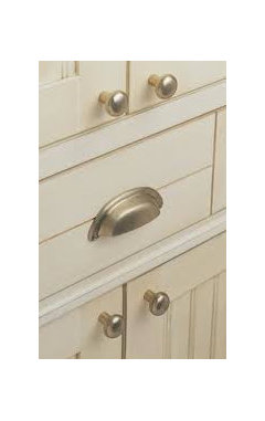
- 14 years agoThere does not seem to be a connection between the kitchen and the dining area which is super dark. Ever think of painting the set white? would it ever pop and look classy. or changing that red to a dark grey floral paper? I think your kitchen would look spectacular this way. I was digging around and found some examples to help you visualize. Then if you want to add red do it with accessories such as a vase with red flowers. I think Sarah richardson from design Inc would agree :)
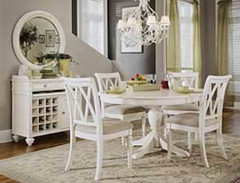
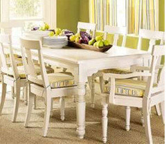
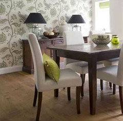
- 14 years agosometimes we are afraid to try but I think making these changes would be so nice. If not painting the table then for sure removing the heavy red floral. There is too much going on and its heavy looking. You could always add a really nice grey rug under the table instead to tie it in with the kitchen if what I am suggesting seems too much. A rug with a faint white floral pattern perhaps.
 PRO14 years agoHi there,
I love the dove grey of your cabinets and the traditional style you have chosen. I think this mixed mosaic would tie in beautifully with your colour scheme. It will pick up the greys and burgandy accents in your kitchen. Good luck!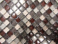
- 14 years agoThe tiles are Walker Zanger Tuilleries collection. They have a great website to preview their tile selection. It was a little more than regular subway tile-but for such a small space (I had the facing side done as well-its a galley kitchen) it's worth it 100% to be happy and enjoy it and splurge a bit on the small details you will look at every single day. A stove is easier to change than a backsplash. Good luck. Post your pics when it's done. Also, I had considered the "arabesque" tile in white. If you search that on the internet, you'll find it. IT's the actual shape of the design as the tile. Gorgeous too! I had a hard time deciding.
nanainatl
Original Author14 years agoI actually have thought about some off white chairs around the kitchen table but would not touch my beautful oak table. However, I am focused on the backsplash at this time.
Patricia, the glass mosaic tile is very interesting. It probably would tie in beautifully. Do you know the name or source? Perhaps it would be limiting the kitchen to those colors so changing the look down the road could be a challenge.- 14 years agoI would either run the granite up for a clean, sleek look or go with a subway tile. You could avoid grout & all of its care if you use the same granite as your counter,
- 14 years agoHi I work in a tile shop and do this every day, so please forgive me but both are wrong.....the pearl is too shiny and way to busy on mass throwing way too many colours under lights also too modern for the look. The circle stone will compete with the stone on the bench tops two different stones with very different natural viens and patterns then the circles to boot. you need something simple perhaps self embossed like the picture provided by glossy polymer. alternately . Look at the laying style to be the feature as in the soft grey grout or diamond laying, this will also keep within the era of the home.. Kitchens as a rule don't use a lot of tiles so stretch your budget for the right look...it costs the same to lay cheap tiles as expensive ones. Your kitchen is the hub of the home, you spend a lot of time in there and you will have to look at it for a very long time. You don't want to think I should have spent the extra $ on tiles 6 months down the track.
Even if you have to wait a little longer......Buy what you love not what you like its there for a long time :) - PRO14 years agoI agree with those of you who suggested subway tile, especially in a 40 year old kitchen with the busy vine pattern going on. I just had it installed. As far as grout color, I almost made a huge mistake. Originally chose white grout and when 25% of it had been applied, it made the tile look like cheap plastic. Changed course and went with grey grout - what a difference. Very classic.
- PRO14 years agolast modified: 14 years agoHi, the mosaic is a glass tile colours-SKU: 76,Z2,Z3,77,78 and called Autumn Mix. I write from Ireland so I will check out a supplier in U.S. for you! Don't worry about future schemes, as I 'm sure whatever further changes you make, the granite will stay. Greys are neutral hues that work with any other colour and the burgandy will always bring a little warmth to the heart of your home.
nanainatl
Original Author14 years agoPatricia it is so nice to hear thoughts from someone so far away. I've never been to Ireland but I know how beautiful the countryside is. Thanks for your input.nanainatl
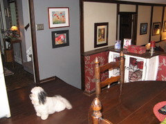
Original Author14 years agoI was so focused on the back splash and didn't realize that the rest of the kitchen should be included to make an informed judgement. It isn't dark, it's rather bright. The fault lies in the photographer. The granite is hard to capture and often looks very beige in photos but it is not. It has more of a marble appearance. I was talked out of marble because it is more porous than light granite and inclined to stain or etch so easily. Thanks again for some wonderful suggestions. I am taking everything into account.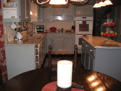
- 14 years agostudiovhdesign,
Loved the cabinet hardware you suggested. Where do I get it? Nanaintl, I like glasspolymer's suggestion. It's beautiful, simple and would fit in with the rest of your look. - 14 years agoI would go with the pearl but in a different shape, 1x2 little subway tiles look better in kitchens because the 1x1 say bathroom, at least to me.
- 14 years ago@mamascrumptious....sorry I was just scouring the internet for images and typed in kitchen gardware :( Its classic sure you can find it at most big hardware stores.
- 14 years agoYour getting lots of good ideas from others. My friend painted her cabinets gray and used a brick tile in multi gray tones she bought at loews. Looks great and was not expensive. Do change the knobs to match the light fixture metal. I would change out the white panel in dishwasher to the gray in the cabinets. I have the same space above the cabinets and I added trim and crown moulding. They made a big difference. Also try little touches of something black. I like the red but, it is over powering.
 PRO14 years agoI like your grey cabinets. I'll throw another thing into the mix - pressed tin. Usually a ceiling material, but they sell it conveniently sized for backsplashes. Inexpensive, easy to install, can be sealed and left silver, or painted. The patterns range from victorian to diner modern. Just a thought...
http://www.m-boss.com/store/Web/c-9-backsplash.aspx- 14 years agoLove the penny round marble!
Beautiful kitchen. I suggest removing the red print in the dining area and try to tie the two rooms together using the same color scheme as your kitchen in, drapery,chair cushions,accent pillows.  PRO14 years agoIf you have small appliances or cell phone chargers on the countertops try a Cordini!Store cords easily and eliminate excessive cord length, and more importantly potential safety hazards, with the new Cordini.
I invented the Cordini – a cord storage product -- to help eliminate excessive cord length. But, it has the potential to do so much more! Using the Cordini can help prevent accidents, eliminate trip hazards and keep toddlers and pets safe. Use the Cordini with a variety of appliances, including: cell phone chargers, floor lamps, table lamps, oscillating fans, alarm clocks, desktop speaker wires, telephone wires, electric toothbrushes, electric shavers, pencil sharpeners, televisions, stereos, radios, PS3 boxes, paper shredders, printers, blenders, candle warmers the list is virtually endless.
There are three versions of this unique product: the Recess Cordini, the Flush Cordini and the GFCI/Decora Cordini. All are easy to install, if you can install a switch plate or an outlet plate you can install a Cordini. Please visit my website www.Cordini.Biz Thanks, -Kevin, owner & inventor of Cordini...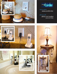
 PRO14 years agoLedge stone in the lighter tones will work well here and tie in the counters while complementing the flooring too. This is one line to look at: http://www.norstoneusa.com/products/stacked-stone-cladding
 14 years agoWe did our kitchen just over a year ago now form a pink and grey laminate to a Baltic Pine and instead of going with tiles and grout which always seems to attract the grime and grease, we chose to install a glass splash back [ back splash ] which is the same color as our feature wall in the adjoining dining room. The glass has a couple of coats of paint on the side that is glued to to wall. It has also opened up the whole room and wasn't as expensive as tiles. Just a thought !!
I would probably paint the dark grey walls the same color as the other wall that has the red / beige on it and the white cupboard near the dining table [ photo with dog in it ] to lighten the area up as well. Again just a thought ! 14 years agoAs a number of people have suggested subway tile (which I think is a very good option for your kitchen), and you've been getting conflicting advice about whether to go with light gray grout or white grout, let me suggest a middle ground option if you head in this direction. We put off-white subway tile in our mostly off-white kitchen, and used a grout that was one shade darker than the tile, but in the same family (in our case "alabaster" grout). In this combination the tiles don't stand out quite so much as they would with gray grout (which is a lovely old fashioned look), but they are defined just a little more than with pure white grout. Pure white grout is also harder to keep clean, so going for either a grout the color of your cabinets or a grout the background color of your granite might be better for maintenance, as well as tying the different colors of the kitchen together.
While I do think either of the smaller tiles you have picked would look nice in your kitchen (i.e. I don't think either would be a bad choice), it is true that the pearl squares would look quite modern and shiny, and that the penny rounds would be quite busy. Both, that is, would draw attention to themselves more than to your granite. So subway tile would indeed be a good third option to consider if you don't want the back splash to be too prominent a feature in the kitchen design.
I also agree that the two rooms would harmonize better without the red wall paper, but I know you only came here to ask about back splashes, so feel free to ignore all other issues. We all have a bad habit of getting off track and redesigning everything in sight if presented with the opportunity.
Best of luck!- 14 years agoWhile both your tile choices are beautiful, I think the pearl is a little sleek and blingy for your design. The penny tiles might be a little busy. To me, the room has a bit of a country French feel. I feel like the simple subway tile in a light shade that would blend well with your granite using soft gray grout. A pretty red tray or platter propped against a light backsplash and a red teapot or vase on the island would look pretty and pull that color into the kitchen some more. I also liked the arabesque design mentioned above that would be more cohesive with your design than the others. I can see the red and white wall coverings and fabrics are integral to your theme, but combined with dark floors, trim and dark stain on the furniture, it looks heavy. I agree that light chairs would help. If you're not ready to buy new chairs, as an interim step, I'd paint the existing chairs a shade of white. When you're ready to buy new, white/off white napoleon style chairs would look great. I agree that a rug in lighter shades beneath the table would look nice and lighten up the space. There are lots of lattice patterns for area rugs on the market now. That pattern would complement rather than fight with the floral. Just don't get one with more red since the idea is to neutralize that beautiful but strong color. If your budget is tight, consider some of the indoor/outdoor rugs as an option. Changing out the hardware will definitely help update the look as recommended above. I love the idea of bin pulls for your drawers.
- 14 years agoI've seen both styles of cabinet knobs/pulls at Lowes. I agree with the idea of subway tile. I've seen a glass backsplash on one of the HGTV design shows and it looked beautiful. I agree with others that the pearl tile is too blingy and the pennyround too busy. I believe your cabinets should be the star of the kitchen and not have a backsplash that jumps out at you.
nanainatl
Original Author14 years agoAIeta1, that is excellent advice. The kitchen looks unfinished but I will live with until I feel really happy about my choice.nanainatl
Original Author14 years agolast modified: 14 years agoJannielee, I had not thought about painting the existing chairs white. I really had an apolstered chair with dark legs in mind but it is a consideration in the meantime and would brighten up the area around the table. A lattice pattern rug would be perfect. I like your style.- 14 years agoI would also paint the grey cabinets a cream or similar color [ that would make the kitchen feel bigger ] and take the glass bask splash the whole way around the kitchen above the bench.
nanainatl
Original Author14 years agoFYI......glossypolymer had suggested a newer arabesque tile for the backsplash & attached a photo showing his/her personal example. I liked it a lot & now I realize why. I have an arabesque tile on a bathroom floor upstairs and it is close to 40 years old and in perfect condition. There is nothing Turkish or Eastern European about that room but the look works & I'm sure it would also be pleasing in our kitchen without being too busy. I do have some concern about keeping the grout clean. If you have a kitchen that is merely for show, sometimes people do, then keeping surfaces clean is not a concern. We spend a good amount of time & actually cook in our kitchen. I don't particularly like the look of extending granite up the wall. I find that a bit cold & commercial looking but definitely would be the easiest to keep clean. Love the glass with back painting but definitely feel that is suited best for a sleek & modern room.- 14 years agoThere are some great products out there that HELP seal the grout. They are worth investigating. Invest in a good one it's worth it. Grout is porous which is why it discolours and stains.. If you seal it most things will wipe away without staining :)
nanainatl
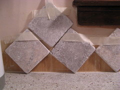
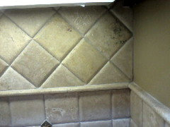
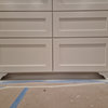
Original Author14 years agoFor those of you still with me, I may have found just what I am looking for. The Tile Store had this selection in Tumbled Travertine in a color they call Silver. It blends very well with the granite without competing with it. Most of the granite colors are in this tile. It is a tumbled or matte finish. It will appear slightly smoother when grouted. Now the choice would be to lay as a subway pattern or to buy it in squares and set on point. The last photo was taken in the store of a tile set on point. It is not the Silver color. Houzz has plenty of photos of square backsplash set on point. I like them both. What do you think?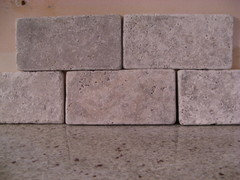
- PRO14 years agoIf you use that tile, then on point is a great look and would look good in your kitchen. But I think you have enough gray already. That's one of the reasons I liked the penny round. The white was a nice relief to you gray cabs and darker gray walls.
- 14 years agolast modified: 14 years agoI think the subway tile would look good, but I think you need some sort of color. I have seen backplashes that were all white, but they had pretty painted tiles that were applied every few inches just horizontally. There are tiles that have all sorts of patterns. I think the pattern does need some red in it since red is the dominant color in your kitchen. You could always keep some extra subway tiles, and later-if you changed the color of the kitchen, if the colored ones no longer matched, you could replace them with the plain subway ones.
nanainatl
Original Author14 years agoI wish my photos came out looking more like what I actually see. That's why lighting is so important. These new tiles I brought home are Claros Silver Tumbled Travertine. They have almost a white washed look to them. In the store we tried them with a Misty Gray & a Standard White grout. Either would work. After I have looked at them at home for a while I am feeling that the 3x6 brick is going to look blah over the space I need to cover especially once the grout is applied. The on point diamond shape has a little more interest to it. The salesman/designer at the tile shop suggested a row of the 4"squares, then a trim line & the balance of the area on point. That might make the overall look more interesting without jumping out & shouting at you.
I have always loved to decorate & have been told my home is a warm & welcoming place. From time to time I have helped others as well. I don't think I have ever faced a more difficult decision than these hard surfaces in my kitchen. I guess it is because you are investing a lot of money in something not easily replaced. I salute all the designers who have to make these kind of decisions daily. Perhaps frequency makes the job easier but then they are not living with the results. I can do beautiful if money is not a consideration but when you combine budget with functionality & ease of care the decisions can be daunting. Some people become frantic in these posts & I see why especially when they are not comfortable with color, texture, pattern & style. I am not under a time restraint but I would like to finish & my husband has had enough of it. Suggestions in this post have been good even if I don't agree with some.
I started out believing I wanted a seamless mini mosaic that would keep in line with my TRANSITIONAL intentions. I've seen that used in tradtional to contemporary kitchens. Now people have tried to steer me more to traditional, even retro & I don't think that is where I want to be. Even some have tried to redecorate the whole space. Thanks, but that is not what I am trying to do at the moment. There is nothing unique or interesting about matching up every accesssory to each other. The beauty is in making a space look collected over time not a paint by number one size fits all. One of your suggestions will light up my vision. Thanks so much fot the imput.nanainatl
Original Author14 years agolast modified: 14 years agoChroma Design, I agree with you. I still like the penny round even though some think it is too busy or does not compliment the granite. What holds me back is that I read an online article about a really bad tile job on a penny round floor. The photos showed some wavey lines. The installer wasted $700 worth of stone that had to be ripped out. They said penny rd was very hard to install. l couldn't live with wavey lines.- PRO14 years agoInstalling penny round can be challenging, but not overly difficult. With all small tile on sheet extra care is needed to align the seems, maintain consistent grout widths and ensure each sheet is on the same plane. Out of plane shows the wavy. A skilled installer should have no problem with the penny round. And that is the key to whichever tile you choose. I have seen the poor results of average installers with a variety of tiles on a number of surfaces. Get recommendations from neighbors and friends and check references. Cold call your potential installers, like a general inquiry. Ask about their experience with penny round, express your concerns, and be clear about your expectations. You should be able to detect their confidence for working with penny round and pride in what they do. You will know at that point if you even want them to come to give an estimate.
None of your choices are wrong. They each will have their own look and effect overall to the kitchen. You seem to have a number one choice in your mind, go with your gut. Don't let installation be the determining factor. Do your homework on them. nanainatl
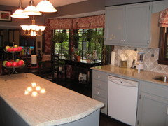
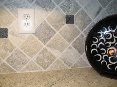
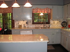
Original Author13 years agoAT LAST......We finally finished with our kitchen. We chose 4" tumbled travertine in Claros Silver. The colors in the tile picked up similar colors in the Kashmir White countertops. The tiles are set on point or diagonally with no borders or liners to keep the look a bit less traditional and more transitional. To add a little punch we scattered 2" pewter metal inserts around the sink and cooktop area. The grout we used is Standard White which helped to keep the look light. It almost appears a light gray. I wanted to say thanks again for all the good suggestions that were made.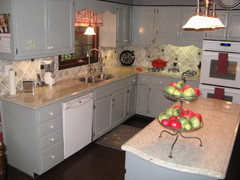
- PRO13 years agoYea! That looks great! I'm very happy for you and thank you for posting picutures of the end result. On diagonal was definitely the way to go and the accent tiles really add interest.
Looks like you found a great installer :)

Related Stories

MATERIALSKitchen Ideas: How to Choose the Perfect Backsplash
Backsplashes not only protect your walls, they also add color, pattern and texture. Find out which material is right for you
Full Story
KITCHEN BACKSPLASHESHow to Choose a Backsplash for Your Granite Counters
By Becky Harris
If you’ve fallen for a gorgeous slab, pair it with a backsplash material that will show it at its best
Full Story
DECLUTTERINGDownsizing Help: Choosing What Furniture to Leave Behind
What to take, what to buy, how to make your favorite furniture fit ... get some answers from a homeowner who scaled way down
Full Story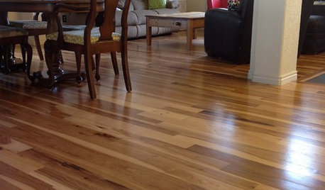
MATERIALSWhat to Ask Before Choosing a Hardwood Floor
We give you the details on cost, installation, wood varieties and more to help you pick the right hardwood flooring
Full Story
REMODELING GUIDESHouse Planning: How to Choose Tile
Glass, Ceramic, Porcelain...? Three Basic Questions Will Help You Make the Right Pick
Full Story
KITCHEN DESIGNHow to Choose the Right Hood Fan for Your Kitchen
Keep your kitchen clean and your home's air fresh by understanding all the options for ventilating via a hood fan
Full Story
KITCHEN DESIGN3 Steps to Choosing Kitchen Finishes Wisely
Lost your way in the field of options for countertop and cabinet finishes? This advice will put your kitchen renovation back on track
Full Story
TILEHow to Choose the Right Tile Layout
Brick, stacked, mosaic and more — get to know the most popular tile layouts and see which one is best for your room
Full Story
BATHROOM DESIGNHow to Choose the Right Bathroom Sink
Learn the differences among eight styles of bathroom sinks, and find the perfect one for your space
Full Story
KITCHEN DESIGNHow to Choose a Kitchen Sink Size
Bigger isn’t necessarily better. Here’s how to pick the right size sink for your kitchen, needs and budget
Full Story

michigammemom