Software
Houzz Logo Print
etrivedi

Need help - calling kitchen experts

13 years ago
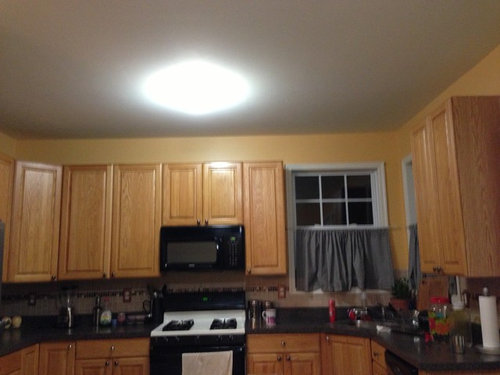
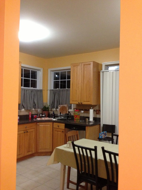
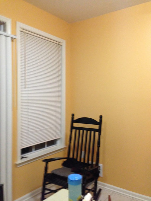
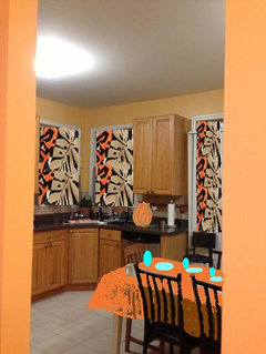
I paint kitchen walls with behr eastern amber color.cabinet color : oak
Need idea on how to coordinate color-scheme

Comments (42)

  • 13 years ago
    last modified: 13 years ago
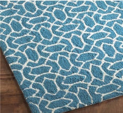
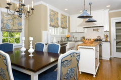
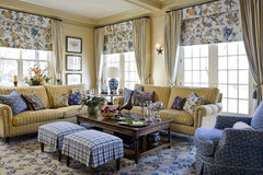
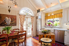
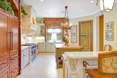
    You can coordinate adding an accent color. I think blue goes well with yellow. I would have a nice blue rug on the floor and coordinate roman shades for the windows [houzz=
    Outdoor or Indoor Summer Trellis Hooked Rug · More Info
    ] [houzz=
    Burlingame Residence Two · More Info
    ]
  • 13 years ago
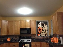
    One more picture
  • 13 years ago
    Any other ideas ?
  • 13 years ago
    I've actually used that color and it's lovely. The greenish blue is nice. Black and white, or sepia and white photos look great with that color. I'm not sure the grey works though.
  • 13 years ago
    I am removing the dirty curtains and planning to put some shades or blinds - not sure should I go with pure white or match blinds with cabinet color ?
  • 13 years ago
    Go with white blinds and colorful rugs. Try to install undercabinet lighting for your workspaces.
  • 13 years ago
    I go with what pinkblue said. Love blue with yellow. Put the shades up at the top of the window.
  • PRO
    13 years ago
    Hello!
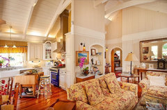
    I think that the roman suggestion would be a beautiful addition. If you like the provincial look, you could add royal blue and red as your accent colors. This would break up the gold of the paint color and the gold of the oak cabinetry. Here are some links within houzz.com.

    Living Room 4 · More Info

    Debra Campbell Design · More Info

    Debra Campbell Design · More Info

    French Country Kitchen · More Info


    The last link, show some tailored cafe curtains, these could look great in your windows too!
    I like the idea of adding a rug as well. You seem to have a large space. You could either put a rug under the table or you could use a rug as an area detail between the dining table and the range.
    Cheers!
    m.
  • 13 years ago
    WHITE and CREAM very rarely work. The white you have brightens things up but stops the scheme working as a monochromatic scheme. I suggest you put in a cornice and paint the ceiling a very pale cream. Otherwise, the decoration stops at the top of the cabinets.

    The splash back is holding you back, too. Bluey beige and cream absolutely do not, and never will, and never have, and can't possibly, ever ever ever look good together. So, with the splashback, go light green, or go contrast. Yellow is opposite blue, so that if you want contrast use it.
  • 13 years ago
    I see the floor now. That is a problem. NOTHING is going to pull the cabinets/wall and the floor together. The cabinets and floor should not have been put in the same room.

    This is the reason that rich people's houses look better than everyone else's. They get basic s- like that right. You could have done that already without spending extra money =(
  • PRO
    13 years ago
    Hi etrivedi, Firstly, to ask for colour assistance online is the WRONG way to go. You need to see the colour in your home, up on the wall.

    Secondly, these tones of paint are (I'm sorry for saying) awful. Nothing flows or harmonizes. It is clashing badly.

    You need to bring in more greens and if you love yellows - a dirty yellow, like the dark brown undertone of wheat to enhance the oak colour. Every photo example above is showing cabinetry in either white or a toffee colour NOT in your oak colour. Please don't take anymore advice online - HIRE A LOCAL DECORATOR/DESIGNER to come out and help you with this - see if the paint colour is at all salvageable with adding fabrics to soften it.

    If it were my home - I would be repainting, but NOT until I have my inspiration point - like a painting, piece of fabric I'm going to use on a drape or valance or even on a tea towel.

    If you don't want to hire a decorator (and my best advice to you is to), then take your paint swatches, head out to your local drapery company and find that magic fabric that has the wall colour, cabinetry colour and your flooring colour with your countertop colour in it. That is the only thing that will tie this room together and make sense.

    Sorry for the bad news, good luck to you...
  • 13 years ago
    Yeah, Marie. If the colours are not accurate, then how can you tell that they are awful. Too, having an "inspiration point" is the WORST ADVICE EVER. Reason: it is probably that the "inspiration point" will not match your floor or the cabinets or something important. What then? Change the floor? Ignore the floor? Too, when you put the "inspiration piece" in the room, it will look contrived. On the other hand, getting some fabric to link the floor with the other colours in the room sounds like a good idea and much better than my earlier, pessimistic advice.

    I was a bit nasty, too, so sorry about that. I was sad to see that you have quality kitchen cabinets and characterful windows and that things had not come together better. As a next step, instead of doing the fabric, can you put down a different coloured vinyl/tiles?

    I still recon a cornice will be great, as it will tie the ceiling in with the windows.

    I still think that the wall colour is good because it matches with the cabinets nicely. You are not a choromophobe. Another, possibly bad, idea is to have a very dark black/slate floor. That way, the white window surrounds could stay and you would have a black/white/yellow(ish) colour scheme going there. Depends if your countertop and chairs are more blackinsh or browninsh. Pls keep me informed.
  • 13 years ago
    etrivedi, I would try to pull the room together with some reds. Reds can be great with shades of yellow and brown. Something rich, a darker, autumny red, for window curtains and a carpet on the floor. I love the yellow wall colour you chose!
  • 13 years ago
    I like the color of your walls. The only thing that is throwing me is the white louvered blinds. Is it possible to change them out to a different color and have them cover the top of the door? Your room reminds me of beautiful fall leaves. It looks very welcoming.
  • 13 years ago
    the paint color is to close to the cabinet color, try repainting it a cinnabar color or a sage green. this will help contrast the cabinets.
  • 13 years ago
    Your corner windows and sink are very nice and would make a good focal point. Roman shades with a fabric with a yellow/gold background and then shades of tan, wheat, and some black would be good. Or a fabric with yellow, several blues, and a touch of black would work. If you need something on the lower half of the window for privacy, half shutters in white would be nice and could be opened when privacy is not required.
  • 13 years ago
    I agree that the paint color isn't working; it clashes with the cabinets ! I suggest a soft shade of green to make the cabinets pop, not fade into the walls. I like the idea of roman shades, but go with a bold color and/or a print for a splash of color!
  • 13 years ago
    Hi....for suggesters to say that there is nothing you can do except junk it is mean & wrong & you don't have to be a designer to know that! Could you please post pics of your adjoining areas & let me know what parts you like? I am going thru a redecorate now & have the same maple cabinets as you. For yrs I had a gold (actually cardboard) color & while it all blended into one, it was easy to break it up with pops of bold color. Now I'm at a stage where I want to remove color but without the expense of new cabinets & flooring. I'm going with greys, creams, golds, browns & metallics. The contrast of a soft grey against the yellowy cabinets is beautiful. I have the black appliances but I'm changing over to stainless....that will be the biggest expense. Also, what are the colors in your backsplash? You can do this!
  • PRO
    13 years ago
    So sad! I agree with azstrawn! Some people have trouble staying on topic and answering just the questions asked!
  • 13 years ago
    Thank you to all of you showing some rays of hope as painter completed the painting job and left me in sock. I am going to soon add more detail pictures for clear idea.
  • 13 years ago
    last modified: 13 years ago
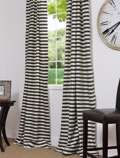
    I see black, your cabinets and your floor. If you were to match your floor to a paint color, what would you call it? Because I'm not sure of my monitor, I am going to call it BM swiss coffee OC-45. I would paint your wall swiss coffee (or whatever matches your floor). A beautiful blue with swiss coffee is BM bridal bouquet 632. Find some curtains that have the wall color, the black and the blue in the fabric. You could even tie this to a rod with blue ribbon.
    Black & Cream Hand Weaved Cotton Curtains & Drapes · More Info
  • 13 years ago
    This is going to sound weird. Jewel tones would be pretty. Like amythist...a purple pattern window treatments and chair cushions would be delicious.
  • PRO
    13 years ago
    May I make a suggestion? If you can save up some $$ to improve the kitchen:
    I would add some lighting. Rather than the lonely ceiling fixture, which puts your work surface in shadow, some recessed in the ceiling, some under the cabinet lighting. You probably need about five recessed lights with white rings and baffles (5") The kitchen will be a more pleasant space in which to cook, and look a lot better, and far less glarey and harsh.
    I would paint the oak cabinets white, and choose some simple cabinet knobs or pulls. Your doors are a great timeless style, and with cabinets painted white, the kitchen would brighten and it would free you for virtually any color on the walls. I would be inclined to do a less intense color, maybe a soft pale sage green, which will be complimentary to the neutral floor. Then simple woven shades, on all the windows, which will add a nice warm texture. Then you can have some fun with rugs, and tablecloths!
  • 13 years ago
    I like your kitchen, I would do roman blinds on all the windows, loose the cafe curtains, too much stuff happening at that level and not enough higher up. Choose a fabric with white background, black and a close shade of yellow to your walls (doesn't have to be a perfect match) in the pattern also an added color would be lovely, to use that other color as a pop, to add as accessory color (blue, turquoise, red, green etc....your favorite ! the rest is neutral, but it has to be vibrant to add life to it ) If there is a slider door next to the right of your cupboard ,I can't really tell whats there, I would do a straight curtain hung by clips so it slides easily on the rod, on one side only , because if it is a slider door it doesn't have room for a drape on both side , otherwise if it is a window just do another roman. then add the pop color maybe as a plant pot behind your sink, a bowl on your table, Also remove the clutter on your counter, only leave the necessary objects like toaster , paper towels etc.. if you need the chair (or chairs) that is a different color maybe paint it that pop color again. I think your kitchen would then look nice and homey . Good luck.
  • 13 years ago
    last modified: 13 years ago
    In case you haven't yet, look the through the hundreds of pictures of kitchens on Houzz and then take it from there. The biggest issue I see is that the color of the walls wash out the cabinets. I agree with Jan Moyer that you either need to change the color of the cabinets or the walls. Once you do that, I think you'll be in a better position to continue your design makeover. Good luck. I know how hard kitchens are...still trying to figure out my design plan. Ignore negative and unduly harsh comments...especially ones from designers who berate you for not hiring one. Hang in there!!
  • 13 years ago
    No contrast between cabinets and walls. Go for a much bolder color!!!!!! Also, try replacing window treatments to dark matchstick blinds and find a fabric that ties it all together. I think a brown and green scheme would look nice. Green paint on walls, green/brown/creamy/gold fabric to tie the the floors, walls and cabinets or you could go beachy- blue walls, dark matchstick blinds, blue/sand fabric- this would be less contrasty if that is what you are going for!
    Good Luck!
  • 13 years ago
    last modified: 13 years ago
    I love your kitchen! I do! It is so welcoming, like a hot cider in a windy day! If it were mine, I would only change the window covers to something like this and add on the counter a big bright orange or gold glass pumpkin (cookie jar may be - right now there are hundreds of them around) . And I will use the same fabric for the tablecloth or napkins or place-mates or chair cushions. Then I will match one of the colors and add few frames (bought at the Value Village and repainted to the exact match that the paint store will do for me), put into them some black and white photos or graphics.
    Oh, I will serve this hot cider with some apple pie with vanilla ice-cream and enjoy it! You may start from this, I believe!
    Here is where I got the fabric http://www.manhattanfabrics.com/product/4238/.
  • 13 years ago
    I agree with Jan Moyer's comments. I would also add undercabinet lighting concealed with a light valance. I would also add simple crown moulding above the cabinets & extend the crown at the same height around the window to connect the two areas. Then add lighting behind the crown on a dimmer.
    Add contrast as many have suggested with rugs. & accessories . I know you only asked for painting advice, but your space looks unfinished. Kitchen designers & other pros want to help everyone have a space that fits their needs & is a joy to live & work in. LOL, I'm on vacation!
  • 13 years ago
    Looks like you already spent the money on everything and just want to pull it together,

    Here is what I would do,

    This fabric for curtains or similar..
    http://www.ebay.com/itm/BOOAK-Fabric-B-W-Black-Gray-Yellow-Toile-Bird-Rose-Flower-Vine-Decor-HTF-VTG-OOP-/230680267781

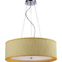
    This Fixture Above,
    http://www.bellacor.com/productdetail/elk-lighting-20215-5-le-triumph-polished-chrome-five-light-pendant-with-yellow-shade-608388.htm

    10 family photos involving food in black frames on the bare wall, hung salon style.

    I don't like the tablecloth, I would just switch to a charcoal one and use white and yellow dishes.

    For the Throw rug I would use a jute rug with a charcoal border.
  • 13 years ago
    Is your head spinning yet!!! Personally I love the wall color and the cabinet color together. The back splash works beautifully. My suggestion is to put white 2+ inch blinds on the windows, all the way to the top of the window. Put a beautiful green plant behind the sink. I agree to clear the counters, and decorate the top of the cabinets. Easy does it, just a few pieces that pull the colors from the room. I personally would use pieces with splashes of black. It pulls the eye up and makes the room pop and look larger. I agree to replace the vertical blinds on the patio door, make sure they cover the entire window. It looks as though you have a high chair or large family with the size of the table? Lose the tablecloth, and get some fun place mats and charger plates made in a natural fabric. Rattan and wicker give the texture you need on a flat surface. The lighting does seem harsh in the room as well as insufficient, so take your time and pick what you love. A ceiling fan, can lights, under cabinet, whatever you love. I used a black fan light in an abstract design that cost only $99 and I love it. The black appliances inspired me to try the black colored light and a can of polish keeps the dust off. Lastly, I would paint the top of the range black. Perhaps an automotive paint, or check out your local home improvement store. The range of paint finishes and colors are amazing!!! Best of luck, relax, and trust your judgement. Decorating is like picking out an outfit to wear, does it go together and do you love it? Finish with the accessories and shoes that you also love, in the colors that work, right? From the looks of your kitchen, I say your taste is pretty good. Go for it, and have fun!!! What color are your dishes? You have your accent color right inside the cabinet! Use this color in the pieces above the cabinets, and perhaps on a mirror or picture on the empty wall. I personally pulled the rugs out of my kitchen, and I love the larger appearance. Just an idea. Good luck!!
  • 13 years ago
    Mslori is right on! Clear off the counters except for a real plant or two and put lights under the cabinets or use small lamps in the corners. I'd like a rusty red for an accent color mixed with your already present earth tones. Paint your table base and chairs black/brownish to match counter tops and do an antique rusty red finish on table top. Varnish well for water resistance. Some neat dried gourds in a basket on the table would make you glad you did not keep your tablecloth.
  • PRO
    13 years ago
    I hate to say it but it almost doesn't matter what tone of color you paint on the walls because of your lighting. A single overhead light like you have is going to kill any paint you put on the walls. There are no shadow lines or accented areas and that is what makes your color pop. Yellow is a beautiful color and I agree it needs to be a bit dirty yellow to make it interesting. Take down that light and put up a track lighting system with small halogen heads. You could put up a single track or even two that would be in the shape of a cross or an x. This will make the most dramatic change to your kitchen.
  • 13 years ago
    Paint the cabinets white, to brighten it up. That is the single most important thing to do and inexpensive if you do it yourself.
    The windows are nice, I would lose the draperies - if you can leave them off to open the space up, if you can't due to privacy, add in roman shades with a great bright bold pattern.
    I don't know about people talking about carpeting in the kitchen...and I think your flooring looks fine at least in the pictures. I think if you paint the cabinets, you can go with just about any color scheme for the walls including what you have here. Get rid of as much of the clutter as you can.
    I am not sure but it look like a slider with a vertical blind covering that doesn't quite go all the way up? A really affordable and nice solution for sliders is grommet top drapery panels that are pulled to the side when not in use. JC Penny has many stock (and custom too) inexpensive but nice solutions, go white/off white to match trim/cabinets if you leave your windows w/o blinds, if not coordinate with those.
    If you do the above, you will have a nice clean look. If you have more money, you can start accenting more by picking an accent color, paint the kitchen table, maybe the chairs, upholstering the seats with a cool fabric that coordinates with the window coverings. Just be careful not to overdo this and make sure you keep a clean not cluttered look as the space is relatively small and you don't want to overwhelm it.
  • 13 years ago
    last modified: 13 years ago
    I did some "paint job" but my skills are close to non(existant). It is just an idea! :)
  • 13 years ago
    And the other one
  • PRO
    13 years ago
    This is no disrespect to the DIY crowd. Please understand you can throw endless amounts of money at "fast fixes" that are no fix at all. Please I beg, save your money to address lighting FIRST. Then consider painting cabinets to white. Then pick your cabinet hardware, and the rest will begin to fall into place. As I said, no disrespect intended, but the DIY'er is what keeps designers in business AFTER boatloads of money have been WASTED.
  • PRO
    13 years ago
    last modified: 13 years ago
    Here is your Eastern Amber in a photo of a kitchen. Note the coordinating colors and how you can move your palette down into a rich mocha brown and pull up some red to give it some spark. http://i141.photobucket.com/albums/r71/thaislip/Kitchen%20Before%20and%20After/Finishedkitchen019.jpg
  • 13 years ago
    etrivedi -

    I'm so sorry about all the nasty comments!

    There is nothing wrong with your kitchen or color choices. (Sone people's answer to everything is to paint perfectly good cabinets white!)

    You don't have to paint your cabinets, or change your floor. The Eastern Amber is a very vibrant color so let it be the star. Cream trim will soften the contrast a bit. With some chocolate brown accessories and some natural roman shades you wil be fine.

    A new lighting fixture in oil-rubbed bronze and your kitchen will be wonderful.
  • 13 years ago
    last modified: 13 years ago
    I have cabinets similar to yours. When I first moved in years ago, I painted my walls a similar color. I couldn't figure out why I didn't like it. then I realized, the color is too close to the cabinet. Once, I changed the color to a olive/taupe/green ish color, things blended much better. i had to go with green bc I have a terracotta colored (opposite color wheel colors) tile floor. I think you should try a sample near one of your cabinets. Then go from there. Hope it helps. in the end, it is you that has to like it...but since you asked....I would say start with a contrasting paint. Good luck.
  • 13 years ago
    I'm not a kitchen expert, but I have similar cabinets that hubby refuses to allow me to paint. On the advice of a designer I painted the walls the same as yours - Eastern Amber - and put in black countertops with a warm beige fleck. The fridge, dishwasher, microwave are black and the gas stove is stainless with a black top. My accent colour is red, both bright and somewhat deep and I have a black framed print on one wall with reds, a bit of the wall colour, and another colour similar to Behr's Butter Cookie, which is a very soft warm yellow bordering on light peach. There is also black and white in the print in a bit of a checkerboard. I've painted the adjoining hallway Butter Cookie with the farthest wall in the entrance way in Eastern Amber with 4 long mirrors. The family room adjacent to the kitchen is painted in Butter Cookie and Eastern Amber. My kitchen floor was the same colour as yours but we are in the process of changing it to black and cream checkerboard ceramic tiles which will go in the kitchen, hallway adjacent to the living room and also in the entrance way.

    Back to the kitchen, the windows have white horizontal blinds and all of the moldings are white.
    I have two black iron framed mirrors about 16 inches square hanging one on top of another on the wall beside the white blinds and there is another black iron framed mirror on a high wall above the stairs to the foyer. The entry way closet doors are also white as is the molding.

    We are in the process of stripping old wallpaper from the adjacent dining room and I am considering Eastern Amber there as well since the actual wall surface is not much considering a very large window, large mirror on another wall and large print. I might go with a brighter colour than Eastern Amber if I can find one that works.

    I'm sure this all sounds like a designer's nightmare, but I love it. To me it's warm and inviting and makes me feel happy in the space.
  • 10 years ago

    Remove the curtains! A white wood (2" slats) blind would blend with the woodwork. Also - consider updating the knobs and pulls - a trim attached to the top of the stand wall cabinets would elongate the cabinets. A new faucet, and coordinating rug and towels would help. Another inexpensive update is undercounter lighting - the new skinny LED (IKEA is cheap) really helps a kitchen! If you want drama, take a kook at slate for a backsplash - great organic colors - 6x6 with a matte finish would look awesome.

Sponsored
Snider & Metcalf Interior Design, LTD
Average rating: 5 out of 5 stars25 Reviews
Leading Interior Designers in Columbus, Ohio & Ponte Vedra, Florida