

Mixing prints and patterns
13 years ago
Featured Answer
Sort by:Oldest
Comments (16)
 13 years ago
 PRO13 years ago
Related Professionals
Pensacola Interior Designers & Decorators · Belleville Interior Designers & Decorators · McComb Interior Designers & Decorators · Parkersburg Interior Designers & Decorators · Cowansville Interior Designers & Decorators · Longview Architects & Building Designers · Plymouth Architects & Building Designers · Garden City Architects & Building Designers · Manhattan Kitchen & Bathroom Designers · Elk City Kitchen & Bathroom Designers · Knoxville Kitchen & Bathroom Designers · Lebanon Kitchen & Bathroom Designers · Olean Kitchen & Bathroom Designers · Wheeling Kitchen & Bathroom Designers · Salem Kitchen & Bathroom Designers 13 years ago
 PRO13 years ago
 13 years agolast modified: 13 years ago
- 13 years ago
- PRO13 years agolast modified: 13 years ago
- 13 years ago
 PRO13 years ago
- 13 years ago
 13 years ago
 13 years ago
 PRO13 years ago
- PRO13 years ago
- PRO6 years ago
Related Stories
COLORPattern Play: Mix Prints for a Traditional-Modern Look
See how to layer florals, stripes and geometrics for a contemporary bedroom or living room
Full Story
SHOP HOUZZShop Houzz: Printed and Patterned Furnishings and Decor
Mix big and small prints for an eclectic space with lots of charisma
Full Story0
SHOP HOUZZShop Houzz: Get Trendy With Mixed Prints
Of-the-moment pattern mash-ups in pillows, rugs and furniture
Full Story0
DECORATING GUIDESPattern Primer: How to Pair Different Prints
From demure florals to fearless camouflage, learn to mix patterns without making a mishmash
Full Story
SHOP HOUZZShop Houzz: 100 Prints and Patterns Under $100
Add a dynamic feel with pillows, rugs, curtains and wallcoverings in peppy prints
Full Story
DECORATING GUIDESInspired by the Runway: The Art of Mixing Patterns
See how to strut the latest patterns with a fashion-forward mix of of color and scale
Full Story
DECORATING GUIDESIdea of the Week: Mix Patterns Like a Pro
Go for a Look That's Not Too Match-y, Not Too Random
Full Story
SHOP HOUZZShop Houzz: Patterns, Prints and Motifs Sale
Save up to 50% on pieces with stylish prints and patterns
Full Story0
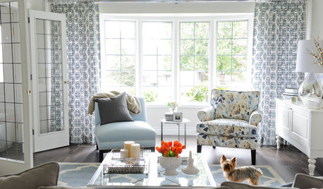
SHOP HOUZZShop Houzz: 3 Great Tips for Mixing Patterns
Blur the lines between organic and graphic by mixing florals, stripes and arabesques
Full Story0

PATTERNMix Pillow Patterns Like a Pro: 17 Foolproof Themes
Toss together one of these helpful pattern mixes for a sofa, chair or bed bursting with liveliness
Full Story




bagaroo