Software
Houzz Logo Print
jessklem

Please Help with Kitchen Decor!!!

13 years ago
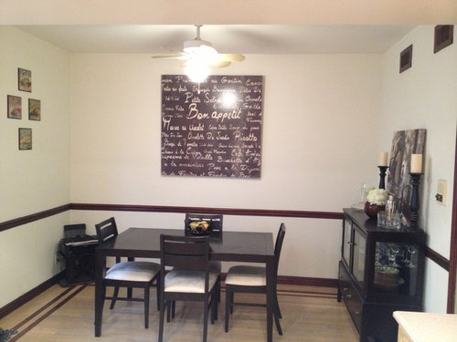
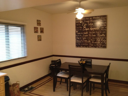
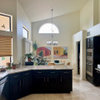
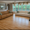
Hi there. I have an extended kitchen/dining room in one, and I am having trouble with the decor. The shape of our kitchen is rectangular so on one end is our refrigerator, cabinets, counter space, appliances, etc., and on the other end is our dining room table. The table is surrounded by 3 walls, and I am having a hard time figuring out how to decorate that side of the room without making the walls look too cluttered. We have a big piece of wall art on the middle wall, and on the right wall, we have a buffet with another photo leaning up against it. I want to do something with the left wall, but just not sure what without it being "too much". It looks really bare without anything. What you see in the photo now is just a temporary thing my husband put up there, but trust me, it will be coming down. :) The kitchen is a little dated and not the prettiest, so I am trying to do the best I can under the circumstances, until we can get around to renovating it. I've looked at a bunch of photos here on houzz, but haven't seen many floor plans with the boxed in 3 walls like mine. Suggestions??

Thanks in advance! :)

Comments (10)

  • 13 years ago
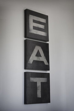
    Thanks for the tips @michigammemom. The four square pieces are just something temporary that my husband put up in the meantime until I figure out what to replace it with. The wall looks really bare otherwise....
  • 13 years ago
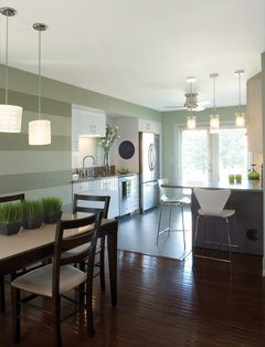
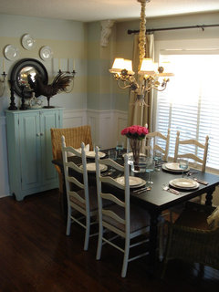
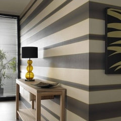
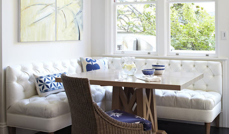
    I recommend painting the upper wall a darker color or even striping the wall for visual interest---much more interesting... [houzz=
    by Jodi Feinhor-Dennis · More Info
    ][houzz=
    Casual dining room · More Info
    ][houzz=
    Graham & Brown - Verve Stripe Wallpaper · More Info
    ][houzz=
    Bayshores Drive · More Info
    ]
  • 13 years ago
    You could hang some fabulous drapes on that window....with the pole extended a good distance past the window.It looks like you have cabinets at the other side of the window, therefore you could pull the drapes to one side only and extend at least half way down that bare wall and place your 4 little picture frames vertically next to the drapes. I would also add interest with paint. Another nice idea would be a very decorative screen/wall divider placed two thirds on that wall, one third in the corner perhaps.Although I like your Bon Appetit art, I don't think the shape/size suits that wall too well as it is just now.There is something about the proportions that just does not sit right, try lowering it a few inches
  • PRO
    13 years ago
    I think the spaced out variety of artwork looks pretty good in that room, maybe just not that exact thing. Something that takes up a little more space in a minimalist way would be great. You should consider a wall decal that would take up a fair amount of space, but not seem overbearing. It could be something like four picture frames or just a larger quote or design, both would look great.
  • 13 years ago
    Why do guy's tend to hang art too high? We'll, it is an easy fix! I think the room needs anchoring with a dark paint under the chair rail. Maybe the chocolate from the Bon Appetit piece. Lower that piece so the bottom aligns with the bottom of the window. If you hang any small prints, make sure they are below the top of the window. The vents need to be painted to match and fade into the wall - one more rectangle eliminated visually. If curtains don't work in your space, try dark wood blinds or an inside mounted soft roman shade. A new drum chandy hung no higher than 36" above the table would really change things. Lots of people are putting their dining tables on a 45 degree angle to break up the squarishness! What is your accent color? How about yellow, red or orange for new seat covers? You need a pop of brightness and pattern wouldn't hurt either.
  • 13 years ago
    Are you open to painting? I agree with Natalie, adding a color to the top section (above the chair rail) would really make a big impact! I like oaklands idea too about adding some curtains. Also, from the angle the photos were taken it looks like the large "bon appetit" piece is hung high up to were the light fixture is blocking part of it. Lowering 6" might make the room feel more grounded. I like you idea of the set of 4 pictures, so maybe try something larger scale? Overall, I think painting would make the biggest difference.
  • 13 years ago
    last modified: 13 years ago
    Not sure if I would paint the lower wall dark---there wouldn't be enough contrast with the wall and your furniture. As for how high/low to hang art---usually the CENTER of your art should be between 57"-60" from the floor---think: middle of painting at eye level... Hope this is helpful.
  • 13 years ago
    The table and chairs look great. Have you ever considered a large oversize mirror centered on the largest wall? It would really reflect the light and energy from your kitchen. Plus, it would visually make the space seem to double in size....taking away from the three wall irritation. I would move the large piece of artwork onto the wall on the right. From there I would probably find some kind of seagrass or sisal rug for underneath the table with a colored border matching your min kitchen area. (Overstock has a really affordable selection that looks just like Pottery Barn) And finally I would pull the color from the rug border and add some matching panels on either side of the window on the left. A pattern there could work really pop as well. Accessorize the table and you're good to go. Good luck!
  • 11 years ago
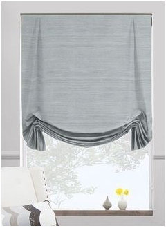
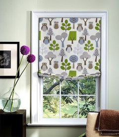
    Your inlay on the floor is wonderful but I think there are too many hard angles in the room and I would consider painting the chair rail the wall color. This sounds dumb but I put my finger in front of you picture to obscure the chair rail and the room immediately read less busy. I think at the very least you need to introduce fabric in this space with a tulip roman shade. I like the idea of going with a pattern. Someday maybe add a pattern to chairs when the time comes, although I like the ones you have.